Categories
Subjects
Authors
Artists
Venues
Locations
Calendar
Filter
Done
November 15, 2024 – Review
62nd New York Film Festival, “Currents”
Almudena Escobar López
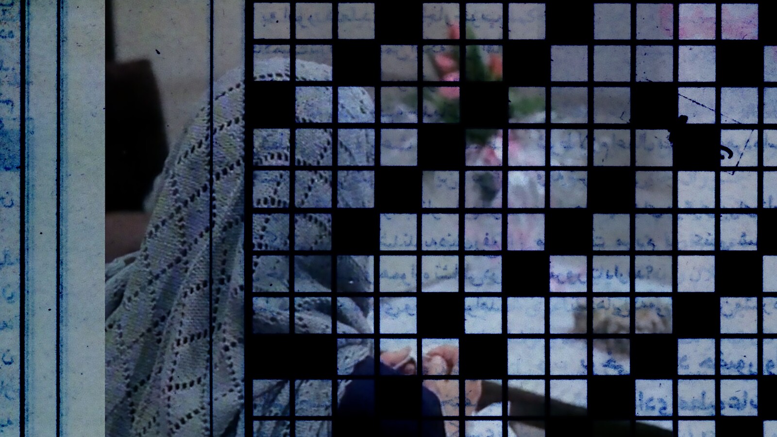
Days before the New York Film Festival opened, dozens of filmmakers—many from the “Currents” section—published a petition urging the festival to cut ties with Bloomberg Philanthropies due to concerns over its implication “in facilitating settlement infrastructure in the West Bank and denying Palestinians their basic rights.” During the fortnight, anti-war demonstrators interrupted Q&As and screenings, and a parallel Counter Film Festival was organized. How do we approach film-making after a year of live-streamed genocide in Gaza? This question lingered over the “Currents” shorts programs, curated by Aily Nash and Tyler Wilson, which seek to foreground “new and innovative forms and voices.” A select group of films from the programs challenged how images influence our perception of reality, particularly in contexts of violence, prompting critical reflection on our roles as viewers.
Two films in “The Will to Change” program reveal the limits of observation, turning the horror of witnessing war into an act of self-reflection. Black Glass (2024) by Adam Piron conjures the ghosts of the past (and the present) by speaking about the intrinsic relationship between early image-making technologies and the ongoing processes of settler colonialism. Piron examines Eadweard Muybridge’s early photographic work, commissioned by the US Army to capture …
September 25, 2024 – Review
Jenny Holzer’s “WORDS”
R.H. Lossin
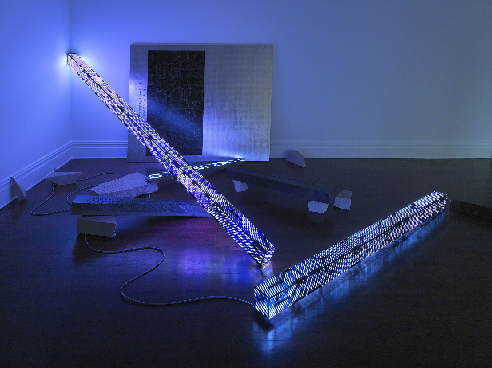
Jenny Holzer began making her ongoing series of “Truisms” in 1977. According to the Oxford English Dictionary, truism indicates “a self-evident truth, esp. one of minor importance; a statement so obviously true as not to require or deserve discussion. Also: a proposition that states nothing beyond what is implied in any of its terms.” The word “truism” means more or less the same thing as “platitude” or “cliché”—unremarkable, banal observations—but the fact of its orthography nudges it, just slightly, toward a charged moral terrain of reality and deception.
Today the word’s appearance, unlike its synonyms, reminds us how contentious such a notion of obvious and easy truth has become. The same statement is either widely repeated nonsense or unquestionable fact depending on who you ask. This has always been the point of Holzer’s text-based works. “Truism” underscores the tension produced by common sense and capital T truth that animates her scrolling digital billboards, engraved park benches, projections, and painting of redacted documents.
Making strange claims in the form of a brief declarative statement or maxim draws attention to the ways that sense becomes common (or doesn’t) and underscores how difficult, if not impossible, it is to produce …
September 20, 2024 – Feature
New York City Roundup
Orit Gat
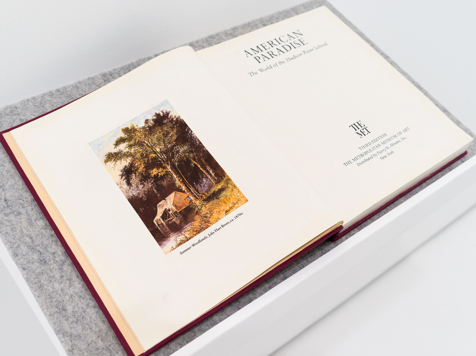
“American Paradise”: Anna Plesset took the title of her show at Jack Barrett Gallery from a 1987 exhibition at the Metropolitan Museum of Art about the nineteenth-century Hudson River School of American landscape painting, which featured twenty-five male artists and not a single woman. Plesset responds by researching the work of women artists of the time, applying an astonishingly skillful trompe l’oeil technique to the task of filling in historical gaps.
Her show opens with a sculpture mimicking the original exhibition’s catalogue, a perfect facsimile in oil on epoxy, aluminum, and steel placed on a plinth. Ostensibly the catalogue’s third edition (only one edition was published), the frontispiece is here replaced with a painting by a woman artist, Julie Hart Beers. In Value Study 2: Niagara Falls / Copied from a picture by Minot / 1818 (2021), Plesset paints an impeccable reproduction of the paper printout of an online image search for Louisa Davis Minot’s painting of the waterfalls, as if adhered to the canvas for reference using blue painter’s tape. The canvas itself shows the sketch and a beginning of a copy of Minot’s original. Plesset’s realism is not a remedy for historical injustice but a conceptual stop-and-start, a …
September 18, 2024 – Review
Whitney Biennial Performance Program
Sanna Almajedi
Taja Cheek—currently artistic director at Performance Space New York, and an artist in her own right as L’Rain—has long advocated for the inclusion of sound artists and musicians in the gallery space, as central figures rather than an entertainment vehicle to lure crowds. This year’s Whitney Biennial featured a five-part performance program, curated by Cheek, featuring an array of performances deeply rooted in sound. Artists Debit, Sarah Hennies, Holland Andrews, Alex Tatarsky, and JJJJJerome Ellis presented electronic music, improvised sounds, an experimental music ensemble, and a sonic exploration of language.
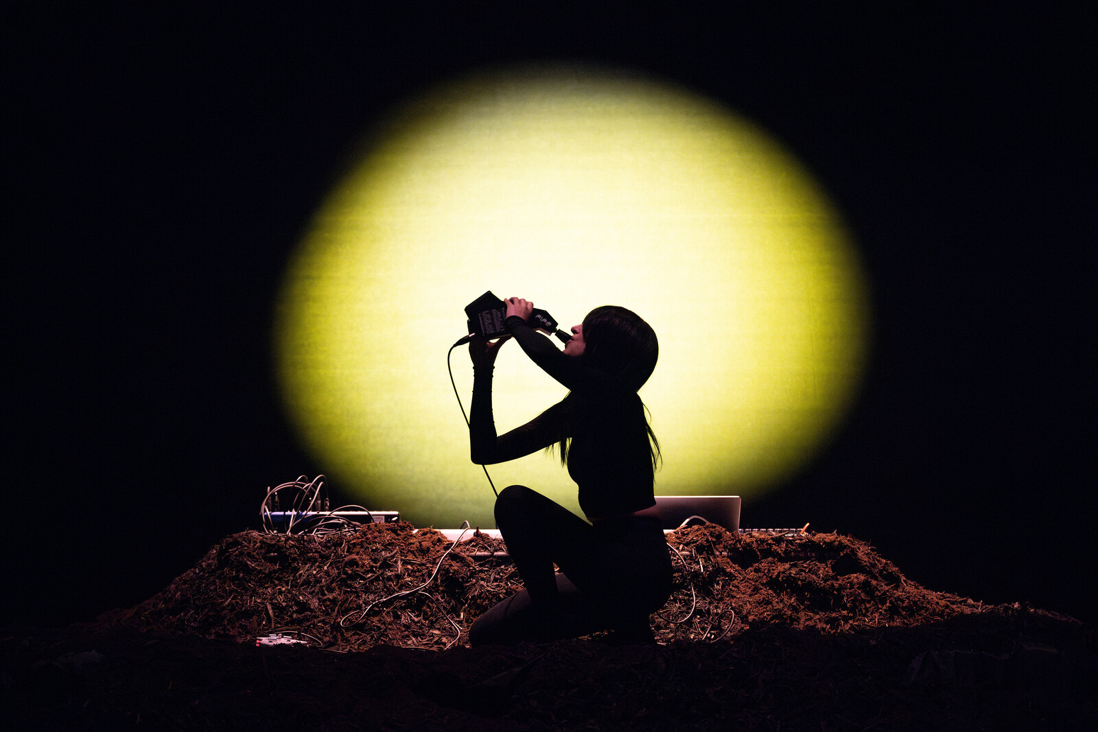
The program began with Debit, playing music from her album The Long Count (2022), which imagines the music of the Mayan civilization through a theatrical and fantastical three-act performance, using intense drone sounds and samples of precious and eerie wind instrumentation. The stage consisted of a mountain made out of a pile of dirt/wood, spot lights and a curtain that was lifted at the end of the show to unveil the Whitney’s majestic view of the Hudson River, alluding perhaps to a call for the land. Debit used synthesizers which, according to the press release, “have sampled and processed the sounds of Late Postclassic Maya wind instruments. Using tones from …
September 6, 2024 – Review
Harun Farocki’s “Inextinguishable Fire”
Leo Goldsmith
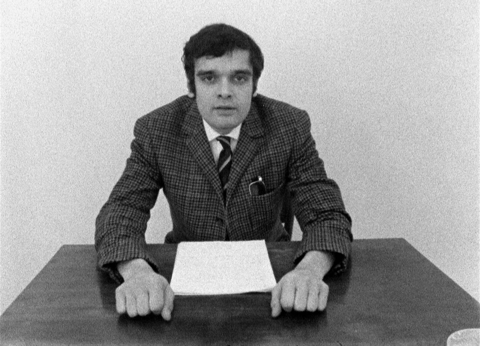
Greene Naftali’s new exhibition of works by Harun Farocki derives its title from perhaps the German filmmaker’s most famous work, a gently excoriating and laser-sharp 1969 film about the complicity shared amongst politicians, Dow Chemical executives, and ordinary workers in the production of the chemical weapon napalm. Inextinguishable Fire remains utterly devastating, a frightening but cogent delineation of the phases of dissociation we experience as we gaze at media images of atrocity, and a methodical examination of how the abstraction of labor makes us unconscious of our complicity in the violence of war.
Here, however, the specificity of Farocki’s title is, along with its definite article, lost. This lends it a more nebulous quality. Perhaps the “inextinguishable fire” in question refers not to a chemical weapon, the slightest drop of which—the film’s voiceover narration tells us—burns for half an hour at a temperature of 3,000 degrees Celsius. In the context of a show that marks a decade since the filmmaker’s death, the title almost sounds like a tone-deaf tribute to Farocki’s burning legacy. It loses its precision as a catch-all for a group of works that branches two different phases of the filmmaker’s career (the 1960s and the 2000s) and …
June 18, 2024 – Review
Tolia Astakhishvili’s “between father and mother”
Chris Murtha
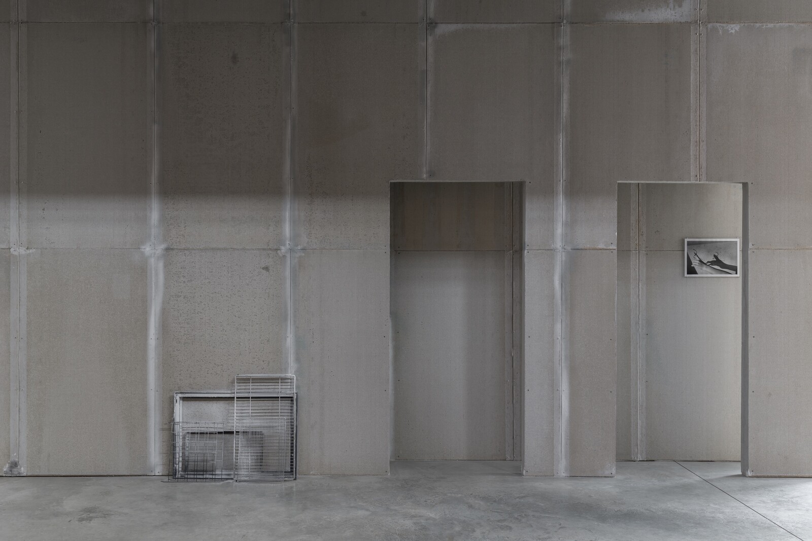
Built from conventional architectural materials including drywall and cement, and later stained with coffee, dirt, and pigment to mimic the wear and tear of time, Tolia Astakhishvili’s installations hover between construction and destruction. SculptureCenter’s brick and cast-iron building, initially designed for repairing trolleys and later used to manufacture derricks, hoists, and cranes, proves a fitting host for the Georgian artist’s first exhibition in the United States. Having previously explored the mutability of domestic spaces, and how they accumulate the marks and alterations of their inhabitants, Astakhishvili here contends with a formerly industrial site, while still remaining focused on what spaces tell us about humans come and gone.
As she did with two recent exhibitions in Germany, Astakhishvili incorporates collaborative projects and works by peers into her installation—an extension of, rather than challenge to, authorship. A microcosm of the exhibiting institution, her fabricated environments become fleeting hosts for her own and others’ artworks. The first sculpture visitors encounter is Astakhishvili’s The endless House (all works 2024 unless otherwise stated), a freestanding cement and particleboard wall modeled on those found in the building’s basement. The structure’s narrow cavities harbor a sculpture and photograph by Katinka Bock and reverberate with the sound of …
June 12, 2024 – Review
Fernando Palma Rodríguez’s “Āmantēcayōtl”
Xenia Benivolski
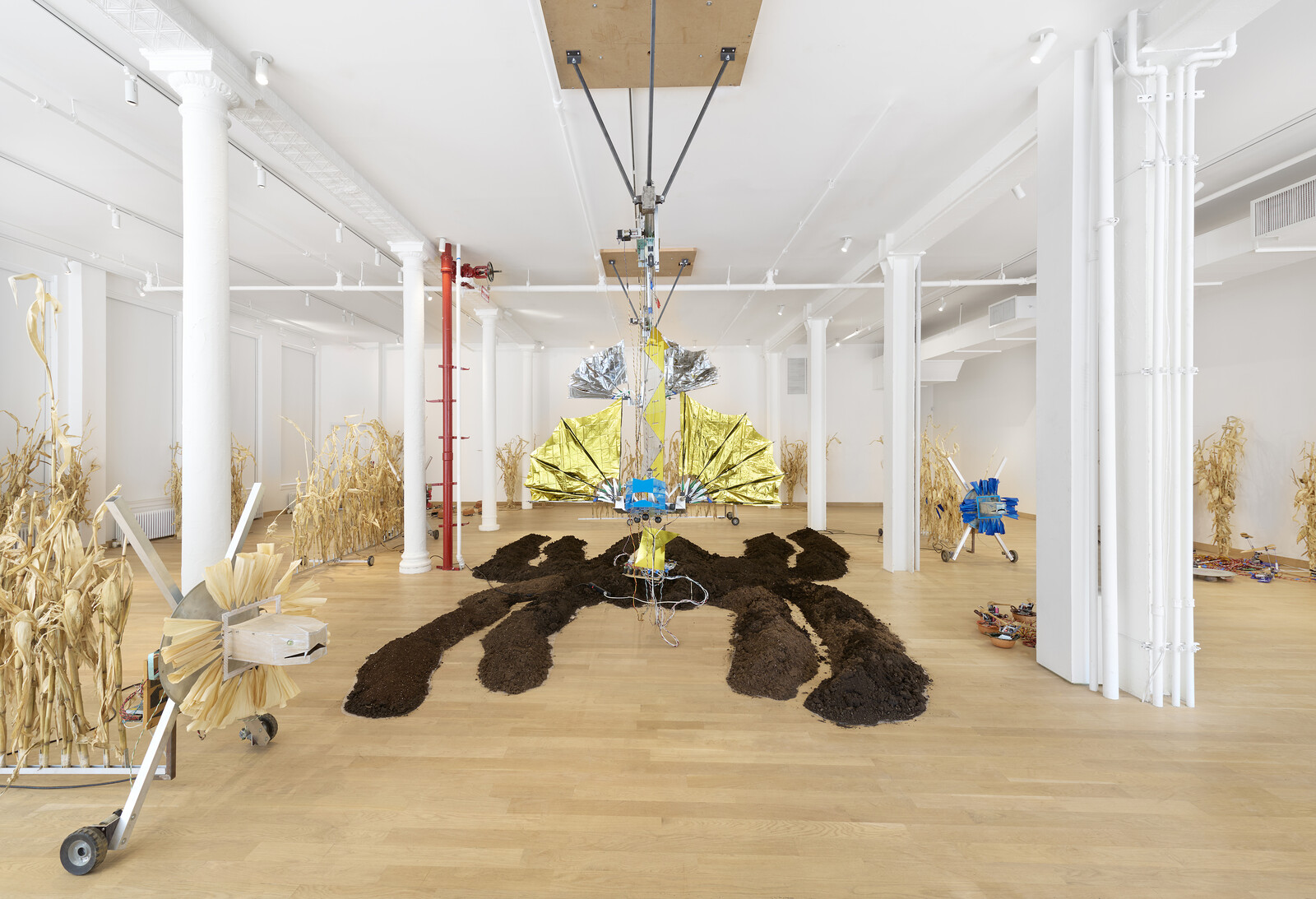
When I first visited the wall between Mexico and the US in Patagonia, Arizona, in 2017, the town was celebrating: the redevelopment of a large patch of agricultural land had been halted due to the discovery of traces left by a jaguar. In one dramatic appearance, the endangered animal had accomplished what land activists had been trying to do for years. In this same spirit, Fernando Palma Rodríguez’s work plays on the symbiotic relationship between nature and technology, hinting at the possibility of alliance between animals, machines, and humans in the interest of anti-capitalist resistance. Rodríguez is an artist trained as a mechanical engineer whose 1994 robotic installation, Greetings, Zapata Moles—sewing machines adorned with traditional Mexican wrestling masks—responded to the industrialization of his hometown. Rodríguez’s latest robotic work likewise anthropomorphizes technological objects while extending the definition of technology to include unspoken, embodied forms of knowledge that sustain the living practices of Mesoamerican cultures, with particular reference to the Nahua cosmology.
At Canal Projects, Rodríguez draws parallels between the energetic currents that power physical, electronic, and metaphysical grids, and the cosmogenic principles that tie humans to the earth. “Āmantēcayōtl: And When it Disappears, it is Said, the Moon has Died” tells …
May 23, 2024 – Review
Arthur Jafa’s “BLACK POWER TOOL AND DIE TRYNIG”
Travis Diehl
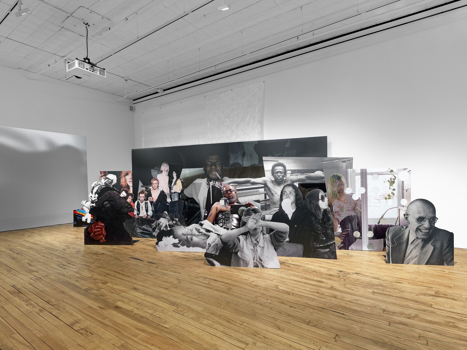
With the subtlety of a revolver, Arthur Jafa’s merciless ***** distilled the racial psychopathy of Martin Scorsese’s Taxi Driver (1976) by replacing the white characters in its climactic bloodbath with Black ones. Robert De Niro and Jodie Foster still play Vietnam vet Travis Bickle and the pubescent sex worker he thinks he’s saving but—by recording new performances and stitching them into the original footage—Jafa transformed the white pimp Sport into the Black Scar, the bouncer and the john were made Black, and so too the horrified cops who edge in after Bickle has emptied his guns. This wasn’t so much a subversion as a restoration: the script had called for a Black body count, but was recast to avoid inflaming audiences. Critics of Jafa’s redux—recently screened at Gladstone Gallery—have complained that Taxi Driver was already about race. But Jafa’s grim snuff film takes that fact to be obvious, then warps it, repeating his revised climax with small differences and new surprises, for seventy-three minutes.
Jafa’s show of sculptures at 52 Walker carries the same themes of Blackness, erasure, violence, and moving images, but in a more damning, paranoid register. A walkthrough structure, studded with extruded aluminum sculptures like bisected window …
May 17, 2024 – Review
Moyra Davey’s “Forks & Spoons”
Maddie Hampton
Moyra Davey’s latest film, Forks & Spoons (2024), studies the work of five photographers: Francesca Woodman, Carla Williams, Alix Cléo Roubaud, Justine Kurland, and Shala Miller. In her characteristic, essayistic style, Davey weaves together footage of herself pacing between moss-covered tree trunks to a voiceover narration that contextualizes the work of each artist within their respective biographies. Reprising a handful of motifs—close-ups of dog-eared book pages, sunlit corners, long shots of her hands methodically turning through photobooks, and other symbols of the daily and domestic—the film is screened alongside a curated selection of prints and photo books by each artist, so that it functions as a kind of coda for the wider exhibition. Though Davey maintains a porous boundary between cinematic and physical space, she accentuates the varying capacities of moving, still, and published images throughout the show, highlighting how each of these forms carries and conveys distinct meanings. Davey’s subject never shifts, but by translating it across forms, she successfully presents something closer to its totality.
Davey’s primary interest here is in many ways a style. Each of her chosen image-makers was or remains attuned to a particular pitch of self-capture: a feminized portraiture of long exposures, blurred movement, …
May 13, 2024 – Review
Vija Celmins’s “Winter”
R.H. Lossin
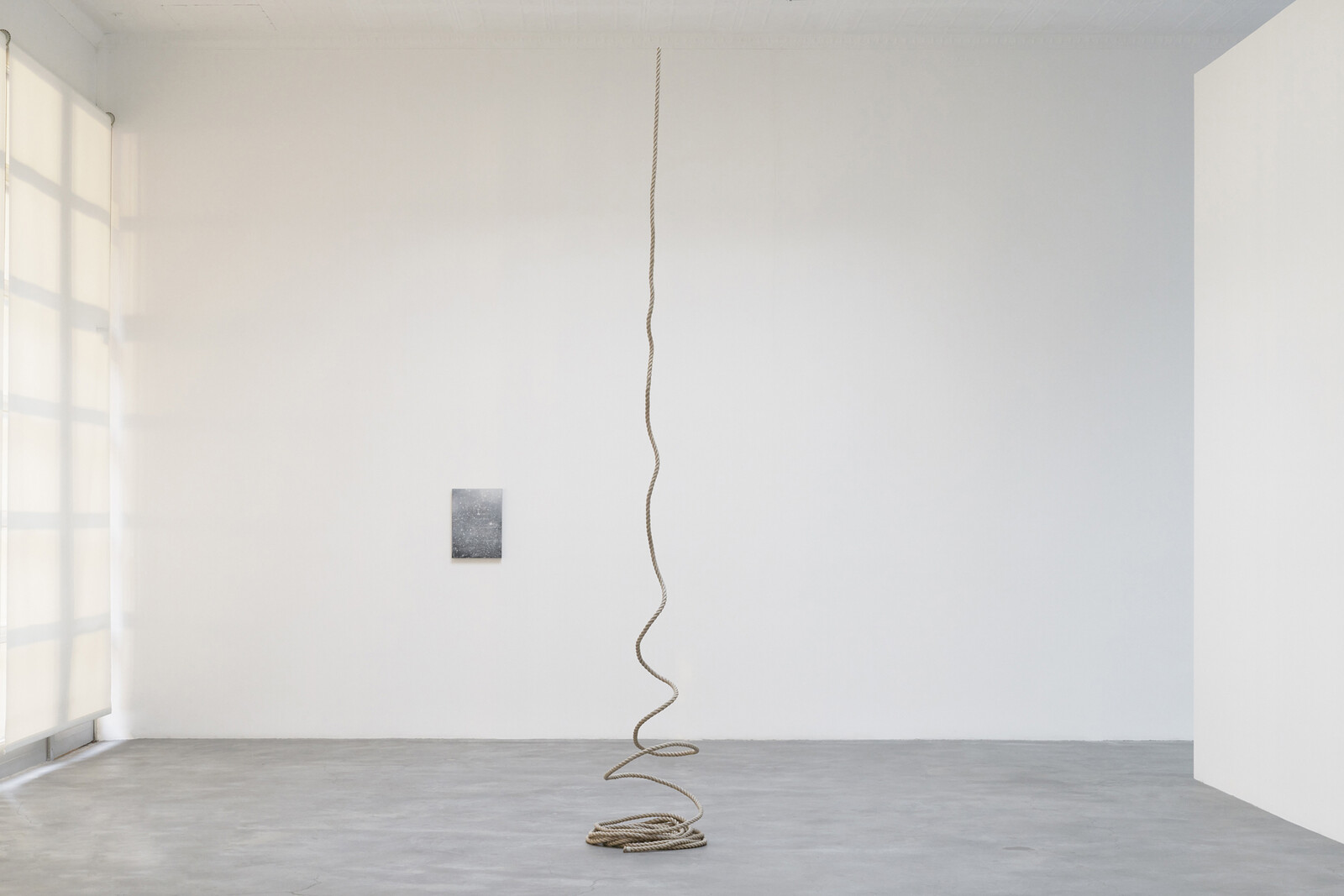
Vija Celmins’s latest show is at once an invitation to marvel at the perfect copy and to contemplate copying itself. The heavy rope that seems to hang down from the gallery ceiling is, in reality, a stainless-steel sculpture extending up from the ground (Ladder, 2021–22). Its adjunct, another piece of painted steel, Rope #2 (2022—24) sits coiled on the floor, playing its role as a fiber weave with equal conviction. The ropes, along with two other sculptures of exquisite verisimilitude, are enthralling in their own right. They also remind visitors that the surrounding paintings, which can easily register as minimal abstractions, are exercises in illusion and replication as well.
Umberto Eco once declared the United States to be a country “obsessed with realism, where, if a reconstruction is to be credible, it must be […] a perfect likeness, a ‘real’ copy of the reality being represented.” This cultural propensity for real fakes, Eco suggests, is at odds with the “cultured” America that produced Abstract Expressionism and modernist architecture. Celmins seems to think otherwise. “Winter” is full of Eco’s real copies, and Ladder may even be a reference to the “Indian Rope Trick” popular in magic shows. On the other hand, …
April 29, 2024 – Review
Grace Wales Bonner’s “Artist’s Choice: Spirit Movers”
Osman Can Yerebakan
Rhythm gives form to Grace Wales Bonner’s contribution to the Artist’s Choice series of exhibitions showcasing the “creative response of artists to the works of their peers and predecessors.” Not in the sense of a soundtrack or score, but rather in the British fashion designer’s focus on the different ways in which “sound, movement, performance, and style in the African diaspora” is translated into the works in MoMA’s collection. Tucked away in the more intimate first floor gallery, Wales Bonner’s exhibition offers a space of tranquility.
Terry Adkins’s Synapse (1992) hovers close to the ceiling, a yellow enamel-painted drum skin as perfectly rounded as the July sun. Beneath it is Adkins’s Last Trumpet (1995), a quartet of eighteen-foot-long horns crafted by attaching used trombone or sousaphone bells to brass cones. Standing like the enduring towers of an ancient civilization, the musical instrument-cum-sculpture resonates with the potential of its own activation (Adkins would play the instrument from its first presentation in 1996 through to his passing in 2014).
Earthy tones, dense textures, and subtle connections are the main ingredients in Wales Bonner’s alchemy. She has painted the gallery in tones of rusting metal, crystalizing sugar, and sanguine resin, lending the gallery …
April 25, 2024 – Review
Raven Chacon’s “A Worm’s Eye View from a Bird’s Beak”
Rômulo Moraes
The flag-score that opens composer and sound-artist Raven Chacon’s exhibition at Swiss Institute—featuring work made over the past twenty-five years alongside a new sound and video installation—is a miniature portrait of his career. American Ledger No. 1 (Army Blanket) (2020), a graphic history of the United States in the form of an army blanket, is embossed with icons of waves, flames, police whistles, wood-chopping axes, and a fractured city skyline. Chacon’s main interests are all there: notation in the expanded field, the interplay of various mediums, the embeddedness of sound and landscape, and the malleability of map and territory. Working with post-Cagean aesthetics yet advancing them within a Diné/Navajo context, Chacon’s work suggests that notation is an imposition onto sound comparable to colonialism’s imposition onto the land.
The opening room contains the installation Still Life No. 3 (2015), in which a series of glass panels mounted onto the walls and engraved with white fonts tell the Diné Bahane’ creation myth, which describes the birth of light and color in worlds below ours, the raising of the waters, and the formation of mountains and celestial bodies. The transparent and reflective surface makes the glossy text intentionally difficult to read, as though …
April 12, 2024 – Review
Joan Jonas’s “Animal, Vegetable, Mineral”
Filipa Ramos
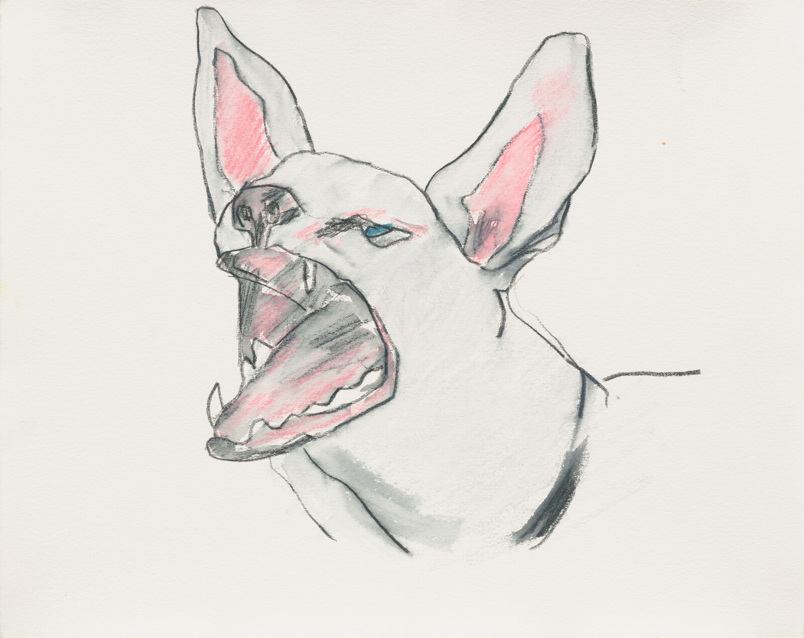
Arranged into families following a meticulous taxonomic logic, the almost 300 drawings presented at Drawing Center reveal the extraordinary bestiary that Joan Jonas has been compiling over five decades. Jonas has a unique capacity to traverse and merge artistic fields as varied as performance, sculpture, environment, and video installation, but what is illuminated by this exhibition, carefully curated by Laura Hoptman with Rebecca DiGiovanna, is how drawing runs through, across, and within every means of her expression, accompanying the development of her career from the 1960s to the present.
The show also demonstrates how the artist has been bringing these disciplines together through drawing, as it becomes a practice akin to performing and editing, in a do-repeat-redo-repeat-erase-do-repeat method that connects the mind, body, and hand until the form emerges. Two drawings flank the entrance to the show (all works are untitled but classified by a reference number, in this case JJ084, circa late 1990s, and JJ085, from 2012), which also becomes its exit. These are two naked female torsos, as imposing and as head-, arm- and feet-less as the Winged Victory of Samothrace (190 BCE), made in the context of two live performances.
In parallel to this, Jonas has blurred …
April 5, 2024 – Review
Eva Gold’s “Shadow Lands”
Jenny Wu
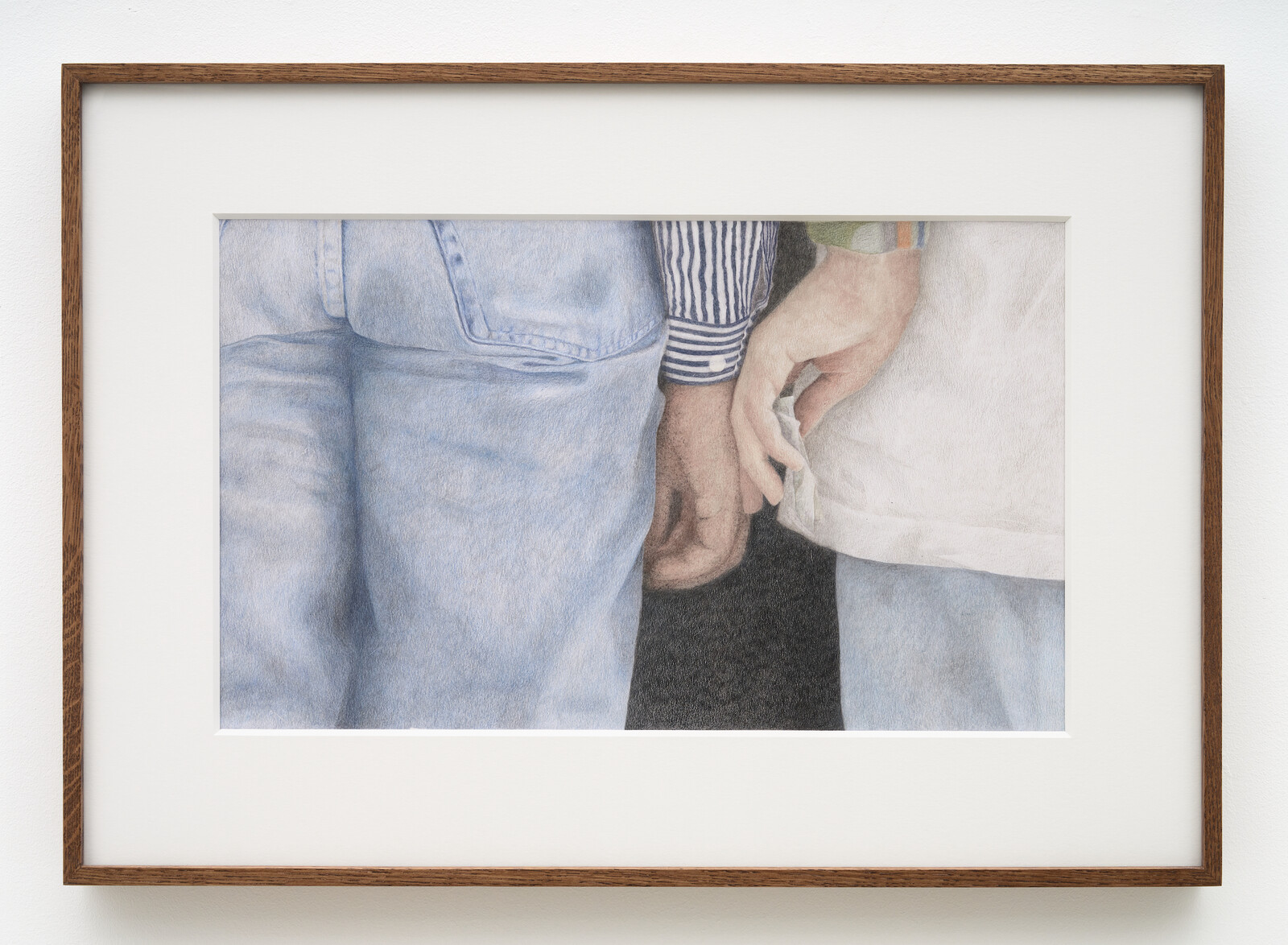
The critique in London-based artist Eva Gold’s first US solo exhibition is spare and subtle. Consisting of six works on paper and two sculptural installations, the show conveys, in meticulous details and material choices, a message about the coercive economic power embedded in everyday cultural transactions. At the heart of the exhibition is “Pilot and Passengers” (all works 2024), a series of colored-pencil drawings of stills from Benny’s Video, Michael Haneke’s 1992 film about a violence-obsessed teenager disenchanted by his affluent upbringing, who murders a stranger in his parents’ home.
Gold’s understated drawings, hung in identical, nineteen-by-twenty-six-inch frames, line three of the gallery’s walls. In Haneke’s film, a low tracking shot follows several pairs of hands as Benny, the teenager, covertly collects money for a pyramid scheme called Pilot and Passengers that he introduced to his friends during school choir practice. Gold’s lighter, less saturated images emphasize general forms over details. From afar, viewers might mistakenly believe that they are spying on people holding hands. Up close, one still feels like a voyeur, since Gold’s static renderings allow the eye to linger on the creases in the fabric of the boys’ jeans, the threaded borders of their back pockets, the …
March 30, 2024 – Review
81st Whitney Biennial, “Even Better Than the Real Thing”
Ben Eastham
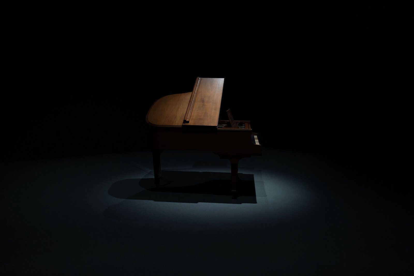
Walking through this survey of American art in the age of anger and anxiety, I kept returning to the curatorial statement’s seemingly innocuous proposal that new technologies are “complicating our understanding of what is real.” Are our horizons now so narrow, it occurred to me, that an algorithm’s ability to generate a derivative image is really more consciousness-expanding than such longstanding preoccupations of art as spiritual experience or the natural world? Or might the title’s appeal to something “better” serve to distract us from the already complicated and unarguably real events playing out beyond the walls of the museum, with which this biennial can seem reluctant to engage?
A generation of artists are, on the show’s evidence, retreating from a hostile public sphere into their own carefully cultivated worlds. This tendency manifests both in the valorization of marginalized identities through the adaptation of folk traditions to the present—notably ektor garcia’s use of crochet to articulate a nomadic cross-border experience—and in the tendency towards opacity, most explicitly in the panels of smoked black glass suspended precariously over the audience’s heads by Charisse Pearlina Weston (of [a] tomorrow: lighter than air, stronger than whiskey, cheaper than dust, 2022). Many of the realities …
March 15, 2024 – Review
Mary Helena Clark’s “Conveyor”
Chris Murtha
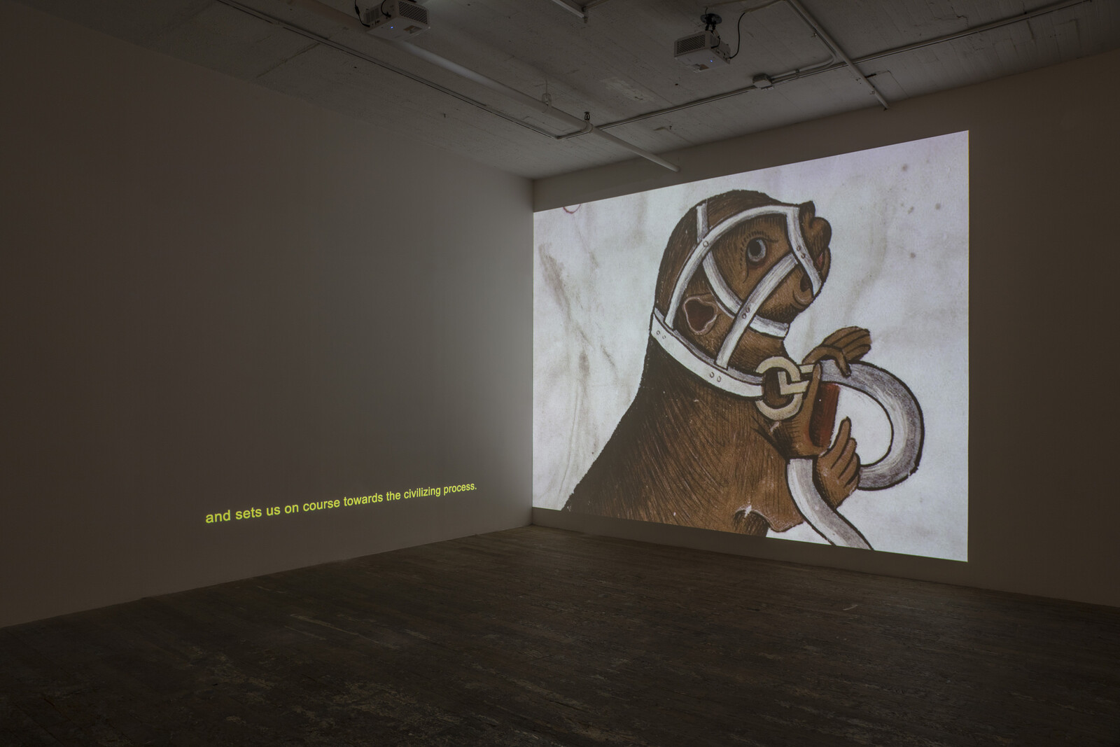
There’s a card trick midway through Mary Helena Clark’s Neighboring Animals (all works 2024 unless otherwise stated), a two-channel video projected into a darkened corner. While an elderly orangutan watches from the other side of his enclosure’s window, two human hands press a single playing card against the thick safety glass. Holding a stick in one hand, the ape nimbly picks up the card, now (miraculously!) on his side of the barrier. After giving it a sniff and twirling it around in his hands, he places it back on the glass, tapping it a few times with his makeshift wand—perhaps his attempt to send it back through the seemingly porous window. Clark edited this video—a zoo’s promotional clip gone viral—to preserve some mystery on behalf of the orangutan, cutting the ending so that the card, instead of falling to the ground, remains affixed to the glass.
A collage of sampled footage, still pictures, medical scans, and her own camerawork, Neighboring Animals scrutinizes the thresholds between inside and outside, human and beast. The left channel consists solely of yellow subtitles with no corresponding voice, a pastiche of quotations on the topic of disgust. Alongside illustrations of chained and leashed animals from …
March 12, 2024 – Review
Catherine Opie’s “Walls, Windows, and Blood”
Sylvie Fortin
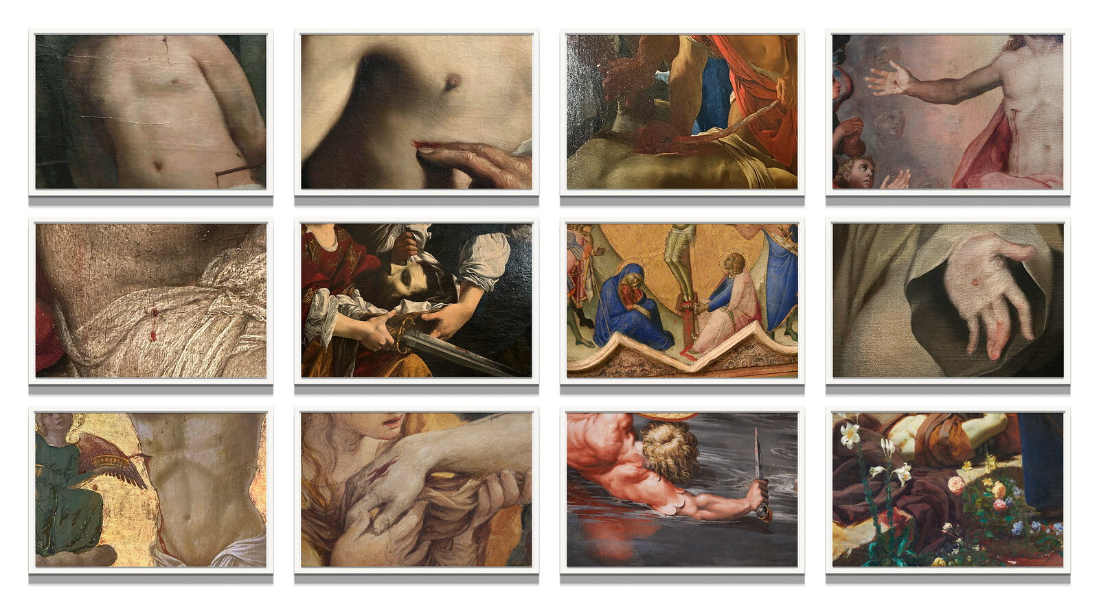
They say ghosts, vampires, and the soulless cast no shadows. Shot in a Vatican City emptied of visitors during the pandemic summer of 2021, Catherine Opie’s new photographs provocatively reshuffle different threads of her longstanding inquiries—the spectrum from transparency to opacity; communal spaces; the body as/and architecture; queerness and institutions. With its succinct, descriptive enumeration, the exhibition’s trinitarian title “Walls, Windows, and Blood” implies unsettling visual conversations to which she gives form with a selection of images from three new series (all works 2023), clustered in grids, lined up along walls, and proceeding in colonnades.
No Apology (June 5, 2021), a large photograph of Pope Francis delivering a speech from a top-floor window of his residence overlooking St. Peter’s Square, greets visitors. A lone white man dwarfed by statuary and muffled by the resounding whiteness of the colonnaded plaza, he floats above a blood-red banner bearing his coat of arms. In his short allocution, uttered in the wake of the traumatic discovery of unmarked graves at the former Church-run Kamloops Indian Residential School in British Columbia, the pontiff acknowledged (apologies would have to wait) the Catholic Church’s complicity in both the colonial dispossession of Canada’s Aboriginal communities and the accompanying systematic …
March 8, 2024 – Review
Amalia Pica’s “Aula Expandida”
Noah Simblist
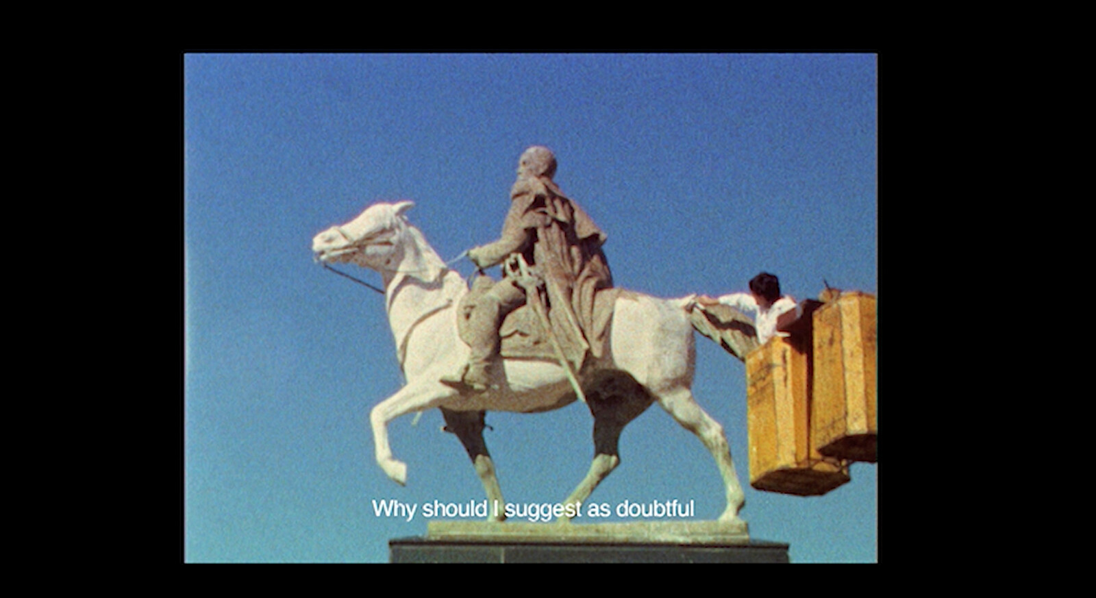
How might our understanding of education better incorporate communication, participation, and play? And what would be the consequences of that expanded approach? Such questions have been at the center of Amalia Pica’s work for many years, drawing partially on her early experience as a primary school teacher. Her first solo exhibition in New York attends to the manifold aspects of learning across a group of collages, sculptures, and video works organized around a new interactive installation.
Two understated large-scale graphite and watercolor drawings, School sheets in adjusted scale (or an exercise in how to go back to all the things I hadn’t thought of yet) #1 and #2 (both 2011), are based on notebook paper with “Rivadavia” printed in an elegant cursive in the margin. This references Bernardino Rivadavia, the first president of the London-based artist’s birth country of Argentina, using a font based on his signature. The stamping of state power into the very books in which young people learn how to write signals the reproduction of the ideological subject through a form of repeated inscription. This has chilling implications in the context of the military dictatorship (1976–83) into which Pica was born.
Her 2008 video On Education depicts …
February 27, 2024 – Review
Madeline Hollander’s “Entanglement”
Maddie Hampton
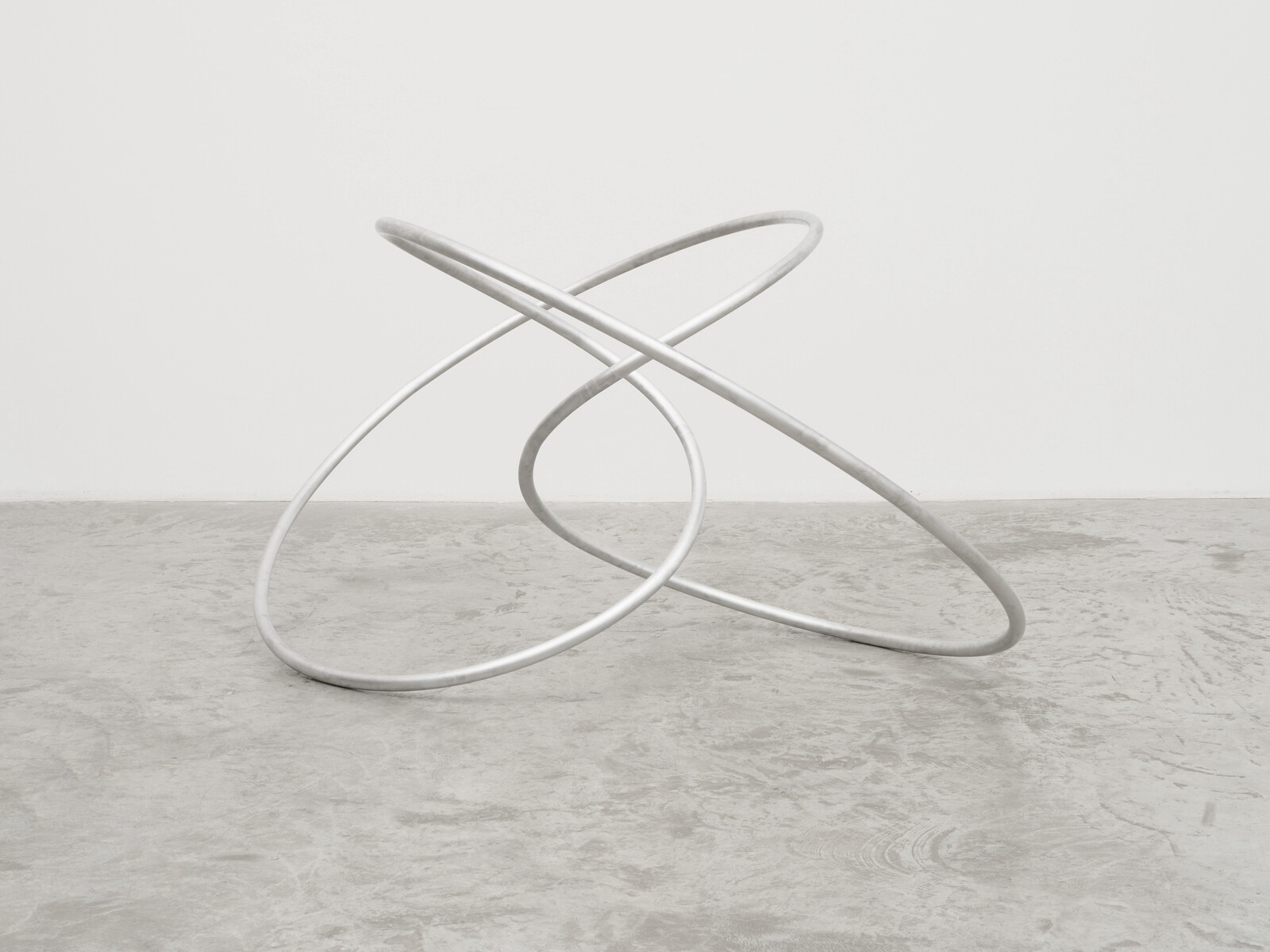
In profile, the six rounded disks at the center of Madeline Hollander’s latest exhibition appear glamorously extraterrestrial, the bright bulbs of the track lighting glinting in their polished chrome surfaces. Arranged in a grid on curved, white pedestals, the satellite-shaped objects are constructed from parabolic mirrors, a hole cut at the top of each to reveal a sinewy figure cast in aluminum, revolving atop a bifurcated circle of colored glass. Based on Hollander’s personalized notation system, specific silhouettes and colors correspond to a precise movement so that, taken in concert, the six figures play out an entire choreography, spinning perpetually in place.
Viewed at the right angle, the maquette doubles, ascending out of the mirror like a ballerina from a jewelry box to create the illusion of a perfect pas de deux—not a limb out of place, nor a posture skipped, as both “dancers” rotate in flawless synchronicity. Titled Entanglement Choreography I-VI (all works 2023), the objects are designed as miniaturized visualizations of quantum entanglement, the theory that two particles can be interdependent, mimicking one another across both space and time, the action of one entirely conditional on that of its partner. Quick and loose with her interpretations of the …
February 9, 2024 – Review
Astrid Klein
Xenia Benivolski
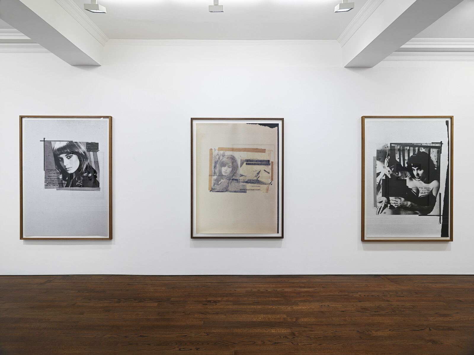
Astrid Klein’s photowork Untitled (Je ne parle pas,…) (1979) presents two cut-out images of Brigitte Bardot—posing in a baby doll dress and, again, coquettishly looking back over her shoulder. In broken, typewritten French and English are the words “je ne parle pas, je ne pense rien” (“I don’t speak, I don’t think”) and “to paint my life, to paint my life, so many ways.” It’s a fitting prelude to this exhibition, which is something of a house of mirrors. Trapped behind the museum glass, like sexy cats in apartment windows, large photographic works fill the walls, each featuring a beautiful woman while slyly reflecting the viewer. In Untitled (la sans couleur…) (1979), a reclining woman awkwardly turns her head to look at me with an enigmatic smile. Loosely draped in a sheet on an unmade bed in the dark, she is a body in waiting. These gazes are not exactly inviting; if anything, they somehow lack emotion, as the title reflects: “masks without color.” But there is something cool, even powerful, about their magnetic resignation. Like several in the show, the image is arranged with visible marker framing and taped sections, giving the impression that this composition sets the stage …
January 12, 2024 – Review
An-My Lê’s “Between Two Rivers/Giữa hai giòng sông/Entre deux rivières”
Jacinda S. Tran
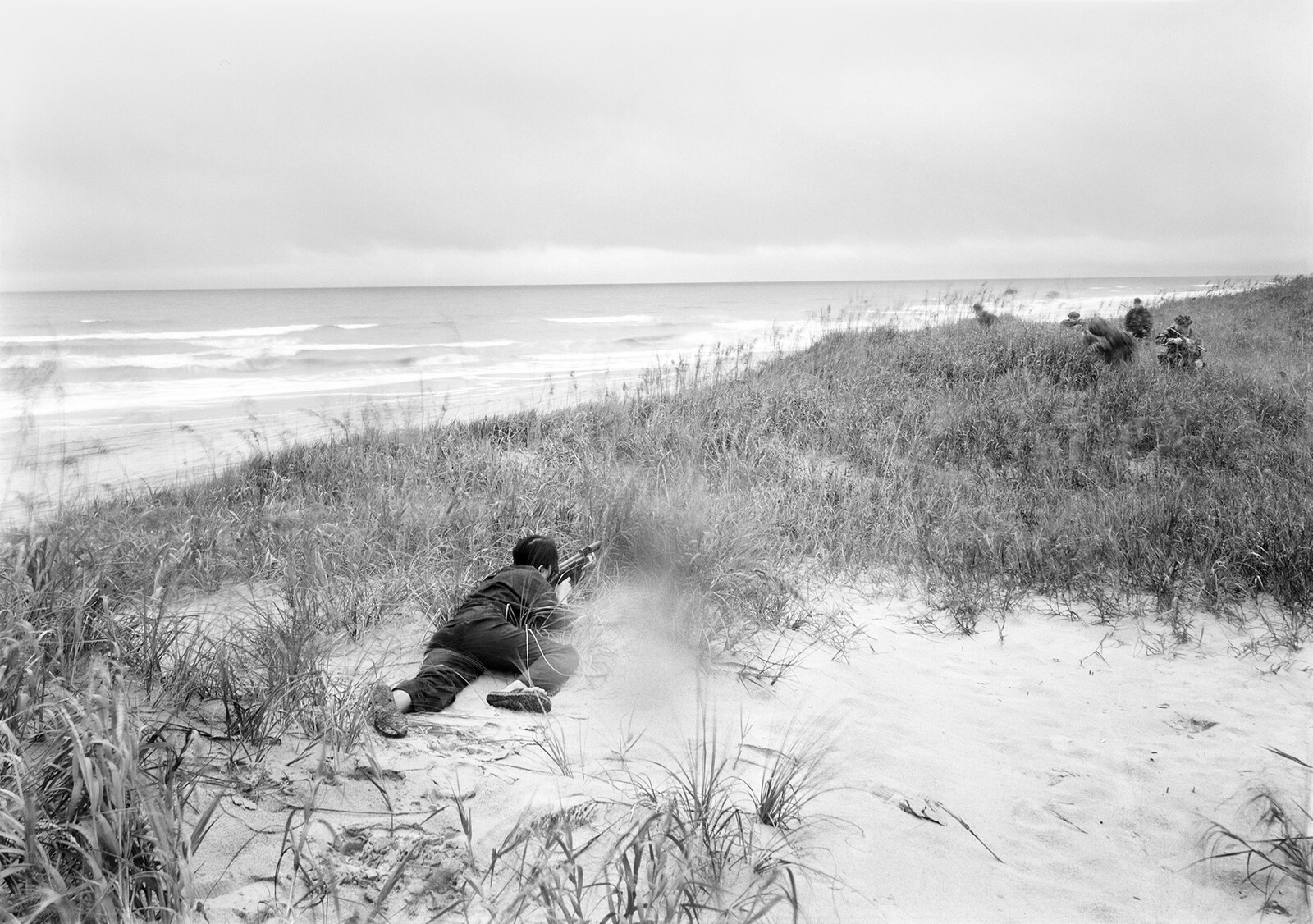
In 1968, army photographer Ron Haeberle shot Vietnamese civilians indiscriminately massacred by US ground forces in the hamlet of Mỹ Lai. His photographs circulated widely—including a color photo of corpses strewn across a road featured in LIFE magazine that, in 1970, with support from the Museum of Modern Art, the Art Workers Coalition incorporated into an antiwar poster overlaid, in blood red, with the text “Q. And babies? A. And babies.” When MoMA withdrew its support for the poster, AWC staged a protest to illuminate board members’ tacit support of the war in Vietnam. The museum promptly assimilated AWC’s poster into their own collections, institutionalizing institutional critique.
Half a century later, MoMA exhibits “Between Two Rivers/Giữa hai giòng sông/Entre deux rivières,” a survey of multimedia works by Vietnam-born An-My Lê, whose large-format photographs are known for their staging and depictions of militarized landscapes. Lê focuses on what the visual reveals and obscures; how a range of quotidian landscapes may be conceived as “always already military.” Though Lê left Vietnam as a teenager after the fall of Saigon in 1975, the specter of war and its spectacularization informs her approaches to representation. In “Viêt Nam” (1994–98), Lê returns to her birth …
December 21, 2023 – Review
Andrea Bowers’s “Joy is an Act of Resistance”
R.H. Lossin

The first work that one encounters on entering Andrew Kreps’s gallery might be mistaken for an extension of the gallery’s commercial operations. Trans Bills (2023) consists of fifty-four black ring binders, arrayed on a shelf to the left of the front desk, labeled with the names of states that have passed legislation restricting the rights of trans citizens. The work’s blandness is perhaps the point. Quietly running in the background of clownish Republican performances of parental rights and viral videos of religious zealots is a legislative machine producing the reams of paper progressively restricting the rights of trans people to work, receive medical care, and live basic social lives. In a mere two years, 1,006 anti-trans bills have been introduced by state legislatures. An additional sixty-three have been introduced at the federal level.
At the back of the first-floor gallery is a 47-minute single-channel video of a trans prom organized by four teenagers as both an adolescent rite of passage and a protest—two things that are, for many trans youth, inseparable. The footage is visible from the gallery’s entrance, and the contrast between the young faces and the scale of adult animosity ranged against them is the show’s most valuable …
December 19, 2023 – Review
Mit Jai Inn
Jenny Wu
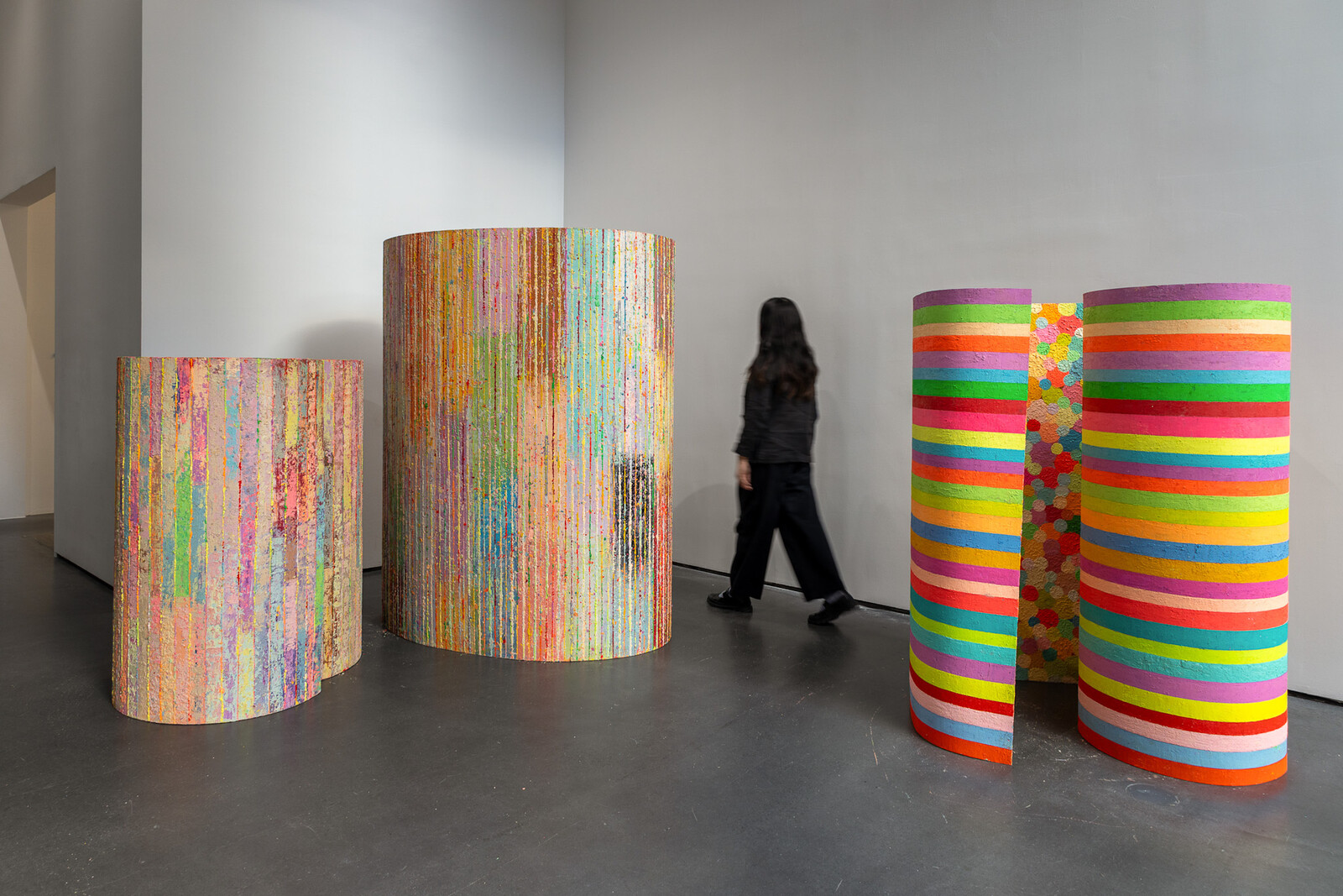
In Shirley Jackson’s allegorical short story “The Lottery” (1948), villagers gather for a game of chance in which they draw slips of paper, all blank but one, from an old black box. Children, adults, and elders alike, accustomed to the tradition, participate with a mixture of anticipation and boredom. The ending reveals that the prize, known to them all along, is the stoning of an unlucky villager. Mit Jai Inn’s first US solo exhibition also features a large quantity of “stones” and a lottery that, in subtler ways, uncovers a set of human behaviors integral to the functioning of society and politics. Here, the Chiang Mai-based artist, whose work is often framed as a form of social practice infused with Buddhist teachings, sets up a participatory piece titled after a recent sculpture series, Marking Stones (2022). Visitors are invited to submit pledges for “positive action” for a chance to win one of these sculptures.
The title of the series is a tenuous reference to the bai sema stones used by Buddhist communities in Southeast Asia to mark their territory: the sculptures are, in fact, fully functional baskets, lamps, and stools. Around two dozen of these candy-colored wares occupy a room …
December 15, 2023 – Review
Delcy Morelos’s “El abrazo”
Michael Kurtz

Here lie the ruins of the American avant-garde. Wood salvaged from an installation by Dan Graham, offcuts from a felt piece by Robert Morris, and scraps of flooring from a Dorothea Rockburne display. Mounds of soil recall Robert Smithson’s geological samples and rows of pipe echo Walter de Maria’s Broken Kilometer (1979) of brass rods lined up on the floor. These fragments now sit in darkness, illuminated only by four shaded skylights. They are arranged across the space along with sheets of corrugated metal, parallel stacks of wooden planks, and hundreds of small pieces of Colombian pottery. Everything is dark brown and sitting on a crust of mud which rises up the walls to a high-water mark, I later read, left after the gallery flooded during Hurricane Sandy.
Despite their simple forms and materials, the objects become mirage-like in this dimly lit monochrome expanse. Walking down the pier of clean floor that stretches into the room, I try to perceive the scale and texture of the things around me, but they evade my grasp. The light fades and they retreat further. Cielo terrenal [Earthly heaven] (2023), the first of two installations by Colombian artist Delcy Morelos at Dia Chelsea, is …
December 7, 2023 – Review
Shilpa Gupta
Paul Stephens

Recent New York Times headlines point to American perceptions of India’s increasingly prominent role in global affairs. “Can India Challenge China for Leadership of the ‘Global South’?” “Will This Be the ‘Indian Century’?” “The Illusion of a US-India Partnership.” “US Seeks Closer Ties With India as Tension With China and Russia Builds.” “US Says Indian Official Directed Assassination Plot in New York.” “An Indian Artist Questions Borders and the Limits on Free Speech.”
The last headline refers to Mumbai-based Shilpa Gupta, whose work obliquely explores the emergent global polycrisis (a term popularized by Adam Tooze) in which India plays a central part. Although Gupta’s art is deeply engaged with contemporary political events, it is not headline-driven. It resists didacticism, in part, through being polyvocal, as exemplified in her standout installation Listening Air (2019–23). Defying simple description and rewarding patient immersion, Listening Air consists of multiple microphones-turned-speakers that play songs of labor and resistance from around the world. As the songs fade in and out, listener-viewers in the dimly lit room slowly begin to perceive themselves as members of a temporary community. The effect is ethereal and meditative.
Gupta’s two concurrent New York exhibitions, at Amant and Tanya Bonakdar Gallery, accord …
November 3, 2023 – Review
New Red Order’s “The World’s UnFair”
Stephanie Bailey
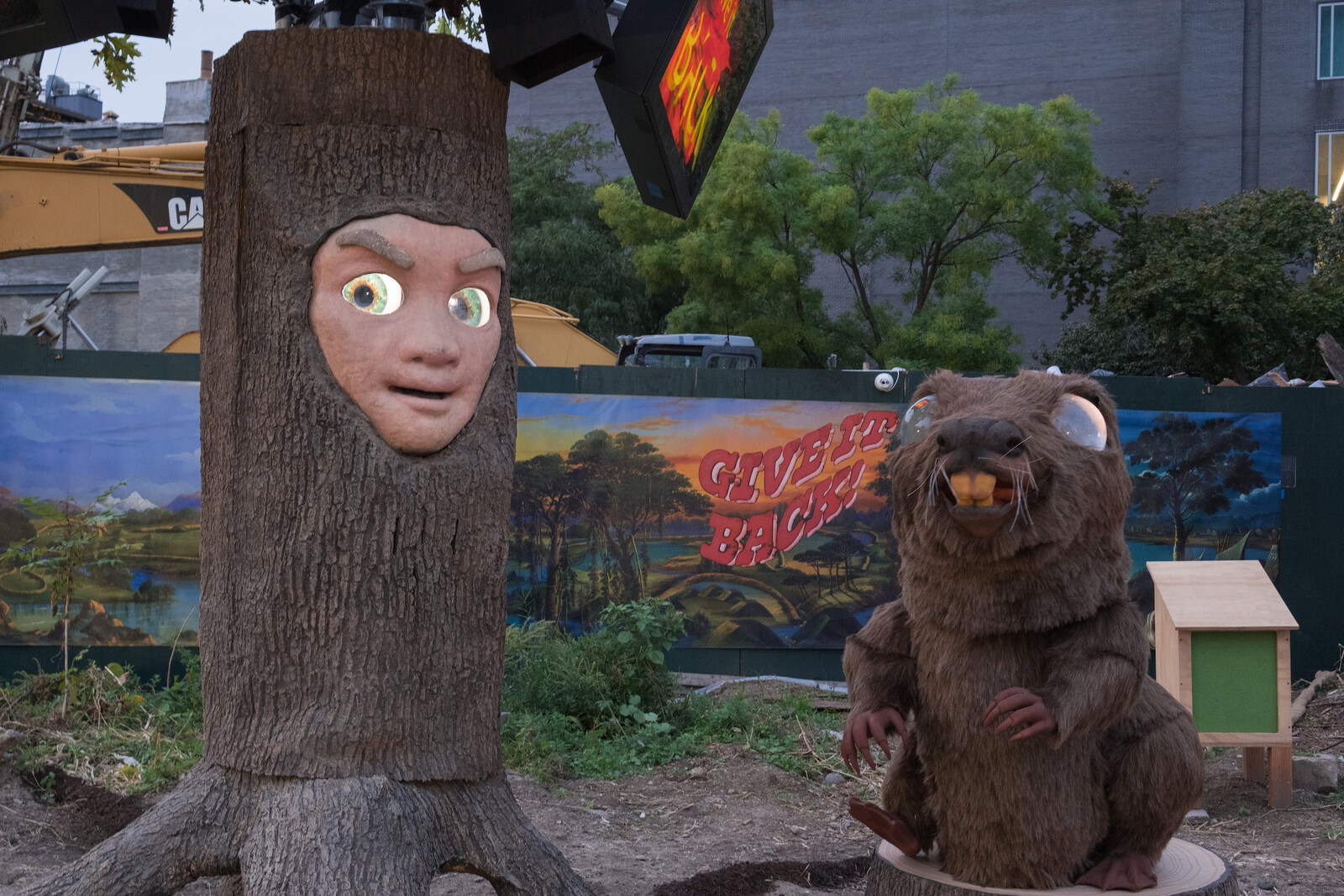
Occupying a pocket of undeveloped land in Long Island City, “The World’s UnFair” is a principled riot. Created by New Red Order (NRO), a “public secret society” facilitated by artists Jackson Polys, Zack Khalil, and Adam Khalil, this carnivalesque fairground, supported by Creative Time, is presided over by Ash and Bruno, a sixteen-foot animatronic tree with LED screens nestled in cellular tower branches and a furry five-foot tall beaver, respectively. The pair talk about the legacies of settler colonialism on the land where they stand, Lenapehoking—a forest, they say, the last time they met. America’s original multi-millionaire John Astor is mentioned: he made his fortune in the fur trade that all but decimated beaver populations, before acquiring land in Manahatta and making “a killing off renting to incoming settlers.”
The politics of land is at the heart of this roadshow. Staked into the earth is New Red Right to Return (2023), a wooden post with directional markers naming Lenape diasporic nations displaced by settlers due to the fundamental difference between the colonial European treatment of land as a commodity and the Indigenous American understanding of it as a communal resource. That discrepancy complicates the narrative that the Lenape sold Manahatta …
October 27, 2023 – Review
Candice Lin’s “Lithium Sex Demons in the Factory”
Jonathan Griffin
The story, as literary theorist Peter Brooks has observed, is today’s dominant cultural form. To Brooks, this “overabundance” of narrative is worrying: he criticizes the deference of virtually all strands of culture (not only literature, TV, and movies but art, museology, and—especially—news media) to the persuasive rhetorical power of the story. I share many of his concerns. “The universe is not our stories about the universe,” he writes, “even if those stories are all we have.”
In the artwork of Candice Lin, however—an artist who nests stories inside stories, who researches, remembers, speculates, and concocts in equal measure, all at once, without hope or intent to persuade—the story becomes a lubricative medium that enables the destabilizing of sense, the de-centering of singular subjectivities, and the unpicking of neatly tied conclusions.
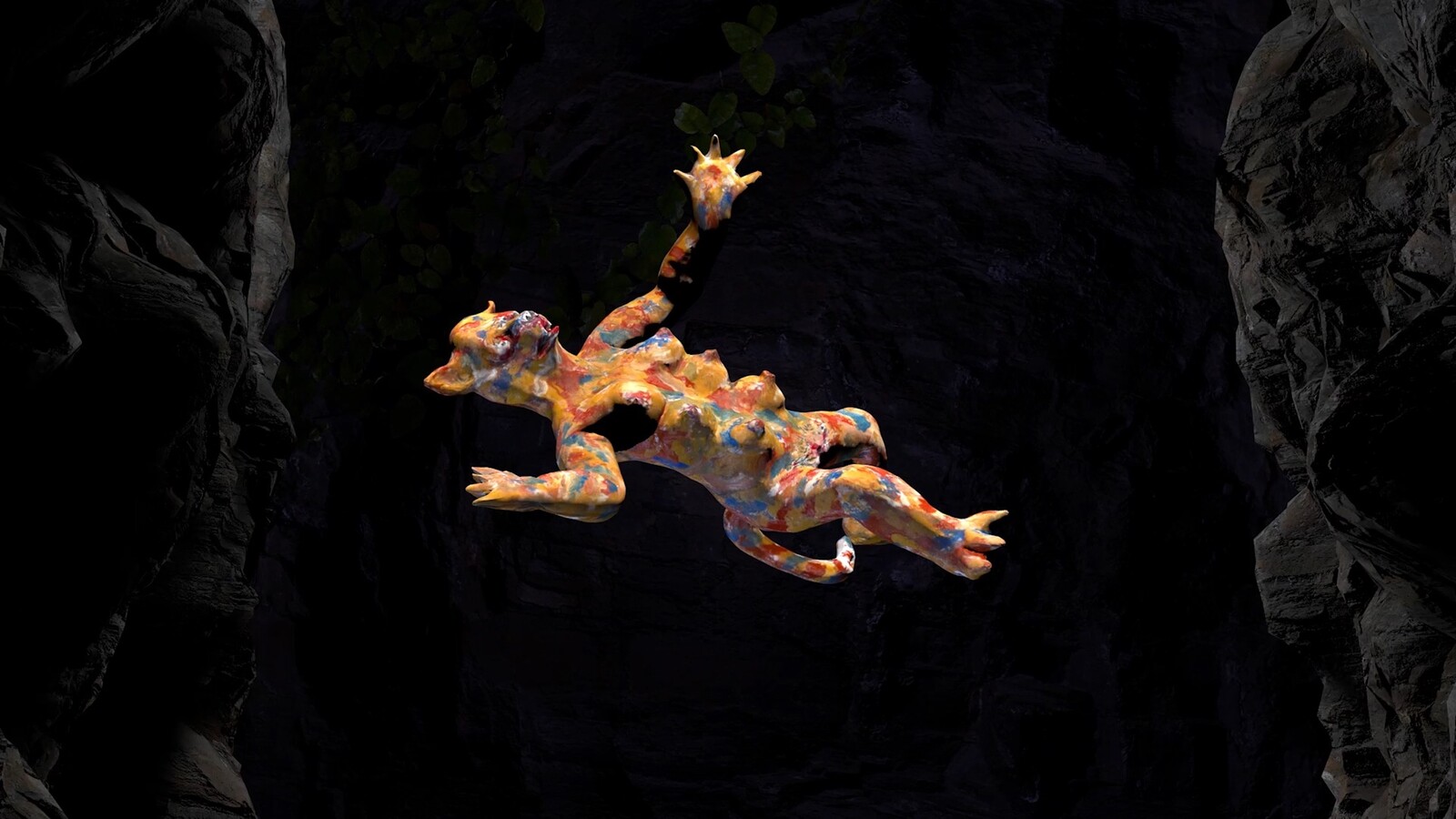
“Lithium Sex Demons in the Factory,” the Los Angeles-based artist’s multimedia exhibition at the non-profit Canal Projects in New York, is near-impossible to summarize, except by telling stories. Let me start with one. In the 1970s, female workers at Japanese-operated factories in rural Malaysia experienced demonic possessions and spirit attacks. Workers at these factories hailed not just from Malaysia but China and India too, so bomohs (Malay shamans) and healers …
October 6, 2023 – Review
“Emerging Ecologies: Architecture and the Rise of Environmentalism”
Matt Shaw
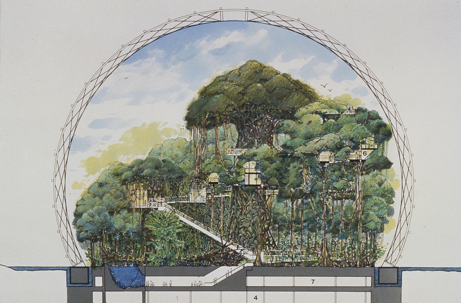
In March 1949, the cover of Popular Science magazine featured Ray Pioch’s brightly colored drawing of architect Eleanor Raymond’s Dover Sun House, a Massachusetts home developed with solar engineer Maria Telkes and heated exclusively by solar energy. Part Rockwell painting, part architectural section, and part science diagram, the illustration drew on Pioch’s experience drawing instruction manuals for the U.S. Navy during World War II. It shows an idyllic family in their well-tempered living room, kept warm by the energy captured through south-facing windows and stored in canisters of mirabilite, or Glauber’s salt, a mineral well suited to storing solar heat in the day and releasing it after dark. The cover represents the best image of post-war Pax Americana, but with a twist: a bright optimism that the sun was the future source of America’s energy needs, not oil.
The cover serves as a lively introduction to “Emerging Ecologies: Architecture and the Rise of Environmentalism,” the inaugural presentation by the Emilio Ambasz Institute for the Joint Study of the Built and Natural Environment. Curated by Carson Chan, the show attempts to draw lines in the sand about what “ecology” and “the environment” mean in architecture from the 1930s to the …
October 5, 2023 – Review
Michael Rakowitz’s “The Monument, the Monster, and the Maquette”
Rachel Valinsky
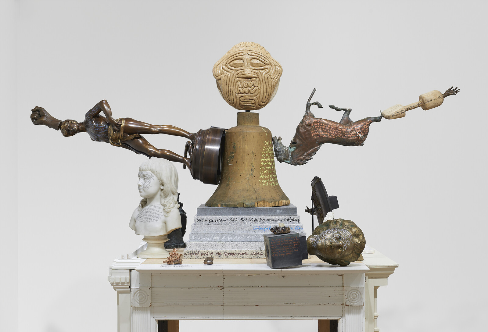
The exhibition’s title, alliteration and all, has the ring of an Aesopian fable. The Latin etymology of monument, Michael Rakowitz spells out on the edges of a sculpture, are trifold: caution (to remind, to advise, to warn), protest (demonstrate, remonstrate), monstrosity (monster). And indeed, around the gallery, the monstrous is everywhere in sight. Its forms are many: to the right, Behemoth (all works 2022), a colossal black plastic tarp obscuring the suggestion of an equestrian figure below rises tall only to fall to the ground as the fan powering its ascent clocks out. At the center, American Golem, poised on a decorative white wooden tabletop, an assemblage of found antiques and papier mâché sculptures (a strategy the artist has previously used for reproducing objects looted from Iraqi museums, highlighting the calls for their repatriation). The central figure, which stands on a stack of marble slabs, greets the viewer from the top of its bell-mold body and fired-clay mask—a copy of the Babylonian monster Humbaba. Gazing out at the viewer, its composite arms outstretched, it recalls Paul Klee’s Angelus Novus (1920), but even more grotesque. It doesn’t just stand on the wreckage of the past, propelled toward the future: it is …
September 29, 2023 – Feature
Valerie Werder’s Thieves
Wendy Vogel
In Valerie Werder’s debut novel Thieves, Valerie—an autofictional alter ego—chronicles her slide from disgruntled gallery copywriter to brazen shoplifter. At first she steals for the rebellious thrill of inhabiting other identities; eventually, and more abstractly, she steals to reclaim her time, words, and sense of self. Thieves centers on the New York blue-chip commercial art world, with its fussy idiosyncrasies and particular flavor of exploitation. But it is equally a novel about the fungibility of female identity—and a shrewd indictment of how language operates under capitalism.
Werder’s decision to write in a self-reflexive mode—a contemporary novel in the lineage of Semiotext(e)’s influential “Native Agents” series, edited by Chris Kraus and featuring authors such as Kathy Acker, Lynne Tillman, and Kraus herself—speaks to a desire to expose and explore the conditions under which Thieves was produced. Yet Werder is critical of how language is strategically deployed in the name of “authenticity,” both within the art world and literature. In Thieves, words bolster value, then drain themselves of meaning. People become expendable, while material things reinforce their self-worth. Over the course of the novel, Valerie becomes both a precious object and a voracious acquisitor. She enables, and is enabled by, a mysterious …
September 7, 2023 – Review
Tuan Andrew Nguyen’s “Radiant Remembrance”
Murtaza Vali
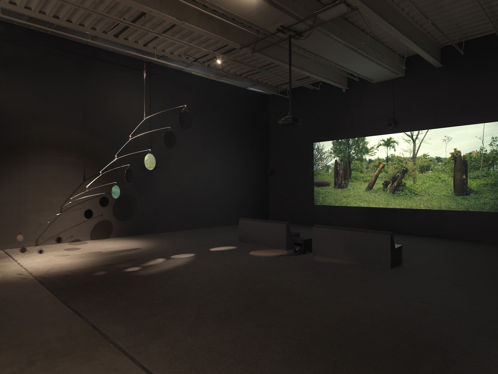
In Ken McMullen’s experimental film Ghost Dance (1983), Jacques Derrida proclaims that “Cinema is the art of ghosts, a battle of phantoms. It’s the art of allowing ghosts to come back.” This assertion of film’s proximity to the spectral plays out across Tuan Andrew Nguyen’s video installations, three of which anchor “Radiant Remembrance.” Blending animist beliefs held by Indigenous communities across Southeast Asia with the importance given to reincarnation within Buddhist theology, Nguyen uses film as a medium, not just as the material form of his art practice but as a channel through which to conjure forgotten pasts, narrate counter-memories, and confront historical violence and ecological destruction. After all, what are ghosts, if not simply our ancestors, and our memories of them, continuing to radiate their presence to us? What is remembrance if not simply a form of reincarnation?
These capacities are most clearly articulated in The Specter of Ancestors Becoming (2019), an immersive four-channel video installation about the descendants of the tirailleurs sénégalais—Senegalese soldiers conscripted to fight for the colonial French army in the First Indochina War who fathered children with Vietnamese women. That conflict ended a year before the 1955 Bandung Conference, which sought to build cooperation …
July 31, 2023 – Feature
Ethan Philbrick’s Group Works
Laura Nelson
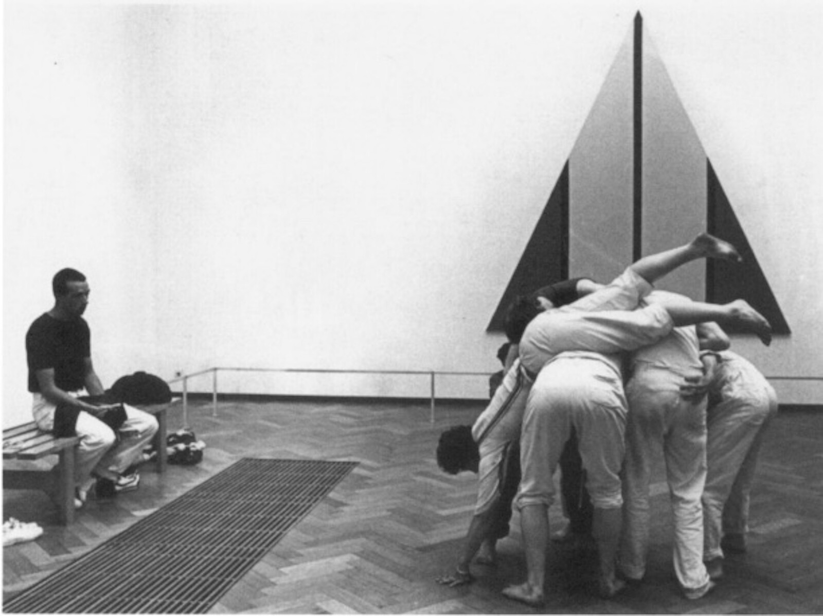
There are many ways to move through and think alongside Ethan Philbrick’s Group Works. At first glance, it’s a book of academic theory coming out of performance studies. Following a “desire for collectivity,” Philbrick takes the small-scale formation of “the group” as the locus of inquiry. He enters the text with a tentativeness toward groups, recognizing the ways that they are frequently viewed with healthy suspicion or uncritical celebration. He asks:
What kind of good-bad thing is a group to do?
When do we do things in groups, and why?
How do we group, and how does that matter?
Moving with these questions, the book turns to artists experimenting with novel group formations in dance, literature, film, and music in the 1960s and ’70s. Each chapter pairs a “group work”—Simone Forti’s 1961 performance Huddle, Samuel Delany’s 1979 memoir Heavenly Breakfast: An Essay on the Winter of Love, Lizzie Borden’s 1976 film Regrouping, and Julius Eastman’s 1979 musical piece Gay Guerrilla—with contemporary works that re-imagine, re-perform, or dialogue with these experiments. Taken together, each pairing amplifies and extends the book’s central impulses to consider how groups assemble and disassemble. Along the way, Philbrick introduces a chorus of thinkers—theorists of community, theorists of in-operative community, theorists …
July 11, 2023 – Review
“Schema: World as Diagram”
Paul Stephens
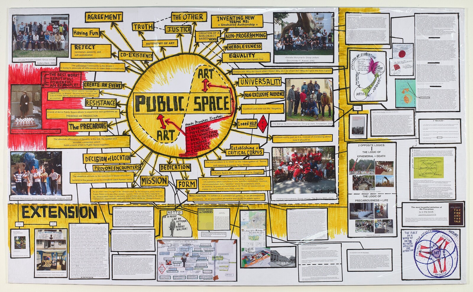
This exhibition of diagrammatic works juggles some of the most contested categories in contemporary art—and manages to keep all its curatorial balls in the air. Despite the broad sweep of its title, the show is tightly curated and requires multiple viewings for its full scope to set in. With an emphasis on painting, this meticulous grouping of fifty-plus artists undermines simplistic, outmoded art-historical binaries that oppose figuration and abstraction, conceptualism and expressionism, scientism and humanism. To call it expansive feels like an understatement.
The show takes its title from Thomas Hirschhorn’s Schema: Art and Public Space (2016–22), an exuberant multimedia collage-manifesto. Rudimentary and improvisational, Hirschhorn’s patchwork of ideas and contexts places the works in the show under a utopian-communitarian umbrella—exemplifying David Joselit’s claim in his 2005 essay “Dada’s Diagrams” that “the diagram constitutes an embodied utopianism.” Hirschhorn’s Schema might usefully be juxtaposed with Dan Graham’s 1966 work of the same name—sometimes taken to represent the apex of early informatic anti-figural conceptualism. (A show devoted to Graham’s Schema at 3A Gallery closed, coincidentally, several weeks before this exhibition opened.) Graham intended his work to be “completely self-referential” and meant to define “itself in place only as information.” Simply a text without …
June 23, 2023 – Review
Aria Dean’s “Figuer Sucia”
Katherine C. M. Adams
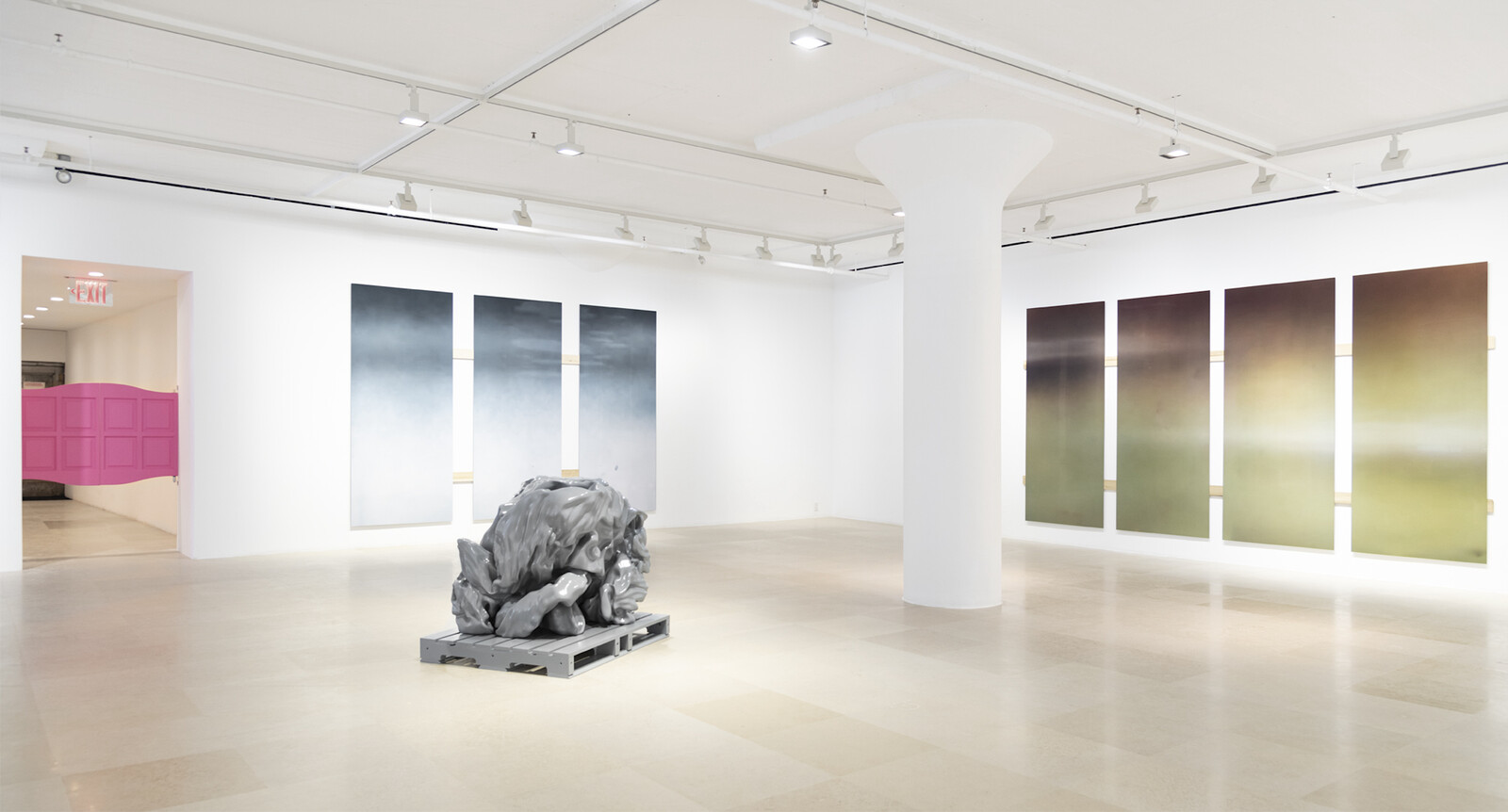
One enters Aria Dean’s exhibition “Figuer Sucia” through Pink Saloon Doors (all works 2023) that open onto a vaguely neo-Western mise-en-scène. An ambiguous gray sculpture—heavily textured, with densely packed contours that evoke layers of folded skin and the crushed musculature of a horse—sits on a wooden pallet at the center of the room. This mildly cubic, contorted sculptural figure (FIGURE A, Friesian Mare) appears to be cowering, its subject’s equine body nearly unrecognizable. Dean’s recent exhibition at the Renaissance Society, “Abattoir, U.S.A.!,” took the slaughterhouse as a way to examine the limits of subjecthood. Its central film work walked the viewer through the environments of factory farming. While Abattoir, U.S.A.!’s featured architecture was outfitted for the killing of animals, the rooms it showed remained empty, painting a backdrop of violent and eerie subjectification. Like that project, “Figuer Sucia” is implicitly connected to Dean’s longstanding reflections on how Blackness is conditioned for and as social material. The contorted not-quite-object, not-quite-subject of FIGURE A might seem to show the implied, absent victim of that prior project. Yet “Figuer Sucia” calls the source of such brutality into question. It examines a violence that is not only in the scene we are witnessing, but …
June 14, 2023 – Review
Paige K.B.’s “Of Course, You Realize, This Means War”
Travis Diehl

At the opening, the red and white helium balloons were in everyone’s face. Now, at the show’s close, they’re at your feet, like a deflated Great Pacific Garbage Patch, pressing visitors closer to Paige K.B.’s intricate collages on wood panels, pastiches of art-historical material, and political sound-bites; closer to the web of found objects and deadpan references supplementing the paintings, to the sour red walls they hang on. The balloons make it hard to take in the show from a safe, not to say critical, distance. No measured overview allowed, only deep diving, unpacking, conspiring. The balloons suggest a constellation so dense and rubbery it’s a blob, the trampled ribbons like the red yarn in the disgraced detective’s storage unit—their significance all wadded up and too close to see.
Maybe that’s too much weight to attach to party decorations that never got cleaned up. But why weren’t they cleaned up? Why are they on the checklist, inaccurately, as 99 Red Balloons of Diplomacy (all works 2023 unless otherwise stated): “Thirty-one red balloons,” when some are white? A checklist on a PDF dated May 17—two weeks after the opening? But the balloons fit the vibe. They insinuate themselves into a scenography …
June 8, 2023 – Feature
Trinh T. Minh-ha’s The Twofold Commitment
Patrick J. Reed
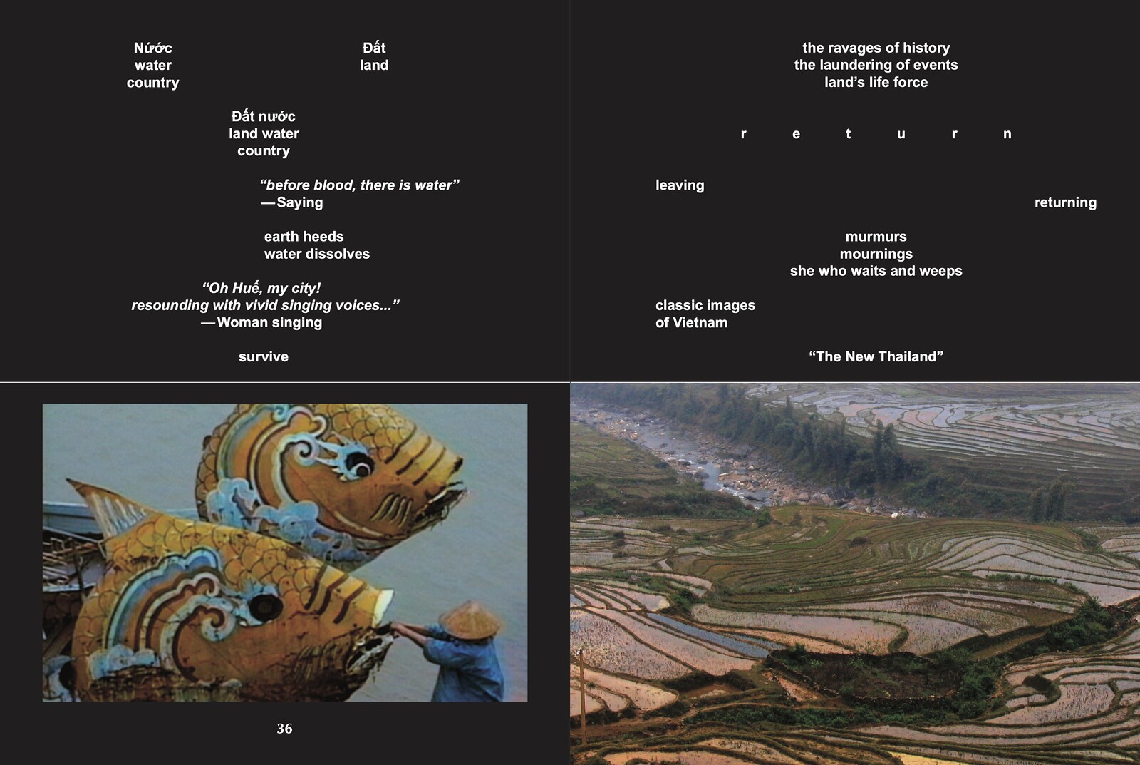
The Twofold Commitment revisits Trinh T. Minh-ha’s time-dipping Forgetting Vietnam (2015), a documentary feature about the mythical origins of Vietnam. Which is to say, it’s a book about a film which reflects on what the name of a country evokes of the history, people, and cultures associated with it. Seven interviews conducted between Trinh and eight media scholars and critics compose half of the book. Each approaches the filmmaker and writer’s work from a different tack, focusing on aspects of Forgetting Vietnam that are representative of her multi-hyphenate career. Irit Rogoff, for example, homes in on what it means to make a film for the feminist viewer, while Stefan Östersjö concentrates on the multi-sonic soundscapes within it. And Lucie Kim-Chi Mercier’s discussion, “Wartime: The Forces of Remembering in Forgetting,” provides important historical background about the country in question.
As a filmmaker and theorist, Trinh strives to disavow classification and impress upon her audience the necessity of the extra- and non-categorical. Thus certain terminology, like some already employed in this review, requires inverted commas more often than not. “Documentary” refers to a moving-image essay composed of Hi8 footage from 1995 and HD footage from 2012, which Trinh gathered on separate visits …
June 7, 2023 – Review
Juliana Huxtable and Tongue in the Mind
Harry Burke
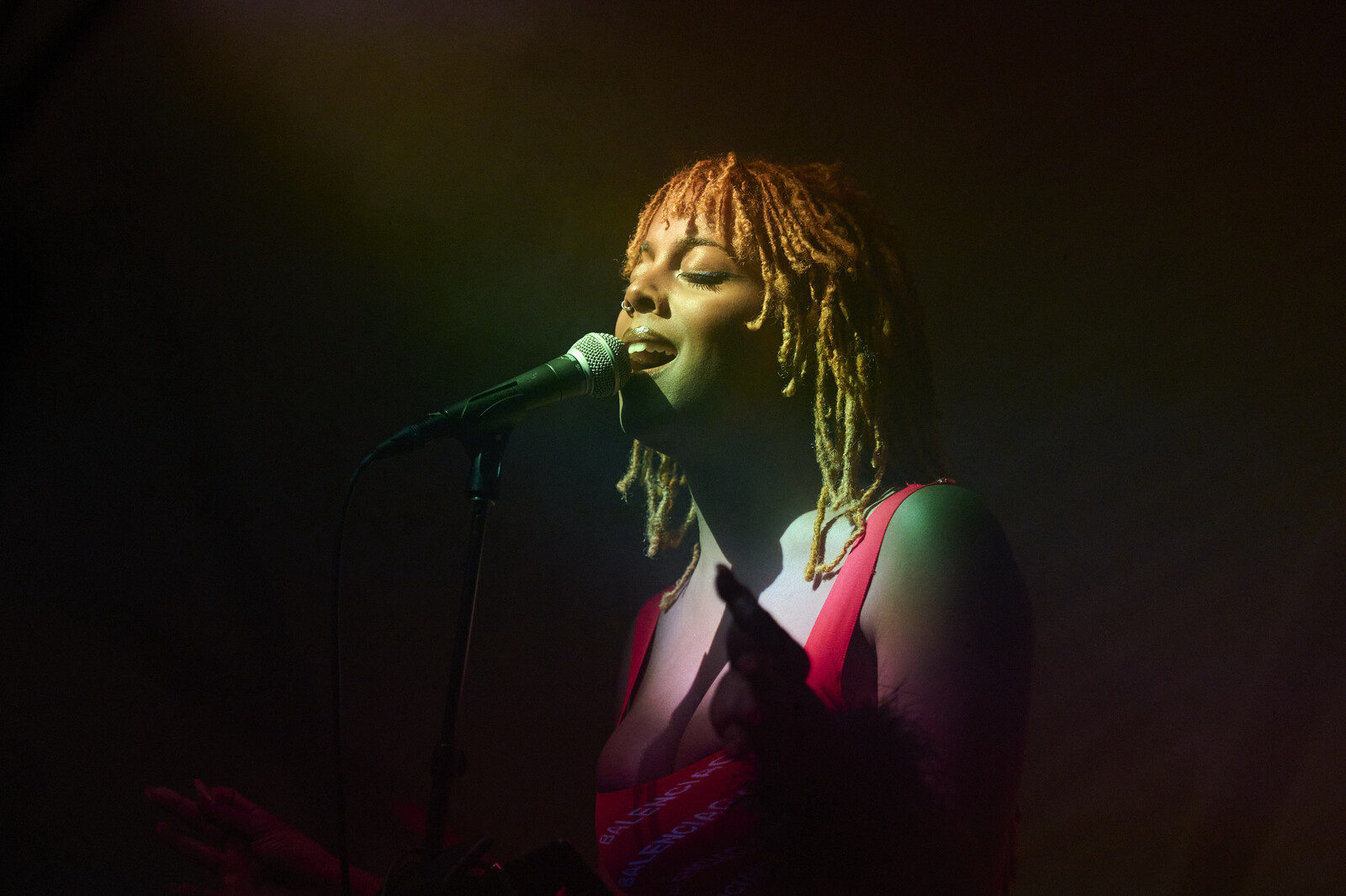
As a teenage indie fan, I spent countless hours on peer-to-peer file sharing platforms like LimeWire and Kazaa, and later blogs and MySpace pages, on which I discovered bands like the Velvet Underground, Boredoms, and Gang Gang Dance. Each products of art scenes, these acts not only soundtracked my adolescence but, by showing me alternative ways of listening and living, sparked my curiosity for contemporary art.
In their New York City debut at National Sawdust early last month, Tongue in the Mind forged a novel branch in the art-rock lineage. The project follows almost ten years of collaborations between artist Juliana Huxtable and multi-instrumentalist Joe Heffernan, also known as Jealous Orgasm, who are joined by DJ and producer Via App on electronics. Huxtable’s art practice spans creative registers, and muses on themes including furry fandom and the psychedelic edges of queer desire. An acclaimed DJ, her inventive sets defy genre and expectations, whether she’s playing Berghain or the basement of a bar. Tongue in the Mind synthesizes these pursuits, and evidences the trio’s musical and artistic maturation.
The performance was the finale of “Archive of Desire,” a week-long ode to the Alexandrian poet Constantine P. Cavafy (1863–1933), programmed by the …
May 3, 2023 – Review
Bispo do Rosario’s “All Existing Materials on Earth”
Elena Vogman
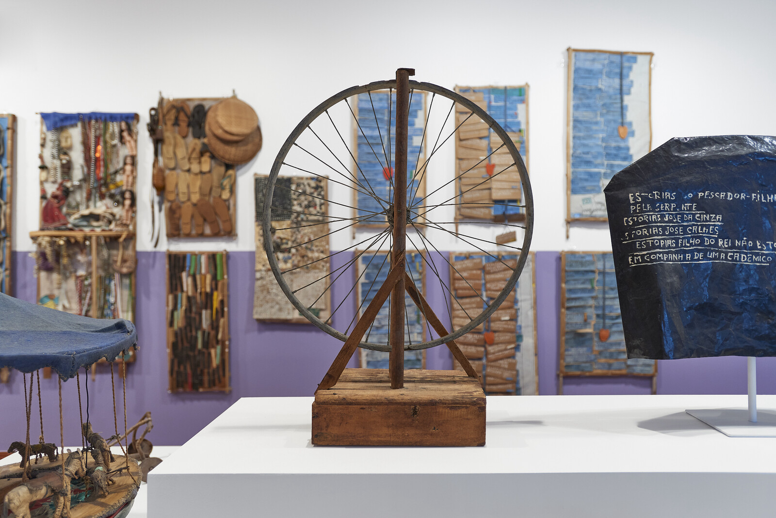
A number of extravagant garments, marked by generous color schemes and complex embroidery, open the first of three luminous rooms in “All Existing Materials on Earth,” curated by Tie Jojima, Aimé Iglesias Lukin, Ricardo Resende, and Javier Téllez. Its central piece, Manto da apresentação [Annunciation Garment], catches the eye with a multiplicity of details, inscribed with colored threads against a light-brown ground: signs and drawings of objects, names, numbers, abbreviations, and streets of Brazilian cities, utensils, boats and a model of a large sailing ship.
A photographic portrait of the artist wearing his magnum opus reveals not a fashion designer but a Brazilian psychiatric patient. The descendant of Black slaves, Arthur Bispo do Rosario (1909/11–1989) spent forty-one years of his life in mental health institutions while accomplishing his “mission.” On the side of the short exhibition text, another mugshot-like portrait of the artist is displayed on the patient card from Colônia Juliano Moreira, the hospital where Bispo was interned. He is described as “indigent,” a wandering Black beggar bearing no documents. The card repeats the police record from December 1938, when Bispo was arrested in Rio de Janeiro and diagnosed with “paranoid schizophrenia.” It was the month of Bispo’s revelation: …
April 21, 2023 – Review
“Refigured”
Travis Diehl
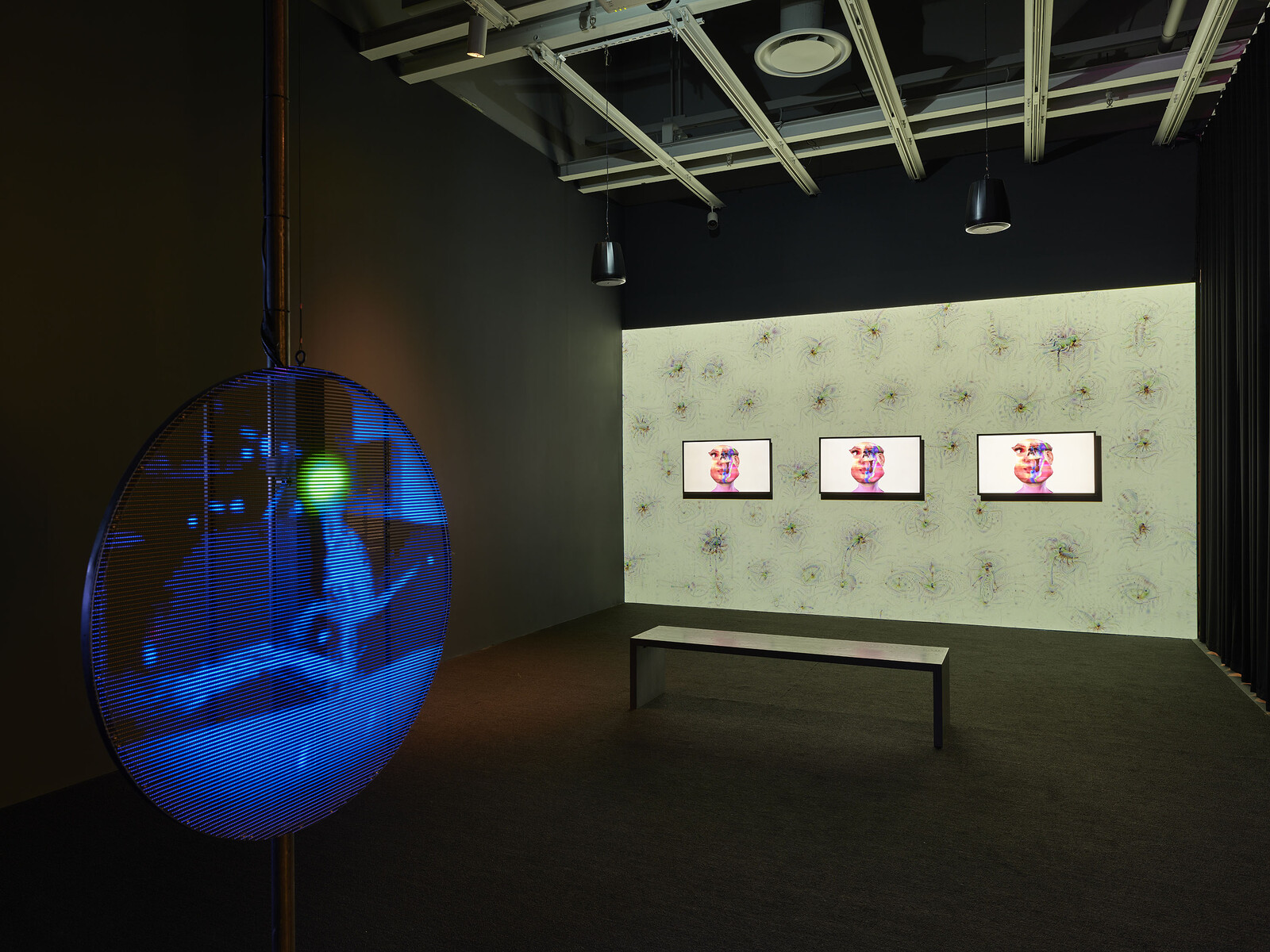
Among a spring flush of screen-, code-, and tech-related museum shows, “Refigured” at the Whitney stands out for its concision. The exhibition’s frame may seem vague—the human figure vis-a-vis technology at times verges on a universalized body—but the five works by six artists pulled by in-house curator Christiane Paul from the Whitney’s holdings maintain a fairly tight focus on the physical possibilities of digital bodies, from statues to demigods to talking heads. In Auriea Harvey’s Ox (2020) and Ox v1-dv2 (apotheosis) (2021), for instance, a muscular, berobed humanoid called Ox—which the wall label describes as an avatar for the artist—appears three times over: a pigmented statuette around 20 cm tall, a 3D model presented on a monitor, and an AR version pinned nearby and visible through an iPad tethered to its plinth. The artist’s intentions notwithstanding, Ox exists in digital and psychic “space” as a concept, a potentiality, and these various renderings are all concessions to display in a physical room.
In fact, as each new struggling trillion-dollar metaverse venture demonstrates, even state-of-the-art interfaces between the digital and physical “realms” remain pretty clunky (and the hardware here is not state of the art). The redundancy of Ox means there are …
April 7, 2023 – Review
“Cinema of Sensations: The Never-Ending Screen of Val del Omar”
Herb Shellenberger
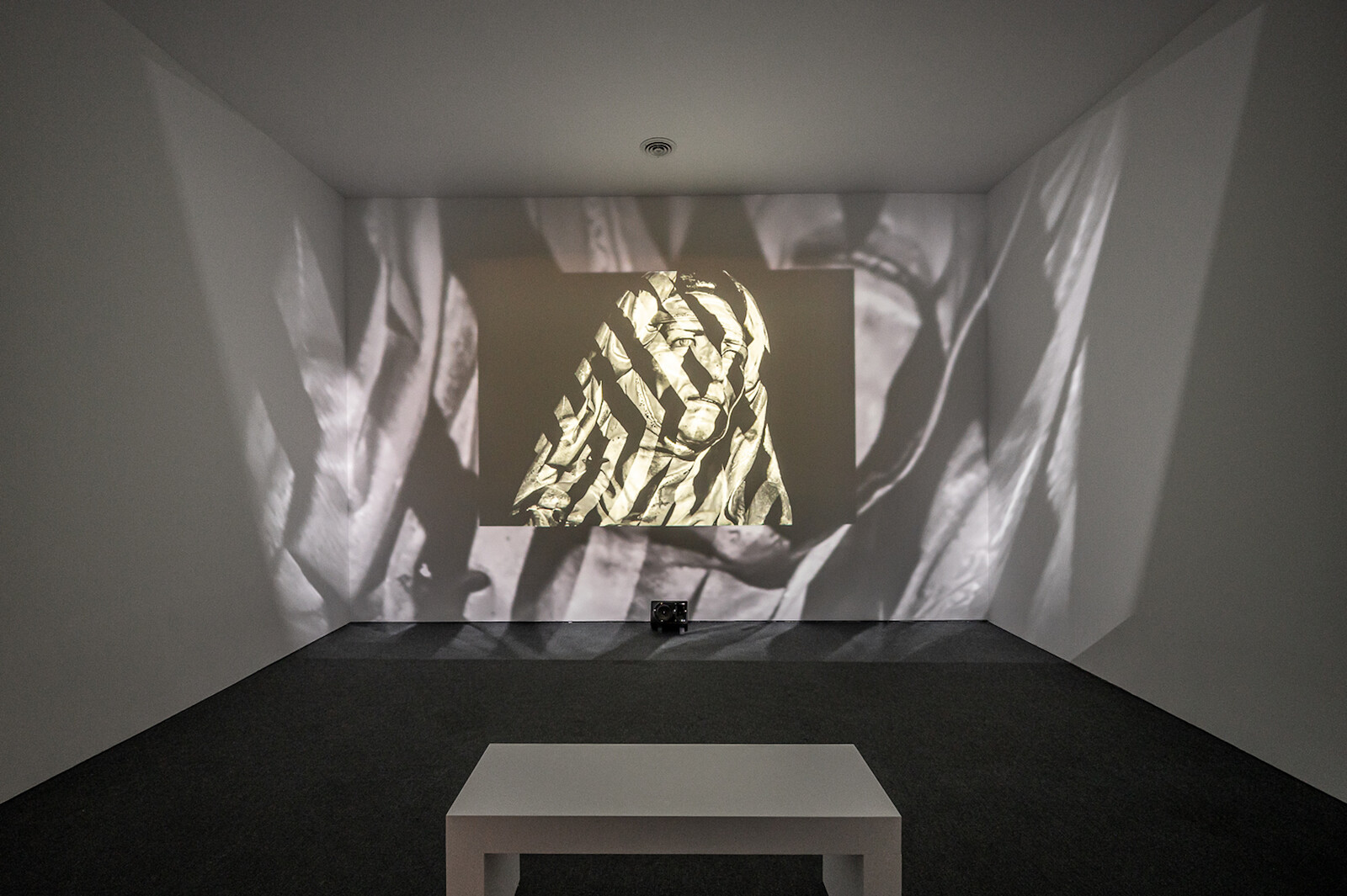
A quick survey of a handful of my peers—among them several experimental filmmakers, curators, and academics—revealed that none of them recognized the name José Val del Omar (1904–82). This came as a surprise to me, given that Val del Omar is perhaps the most foundational filmmaker of Spanish avant-garde cinema. My peers’ responses were ample if anecdotal evidence that the Museum of the Moving Image’s “Cinema of Sensations: The Never-Ending Screen of Val del Omar” is not only much needed; it should also provide an eye-opening look at the work of a visionary artist who is too little-known outside his home country—even to those who are invested in the subject of experimental film.
“Cinema of Sensations,” in the museum’s temporary exhibition gallery, demonstrates that Val del Omar was not just a filmmaker but a technician and inventor, cultural critic and theorist, and a trailblazing artist whose work and ideas spilled across many forms and media. This chronological exhibition opens with Val del Omar’s first films, made in rural towns that he visited during the early 1930s as part of the Misiones Pedagógicas (Pedagogical Missions) literacy campaign. It closes with the techno-futuristic experiments developed at his P.L.A.T. lab, a live-in studio space …
March 24, 2023 – Review
“Signals: How Video Transformed the World”
Dennis Lim

“Video is everywhere,” begins the wall text at the entrance to MoMA’s largest video show in decades, as if on a cautionary note. Equally, to borrow an aphorism from Shigeko Kubota, subject of a recent MoMA exhibition: “Everything is video.” (It is worth noting that Kubota said this in 1975.) In tracing the evolution of video from its emergence as a consumer technology in the 1960s to its present-day ubiquity, “Signals” covers a dauntingly vast sixty-year span. A lot happened—not least to video itself—in the years separating the Portapak and the iPhone, half-inch tape and the digital cloud, and as the material basis of video changed, so too did its role in daily life.
This sprawling, frequently thought-provoking show proposes a path through these dizzying developments by considering video as a political force. In their catalog essay, curators Stuart Comer and Michelle Kuo call the exhibition “not a survey but a lens, reframing and revealing a history of massive shifts in society.” Not incidentally, this view of the medium—as a creator of publics and an agent of change—is in direct contradiction to a famous early perspective advanced by Rosalind Krauss, who in a 1976 essay wondered if “the medium of …
March 14, 2023 – Review
Refik Anadol’s “Unsupervised”
R.H. Lossin
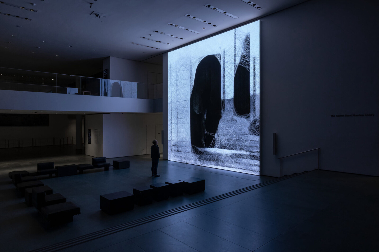
It is widely accepted that propaganda makes for bad art. But propaganda is not always an Uncle Sam poster. Sometimes it is a towering, spectacular argument for the supremacy of the machine; an exercise in post-industrial American triumphalism, surveillance technology, and repressive deep-state R&D disguised as visually appealing, non-referential images. The United States has a long history of cultural campaigns aimed at furthering its imperial goals. The Museum of Modern Art’s historical connection to the CIA is—like Radio Free Europe and the Congress for Cultural Freedom—among the more notable examples of the government’s intervention in our civic life. But despite our awareness of these operations, the potential propaganda function of abstract and non-representational art rarely enters into its critical reception and evaluation. Perhaps the idea of propaganda is so thoroughly wedded to realism in the American imagination that MoMA’s collection seems unimpeachable. Maybe the term “propaganda” has become, through popular use, something that is only used by one’s political opponents. While it is tempting to argue that cultural control is now mediated by a confusing, irresponsible, and diffuse spectacle of corporate greed, Refik Anadol’s “Unsupervised” (2022) suggests that we should reconsider the utility of a more vulgar analysis of visual …
March 8, 2023 – Review
Charles Atlas’s “A Prune Twin”
Erik Morse
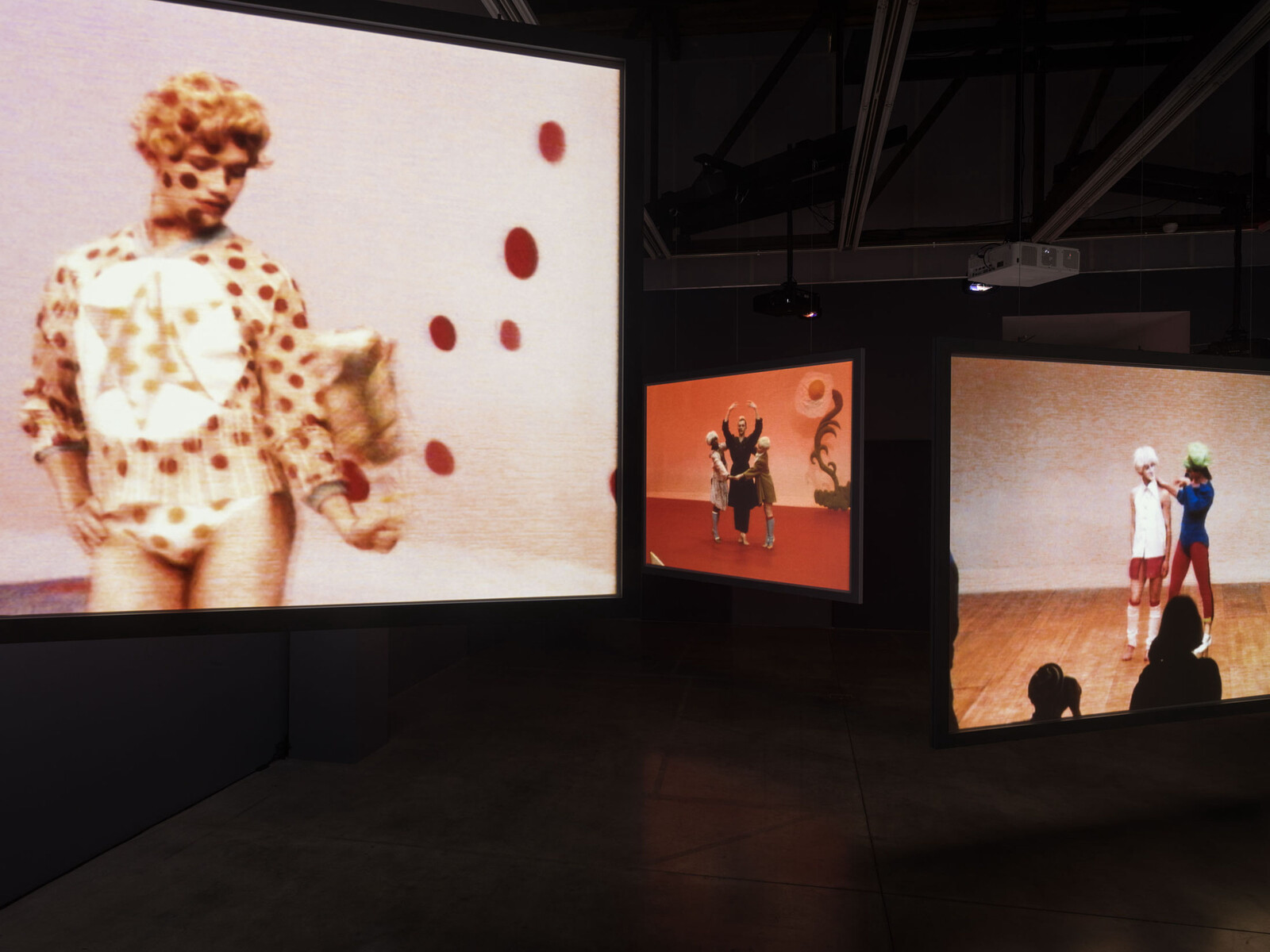
When Charles Atlas quit as filmmaker-in-residence at the influential Merce Cunningham Dance Company, in 1983, after more than a decade, he decided to embrace a younger generation, a different continent, and a more public medium. These changes coalesced around the Pandean figure of Michael Clark, a former prodigy of London’s Royal Ballet School who in 1984 began to sketch out a punk- and club-inspired choreography with his own newly founded dance company. That same year, Atlas produced two works of videodance—a genre of experimental dance film, popularized by Atlas and Cunningham, in which choreography is designed for the camera rather than the stage.
These two films, Parafango (1984) and Ex-Romance (1984/1987), feature performances by Clark, Philippe Decouflé, and former Cunningham dancer Karole Armitage. They are set in vernacular places such as airport lounges and gas stations, and are spliced with news footage, presenter commentary, and video transmission signals. Both spotlight Clark as the enfant terrible of London’s post-punk underground, and the combination of his fauvist choreography with Atlas’s camp visuals captured a Baroque aesthetic that would characterize its queer subculture throughout the decade.
A Prune Twin, originally commissioned by London’s Barbican in 2020, consists of a multi-channel video projection sourced …
February 17, 2023 – Review
Gordon Matta-Clark and Pope.L’s “Impossible Failures”
Katherine C. M. Adams
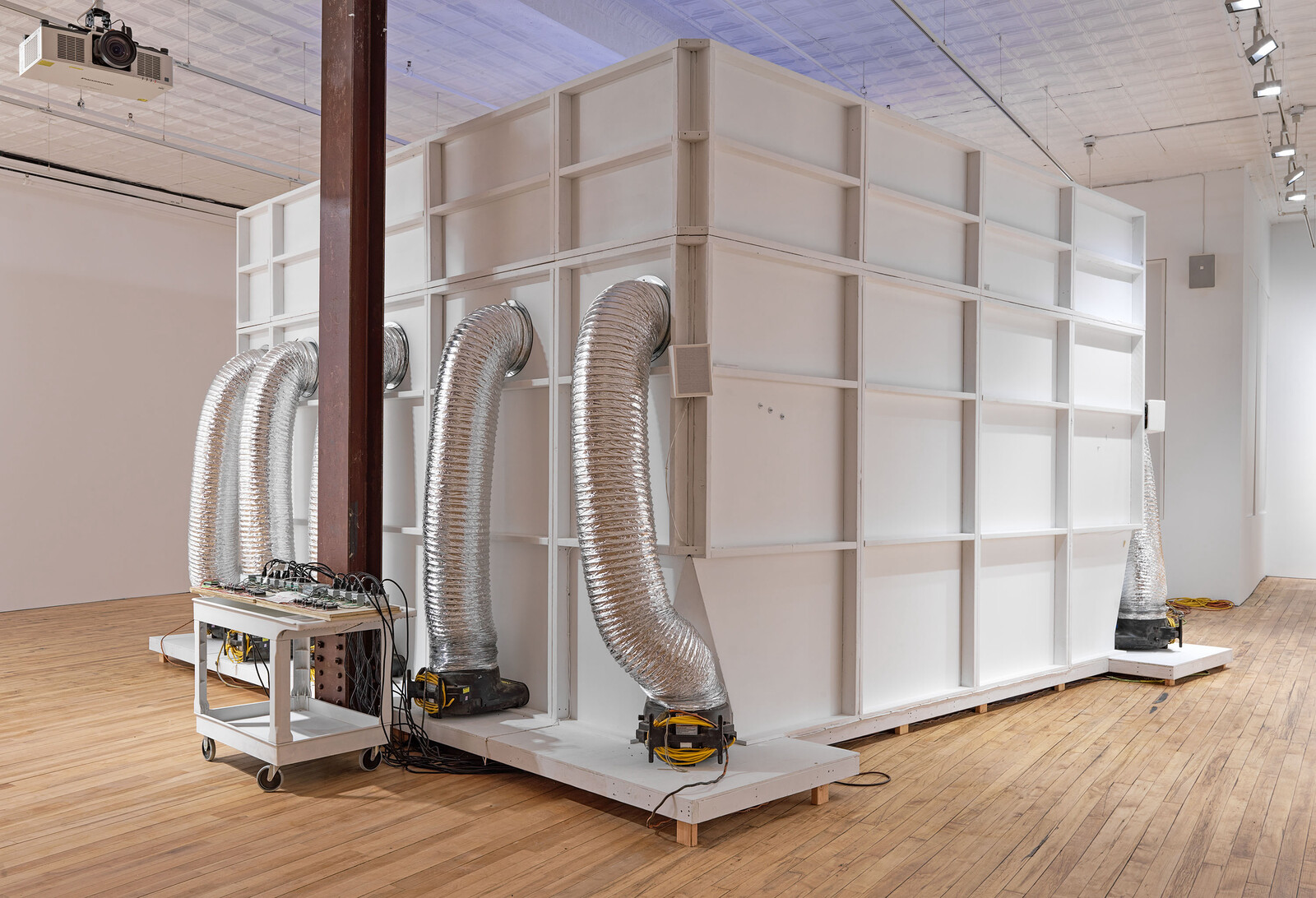
Gordon Matta-Clark’s film Bingo X Ninths (1974), which features a precise dismantling of all but the core of an abandoned house, has been projected at large scale along the first wall of 52 Walker. The door to the exhibition space intersects the projection, such that gallery visitors irrupt onto the image as they enter and exit. A perfectly circular hole, cut straight through the same gallery wall, also interferes with the clean transmission of the film. A layer of dust from this incision lines the gallery floor.
It’s tempting to view such strategies as a literal self-reflexivity built into the gallery design: Matta-Clark’s canonical building cuts overflowing onto the gallery’s walls, making their mark on the present architectural space. Yet the pairing of Matta-Clark and Pope.L for “Impossible Failures” performs a different function, complicating Matta-Clark’s practice on a more fundamental plane. Here, Matta-Clark appears to work vertically, in the air, through various forms of physical suspension, while Pope.L works laterally, low-to-the-ground, worm-like. Drawings by Matta-Clark with subjects such as High Rise Excavation Diving Tower (1974) show lofty engineering schemes that seem to resist the pull of gravity. The artist’s three exhibited films all emphasize, to varying degrees, aerial vantage points …
February 10, 2023 – Review
Luis Camnitzer’s “Arbitrary Order”
Paul Stephens
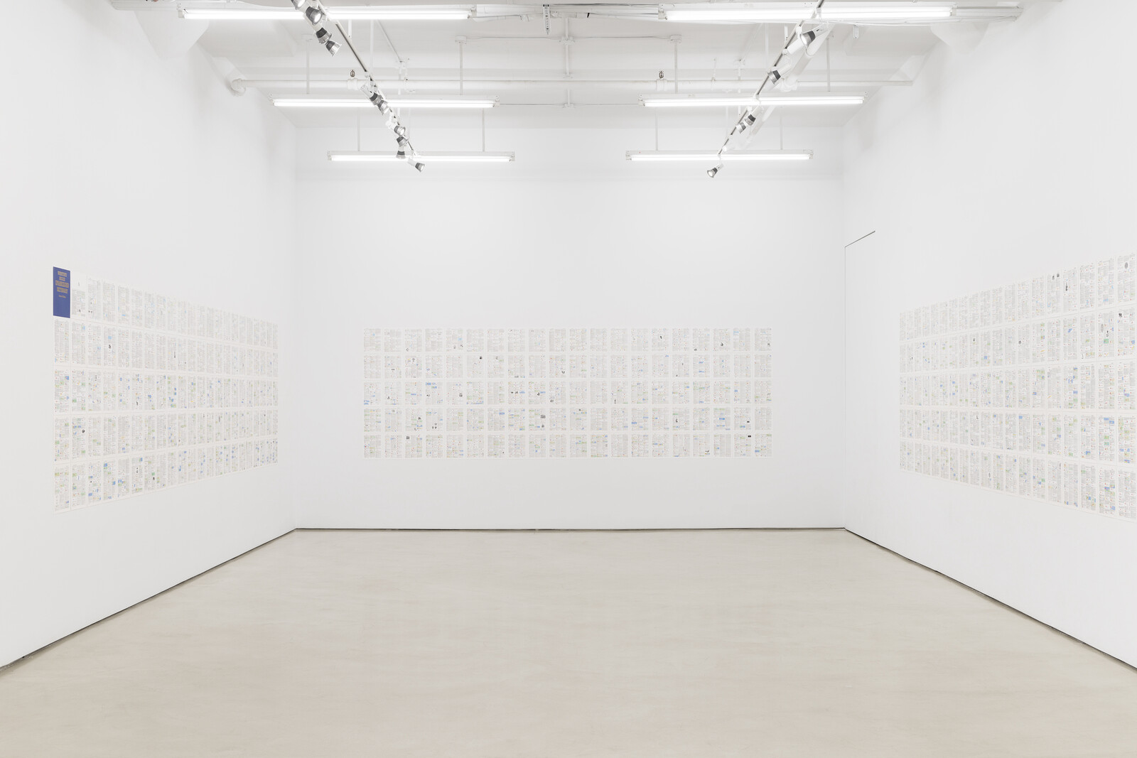
Luis Camnitzer’s A to Cosmopolite (2020–22) is a marvel of precisely executed conceptual art—or as Camnitzer might prefer, “contextual art” (a term he has advocated since the 1960s). Writing through a 1972 Webster’s unabridged English dictionary, Camnitzer covers the gallery walls in prints that match each definition to a screenshot of the first search result from Google Maps that corresponds to it. The title of the exhibition is something of an oxymoron: by combining two classification systems, the cartographic and the lexicographic, Camnitzer reveals a myriad of cultural and political interconnections. The search results in A to Cosmopolite are proximate to Camnitzer’s own location in Great Neck, New York, thus making the project personal as well as global. Someone in Camnitzer’s digital orbit named their corporation “Aleatoric Media, LLC,” and that entry, like many others, stuck out to me as a viewer. I found the best way to explore the work was to read, in alphabetical order, every red location name—which took approximately an hour. When a name intrigued me, I consulted the corresponding definition and took a photo with my phone—reincorporating the physical work on the wall into my own personal datasphere. This work is, importantly, a remediation of …
January 24, 2023 – Review
Andrea Fraser
Wendy Vogel
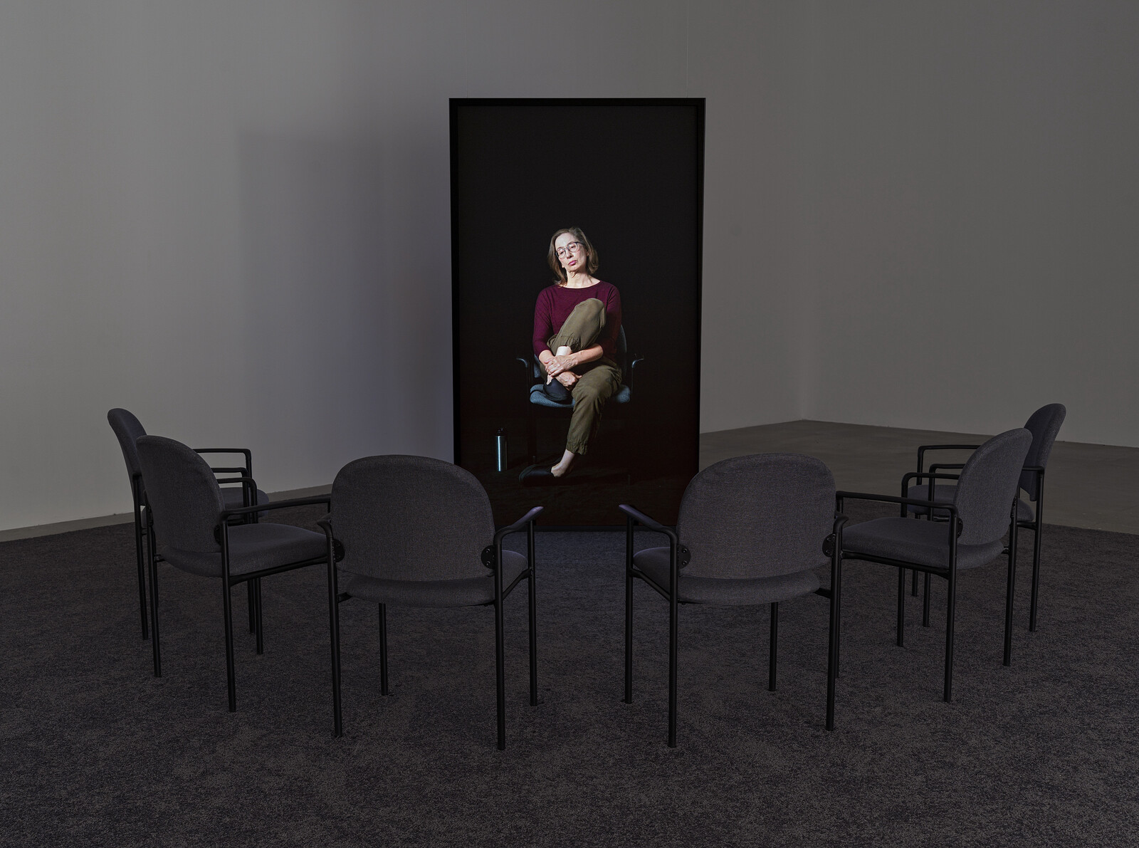
In 2005, Andrea Fraser’s consideration of the art world appeared to undergo a transformation—from externalization to embodiment. “If there is no outside for us, it is not because the institution is perfectly closed,” she wrote. “It is because the institution is inside of us, and we can’t get outside ourselves.” This sentiment of identity entrapment is nowhere more evident than in her latest work, This meeting is being recorded (2021), in which the shape-shifting artist portrays seven white women in a closed-door meeting about internalized racism. The ninety-nine-minute video—which is based on real conversations and debuted at the Künstlerhaus Stuttgart before traveling to the Hammer Museum in Los Angeles last year—forms the nucleus of Fraser’s first US commercial gallery show in 13 years. The five works on view, from the late 1980s onward, get a new, retroactive reading from her current perspective of grappling with the complex, emotive terrain of racial privilege.
Fraser’s best-known performances offer pitch-perfect approximations of art speak and style, from staid guided tours to overblown acceptance speeches by egotistical artists, threaded with a feminist criticality toward gendered modes of presentation. Two major works from the 1990s, commissioned by the Wadsworth Atheneum and the São Paulo Bienal, …
January 20, 2023 – Review
Ali Eyal’s “In the Head’s Sunrise”
Dina Ramadan
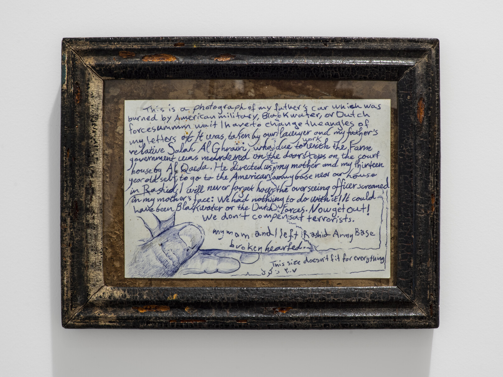
“In the Head’s Sunrise”, a quiet yet compelling exhibition of Ali Eyal’s recent drawings and paintings, captures the intricacy and complexity of the young Iraqi artist’s practice; the emotional texture of the work, accomplished through rapid, forceful strokes, is immediately striking. Individually and collectively the works recreate moments from life in Eyal’s hometown—referred to only as small farm—where he came of age amidst the violent turmoil of the US-led invasion of Iraq. The titles of the pieces underscore Eyal’s propensity for narrative along with his acute awareness of its limitations; each enigmatic label ends with “and,” indicating its incompleteness, and suggesting that every encounter is a beginning, like tugging on a loose, seemingly extraneous thread that unexpectedly unravels the entire fabric.
Three heads walking between towns, and (2022) is the immediate focal point of the exhibition and reflects the mythological nature of Eyal’s work. The large canvas hangs like a banner, hands snatching at its sides, attempting to tear through the composition. Three women’s heads attached to makeshift bodies, an assemblage of ill-fitting and dislocated ligaments, dominate the canvas. They are reminiscent of the three fates, their thick black hair unfurling behind them like billows of smoke, each home to …
January 12, 2023 – Review
keyon gaskin with Zinzi Minott and Moya Michael
Rachel Valinsky
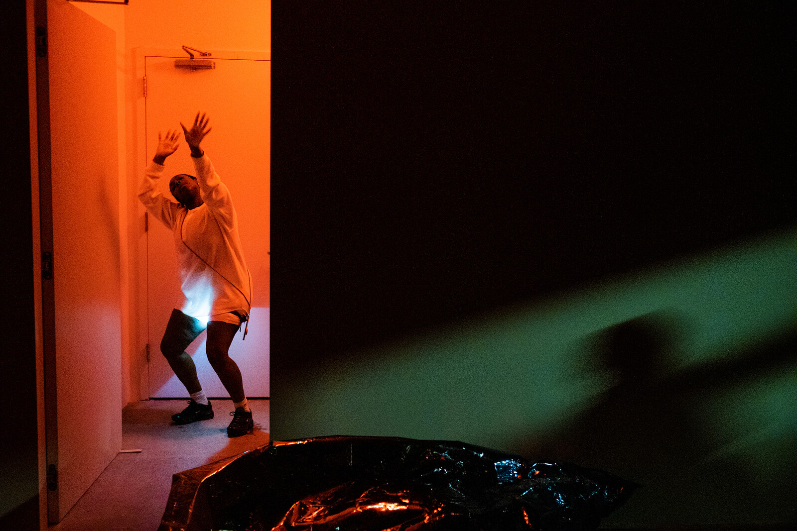
keyon gaskin, Zinzi Minott, and Moya Michael weren’t just stalling. Barely visible beneath their semi-opaque hooded cloaks, and positioned at various points around the entrance to Artists Space, they outlined the terms of their performance clearly: “Once we get moving feel free to roam around the space. We will be all over the place … We might get close to you … Keep your hands to yourself … Be mindful, be careful … We’re at work.” We “waited” for things to start—though, of course, they already had.
gaskin—an artist living in Portland, Oregon who performs both solo and in movement-based groups—has frequently made active audience engagement a feature of their pieces, eschewing passive consumption of black and queer performance by primarily white audiences. At the first performance commission held across Artists Space’s 8,000 square feet, audience-performer interactions were diffuse in part because of the building’s size—the performance took place over several rooms, and not all of it could be witnessed simultaneously. Visibility, its trappings and attendant politics, were not so much withheld as decentered. “We can’t see everything,” gaskin and their collaborators cautioned at the start, implying that neither should we. “Remember, this is a performance, but not your performance. …
December 6, 2022 – Review
Nikita Kadan’s “Victory over the Sun”
Xenia Benivolski

The 1913 opera Victory over the Sun describes an attempt to capture the sun in order to overthrow linear time and reason. The work ushered in artistic traditions that came to shape Soviet Futurism: it’s where Malevich’s black square, for instance, made its first appearance (on a set curtain). Nikita Kadan’s exhibition, which takes its title from the opera, is anchored by a wall-hanging neon sculpture entitled Private Sun (2022) which refers to a classic of Soviet-era design: a window grate, ubiquitous in large apartment buildings, with bars like the rising sun. Where the avant-garde original advocated for the destruction of the present to clear a path for the new, the Ukrainian artist’s use of the architectural feature suggests a darker notion: of being held captive in someone else’s idea of the future.
Hanging in the main space of the gallery is a series of charcoal drawings. In one, titled A Sun-headed character in a garbage bag (2022), Kadan renders a black trash bag akin to those rumored to have been used to transport the bodies of soldiers killed during Russia’s invasion. Over the trash bag presides an unsmiling black sun. In another, similar drawing (The Sun I, 2022), a black …
November 9, 2022 – Review
Jumana Manna’s “Break, Take, Erase, Tally”
Dina Ramadan
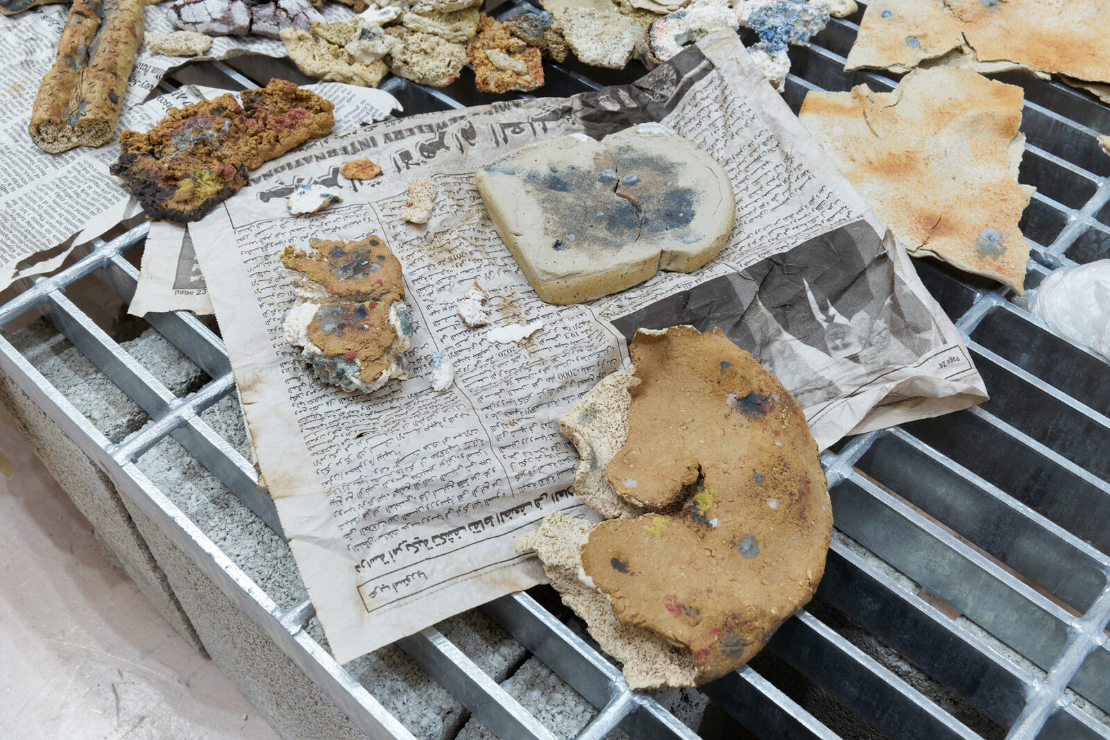
Jumana Manna’s first US museum exhibition traces the violence inflicted through infrastructures designed to control, transform, protect, or even destroy the natural environment, while recognizing the ways in which the land, in its mutations and transformations, resists in order to survive. Knowledge produced from and about the land emerges as a site of struggle, both an apparatus of hegemony and oppression and a potential tool for defiance and liberation.
The exhibition includes recent and newly commissioned sculptural works; pieces from the multidisciplinary Palestinian artist’s ongoing “Cache Series” populate the main gallery space. These large, smooth, earth-toned ceramic sculptures seem capable of shape-shifting despite their sturdiness. Inspired by the khabyas—the storage vessels attached to homes throughout the Levant that have been rendered superfluous with the proliferation of modern means of refrigeration—they capture these structures in various states of disintegration and ruination. Some share recognizable features of the original khabya while others have morphed into unfamiliar forms, alien-like creatures whose disfigurations speak to their incongruity in the contemporary landscape, glossy monuments to their own demise in the face of industrialized means of producing and conserving food.
Throughout the exhibition, Manna borrows from the visual and organizational language of archival institutions; the steel …
September 27, 2022 – Review
Ghislaine Leung’s “Balances”
Katherine C. M. Adams
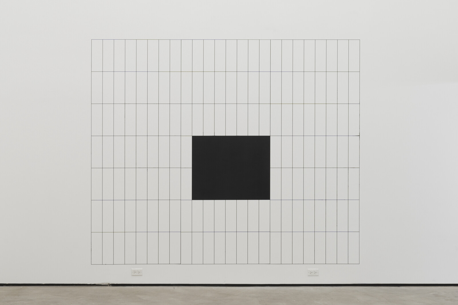
What one sees of Ghislaine Leung’s “Balances” depends on precisely when one visits the exhibition. During Leung’s own “studio hours” (9 a.m. to 4 p.m., Thursday and Friday), Gates (2019) lines the main gallery space with child safety gates. The work’s three editions—each a different neutral shade—have been installed on top of each other: sometimes they occupy the same elevation of the wall in dense proximity, and at other points are stacked vertically. Directly before the first group of Gates is one half of Monitors (2022)—a baby monitor transmitting live footage of the gallery’s back office. Other works on view in the central space include Fountains (2022), a small readymade, three-tiered fountain burbling loud enough to “cancel sound” in the vicinity, as the work’s score instructs. A partly filled rectangular grid the size of Leung’s studio wall, Hours (2022), covers the largest wall.
Outside these hours, the gallery is apparently blank, all works removed or covered over. “Balances” exercises an unusually strict control over the terms of encounter with its work, calibrating the viewing situation to the artist’s allocated studio time for art production. In a correspondence with the gallery reproduced in the show’s press release, Leung explains the three-way …
September 23, 2022 – Review
“A Maze Zanine, Amaze Zaning, A-Mezzaning, Meza-9”
Rachel Valinsky
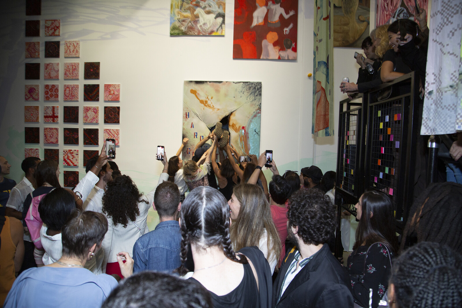
Pulling up to David Zwirner on the opening night of its tongue-twistingly-titled benefit show for Performance Space New York, the scene was chaotic: a several-hundred strong mix of fashion week, Armory week, and overdressed Chelsea partygoing crowds spilled out onto 19th Street, closed to car traffic and repurposed for a block party, complete with food stands and ice-cream truck. Inside, five long banners co-made by the exhibition’s all-star squad of artist-organizers—Ei Arakawa, Kerstin Brätsch, Nicole Eisenman, and Laura Owens—hung from a beam overhead.
These screen-printed, acrylic- and vinyl-painted Curtains (all works 2022 unless otherwise stated)—a title that evokes the fabric separating audience from proscenium stage—read like précis of each artist’s signature style: one shows a cartoonish Eisenman figure raising paint roller to wall, while Brätsch’s and Owens’s colorful, abstract geometries and pop-cultural influences infiltrate others. Two open, wooden structures on wheels evoked both stage props and domestic spaces (they are called “houses” on the gallery map). Behind the curtains, Performance Space’s metal rigging structure was temporarily relocated as décor, where it dynamically remodeled the gallery’s interior. A ramp leading to a platform wrapping around either side of the space served as the titular “mezzanine,” offering elevated views of the many paintings …
June 9, 2022 – Review
Anne Imhof’s “AVATAR”
R.H. Lossin
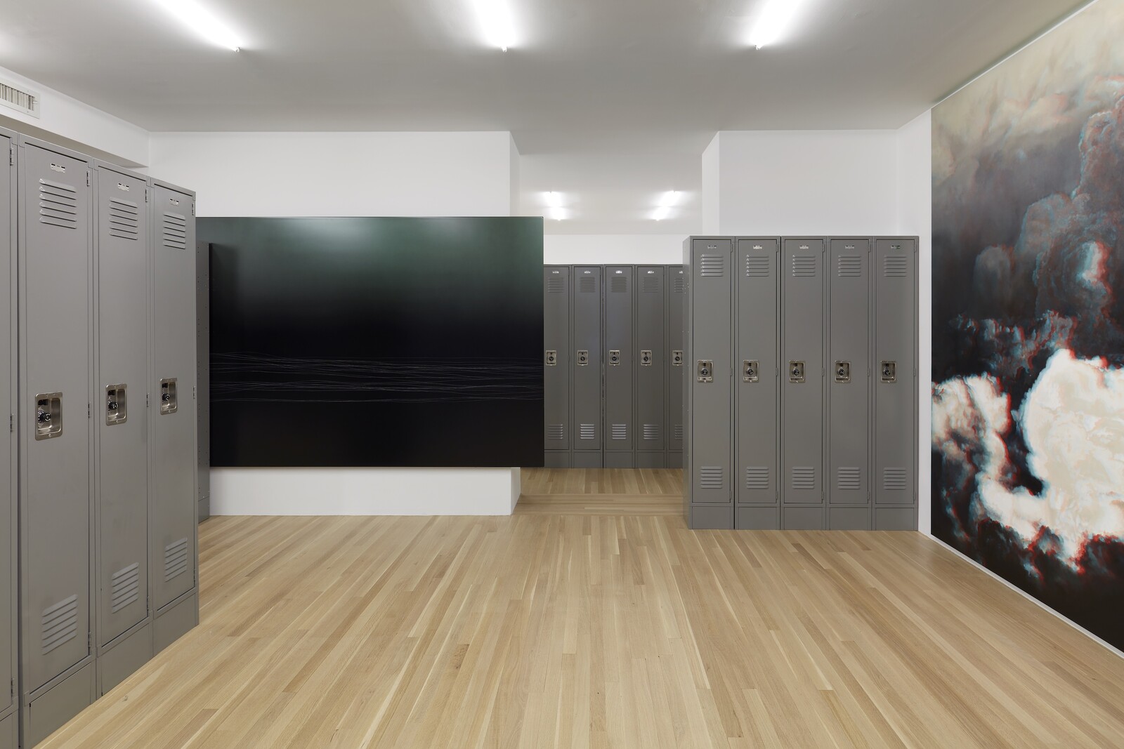
“AVATAR” is an installation featuring rows of industrial lockers, cored concrete blocks, a large, three-panel painting of clouds, figurative drawings, and new additions to Anne Imhof’s series of “Scratch Paintings”—large aluminum panels coated in custom automobile paint with patterns scratched into them by the artist. While no performance will be held here, it is impossible not to think of it as a set absent the actors—which, given the function of lockers and the potential density of bodies in a locker room, isn’t far-fetched, even if we bracket the German artist’s fame as a dramaturge. The lockers containing concrete blocks as a way of staging giant, slightly abstracted car doors is almost too literal if you have even a glancing, film-based familiarity with industrial production. The untitled cloud painting is compelling—beautiful in a Monet’s waterlilies sort of way. The drawings—mostly hung in a back space that functions as an office—are likely there so people have something to buy. The show is fine. Imhof is a talented painter and draughtswoman. One could leave it at that if it weren’t for the ghosts of bodies that might use the lockers on the way into a General Motors plant.
Imhof continues to describe herself …
May 17, 2022 – Review
Josephine Pryde’s “Taylor Swift’s ‘Lover’ & the Gastric Flu”
Travis Diehl
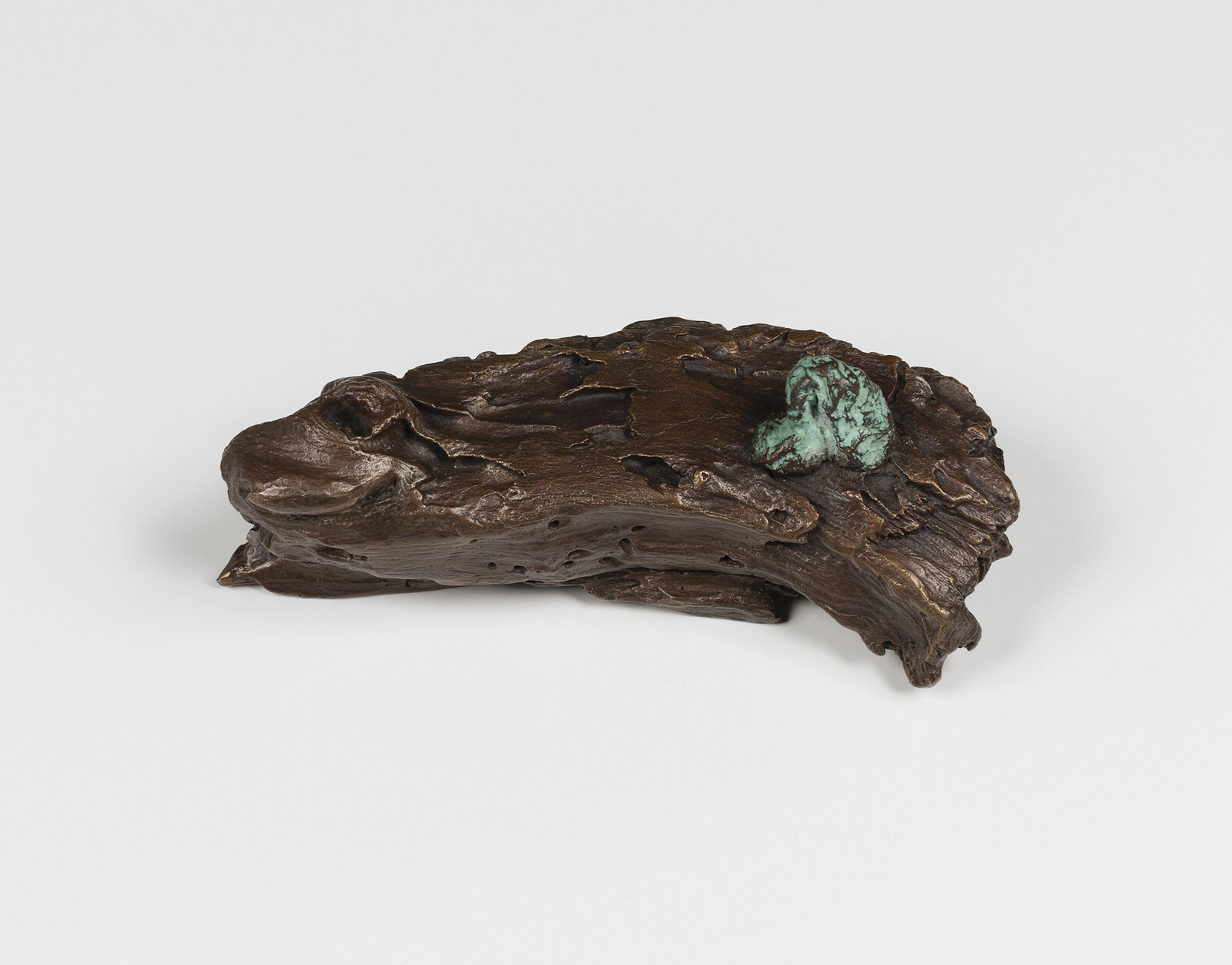
Josephine Pryde’s campily titled show at Reena Spaulings frames the genius of Taylor Swift—her capacity for reinvention and the influence of her confessional songwriting—as a model of the creative process. The story goes that sometime in 2019, Pryde, an English artist known for detourning the conventions of commercial photography, came down with a stomach bug: she spent her convalescence listening repeatedly to Swift’s album Lover, released that same year. In the months since, she produced a series of twelve bronzes by chewing on a piece of gum while remembering a different track, matching her chews to the rhythm of each song in a kind of masticatory lip-sync. She stuck each resulting wad to one of the pieces of driftwood or small rocks scattered around her flat, cast the assemblages in bronze, and patinated the gum part a scaly green. Hannah Wilke, eat your heart out.
Pryde’s goal seems not to relive or remember her illness so much as transpose it into the key of Taylor’s heartbreak. Each piece is titled after the song in Pryde’s head while she made it: “The Archer”; “Paper Rings”; “Miss Americana & The Heartbreak Prince.” The suggestion is that the tenor of each song affected …
May 13, 2022 – Review
Em Rooney’s “Entrance of Butterfly”
R.H. Lossin
“Entrance of Butterfly,” Em Rooney’s third solo show with Derosia (formerly Bodega), consists of six large sculptures and the looping, 11-minute slide show that gives the exhibition its title. The artist has previously integrated photographs into her sculptures, but here the 80 color stills are disaggregated and projected at a notably small scale in a separate gallery: their relation to the sculptural forms is symbolic or narrative rather than material. If these representational images suggest context or content for their more abstract, three-dimensional counterparts, it is only in the most provisional way. The wall-mounted sculptures, titled with reference to films and natural processes, have a descriptive power of their own.
trouble every day (all works 2022) is the approximate size and shape of a headless dress mannequin. Impaled on the steel strip that secures it to the wall, the candy-wrapper quality bestowed by Mylar and coated rice paper is at odds with the violence of a disarticulated female torso. This shape, at once a replica and an encasement of the female body—shiny, blue, aggressively corseted by sharp, rhinestone-studded petals (synthetic whale boning and all)—invites us to dwell on the often incompatible demands made on women’s bodies (literally, materially on them). …
April 28, 2022 – Review
Elbert Joseph Perez’s “Just Living the Dream”
Hallie Ayres

A pristine, nondescript hammer dangles upside down from the skylight in Rachel Uffner’s upstairs gallery. Situated on a pedestal directly underneath are three porcelain figurines: a swan, a lamb, and a pony. Arranged in a congregation that is as tender as it is eerie, the figurines exude a fragility that is exacerbated tenfold by the hammer’s precarious installation. The notion that moments of suspension—of disbelief or otherwise—can so quickly turn catastrophic runs through the rest of the works on display in “Just Living the Dream,” Elbert Joseph Perez’s first solo gallery show in New York City.
The motif of ceramic figurines of baby animals on the brink of violent extermination recurs throughout Perez’s suite of paintings. The eleven compositions, all oil on canvas, oscillate stylistically between aesthetics of naturalist still life and symbolist metaphysics. Their conventional orientation on the gallery wall belies the foreboding subject matter. Duhkha Aisle (all works 2022) features a ceramic duck in a cowboy hat, an immobile target for the rearing snake in the hellscape behind it, while 16 oz. Migraine positions the glazed upper body of a horse inches away from a glimmering sledgehammer affixed to something beyond the bounds of the canvas by a …
April 5, 2022 – Review
80th Whitney Biennial, “Quiet as It’s Kept”
Dina Ramadan

In her 1988 lecture, “Unspeakable Things Unspoken: The Afro-American Presence in American Literature,” Toni Morrison explained that the opening sentence of her 1970 novel The Bluest Eye—“Quiet as it’s kept”—was a familiar idiom from her childhood, usually whispered by Black women exchanging gossip, signaling a confidence shared. “The conspiracy is both held and withheld, exposed and sustained,” Morrison tells us. By borrowing this expression for the 80th edition of the Whitney Biennial, curators David Breslin and Adrienne Edwards promise the intimacy of knowledge bestowed, an exploration of the tantalizing space between hidden and revealed, a quiet reflection on whispered truths.
Unfortunately, the possibilities of this title are not fully explored; the curators instead pursue a series of “hunches” which are much less satisfying. The two main floors of the biennial are constructed in opposition to each other, the upper story a dark maze, restricted and confined, while the lower level is an airy relief, open and invigorating. This contrast is intended to reflect what the curatorial statement describes as “the acute polarity of our society,” although it is never clear how the works on each floor speak specifically to these fissures.
A recurring concern through the exhibition is a palpable disillusionment …
March 18, 2022 – Review
Carolyn Drake’s “Knit Club”
Ben Eastham
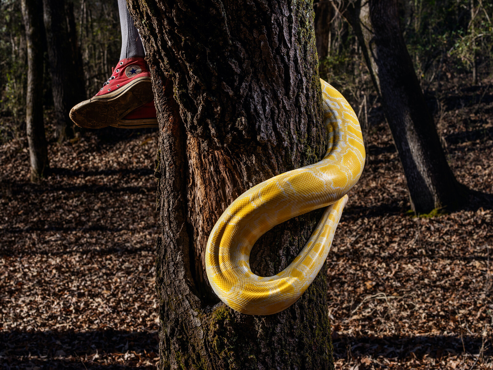
To walk into Yancey Richardson’s Chelsea gallery is to enter a secret society of women. These photographic portraits of women alone, with their children, and in groups—their faces often hidden behind objects ranging from bunches of flowers to a plaster cast death mask—are freighted with esoteric symbols. A snake twists around a tree as if it were Asclepius’s staff before transforming into dangling feet; a woman holds an eerie nineteenth-century painting of a small girl in front of her like a screen. A slim figure in a pink dress wearing the rubber mask of an eagle’s head completes the impression of having stumbled into a feminine cult, the meaning and membership of which must remain obscure to the uninitiated.
That the title of the exhibition suggests this is a “knit club” does not diminish the mystery: even fleeting acquaintance with the literature of the Southern Renaissance is enough to forewarn the viewer that the weirdest histories are concealed behind the picket fences of polite society. And we are unmistakeably in the American South of the popular imaginary: complementing the air of collapsed grandeur connoted by peeling colonial-era wallpapers and hardwood dressing tables are signifiers as direct as a Victorian Gothic dollhouse …
February 25, 2022 – Review
Shannon Ebner’s “FRET SCAPES”
R.H. Lossin

FRET is an acronym for Forecast Reference Evapotranspiration Report. It is a record of the rate of evaporation and transpiration, or how fast water moves from the various living and non-living surfaces of the earth—dirt, lakes, oceans, plant bodies, forest canopies—back into the atmosphere. The information is useful in deciding how to irrigate crops and manage municipal water supplies; decreased precipitation depths, as a result of climate change, mean water will evaporate more quickly and increase irrigation demands in arid and semi-arid climates. Fret is also, of course, a verb that means “to worry” and a noun that refers to a number of things: a repeating, geometric ornament that forms part of a frieze, the fret saw that might be used to cut such ornamental designs into wood, and the raised portion on the neck of many stringed instruments.
Shannon Ebner’s “FRET SCAPES” consists of thirteen black-and-white photographs arranged around a five-columned floor-to-ceiling poem called FRET, in which Ebner has some fun playing with the acronym in relation to the common verb as well as its technical use. The National Weather Service gives daily, weekly, and other reports that Ebner transcribes: “THE DAILY FRET/THE WEEKLY FRET/AND THE DEPARTURE/FROM NORMAL FRET.” It …
February 17, 2022 – Review
Golnar Adili’s “Found in Translation: A Story of Language, Play, and a Personal Archive”
Dina Ramadan
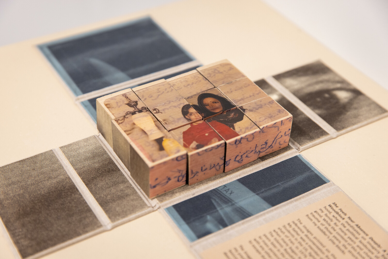
“Found in Translation” is a quiet exhibition that exudes a palpable sense of yearning for a past that never quite was. Golnar Adili’s childhood was shaped by the fracturing of her family due to political events; born in Virginia, she returned with her parents to their home country of Iran in the wake of the 1979 revolution. Her father, a leftist activist, soon returned to the United States, forced into exile by his political convictions. The exhibition is an expansive yet cohesive “lexicon of displacement” (in Adili’s words) articulated through a floor installation, sculptures, digital and silkscreen prints, and photo lithography.
The first piece we encounter is She Feels Your Absence Deeply - Pixels (2017), a digital image of the artist and her mother printed on delicate Japanese paper and reconstructed in a grid of quarter-inch wood cubes reminiscent of children’s building blocks. The two subjects, seated close together, stare directly at the camera with gravitas, intent on capturing the moment, no matter how joyless. Titled after a line in a letter from Adili’s mother to her husband, in which she describes their daughter’s visceral response to the family’s disintegration, the piece evokes many of the exhibition’s essential themes; the (re)construction …
February 15, 2022 – Review
Sahra Motalebi’s “This Phenomenal Overlay”
Rachel Valinsky
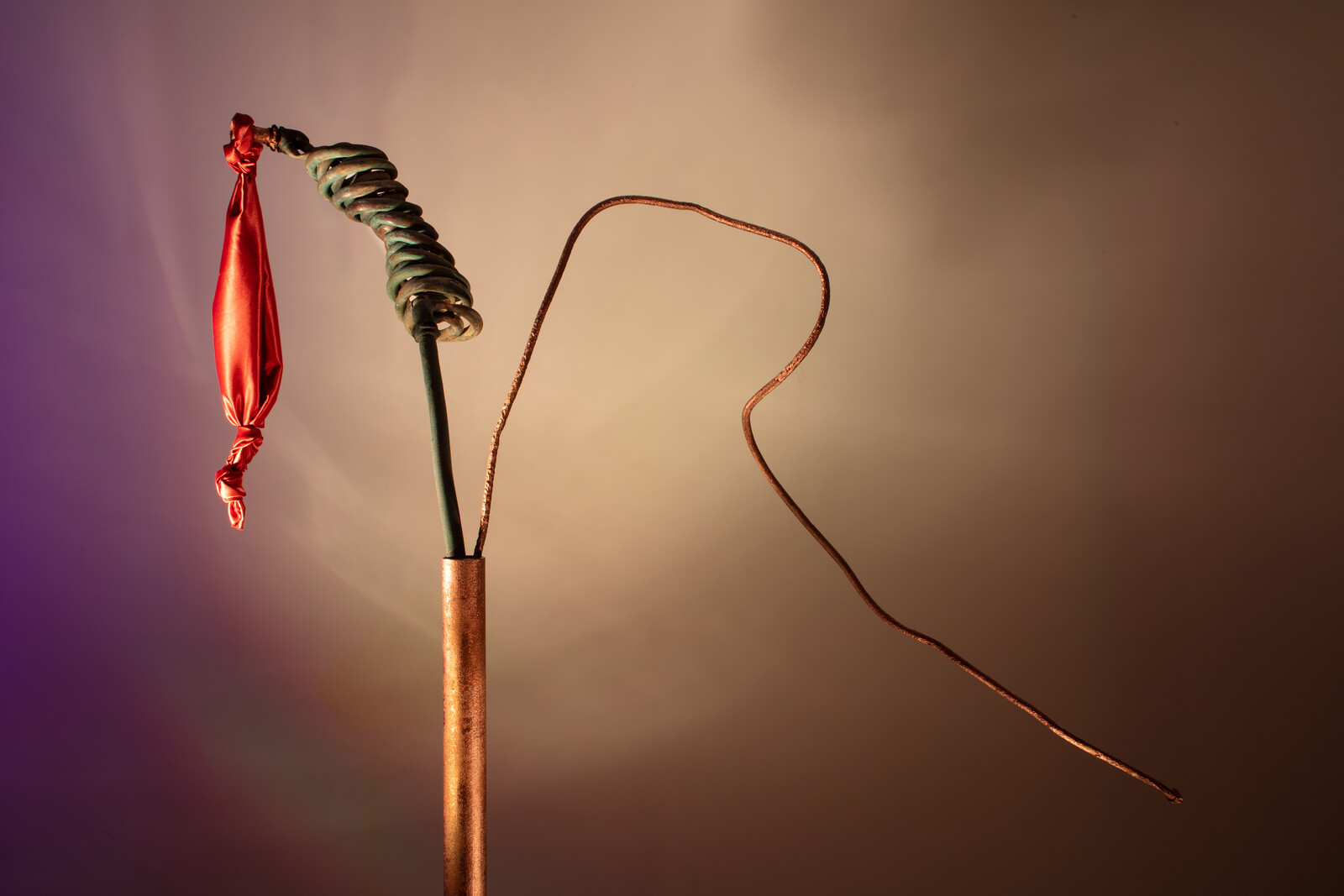
“What is semantic security?” asks an acousmatic voice. This is one among many phrases Sahra Motalebi recites in a twenty-minute recorded track that emanates from a speaker concealed in a wall-hung assemblage to the left of the entrance door. Material Conditions for a Stage (Diorama) (2022) teases the premise of its own title with its slapdash construction and unpretentious materials: a linen curtain peeled back over two metal pylons enframes a rectangular, open-faced cardboard container like product packaging, its insides an irregular topography shaped to hold an object during transport. In other words, the kind of thing that is usually thrown away. But for Motalebi, a dispensable object, like a “dead metaphor,” can have alchemical properties. “What can we perceive?” the voice asks. “This Phenomenal Overlay,” the exhibition’s title, suggests one possible way into the question.
Material Conditions is one of two “dioramas” in Motalebi’s exhibition at Brief Histories. As if reprising the question at the core of Plato’s allegory of the cave—whether we acquire knowledge through sensate experience or philosophical reasoning—the diorama enters into dialogue with another voice sculpture, Resonator #1 (404) (2022). The “resonator,” a potential instrument, is made of decommissioned copper tubing from which jut out two …
February 11, 2022 – Review
Nikita Gale’s “END OF SUBJECT”
Adam Kleinman
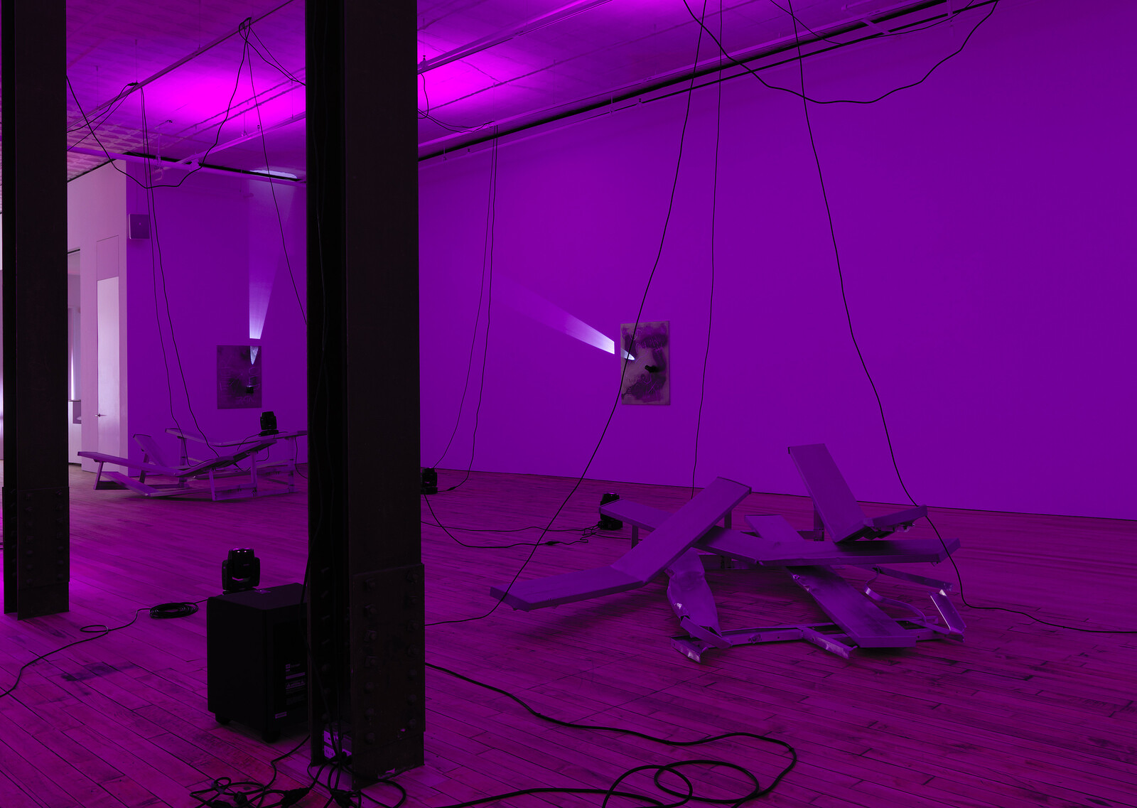
What are the uses, and abuses, of abstraction? Five years on from the controversy sparked by the inclusion of Dana Schutz’s Open Casket (2016) in the 2017 Whitney Biennial, the quandaries of representation continue to preoccupy institutional programs. Brilliant figurative portraiture of and by traditionally silenced voices has become dominant—at the price, perhaps, of de-platforming artwork in which personal identity is less then immediately recognizable. Said more crudely: visibility is in, while opacity is out. But at what, or whose, cost? Plausibly as a consequence of, and response to, the kind of over-visibility through which people are surveilled by corporations and states, several artists who deploy strategies of interference are now, perhaps paradoxically, achieving prominence. Nikita Gale—a nom de plume (or is it nom de guerre?) created by redacting Gale’s inherited “legal” surname—is one such artist. In Gale’s work, abstraction is more than a device to generate imagery, and becomes a mode of creative reflection and deflection.
Upon entering the artist’s current exhibition at 52 Walker, the David Zwirner TriBeCa outpost that opened in October 2021, expectations are immediately interrupted. Within the cavernous hall, a series of crushed and deformed aluminum bleachers frame the overall sense of arriving too …
December 20, 2021 – Review
Colette Lumiere’s “Notes on Baroque Living: Colette and Her Living Environment, 1972–83”
Wendy Vogel
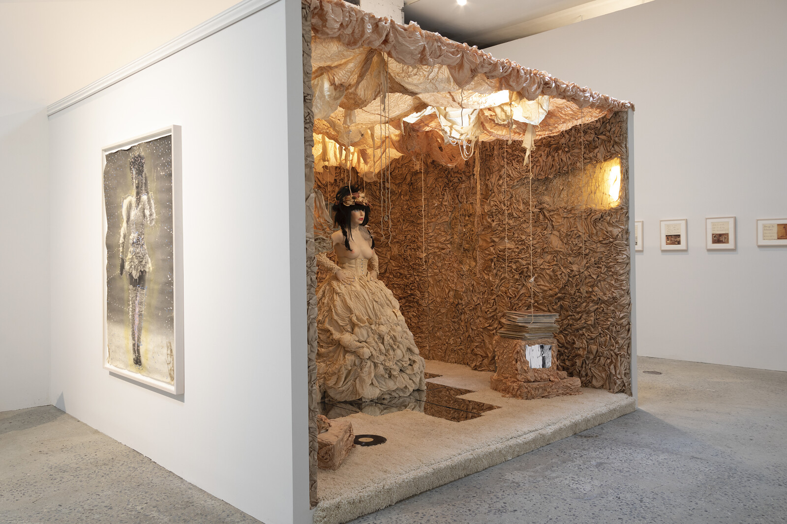
Colette Lumiere’s art is unmistakably original, though its reverberations throughout pop culture may inspire feelings of déjà vu. Spanning painting, sculpture, and performance tableaux, as well as interior design, music, fashion, and the branding of various personae, Colette’s “Deadly Feminine” aesthetic crystallized in the New York of the late 1970s and early ’80s. Her work is born of the unique cultural collisions of that time—disco, punk, and new wave; the countercultural underground and the emerging art market; feminist ideology and postmodernism; and a thirst for glamor in a city plagued by crime and bankruptcy. Much like punk’s jarring aesthetics, Colette’s winking appropriation of theatrical femininity (with nods to the bohemian demimonde) has moved from the artistic fringe to a canny marketing posture in pop and art. Her restless and shapeshifting influence has become part of the cultural ether.
This exhibition focuses on the fruitful period of 1972 to ’83. At the show’s core are garments and artifacts from her Living Environment, staged in her Wall Street–adjacent loft during these years. There, Colette suspended satiny ruched fabric in unabashedly feminine shades of blush and cream from every available surface. The look was described by one writer as “suffocating voluptuousness”—a …
November 17, 2021 – Review
New Museum Triennial, “Soft Water Hard Stone”
Dina Ramadan

The reopening of New York’s art institutions a little over a year ago was accompanied by vocal expressions of support for movements for racial and social justice, and an avowed intention to confront their own discriminatory practices. What has transpired since has mostly taken the form of a curatorial recalibration—of which “Soft Water Hard Stone” is symptomatic—in which exhibition-making has been used as a primary tool of critique and correction. However, despite their content, such exhibitions tend to leave the institutional infrastructure largely intact, all too often underplaying both the historic and continued complicity of the art establishment in perpetuating the conditions for colonialism, climate change, poverty, income inequality, displacement, and gentrification. Curated by the New Museum’s Margot Norton and Jamillah James of the Institution of Contemporary Art, Los Angeles, the fifth edition of the New Museum Triennial includes 40 artists from 23 countries. Borrowing its title from a Brazilian proverb—a commentary on the power of perseverance and persistence—“Soft Water Hard Stone” contemplates material and materiality, focusing primarily on Indigenous artists from the Americas working in various forms of sculpture, with a handful of video installations and a noticeable absence of photography. The assumption of a slow and steady path …
November 12, 2021 – Review
59th New York Film Festival, “Currents”
Herb Shellenberger

After the virtual screenings and drive-ins of its 2020 edition, this year’s New York Film Festival (NYFF) once again rolled through Lincoln Center: a program of screenings, talks, parties, and red carpets that—with the exception of vaccine checks and masks—would not have felt out of place pre-pandemic. Situated as a festival-within-a-festival, NYFF’s “Currents” strand was billed as an eclectic showcase of innovative cinema, comprising 15 features and 36 short films that ranged from experimental and essay film to low-budget arthouse. In the context of a reduction in support for experimental film across festival lineups internationally, “Currents” was this year marked by a sense of plentitude that felt both generative and somewhat overwhelming. The general level of quality was high, but several works stood out.
A Night of Knowing Nothing (all films mentioned 2021), Payal Kapadia’s feature debut, is a bold work of documentary that balances the poetic and political in depicting protest movements at the Film and Television Institute of India (FTII). (Kapadia joined the institute as a student in 2012, producing several phenomenal short films through to the end of the decade.) It opens with an off-kilter shot, camera low to the ground like Ozu’s, showing a group …
October 25, 2021 – Review
Diane Severin Nguyen’s “IF REVOLUTION IS A SICKNESS”
Peter Brock

The central character in Diane Severin Nguyen’s video IF REVOLUTION IS A SICKNESS (2021), which comprises her institutional debut at Sculpture Center alongside four color photographs, is a Vietnamese girl named Weroníka who literally washes up on the shores of Poland. In the opening sequence, a male voice addresses her in Polish over shots of soggy grey landscapes. His obscure phrases are charged with radical sentiment as low piano music escalates the tension: “This is the condition for understanding the collective as a process. Isolation will destroy you.” When Weroníka appears onscreen in a yellow shirt with red sleeves, she is accompanied by sound effects: a mechanical breathing noise ends in a metallic click as she opens her eyes; percussive noises punctuate her repeated, dance-like gestures. Later, she nods her head to the thumping bass of a pop song playing on her headphones while the man’s voice declares that knowing the “truth” of a spectacle comes at the price of not participating in it.
Nguyen’s sound effects complicate the viewer’s relationship to Weroníka, as does the staging of the video. Flanked by two PA speakers and pleated yellow fabric, the screen on which the video is shown is mounted …
October 17, 2021 – Review
“Greater New York”
R.H. Lossin
A large installation of T-shirts stretched across metal wall studs anchors MoMA PS1’s 2021 iteration of “Greater New York.” The T-shirts—by the collective Shanzhai Lyric—are the bearers of mistranslations (“Revoltig/No!/Save the Queen”), misspellings (“La Vieen Rose”), juxtapositions that make little to no sense (“LV/Louis Vuitton/Challenger Races for the Americas Cop/For the Americas Cop”), or free-floating phrases that violate the semiotics of communicative clothing (“I’ll be back!/I’ll be back!”). Shanzhai is the transliteration of a Chinese word for both “mountain hamlet” and “counterfeit.” The shanzai T-shirts, collected since 2015 from Hong Kong to New York City, are part of an ongoing project—or poem—that urges us to think about translation, trade networks, the exchange value that is increased by the designation “real,” and, as the artists note in the wall-text, “how deeply we can be moved by apparent non-sense, how it actually seems to describe with poetic precision, the experience of living in an utterly nonsensical world.”
Incomplete Poem (2015–ongoing) might serve as a useful cipher for a large and, one could argue, unavoidably chaotic exhibition. “Greater New York” is staged every five years. It is what it sounds like: an exhibition meant to give viewers a sense of what artists are …
October 12, 2021 – Review
Lyndon Barrois Jr. and Kahlil Robert Irving’s “Dreamsickle”
Shiv Kotecha
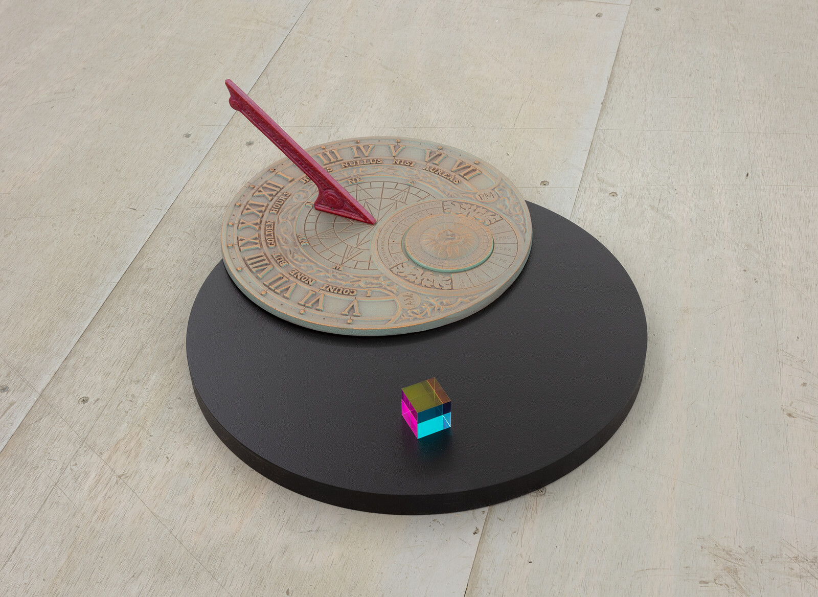
The word “dreamsickle,” like the word “chaos,” conjures numerous associations. Referring to the defunct brand of ice pop, it might invoke an orange gleam, a vanilla coat, the state of being frozen; more broadly, a “dreamsickle” suggests a tool used to harvest imaginative content, such as montage or color. In their show at New York’s 47 Canal, Lyndon Barrois Jr. and Kahlil Robert Irving probe at the chromatic (and chronomatic) channels by which cultural memory is sutured to political violence. Using collage, repurposed film stills, and frequent allusion to the coded lexicons with which we read color—for example, the artists specify that the exhibition title is formatted using the “pure Orange” code HEX #ff7c00—Barrois Jr. and Irving’s latest collaborative exhibition teases out the elastic, yet always discontinuous, circuits by which a person may inhabit the limits within which they are materially defined.
Installed at eye-level along the gallery’s main wall is Irving’s Sky_High (Low & fractured SMAERD) (all works 2021), a thin wooden shelf on which rest several square and rectangular panels that depict blue skies and fluffy clouds, cross-sections made from a digital composite image. The panels fill out the shelf’s sill, overlapping with one another from one …
September 17, 2021 – Review
Sara Cwynar’s “Glass Life”
R.H. Lossin
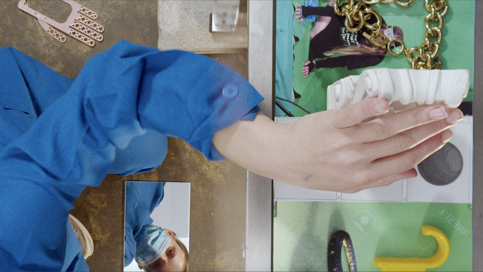
Early in T.S. Eliot’s Four Quartets (1941), we are told to get out: “Go, go, go, said the bird: human kind / Cannot bear very much reality.” Part of Eliot’s poem makes up a small fraction of the voiceover narration to Sara Cwynar’s six-channel video installation Glass Life (2021), a maximalist meditation on living amongst ever-accumulating and constantly moving images.
Glass Life is as dense audially as it is visually. The images are accompanied by two voices reading a sequence of largely unattributed quotes culled from texts and speeches by Anne Boyer, Margaret Thatcher, and William Shakespeare, among many others. But this line seems to offer a particularly apt cipher for a work that is about a life lived in and through an excess of images and text—a life whose reality is always in question, where the distinction between activity and documentation collapses, and representation precedes its object. What is the internet but a massive archive? And what is an archive but an institution, as Jacques Derrida noted in the mid-1990s, obsessed with cheating death? “The archiving,” Cwynar’s two narrators say, “makes the self seem richer and more substantial even as it becomes more tenuous.”
The internet is a space …
July 21, 2021 – Review
Every Woman Biennial, “My Love is Your Love”
Wendy Vogel
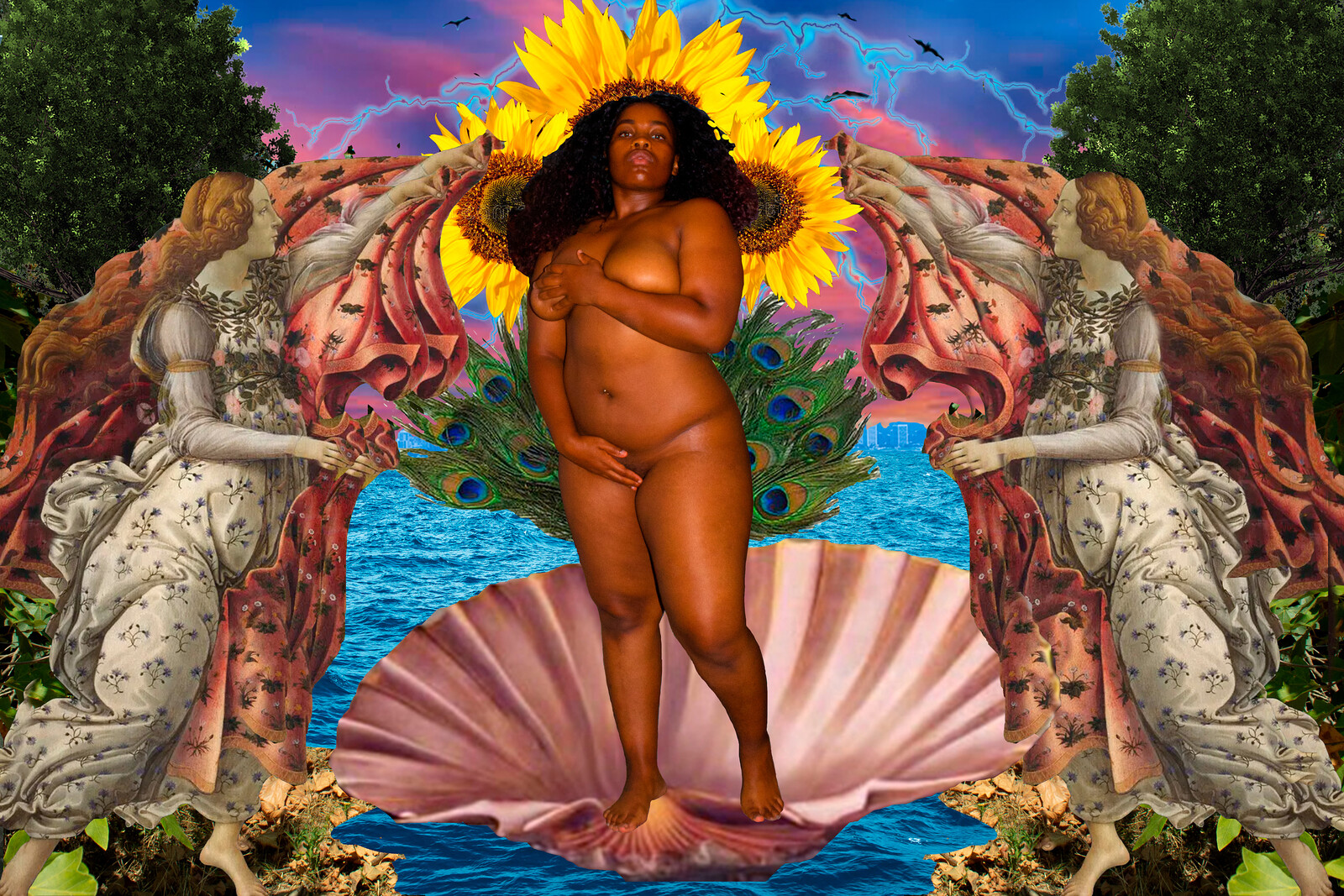
There’s always been a pioneering, even contrarian spirit to the Every Woman Biennial (EWB). Formerly known as the Whitney Houston Biennial, the inaugural exhibition opened in March 2014—in the same week as that year’s Whitney Biennial—as a scrappy one-day exhibition in a Brooklyn artist’s studio. With works by women artists hung floor to ceiling and ranging from figuration to agitprop, the Whitney Houston Biennial thumbed its nose at the tepid representational politics of the uptown affair from which it derived its (first) name. Over the next two New York editions C. Finley, the biennial’s founder, grew the exhibition to include hundreds of women and non-binary artists of diverse ages, races, and life paths.
The 2021 iteration of the EWB operated as a testing ground for the (post-?)pandemic new normal. The EWB expanded to London for the first time, presenting work by more than 300 artists in IRL locations for a week in early July. This year’s New York show, “NYC/NFT,” moved to the Wild West of the blockchain. Curated by Finley and EWB managing director Molly Caldwell, the show featured NFTs of works by 272 female and non-binary artists selected through an open-call proposal process. Superchief Gallery hosted the …
June 10, 2021 – Review
Nan Goldin’s “Memory Lost”
Talia Curtis

Since the advent of the US’s “War on Drugs,” popular media representations from Breaking Bad to Intervention to Celebrity Rehab with Dr. Drew have mirrored the political consensus on drug addiction, reducing it from a deeply political phenomenon driven by markets—both the pharmaceutical industry and underground economies—to a dialectic of stylized euphoria on the one hand and abject depravity on the other. Both the media landscape and the rehab industrial complex drip with a Protestant ethic that pits puritanism against hedonism: addiction is rendered as a moral failing, not what a growing scientific and sociological consensus understands as one symptom of a profit-driven healthcare system, systemic racism, and gross income inequality.
Nan Goldin’s work is antithetical to ideas of addiction that, by painting it as a personal failing, obstruct any substantive response to a devastating health crisis in favor of subjecting vulnerable populations to punitive violence. Against this backdrop, Marian Goodman Gallery’s first New York exhibition of Goldin’s work highlights several major pieces, including Memory Lost (2019–21), an impressionistic slideshow of life seen through the experience of addiction; its thematic sister Sirens (2019–20), a video work approximating the hypnotic ecstasy of being high; and The Other Side (1992–2021), an update of …
May 27, 2021 – Review
Cameron Rowland’s “Deputies”
Alan Gilbert
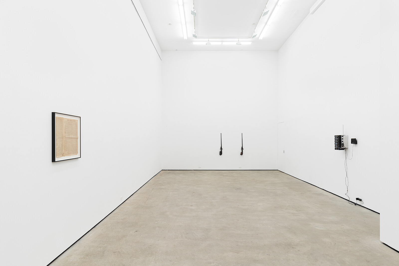
Cameron Rowland’s artworks sometimes feel as if they are meant to serve as illustrations for a text or historical thesis. I don’t say this as a criticism. His breakout 2016 exhibition “91020000” at Artists Space in New York City contained previously manufactured items—to use the term “readymade” would already begin to aestheticize them—that partly functioned as visual counterparts to their captions and to an accompanying essay made available as a pamphlet. Displaying desks and benches made by inmates, “91020000” addressed the prison-industrial complex, which disproportionately incarcerates Black men and is a crucial node in slavery’s ongoing legacy in the United States.
Rowland’s current exhibition, “Deputies,” contains four object-installations (all undated) and a longer essay also available in takeaway pamphlet form. The theme here is the origins of policing in the United States with the establishment of slave patrols that monitored and disciplined the subjugated and hunted down fugitives. With a nod to site-specificity, the exhibition focuses on New York City (where the first official U.S. police force was created following the passage of the 1844 Metropolitan Police Act), and extends outside the gallery space to five benches installed in a nearby park, each one paying homage to a different unmarked …
May 20, 2021 – Review
Monika Baer’s “loose change”
Peter Brock
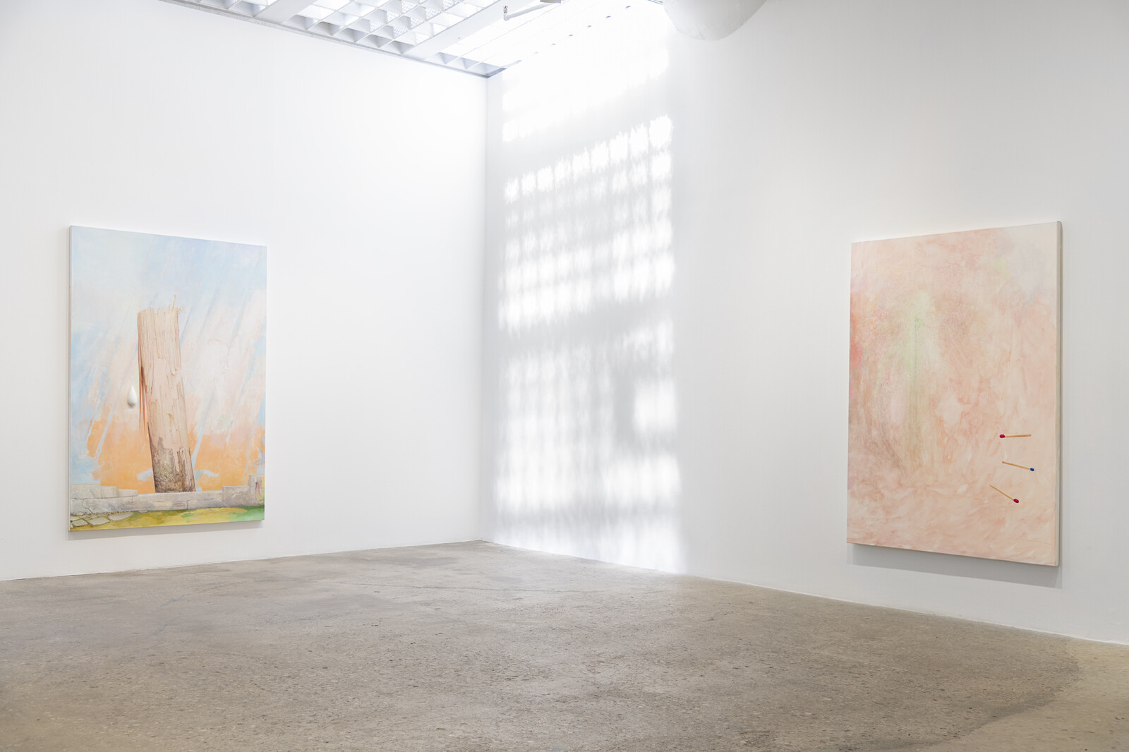
The six watercolors that greet the viewer when they enter “loose change,” Monika Baer’s second exhibition at Greene Naftali, offer a pared-down introduction to the artist’s habit of combining heterogeneous elements within the space of a single picture. In one sense, these modestly sized paintings are straightforward: splotchy pools of pigment on chunky paper with a few coins glued to their surfaces, sometimes in little clusters. The painted bits look casual, loosely composed, and unselfconscious. Faint lines meander through The Grove (2021) with such ease that they almost resemble accidental scratches from a bracelet or the dull end of a tool. Two of these works have fragments of small sawblades screwed into their surfaces. The watery dabs of paint in Loose Change (2021) seem not to notice the menacing metal teeth less than an inch away, whose rusted tips look weary but fierce. The literal and symbolic density of these metallic intruders contrasts strongly with the soft haze of the watercolor passages. At first it seems like the only relationship these chunks of metal have with the paint is that a few of the coins overlap with the colors.
Face Up (2021) contains a loose wash of pale blue …
May 14, 2021 – Review
Smriti Keshari and Eric Schlosser’s “the bomb”
Hallie Ayres
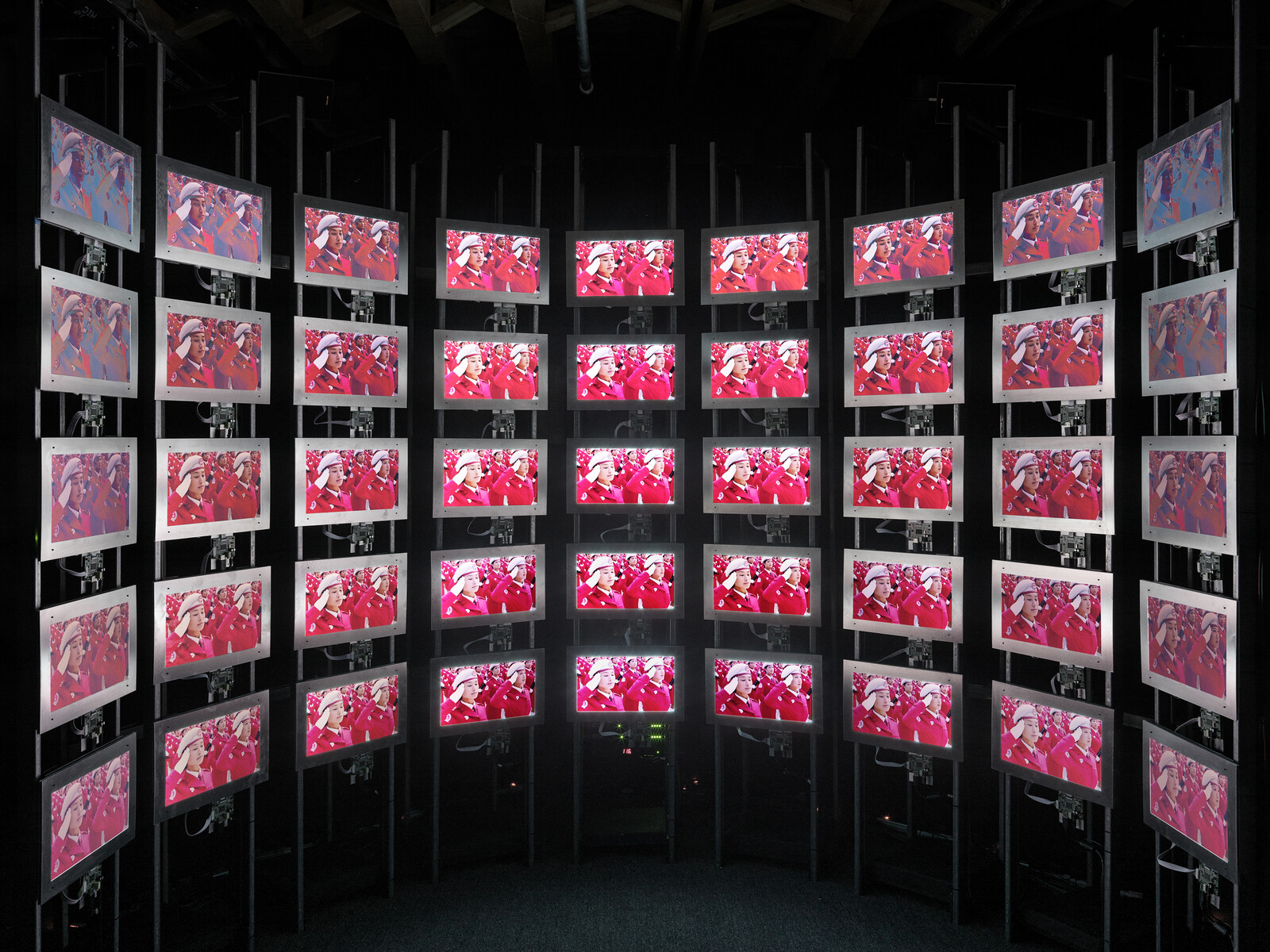
When an atomic mushroom cloud is reduced to an image, it is more likely to inspire awe than terror. This is the paradox that haunts Smriti Keshari and Eric Schlosser’s the bomb (2021), an immersive adaptation of a 2016 film that transmutes violence into spectacle in an attempt to teach its audience a lesson. These sensational images, though ostensibly employed in the service of nuclear disarmament, instead exaggerate the perverse glamor of mass destruction.
At Pioneer Works, the black-box installation resembles a military command center, curved to simulate the enclosure of a cockpit. The effect calls to mind Charles Eames’s Glimpses of the U.S.A., which collaged thousands of images of “typical” American life into 13 minutes and projected them onto seven massive screens suspended within a geodesic dome. The reference to Eames’s consumerist propaganda, famously displayed at the American National Exhibition in Moscow in 1959, sets a prescient tone for a film that spends nearly half of its 59-minute runtime rehashing Cold War talking points. Playing through five rows of nine LED screens, the thematically grouped footage follows a loose chronological cycle: contemporary displays of military might; US propaganda footage of nuclear testing and safety drill education; the destruction of Hiroshima …
May 7, 2021 – Feature
Frieze New York
Osman Can Yerebakan

Nostalgia was the prevailing feeling as I approached Frieze New York’s new home at The Shed in Hudson Yards. I wasn’t around when the piers were a queer hub of sex and solidarity, but I remember the East River breeze on the ferry to Randall’s Island on previous visits to the fair, and a time before Thomas Heatherwick’s (indefinitely closed) eyesore The Vessel. Frieze’s pandemic-enforced change in venue brings into sharp relief the disparity between the neighborhood’s new occupiers—business-casual millennials; more recently those getting their vaccines at the nearby Javits Center; and, now, fair-goers—and the legendary stories that haunt the crumbling docks. It was nonetheless hard not to miss the old spectacle of the fair, which has been replaced by a new and more muted tone.
In place of the gigantic sculptures that guarded the vast fair tent in its previous location, visitors to The Shed find a series of more modest flower boxes. The Acute Art “augmented reality” app transforms them, via your phone screen, into Cao Fei’s RMB City AR (2020), a virtual rendering of an exploding, dystopian city. Stationed outside the entrance, the phone-activated work starts the chain of “camera moments” that stretches into the booths …
April 6, 2021 – Feature
“Grief and Grievance: Art and Mourning in America”
Ladi’Sasha Jones
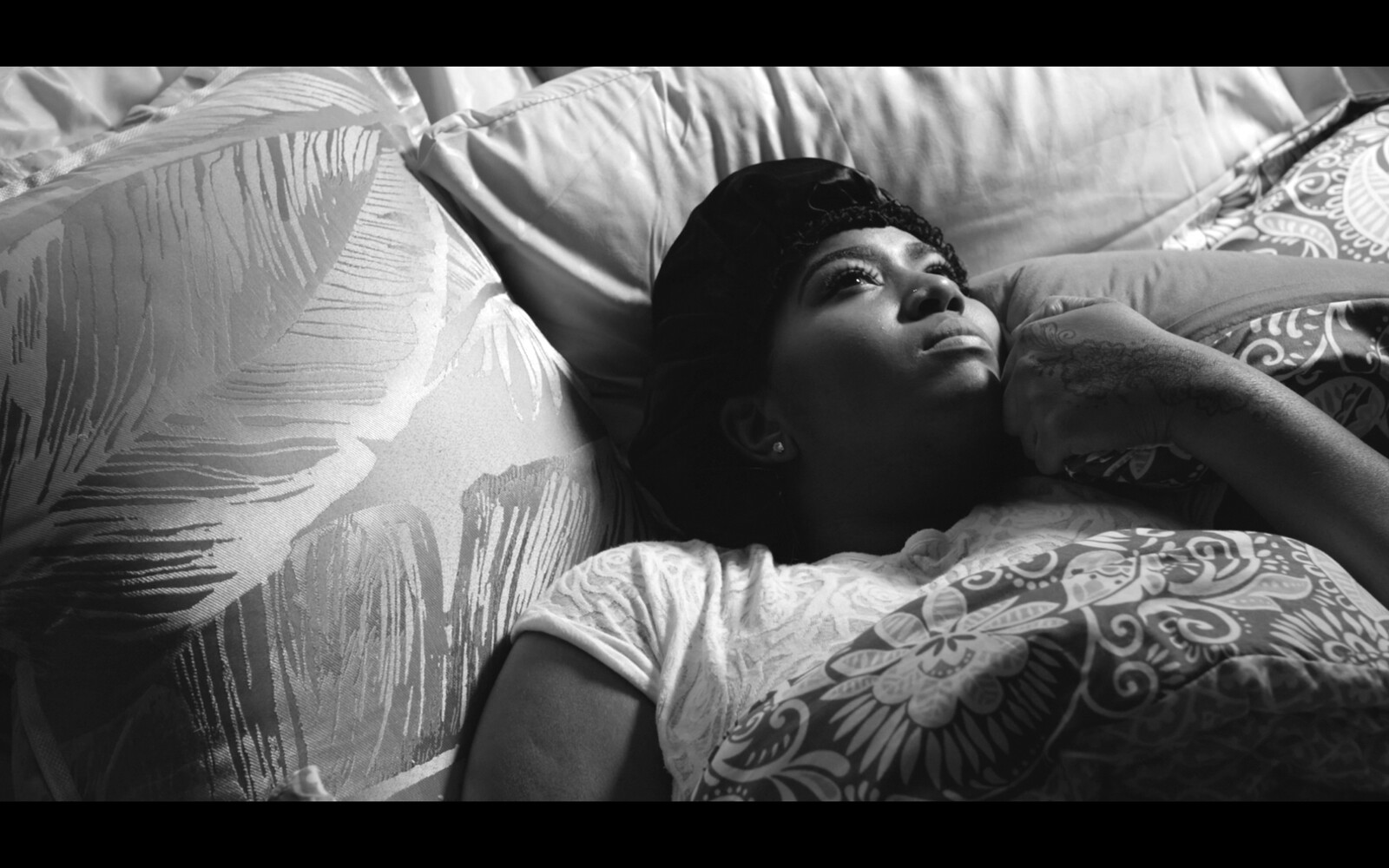
Ella Sheppard Moore’s father bought her freedom from enslavement as a child; as the lead arranger and composer of the Fisk Jubilee Singers, she grew up to establish Negro spirituals (or plantation songs) in the landscape of American popular culture. Listening to a 1909 recording of “Swing Low, Sweet Chariot,” which happens to be my favorite spiritual, I hear a haunting ringing out as the four members sing the phrase “coming for to carry me home”—taking a hold of the word “home,” stretching it, and drawing it out over a run of four notes wherein the register lowers twice as the chorus loops back around. What is utterly magnificent about this rendition of the song, which differs greatly from the version I grew up listening to and singing, is that it conveys a deeper, reifying story of radical refusal, stirring the condition that emerges from living in pursuit of freedom from the imagination of white terror. This kind of living is marked in the formations of early Black American music, wherein songs are in part prayers and prophetic visioning. They are spiritual speech acts that map pathways for new possibilities, self-possessed futurities.
Okwui Enwezor wrote that the social space …
March 26, 2021 – Review
Seung-Min Lee’s “Light White”
Peter Brock
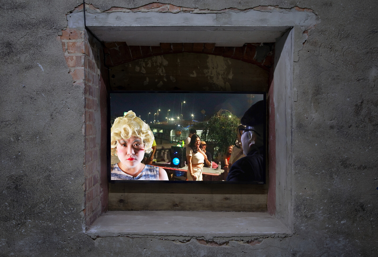
Seung-Min Lee’s satirical video installation challenges all claims to virtue, especially those that depend on reductive notions of identity. With four looping videos and their intermingling soundtracks, Lee transforms this subterranean gallery into a bunker where the air is thick with bad vibes. In these works, the artist—who was born in Seoul and grew up in Queens—performs as a suite of characters in a way that simultaneously debases and dignifies them. At the center of this effort is Lee’s impersonation of Kim Jong-un, who plays a role in all but one of the videos. Instead of the righteous condemnation and mockery common in western media, we find oddly intimate glimpses of the Supreme Leader and even the occasional moment of glee.
Frantic slurping sounds interspersed with a metallic clanking quickly drew my attention to a flatscreen television lying askew on the floor. Supreme Leader Feed 2 (Kim Jong Un Mukbang) (all works 2021) consists of looping footage of the artist scarfing ramen while dressed as Kim Jong-un. Filmed from the perspective of the bowl, this work is mostly chin, nostrils, chopsticks, and yellow noodles. The ramen occasionally covers the lens completely, resulting in lovely moments of glowing beige abstraction. Aside …
March 23, 2021 – Review
Lucy McKenzie’s “No Motive”
Laura McLean-Ferris
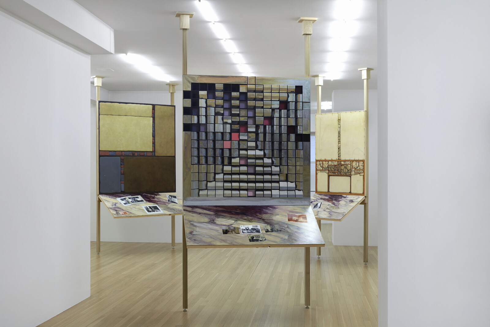
Aesthetic objects of art and design have unruly lives beyond their official business—they exist in homes, imaginations, shopping malls, state politics, and world histories in ways that are promiscuous and difficult to control. Over the last decade, Lucy McKenzie has depicted this pollination between forms in a captivating practice which unifies troubling, exciting, and mundane associative materials through the smoothing effects of style, most prominently trompe l’oeil painting.
Her exhibition at Galerie Buchholz’s New York space, “No Motive,” opens with Ethnic Composition (Moldova, Russian Ethnographic Museum) (2021), a kind of user guide to thinking through forms as composites of visual influence. Adopting the design of an informational display from the Russian Museum of Ethnography in St Petersburg, the artist painted a map of Moldova, divided into patches of cream, green, blue, and lilac, according to the styles of traditional dress in the country. On an “explainer panel” below, angled towards the viewer, we find, in place of any “key” to the data, six photographic prints: a mannequin in a museum display; a fashion illustration; a Mexican store mannequin dressed as “The Lady of Death”; a 1950s Russian department store mannequin; a young woman visiting a Moscow gallery; and, finally, an …
March 18, 2021 – Review
“Speculations on the Infrared”
Harry Burke
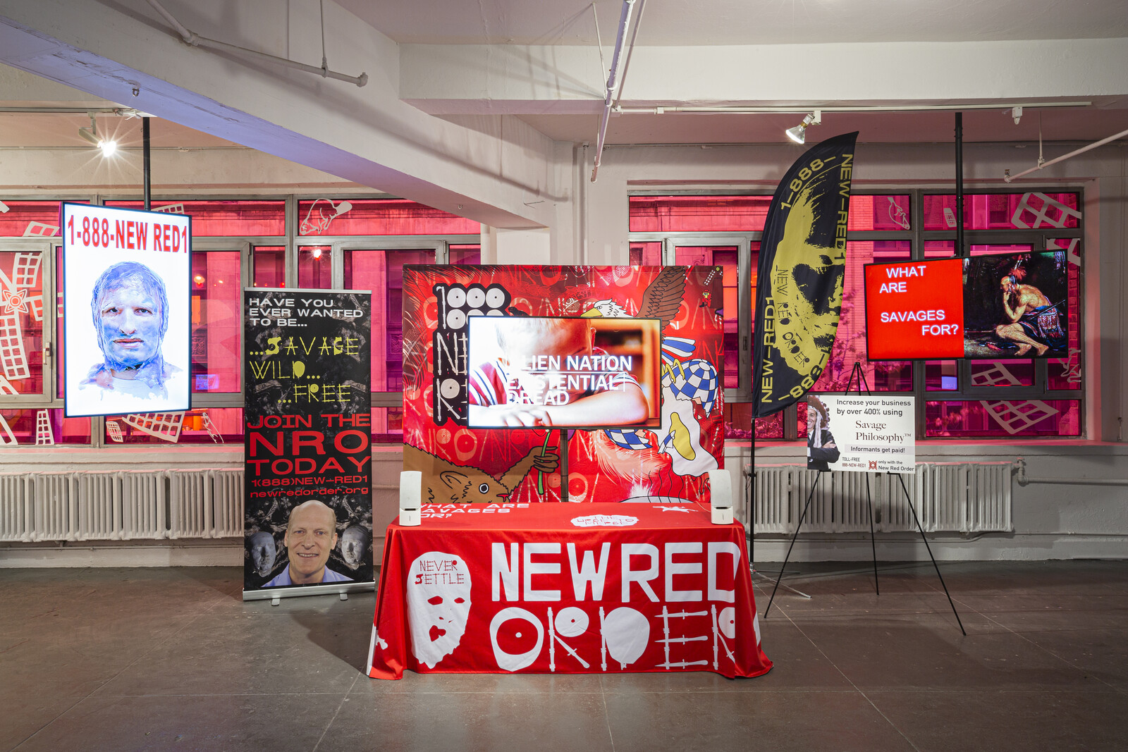
“Have you ever wanted to be… savage… wild… free?” asks a nylon banner in New Red Order’s Recruitment Station (2020–21). Mimicking the pat visual grammar of military recruiting tables, the multimedia booth—modelled on a portable trade show exhibit—solicits volunteer “informants” to join the self-styled “public secret society.” With plentiful wit, Recruitment Station frames a contradiction that haunts this exhibition of Indigenous futurisms: modernity has consistently subjugated Indigenous peoples, yet is driven by a sublimated desire for Indigeneity.
Addressing this bind, “Speculations on the Infrared” explores the ways in which Indigenous artists are dismantling settler colonial fantasies by asserting decolonized futures. Alan Michelson, a Mohawk member of the Six Nations of the Grand River, here displays Pehin Hanska ktepi (They killed Long Hair) (2021). The installation projects archival film of Indigenous veterans of the Battle of the Greasy Grass onto an antique wool trade blanket. Known in the settler mythos as Custer’s Last Stand, this saw several Plains tribes unite to defeat forces from the US Army during the Great Sioux War of 1876. The gridded, looping footage, recorded during a parade celebrating the battle’s fiftieth anniversary in 1926, recalls a winter count: a pictorial record used by Plains tribes to …
February 16, 2021 – Review
Casey Reas and Jan St. Werner’s “Alchemical”
Forrest Muelrath
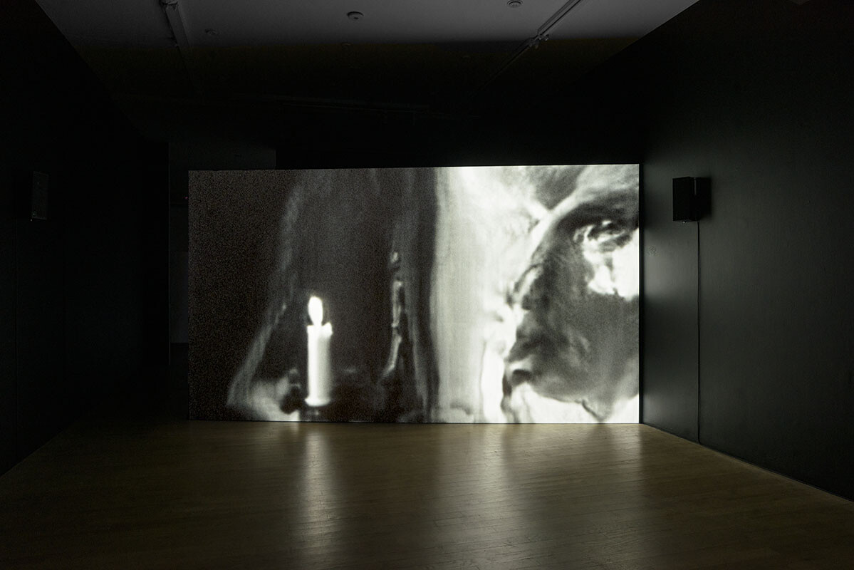
What would it take to simulate the sensorium of a single person on any given day and channel it into my own nervous system? Something like the SimStim technology in William Gibson’s 1984 novel Neuromancer, or the apparatuses that simulate the sensory experience of other people inhabiting other worlds in the Wachowskis’ 1999 film The Matrix. What if a machine were trained to create new 3D spaces based on photographs and videos: could it then simulate a world indistinguishable from our own?
Science-fiction fantasies and ethical questions such as these come easily when considering Casey Reas’s work. This has less to do with the images he creates than how he creates them. Reas is best known for co-developing Processing, an open-source software and coding language intended to make computer programming easier for non-programmer artists and designers. By turns poignant and unnerving, his exhibition “Alchemical” at New York’s bitforms showcases still images and videos made using generative adversarial networks (GANs), a machine-learning program that creates new images from processing thousands of existing ones. The images are accompanied by glitchy, hypnotic music composed by Jan St. Werner, one half of the electronic music duo Mouse on Mars.
In the first room …
February 8, 2021 – Feature
“WACK! Art and the Feminist Revolution”
Wendy Vogel
The Rearview series addresses blind spots in contemporary art history by returning to an influential exhibition, work, or text from the past and reflecting on its relevance to the present. In this edition, Wendy Vogel considers how the 2007 touring exhibition “WACK! Art and the Feminist Revolution” marked a generational shift in art criticism.
Feminist art history may come to be defined as the era before and after WACK!. The onomatopoeic word—more a metaphorical whip-crack than a line in the sand—is shorthand for “WACK! Art and the Feminist Revolution,” an exhibition curated by Cornelia Butler that opened at the Museum of Contemporary Art, Los Angeles (MOCA) in March 2007. This pioneering institutional survey of feminist art brought together work made by more than 120 female artists and collectives between 1965 and 1980. In the introduction to the 500-plus-page exhibition catalogue, Butler stated her curatorial goals: “My ambition for ‘WACK!’ is to make the case that feminism’s impact on art of the 1970s constitutes the most influential international ‘movement’ of any during the postwar period—in spite or perhaps because of the fact that it never cohered, formally or critically, into a movement.” It remains a bold statement today; it was …
January 22, 2021 – Review
Sable Elyse Smith’s “FEAR TOUCH POLICE”
Natasha Marie Llorens
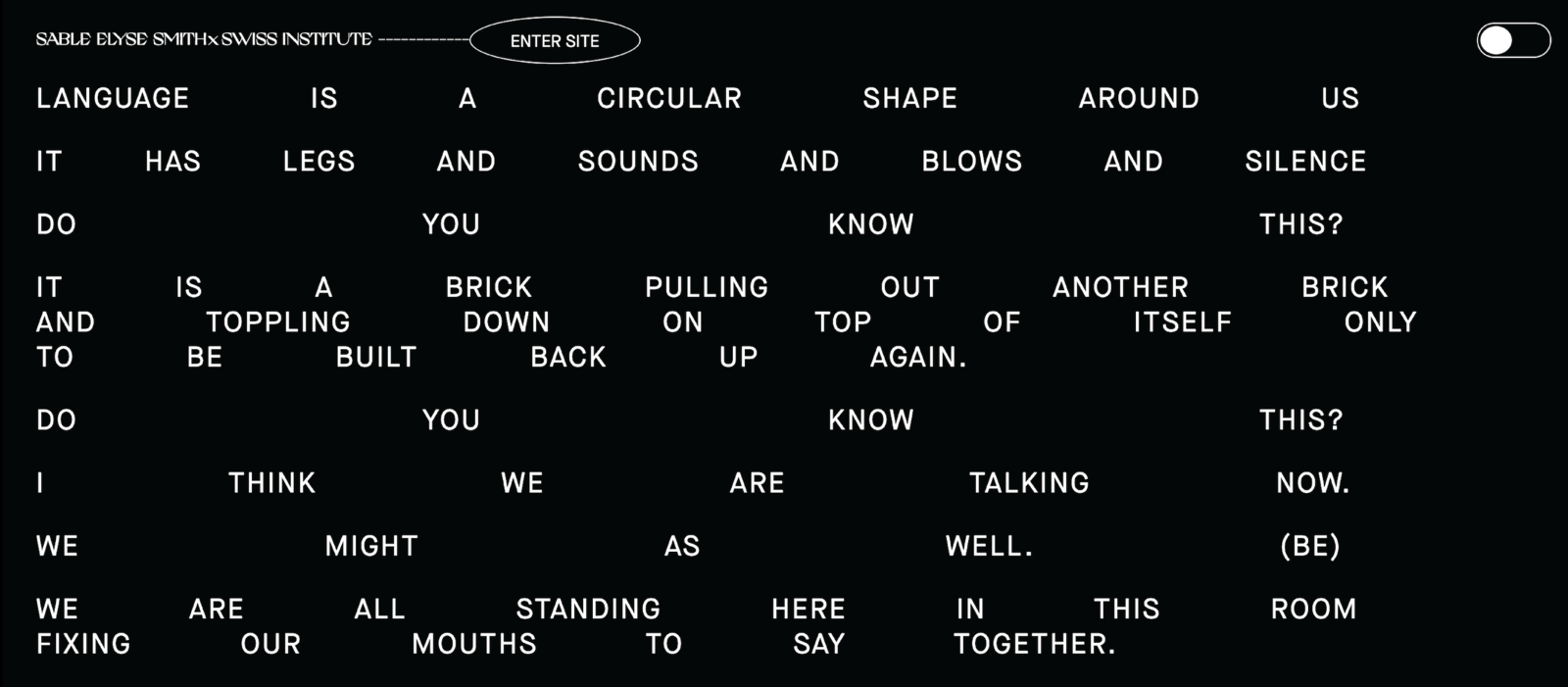
A short clip functions as the backdrop for Sable Elyse Smith’s multimedia project in three issues—“FEAR TOUCH POLICE”—commissioned by the Swiss Institute and exhibited on a dedicated website. It is roughly 18 seconds of footage showing a solitary car parked by the side of a road at night engulfed in flame. After 14 seconds the car explodes, the camera jolts and then restabilizes. Then the clip resets.
The fire is omnipresent as I scroll down through the five entries that make up “Issue one: FEAR.” I zoom into Jibade-Khalil Huffman’s poem, which is printed in infinitesimal letters to the right of the screen, and the fire is there. It explodes around the edges of the embedded screen on which plays Johan Grimonprez’s classic montage film dial H-I-S-T-O-R-Y (1997). “If you are reading this, then you have found yourself in a time consumed by crisis,” writes Jessica Lynne in her contribution entitled “A letter written on a day without the sun,” and the car explodes in the background. Several paragraphs later she writes about her wish for a “place that is not riddled with food insecurity or housing instability or extrajudicial murder or…” and the car explodes again.
Neither …
January 6, 2021 – Review
SoiL Thornton’s “Does productivity know what it’s named, maybe it calls itself identity?”
Rahel Aima
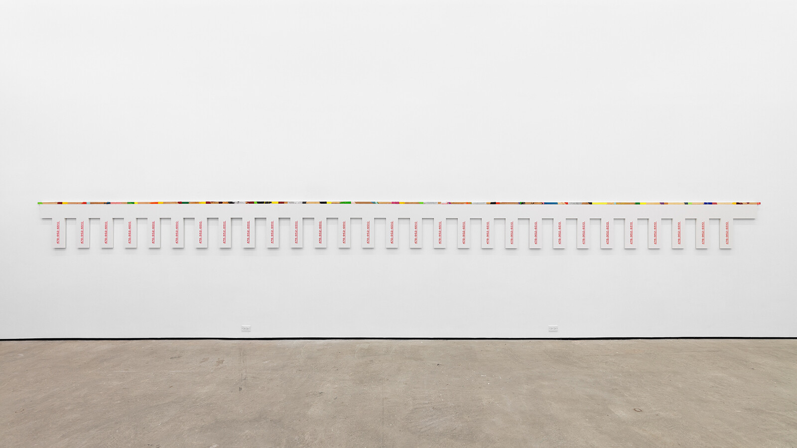
In SoiL (formerly Torey) Thornton’s 2019 solo show at London’s Modern Art, a Macon, Georgia-area number was spray-painted across one corner of the gallery. In their current show at Essex Street, New York, the same number repeats on a crenellated Formica tear-off flyer, titled Dematerialize now but as self portrait to whom (1990-2020 Labor Cont(r)act) (all works 2020 unless otherwise stated), an oversize version of the kind you might see advertising piano lessons or rooms for rent. Used paint sticks along its top edge create an overall effect of a printer test page. But here, it’s the artist that’s for sale in one of the most frankly exciting shows I’ve seen this past year. Call them, maybe.
In 2020, art institutions sought to offer a corrective to the historical marginalization of BIPOC artists. Or perhaps dealers are more interested in meeting the predictable uptick in market demand. In the aptly titled “Does productivity know what it’s named, maybe it calls itself identity?” Thornton unpicks this fetishization of identity and, as their diaristic exhibition text puts it, “biography as trap.” They wonder whether the cultivation of individual celebrity—especially one whose work is predicated upon their racial or gender identity—is a …
December 9, 2020 – Review
Ambera Wellmann’s “Nosegay Tornado”
Jessica Caroline
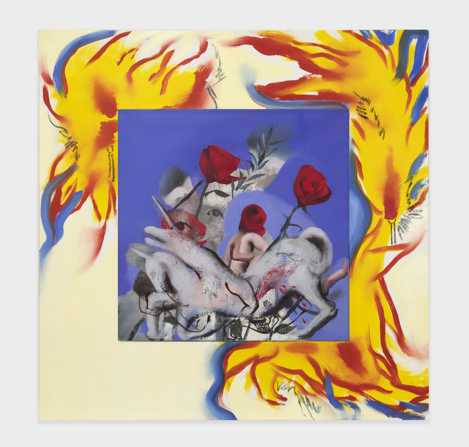
Ambera Wellmann’s roses are not sick. They are not exactly well, either. The paintings in “Nosegay Tornado” stage fantasy landscapes in which bodies topple out of other bodies, depersonalized and pliable, genitalia effaced, often surrounded by enormous flowers. Her arrangements call to mind the doomed visions of Georges Bataille or William Blake, in which beauty is always poised between grace and destruction. Wellmann’s work also exists at the juncture of excess and profanity, where the material and spiritual realms dissolve into each other. Her triumph is to make these weary old Romantic and Surrealist tropes seem fresh.
In The Unicorn Captivity (all works 2020), roses are anxious placeholders for human heads. Their bodies ride a two-headed unicorn beneath echoes of the eye in Odilon Redon’s Le cyclope (c. 1914); the scene is bordered by flames. The edges of Wellmann’s brushstrokes are soft, her contours indistinct. Like many of the bodies in her paintings, the unicorn appears to be splitting and doubling, recalling earlier works that play on the idea of autoscopy—the ability to hallucinate externalized versions of oneself. Blue Bouquet presents a different kind of framing device, giving the impression that the viewer is peeping through a service window or, perhaps, …
December 4, 2020 – Review
Salman Toor’s “How Will I Know”
Murtaza Vali
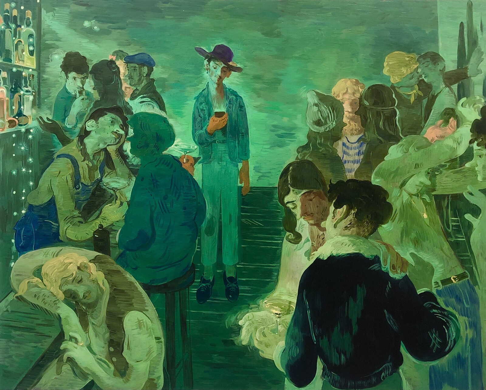
Nine months since the pandemic first hit New York, it is hard not to be moved by Salman Toor’s tender and luminous paintings, fifteen of which make up “How Will I Know,” his first solo show in a museum. In them young queer men gather inside and outside bars, dance joyously in apartments, embrace tenderly, and chat quietly on stoops and sofas, banal scenes of everyday intimacy and sociality that our seemingly interminable forced isolation has rendered both unfamiliar and precious. Skillfully composed of accumulations of short sketchy brush strokes, they picture the innocent ease of pre-pandemic revelry when the simple act of coming together was still untainted by the invisible threat of contagion.
Though inspired by moments from his life, Toor’s scenes are composed entirely from memory and imagination, and form visual analogues to the literary genre of autofiction, as co-curator Ambika Trasi persuasively argues in an accompanying essay published online. Some are given a dazzling emerald tint, energizing their quotidian settings with the buzz of dreamy fabulation. Toor conceives of his slender young male figures as marionettes, a quality emphasized through their slightly elongated noses á la Pinocchio. However, their sleepy downcast eyes, drooped shoulders, and limp, …
November 24, 2020 – Review
Yara El-Sherbini’s “Forms of Regulation and Control”
Dina Ramadan
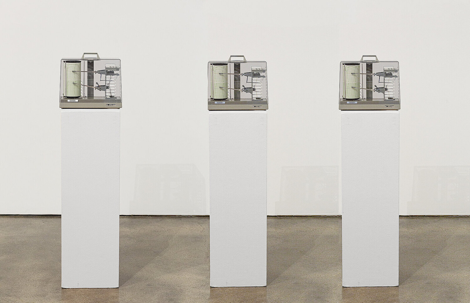
It is impossible to separate my experience of Yara El-Sherbini’s “Forms of Regulation and Control” from the circumstances surrounding the viewing: the end of a balmy November day, awash with the jubilation of Donald Trump’s electoral defeat. The first US solo exhibition for British-born, Santa Barbara–based El-Sherbini, curated by Naeem Mohaiemen, is an elegant rejoinder to the din of recent months. Deftly weaponizing humor through a series of discreet interventions, it challenges the so-called “unconscious” bias that permeates even the most seemingly benign forms of knowledge and their production.
“Forms of Regulation and Control” is an exhibition conceived and reconceptualized in the wake of the pandemic; El-Sherbini’s work, usually tactile and interactive, is incompatible with our current socially distanced reality. The game “Border Control” (2017), the only pre-pandemic piece in the show, is an example of the kind of audience participation El-Sherbini usually employs. In something reminiscent of the children’s game, players must trace a charged metal wire shaped like the US-Mexican border with a circular metal tool, all the while avoiding making contact with it: if they do, they will sound off alarms and lights. And yet the way in which the exhibition has been reimagined serves to highlight …
November 10, 2020 – Review
Ellen Lesperance’s “Together we lie in ditches and in front of machines”
R.H. Lossin

Let us begin with the grid: flat, rational, anti-mimetic, static. The grid, writes Rosalind E. Krauss, “announces […] modern art’s will to silence, its hostility to literature, narrative, discourse.” If the grid can be said to represent anything, Krauss argues, it is the two-dimensional surface of the canvas itself. Nine new gouache- and graphite-on-paper works by the Portland-based Ellen Lesperance present us with evidence to the contrary.
Lesperance’s grids are not austere or empty—the hand-drawn graphite lines hold layered squares of color that combine to produce, from a certain distance, the appearance of tightly woven tapestry. But they are still, insistently, grids—the lines are visible and the shapes emerge from a series of squares whose boundaries are observed. What differs from Krauss’s evaluation here is not the grid itself but its function. These grids speak. Their content is historical, narrative, real. Far from being silent, these artworks are a condensed, formal expression of years of research into feminist, anti-nuclear activism.
In 1981, the Welsh group “Women for Life on Earth” walked from Cardiff to Greenham Common in Berkshire, England to protest the installment of ninety-six Cruise nuclear missiles. The protest turned into an encampment—the Greenham Common Women’s Peace Camp—that remained …
October 8, 2020 – Review
“Marking Time: Art in the Age of Mass Incarceration”
Adam Kleinman
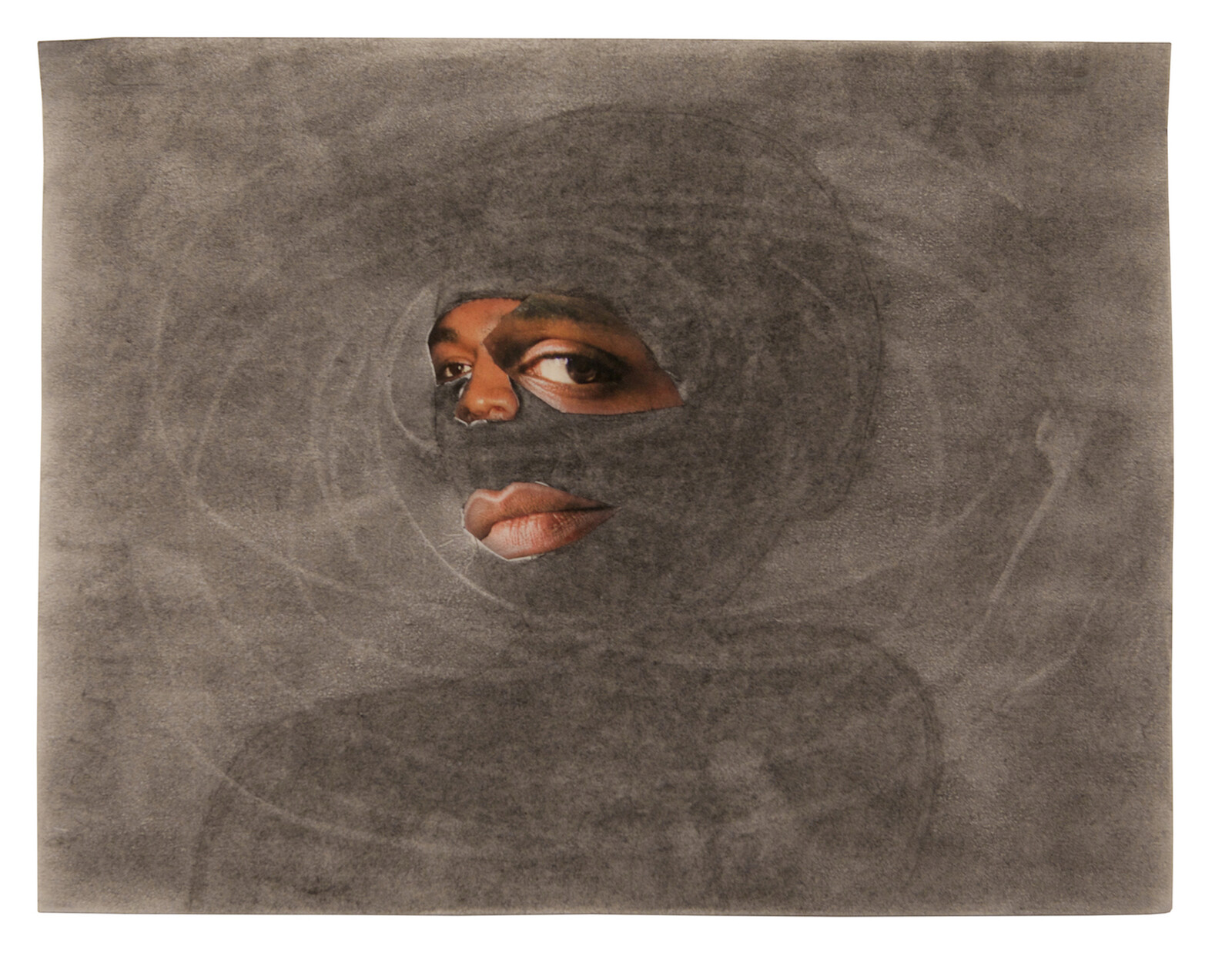
The feeling that physical detention is only one aspect of a grander system of constraint haunts “Marking Time: Art in the Age of Mass Incarceration.” Curated by Nicole R. Fleetwood, Amy Rosenblum-Martín, Jocelyn Miller, and Josephine Graf, and based on Fleetwood’s book of the same name published earlier this year, the adroit exhibition at MoMA PS1 features work by past and present detainees as well as their extended family, friends, and advocates, alongside pieces by other nonincarcerated artists. In doing so, the show maps what Fleetwood calls “carceral aesthetics,” referring to the wide-reaching ways in which the US prison-industrial complex affects cultural production, and how such artifacts draw an image of our society at large.
On a formal level, several works note how artists overcome the material limitations inherent to forced captivity. Jesse Krimes’s Apokaluptein 16389067 (2010–13) is a vast fever dream. Hung as a floor-to-ceiling panorama on a curved wall, it consists of heaven, earth, and hell drawn in pencil over newspaper images transferred using hair gel onto 39 bed sheets—each of which were individually smuggled out of jail via the postal system. A low plinth in another chamber hosts Dean Gillispie’s nostalgic maquettes depicting 1950s Americana …
September 18, 2020 – Review
Tavares Strachan’s “In Plain Sight”
Orit Gat
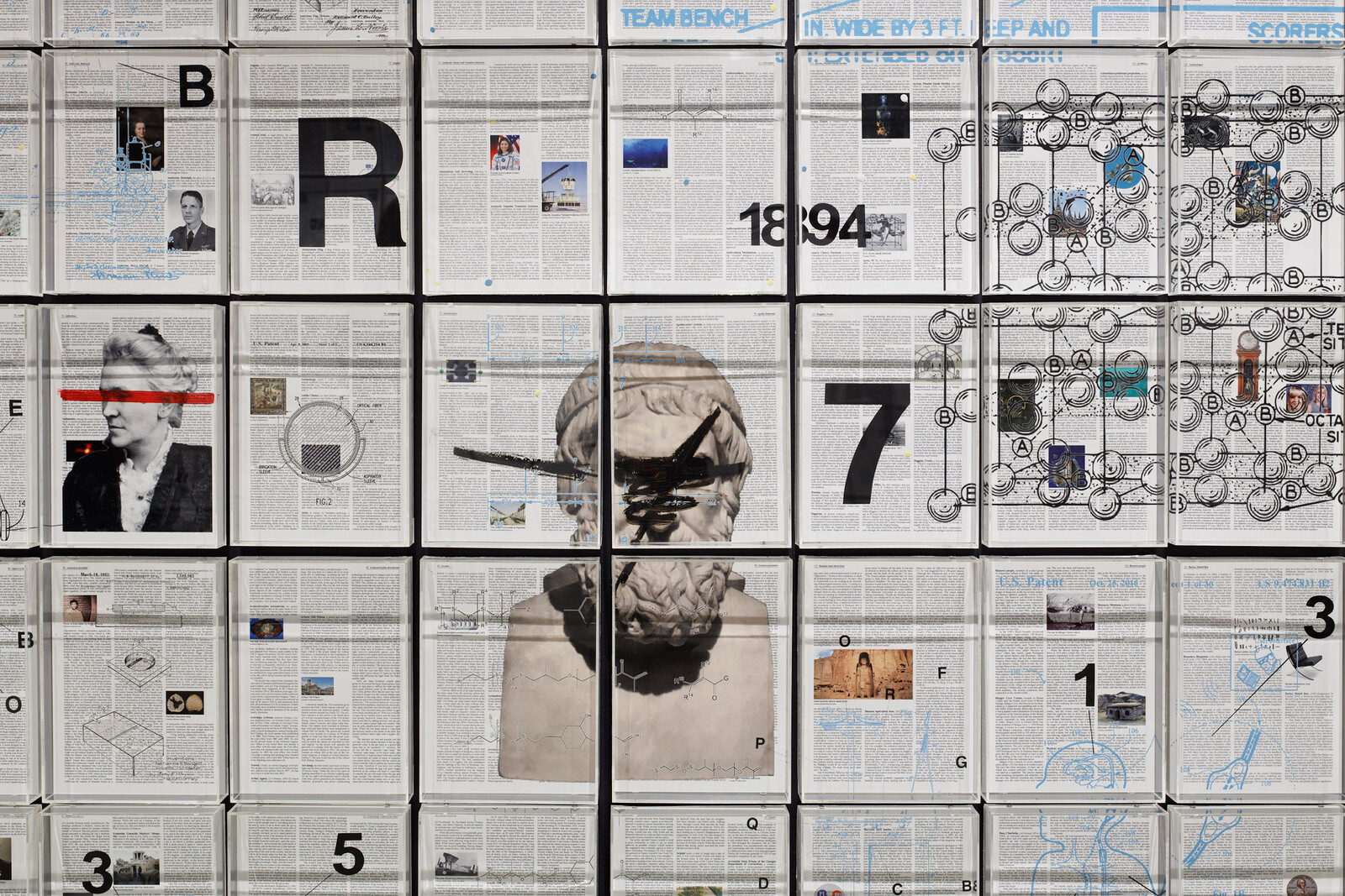
How are stories told? Who is remembered, who forgotten, and why? Which narratives last and what histories remain unaccounted for? These are questions of the moment, when representation is crucial to political struggle and debates on decolonial knowledge gain mainstream traction. Tavares Strachan’s exhibition at Marian Goodman suggests that what was neglected was always in plain sight, and that what was missing from the narrative was often not image-making but storytelling.
A large, leather-bound and gilded book is displayed in a mahogany and glass case. Titled The Encyclopedia of Invisibility (Mahogany #9) (2018), it is part of an ongoing project that has featured in different iterations in several of Strachan’s previous exhibitions: its thousands of pages include entries dedicated to people, places, and events that were omitted from the Encyclopaedia Britannica, that is, systemically sidelined by Western history. At the most recent Venice Biennale, he displayed another version of the work, subtitled White (also 2018), along with pieces dedicated to Robert Henry Lawrence Jr., the first African American astronaut, who died in a training accident in 1967. “In Plain Sight” departs from another African American explorer: Matthew Henson, who was part of an expedition with Robert Peary and four Inuits …
July 27, 2020 – Feature
New York City Roundup
Terence Trouillot
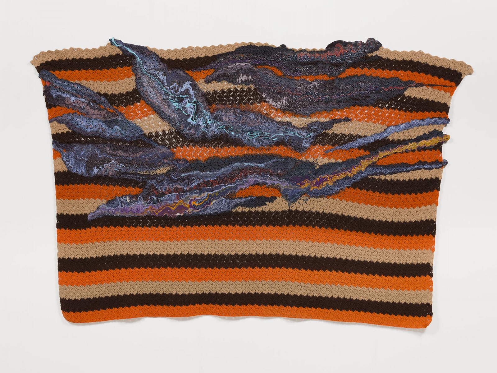
I didn’t think I’d be this excited to go back to a gallery. In some ways, I’ve enjoyed experiencing art within the confines of my Brooklyn apartment over the past months, and I’m still excited by the possibilities arising from the advent of novel digital platforms. But this time away from real-life art viewing has made the experience a novelty, and as galleries started to reopen it felt like a much-needed indulgence—after months of social distancing, and then weeks of defying said social distancing to protest in the streets against the most recent examples of state-sanctioned violence against Black bodies—simply to be back.
At “Jack Whitten. Transitional Space. A Drawing Survey.” at Hauser & Wirth on the Upper East Side—an exhibition which outlines Whitten’s exceptional works on paper chronologically, from the 1960s to the 2010s—I was surprised by the boyish glee I felt just at noticing the pronounced physicality of paper: the deckled edges, the wrinkle in the page, the raised contours of paper cut-outs collaged onto another flat surface. The show demonstrates the careful evolution in Whitten’s work from figuration to abstraction, but also focuses on the artist’s attention to material, and the various techniques that make his later …
July 23, 2020 – Review
“A Language for Intimacy”
Natasha Marie Llorens
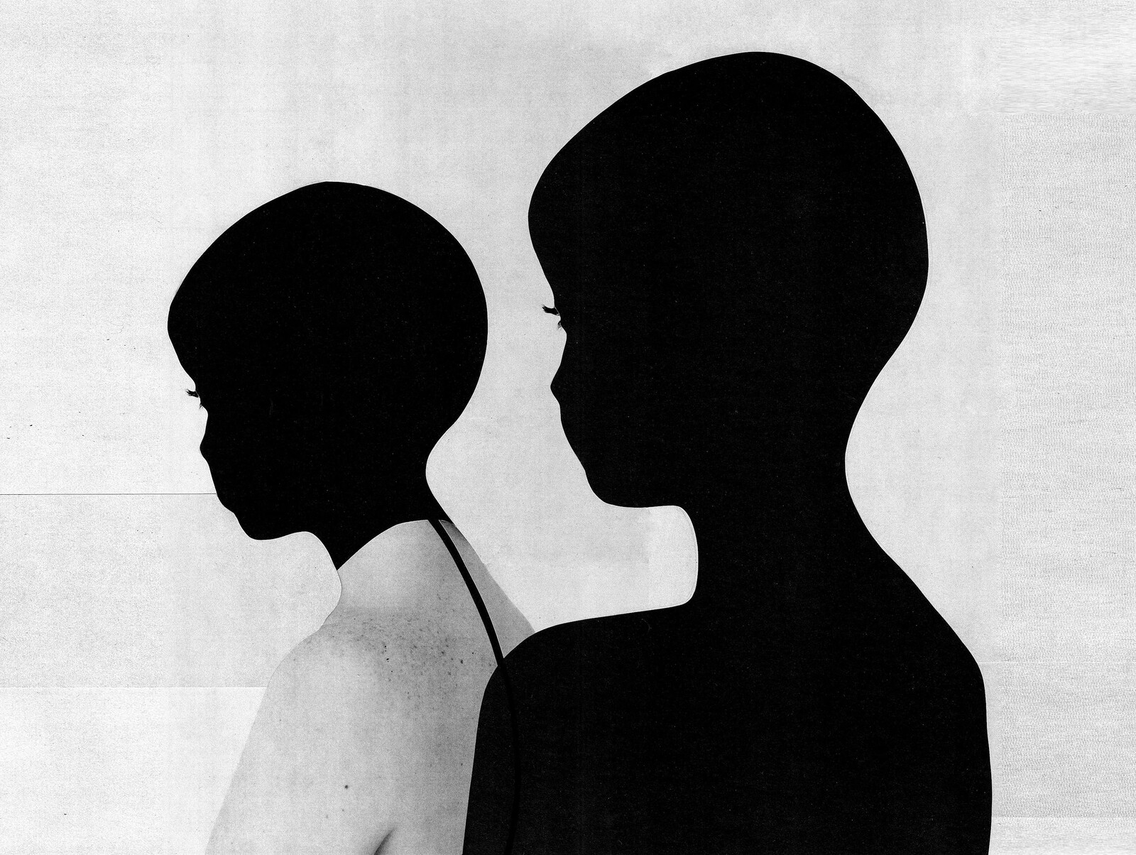
“A Language for Intimacy” is an online group exhibition, curated by Amanda Contrada and Terence Trouillot, addressed to the notion of intimacy. The project is set up as a dialogue between nine artists and nine writers. Each page centers images of an artwork at the top, with an interpretative meditation below it. To take one example, Sougwen Chung’s Corpus VII, from the series “(distance) in place” (2020), is a drawing made using a robotic arm, in which Claire Voon sees “the poetic promise of mechanical and artificial systems to imagine forms of closeness in an increasingly estranged world.” Voon’s observation could be extended to the project as a whole. Contrada and Trouillot have assembled a portrait of entanglement between humans, and our entanglement with the technologies of perception we use to try to reach each other. What emerges is the sense that intimacy is in crisis, infused with a profound exhaustion and uncertainty.
In late March 2020, Paul B. Preciado published a short piece in Artforum describing the moments after he emerged from the sickbed in an empty Parisian apartment. The last paragraph struck me as a particularly apt analysis of intimacy during the present pandemic. He wrote a …
May 28, 2020 – Review
“Metro Pictures Online Film Festival”
Anthony Hawley

It might be a stretch to call an online screening program of gallery artists a “film festival,” just as it might be a leap to describe an online viewing room as an “exhibition.” But “Metro Pictures Online Film Festival” offer its viewers something that resonates in our infinitely streamable world: a series of reckonings with time out of joint and objects out of place. Time capsules, time travel, and temporal transformations abound in works exploring the brevity of life and our troubled relationship to the past.
“I suggest we change the function of this building!” declares a character in David Maljković’s Scene for a New Heritage (2004), the title work in a trilogy featured in the festival. The building in question is the Monument to the Uprising of the People of Kordun and Banija in the Petrova Gora mountain range in Croatia, to which the film’s three protagonists have pilgrimaged as part of their “quest for heritage” in the year 2045. The characters’ reality, symbolized by the tin-foil-covered cars they drive, doesn’t match up with the grandiose future promised by Vojin Bakić’s glittering postmodernist monument, one in a series of towering Croatian spomeniks commemorating revolutions and uprisings against fascism during …
April 7, 2020 – Review
Jutta Koether’s “4 the Team” / Jana Euler’s “Unform”
Wendy Vogel
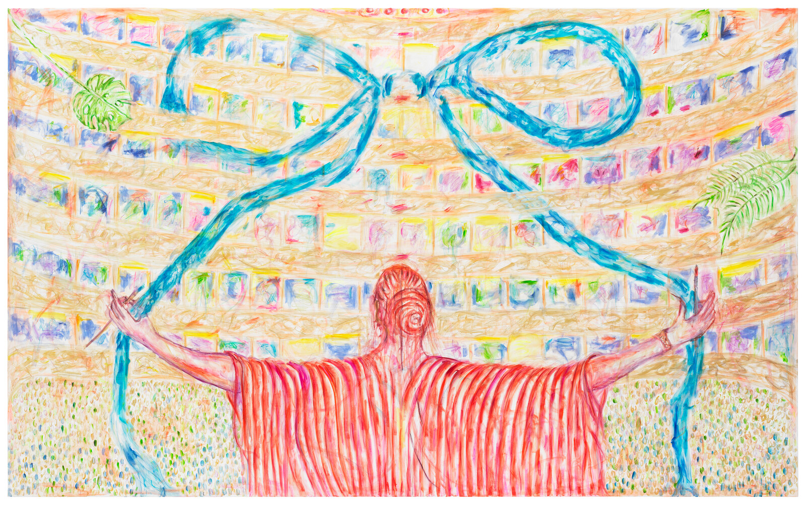
Days before New York’s galleries shuttered in mid-March, I saw exhibitions of figurative paintings by Jutta Koether and Jana Euler that read to me like biological weapons threatening the patriarchal history of art. Worried that I may have become an invisible conduit for viral contagion, my heightened bodily self-consciousness found echoes, first, in Koether’s exhibition “4 the Team,” the German-born painter and musician’s first solo show at Lévy Gorvy. For this mini-survey of the artist’s works on canvas from the 1980s to the present, Koether variously adopts vulnerability and heroism as painterly moods. Her practice—born out of the discourses of appropriation, feminism, and institutional critique—often hinges on the theatrics of installation: stage lighting, transparent glass walls, and performance. Here, she chose to leave the gallery’s elegant three-story space free of spatial interventions, allowing for an associative reading of the paintings.
The ground floor debuted a suite of triumphant new works—three large figurative canvases, and two smaller abstract pieces titled Vorhang [Curtains] in her signature palette of reds and pinks. At first glance the portraits Neue Frau [New Woman], Neuer Mann [New Man], and Encore, all from 2019 with a color scheme of contrasting pastels, appear optimistic about the state …
March 31, 2020 – Review
Peter Saul’s “Crime and Punishment”
Jonathan Griffin
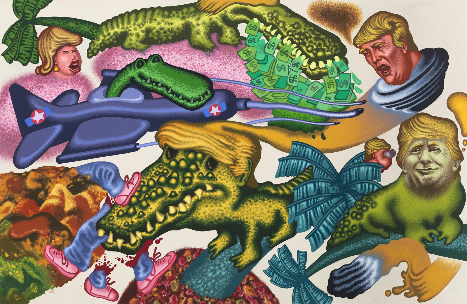
How much is too much, when it comes to the art of Peter Saul? How about: The big high box of the New Museum’s fourth-floor gallery stacked two-deep with more than two dozen large paintings in fluorescent hues? How about: Every gallery on the floor below packed with at least as many again, dating from 1960 to the present? How about: Three paintings that feature Donald Trump? Seven of electric chairs? Countless more figures with bullet-holes spewing glossy gouts of blood? A dog barfing onto the head of Rush Limbaugh, accompanied by a speech bubble that reads “BARF”? How about: One retrospective, only the second of the artist’s career, and his first in New York?
I thought I was a fan of Peter Saul, but “Crime and Punishment,” the five-decade retrospective curated by Massimiliano Gioni and Gary Carrion-Murayari, left me numb. Really, there is no other way to feel after seeing this much of Saul’s work, which trades in violent mayhem, visual noise, muscular kinesis, compositional derangement and—increasingly since the mid-1960s—hard-edged shapes rendered in bold and clashing colors.
There is no question that Saul is a virtuoso technician, as he himself seems eager to demonstrate. His meticulous use of pointillism renders …
March 13, 2020 – Feature
“Before and After Tiananmen”
Xin Wang
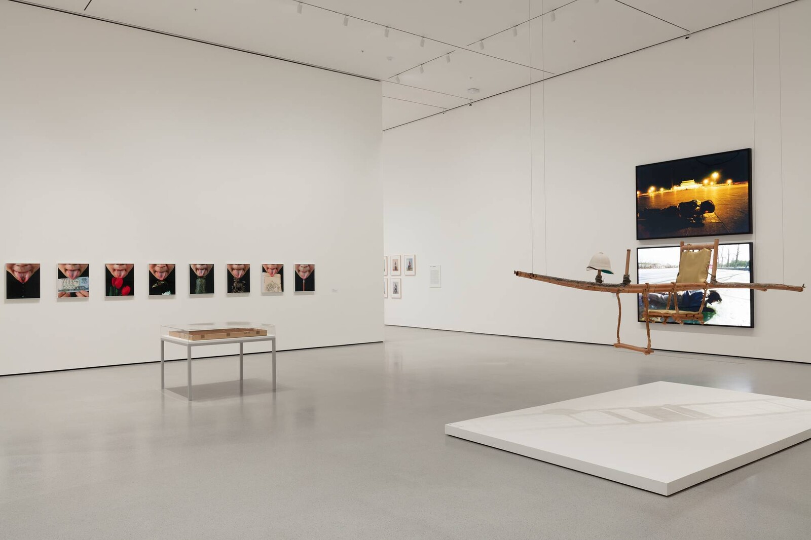
Imagine a curated overview of contemporary art from the United States titled “Before and After the Vietnam War.” Imagine the case not as a new direction for explorative scholarship but as the perpetuating, defining framework, over and over again. “Before and After Tiananmen,” Gallery 207 in the 2019 rehang of the permanent collection of the Museum of Modern Art, New York, presents established Chinese artists such as Xu Bing, Zhang Peili, Huang Yong Ping, and Song Dong in a sparse installation. Yet it registers not as a progressive move towards more inclusive and nuanced narratives of modern and postmodern art worldwide, but rather as a form of institutional gaslighting that raises deeper and stickier issues than the more manifest ills of exclusion or erasure. Reflecting a growing institutional recognition of heterogeneous global modernisms, it illustrates where that promise of progressive inclusivity falls short—and flat—if the historical framing remains uncontested, and situated knowledges are routinely overlooked. Presenting these alternative trajectories using the criteria and assumptions of the old canon—essentially treating them as outposts of western art history—will always miss the mark, limiting the discourse while purporting to expand it.
It is telling that in most reviews of the new MoMA, …
February 26, 2020 – Review
Hannah Levy’s “Pendulous Picnic”
Ksenia M. Soboleva
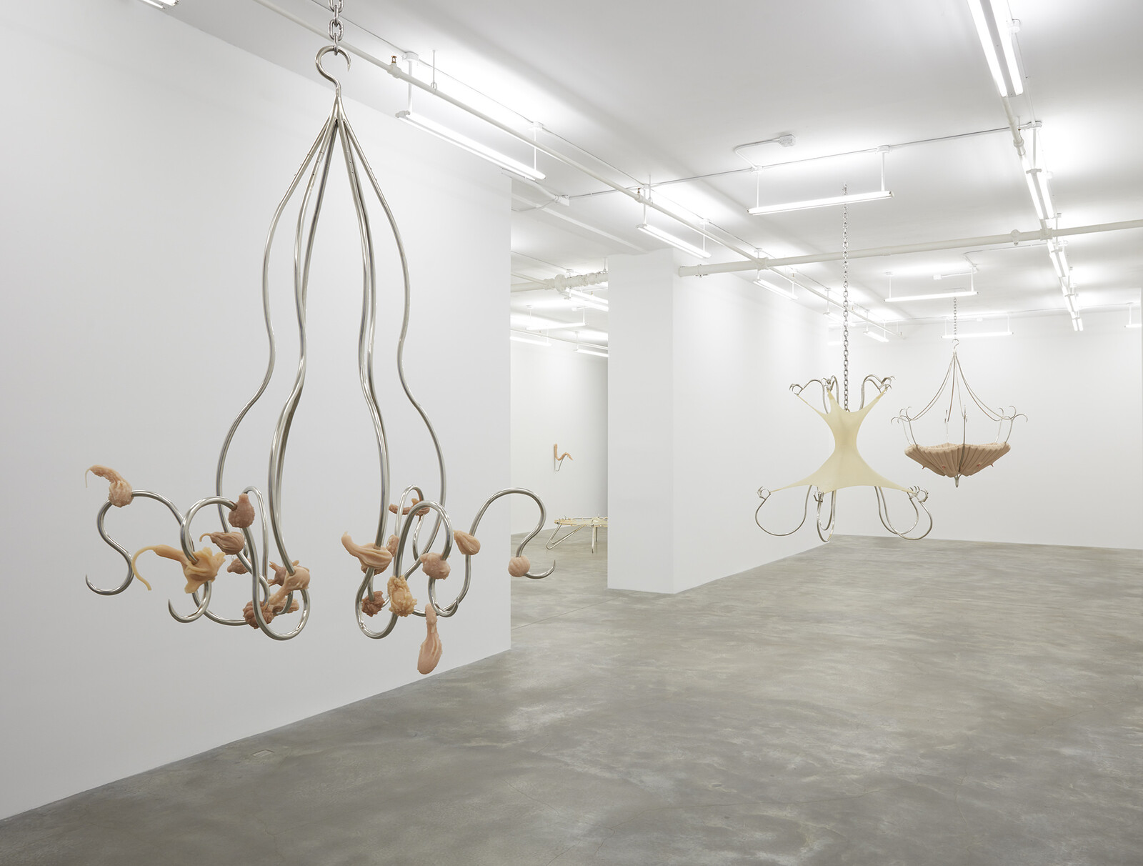
Hannah Levy’s sculptures can make you shudder. Working between sculpture and design, she extracts commonplace objects from domestic contexts and defamiliarizes them through her use of unexpected materials, distortion of scale, and exaggeration of their formal properties: their curves and bends. The sculptures in “Pendulous Picnic,” her first solo exhibition with Casey Kaplan Gallery in New York, combine silicone and steel—the artist’s signature materials—into multifaceted structures that conflate forms resembling vegetables and body parts in disturbing ways. Take her untitled series of wall-mounted sculptures (all 2019), in which metal fixtures hold up silicone casts of enlarged asparagus, a recurring motif. The artist renders each phallic object limp, drooping over the curved metal as if it might slide off any second—thereby denying any imagined potential for sexual pleasure.
More striking are Levy’s suspended sculptures, something of a departure for the artist. Hanging from the ceiling in the first gallery are three large, untitled structures (all 2020) reminiscent of nursery mobiles—though far too large and hazardous to be suitable for infants. The nickel-plated steel frames curl into chillingly sharp edges resembling fishhooks. The metal is pierced with silicone objects whose surfaces resemble pale skin: in the first sculpture the viewer encounters, casts of …
February 19, 2020 – Review
Jason Hirata’s “Sometimes You’re Both”
Saim Demircan
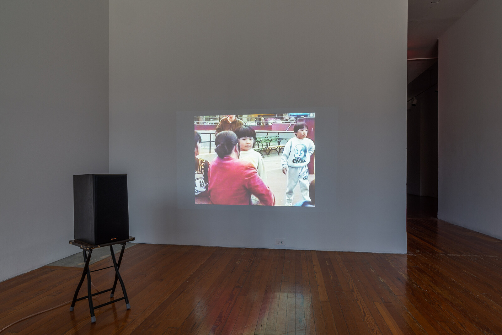
The ambiguity of Jason Hirata’s exhibition title speaks to his ambidexterity as artist and videographer, two roles that fold into one another in this show. Hirata produces videos for artists, as well as documenting live events and providing technical assistance, and this exhibition presents six videos he has worked on. The precise nature of his labor, however, remains oblique or uncredited, the exception being Hito Steyerl’s 2018 video Unbroken Windows (a piece of paper sellotaped to the wall lists Hirata as production manager and director of photography).
“Sometimes You’re Both” continues Hirata’s recent practice of deconstructing the solo show. For his “25 October, 2015—12 May, 2019” exhibition at Kunstverein Nürnberg in 2019, he exhibited other artists’ work under his own name. Similarly, “Sometimes You’re Both” is neither strictly artist-curated nor collaboratively billed. More liberty is taken here with the display of works than in “25 October, 2015—12 May, 2019”: technical equipment sits out in the open on tabletops. While this could be mistaken for slacker aesthetics, it’s rather another instance of the artist divulging the mechanics of artistic production—or, perhaps more specifically, the invisible labor behind installation. Films play from laptop to projector in a visible circulatory system. The …
February 7, 2020 – Review
“Theater of Operations: The Gulf Wars 1991–2011”
Dina Ramadan

Even before it opened, “Theater of Operations: The Gulf Wars 1991–2011” had attracted critical attention. A string of scandals highlighted once again just how embedded museums like MoMA, and its affiliate PS1, are in the military and prison industrial complexes responsible for so much of the devastation on display in this exhibition. Phil Collins’s withdrawal of his work from the show late last year, in protest of some MoMA board members’ investments in private prisons and ICE detention centers, was followed by a request from Iraqi-American artist Michael Rakowitz that the curators “press the pause button” on his video in order to “discuss some recent events.” After PS1 ignored Rakowitz’s request, the artist paused the video himself, in January this year, and posted a statement explaining his position on the gallery wall beside it. The museum quickly removed the statement, despite the artist’s insistence that it “constitutes an essential part of [the] ongoing artwork.” Three dozen participants in the show have since signed a letter urging the museum to sever ties with controversial trustees. Meanwhile, at least four Arab artists, including Netherlands-based Afifa Aleiby, were denied visas to attend the opening. Others knew better than to apply.
The absence of …
February 4, 2020 – Review
Michael Rakowitz’s “The invisible enemy should not exist (Room F, section 1, Northwest Palace of Nimrud)”
Alan Gilbert
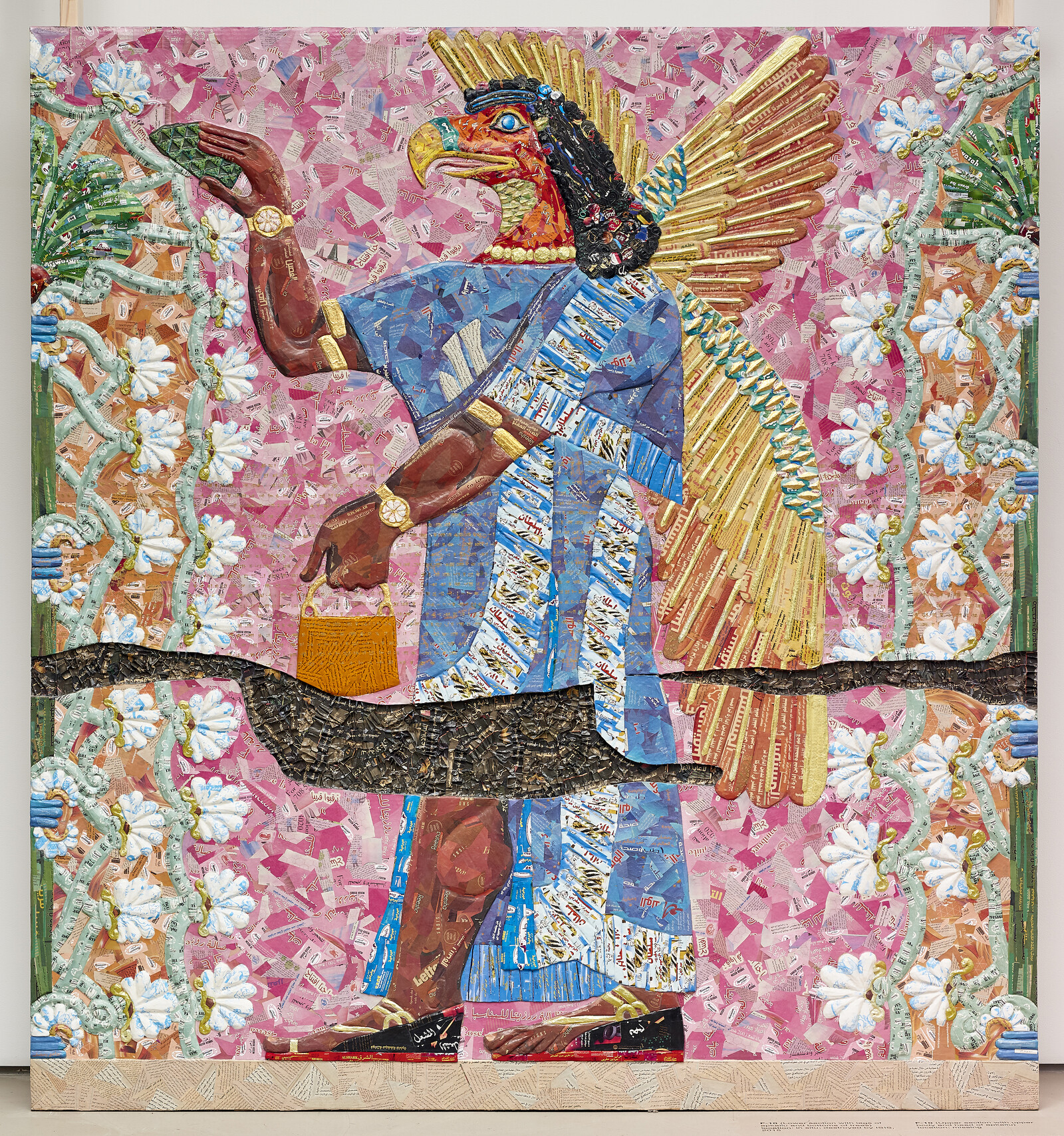
The world has experienced immense changes since the turn of the millennium, including the spread of neo-fascism, a deepening of the climate crisis, and advances in digital technologies. Yet one situation has remained consistent throughout that time: infernal war across the Middle East. Whether in Afghanistan, Iraq, Syria, or Yemen, the devastation these countries have experienced remains almost unfathomable to those living in the West. For much of this time, Iraqi-American artist Michael Rakowitz has addressed the repercussions of these conflicts through a cross-cultural artistic practice rooted in processes of translation across mediums, disciplines, and national borders. At the same time, Rakowitz aims to engage with a history of the Middle East that expands far beyond the prevailing narratives of war and insurrection.
In an exhibition entitled “The invisible enemy should not exist” at New York’s Lombard-Freid Projects in 2007, Rakowitz used everyday materials from the Middle East, such as food packaging, newspapers, and cardboard, to make replicas of some of the nearly 7,000 cultural artifacts plundered from the National Museum of Iraq in Baghdad following the disastrous US invasion in 2003. Versions of small statues, friezes, cups, vases, and more from ancient Mesopotamia were displayed in rows on wooden …
November 19, 2019 – Review
Jacolby Satterwhite’s “You’re at home”
Ania Szremski

“Let me tell you about my mother” is a famous line from Blade Runner (1982), the iconic movie that wonders about the violent intersections of life and technology and what really makes us human. A little over a decade later, at a time when technology’s coloring of the human experience had exponentially intensified, those words were recycled as a sample in “Aftermath,” a song off Tricky’s debut, genre-defying album, Maxinquaye (1995), which was named for his mother, Maxine Quaye, who died of suicide when he was little. Now fast-forward nearly 15 years after that, and consider Jacolby Satterwhite’s exhibition “You’re at home,” which rolls up everything I’ve just written about into a dizzying fractal pattern along with a manifold of other references, sounds, and iconography in which, indeed, the artist tells us all about his mother.
Tricky has said his mother used to write poems but had no place to put them. Patricia Satterwhite, too, was an artist without a public, without a means of access to the infrastructure and institutions that would have made her the star Jacolby says she dreamed of becoming. Before she died in 2016, she had lived with schizophrenia. Throughout her life she incessantly wrote …
November 13, 2019 – Review
“Soft and Wet”
Natasha Marie Llorens
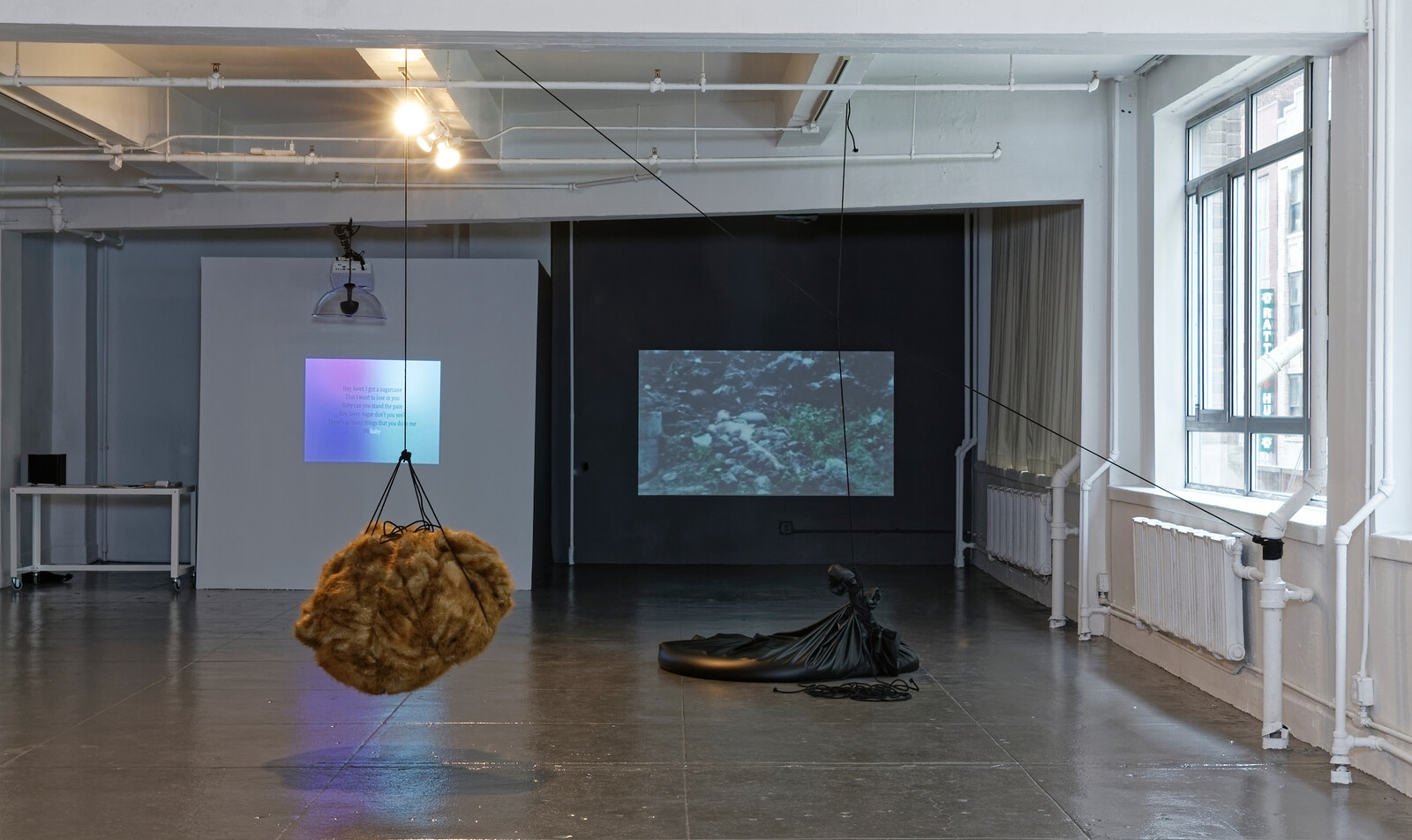
In the video documentation of Burial Pyramid (1974), Ana Mendieta’s body looks like it is lodged in the aftermath of a landslide. Lying on the ground, everything but her face covered with muddy rocks, the late artist seems trapped under the stones’ weight. She starts to breathe great heaving breaths and the rocks slowly shift and then tumble away. The soft flesh of her midriff and the areola of her right breast faintly come into view through the grain of the digitized Super 8mm film.
Mendieta’s film immediately drew me into “Soft and Wet,” a group show curated by Sadia Shirazi at the project space of the Elizabeth Foundation for the Arts. It is shown across the room from the entrance and when I turn away from Mendieta’s immobilized form, I notice a pedestal by the door and return to inspect it. The slim, stapled booklet on it is a facsimile of the catalog of an exhibition curated by Mendieta, Kazuko Miyamoto, and Zarina at feminist gallery A.I.R. in New York in 1980. “Dialectics of Isolation: An Exhibition of Third World Women Artists of the United States” was organized in response to the marginalization of women of color within white feminist …
November 12, 2019 – Review
Danh Vo’s “untitled” and “Cathedral Block, Prayer Stage, Gun Stock”
Harry Thorne
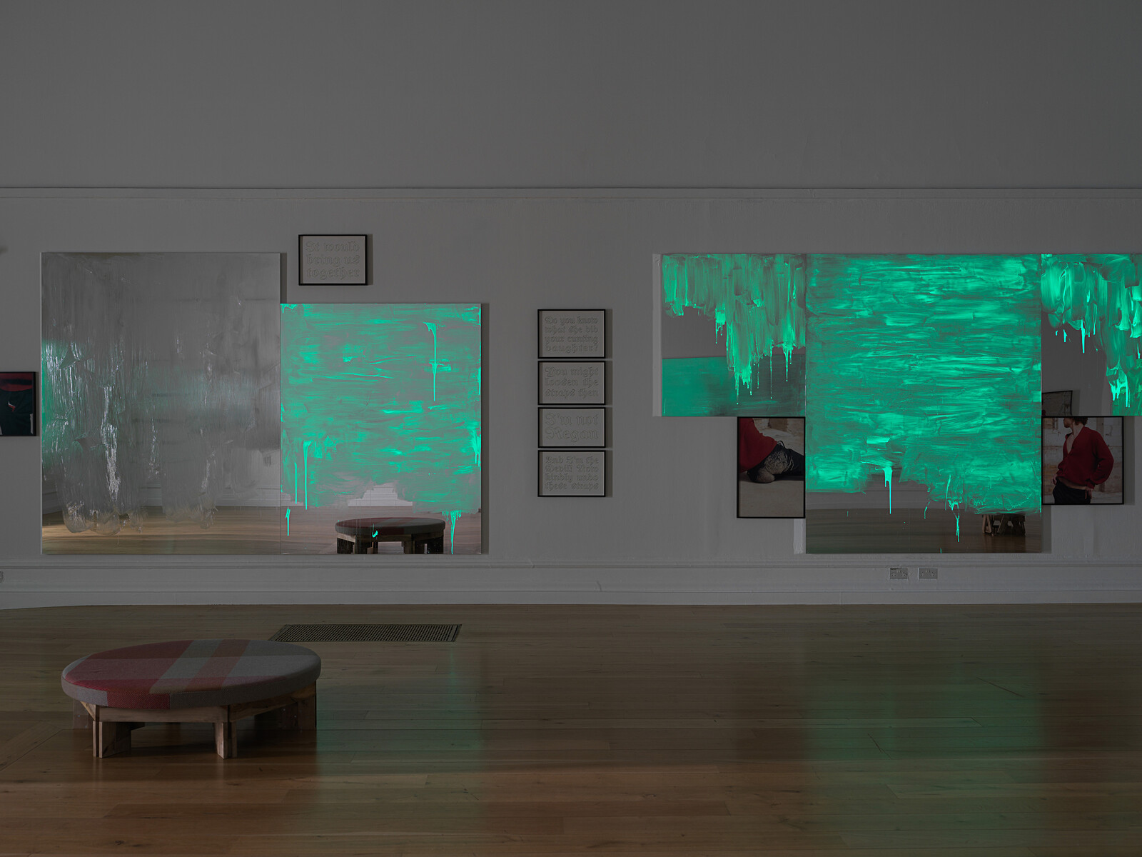
We create our own artworks. Regardless of their maker or mark, we push ourselves through the objects and images that deign to confront us and, as such, shape ourselves and our newfound companions into something other than we were before. It could be said that when we interact with art objects, we actively collaborate with another, with one another, which is a pleasant way of narrativizing our lowly passage through life: we work alongside the many things of the world so as to generate meaning.
This notion of incorporeal co-existence would suggest that the self is an entity less fixed and singular than it is multivalent, multiplicitous, more. The memory of Édouard Glissant floats, preaching the oft-quoted pledge “not to be a single being”; Antonio Gramsci, cited prominently in Edward Said’s Orientalism (1978), writes of “‘knowing thyself’ as a product of the historical process to date, which has deposited in you an infinity of traces.” Self as infinity. Infinity as self.
Vietnam-born Danish artist Danh Vo speaks in similar tones: “I don’t really believe in my own story, not as a singular thing anyway. […] I see myself, like any other person, as a container.” But are we containers or conduits? Do …
October 10, 2019 – Review
Paul Chan’s “The Bather’s Dilemma”
Alan Gilbert
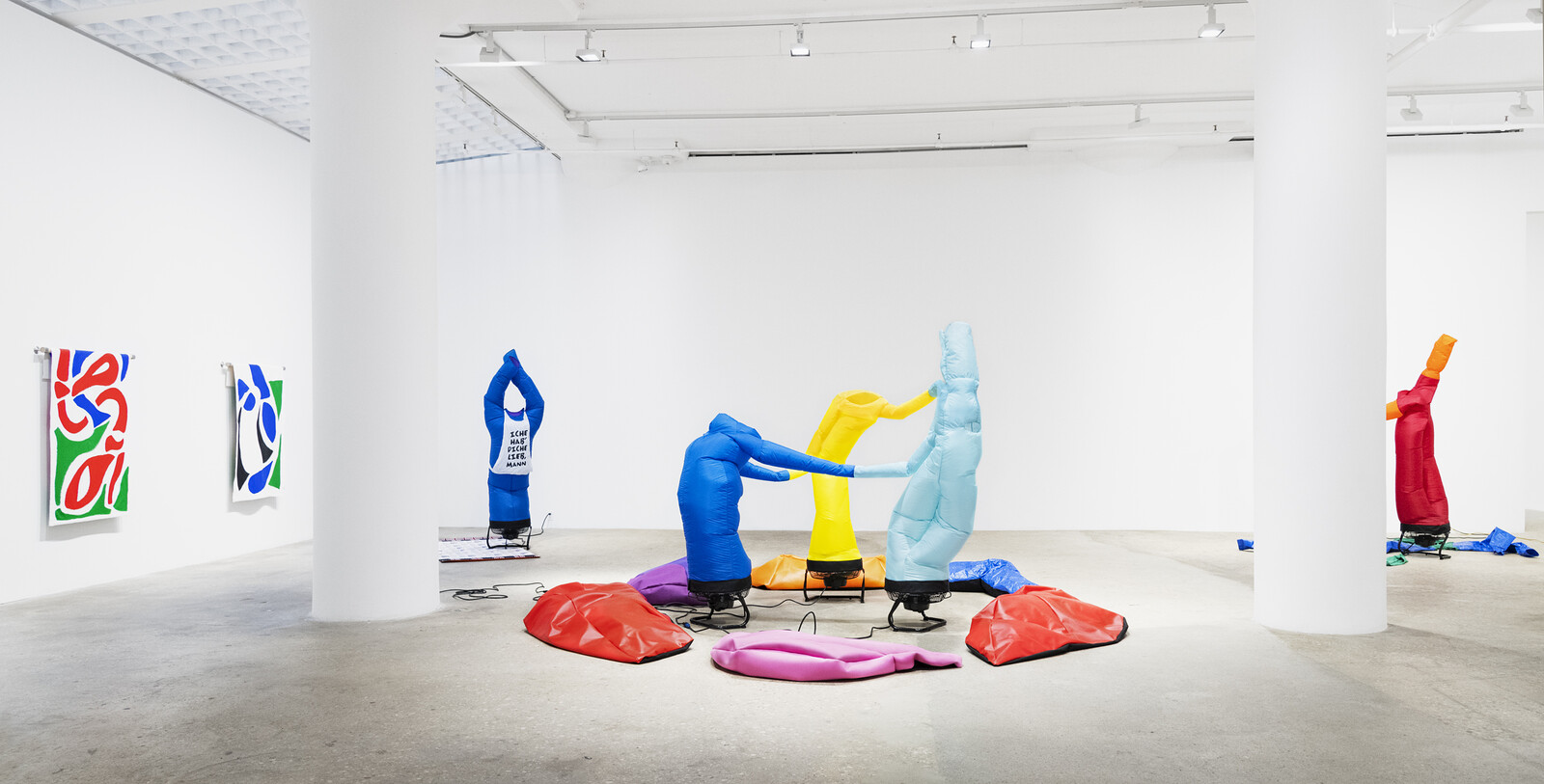
The figures in Paul Chan’s work have frequently been subject to powerful outside forces. In the large-scale animated video Happiness (Finally) After 35,000 Years of Civilization (After Henry Darger and Charles Fourier) (1999–2003), which helped garner Chan initial acclaim, a group of prepubescent girls with origins in Darger’s writings are threatened by a war raging around them. Every object in The 7 Lights series (2005–07) of digital projections is subject to the same gravitational pull. The physical and sexual violence depicted in black-and-white silhouette in the mural-sized and nearly six-hour-long digital video projection Sade for Sade’s sake (2009), created in the wake of the Abu Ghraib torture revelations, is larger than any one person; rather, it is institutional and endemic. Even Chan’s more documentary-style video essay, Baghdad in No Particular Order (2003), was shot during a visit to Iraq and ominously foretells a war that would leave hundreds of thousands dead and a country in near total ruin.
It is understandable that Chan eventually took a hiatus from these labor-intensive screen-based projects, and from the ubiquity of screens in general, while continuing to think about the centrality of images in a rapidly digitizing world. Recently, he has been producing bodies of …
July 8, 2019 – Review
Condo New York
Orit Gat
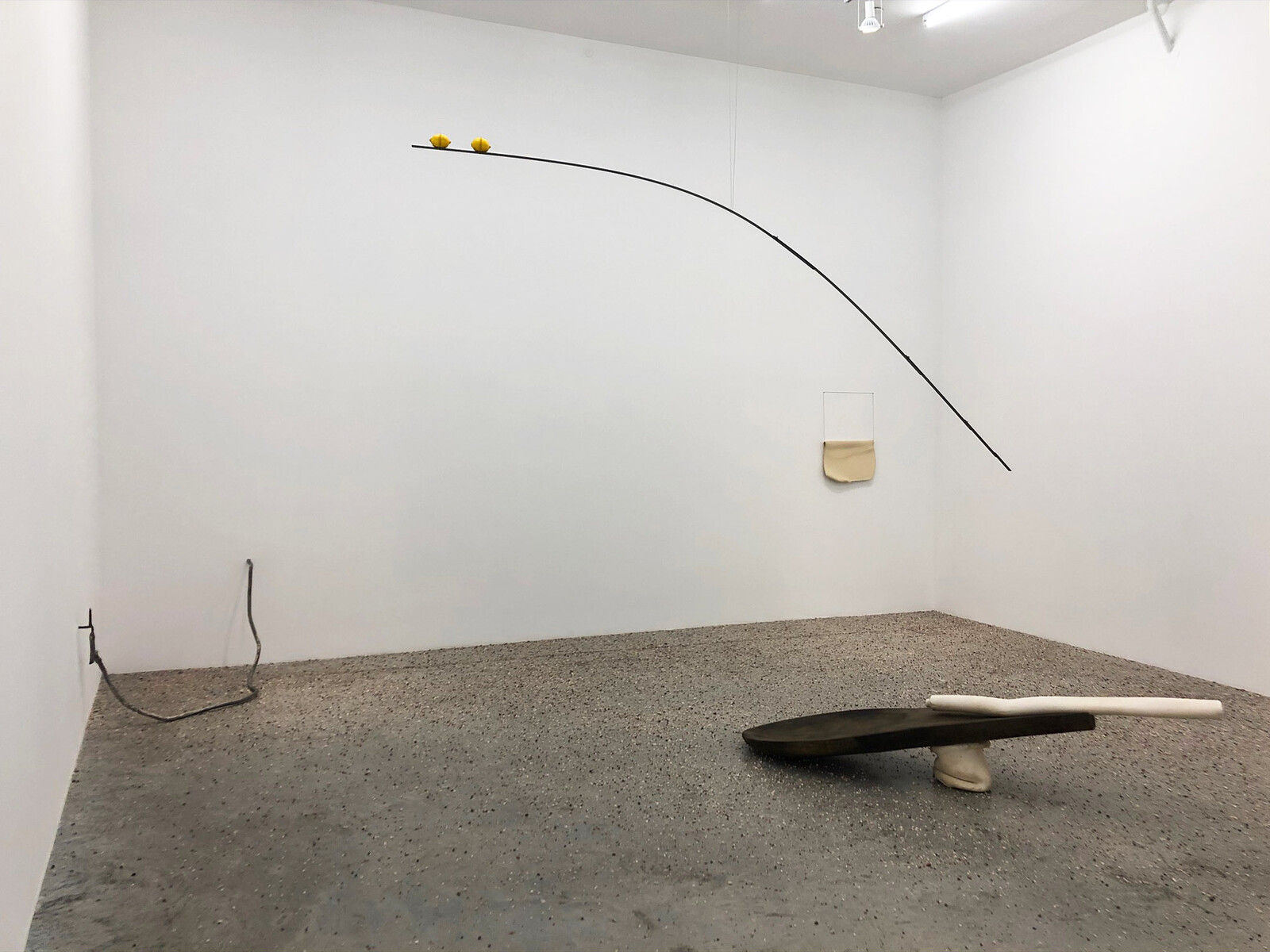
I’m leaving New York in a month. The other night I told that to an acquaintance who asked if I had read Goodbye to All That (2013), a collection of writing about “loving and leaving New York.” I’ve only read the 1967 Joan Didion essay that gave the book its title. A friend suggested we go to the used bookstore around the corner. “They probably have a shelf dedicated to it,” I said.
“You see I was in a curious position in New York,” Didion writes: “it never occurred to me that I was living a real life there.” She came for a few months and stayed for eight years. I came with an intention to stay, but “a real life” is elusive or impossible under the current political system. The third iteration of Condo New York, an initiative begun in London in 2016 in which local spaces host visiting galleries, opened in the same month MoMA closed for renovations as it soaks up the building of its displaced former neighbor the American Folk Art Museum, and in the same week I skipped an opening at the New Museum because I didn’t want to cross the picket line of its …
May 24, 2019 – Review
79th Whitney Biennial
Travis Diehl
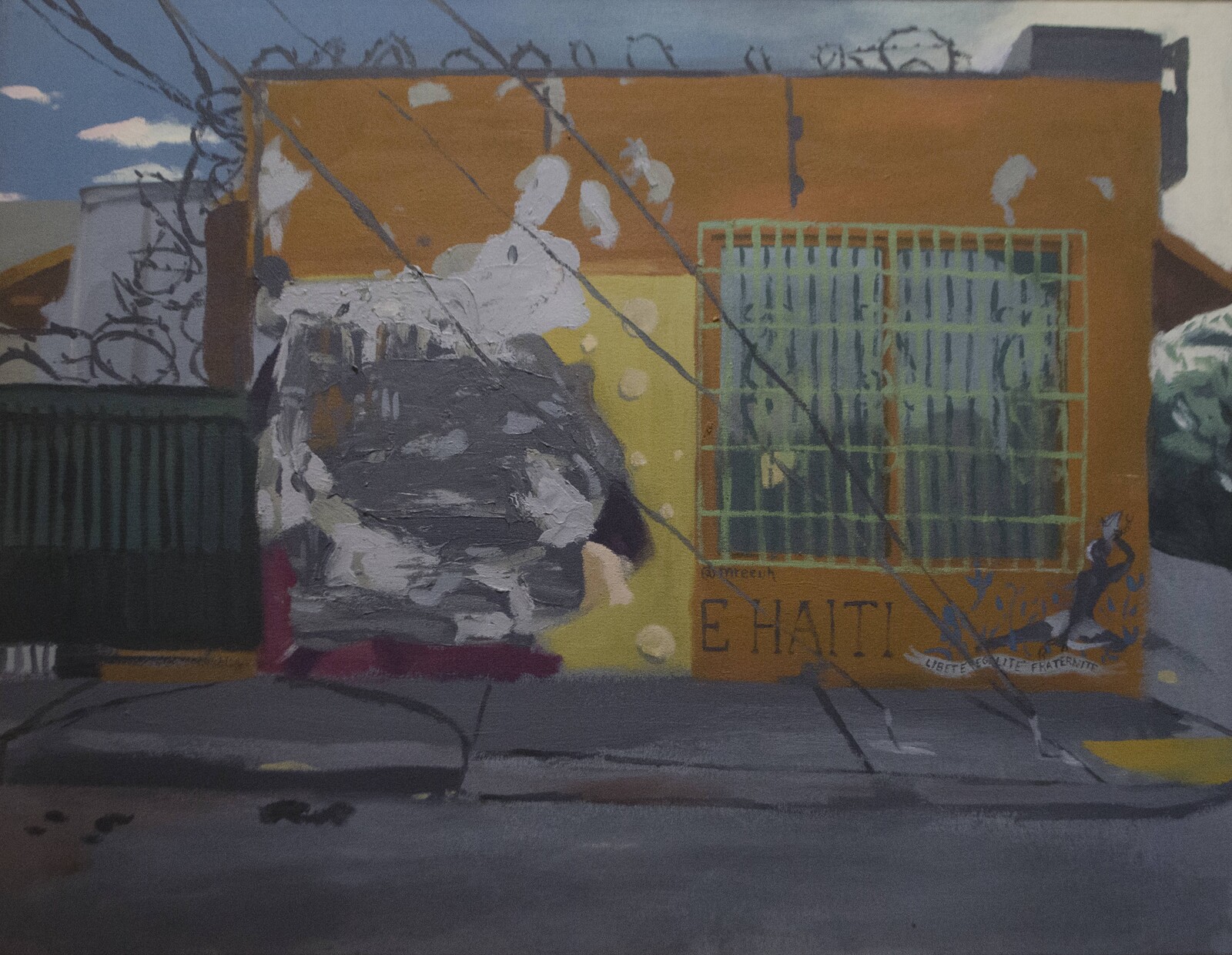
Remember when America was hard to see? Boy, is it obvious now. The Whitney Biennial 2019, curated by Jane Panetta and Rujeko Hockley, has a marked interest in the alter-local, doing some overdue national soul-searching, as well as catching up to artists who have been doing this kind of reparative work all along. There is Joe Minter from Birmingham, Alabama, whose assemblages of rusty tools and metal imagine an “African village” in America, a stunning euphemism that is lost on no one. The agglomerations of plant matter and mass commodities by Puerto Rican artist Daniel Lind-Ramos (such as Maria-Maria [2019], in which an emergency FEMA tarp clothes a Virgin-like figure) are at once elusively bitter, ritualistic, and ruthlessly compromised, like a straw on a Caribbean beach. Curran Hatleberg’s lucid photographs document America’s rural poor over the past decade: folks on their stoops between weedy squares of lawn (Untitled [Front Porch], 2016), children in what seems like the aftermath of a natural disaster (Untitled [Girl with Snake], 2016), a half-dozen men in an auto junkyard waiting (for what?) around a fresh, grave-sized pit (Untitled [Hole], 2016). A half-hour video by Steffani Jemison, Sensus Plenior (2017), portrays a gospel mime in Harlem …
May 7, 2019 – Review
Allan Sekula’s “Photography, A Wonderfully Inadequate Medium”
Kylie Gilchrist
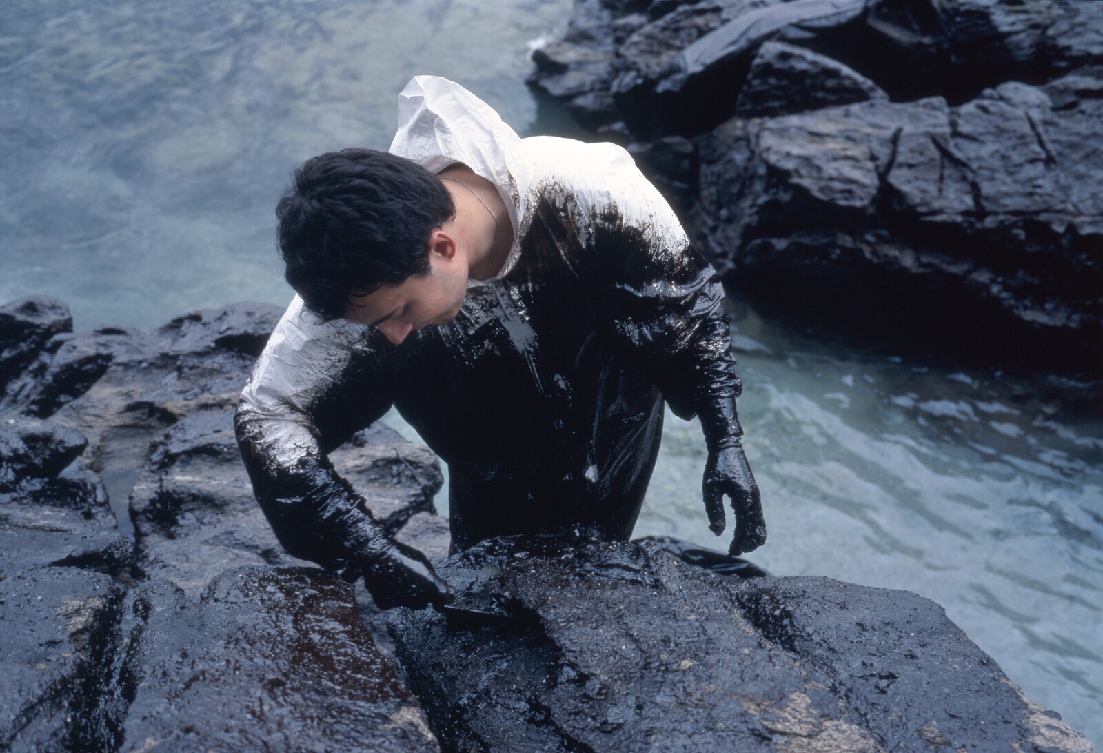
In one gruelingly unedited scene of Allan Sekula’s three-hour film essay Lottery of the Sea (2006), a figure suited head-to-toe in white Tyvek hauls a gluey black lump across a slate-gray jetty. Steely waves wash up pebbles of oil, which she collects by rolling or smashing the lump upon them. Her mass will soon be lobbed into a rubber basket, foisted up a dune by a chain of hands, and deposited in a sea of oily baskets awaiting removal. The labor of viewing this protracted sequence faintly echoes its subject: the Sisyphean task of cleaning an oil spill on Spain’s Galician coast, accomplished by volunteers and by hand. In a world where most things are—as Sekula says of a Greek fish market at the film’s start—“fresh but dead,” the scene’s weary, weather-worn figures testify to the fragile solitaries born in struggles to resist the wholesale extermination of human and non-human life.
The film is housed in a screening room at the center of an exhibition purportedly dedicated to Sekula’s photography, underscoring the latter medium’s distinctive feature for the artist: its insufficiency. True to the exhibition’s title, photography’s limitations are foregrounded throughout. The opening sequence of works features Sekula’s early engagement …
May 1, 2019 – Review
Siah Armajani’s “Follow This Line”
Ania Szremski
.jpg,1600)
“Habit is like a cotton blanket. It covers up all the sharp edges, and it dampens all noises,” Vilém Flusser mused in his 1984 essay “Exile and Creativity.” Comfortable and self-affirming, the familiar is “a mud bath where it is nice to wallow.” There’s a sensation of wading into that warm gooey tub when you first encounter Minneapolis-based artist Siah Armajani’s sculptures from the 1970s at his Met Breuer retrospective, “Follow This Line.” His models of houses, bridges, rooms, and gates draw from an old-timey tradition of plain vernacular architecture gleaming with middle-American wholesomeness, but look a little closer, that air of comfort turns out to be a trick—an innocently nondescript bridge doesn’t let you out the other side, a dependably sober log house refuses entry, a Norman Rockwell main street is shuttered and shrouded in black. The noises of strangeness rush in, forebodingly.
For the expelled, who has been uprooted from a life of cozy continuity, “everything becomes unusual, monstrous, in the true sense of the word un-settling,” Flusser wrote. And it’s this perception of the world that drives the exiled “to discover the truth” of experience, inconstant and fractious. In her catalog essay for “Follow This Line,” curator Clare …
April 11, 2019 – Review
Andrea Geyer’s “On this day”
Ksenia M. Soboleva
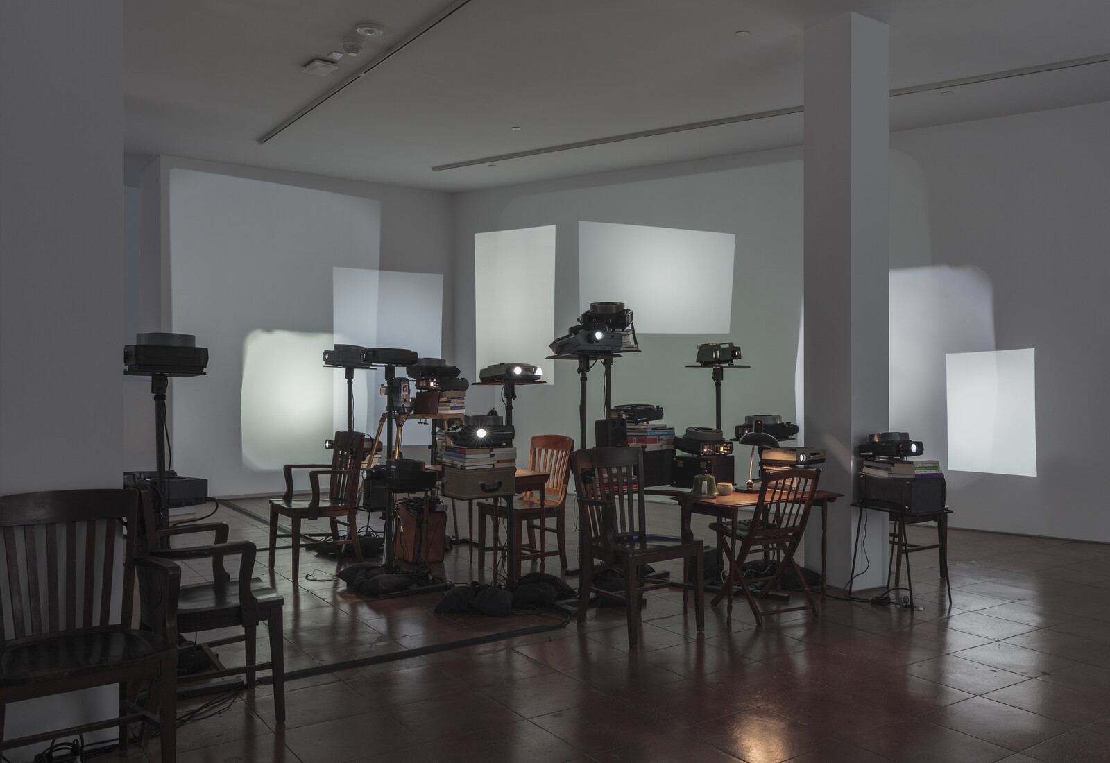
A series of slide projectors are supported by stacks of books and pieces of wooden furniture. The space is darkened, only illuminated by streams of light exuding from the projectors, as well as the images they produce: a range of abstract squares and rectangles in various shades of white that linger on the walls in a quiet rhythm. From a handful of speakers spread across the room, a recording is transmitted, with the sound of the artist’s voice, speaking English with a subtle German accent.
Titled Feeding the Ghost (2019), this multimedia installation is the centerpiece of Andrea Geyer’s current solo show at the Hales Gallery. The project was originally conceived as a performance lecture delivered by Geyer at Dia Art Foundation in September 2018. Indeed, this installation mimics the interior Geyer created at Dia, where she performed her lecture around an audience seated in the middle of the room, surrounded by small wooden classroom tables. The artist sat and read at each table for about 15 minutes, before switching to the next, while the audience’s gaze followed her, some awkwardly rotating their chairs. The text Geyer reads is always the same, an intimate account of her watching Chantal Akerman’s one-hour …
April 5, 2019 – Review
Paul Mpagi Sepuya’s “The Conditions”
Alan Gilbert
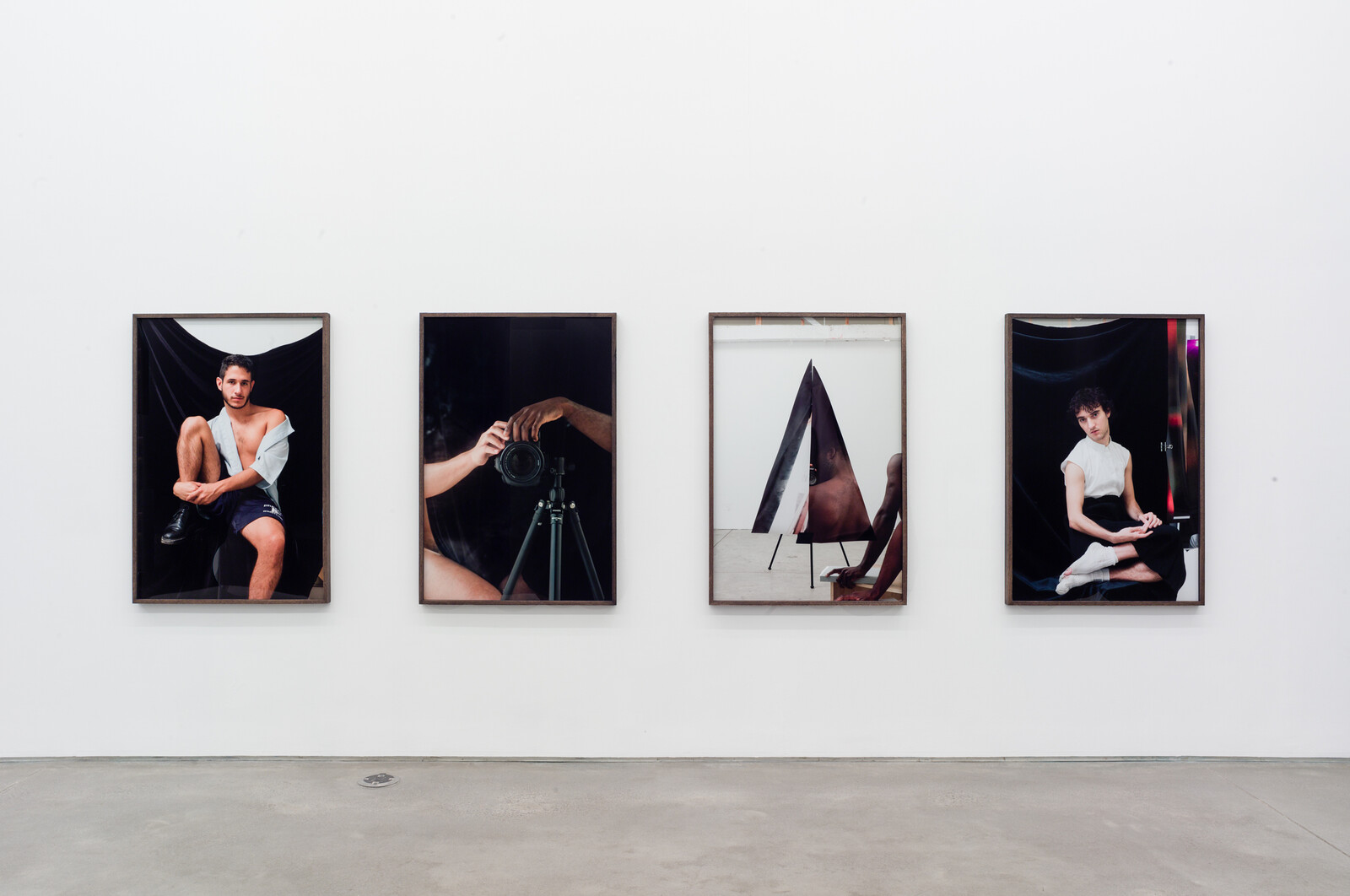
A gaze without a frame might be a form of direct perception, or, in the digital age, unprocessed information. Frames are always accompanied by categories, which in turn bring their histories and memories along with them. In this sense, a gaze is only as powerful as the frames and categories, discourses and institutions that support it. When attached to an apparatus for seeing, a gaze becomes structural or systemic. It should also be remembered that a gaze, as feminist scholars and theorists of race have insisted, is an aperture that holds the potential to open onto physical violence.
This may seem a grim way to introduce Paul Mpagi Sepuya’s photographs, which attentively celebrate queer identities and relations. Yet what is most striking about Sepuya’s current exhibition, “The Conditions,” is how strongly it foregrounds the camera’s gaze and the studio as site of image-making. Using sets fashioned from wood, mirrors, and black velvet drapery, Sepuya constructs carefully composed photographs. These images feature his camera, parts of his body, and on one occasion—A Portrait (0X5A6109) (2017)—his entire figure reflected in mirrors.
This desire to oversee both sides of the gaze is crucial to Sepuya’s photographic practice, with its blending of portrait and self-portrait. A …
March 26, 2019 – Feature
New York City Roundup
Amy Zion
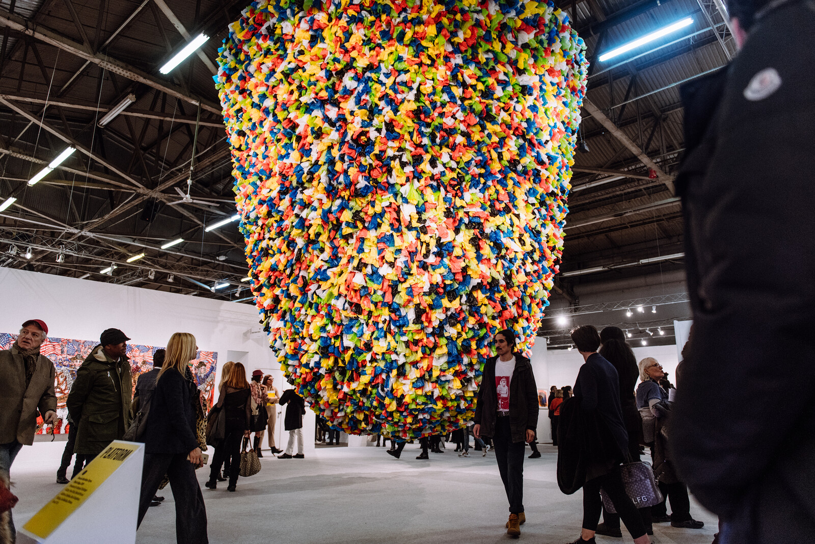
Twenty-five years ago, a group of young dealers, including Pat Hearn, Colin de Land, and Matthew, Marks started the first contemporary art fair in New York at the Gramercy Park Hotel. Titled the Gramercy International Art Fair, it spanned floors 12, 14, and 15 (there is no 13, of course) of the hotel, with each gallery taking over a room or suite. In the first iteration in 1994, Tracey Emin slept in the bed in the room where her work was displayed (by Jay Jopling/White Cube). In 1997, Holly Solomon installed two TV screens as part of a work by Nam June Paik in her room’s bathtub. After outgrowing the hotel, in 1999, the fair moved to the original site of the infamous 1913 Armory Show and changed its name. Now it fills two West Side piers and includes a modern/twentieth-century art portion alongside the contemporary. There are more fairs that share the week with the Armory—the Independent, which celebrated its 10th anniversary, Volta (more on that later), and Spring Break, among others.
Amid talks and other initiatives marking the quarter-century celebrations, at the fair there was a room several booths wide that included documentation and restaging of works from the …
February 27, 2019 – Review
“Samaritans”
Rob Goyanes
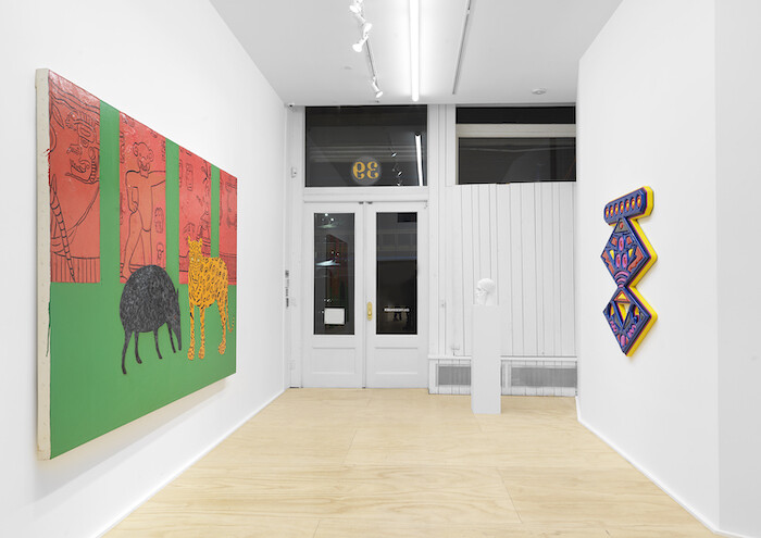
The first lines of the song “I See a Darkness” (1999) by Will Oldham, aka Bonnie “Prince” Billy, go like this: “Well you’re my friend / That’s what you told me.” Dan Nadel, curator of “SAMARITANS” at Eva Presenhuber, suggests viewers read the lyrics while visiting the exhibition: they are printed in full in the press release. Instead, I listened to it about 25 times: “Many times we’ve shared our thoughts / But did you ever / Ever notice / The kind of thoughts I got?” An alt-country ballad, “I See a Darkness” is tender, bordering on saccharine. Its voice, piano, and guitars are aching, then hopeful, then not. It is about, among other things, friendship: “Well, you know I have a love / A love for everyone I know.” And though the artists in the exhibition, according to the press release, are “connected to at least one other [artist], and usually more, by friendship, inspiration, and influence,” the connections between the works feel tenuous.
On a wall in the first room is Xeno (2017) by Takeshi Murata, a slick, totemic, geometric sculpture whose enamel paint glows like radioactive candy. On the wall adjacent is The Golden Age: The Jaguar and …
December 20, 2018 – Review
Eileen Myles’s “poems”
Alan Gilbert
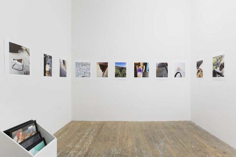
It’s so easy to ignore what’s directly in front of you when it seems more sullied than that which is imagined to be just beyond a particular moment or place. Digital technologies seek to eradicate this gap by making a better or more convenient life, via an image or purchase, only a click away. In the process, desire is replaced by need as online streams of ads and information, many of which are targeted to sell some sort of aspirational product or lifestyle, arrive with greater speed and density—not for nothing are these streams called feeds. At the same time, social media has created spaces for alternative communities, identities, and politics that refuse the increasingly tenuous status quo. And while their cooptation can happen quickly, and their tracking—the consumer-friendly word for surveillance—is ubiquitous, these spaces are also seedbeds for a different world.
The most striking visual aspect of the photographs from the writer Eileen Myles’s Instagram account (@eileen.myles) currently on display as enlarged (ca. 24 x 18 inches) digital prints at Bridget Donahue is how oriented they are on the image’s frequently messy foreground. In the selection of 20 photographs (out of more than 6000 on Myles’s Instagram), this foreground includes …
December 14, 2018 – Review
Jean-Marie Appriou’s “November”
Aoife Rosenmeyer
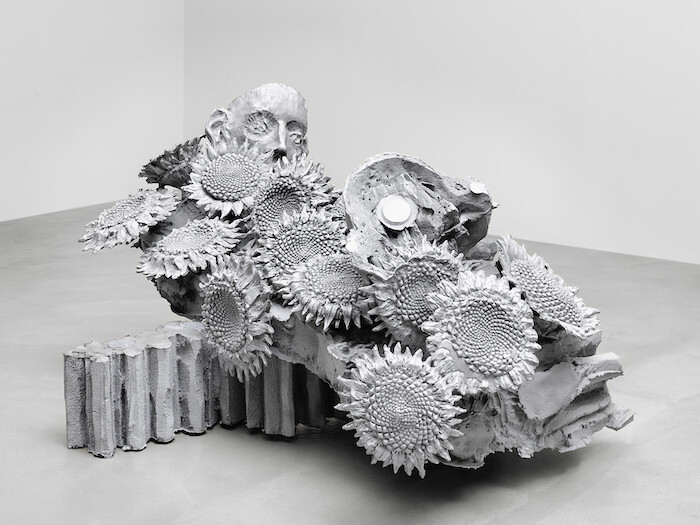
The show is called “November”; I write as the month draws to a close. It’s cold and slightly damp, albeit not enough to offset the long, dry summer and autumn. But the apples sold at the market are still crisp, the Raebeliechtliumzug—an annual walk through the dark, originating in harvest festival celebrations, in which children sing songs and carry lanterns carved out of turnips—took place last week, and now we’re getting ready for Christmas. To everything there is a season. Jean-Marie Appriou illustrates this circle of life in two chapters. In the first gallery are sunflowers in full bloom and thick fields of corn; the second features a collection of waist-high caves, tall dark cypress trees, and bats flying around the viewers’ heads.
All the sculptures were made this year, cast in aluminum from clay models formed by traditional tools and the artist’s gouging fingers, which have left deep, irregular, tactile indentations. The aluminum varies from silvery to blackened. The works are striking, like the two-and-a-half metres-tall corn thicket Crossing the parallel worlds; the faces and limbs that appear elsewhere are spindly, verging on grotesque. It is hard to gauge this aesthetic, which is unfamiliar in a contemporary art context—as is …
December 12, 2018 – Review
Aura Satz’s “Listen, Recalibrate”
Genevieve Yue
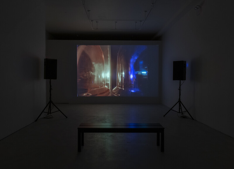
On the night of July 16, 2006, Mazen Kerbaj stood on a balcony in Beirut as Israeli Air Force bombs fell in the distance. He picked up his trumpet and played along to the ominous pops, some louder than others. Starry Night (2006), the composition that resulted, asks the unanswerable question: What is the value of an aesthetic response to a political situation? Aura Satz’s film Preemptive Listening (Part 1: The Fork in the Road) (2018) dwells in the same conceptual and acoustic space. This spare work, which beyond a few close-up glimpses of a light bulb depicts only a dark void punctuated by pulses of light, obscures its sources to the point of unrecognizability: actor and activist Khalid Abdalla, whose voice we hear, never identifies the emergency sirens he describes occurring in Egypt during the Arab Spring; an alarm light rotates according to the cadence of his speech; and Kerbaj again plays his trumpet, this time as a low drone imitating the sound of a siren. Satz turns a moment of questioning into reckoning, when one is called to attention by a distant siren, but not yet certain how to act. Played on a loop in the gallery’s back …
November 16, 2018 – Review
Jeffrey Gibson’s “I AM A RAINBOW TOO”
Alan Gilbert
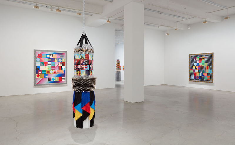
If there ever was an ars poetica for house music, it might be the one articulated by Chuck Roberts that Larry Heard incorporated into a 1988 remix of his own groundbreaking single “Can You Feel It” (1986). Roberts’s proclamation is a nearly two-minute-long origin story delivered in sermonic fashion featuring a figure named Jack: “In the beginning there was Jack, and Jack had a groove.” Roberts describes house music being born with an utterance by Jack, just as the Judeo-Christian God named the world into being, before announcing: “And in my house there is only house music. But I am not so selfish because once you enter my house, it then becomes our house and our house music.” The slightly modified “Because once you enter my house it becomes our house” is one of many phrases derived from dance-music tracks that Jeffrey Gibson incorporates into the paintings, sculptures, and beaded weavings featured in his exhibition “I AM A RAINBOW TOO.” Some, such as “Last night a dj saved my life,” will be recognizable to casual dance-music listeners; others require deeper digging in the crates (or lots of googling).
Gibson’s exhibition title is also shared with its opening work, a series of …
November 6, 2018 – Review
“A Void”
Natasha Marie Llorens
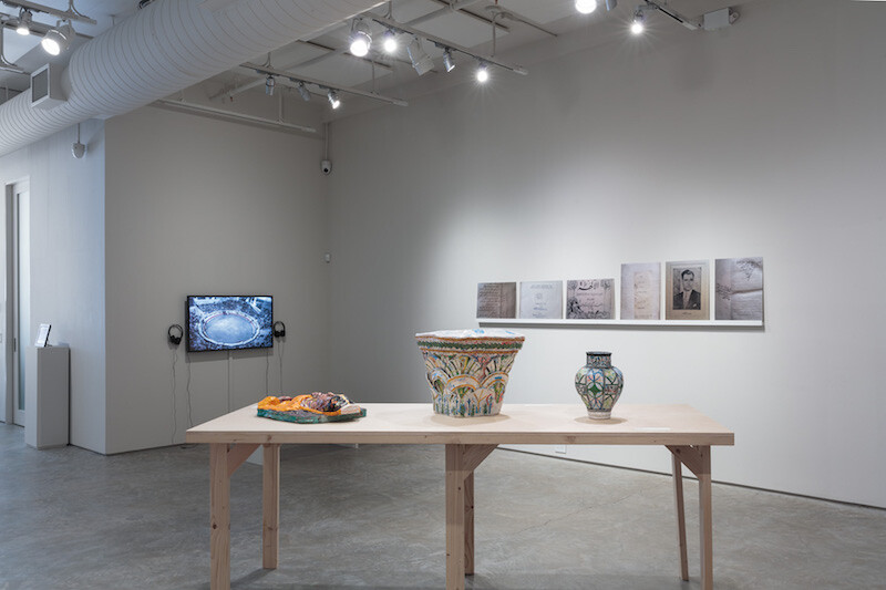
In his press release for “A Void,” a group exhibition at 601Artspace, curator and artist Paul Ramírez Jonas provides an epigraphic clue to the relationship he sees between various forms of displacement that result in a void: “When books burn, people burn.” The phrase, according to the press release, is a quote by Iraqi-American artist Michael Rakowitz, one of eight artists in the show..] Their works render the violent displacement and death of people: Palestinians, Syrians, African Americans, Bosnian Muslims, Colombians, French Jews during the Holocaust, and female victims of domestic abuse in Ecuador.
The exhibition is bifurcated: on the largest wall of the narrow gallery, Ramírez Jonas has painted eight large black rectangles, which are meant to represent the absence of eight Western European paintings destroyed over the course of World War II by both sides and, thus, to illustrate his curatorial intervention. Past these voids and into the gallery, eight artworks are installed simply but effectively. A new work by Aida Šehović, Family Album (ŠTO TE NEMA): Wall 6 and 7 (2018), covers the gallery’s back corner with a one-to-one scale photographic reproduction of two walls in the Women of Srebrenica Association office, a nonprofit dedicated to identifying the …
October 31, 2018 – Review
Haroon Mirza’s “The Night Journey”
Monica Westin
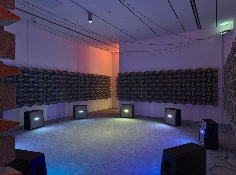
The source material for The Night Journey (2018), Haroon Mirza’s sound-based multimedia installation, is a miniature painting from the collection of the Asian Art Museum that is conspicuously absent from the final exhibition. The original painting, The night journey of the prophet Muhammad on the heavenly creature Buraq, created in India around 1800, depicts Muhammad on his journey from Mecca to Jerusalem with his face unveiled: a type of representation that has often been prohibited on the grounds that images of the Prophet can encourage idolatry. There is a roughly contemporaneous miniature painting of Muhammad included in Mirza’s exhibition: this one is, pointedly, veiled.
The theme of iconoclasm—the destruction of images—is thus woven into Mirza’s installation, which teases out from the perennial contentiousness of representing religious figures a more formal question, asking how the relationship between a subject and abstracted information extracted from it and converted into another form can be understood, whether as an appropriation, another type of depiction, or a form of censorship. In other words, iconoclasm is a starting point for the artist’s exploration around the limits of translation that transcend ideology into form.
Mirza’s exhibition “The Night Journey” includes a pixelated inkjet printout of the c. 1800 …
October 24, 2018 – Review
Zardulu The Mythmaker’s “Triconis Aeternis: Rites and Mysteries”
Ania Szremski
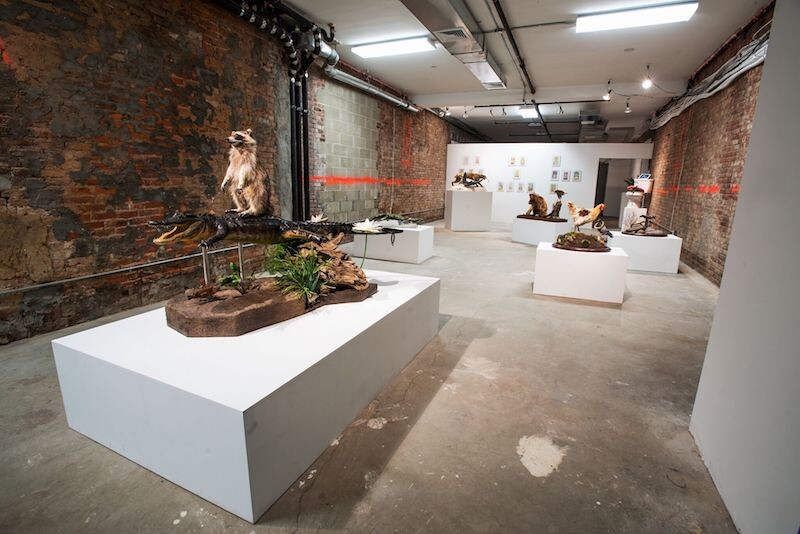
The summer of 2018 was grifter season. Starting sometime in May, a strange coterie of glittering personages came coasting along: hustling socialites, scurrilous aventuriers, faux–Saudi princes. The hoax has always had a special place in American mythology, from a newspaper editor convincing his readers there were unicorns on the moon in 1835 to P.T. Barnum’s unveiling of an exotic mermaid in 1842, but there seems to be a renaissance in a present-day America where the sociopolitical order feels like it’s crumbling. And these swindling apparitions with the power to dupe the richest among us (think of Anna Delvey, a young Russian woman reborn as a German aristocrat in New York City[1]) have the gleam of folk heroes.
The anonymous performance artist who goes by the name of Zardulu the Mythmaker has a keen understanding of this bunk that resides at the heart of the American imaginary. It’s the fundamental stuff of her work: she crafts an outlandish con, then tips off a credulous media outlet, and sees it go viral. The work is over when the artist chooses to trigger the reveal—the gotcha moment that shows everyone what a fool they’ve been to believe. (It can take years to come, if …
October 18, 2018 – Review
Trisha Baga’s “Mollusca & The Pelvic Floor”
Leo Goldsmith
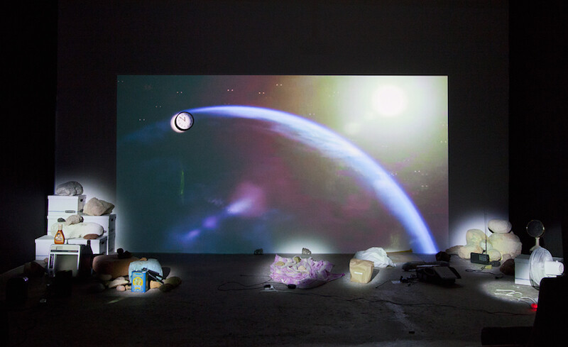
Trisha Baga’s third exhibition at Greene Naftali is also her most ambitious. “Mollusca & The Pelvic Floor,” like its cosmically hilarious and dizzyingly psychedelic predecessors, features a dazzling and untidy collection of found, handmade, and moving-image works: from doctored lenticular posters of human anatomy to idiosyncratic ceramic representations of everyday objects, all arranged around and within a deliriously complex 3D video installation.
Baga has made more than 40 ceramic pieces of various sizes and dimensions representing an array of often comical real-world objects. There’s a full rock-band set-up, complete with drum set, guitar, and tip jar; a log fire; a cardboard box with the Amazon swoosh logo; a portrait of Baga’s dog, Monkey, swimming; and a quintet of poodle heads in the shape of Mesoamerican pyramids (temples of the dogs?), with titles such as Kimberly and Butchie (both 2018). Encountering life-sized versions of a crumpled rhinestone Elvis suit or a cockatoo in the gallery, you get the feeling of entering the artist’s psyche—or, simply, of her ideas made flesh, birthed into the world in a way that’s as simultaneously magical and quotidian.
Baga’s ceramics have an amusingly DIY quality that both belies their complex material origins and butts up against the more …
July 13, 2018 – Review
Hiwa K’s “Blind as the Mother Tongue”
Ania Szremski
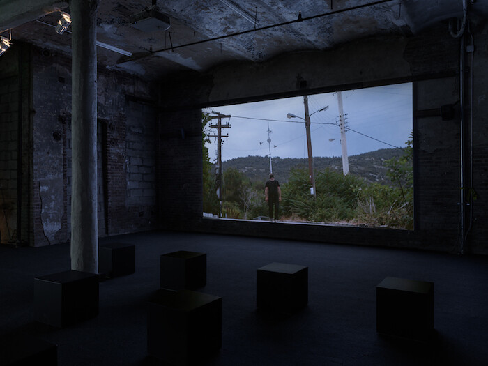
Hiwa K doesn’t believe that art can change anything.
Following a screening of his videos at the Film Society of Lincoln Center, the Iraqi-Kurdish artist explained his frustration with the uselessness of the whole contemporary art enterprise in the face of profound global violence. To hear him say that he doesn’t believe art can offer anything in terms of repair felt startling, at odds with the political nature of the works we had just seen.
But it also felt breathtakingly familiar. I worked at an art space in downtown Cairo in the years following Egypt’s 2011 revolution. As I was mounting exhibitions in the center of clouds of tear gas and violent clashes, against a backdrop of forced disappearances and mass killings, I was constantly, brutally, forced to ask myself why we were doing what we were doing. There was an incredible sense of urgency to persist, but at the same time, the crushing knowledge that it was largely pointless, that art wasn’t going to get anyone out of jail, for example. Hiwa K left the context of crisis out of necessity, I left out of choice; we both settled in the so-called Western world, where we watch those traumas continue to …
May 8, 2018 – Review
Frieze New York
Orit Gat
It’s summer in May. It’s been a long winter, and a long semester teaching art history is drawing to a close. The past four months I’ve been talking to my students about the political possibilities of art: trying to convince them not to look away, but to be moved, to pay attention, and to think of that participation as a form of political agency. We’ve talked about how to look at historical work with an eye to 2018. “Is this still useful?” I ask them of 1950s painting, or video work from last year. My students don’t always have an answer. Nor do I. But I keep asking and looking, knowing that, while I may not always find answers, paying attention is important.
At Sfeir-Semler Gallery (Beirut/Hamburg) are drawings from Rabih Mroué’s Leap Year’s Diary (2006–16). Small framed works are composed of clippings from mostly Lebanese newspapers, cut out and glued onto paper. There are objects (a bell, a truck, a military plane flying across a blank white-paper sky) and full scenes (a boy reaching for a string tied to a bird’s foot); there are shells of homes, and figures standing alone, looking at what may have been landscapes before they …
April 10, 2018 – Review
Laure Prouvost
Alan Gilbert
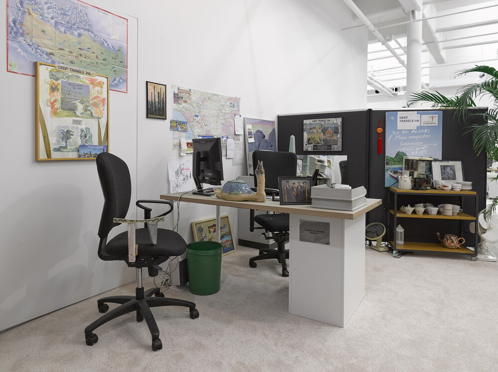
Eager to see the art in Laure Prouvost’s first solo exhibition at Lisson Gallery in New York, visitors might breeze through its central installation: Uncle’s Travel Agency Franchise, Deep Travel Ink. NYC (2016–18). Situated at the entrance to the gallery, it looks like an unkempt and outdated version of an art gallery’s normally pristine front desk featuring a guest book, a stack of press releases, and a 3-ring binder containing an artist’s curriculum vitae and relevant press materials. Instead, Prouvost has surrounded the gallery attendant with promotional airline posters, maps, a bookshelf lined with travel guides, a coat rack and umbrella stand, an outmoded printer, a dirty water cooler, and even the requisite framed family photo on the desk. To the right of this configuration is a table with two chairs and a ceramic teapot in the shape of a pair of buttocks that is the first explicit clue to the whimsy and weirdness of Prouvost’s art.
The exhibition’s conceit is that all the work on display—including installation, sculpture, painting, textile, and video—is connected to this travel agency. Three other workstations feature stacks of plane-ticket receipts and travel magazines with the company name, “Deep Travel Ink,” printed on white labels affixed …
March 12, 2018 – Review
The Armory Show and Independent Art Fair
Ania Szremski
The art-fair think piece is as stale as the art fair itself. What could be said already has been, from puzzling over the mysterious machinations of the market, to annual denunciations from gallerists, and ethnographies of those who buy and those who sell. The form of writing that is truest to the form of the art fair is the nimble listicle, the best-or-worst-of reportage, the photo-heavy guided tour; the spirit of the fair is inimical to the weightier, slower-moving thousand-word reflection.
Even though visiting the storied behemoth that is The Armory Show and the leaner, more winsome upstart Independent was something of an exercise in “seen one, seen them all,” I was nonetheless startled to be confronted by works that I actually liked—that offered a cool respite from the surrounding fervor of the art-mall experience, that compelled dreamier reflection. And so begins my own inevitable best-of list: at The Armory, Upfor Gallery from Portland, Oregon, showed Iranian artist Morehshin Allahyari, who commanded sustained attention with her spellbinding videos Huma (2016), Ya’jooj and Ma’jooj (2017), and Aisha Qandisha (2018), each depicting voracious Near Eastern goddesses and fever-causing spirits with glitched-out animations and oracle-like narrations. And even as Nam June Paik’s multimedia sculptural …
March 8, 2018 – Review
“Memories of Utopia: Jean-Luc Godard’s ‘Collages de France’ Models”
Leo Goldsmith
In 2006, French filmmaker and polymath Jean-Luc Godard was commissioned to curate an exhibition at the Centre Pompidou, devising a series of 18 maquettes—nine large, nine small—as a plan for “Collage(s) de France: Archaeology of the Cinema.” The exhibition would link a series of rooms—each with its own title, like “Myth (allegory of cinema),” “The Camera (metaphor),” and “The Real (reverie)”—featuring objects, artworks, and videos. The result would be a kind of funhouse excursion through the director’s major themes and obsessions: cinematic and media images, the patrimonies of Europe, Hollywood, and their cultural and ideological peripheries.
But the exhibition was not to be: after two years of work, Godard abruptly abandoned the project, leaving the museum’s then-director of cultural development, Dominique Païni, to construct an attenuated version in its place: “Travel(s) in Utopia, Jean-Luc Godard 1946–2006, In Search of a Lost Theorem,” in which paintings by Nicolas de Staël and Henri Matisse were exhibited in proximity to excerpts from films by Godard and his idols (like Fritz Lang and Robert Bresson) and collaborators (like his longtime partner Anne-Marie Miéville).
While Godard’s original idea for the show was never realized, his maquettes (all from 2004–2006)—eventually deposited in one of the rooms of the …
February 28, 2018 – Review
Judy Chicago’s “PowerPlay: A Prediction”
Tess Edmonson
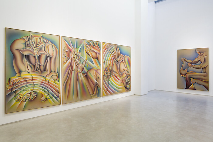
After the completion of The Dinner Party (1974–89), for a five-year period from 1982 to 1987, Judy Chicago interrupted her study of female subjecthood to focus instead on its political other, masculinity. The result is a series of paintings and bronzes titled “PowerPlay,” a selection of which is currently on view at New York’s Salon 94. It’s affixed with the subtitle “A Prediction.” Of what?
Four large-scale paintings in the main gallery figure variations on a male nude in a wash of taupe and technicolor. In each, he appears bald, white, and muscled, engaged in the performance of symbolic action. Driving the World to Destruction (1985), for example, shows the surface of a bald man’s torso, its hypertrophy defined by dark shadows. His overlarge hands hold a steering wheel affixed to the surface of the earth, whose deep greens are caught in a swirl of flames. In their rendering of male violence, these allegories are not complicated.
A second gallery location in Freeman Alley housed an additional suite of works on paper, whose surface is sculpted to protrude from its frame. (This part of the exhibition is now closed.) Two among these works qualify the show’s claim to prophecy: Doublehead with Green …
February 22, 2018 – Review
New Museum Triennial, “Songs for Sabotage”
Kevin McGarry
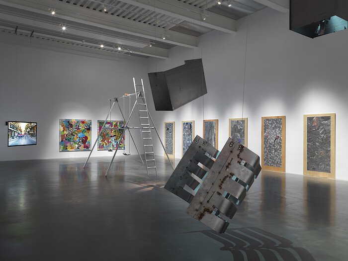
“Songs for Sabotage,” the fourth New Museum Triennial, is suavely branded as a survey of 26 subversive practices from around the world. The curators, Gary Carrion-Murayari and Alex Gartenfeld, frame the exhibition with an astute awareness of the challenges it faces as an institution that would seem to reify the repressive ideologies it purports to dismantle. In his catalog text, Gartenfeld—who might be considered the most precocious institutional mind of the generation still younger than Jesus, and thus keenly attuned to the trappings of dwelling on age—addresses the wise move to excise the word “generational” from the show’s identity (though it remains a round-up of artists under 35), writing, as a kind of disclaimer: “Previously described as a ‘generational’ survey, the Triennial implicitly and explicitly weds the notion of youth to international movements in order to link artistic potential (both criticality and marketability) to demographics.”
Further, he parses how the Triennial is positioned in such a way that makes it an increasingly impossible curatorial undertaking: “The implicit task of the Triennial is to contrast the spirit of internationalism—solidarity, diversity, autonomy—with the deleterious, dominating processes of globalization, and to observe and propose points of connection that might be liberatory, rather than merely …
January 31, 2018 – Review
Sondra Perry
Natasha Marie Llorens
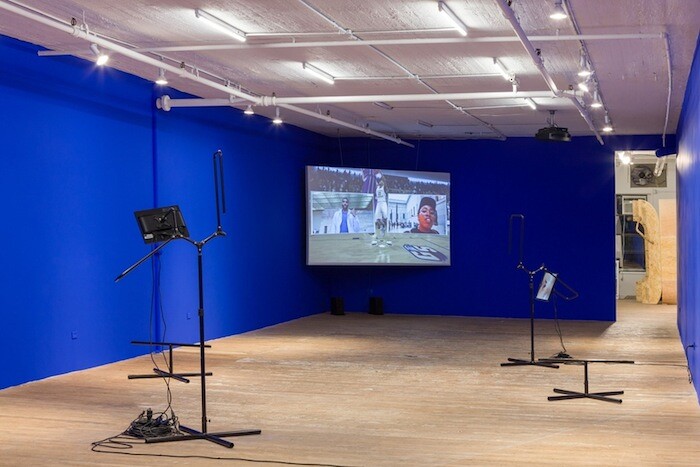
For Sondra Perry’s solo exhibition at Bridget Donahue, New York, all the walls are painted Rosco Chroma Key Blue. The deeply saturated color is used on television sets and in the production of special effects for movies and videogames because it contrasts so profoundly with most human skin colors. Chroma Key Blue is the obverse of the color of being, Sondra Perry pointed out to me at the opening. No human skin exists in an adjacent shade, and so it can be used as the negative space onto which context for any body can be manufactured and projected. The color of ultimate negativity, or the absence of existence.
Perry’s interest in the condition of visibility is influenced in part by Simone Browne’s Dark Matters: On the Surveillance of Blackness (2015), which analyzes the way people of color are visualized using surveillance technologies and, through this visualization, de-humanized. Browne traces the containment of blackness from basic technologies, such as branding and lantern laws, to more technically advanced forms used in contemporary policing.
Black bodies are often represented in the aforementioned visualization techniques against a ground very similar to Rosco Chroma Key Blue: one of the conditions of their visibility since slavery has been …
January 25, 2018 – Review
Survival Research Laboratories’ “Inconsiderate fantasies of negative acceleration characterized by sacrifices of a non-consensual nature”
Rob Goyanes
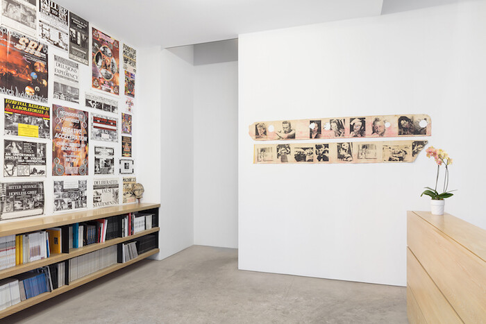
A modernist critical framework would have you believe that the difference between a machine and sculpture is the same as between politics and aesthetics: a machine uses power to fulfill a function, while a sculpture is all about form and taste. Knowing that this is bullshit—that there is no apolitical aesthetic—our contemporary lives are defined by the somewhat analogous understanding that the difference between war and terrorism is the same as between art and non-art: purely a question of legitimacy.
Started in 1978 in San Francisco by Mark Pauline, Survival Research Laboratories is a collective of technicians who build freakish militaristic machines. They’re then employed in spectacular public productions that are part hilarious war zone, part robot drama, consisting of modified jet engines that shoot hurricanes of fire; remote-controlled six-legged crawlers that skitter and stab; and spark shooters and shockwave canons and wheelocopters that provoke a sort of childish, anarchic delight. However, there’s a political rigor to these radical machines.
Revered in the social circles of punk, noise, outsider junk art and other so-called “extreme” American subcultures, SRL’s VHS tapes documented these chaotic public events, which often ended in pissed off cops and fire departments even though proper permits were (usually) always …
December 20, 2017 – Review
“Cosmic Communities: Coming Out Into Outer Space—Homofuturism, Applied Psychedelia & Magic Connectivity”
Alan Gilbert
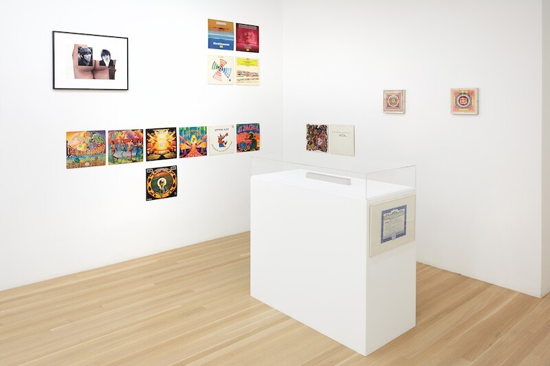
There is an astonishing sequence in Robert Mugge’s 1980 film Sun Ra: A Joyful Noise, a documentary about the great intergalactic avant-garde jazz musician, artist, and poet. It occurs when Sun Ra is playing a solo during his band’s—the Arkestra—performance in a Baltimore ballroom. Sun Ra stands in front of his synthesizer and makes a glorious cacophony of smashed and pounded notes. He then spins and turns his back to the keyboard, playing it with the tops of his fingers and hands. The music is quite literally meant to transport: Sun Ra believed that life on this planet was doomed, especially for people of African descent, and that his music and philosophy would carry people to other worlds. Even Jupiter would be better than the ongoing slave ship called Earth.
Sun Ra features prominently in “Cosmic Communities: Coming Out Into Outer Space—Homofuturism, Applied Psychedelia & Magic Connectivity,” a sprawling, ambitious, and occasionally overreaching exhibition organized by Diedrich Diederichsen and Christopher Müller for Galerie Buchholz. Eight Sun Ra vinyl record sleeves are included along with three of his original designs for other album covers—two in red swathes and lettering, one in shiny gold and black. Nearby vitrines contain over 50 black-and-white photographs …
November 10, 2017 – Review
Douglas Huebler’s “Works from the 1960s”
Kim Levin
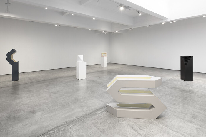
“The world is full of objects, more or less interesting; I do not wish to add any more. I prefer, simply, to state the existence of things in terms of time and/or place.” That once startling, now iconic statement by Douglas Huebler (1924–1997) was crucial to the foundation of Conceptual art. It was his contribution to Seth Siegelaub’s “January 5 – 31, 1969,” the exhibition without objects that launched Conceptualism. With those sentences, aimed at an art world dominated by Minimalist objects, Huebler announced that art was no longer an object: it was an idea, documented by means of language, photographs, or diagrams. It was also a matter of time and space. He was the eldest and most famous of the Conceptualists—including Robert Barry Joseph Kosuth, and Lawrence Weiner—who participated in that objectless exhibition, but in retrospect he was also the most elusive, puzzling, and least understood.
Almost half a century later, the current exhibition is not about what Huebler went on to do after that announcement—his “Variable” series, “Location” series, and “Duration” series (all begun in 1969)—and his quixotic attempt to document everyone on earth. Instead it offers the work he made shortly before that revelation: the quasi-Minimalist objects that …
October 17, 2017 – Review
Cassils’s “Monumental”
Wendy Vogel
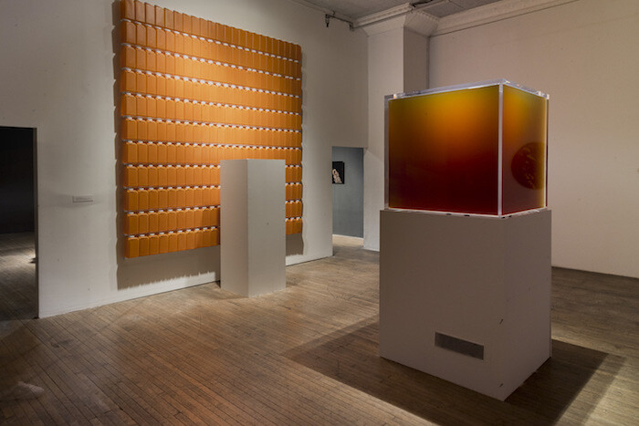
The practice of Canadian-born, Los Angeles-based artist Cassils expands upon—and queers—a feminist performance-art tradition, molding their transgender masculine physique through rigorous fitness regimens and durational actions. Though in “Monumental,” Cassils’s current New York exhibition, abstraction has entered the artist’s repertoire. Cassils grapples with their political desire to represent transgender lives and the media’s desire to spectacularize transgender bodies. The most traditional monument on display is Resilience of the 20% (2016), a bronze cast of a one-ton block of clay that Cassils attacked during a previous live performance in the Pennsylvania Academy of Fine Arts’s casting hall. The sculpture, which reveals impressions of Cassils’s hands, feet, and limbs, is spotlit at the center of a room painted a sober, dark gray.
A suite of five photographs depicts the artist’s creation of Resilience of the 20%, punching and kicking their way through a ton of clay in total darkness. The only illumination comes from the hard flash of the cantilevered camera, capturing the artist and wide-eyed audience, as well as a cast of Michelangelo’s David (1501-4) behind them. Earlier this year, Cassils led a site-specific performance with Resilience of the 20% in Omaha, Nebraska, called Monument Push. A series of local activists pushed …
October 10, 2017 – Review
Amar Kanwar’s “Such A Morning”
Colin Perry
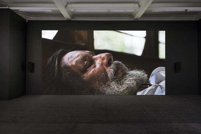
Amar Kanwar’s latest video installation delves into more mystical concerns than the documentary format, for which he is known, might seem capable of containing. The eponymous single-channel video at the heart of “Such A Morning” (all works 2017) is an exquisitely installed piece of visionary slow cinema—a work whose mode comes close to magical realism, speculative fiction, or fractured moral parable. Where Kanwar’s earlier films always had one foot in reality, this 85-minute work unfurls a loose narrative in which a famous but unnamed mathematics professor quits his job for no good reason (his colleagues guess at a “deep inner question of the soul” or “a complex conflict of ideology and prejudice”), and retreats to the wilderness to live in an abandoned train carriage. Previously installed at Documenta 14, Such A Morning voices a general existential question: how to live in the present?
Such A Morning is a cinema of affect at its most seductive. Kanwar’s camera captures verdant leaves, rust, and old wood; his soundtrack includes traditional Indian music of flutes and strings. Immersed in this sensorial world, the mathematician’s mind appears to transcend the world of logic, deduction, and syllogisms, to a new plane of emotional resonance between environment …
June 21, 2017 – Review
John Gerrard’s "X. laevis (Spacelab)"
Laura McLean-Ferris
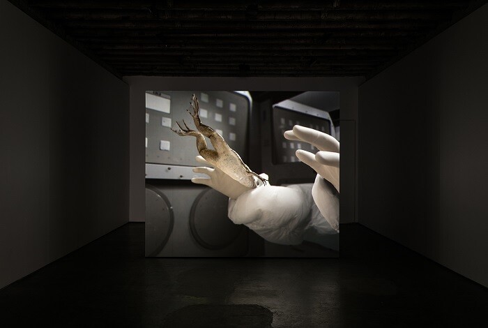
Where is the bright line between life and the simulation of life? And what then are the criteria for assessing aliveness? These questions are forever reconstituted and assessed anew at life’s fringes—around automata, the dead, artificial intelligence. 2017’s prestige AI television series Westworld is only the most recent thinking-through of such questions—a narrative in which robots make a leap into sentience through the injection of a “mistake” memory gesture into their programming. In 1780 Luigi Galvani ran currents of electricity through dead frogs’ legs, the force animated the limbs so that they twitched and jumped (the term “to galvanize”—to electrify into action—is named after the scientist). The repercussions of this experiment, and the question marks it placed over animation, reanimation, and the godlike ability to give life charged through Mary Shelley’s Frankenstein (1818), the seminal horror story which drew on Galvani’s experiments to consider the implications of electricity as the force of vitality.
Such histories and philosophical problems are embedded in John Gerrard’s new simulation, X. laevis (Spacelab) (2017), on view at Simon Preston, playing on a large screen in the center of the gallery. Like several of the artist’s previous works, this is a digital animation that renders in real …
June 7, 2017 – Review
Mel Bochner’s “Voices”
Kim Levin
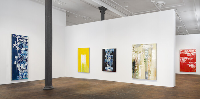
At a moment when all kinds of anxieties can be tweaked by a tweeting president, Mel Bochner—a highly respected first-generation Conceptualist—has found his voice. Or perhaps I should say, these uneasy times have caught up with Bochner’s word-based art of language and ideas.
Other founding Conceptualists of the late 1960s— Robert Barry, Douglas Huebler, Joseph Kosuth, Lawrence Weiner—formulated their immaterial ideas and the stenciled or neon words to articulate them early, and stuck with them, developing and refining them. In those days, Bochner’s dematerialized works questioned the measurement of space. When his early “Theory of Sculpture” series (1968-73)—made with numbers, lines, circles, white stones, and walnuts arrayed on the floor—was re-shown at Peter Freeman in 2013, Roberta Smith in the New York Times called the pieces “elegant thought puzzles.”
But shortly after the turn of our century, Bochner went backwards to move forward. He embraced the old material-based act of painting on canvas. He began making enigmatic, hotly expressionistic, and sometimes illegible words with brushy, runny, dripping oil paint. At the time, some of us were puzzled by this apparently retrograde move by a highly theoretical artist who had studied philosophy. Was he still making Conceptual art? Or was he turning to …
June 2, 2017 – Review
Dara Birnbaum’s “Psalm 29(30)”
Leo Goldsmith
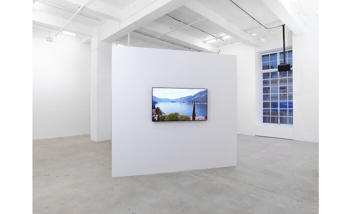
Six years in, Syria’s Civil War has been the subject of a vast quantity of information—in the form of user-generated video, reportage, news analysis, social media updates—and yet we seem no nearer to an adequate means of representing it. Representation and resolution are often intertwined: the clarity of a representation, the point at which visual material resolves into an image, is a question of the way in which content is subjected to form. We are still seeking a form with which to organize the barrage of information from Syria into a coherent image that will make the conflict materially sensible for those only able to apprehend it from afar.
Documentary media have historically been the privileged modes through which to process such crises. News reportage now constitutes the most prolific of these, if also the noisiest. But contemporary art, with its recently intensifying interest in strategies of documentary, has been quick to respond as well: through photography and reenactment—such as Ai Weiwei’s restaging of the shocking photograph of Alan Kurdi, the Syrian toddler who drowned off the coast of Turkey, with the artist himself as the dead child—as well as more “archival,” object-based exhibitions of work made by Syrian artists or …
May 23, 2017 – Feature
New York City Roundup
Orit Gat
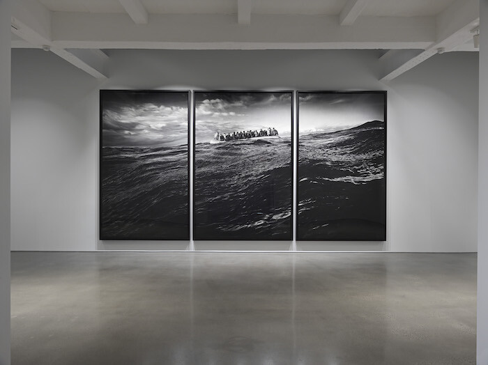
As I missed out on international art events this season because New York is so far away, all I could think of was how unlucky their curators are. You work on Venice or Documenta for a year or two or four. You start out researching when there’s a somewhat liberal president in the US and some island off the coast of Europe still considers itself part of the union. Though the war in Syria, the refugee crisis, and economic instability in the EU were already present, there’s still a feeling that this past year has served too many blows. And those large-scale exhibitions, years in the making, all opened to a great unknown.
On Instagram, almost all the photos I see from Venice are of the same works, and I wonder how and if they respond to the current situation, whether there is a way for art not to seem detached. In New York, few of the exhibitions currently on view in commercial galleries and museums focus directly on contemporary politics. At Metro Pictures, Robert Longo’s show, “The Destroyer Cycle,” does just that. It’s comprised of large-scale charcoal-and-graphite drawings of riot cops in full gear, prisoners being led to a CIA …
May 11, 2017 – Review
Jörg Immendorff’s “LIDL Works and Performances from the 60s”
Andrew Stefan Weiner
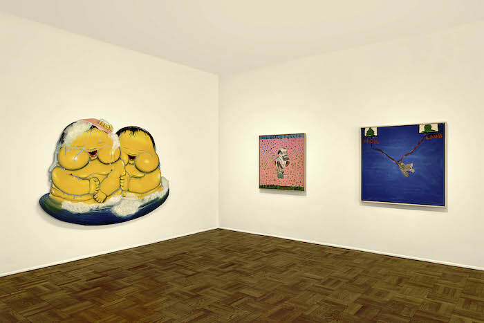
At the time of his death in 2007, Jörg Immendorff was celebrated in his homeland as one of postwar Germany’s most famous artists, and also as one of its most infamous. Earlier that year the terminally ill, functionally incapacitated painter had directed a team of assistants to produce an official portrait of the former Chancellor Gerhard Schröder. The commission from Schröder, a friend of the artist, offered him a chance to redeem himself after a spectacularly louche scandal in which police found the wheelchair-bound Immendorff enjoying the company of seven prostitutes in a posh hotel suite, accompanied by some eleven grams of cocaine (on a Versace tray, no less). Whether because this rehabilitation was in fact successful, or more probably because Immendorff’s improbable escapade only enhanced his rakish reputation, a decade later the artist’s status in his homeland looks to be secure.
However, outside Germany matters are less clear. While Immendorff’s name is widely recognized, he has failed to attain the sort of superstardom associated with peers like Isa Genzken, Sigmar Polke, or Gerhard Richter, or even with younger artists like Martin Kippenberger. Although his work is in the collections of MoMA and Tate Modern, along with many other prominent museums, …
May 5, 2017 – Review
Frieze New York
Rachel Wetzler
The first thing I saw upon entering the tent at Frieze New York was Elmgreen and Dragset’s Rite of Passage (2014) at Massimo De Carlo, a tattered sign bearing the word “MIRACLE” with a white vulture perched on top, flanked by lengths of torn chain link fence. This dismal tableau fitted the mood: when I left my apartment for the preview on Thursday morning, Congress was, for the second time in as many months, debating a bill that would return millions of Americans—including most of the artists and writers I know—to the ranks of the perpetually uninsured.
This unreal quality of the fair, literally ensconced on an island, was the subject of Dora Budor’s Frieze Projects commission, MANICOMIO! (2017), for which she hired several Leonardo DiCaprio impersonators to meander around in the guise of the actor-collector’s notable characters. Details were left intentionally murky in the advance press materials, presumably to enable moments like the one I experienced upon seeing a man with a scraggly beard and fur cape walk by: I jotted down in my notebook “is the man dressed like he belongs in The Revenant a performance artist, or just weird?”
Still, I was pleased by the distraction. Though the overall …
April 13, 2017 – Review
“Sputterances”
Tim Gentles
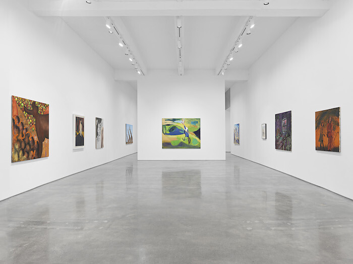
In artist Sanya Kantarovsky’s latest curatorial venture, an exhibition at Metro Pictures organized around the underappreciated Dutch painter René Daniëls, he continues to examine the mechanics of artistic positioning. Similarly, in his previous curated exhibition, “No Joke” at Tanya Leighton (Berlin, 2015), he grouped together work that, through humor and self-deprecation, cast a self-reflexive eye on the mythologization of the artist.
Daniëls, who suffered a cerebral hemorrhage in 1987 at the age of 37, and has only made work sporadically since, was initially received as a Neo-Expressionist, a movement known more for the expulsion of sweat and blood onto canvas than critique of the broader art field. Yet Daniëls’s work—and the present exhibition, whose title “Sputterances,” a portmanteau of sputter and utterance, derived from a poem written by the artist—suggests that this is hardly a neither/nor proposition, and that, rather, expression is tied to the mutual dependence of sense and nonsense, central to which is the question of the frame.
For “Sputterances,” Kantarovsky has assembled 22 artists, ranging from his peers, elder statespeople of figurative painting’s seemingly perpetual renewal, and historical figures both vaunted and obscure, alongside three works by Daniëls. It’s not immediately clear what unites these artists, much less around …
March 21, 2017 – Feature
78th Whitney Biennial
Chris Sharp
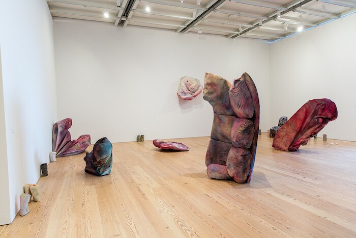
The stakes surrounding this Whitney Biennial are, to say the least, high. Indeed, it’s hard to imagine a biennial being under more pressure to signify, to mean, to produce meaning, to attempt to offer some special and tangible insight into our current moment. Instead, what the curators Christopher Lew and Mia Locks offer is art. This is not to say, of course, that the art presented here is divorced from our current harrowing reality, by any means, but that it does not forfeit its unique transformative power in the face of it. Lew’s and Locks’s love of and faith in art is refreshingly unequivocal. Nor is this to say that the biennial they have curated is devoid of the political, insofar as one of the capacities of the political is to seek to imagine alternatives to the status quo. In the alternative imagined here, an ideal diversity and gender balance reigns. Of the agreeably modest and negotiable number of 63 artists and artist collectives, this biennial possesses more artists of color than any other in its past. That diversity is not limited to ethnicity, gender, and geography (artists hail from as far afield here as Puerto Rico and Seattle, although …
March 9, 2017 – Review
Lynn Hershman Leeson’s “Remote Controls”
Alan Gilbert
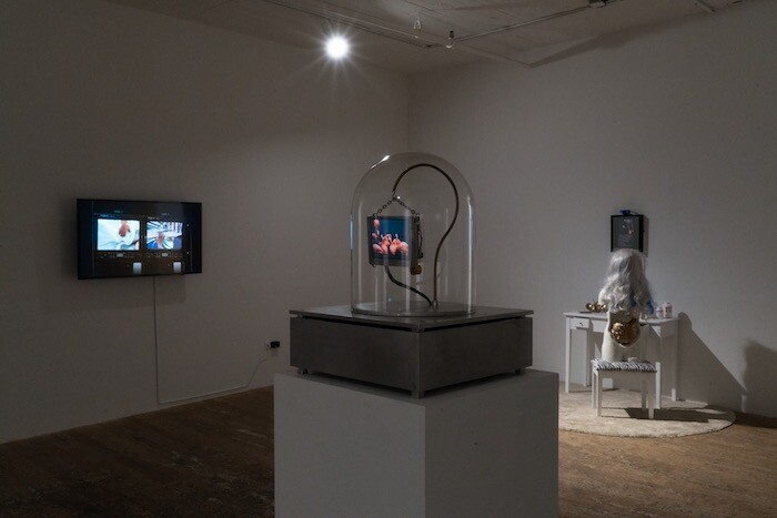
One day the interface between humans and computers will be seamless. For now, it involves necks bent over smartphones, hours sitting hunched in front of a monitor, fingers and arms that still need to extend toward their devices. Despite all the talk about disembodied experiences and virtual worlds, computer technology hasn’t superseded the physical body; instead, it’s subtly reshaping it, including neurochemistry. Nevertheless, some new media and digital art treats computers as if they’re mostly tools for creating shiny images and scrolling animations, especially when abstraction is added to the mix. Many of these works can feel like painting and video simply updated for the electronic age.
The first audio track encountered upon entering Lynn Hershman Leeson’s exhibition “Remote Controls” at Bridget Donahue is the phrase “touch me.” It emanates from Deep Contact (1984–89), described on the exhibition checklist as the “earliest touchscreen”—i.e., the first artwork to utilize an operational touchscreen. Hershman Leeson has always been at the forefront of incorporating new technologies into her work (checklist descriptions also mention “earliest digital editing software” [Seduction of a Cyborg, 1994], “earliest emotional engine to reflect stock market data” [Synthia Stock Ticker, 2000–2], and “earliest interactive LaserDisc” [Lorna, 1979–84]), but accompanying this exploration …
March 3, 2017 – Review
The Armory Show and Independent Art Fair
Brian Karl
If the art auction is the ultimate hunger games of ostentatious display for your taste and bank account, the art fair is the auction’s suburban or exurban cousin: the mega shopping mall, where everything is under one roof. Whether or not you went in knowing what you wanted to get and what your individual sensibility might consist of, there is a tidal flow of people and things that overwhelms and cross-wires your brain toward shutdown.
Any individual piece of art, of course, has its competitors for attention at the fair, including not only a swirling mass of people (most decked out in lively garb) but the mass of art itself, an ongoing assault not just to the eye but to the mind demanding response to an endless stream of questions, starting with “What is that?” and often ending with not only “Is it good or bad?” but “Why?” or “What is it good for?”
The Armory Show, having established itself after a mere 22 years as the go-to art fair of scale in New York, is attempting this year to buck off a sense of staidness, of predictability and unmaneuverability. Filling two of the giant piers on the Hudson River (appropriately enough, …
February 28, 2017 – Review
Kader Attia’s “Reason’s Oxymorons”
Andrew Stefan Weiner
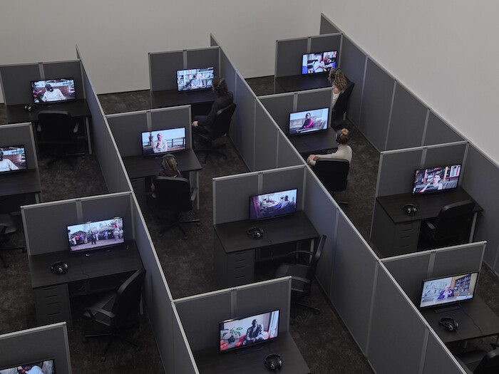
Despite their enigmatic, aloof character, most of the works in Kader Attia’s current exhibition at Lehmann Maupin are relatively easy to make sense of. Whether in their medium (neoconceptual sculpture), their mode of facture (readymade assemblage), or their topic (cultural hybridization), they exemplify what we now expect of “global contemporary art.” This isn’t meant pejoratively; the sculptures are poetic, spare, and subtle, compelling attention while frustrating reductive interpretation. They show why the artist is receiving ever-broader acclamation, and they make clear that he deserves it. Attia’s inventiveness and spatial intelligence are evident from the show’s outset, most memorably in an arrangement of Styrofoam packing materials upon a wooden table (Untitled, 2017), a piece that looks like it might have taken minutes to assemble but that reads as a mordant update of Constant’s designs for New Babylon (1959-74).
By and large, the other sculptures in the show successfully achieve the objectives they seem to set for themselves, reworking established tropes of the Western neo-avant-gardes by interrogating their assumed universality; the precedent of artists like Jimmie Durham and David Hammons is clear. With that said, the piece that stands out is the one that doesn’t really work, at least not in the way …
February 10, 2017 – Review
Halil Altindere’s “Space Refugee”
Orit Gat
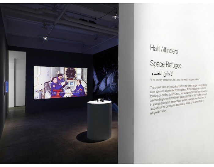
Muhammed Ahmed Faris is the only Syrian who has traveled to outer space. A colonel in the Syrian Air Force, Faris—the subject of Turkish artist Halil Altindere’s video Space Refugee (2016)—joined the Soviet cosmonaut program in 1985 and was part of a mission to the Mir Space Station in 1987. “Those seven days 23 hours and five minutes changed my life,” Faris told The Guardian. He saw this experience as a privilege that he could share with other Syrians through education in science and astronomy, but that was not on the agenda of President Hafez al-Assad, who controlled Syria following a coup in 1970.
When in 2000 al-Assad died and his son Bashar succeeded him, Faris was the head of the Syrian Air Force Academy and a military advisor. To The Guardian, Faris describes both father and son as enemies of the people, who ruled by maintaining their population as uneducated and divided as possible. In 2011, when the revolution in Syria broke out, he marched in Damascus, calling for reform; the next year he defected to Turkey, becoming one of the five million Syrian refugees to leave the country.
Faris and Altindere met in Istanbul, and the cosmonaut became the subject …
January 19, 2017 – Review
Arthur Jafa’s “Love Is The Message, The Message Is Death”
Genevieve Yue
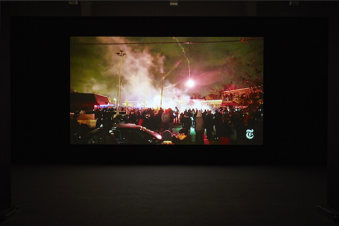
The art world is overstuffed with collages of YouTube clips and Internet artifacts, with most of these trafficking in an ironic glibness that is overly praised either for its affect or lack of it. Though cut from the same digital cloth, the compilation video Love Is The Message, The Message Is Death (2016) comes from a radically different place. Appropriately situated in Gavin Brown Enterprise’s new location in the historic black (and rapidly gentrifying) neighborhood of Harlem, this monumental piece is the sole work on view in the cavernous, converted brewery. Jafa doesn’t allow his materials—a collection of black athletes, musicians, dancers, civil rights leaders, victims of police violence, and sci-fi creatures—to overwhelm him; instead he moves with them, feeling a pulse in and through each fleet and purposeful cut.
This makes the work emphatically cinematic. Jafa, a long-time cinematographer whose career includes Julie Dash’s newly restored Daughters of the Dust (1991) and two recent music videos for Solange Knowles (“Don’t Touch My Hair” and “Cranes In The Sky,” both 2016), has developed a complex system of continuity that goes far beyond classical Hollywood cinema norms. Instead, he adapts a musical structure of harmony, rhythm, and variation, as when a shot …
January 17, 2017 – Review
Gordon Matta-Clark
Mara Hoberman
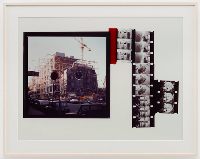
“If anything emerges to cut up, I’ll go anywhere, anytime” wrote Gordon Matta-Clark in 1975. Earlier that year, Paris had come calling, and, at the invitation of the ninth edition of the Paris Biennale curated by Georges Boudaille, the artist realized Conical Intersect (1975). Photographs, photomontages, and film footage of Matta-Clark’s highest profile project in Paris (where he spent considerable time during his short lifetime) are now on view as part of the artist’s first solo show in France since 2000.
Conical Intersect, an enormous oculus that Matta-Clark carved through two abutting seventeenth-century apartment buildings on rue Beaubourg, is a spectacular example of what Matta-Clark described as his practice of “anarchitecture” as well as a case study of how the artist engaged with physical and sociopolitical structures. Overlooking the construction site where the Richard Rogers and Renzo Piano-designed Pompidou Center would open two years later, Conical Intersect created a giant peephole onto gentrification in-progress. Matta-Clark cited Anthony McCall’s seminal light and fog installation Line Describing a Cone (1973) as inspiration, but Conical Intersect’s corkscrew form also evoked the tornado of controversy surrounding its neighbor. Though the Pompidou Center is now an architectural icon and top tourist attraction, it was initially much …
January 9, 2017 – Review
Wael Shawky
Ilaria Bombelli
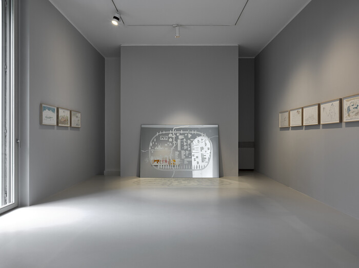
Craggy peaks of stone, desolate plains, parched and rasping arctic coasts—still caught perhaps in some distant geologic era—provide a home to stray beasts of all kinds: the spindly heads of snakes rise like pinnacles from the summits of crumbling towers. The sagging legs of pachyderms prop up arcades redolent of Byzantium. The hooked beaks of hawks frown from the prows of merchant vessels. Prehistoric herbivores with dorsal crests like minarets spring from the ground, breaking its crust as if they had just awoken from centuries of hibernation. The salt spume curls into the outline of a feather, of a scale. Stone turns to visage, snout, and sneer.
Pinned down by tremulous lines of ink and graphite, and filled with the pale colors of a sorbet—blush, ocher, powder blue—the drawings of surreal vistas (about 20 in all, with the collective title Al Araba Al Madfuna Drawings, 2015) that underpin Wael Shawky’s first show at Lisson Gallery’s Milan venue tell of a world straddling past and present, East and West, with the penchant for zoomorphism found in ancient civilizations, first and foremost that of Egypt, the artist’s home country. Docile creatures parade through them, alarming no one. The doubtful perspective skews planes and …
December 20, 2016 – Review
Ai Weiwei’s “Laundromat” and “Roots and Branches”
Andrew Stefan Weiner
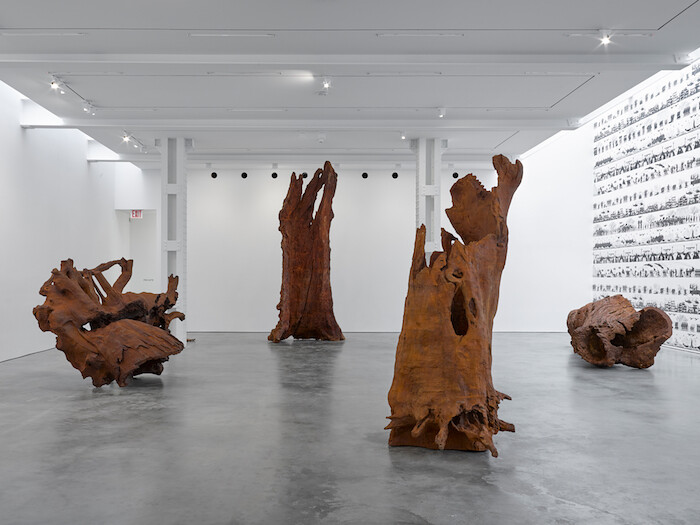
Whatever one might think of Ai Weiwei, he has made it impossible to simply not think about him. Ai’s will-to-notoriety has led to him to become all but ubiquitous, with much of this publicity deriving from his transformation into the world’s most prominent artist-activist. Critical reactions to this development have been mixed. While some have hailed Ai’s bravery, taking this reinvention as a convincingly artistic act of self-fashioning, many have criticized him as a sloppy artist, an opportunistic activist, or an impresario who forces both art and politics into the service of his own self-promotion. Still others have sought to split the difference: “wonderful dissident, terrible artist,” as Jed Perl put it in the New Republic.
It is difficult to find adequate precedents or analogies for the position of Global Artist-Activist that Ai has created for himself. Andy Warhol shunned politics, whereas Joseph Beuys wanted little to do with pop culture; in some ways Ai’s aesthetic and commitments resemble those of Thomas Hirschhorn and Tania Bruguera, but neither enjoy anything like his degree of international exposure. It would seem that the best parallel is the celebrity humanitarianism of Angelina Jolie or Bono: the artist has made publicized visits to refugee camps; …
December 1, 2016 – Review
Carolee Schneemann’s “Further Evidence - Exhibit A & B”
Leo Goldsmith
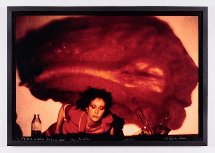
Exploded canvases, split screens and multiple channels, mixed-, multi-, and inter-media: Carolee Schneemann has been clear in her rejection of medium specificity in favor of what one might call medium promiscuity. Since the early 1960s, she has consistently incorporated images (both moving and still) into multimedia environments that include elements of performance, painting, sculpture, installation, Happening. This has always made her difficult to categorize and, despite her centrality to the history of the last half-century of American art, easy to marginalize. The intense hybridity of form and medium is, in this sense, partly bound up with her feminism, her explicit engagement with sexuality, and the exploration of her own body through her work.
While her contribution to experimental cinema is fairly well known, her reputation rests almost entirely on the four films she made between the mid-1960s and late 1970s. Relatively little has been written about her practice since then, leaving a lacuna which is only now being filled by a two-part solo exhibition, divided between P•P•O•W Gallery (“Further Evidence – Exhibit A”) and Galerie Lelong (“Further Evidence – Exhibit B”), which focuses on work that the artist made in a number of mediums—video installation, collage, sculpture, performance, drawing, painting—from the …
November 17, 2016 – Review
Jacky Connolly’s “Shadows on the Hudson”
Tim Gentles

A source of artistic fascination since the nineteenth century, when it became the subject of the Hudson River School of landscape painters, the grandeur of Upstate New York’s Hudson Valley also figures in Jacky Connolly’s first solo exhibition, at Kimberly-Klark in Queens, New York. The exhibition’s centerpiece is a video projected against the wall of the darkened gallery—for the duration of the show, the gallery is only open during the evening. Entitled Hudson Valley Ruins (2016), the video, as with all of the artist’s, has been constructed entirely within the computer game The Sims 3 (2009). Named after a website that chronicles the region’s abandoned architectural landmarks, it is set in a virtualized Hudson Valley with an ambience that might best be described as rural-suburban Halloween macabre circa 2004. Hudson Valley Ruins’s opening sequence clearly situates its aesthetic coordinates—cartoonishly gothic red lettering displays the title over a shot, at dawn, of rolling hills, fall foliage and, in the foreground, a weather vane on the roof of a lone house. The wind whistles threateningly, a motif that persists throughout the video’s half hour. Then, it begins to rain.
Like The Sims, Hudson Valley Ruins contains no dialogue, but is accompanied by in-game …
November 1, 2016 – Review
Bruce Nauman’s “Contrapposto Studies, i through vii”
Kim Levin
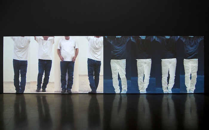
He was considered a lightweight in the early days of post-minimalism but for decades Bruce Nauman has been praised as one of the most wildly influential artists of our time. His video performances with the sounds of their own making hover between tedium and enthrallment, banality and profundity, repetition and distortion. Nauman’s art probes the failure of language and the betrayals of the body and what used to be known as “the eternal verities.” One Hundred Live and Die (1984), his huge flashing neon wall piece at the Benesse House Museum on the Japanese island of Naoshima, proclaims a litany of one hundred oxymoronic alternatives: “LIVE AND DIE, LOVE AND DIE, SHIT AND DIE, PISS AND DIE, EAT AND DIE, SLEEP AND DIE, HATE AND DIE,” and their opposites, “EAT AND LIVE, SLEEP AND LIVE, LOVE AND LIVE, HATE AND LIVE.” His Clown Torture video installation (1987) is as excruciating to listen to as it is to watch. Nauman’s art goes straight to the crux of the human condition.
One of his best-known early video performances is Walk with Contrapposto (1968), in which the young Nauman sashayed back and forth along a narrow corridor, swinging his hips from side to side.(1) …
October 25, 2016 – Review
Simon Denny’s "Blockchain Future States"
Andrew Stefan Weiner

Few major exhibitions in recent memory have generated anything like the sort of intensely polarized response that greeted the recently concluded 9th Berlin Biennale, curated by the New York-based DIS, an increasingly notorious group of Gen X and Y “creatives” with close ties to the fashion and advertising industries. A recent publicity email from the Biennale explicitly highlighted this split, inviting readers to peruse the show’s “accolades” alongside its “viral backlash.” Yet despite this blithely mediaphilic rhetoric of all-press-is-good-press, the statement barely concealed a more defiant, even petulant message, evident in its illustration—a smugly confrontational photograph of a man and a woman wearing Yngve Holen’s Hater Blockers contact lenses (2016)—and its advertisement for a “soundtrack” mix by Isa Genzken and Total Freedom called FUCK THEM ALL (2016).
In presuming that any negative responses could be dismissed as mere hateration, the message positioned the Biennale as standing somehow beyond critique. This maneuver formed part of a more concerted defensive strategy in which the exhibition’s curators framed their product as immune to conventional forms of postmodern criticality, while simultaneously deploying their own bespoke, branded form of critical discourse, for example in a guest-edited issue of DIS magazine that attempted to theorize the “post-contemporary.”
So …
October 14, 2016 – Review
Matthew Barney’s "Facility of DECLINE"
Thyrza Nichols Goodeve
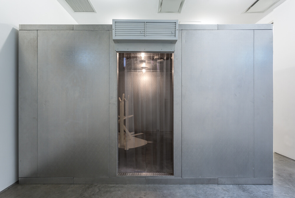
Archival documents “are not items of a completed past, but rather active elements of a present,” writes Ariella Azoulay. As e-flux Criticism takes a break from publishing new material in August, the editors have selected a few pieces from our free-to-access archive (of more than 1,700 articles) that might relate in new and unexpected ways to the moment.
Matthew Barney’s recent show at Gladstone Gallery explored the limits of the body by pushing the boundaries of his materials. Thyrza Nichols Goodeve’s response to his 2016 show at the same venue—which “mirrors but does not reproduce” the 1991 show that transformed Barney’s reputation—offers a nuanced overview of a career characterized by continual reinvention that comes from repeated return to a creative source. Barney’s new video installation SECONDARY is on view at the Fondation Cartier pour l’art contemporain in Paris through September 8.
“Facility of DECLINE” at Gladstone Gallery, New York, “mirrors but does not reproduce” Matthew Barney’s iconic 1991 exhibition of the same name at the gallery’s SoHo space. Immediately upon entering, one is immersed in Barney’s now familiar yet ever fantastic world of petroleum jelly, mythic characters, seductive hermeticism, and ever-revelatory aesthetic invention: the signature hermetic conceptual drawings in self-lubricating plastic …
October 4, 2016 – Review
Andrea Zittel
Alan Gilbert
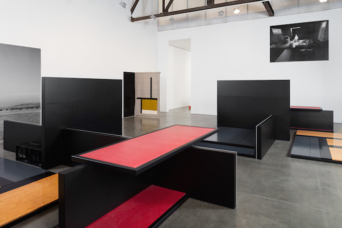
While driving through the Mojave Desert two hours east of Los Angeles in the area surrounding Joshua Tree National Monument, among the most striking aspects of the scrub-and-bleached landscape are abandoned wooden shacks that regularly punctuate the view. The majority are nothing more than weather-blasted frames with doors and windows gone. Most are the products of a Small Tract Act that lasted from 1938–1976, whereby the federal government sold small parcels of land for cheap to those who built structures on the property and made an effort to inhabit it. As the current vacancy rate shows, most denizens couldn’t maintain a viable existence in the unforgiving desert environs.
It’s to this area that Andrea Zittel moved from Brooklyn in 2000 to make an attempt at total living, which involves designing and building domestic and work spaces, producing clothes, growing food, and having greater agency over one’s social and cultural experiences—all of it done on a relatively small and sustainable level. Although since expanded to 50 acres, Zittel’s experiment is still dwarfed in comparison with, for instance, Donald Judd’s related project for the art of living in Marfa, Texas. (Of course, he initially had many more resources at his disposal.) A one-person …
July 26, 2016 – Review
John Akomfrah
Andrew Stefan Weiner
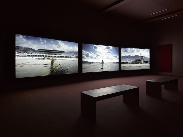
It is lamentable and somewhat curious that John Akomfrah is just now receiving his first major exhibition in the US. Despite the critical acclaim Akomfrah has received in the UK and Europe, both for his recent solo output and his earlier work with the Black Audio Film Collective, he remains relatively unknown to Americans outside the experimental film community. One hopes that the current show at Lisson Gallery’s new Chelsea outpost will begin to address this oversight, thereby bringing more attention to the pivotal, underexposed history of Black British cultural production in the Thatcher era and to its continuing relevance in the present.
Responding to the precedent of Third Cinema, as well as the thinking of figures including Stuart Hall and Paul Gilroy, groups like BAFC and Sankofa Film and Video Collective (which included Isaac Julien) used broadcast media to advance a nuanced critique of the intersections between race, neoliberalism, and postcoloniality. Rethinking the politics of the African diaspora through the idiom of emergent artistic, musical, and mediatic forms, these cooperatives laid the foundation for what would later be called Afrofuturism, establishing a crucial precedent for contemporary practices like those of the Otolith Group and Chimurenga. Perhaps the most outstanding example …
July 12, 2016 – Review
Rosalind Nashashibi’s “Two Tribes”
Rachael Rakes
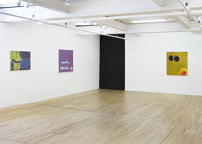
Ever-regenerating discussions in mainstream documentary discourse pit form in opposition to function. It is still commonly understood that utility and representable actuality risk becoming diluted or confused by formal invention or experimentation with narrative structure. This reasoning foregrounds a perpetuating valuation in the inherent power of the documentary as a pedagogical and propaganda tool, above all else, and suggests that a kind of ideal documentary purity is always just out of reach. Consequently, this has also produced infertile grounds from which to begin discussing documentary works that sit outside of documentary convention, even after a particularly fruitful past decade of aesthetic development in the discipline.
In some sense, the documentary’s entrance into the art world as an aesthetic and as a research mode has helped to lessen this specific pressure on the form (whether that pressure is justified is another matter). The expanded material exhibition practices of contemporary art help to constellate a more coherent message—of evidence, explanation, context—that would otherwise need to emanate solely from the single work, thereby leaving it more often than not suffused in and defined by didacticism. At the same time, contemporary art does not typically require such a rigorous self-justification in terms of its usefulness. …
July 5, 2016 – Review
Sadie Benning’s "Green God"
Alan Gilbert
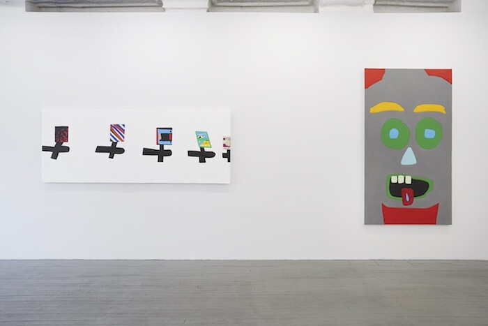
The internet and its social media spawn have made modes of communication increasingly seamless, with displays of personhood now embedded in a post or link. And while the democratic polyphony of voices has perhaps never been greater, so too is its expression through corporate-owned technologies. Ever since Sadie Benning was a teenager making short videos with a Fisher-Price toy movie camera in a working-class Milwaukee bedroom in the late 1980s and early 1990s, the artist has foregrounded the seams, the fractures, the not quite fitting in.
Those early videos brought Benning much-deserved acclaim before the artist turned 20, and they still feel groundbreaking in their fragmentary reveal of a queer identity that tentatively—yet joyfully—coalesces into a whole. In an age of unabashed selfies, it’s curious to see these works frame small slivers of the body (an eye, a hand) in a slow exposure of self over multiple videos and years. Along with making video, film, and, later, digital animation, the artist also participated in Riot grrrl zine culture (and was an original member of the band Le Tigre), and it’s possible to connect that format’s literal cut-and-paste technique and aesthetic with much of Benning’s output up to the present.
This includes the …
May 24, 2016 – Review
Amie Siegel’s "The Spear in the Stone"
Orit Gat
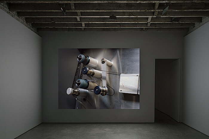
Exhibition spaces are, at times, haunted by the work they housed in the past. Walk through a museum and former installations will reverberate. Think of the Arsenale in Venice, visited by the ghosts of biennials past. This is all the more evident in galleries. The steady relationship between a gallery and an artist translates to a specific kind of knowledge by way of following, by way of making connections when seeing an artist return to a space with new work.
“Provenance,” Amie Siegel’s first exhibition at Simon Preston, in fall 2013, included a video, Provenance (also from 2013), that presented the artist’s research into the trail of value creation that occurs in auction houses. Tracking pieces of furniture created by Le Corbusier for buildings in Chandigarh, the Indian city planned by the Swiss-French architect, the work delineates the travels of tables, chairs, and settees from fancy apartments in New York and London back through their sales at auction, through auction previews, shipping crates, and finally their origin in India. Even if they are the video’s subject, these objects don’t have magical faculties, they do not carry an inherent value just by virtue of the attention paid to them; rather, value is …
May 13, 2016 – Feature
Art Fair Roundup: Berlin, Brussels, Cologne, New York
Stefan Kobel

When Claus Föttinger installed his Bar 60/99-16 (2016) in the booth of Düsseldorf’s Van Horn Gallery at Art Cologne, Rhinelanders did what they are said to do best and partied, using the installation as an actual bar. Yet what might have been expected to be the biggest celebration—the opening of the 50th Art Cologne, the oldest continuously running contemporary art fair—was a rather sober event. Everything was in place: after a long and painful downturn, some important international galleries have returned to the fair since Daniel Hug became director in 2008. Almost all of the predominant German protagonists have become regulars again since the death of Art Forum Berlin in 2010, and collectors from neighboring countries visit the fair, even some Britons and Americans. All this adds to the unrivaled (in Europe) density of private collectors and institutions in the Rhine region. Sales have always been solid—rarely spectacular—at Art Cologne, where the collectors are traditionally educated and savvy but not deep-pocketed.
But for a 50th jubilee one would have expected more. The low-key atmosphere was only partly due the general sentiment of a world in crisis, and there are structural reasons why the fair felt uninspiring. One of its strengths has …
May 10, 2016 – Review
“David Hammons: Five Decades”
Andrew Stefan Weiner
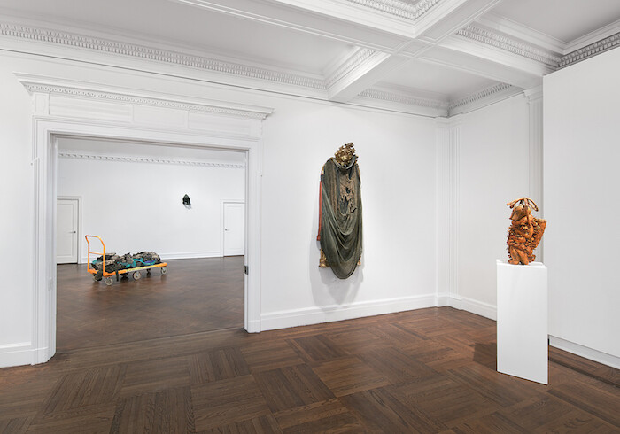
Among the many brilliant and confounding works in David Hammons’s current retrospective is one entitled A Movable Object/A Japanese Garden (2012). The piece centers around a wheeled flatbed dolly, a perfectly banal machine bearing strange cargo: chunks of broken asphalt interspersed with unrecognizable articles of clothing and lengths of colorful tulle. Facing this apparent enigma, the mind grasps after established meanings. It registers familiar qualities like texture, color, and density. It tries to establish contrasts between the jagged opacity of the asphalt and the smooth translucency of the fabric. It asks questions: what is being said here about color, about blackness, about materiality or meaning?
Searching for cues, the viewer’s eye finds a warning sticker on the dolly’s side: DO NOT RIDE OR OVERLOAD. In an elliptical manner that is typical of Hammons, this caption reads as a wry, sardonic joke. Of course the “movable object” can’t be ridden, it’s an artwork. And not only is the dolly loaded with hundreds of pounds of asphalt; the sculpture seems to be overloaded with potential meanings, not all of which resolve or align. There’s a gnomic levity to this humor but also an air of faintly hostile warning: the joke’s on the person …
May 6, 2016 – Review
Frieze New York
Tim Gentles
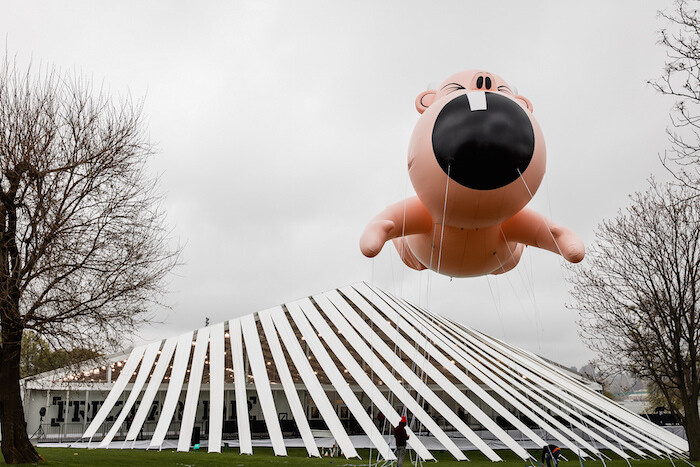
On Wednesday, the day of Frieze New York’s invitation-only preview, a friend of mine, another part-time art writer, tweeted: “Feels like a good weekend to go to something you loathe, run into people you sort of know, and make small talk about the inanity of it all.” Those who work in the contemporary art world typically approach major art fairs with a unique blend of trepidation, begrudging participation, and barely contained glee at being able to tell everyone just how busy and sleep-deprived you are for an entire week. While taking a masochistic delight in being overworked is nothing new to the art world—in fact, it could and has been argued that our longstanding tradition of eliding the distinction between work and leisure is precisely the economic model for an overworked and underpaid present—it’s a coping strategy that feels especially resonant as art fairs become increasingly numerous and integral to its fabric.
Frieze in particular is synonymous with the rise of an event culture within the art world, and this year’s iteration only serves to expand this tendency. Once again presenting a series of talks, specially curated sections, site-specific commissions, an education component, and a meticulous selection of hip New York …
April 15, 2016 – Review
Mark Dion’s “The Library for the Birds of New York and Other Marvels”
Thyrza Nichols Goodeve
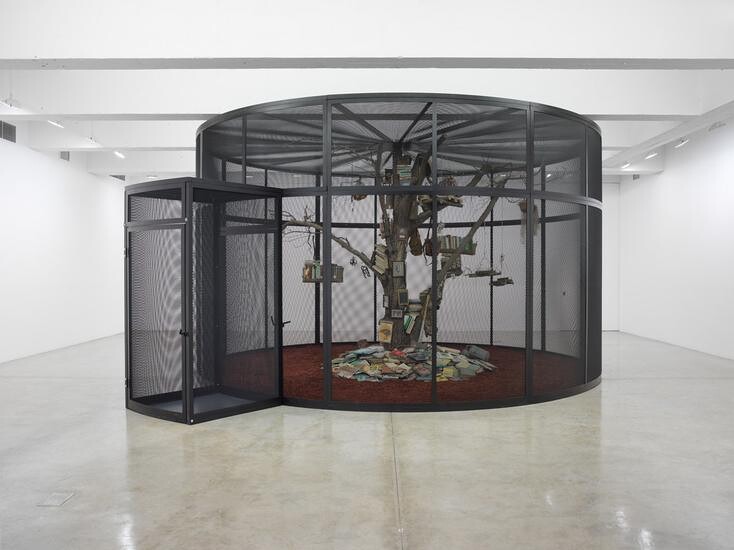
While Charles Baudelaire’s definition of “the ephemeral, the fugitive, and the contingent” is a familiar truism of contemporary understandings of “the modern,” Baudelaire’s casual, even offhand 1863 observation, “nature, being none other than the voice of our own self-interest,” is less well known. Yet if one were to draw a line from Baudelaire’s nineteenth-century evocation of the early days of modernism to our twenty-first century epoch of over-modernism(s), who but the artist Mark Dion would affirm Baudelaire’s prescient observation? As Dion knows, and explores once again in his exhibition “The Library for the Birds of New York and Other Marvels,” we live in an era when this self-interest has cast the very planet we live on into a melancholy condition of the “ephemeral,” “fugitive,” and “contingent.”
While a quick impression of the works on view suggests Dion has broken no new ground, and may even be recycling what have become all-too familiar tropes, it is the contingent, the detail, the specificity of the subject matter of each piece, that reveals once again Dion’s cogent, nuanced, and up-to-the-minute dissection of this self-interest we call nature. For instance, the formal elements (monumental bird cage, dead tree trunk, shelves and piles of books, photographs …
March 23, 2016 – Review
Ana Mendieta’s “Experimental and Interactive Films”
Kim Levin
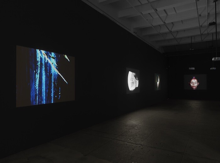
It is now impossible to speak of Ana Mendieta’s pioneering, ritualized, land-body performance art without referring to the still unsettling manner of her untimely death—fallen, pushed, or thrown from a 34th-story window on Mercer Street, New York.
Back in 1988, shortly after her husband Carl Andre was acquitted of Mendieta’s murder, monochrome painter Marcia Hafif invited me to a dinner party in her loft. She neglected to tell me the purpose was to welcome Andre back to the art world. And so I found myself seated opposite him, quite speechless, at a long table of minimalists and monochromists. The conversation started innocuously, with a discussion of front-page items from the day’s New York Times. It was the summer of the circling garbage barge, which was traveling up and down the Eastern Seaboard, unable to dispose of its trash. “In some places,” one person remarked, “they just throw their garbage out the window.” Another guest added that in Rome, throwing something out the window on the New Year was believed to bring good luck, and a third regaled us with how he was narrowly missed by a milk bottle that fell from a fire escape. Each person added another out-the-window anecdote, oblivious …
March 17, 2016 – Review
“Marcel Broodthaers: Écriture”
Alan Gilbert
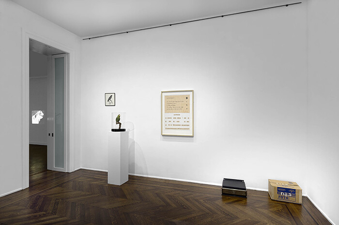
It’s only appropriate that visitors to Michael Werner’s current Marcel Broodthaers exhibition would encounter a stuffed parrot as part of the installation Dites Partout Que Je L’Ai Dit (1974). Broodthaers was a master at creatively parroting—both consciously and unconsciously—the tropes, images, and theory that may now seem a bit tame or even passé, but which during his decade or so working as an artist (1963–1976) were some of the most heady and cutting-edge ideas of the time: René Magritte’s indexically challenged “Ceci n’est pas une pipe” as contemplated by Michel Foucault in 1968; Jacques Derrida’s distinction between speech and writing; Jacques Lacan’s string of metonymic associations, etc.
Take, for instance, Parle Ecrit Copie (1972–1973), an image of which could serve quite well as the cover of any of Derrida’s early works. In a wall-mounted vitrine, three nearly identical blue typewriters with raised lids are aligned to face the viewer, with the word PARLE letterpressed in purple on a strip of canvas inserted into the carriage of the one on the left, the word ECRIT letterpressed in yellow for the one in the middle, and COPIE in the typewriters’ same shade of blue placed in the one on the right. Not exactly …
March 14, 2016 – Review
Jeanette Mundt’s “Heroin: Cape Cod, USA”
Tess Edmonson
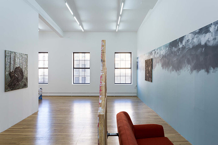
Of the six paintings that make up Jeanette Mundt’s “Heroin: Cape Cod, USA,” three render figures of women at rest. Of these, Jeanette Mundt (all works 2016) is a self-portrait; we see her body contorted into the archetypal pose of the butt selfie: the back side of her body facing the plane of the image, with shoulders and head twisted around to point the camera. Here, in their translation from photograph to painting, the artist’s hands, face, and camera (phone)—what’s typically a dense site for information—are obscured by a greyish specter, left unarticulated. In the hands of another artist the gesture of painting a selfie might feel cheap, but Mundt—simultaneously painter, photographer, viewer, and model, both subject and object—gives it grace, teaching viewers how to see a body seeing itself.
The scope of the adjacent artwork (Another Double Mountain and the Modern Sofa) feels radically different, with a sort of ugly modernist sofa affixed to an upright painted panel featuring the Alps’ Matterhorn. In the painting, the mountain’s blue peak is reflected in the waters of a deep pool at its base, with bands of paint leaking downwards. A second smaller slope bisects the image, supersaturated with rust, ochre, and peacock …
March 4, 2016 – Review
Armory Show and Independent
Sam Korman
“Who isn’t here?” I asked myself on the lead-up to the 2016 incarnations of the Armory and Independent art fairs. And I asked myself again upon leaving. A few weeks ago, I received the announcement that Laurel Gitlen Gallery closed. As an art student in Portland, Oregon, I had missed Laurel’s original project space by a year or two, but it possessed mythic status for me. After she settled in New York, her gallery lent credibility, if not a lingering inspiration, to those of us trying to organize exhibition spaces as something punk, smart, and deliberate. We followed in her footsteps—albeit in our garages—and saw that our activities could be legible in New York or Los Angeles or wherever the conversation was happening. I am not sure how many people from my Portland community would count Laurel as a direct influence, but most of my friends there have moved to New York, most still work in art or as artists, and we discussed the gallery’s closure with bummed-out, downturned glances. It’s hard not to feel indignant that the art world could suck a personal history up its ass, but an organizer can be around for one or two (or, in …
January 21, 2016 – Review
Pat O’Neill’s “Let’s Make a Sandwich”
Leo Goldsmith
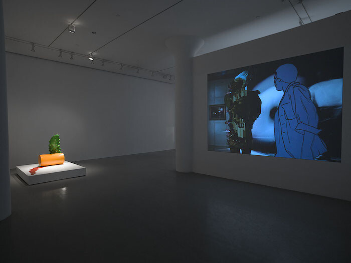
Los Angeles-based artist Pat O’Neill has been making work for the last 50 years, and yet it’s rarely seen in New York. A key figure in West Coast experimental cinema, O’Neill is probably best known for highly plastic and technically accomplished films like his lysergic 7362 (1967) or his extraordinary 35mm feature Water and Power (1989), an experimental documentary concerning, among many things, the development of the Los Angeles Basin from prehistory to the present. But since the start of his career O’Neill has also been involved in an astonishing range of media—photography, sculpture, collage, and installation, in both commercial and independent spheres. Now in his late seventies, O’Neill is the subject of his first New York solo exhibition, which offers a concise but judicious sampling of his varied output.
Comprising twenty-two works on paper, five sculptures, and three moving-image works, “Let’s Make a Sandwich” exhibits both O’Neill’s playful sense of humor and his fascination with diverse materials, images, textures, and technical processes. The visitor most familiar with O’Neill’s film work will recognize his sensibility in the other media immediately, as in the exhibition’s first object: the 2001 sculpture Forney Chair, a red wooden chair with a yellow lacquered cow horn …
January 12, 2016 – Feature
Julie Ault’s “afterlife”
Pedro Neves Marques

Dear Ted Kaczynski,
It will soon be twenty years since you entered prison. I saw that you finally changed your occupation status to “prisoner” in the Harvard alumni magazine, and that you’ve listed your eight life sentences as “awards.” Controversial as always. Twenty years have done a lot to New York… Luddite that you are, you’d hate it right now. Hell, I’m sure you’d be up for bombing the whole place! The thing is, there are so many tech start-ups, services, and businesses nowadays you wouldn’t know where to begin…
Julie Ault has a solo show at Galerie Buchholz’s new space uptown. I didn’t know that you had corresponded before, but in the show she says so, and who am I not to believe her? I’m sure you must have happened to discuss New York at some point. The city has always been a subject for her work—her life downtown in the 1980s, the artist’s collective Group Material. While Ault’s work has become more intimate, quieter, it’s definitely not mute. It’s just a different politics: of friendship, of details, her own affective archive.
Ault’s archive has traveled some: to the Museum für Gegenwartskunst, Basel; Culturgest, Lisbon (both 2013); and the 2014 Whitney Biennial …
January 8, 2016 – Review
Robert Smithson’s “Pop”
Thyrza Nichols Goodeve
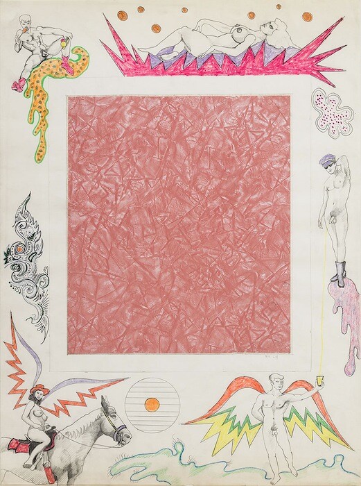
Robert Smithson grew up collecting rocks, shells, and insects. He adored The American Museum of Natural History, about which he famously said: “There is nothing ‘natural’ about the Museum of Natural History. ‘Nature’ is simply another eighteenth- and nineteenth-century fiction.” An iconic figure in what we now know as “Land Art” or “Earthworks,” he is best known for the conceptually radical distinction between site and non-site and the brilliant aesthetic repurposing of natural history, industrial decay, geology, cartography, photography (“art that is made out of casting a glance”[2]), entropy, erosion, gravity, the monumental, and the crystalline into tools and methods of conceptual and minimal art. Such works as Asphalt Rundown (1969), Spiral Jetty (1970), Partially Buried Woodshed (1970), and Floating Island to Travel Around Manhattan (conceived in 1970 but realized some 30 years after his death by Minetta Brook in collaboration with the Whitney in 2005), have given him an ambiance of neutral colors and earthy hues, tones drawn from the layers of geological sedimentation and industrial waste from which he made his art.
For this reason, you wouldn’t be the only one who passed through the glass doors of James Cohan’s handsome new gallery on the Lower East Side and …
January 5, 2016 – Review
John Russell’s “SQRRL”
Alan Gilbert
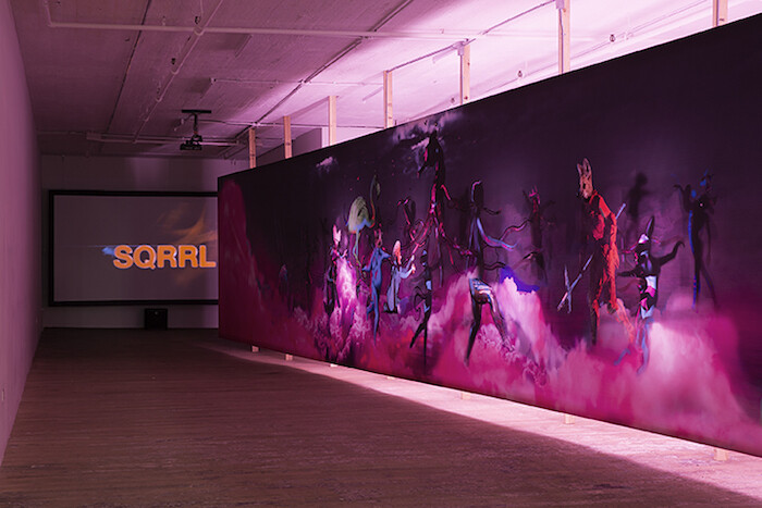
If after finishing this review you visit Bridget Donahue’s website to learn more about John Russell’s current exhibition, “SQRRL,” you’ll find a brightly hued digital collage of image and text in the place of a static gallery homepage with its neatly tabbed categories linking to exhibitions, artists, about, and contact information. Hybrid imagery featuring animals, humans, and robots is illustrated by short, cryptic texts, such as “CarlEee sits sipping coffee. / 195 years old. / Forty-five body allocations / Since the Starvation Wars of 87.” These, in turn, are explicated by 33 footnotes and a bibliography in the right-hand margin that unfolds a sci-fi-esque allegory of the present in which a predatory digital realm becomes the new organic as the human—and its various modes of social and epistemological organization—collapses in its wake. Along with slyly serving as an online artwork in the exhibition, it also functions as the show’s press release.
If you visit Bridget Donahue proper, you’ll find a 45-minute digitally animated projected video version of the web page entitled Relaxation Video: SQRRL/BRUCE WILLIS (2015) with ambient soundtrack and Russell whispering parts of the script. Beginning relatively bucolically, and with short poetic descriptions, the work vividly depicts the cyborgization of …
December 18, 2015 – Review
Hollis Frampton’s “ADSVMVS ABSVMVS”
Genevieve Yue
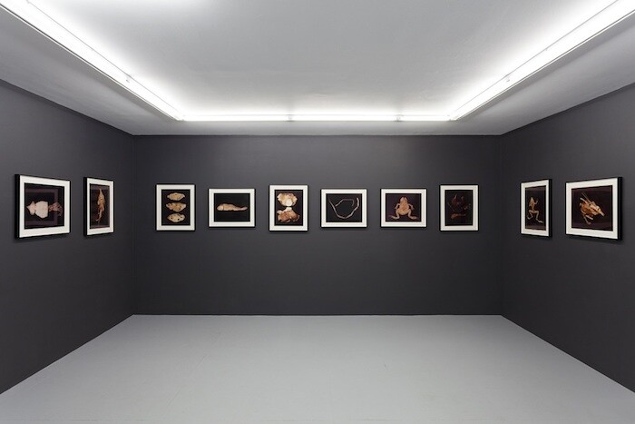
There is a certain historical irony in the way “ADSVMVS ABSVMVS,” Hollis Frampton’s last major photographic series, became the basis for his first solo exhibition in New York some thirty years after his death in 1984. Frampton himself might have delighted in this inversion of firsts and lasts; his thinking, elaborated in his theoretical writings, was often preoccupied with the origins and overlapping destinies of the media in which he practiced, namely photography, film, and, well ahead of his time, the burgeoning field of computer arts. “ADSVMVS ABSVMVS,” a series of plant and animal specimens in various states of decomposition, evinces these diachronic concerns. Paralleling the work’s archaeological overtones, this excavation of Frampton’s photographic legacy promises to be the first of many shows to bestow upon this major American artist and polymath the recognition he has long deserved.
For those familiar with Frampton’s films, it may come as a surprise that he continued to make photographs: in (nostalgia) (1971), he suggests that he has abandoned photography altogether. The film, which screened at Anthology Film Archives in conjunction with the exhibition at ROOM EAST, provides a voiceover account (spoken by Michael Snow) of the young photographer’s struggles in New York from the …
November 4, 2015 – Review
Paul Laffoley’s “The Force Structure of the Mystical Experience”
Tyler Coburn
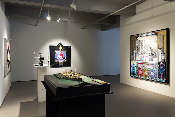
The past decade has seen a shift in art’s center/periphery model, as so-called “Outsider Art” gains both curatorial and market visibility. Yet far from losing its particularity, as David Maclagan notes in a 2012 frieze roundtable, Outsider Art risks becoming “a prospective concept, continually enlarging itself, not least because of the commercial pressures driving it.” The term, in other words, may remain an expedient, ignoring the wildly different interests and circumstances of the artists in question.
One of the roundtable discussants was Paul Laffoley, a Boston-based artist who sometimes falls into this category, though prefers to describe his relationship to the art world as that of a “lightly touching tangent.” While Laffoley has a few of the stereotypical qualities of the Outsider—an intensely private studio practice, a spiritualized singular vision—his commitments to theology and philosophy are too vast and scholarly for easy categorization.
This partly owes to his upbringing. Laffoley’s father, a lawyer, cultivated an interest in occultism and Eastern faith practices (supposedly performing as a medium). When diagnosed with mild Asperger’s Syndrome, the artist found himself in the tutelage of an Indian Brahmin who taught math at Harvard. That said, Laffoley’s creativity might also derive from a more unusual muse: a …
October 26, 2015 – Review
Wu Tsang
Rachael Rakes
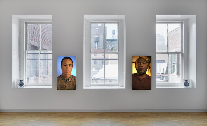
Wu Tsang’s work employs the fruits of creative human exchange as both a subject and a method. Whether engaging with various facets of queer community (Wildness, 2012, and A Day in the Life of Bliss, 2014), or previously unfamiliar subjectivities (The Shape of a Right Statement, 2008, based on a speech by autism rights activist Amanda Baggs), Tsang’s films, performances, and installations make space for reliance and collaboration. Tsang’s latest solo exhibition at New York’s Clifton Benevento is the result of an exchange with Fred Moten, the poet and theorist whose explorations of representation and identity in black avant-garde culture have over the last few years brought him into the art-world fold.
The central work of this exchange, Miss Communication and Mr:Re (2014), was initiated as a long-distance communication experiment. Moten and Tsang left each other voicemail messages every day over a two-week period, never actually making contact, but often riffing off of the other’s previous message. The recording of these messages plays over separate speakers, with the two channels laid over each other, making only segments of either party’s monologue distinguishable. Gratifyingly, the transcript reads out on a video screen across the gallery. The typed text allows their two distinct …
October 13, 2015 – Review
"Greater New York"
Andrew Stefan Weiner
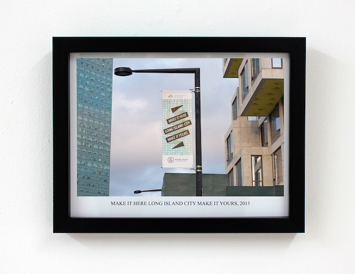
One of the biggest stories of the year in U.S. literary fiction was the publication of Garth Risk Hallberg’s debut novel City on Fire, for which the young author received a reported two-million-dollar advance––a startling number, even by the hyperinflationary standards of the contemporary art market. Such a bet seemed odd at first, given the novel’s length (nearly a thousand pages), complex plot structure, and setting (New York City in the bombed-out 1970s). However, on closer inspection the deal looked canny. With the commercial appeal of this period already proven by figures like Patti Smith and Rachel Kushner, what better time to roll out a novel full of potential screenplay material? (In the event, the film rights were optioned for six figures; the novel was also sold in 17 other countries.)
As this episode suggests, fistfuls of money are being made from the fantasy of being poor and beautiful and artisanal in New York. This is true not just in the U.S. but globally, where “Brooklyn” is the most recognizable brand identity for bourgeois-bohemian-hipster culture. One uncomfortable irony is that many of those who built Brooklyn™ can no longer afford to live there; another is that figures like Hallberg exhibit an …
October 7, 2015 – Review
Trevor Paglen
Laura McLean-Ferris
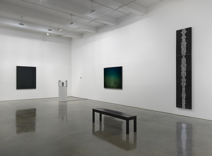
The evidence that we live in a dystopia is mostly swept out of sight, and kept out of mind. So let’s be clear that Trevor Paglen is engaged in a form of politically urgent visual labor. His work, most notably in photography, has given visual texture to a very real, and very menacing, shadow-realm. Lush, compelling images dramatize his near-failure to photograph post-9/11 black sites used for extraordinary rendition (quasi-legalized kidnap and torture of terror suspects); astral military satellites hard to make out in constellations of twinkling stars in the night sky; tiny drones seen from a distance, mosquito-like, crossing florid, sunset skies. Here are the enormous blind spots of our age, mostly off-screen zones that are routinely used to exercise and abuse power.
Presently Paglen is attentive to dismantling one of the most insidious metaphors of our age—that myth of immateriality which suggests that information is held and shared in data “clouds.” At the risk of victim-shaming myself and every other person with a smartphone, it’s true to say that societal blindness to infrastructure leaves us wide open to abuses of power. A failure to understand the geophysical elements of say, the internet (the mining of metals, the labor practices …
June 30, 2015 – Review
Lorraine O’Grady
Alan Gilbert
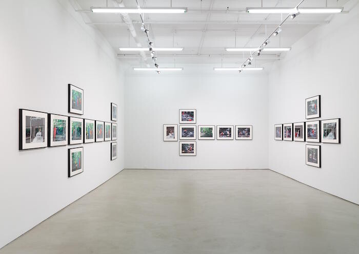
In the “Dada Manifesto on Feeble Love and Brittle Love” from 1920, Tristan Tzara famously provided instructions on how to write a Dada poem: get a newspaper and some scissors, snip out individual words and put them in a bag, shake it and then withdraw slivers of text, write down the words in the exact order in which they appear, and—voilà!—poem. Yet even more provocative than the method is Tzara’s claim that, “The poem will resemble you.” Similarly, although William Burroughs utilized the cut-up technique to undermine authorial intention and the way in which information serves as a means of control, the writings he produced in this manner continued to bear the impression of his obsessions: the police, queer sex, death.
Over the course of 26 Sundays in 1977, Lorraine O’Grady took scissors to the New York Times to create a series of text-based works recently on display at Alexander Gray Associates. If Tzara was convinced that his aleatory approach to writing a poem would nevertheless reflect the author, what does this involve for O’Grady, a crucial yet still somewhat overlooked artist of Caribbean descent who produced an important body of work in the late 1970s and early 1980s, including “Mlle …
June 25, 2015 – Review
Bruce Conner
Kevin Hatch
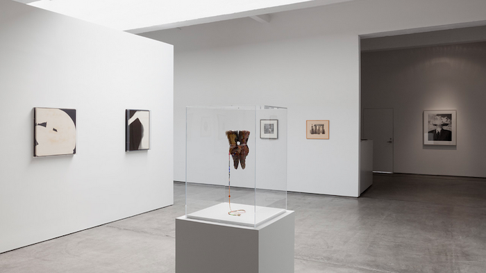
Bruce Conner used to give fits to museums and galleries. He exasperated William C. Seitz when he served as his consultant for the landmark 1961 exhibition “The Art of Assemblage” at the Museum of Modern Art, New York, which culminated in the artist dumping a box of junk at the doorway during the show’s opening (an attempt to demonstrate to the curator what “real” assemblage was). In 1964, he fatally poisoned his working relationship with his longtime New York gallerist Charles Alan by handing him a box of random objects to show in lieu of new work. And, in the 1970s, with an idea well ahead of its time, he insisted on a cut of the “box office” for a planned mid-career retrospective at what is now the San Francisco Museum of Modern Art. (He was deadly serious, and his intransigence ultimately scuttled the show.) Conner died in 2008, but it is fun to imagine what new aggravation, were he still around, he might inflict on those currently planning his major retrospective, jointly organized by MoMA and SFMOMA and set to open in July 2016. In the meantime, Paula Cooper Gallery offers an elegant if rather solemn show of Conner’s …
June 16, 2015 – Review
Stan VanDerBeek
Leo Goldsmith
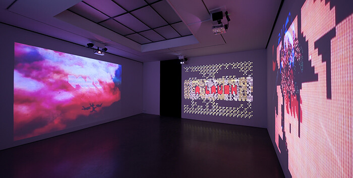
Words pulsate, then bleed into abstraction. Fields of color fragment into pixels or smear into mutating organisms. Swarming text grids explode into chaotic rainbow clouds, blinking dots, stars, and spirals. Snaking orange lines and pointillist textures form strobing mandalas, mosaic embroidery, and Pac Man architecture, tumbling geometries of throbbing color that dissolve into blue, pink, yellow, and green pixel noise.
Five of the eight Poemfield films that Stan VanDerBeek made between roughly 1966 and 1971 return to us now at a moment in which the technologies of computation and image-making have all but inextricably fused. This transition seemed only just underway when VanDerBeek died in 1984, and yet the works that he created in collaboration with programmer and physicist Ken Knowlton at Bell Laboratories in Murray Hill, New Jersey, and then further developed during an artist residency at MIT’s Center for Advanced Visual Studies, look ahead to a full integration of cinema with computer imaging, attesting both to the artist’s prescience and to his devotion to a deeply syncretic notion of media.
VanDerBeek is frequently cited as the originator of the terms “expanded cinema” and “underground film,” and while his name is most closely associated with these spheres, his body of work …
June 8, 2015 – Review
The Gallerist: Kazuko Miyamoto from A.I.R. Gallery and Onetwentyeight, New York
Luca Cerizza
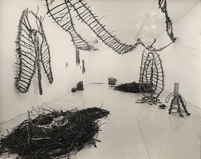
This column aims to introduce and analyze the activity of a number of gallerists and galleries. I am interested in presenting not necessarily the history of major galleries and their successful careers, but to reflect on a series of experimental approaches to the gallery format, and to discuss the different modalities in which the borders of the profession of the gallerist and the format of the commercial gallery have been tested and eventually eroded. The first episode (which discussed Fabio Sargentini and his gallery, L’Attico, in Rome) analyzed the case of a dealer who had a strong curatorial approach to his gallery program and to the exhibition format, to the point of using the gallery as his own linguistic, even artistic, tool. In this second installment, I will discuss the activities of artist Kazuko Miyamoto and her role as an early member of A.I.R. Gallery (Artist In Residence Gallery) and as the founder and director of Gallery Onetwentyeight, both located in New York.
Born in Tokyo in 1942, where she studied art at the Gendai Bijutsu Kenkyujo (Contemporary Art Research Studio), Miyamoto moved to New York in 1964 to attend The Arts Student League of New York, located in Manhattan (1964–1968). …
May 18, 2015 – Review
Vitaly Komar’s “Allegories of Justice”
Kim Levin
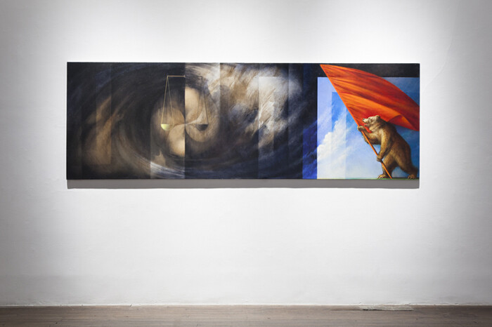
Vitaly Komar, formerly half of the illustrious team Komar & Melamid, which split in 2003, continues to paint in a style he has dubbed “New Symbolism.” For more than a decade, his virtuosic paintings of the proverbial scales of justice, tiny birds of truth, hulking Russian bears waving red flags, and circular serpents biting their own tails have been going through their allegorical paces, wrapping religion in history and spirituality in cosmic swirls. Melamid, meanwhile, has kept a lower profile.
Komar’s recent exhibition at New York’s Ronald Feldman Fine Arts, “Allegories of Justice,” which includes a few earlier works by the former team, raises a number of questions. What happens when an artist duo splits up, as Komar & Melamid did? What happens when the context of any artist’s production—in this case conceptual sociopolitical work satirically skewering both Soviet ideology and American consumerism—vanishes into thin air, as the Soviet system did, leaving them and other Soviet artists without a framework? And how do they continue to make art in the context of the internal void of a suddenly collapsed culture? Also, in the case of Komar & Melamid—who left Moscow in 1977 and moved to New York the next year—how was …
May 15, 2015 – Review
Frieze New York
Andrew Stefan Weiner
Far above the North Atlantic, a plane is flying from Venice to New York. Most of the passengers in business class sleep comfortably in their lie-flat seats, but one stays awake sipping complimentary champagne. His voice barely audible above the jets’ white noise, he muses: “Is there even any difference between biennials and contemporary art fairs?” The knee-jerk answer to his question would be, Of course. Biennials are typically organized by curatorial teams who engage in protracted research to stage thematic arguments. Whereas they ask their visitors to look and think, art fairs tell them to buy, or at least window-shop. Venice notwithstanding, most biennials exist in relatively peripheral locations and often target non-art audiences, while fairs are built to serve the needs of the global 1 percent who comprise their clientele. But another, more pertinent answer might be, Less and less, or even, Was there ever? As the sociologist Olav Velthuis has shown, aesthetic and commercial modes of exhibition have been indissociable throughout the history of the Venice Biennale. For its first 70 years, the Biennale had a sales office that worked on commission. Following the protests of 1968, it adopted new practices that spawned what Velthuis has called …
April 23, 2015 – Review
Pierre Bismuth’s “Where Is Rocky II? Trailer-Teaser”
Genevieve Yue
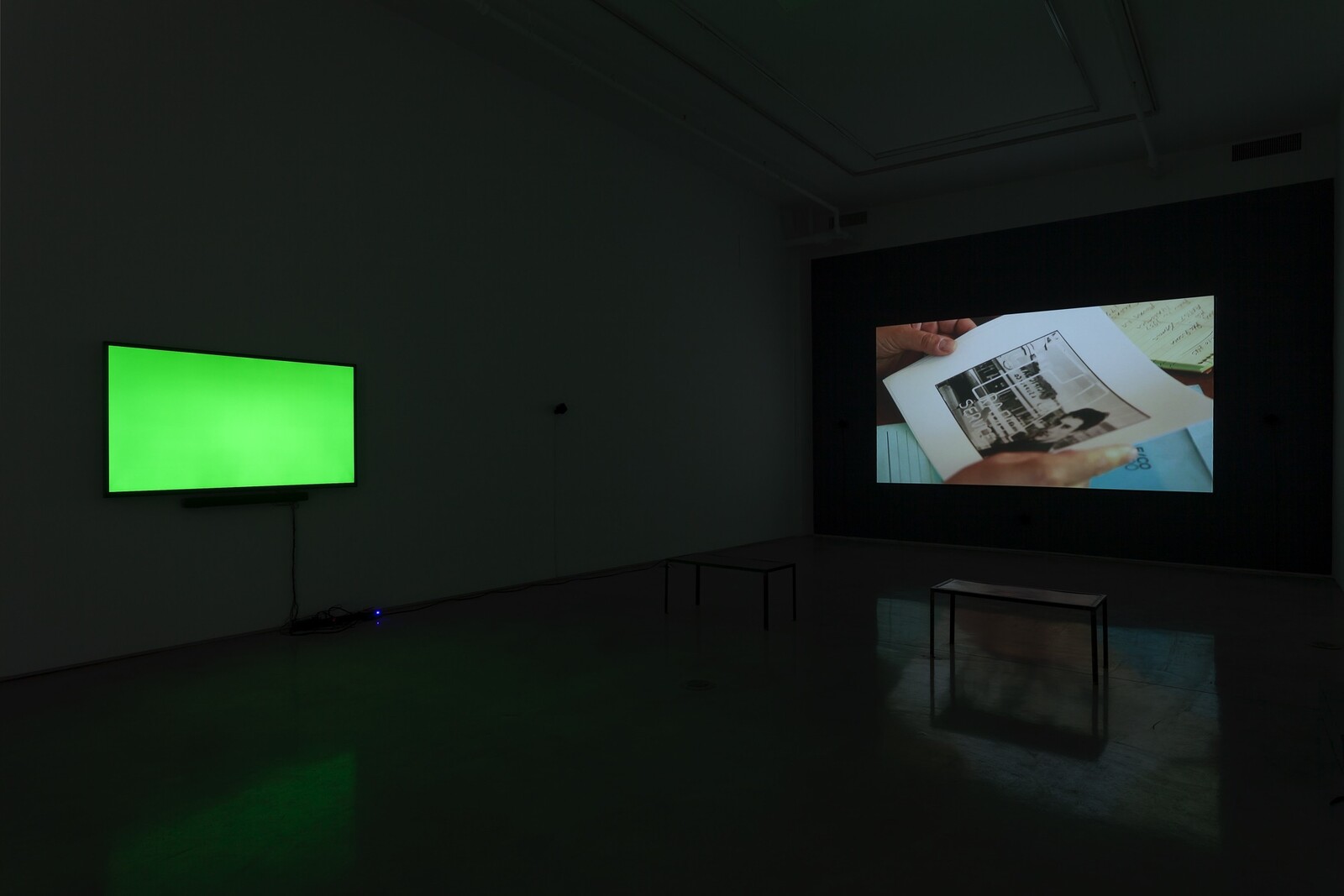
Pierre Bismuth’s “Where Is Rocky II? Teaser-Trailer” offers itself as a conceptual riddle. The two videos in the exhibition, one a two-minute teaser, the other a three-minute trailer precisely edited to Hollywood convention, play in alternation, advertising a film about an artwork that may be hidden, forgotten, or non-existent. They also hold the status of this “coming attraction” in a similarly contingent state. In the teaser, Lawrence Weiner’s voice plays over a field of solid green, the same screen used for digital visual effects, or, on a film set, a placeholder for an image that will be added later. Like the white neon letters that served as both advertisement for and a standalone artwork in Bismuth’s 2008 exhibition “Coming Soon,” there’s no guarantee that the promised film that investigates the whereabouts of Ed Ruscha’s Rocky II, a fake rock planted somewhere in the Mojave Desert in 1976 (the date given in the teaser), actually exists. If an artwork is lost in the landscape, and there’s no film to corroborate its location, is it really there?
With Where Is Rocky II?, the answer is a tentative yes. Bismuth has been shooting a documentary, which, as the trailer depicts, follows private investigator and …
April 2, 2015 – Review
Claire Fontaine’s "Stop Seeking Approval"
Stephen Squibb
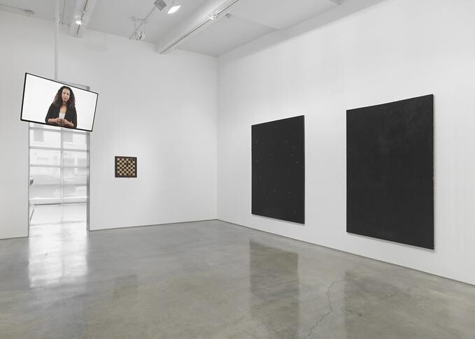
At the center of Claire Fontaine’s new show, “Stop Seeking Approval,” is a series of monochrome paintings, in gray, a burnt red, and black. They have been painted using anti-climb paint, their colors dictated by price and availability. Anti-climb paint never dries, so in addition to making its object hard to climb, anyone who touches it is marked as having done so. These paintings are permanently wet.
They are also paintings, the classic objects of desire for the collecting class, and so the temptation is to read Fontaine’s no-climb monochromes as the artist getting defensive about making objects for the purpose of exchange. And the great pleasure of “Stop Seeking Approval” is that so much of the show works as a personal expression of the ready-made artist, in addition to the host of conceptual and political levels we’d expect. The title, for example, could just as easily refer to:
1) A message from the artist to herself. 2) An excerpt from Untitled (Why your psychology sucks) (all works 2015), the re-fabricated self-help video, alternately seductive and ridiculous, that greets us on a monitor as we enter. 3) A commentary on the political strategy of Syriza. 4) A hypothetical slogan for Claire Fontaine™. …
March 27, 2015 – Review
“Destroy, she said”
Alan Gilbert
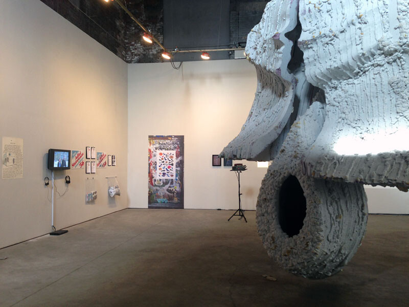
As capitalism solidifies into a global religion, iconoclasm—traditionally defined as the destruction of sacred artifacts—accordingly shifts its tactics, where it doesn’t become coopted. However inadvertent it may have been, the last notable iconoclastic act in Europe—“Beast Jesus,” an elderly Spanish woman’s attempt in 2012 to improve, while in fact defacing, a fresco portrait of its namesake—created a cash cow for the various parties involved. A more secular brand of iconoclasm in contemporary art has its famous examples—whether Tony Shafrazi spray-painting Pablo Picasso’s Guernica in 1974 or a 2006 hammer attack on Marcel Duchamp’s Fountain by a self-proclaimed Dadaist—that go alongside more conceptually oriented versions such as Robert Rauschenberg’s erasing of a Willem de Kooning drawing in 1953.
Just as every system contains the seeds of its own destruction, iconoclasm has erupted from within the current art world and even artworks themselves in response to their hyper-commoditization over the past decade or so. Recent projects have begun to address this at times literal fracturing of art as commodity object. Elka Krajewska’s Salvage Art Institute, which makes an appearance in Ben Lerner’s widely touted 2014 novel 10:04, presents works of art that have been rendered valueless (in some cases temporarily) because of damage …
March 6, 2015 – Review
Armory Show and Independent
Orit Gat
Trendspotting is a competitive sport at art fairs. Still, with every fashion, there’s always an artist who either reinvents worn forms or executes them so well it’s hard not to admire. This year, it’s the case of objects hanging from fishing lines—a frequent fair staple—and Glenn Kaino’s A Shout Within a Storm (2014) on view at Los Angeles’s Honor Fraser is the perfect example. The 149 copper-plated steel arrows, shining in the strong exhibition lighting, filled the booth, especially since Kaino’s paraffin brick wall, The Last Sight of Icarus (2014), was positioned diagonally against the back corner, pressing the space even further. They’re not site-specific, but seeing them together at a fair—where they seem monumental and ambitious in comparison to all the paintings hanging on drywall—becomes not only impressive, but also meaningful. When sameness abounds, it’s key to focus on the work that’s different.
At Philipp von Rosen Galerie, Cologne, Anna K.E. showed Post-Hunger Generation (2015), comprising drawings on paper installed in a wooden structure. The architectural configuration served to frame the drawings and a small monitor, showing a man’s hands as he unwraps plastic packages and rearranges their contents (headphones, an SD card, a USB cable) on a table, to …
February 26, 2015 – Review
New Museum Triennial, “Surround Audience”
Andrew Stefan Weiner
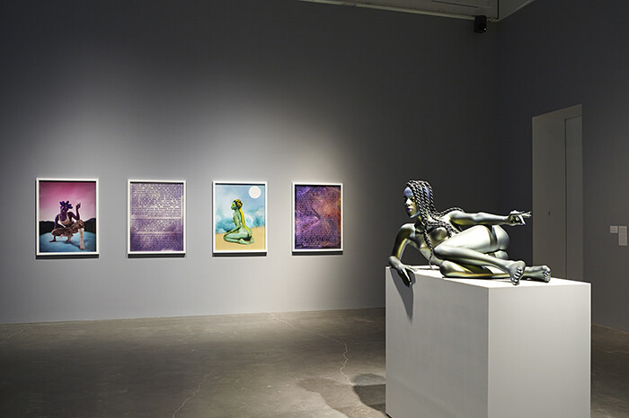
The phrase “Surround Audience” sounds like it could be the name of an EDM party, a function in a home theater system, a Quickmeme caption, or Michael Fried’s worst nightmare. It is actually the title-cum-motto-cum-slogan of the 2015 New Museum Triennial, which at first glance appears to be some mixture of these descriptors. The current Triennial, curated by Lauren Cornell and the artist Ryan Trecartin, is the third installment of an event that has quickly realized its ambition of becoming New York’s leading exhibition of on-trend global contemporary art. As if this weren’t enough, the current Triennial aspires to expand into a kind of aggregative platform: hosting performances, publishing a poetry collection, and sponsoring residencies, research projects, and a web series.
Visitors to the Triennial will indeed feel themselves surrounded, even overrun by competing appeals for their attention. These bids are so numerous and elaborate that at times the show seems less like an art exhibition than a tech convention or a curated Tumblr. To be fair, such heterogeneity is endemic in biennials, which tend to be at cross purposes in trying to craft a cohesive, timely statement from disparate works chosen for divergent reasons. Depending on one’s age, taste, and …
February 17, 2015 – Review
Erik van Lieshout’s “I Am In Heaven”
Thyrza Nichols Goodeve
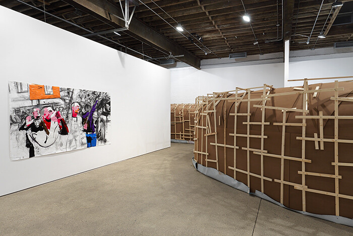
It’s a bit like meeting a landmine that’s about to detonate. In his first solo show at Anton Kern, Erik van Lieshout explodes into our consciousness as a wild-child provocateur, a Pac-Man Expressionist running rampant 24/7, videotaping everything in his life, while making art out of every piece of paper, chunk of wood, sentence, gesture, fragment of material, conflict, situation, and mess that constitutes his—the contemporary artist’s—everyday life.
Provocation and agitation are his calling cards: two feet into the gallery’s threshold, the viewer is confronted with a looming, life-size tunnel hastily put together out of plywood and carpet, designed to mimic the basement of the St. Petersburg’s Hermitage where, for Manifesta 10 (in the summer of 2014) the artist and his team performed a two-month make-over for the museum’s 70 cats. (Since Empress Elizaveta Petrovna, the daughter of Peter the great, who ruled over Russia in the mid-eighteenth century, cats have lived in the basement of the museum in various states of care in order to rid the impeccable, imperial treasure house of mice and rats.) The tunnel leads to a cozy screening room where the 80-minute WORK (2015) is playing. Footage from Workers (2013) is fused and re-edited with footage …
February 13, 2015 – Review
Joachim Koester’s “Body Electric”
Pedro Neves Marques
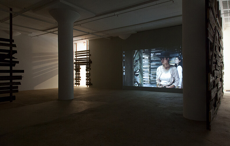
“Nothing is true, everything is permitted.” A fine phrase for art, but just as eerily appropriate for politics in these days of technocratic, neoliberal control over “non-societies” jam-packed with contemporary “me only” pathologies—from entrepreneurship bullshit to non-dom tax evasion. What William Burroughs couldn’t possibly have imagined was how this iconic sentence from his Red Night Trilogy (1981–1987) would, in time, mirror another phrase, instated by Britain’s Iron Lady: “There is no alternative!”
Despite its close relationship with Burroughs’s work, in Joachim Koester’s solo show at Greene Naftali not everything is permitted. In the main room, anonymous bodies communicate, exasperatingly, in a language whose bodily grammar is found somewhere between hallucinogenic and repressed oblivion—all in a set of four moving image works. At its heart screens The Place of Dead Roads (2013), Koester’s video adaptation of Burroughs’s 1983 Wild West novel, which tells the time-traveling tale of gay gunslinger cowboy Kim Carsons, shot dead in 1899, who desires only to escape his body-prison out into the immortal cosmos. But Carsons is nowhere to be seen, either in the video or in the show. More important to the exhibition’s spirit is the series Some Boarded Up Houses (2009–2013) that greets us in the …
February 4, 2015 – Review
“Thanks to Apple, Amazon, and the Mall”
Media Farzin
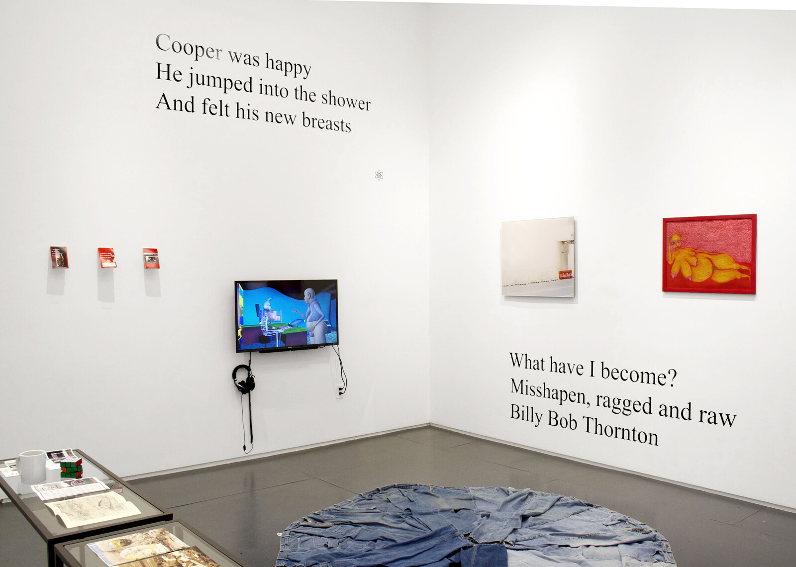
Stupidity is a tricky thing. It’s omnipresent, but usually hidden. It can be the place where things begin—first drafts, new ideas—but it’s also a final judgment. As philosopher Avital Ronell points out, stupidity has its own nature and contours, yet we rarely take time to explore it. We tell children that it’s wrong to call someone stupid, because we consider it “the ur-curse, the renunciation of which primes socialization in this culture.” Fear of being stupid can inhibit desire, but the inhibition feels necessary. Certainly, it’s as derogatory a term in art criticism as it was in kindergarten.
But it might be time to reconsider. Deliberately or not, “Thanks to Apple, Amazon, and the Mall” presents some very stupid things—many of them specific to online life and its vernacular—as a crucial means for contemporary socialization. The group show, curated by Brian Droitcour, takes social relations in the digital age as its focus: the emotional valences of digital identities, the implications of their potential for shape-shifting, and the way artists weave their lines of inquiry between the porousness of the virtual world and hard materiality.
“Thanks to Apple” is a small show, with nine artists and one gallery of works, but it’s also …
December 12, 2014 – Review
The 6th Annual Migrating Forms
Genevieve Yue

“Migrating Forms” is easily New York’s most eclectic film festival. A glance at the program, now in its sixth year, can be dizzying: a half-inch videotape documentary from the seventies here, a Korean art film there, and all manner of experimental film and artists’ film in between. Instead of theme, we get range. The festival bills itself as innovative and inclusive, and it is. It’s a kind of weathervane sample of the past year’s moving image work, not tied to any particular culture, whether avant-garde film, the art world, or the subcultural connotations of its predecessor, the New York Underground Film Festival. Forms, as it were, are able to migrate freely, often in delirious and unpredictable ways.
But it’s unclear whether such movements—across histories, institutions, and media practices—actually are that easy. Left unanswered is the question of what it means to serve up these various forms as if flipped through in the manner of a restless channel surfer—a metaphor all the more fitting for the festival’s ongoing emphasis on television, as evident in the accompanying sidebar program “Tube Time” showing at Anthology Film Archives. There’s undoubtedly value in creative disassociation, of stepping from Cory Archangel’s Freshbuzz (2014), a mesmerizing plunge into …
December 4, 2014 – Review
Geoffrey Farmer’s “Cut Nothing, Cut Parts, Cut the Whole, Cut the Order of Time”
Alan Gilbert
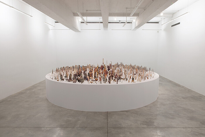
If some version of the afterlife exists, and if Aby Warburg manages to find a little peace there, he might be pleased to see Geoffrey Farmer’s “Cut Nothing, Cut Parts, Cut the Whole, Cut the Order of Time” at New York’s Casey Kaplan. During the last few years of his life, Warburg famously worked on Mnemosyne Atlas (1924–1929), a collection of nearly one thousand images divided thematically and pinned to wooden panels. Though primarily art-historical (and heavy on the Italian Renaissance), these black-and-white reproductions were supplemented with maps, cosmological and mathematical formulas, text, and newspaper photos. While diachronically charting the evolution of an image or motif through time (“ascent to the sun,” for instance), Mnemosyne Atlas also makes synchronic connections across cultures and metaphor. The result is a project that combines the deep knowledge of the scholar with the associational logic of the poet, both amplified by a sense of iconography as always alive: Warburg’s panels are a kind of animistic art history (and prophetically proto-digital).
Farmer’s Leaves of Grass (2012) was among the most memorable works at Documenta 13 in 2012. Using approximately 16,000 images clipped from issues of LIFE magazine spanning 1935–1985 and affixed to thin sticks, he created …
November 11, 2014 – Review
Independent Projects
Laura McLean-Ferris
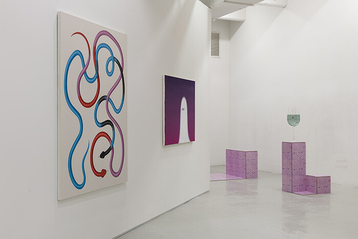
It’s hard to find much affection for art fairs. Aside from their unvarnished commercialism, they are, after all, why some gallerists never see their children/partners/ornamental budgerigars. However, Independent—a fair that has taken place in New York every March since 2010 to coincide with the Armory show—has induced warm feelings over the years, rising through the old sun-lit Dia building in Chelsea. At a time when galleries, collectors, and critics alike were losing faith in the Armory’s bald, depressing, trade-fair approach, Independent stepped in with proof of life and experimentation in the fair game: freeform design, heavy European participation, and not-for-profit collaboration brought playful experimentation at a moment when things were feeling scarily dead on the piers.
Capitalizing on these successes, this year Independent attempted to switch it up once more, adding an autumn show with Independent Projects, which not only went it alone without a mega fair in town to support it (though New York’s Contemporary and Modern auctions do take place within its run), but also proposed that the fair be devoted only to artists’ solo projects, and that it should transform into an “exhibition” after an initial “fair weekend.” Gallerists, desks, and iPads would disappear and be replaced by …
November 5, 2014 – Review
Jean-Luc Mylayne’s “Chaos”
Thyrza Nichols Goodeve
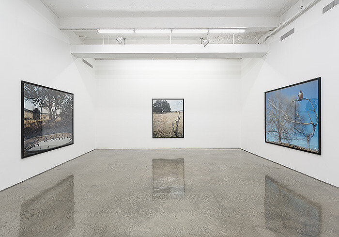
Our contemporary ontology is one of acceleration and mania. Along with the logic of global and cognitive capitalism, we look to our iPhones and the internet as the source for these intensified temporalities. Indeed, walk out on any street and hundreds of individuals are engaged in locating their sense of self and place via the rapid click of the cell-phone snapshot. Jean-Luc Mylayne’s 38-year oeuvre of patiently staged conceptual nature photography is the philosophical inversion of this state. Famous for his extensive labor and Zen-like patience, not to mention the huge amounts of time and ethical sensitivity he invests in creating his images of birds (as if that is all he is doing), Mylayne has more in common with Proust’s distended moments of reflective memory than the manic attention deficit of today’s amnesiac iPhone present. In fact, while preeminently photographic, his work calls more upon the fixed, contemplative gaze of modernist cinema and Bergsonian duration than upon the gee-whiz gimmickry of still digital photography. And yet Mylayne has also been linked to a new ethics of animal studies, since his work depends upon trust and mutual recognition, not force or artificial hierarchies of human versus animal. These “bird photographs” are …
October 13, 2014 – Review
Helen Mirra’s “Waulked”
Media Farzin
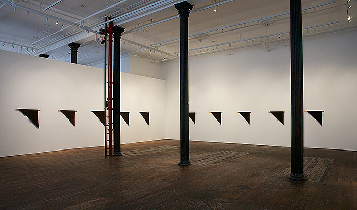
The wool of a black sheep, I was surprised to learn, isn’t black at all—it comes in numerous subtle variations of dark brown. Helen Mirra’s recent exhibition “Waulked,” offers several such lessons; seemingly random observations about organic materials, traditional crafts, and what could be called “more grounded” ways of being in the world.
The show’s centerpiece is a room full of Waulked Triangles (all 2013), identically shaped pieces of dark cloth draped over cedar wood supports. Each strip combines the wool of two different black sheep (which are identified in the works’ titles by location). Up close, the Triangles are engagingly tactile and reveal subtle differences in texture and color. Some portions are smooth and evenly covered with white wool fuzz; others are nubby, knotted, or glossy. There are sections that appear to be the wool of an individual sheep, and in some pieces, thin strands dyed with the inks of wild mushrooms delicately underline interwoven portions. The technique is identical in each Triangle—an apparently straightforward weaving of warp and weft—but the gradual accumulation of differences in the wool brings the source of each object’s material, in its individual and living reality, into intense focus.
“Waulking” is an obsolete term for finishing …
October 9, 2014 – Review
Chris Marker’s “Koreans”
Stephen Squibb
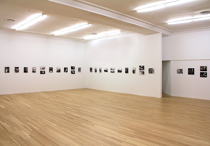
A sequence of photos by Chris Marker on display at New York’s Peter Blum Gallery features a little girl. The 51 images are mostly snapshots; matte, legal-pad-sized prints hung evenly at eye level around the four walls of the gallery. Some appear to have a kind of incidental chronology, following a single figure through different settings, as with the child in a dress. In one image, we are positioned behind her as she faces a propaganda poster. In another, we see her alone amidst a vast public plaza. In a third, she regards us quizzically alongside a strange painting on a stone wall. In each case we feel as if we are alongside the girl, sharing her field of vision and experience, rather than regarding her as a subject for pity or contemplation. The photos were taken in 1957 when “the formidable propaganda machine that would soon be identified with the sheer mention of North Korea wasn’t yet running at full throttle,” as Marker puts it in an accompanying testimony. The resulting photos, he notes with amusement, were rejected on both sides of the 38th parallel:
“To the North, [work] which never mentioned once the name of Kim Il-sung simply didn’t …
September 29, 2014 – Review
“Slide Slide Slide”
Genevieve Yue
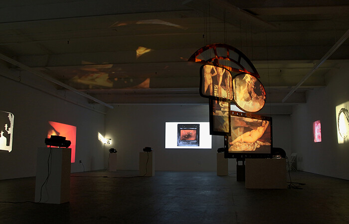
The slide projector last appeared in pop cultural consciousness on the television period drama Mad Men. Don Draper, pitching a fictional ad campaign to Kodak executives, clicks through a carousel filled with own family photos: his head leaning against his wife’s pregnant belly, his daughter sitting atop his shoulders. The poignancy of these slides is underscored by the knowledge that Don’s family life is falling apart. Nostalgia, he explains, means the pain of an old wound. The carousel is “a time machine… it takes us to a place where we ache to go again.”
The carousel’s nostalgic twinge appears in “Slide Slide Slide,” an exhibition of slide projection works and related performances at New York’s Microscope Gallery. Older viewers will recognize the stout plastic machines from their childhood homes and classrooms. They are less familiar for younger audiences, for whom slide projectors have been replaced by their digital counterparts. This is evident in Bruno Munari’s Untitled (1, 2, 3) (1952), slide sculptures that, because of their curled ribbons that extend from the flat slide frame, are too delicate to be exhibited in a projector. In their place, images of the multifocal works are digitally projected as visual documents. Joel Schlemowitz’s A …
June 25, 2014 – Review
“The Bigger Picture: Work from the 1990s”
Alan Gilbert
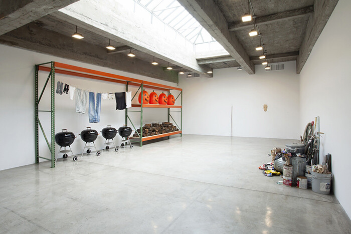
The 1990s art world began with the rumblings of multiculturalism and identity politics and closed with a resurgent art market interested in—as it frequently is—painting, and figurative painting in particular: John Currin, Lisa Yuskavage, and the total ascendance of Gerhard Richter. In between these two moments a variety of forms proliferated, especially installation and new media works, and so it’s not a surprise that there isn’t much painting on display at Tanya Bonakdar Gallery’s own survey of the decade: “The Bigger Picture: Work from the 1990s.” In fact, the exhibition is as much a celebration of the gallery’s first twenty years as it is any kind of time capsule or historical summary of the period.
Although founded in New York’s SoHo in 1994, Tanya Bonakdar Gallery made the early move to Chelsea in 1998. International notables such as Phil Collins, Olafur Eliasson, Ernesto Neto, Sarah Sze, and Gillian Wearing all have work in “The Bigger Picture” as part of a mid-1990s openness that gradually evolved—paralleling the rise of social media—into a late 2000s state of anything goes. But the historical still registers, if mostly in terms of the trajectory individual artists took, as in Eliasson’s early experiments with perspective and perception …
May 21, 2014 – Review
Dominique Gonzalez-Foerster’s “euqinimod & costumes”
Media Farzin
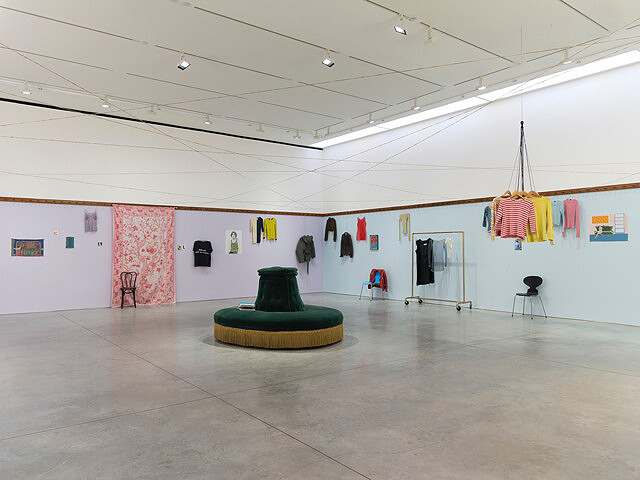
I puzzled over the word “euqinimod” in the exhibition’s title for some time, until I figured out that it’s the artist’s name spelled backwards. And for viewers familiar with Dominique Gonzalez-Foerster’s work of the past two decades, the show does seem like an inversion of her typical approach, and an unusual statement for her first solo exhibition in a US gallery. She is mainly known to New York audiences for her elaborate installations, like chronotopes & dioramas (2009), a project that the Dia Art Foundation commissioned for The Hispanic Society of America, or the performance-concerts NY.2022 (2008) and T.1912 (2011) at the Guggenheim Museum. Gonzalez-Foerster’s signature style is to supply her audience with a minimally furnished stage and invite the viewer’s participation with props, which are often books on subjects that inspire her thinking, from “tropical modernism” to experimental science fiction.
While “euqinimod & costumes” does include a roomy couch and reading material, it feels detached from Gonzalez-Foerster’s larger body of work. It is essentially an installation of her clothes, interspersed with memorabilia like snapshots, childhood drawings, domestic furnishings, and even a painting by her aunt. Strains of Richard Wagner’s 1845 Tannhäuser opera waft out from a smaller back room, a …
May 9, 2014 – Review
Frieze New York
Ginny Kollak
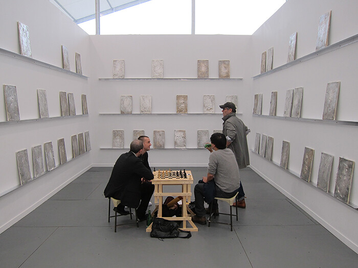
A rather Duchampian vignette set the tone for my visit to this year’s Frieze New York, the third edition of the London-import fair that takes up residence in an airy custom tent on Randall’s Island, the East River stopover noted both for its athletic fields and psychiatric asylums. In the first booth I visited, of the Lower East Side gallery Ramiken Crucible, two dealers were seated at a small table, attempting to play a game of chess. Their progress was impeded, however, by the constant stream of interested parties inquiring about the works they had on display: a lush series of cast-aluminum panels, uniform in size but varied in surface and color, by Alberta-born, New York-based artist Elaine Cameron-Weir. The panels have the archeological quality of relics from the future, alternately evoking bars of gold bullion, the remnants of some unknown spacecraft, or fossilized color field paintings.
But the chess game, in spite of it being an obviously cheeky gesture, seemed significant, as it points to how completely internalized certain motifs of twentieth-century modernism have become, but also reminds one of the important role that chance encounters still have to play in contemporary art. In the regimented world of art fairs, …
April 16, 2014 – Review
Martin Kippenberger’s “The Raft of the Medusa”
Chris Reitz
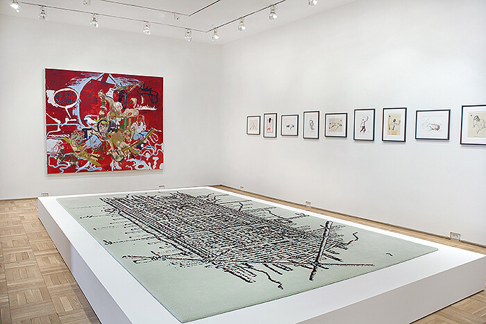
In 1996, his body bloated, his liver consumed by cancer, and his work more popular than ever, Martin Kippenberger (1953–1997) set about his final series of self-portraits. Taking Théodore Géricault’s iconic 1818–19 painting as its point of departure, and working from photographs taken by his wife Elfie Semotan, “The Raft of the Medusa” eventually came to include over a dozen each of paintings, drawings, and lithographs, as well as an eight-by-fifteen-foot rug that depicts the raft’s schematic layout. This sprawling multimedia series has been reunited for its first New York exhibition at Skarstedt, organized in collaboration with the Estate of Martin Kippenberger at Cologne’s Galerie Gisela Capitain.
The project has been divided into four elements. The first floor provides a preliminary or preparatory overview: a collection of drawings on hotel stationary as well as the rug and an oversized painting that, here, appears as the series’ linchpin. The second floor, the gallery’s largest exhibition space, features the body of “Medusa”’s 16 paintings. On the third floor, a group of lithographs produced after the “Medusa” work opened in Copenhagen acts as the images’ afterlife; ethereal yet straightforward, these prints announce the end of their author—one of them, depicting a detail of the …
March 7, 2014 – Review
77th Whitney Biennial
Kevin McGarry
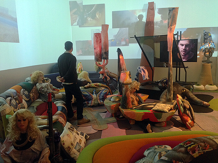
The most streamlined mythology of the past two decades of the Whitney Biennial goes something like this: 1993 represented the Big Bang of art and identity politics, and since then, the curve has bobbed up and down like a sine wave, going above and below the axis of overthought mediocrity towards an ever more platitudinous parody of itself. It is, after all, the biennial that everyone… loves to hate. Shoot me now. Framing it this way can be as mind numbing as discussing the weather, and yet, it is nearly as inescapable.
Perhaps drawing from its upper Manhattan terroir, the Whitney Biennial is an inimitable, enduringly anachronistic, and extremely self-referential institution. Each edition rehashes the questions “What is contemporary?” and “What is American?”—often to post-rational ends. Convoluted curatorial conceit is the most dangerous pitfall threatening state-of-the-art-world survey shows today. The best biennial I’ve seen in the past couple of years was Luiz Pérez-Oramas, André Severo, and Tobi Maier’s 2012 30th São Paulo Biennial about, simply, “poetics”—a theme so loose and extensible that the exhibition wore it as a heartening halo rather than a pretentious noose. In this respect, the 2014 Whitney Biennial does not fail. Well, actually, it does, but only …
February 14, 2014 – Review
“Bad Conscience”
Jennifer Piejko
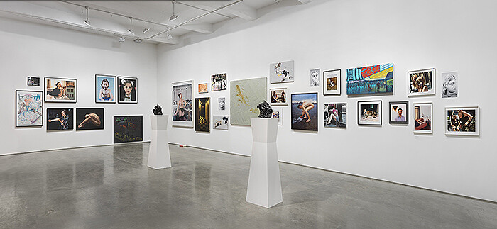
Over the decades, John Miller has produced a body of work that is semi-ambiguous in concept, yet is—in terms of deadpan humor and wry observation—unwaveringly his own. In the 1980s, he made pieces that appeared to be caked in human waste, like paintings with brown splotches and appropriated objects covered with brown plaster; in recent years, he has gilded junk and composed melodramatic portrayals of reality-television-show stars—all of which play to the middlebrow taste and artifice that he critiques. However, Miller’s latest endeavor at Metro Pictures, “Bad Conscience,” an expansive and varied group show he has curated, suggests that it might simply be impossible for his practice to be represented by his artwork alone.
Illustrating the work of a significant number of his previous collaborators, sixty-five works are spread across the gallery’s immense rooms, most of them clustered in conceptually interlaced compositions. One constellation of banal images, richly treated in oil paint—Caleb Considine’s Hairdryer (2013) and Marilyn Minter’s Paper Curls and Untitled (Porcelain Photo) (both 1976)—are hung opposite from a mix of photographs either weighed down with self-conscious unease or unmoored by their subjects’ reckless oblivion. Adjacent is a wall that includes Walter Robinson’s Impression Cheeseburger (2012) and Greg Parma Smith’s …
February 7, 2014 – Review
Tacita Dean’s “JG”
Mara Hoberman
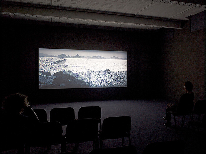
In the late 1990s, equipped with directions furnished by the Utah Arts Council, Tacita Dean traveled to the Great Salt Lake in search of Robert Smithson’s Land art masterpiece Spiral Jetty (1970). Though she was ultimately unsuccessful in locating the massive earthwork (likely, it was submerged at the time), her thwarted pilgrimage was far from unfruitful. Having inspired an early sound piece, Trying to Find Spiral Jetty (1997), Smithson’s elusive anti-monument resurfaces—so to speak—sixteen years later in Dean’s latest film, JG (2013). Titled after the late author J.G. Ballard—with whom Dean enjoyed a long-running correspondence based on their mutual interest in Smithson’s work—the 26.5 minute, 35mm film pairs footage of saline landscapes in Utah and California with a voiceover culled from various texts by Smithson and Ballard, including the latter’s 1960 dystopian short story “The Voices of Time.” Offering alternate glimpses into Dean’s salt-infused experience, the current exhibition presents JG in the company of a number of related photographs, paintings, prints, and objects.
Projected widescreen on a continuous loop in the basement of Marian Goodman’s Parisian gallery, JG is a slide show-like succession of landscapes ranging from snowy-white salt flats and crystalline stalagmites to turquoise-blue thermal lakes and fiery sunsets. Making …
January 29, 2014 – Review
Liz Glynn’s “On the Possibility of Salvage”
Ginny Kollak
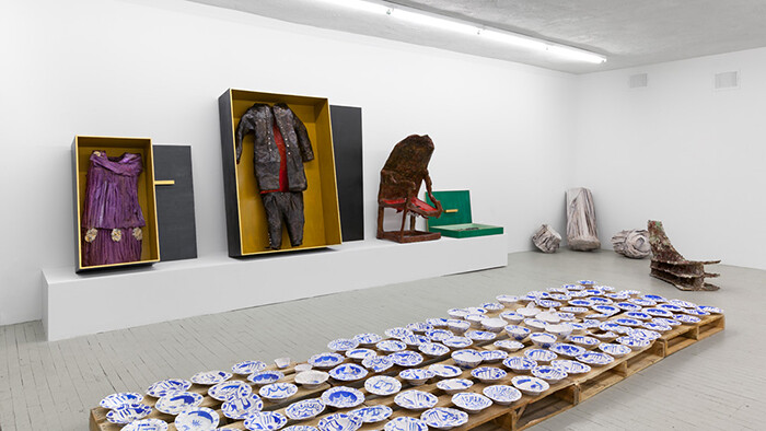
The pants belonging to the “friend” of the eighteenth-century Welsh pirate Captain Howard Davis were apparently very tiny. Their sculptural replica, crafted from painted papier-mâché and complete with a petite button fly, now sits in a storage box made of birch in the Tenth Avenue space of the venerable Paula Cooper Gallery, alongside a large, floppy-armed, double-breasted overcoat. As the story goes—when Captain Davis landed at the Portuguese colony of São Tomé, a shipmate went ashore with a bag of second-hand clothes to sell to the “natives.” One can only imagine the small-bottomed man’s shocked expression when the crowd gathering on the beach made off with the goods instead. Black Suit from a friend of Capt. Howard Davis (Stolen) (all works 2013)—one of the new pieces on view in Los Angeles-based artist Liz Glynn’s New York solo debut “On the Possibility of Salvage”—exemplifies the artist’s careful balance between humor and pathos, politics and poetry. Taking the themes of piracy, smuggling, wreckage, and recovery as a starting point, Glynn stages an assortment of papier-mâché sculptures in the gallery, which represent either salvaged or seized (depending on one’s perspective) objects across a spectrum of times and cultures.
Why does one become a pirate? …
December 16, 2013 – Review
Liam Gillick and Louise Lawler
Tyler Coburn
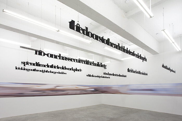
In their current exhibition at Casey Kaplan, Liam Gillick and Louise Lawler look backwards and askance, mining their archives for oblique portraits of the museum and factory floors, fast inclining towards abstraction. Gillick has periodically advocated for a methodology that functions as a “critical double” and “parallel structure” to a dominant culture, and both his and Lawler’s works reveal the possibilities and pitfalls borne of such proximity.
The artists have never shown together, though each has worked to varying degrees with colleagues, from Lawler’s seminal collaborations with Sherrie Levine and Allan McCollum to Gillick’s recent exhibition with Lawrence Weiner. Lawler’s broader practice, of course, is also necessarily incorporative, filled with poignant glimpses of artworks enmeshed in institutional matrices. For Kaplan, she returns to a view of a work by Carl Andre, a Gerhard Richter color chart, and a Richard Serra drawing in Life Expectancy (2010), as well as to an image of Edgar Degas’s dancer in Chicago (2011/2012); the softness of her figure gives the tantalizing suggestion that Lawler has chosen to focus instead on the glass case so central to the sculpture’s original controversy.
These cibachromes share space with their vinyl mutations, “placed and pulled,” as she calls it, along one …
December 6, 2013 – Review
Michael E. Smith
Stephen Squibb
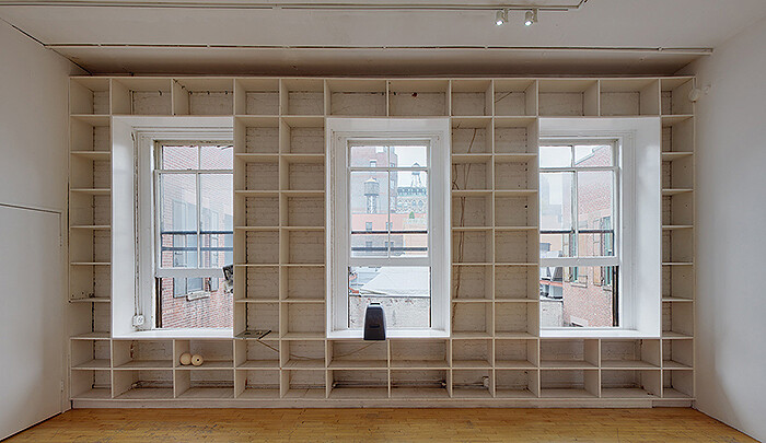
Michael E. Smith has left the gallery nearly empty. Entering the space of Clifton Benevento, my first impression was one of absence, in sharp contrast to its location. Finding the show on the sixth floor of a building in the center of New York’s boutique-saturated SoHo commercial district, I could feel my eyes struggling to adjust as if blinded by a sudden transition from light to darkness. For a long time, images of luxury goods lingered like ghosts orienting my experience, as when one of Smith’s untitled works appeared to be looking up towards another, in the same way I had just been looking up at the billboards in the street.
The first work (all works 2013), a pair of ostrich eggs, drained, as if for Easter, resembled a set of eyes, staring up and across the empty gallery at a painting hung in the far corner of the room. Composed of rubber, cotton, chicken feathers, and plastic, the painting represents an aspirational image of what the eggs might have been, albeit flattened out and optimized for viewing from a distance. In the same way that the pedestrian stands agape at billboards, which are constructed from advertising images rearranged to sell …
October 29, 2013 – Review
Henrik Olesen’s “Hysterical Men”
Kirsty Bell
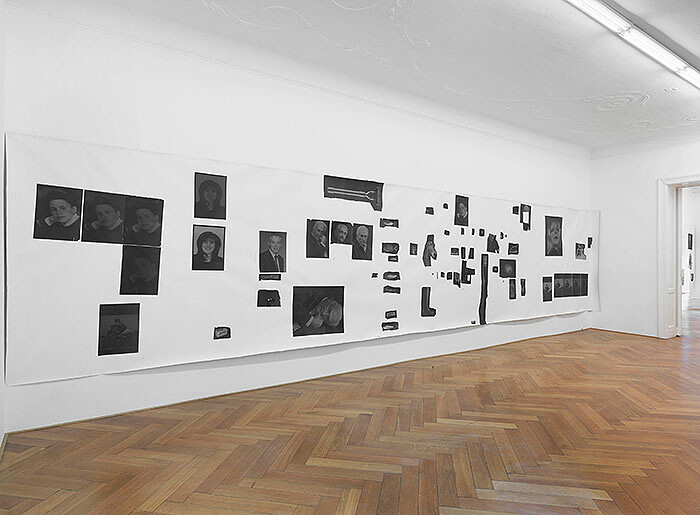
The aggressively roughshod aesthetic that characterizes Henrik Olesen’s work clashes immediately with the bourgeois atmosphere of Galerie Buchholz’s bel-étage apartment space: the exhibition press release and checklist have been stuck haphazardly onto the wall in the elegant entrance, while two further texts printed on adhesive transparencies are affixed to the hallway’s decorative mirror. Meanwhile, the doorway to one of the gallery’s main showrooms ahead has been dry-walled shut. On the glass panel of the door leading into a small reception room is one of the texts already encountered before, a list enumerating six different categories of sex, ranging from “AMBIGUOUS SEX” to “PATRIARCHAL SEX.” Further documents are affixed to the room’s other surfaces: excerpts from Robert Walser’s hypnotic 1917 novella The Walk; or the colophon from Polysexuality, a book published by Semiotext(e) in 1981, which seems to be the source of the aforementioned sexual classifications. The list itself appears again, so repeatedly in fact that it becomes a confrontation. Where do we place ourselves on this index of sex? And what about the artist himself?
The stately self-assurance of the gallery’s rooms is undermined by further unkempt details. There are visible nail holes and screw plugs in the walls that …
October 15, 2013 – Review
Damián Ortega
Arnaud Gerspacher
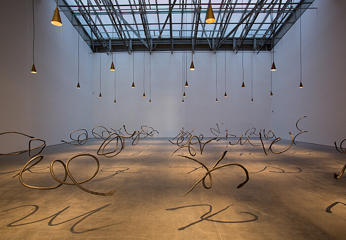
If language is a tool then two things follow: there was a time before the tool was useful, hanging in a pre-anthropological state of potential, and there may come a time when it once again becomes useless. Similarly, if the sign is arbitrary, then there was a time before it settled on its current referent and the moment may come when it detaches itself again from it, like obsolete code. This sort of speculative linguistic archaeology—taking its cue from Wittgenstein and Saussure—finds an imaginative, sculptural dramatization in Damián Ortega’s new work at Gladstone Gallery. As the consummate bricoleur, Ortega redirects his affinity for assembly and disassembly of objects onto systems of language, uncovering the complex relations between materiality, symbolism, inscription, and the perception of meaning resulting from their interaction.
The centerpiece of the show is Harvest (2013), a large installation of some twenty steel sculptures hovering mid-air and evenly distributed throughout the main space of the gallery. Thin shapes tracing lines in space, they read like corrugated tire irons crossed with cobras in suspended animation. Their appearance straddles the line between objects of human techné and organic shapes resulting from nonhuman forces, like the speculative first bone-tool in Stanley Kubrick’s 1968 …
September 25, 2013 – Review
Carol Bove’s “RA, or Why is an orange like a bell?” and “Qor Corporation: Lionel Ziprin, Harry Smith and the Inner Language of Laminates”
Ginny Kollak
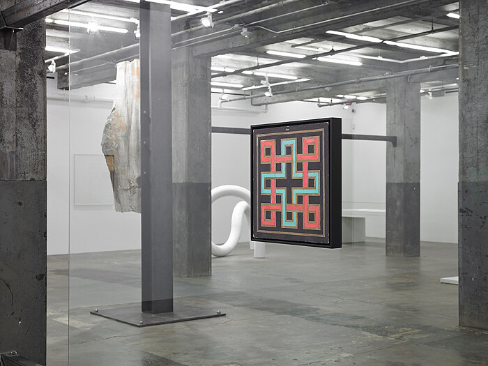
Riddle me this: Just what is it that continues to make Carol Bove’s focused yet multifaceted sculptural practice so uniquely satisfying?
A simple answer might start with her materials—a carefully calibrated mix of concrete cubes and I-beams, petrified wood and peacock feathers, geometric figures fashioned in delicate brass and powder-coated steel, and well-thumbed paperback books and other esoteric ephemera. These items come together in shelf works, sculptural assemblages, and exhibition tableaux that read equally as modern and ancient, industrial and organic, utopian and brutal, hopeful and melancholic. Then there is the mythology of their origin to consider—either in Bove’s Northern California upbringing or her current life within the post-industrial wilderness of South Brooklyn, where materials like driftwood and desiccated mattresses literally wash up at her feet. (Both of which are part of the artist’s exhibition “The Equinox,” which is on view at the Museum of Modern Art in New York until January 12, 2014.) But there is also something else at work. A productive vagueness animates all of Bove’s work from the last decade or so, meandering between familiarity and enigma while engaging the viewer’s attention at both conscious and subconscious levels.
Those two registers of understanding—the analytic and the intuitive—are pushed …
September 10, 2013 – Review
ICP Triennial, “A Different Kind of Order”
Alan Gilbert
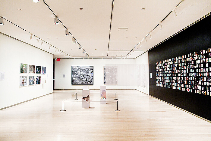
For a few years in the mid-2000s, writing made a notable dent in contemporary image-saturated culture—what’s ever more loosely called the society of the spectacle. With the explosion of texting and blogs, written language almost seemed to rival visual culture for the attention of citizens, consumers, and everyone in between. The gatekeepers of all things well-behaved bemoaned the linguistic crudities of texting (lol) and the way in which blogs gave more people an opportunity to express their (sometimes misinformed) opinions (a still prevalent complaint in the art- and music-writing worlds). But this brief efflorescence of the written word didn’t last long, as the clean graphic interface of the iPhone (etc.) reemphasized the visual experience over the linguistic one. Of course, many other factors played a role in this as well, such as the unsustainability of regular blogging without financial recompense. The utopic democracy promised by the Internet since its more widespread inception in the early to mid-1990s (everyone will have a website! omg) only first pushed toward this potential—in my mind, anyway—with the blogspot.com suffix. These days Tumblr pages—granted, a blog, but a predominantly visual one—outnumber those using the more linguistically oriented WordPress, and Facebook is losing its younger audience …
July 22, 2013 – Review
Jane and Louise Wilson
Media Farzin
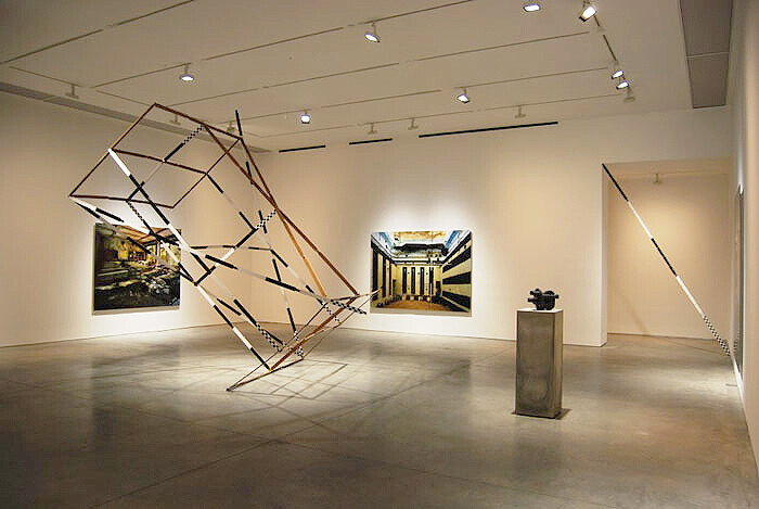
For over two decades, British artists (and sisters) Jane and Louise Wilson have meticulously documented the architectural ruins of twentieth-century modernity. In specific, their focus has been directed towards the dire fate of obsolete military-industrial constellations. Like many artists coming of age after the collapse of the Soviet bloc, their work seems irresistibly drawn to the decaying skeletons of modernist utopias. They sift through debris to uncover present-day resonances that also happen to produce eerily beautiful photographs, films, and installations. Their current exhibition at 303 Gallery shows that the subject still holds their attention while making a compelling case that it should also hold ours.
The works on view are culled from two recent projects, and their undifferentiated installation in one gallery emphasizes an ongoing engagement with the history of Cold War nuclear ambitions and socialist utopianism. The recurring motif here is the yardstick—discreetly included in each of the seven large photographs on view, and reappearing as actual yardsticks in the gallery: some reaching from floor to ceiling in a corner, others stretching diagonally across a doorway, and finally as a large geometric sculpture in the center of the room.
One set of photographs is from the series “Atomgrad, Nature Abhors a …
July 8, 2013 – Review
"ambient"
Stephen Squibb
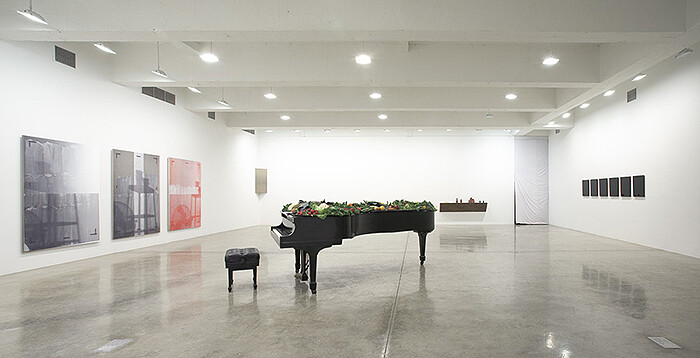
The title of the group show currently on view at Tanya Bonakdar, “ambient,” invites historical speculation. Where does ambience settle as an interpretive framework? The show even designates an event, of sorts, that puts forward ambience as an artistic strategy. The press release opens with an anecdote from the liner notes of Brian Eno’s 1975 Discreet Music. Apparently, Eno had located the origins of ambient music in something that happened to him while bedridden after an accident: “After a friend placed a recording of eighteenth-century harp music on the composer’s turntable before departing the room, he realized the stereo amplifier was at such a low level that the music (which was also playing only through a single channel) was nearly inaudible, blending with the ‘color of the light’ and ‘sound of the rain,’ and residing at or just beneath the threshold of perception.” We can read the works in “ambient” as evidence submitted to determine the subsequent significance of this innovation.
The production, in 1975, of things existing “at or just beneath the threshold of perception” superficially recalls two things: phenomenology—or the philosophical investigation and analysis of perception in the work of thinkers like Edmund Husserl and Maurice Merleau-Ponty—and Minimalism, whose …
June 19, 2013 – Review
Wolfgang Tillmans’s “from Neue Welt”
Kevin McGarry
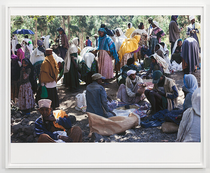
A frustrated Berliner recently posited Wolfgang Tillmans to me as the only example of a truly successful youngish artist living and working in the city. This is, of course, ludicrously far from accurate, but as hyperbole it illustrates something telling about the aura of the young-at-heart photographer who has been showing for more than twenty years now. For all his whimsical individualism, his gaze has long since evolved into an authoritative brand. His images are reliably one of the easiest places to experience that alchemical combination of subjectivity, nuance, and virtuosity to make you sigh happily and see their haphazard forms as more or less perfect.
Tillmans’s recent show at Andrea Rosen Gallery in Chelsea is called “from Neue Welt,” a selection of twenty-five photographs sifted from a much larger series amassed over the past four years, Neue Welt. More extensive samplings from Neue Welt have made the rounds in a string of museums internationally, and last year the collection was published as a book by the same name. Prepositionally nested as such, the title of the Rosen show becomes a double entendre, both for a gallery-scaled edit of the pre-existing exhibitions and for the more abstract notion of excerpts from …
May 10, 2013 – Review
Frieze New York
Karen Archey
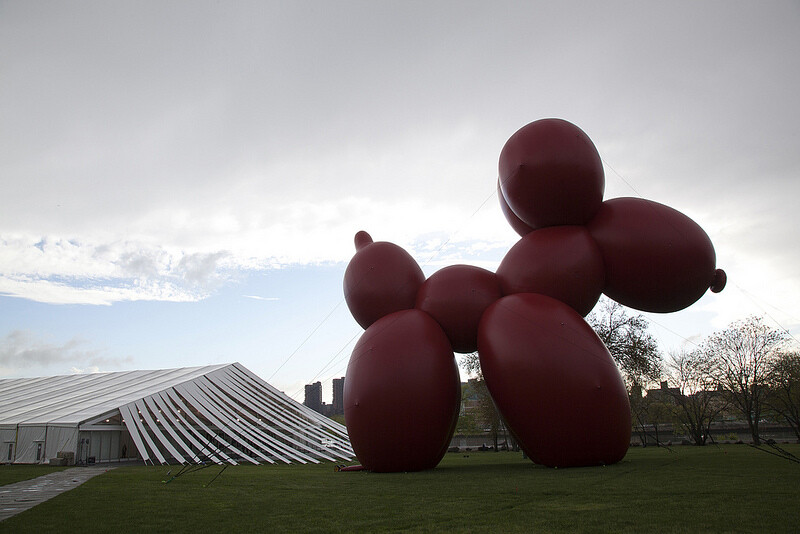
“Contemporary art: one, us: zero,” quipped a friend as we mistakenly toured what appeared to be the off-limits back room of Marian Goodman’s booth at Frieze New York. We were looking for Tino Sehgal’s performance Ann Lee. Aware of the nature of Sehgal’s work probing social boundaries through real life situations, my partner and I weren’t entirely convinced our foray into Goodman’s secret room wasn’t part of the performance itself. Our mishap was worthwhile though: it brought us to Ann Lee, an adolescent girl performing a monologue as a fictional Manga character originally developed by Pierre Huyghe and Philippe Parreno in 1999. The duo had purchased the rights to the character from a Japanese animation company, and subsequently invited other artists, such as Dominique Gonzalez-Foerster, Rirkrit Tiravanija, and Liam Gillick, to include her in their work. Originally a vacant character, she is figuratively filled by the artist’s intention. Sehgal’s version of Ann Lee comprises a rotating cast of confident, “robotic” 11-year-old girls, replete with mechanical limb movements, who directly engage audience members with questions like “Would you rather be too busy or not busy enough?” (Unsurprisingly, most audience members preferred to be too busy.) The piece examines a collective desire …
April 22, 2013 – Review
Danh Vo’s “Mother Tongue”
Arnaud Gerspacher
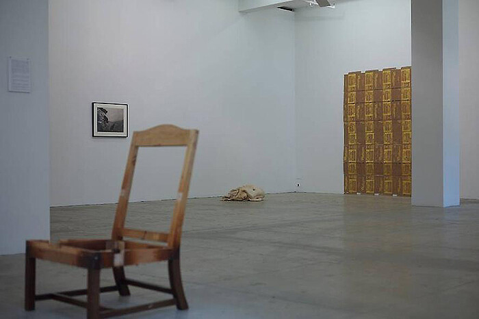
The plush trappings of power, stripped down and isolated: this seems to be one of the themes and strategies of Danh Vo’s show “Mother Tongue” at Marian Goodman Gallery. The title comes from a small calligraphic drawing by the artist’s father, Phung Vo, who, while not knowing the language he writes in, inscribes Gothic stenciled letters on this and various other objects, such as gilded cardboard boxes of Budweiser (Promised Land, 2013). While there are a smattering of works represented in this diverse show, the dominant centerpiece is a quasi-archeological project displaying “finds” from a recent Sotheby’s auction of Robert McNamara’s belongings. Acquired by Vo and Marian Goodman, these objects have now found a new home in the art world, functioning both as political history and contemporary art.
Unlike the show’s title, the McNamara work seems to be less about translation or a mother tongue than about the looming presence of a domineering father. Bureaucratic relics used by the former U.S. Secretary of Defense during the Vietnam War have been either strewn about the two larger gallery spaces, or crisply displayed in backlit vitrines along the narrow corridor connecting the two galleries. This latter setup and its artifacts are the most …
April 8, 2013 – Review
Joana Hadjithomas & Khalil Joreige’s “The Lebanese Rocket Society – A Tribute to Dreamers (Parts II, III, IV, and V)”
Kareem Estefan
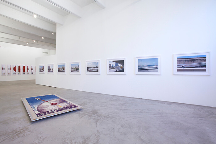
Much to their surprise, Joana Hadjithomas and Khalil Joreige recently came across a half-century-old Lebanese postage stamp depicting a rocket emblazoned with a cedar tree. Though enshrined in official history, this inscrutable, fantastic image—seemingly the stuff of science fiction—commemorated an event no one could remember. An enigma, it intrigued the artists enough to do some research. They discovered that between 1960 and 1967, as the global superpowers vied for superiority in the space race, Armenian students at Beirut’s Haigazian University had successfully produced the Middle East’s first rockets intended for space exploration. The Lebanese Rocket Society launched more than ten of what were called “Cedar” rockets (after the country’s national emblem), reaching an altitude of two hundred kilometers with the “Cedar IV” rocket and briefly becoming the pride of a small nation riding the hopeful, modernizing wave of pan-Arabism. The amateur space program fell apart in 1967, and later, with Lebanon besieged by sectarian strife, it was forgotten.
Like many Lebanese artists who came of age during the country’s civil war (1975–1990), a period excluded from national textbooks to this day, Hadjithomas and Joreige have investigated—and invented—unofficial histories both to redress public amnesia and to question the select images and narratives …
March 25, 2013 – Review
Gianni Colombo
Alan Gilbert
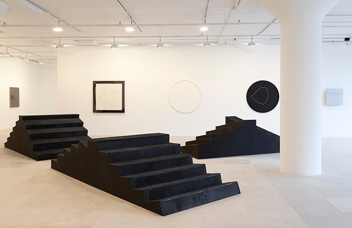
I don’t know if I’ve ever seen—and experienced—as much unadulterated glee in an art gallery or museum as I did at the opening of Gelitin’s “The Fall Show” at Greene Naftali last September. The gallery was filled with makeshift sculptures of different shapes fashioned from relatively cheap materials and placed on variously sized pedestals. Each pedestal had a foot pedal attached that rocked or jolted it, sending the sculpture perched on top crashing to the floor, usually with a loud thud or a sharp clatter. Some of the sculptures were dented and chipped by the end of the evening, and I can only imagine their condition by the close of the show. At the opening and in the weeks that followed, people took iconoclastic pleasure in toppling Gelitin’s artworks, which seems appropriate given the aura of exclusivity that still generally surrounds art (and its institutions), even after a decade or more of frequently overheated rhetoric—pro and con—regarding participatory and interactive art (along with its kissing cousin, relational aesthetics). In certain ways, Gelitin’s show felt like an absurdist exclamation mark emphatically inserted into this debate.
The much quieter, although not entirely silent, current exhibition at Greene Naftali follows participatory and interactive art …
March 13, 2013 – Review
LETTER TO THE EDITOR OF ART-AGENDA
Media Farzin
MY DEAR J—, when you did me the honor of asking for an analysis of the Armory Show, you said, “Be brief; do not write a review, but a general impression, something like the account of a rapid philosophical walk through the galleries, an overview of a century of art fairs.” Very well, you shall have your wish; not because your program accords (perhaps it does) with my own conception of that tiresome kind of article called an “Art Fair”; nor because your method is easier than the other—it is not, for generality always demands more effort than specificity, especially when historical research is involved; but simply because, above all in the present instance, there is no other possible way. Certainly I should have been more embarrassed if I had found myself lost in a forest of originality, if the contemporary art fair, suddenly modified, purified, and rejuvenated, had provoked floods of praise—a garrulous admiration—or necessitated whole new categories in the language of criticism. But there is nothing of all that, fortunately (for me). The thoughts suggested by the sight of the Armory are of so simple, so traditional, so classic an order, that a few pages will doubtless be …
March 11, 2013 – Review
Ragnar Kjartansson’s “The Visitors”
Nickolas Calabrese
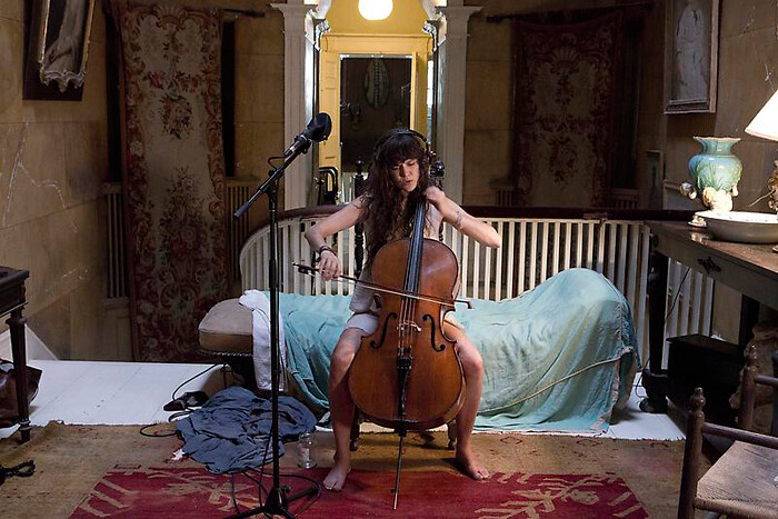
Despite his radical experiments in music, modernist composer Charles Ives had the belief that America and its intellectual landscape were filled with the robust spirit of practicality. Ives liked to recall a quote from his father: “If a poet knows more about a horse than he does about heaven, he might better stick to the horse, and some day the horse may carry him into heaven.”
Ragnar Kjartansson has pretty much always stuck to his horse and that horse is song. The Visitors (2012) at Luhring Augustine Gallery is a nine-channel video projection detailing the communal production of a roughly hour-long folk song. The work is inspired by Swedish pop-group Abba and features lyrics from a poem by artist Ásdís Sif Gunnarsdóttir, Kjartansson’s ex-wife, with musical arrangement by the artist and Davíð Þór Jónsson. Each screen harbors one of the band members, with the artist himself playing the role of guitar-strummer and lead singer, taking a bath. The other players are reminiscent of lonesome doves—a cellist in the stairwell, a bass player in the library. Towards the end of the hour, the musicians slowly come together on the ninth screen and descend into a sublime landscape worthy of Thomas Cole’s …
March 8, 2013 – Review
Independent
Ginny Kollak
In the weeks leading up to this year’s Independent art fair, the self-styled “temporary exhibition forum” that has taken up residence in the former Dia Art Foundation building during each Armory week since 2010, I felt a creeping, empathetic anxiety. How would exhibitors respond to the increasingly crowded field of art fairs with similar indie credentials? Would there be evidence of growing pains, or worse yet, an awkward adolescent phase?
As it turns out, I needn’t have worried. While the funhouse vibe of years past may have subsided (there are no oversized inflatable rats, for example, like the one by the Bruce High Quality Foundation that greeted visitors to Independent’s first iteration), what remains is a casually self-assured, even subdued presentation of works by artists from both within and beyond the mainstream. There’s not much by way of shock value or even spectacle here, though I doubt most visitors will miss the glittery multiples and clever slogans that populate other fairs. Still, with more than 40 galleries and several non-profits and publications spread comfortably among three floors, there is plenty to see and appreciate.
New this year is the Privatus Prize, a 10,000 USD award juried by independent curator Clarissa Dalrymple and …
February 28, 2013 – Review
Trevor Paglen
Stephen Squibb
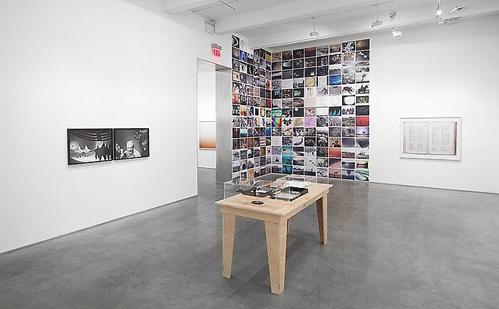
Politics is similar to art in that both are often reduced to questions of representation. The question of who or what is being represented by who or what; the question of whether this representation is legitimate or effective; and most importantly, the belief that the most important work is simply a redistribution of representation: a redeployment of our attention to where it was missing—or merely adding a seat at an already existing table. The limitations of this approach become evident if the table is deemed unsatisfactory. In politics, the re-designers of that table are called “radicals” (from the Latin radicalis, or “roots”), whereas in art, there is a parallel to work we call abstract. Thus, the work of the imaginary is especially clear and obvious in both radical politics and abstract art—though, and this is important, it is not absent from either non-abstract art or un-radical politics, merely harder to locate.
I would like to wager that when history remembers Trevor Paglen as one of the important artists of our time it will be because of the way that his work summons precisely this set of relationships: between abstraction and representation, politics and art, image and idea. If this claim seems …
February 20, 2013 – Review
“39greatjones”
Aoife Rosenmeyer
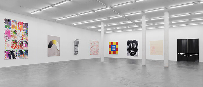
Everything you see here has lived out a solitary life of its own in a shop window on a quiet street in the East Village. One by one, sixteen works by Martin Boyce, John Giorno, Wesley Martin Berg, Matteo Callegari, Wyatt Kahn, Alan Shields, Bruno Gironcoli, Ann Craven, Joyce Pensato, Josh Smith, Andrew Brischler, Giorgio Griffa, Tamuna Sirbiladze, Davis Rhodes, Ron Gorchov, Anne Chu, George Ortman, and Kes Zapkus were exhibited solo, between October 2010 and the present (with two more installations lined up). Curator, artist, and publisher Phong Bui, who has written the gallery text, compares that shop window on Great Jones Street to a device linking disparate elements, a “magic object” à la jewelled ring via Italo Calvino’s parsing of the story of Emperor Charlemagne who fell for whoever possessed the ring: “Around the magic object there forms a kind of force field that is in fact the territory of the story itself. We might say that the magic object is an outward and visible sign that reveals the connection between people or between events.” (from Italo Calvino’s collection of lectures, Six Memos for the Next Millennium, 1985–1986)
Bui’s text also includes his poem “Life is a Killer,” …
February 18, 2013 – Review
Gerard Byrne’s “Present Continuous Past”
Gil Leung
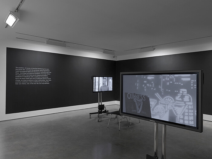
To adequately reflect on the present moment requires a certain distance, some way of pulling out of the perpetual now of contemporary time and into another. This phenomenon can be evidenced in the compression of time that occurs when attempting to recall the near past; years turn into events and decades into fashions. Hindsight, as this is usually referred to, posits the notion of an ability to see something clearer from further away, from a distance. Gerard Byrne’s “Present Continuous Past” is not about the accuracy of a past represented so much as an attempt to collapse and flatten one differentiated temporality into another. The show itself is framed as an accompaniment to Byrne’s current survey exhibition “A state of neutral pleasure” at Whitechapel Gallery.
In its most literal sense, “hindsight” would imply seeing the back of something, the behind. Byrne’s 2013 series of silver gelatin prints—such as Inventory number 3280, a depiction of the martyrdom of St. Quirinus, photographed in the Belvedere Museum, Vienna, 219 years after it was painted, and reproduced here at 68% of its original size—depict the backs of framed canvases, in a continued reference to Cornelius Gijsbrechts’s 1670 trompe-l’œil Reverse Side of a Painting, the back …
February 6, 2013 – Review
Svenja Deininger’s “One Second Balance”
Media Farzin
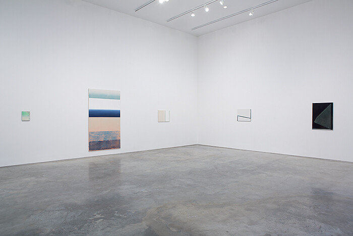
Svenja Deininger’s current show at Marianne Boesky Gallery has a quietness to it, an air of minding its own business that can be initially disarming. From a distance, the geometric abstractions look as pristine and empty as the gallery’s walls: no external references, no critical provocations, nor expressive painterly effects—nothing, it seems, to hold the viewer’s attention at all. But with closer views, their formal goals become quite clear. Each painting plays various perceptual elements against each other, balancing opacity against transparency, turning surface into depth. Mass open spaces are girded with lines, and abstraction is held in captivity, on the brink of representational possibility.
“One Second Balance” is the Vienna-based painter’s first solo exhibition in New York, with fourteen untitled works all made in the previous year. The work is installed to form a possible trajectory through Deininger’s process, with one canvas often introducing a motif or element that is reprised in the next, in a limited palette of blacks, blues, greens, and pinks. The change of scale between the works only serves to further emphasize nuanced compositional details: as the viewer draws closer, what initially appeared to be virgin white matte space turns out have multiple layers and planes, …
January 25, 2013 – Review
Daniel Buren’s “Electricity Paper Vinyl…” and “Electricity Fabric Paint Paper Vinyl…” Works In Situ and Situated Works from 1968 to 2013 (Dedicated to Michael Asher)
Karen Archey
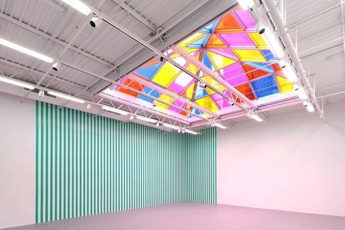
For nearly five decades, Daniel Buren has used 8.7-centimeter stripes to highlight the lack of phenomenological neutrality of the exhibition space, his ubiquitous colored bands appearing everywhere from institutions such as Paris’s Grand Palais and the Centre Georges Pompidou to the hallowed escalators of Art Basel. Not soon forgotten is his participation and removal from the “Sixth Guggenheim International Exhibition” (1971) at the behest of fellow artists Dan Flavin, Donald Judd, Joseph Kosuth, and Richard Long, who felt their respective installations were aesthetically interrupted by Buren’s striped banner suspended from the institution’s famed rotunda. Buren’s “in situ” work, as well as the Guggenheim incident (which now occupies a chapter in many an art history textbook), taught us that viewing art in an institution is always negotiated by economic and ideological factors, and that aesthetic autonomy is merely a delusion. In an early example of institutional critique, Buren’s stripes point outward toward the institution, prompting us to reflect upon both the architecture and function of the museum itself.
But what happens when institutional critique is taken out of the institution and located in a commercial gallery? Does it become an empty, decorative gesture? Buren’s first solo exhibition in New York since …
January 9, 2013 – Review
“Problem Play”
Tyler Coburn
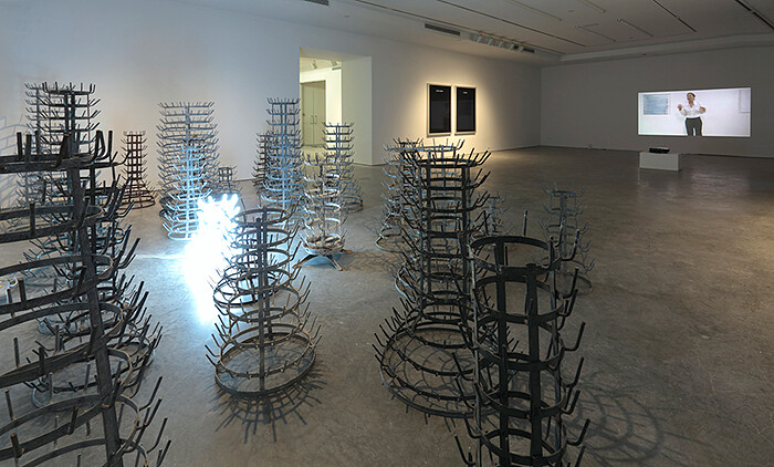
The term “problem play” originated when nineteenth-century theater made a realist turn, saddling characters and stories with the cause célèbres of the day. In simplest form, drama gave way to soapbox sermons and moral absolutism. The prevalence of such mediocrity may account for why the problem play’s most artful contributor, Henrik Ibsen, went so far as to profess no interest in feminism at a dinner lauding his support of the cause.(1)
Compounding the problem as subject is the problem of classification—Shakespeare scholar Frederick S. Boas has repurposed the term to designate works that toe the Aristotelian line and thus compel us to “move along dim untrodden paths.”(2) Rather than settle on a catchall of convenient imprecision, like “tragicomedy” or “dark humor,” Boas retains “problem play” wholesale, implying that the form’s problematic eluding of traditional genres is key to its critical operation.
The eponymous group exhibition on view at Leo Koenig Inc. brings both definitions to bear on the generational inheritance of its participating artists. The audience enters the gallery through the back door, as it were, greeted by contemporary annotations of ur-texts. Bethan Huws’s two display boards, Ladies and Gentlemen (2006), educe gendered scripts from the assisted readymade, contingently troubling her nearby …
December 13, 2012 – Review
Mickalene Thomas’s “How to Organize a Room Around a Striking Piece of Art”
Alan Gilbert
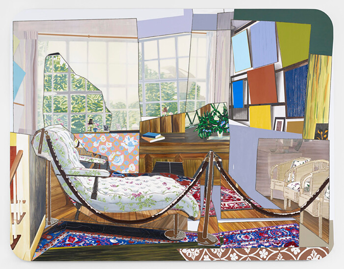
Mickalene Thomas first gained acclaim with her stunning painted portraits of African-American women. She easily could have continued producing this kind of portraiture work à la Chuck Close or Kehinde Wiley and become quite successful in a similar way; instead, she has restlessly explored a variety of genres and mediums—including photography, installation, collage, murals, film, and video—while retaining her signature style. Concurrent with a large solo exhibition at the Brooklyn Museum, her work is showing at both of Lehmann Maupin’s New York City locations under the title “How to Organize a Room Around a Striking Piece of Art.” At the Lower East Side venue, new paintings resulting from time Thomas spent at Claude Monet’s house and garden in Giverny, France, are on display. Each employs the fractured picture plane, swathes of bold color, and embedded rhinestones common to Thomas’s work; if anything, absent the faces that previously dominated, these qualities become even more pronounced.
In her portraits, rhinestones outline shapes or sparkle in the jewelry worn by her depicted subjects, but in Monet’s Salon (all works 2012) red rhinestones cluster in a rug’s gorgeous detailing. This interior view reflects an image seen in the first piece gallery-goers encounter—a video looped partially …
November 23, 2012 – Review
Kutluğ Ataman’s “Mesopotamian Dramaturgies”
Arnaud Gerspacher
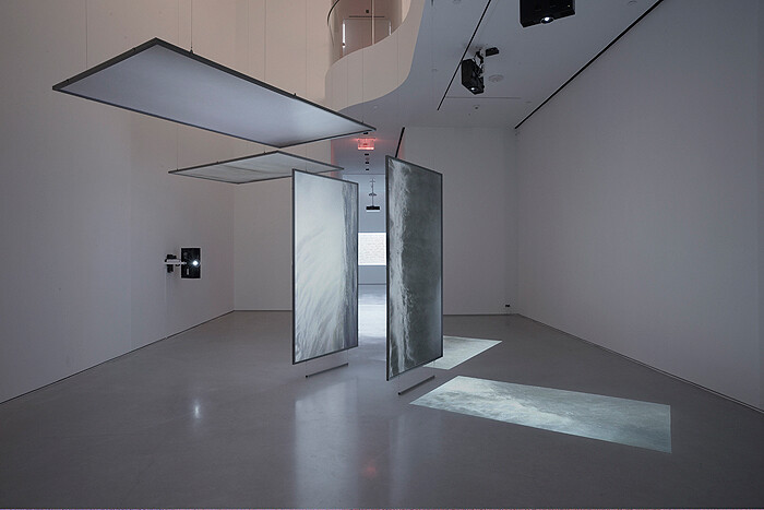
If you’re overly tapped into art world tropes or academic hotspots, it’s tempting to think that there would be little new to offer in the archival impulse, in interrogating documentary conventions, or in playing with the effects fictions have on the facts. But like Harun Farocki, Amar Kanwar, or Omer Fast, Kutluğ Ataman does it so well you end up reconsidering those knowing prejudices you carried into a gallery. Ataman’s current show at Sperone Westwater, featuring four works from his “Mesopotamian Dramaturgies” series, is a case in point: through subtlety, craft, and humor—edged by formal and conceptual rigor—his approach demonstrates that well-worn strategies are not inherently exhausted and that our discourse is as coerced by the detracting force of cliché as any other.
Mayhem (2011) comes first. The seven-channel video installation is a multiplied and vertiginous view of the massive Iguazu Falls, specifically the area known as the Devil’s Throat, between Argentina and Brazil. Each video is a close-up of cascading torrents of water foaming, pouring, and crashing in on themselves from various angles. Ataman calls this work his direct response to the Arab Spring, describing the water as both a violent and cleansing force. This response is deeply ambiguous. The …
November 16, 2012 – Review
Nairy Baghramian’s “Fluffing the Pillows”
Katharina Neuburger
All of the signifiers are already there: a postage-stamp image of a sailor in full sailor garb hoisting a mainsail, the stylized trace of its having already been posted, the otherwise blank postcard just waiting to be filled with some carefree lines about warm summer evenings. It’s the invitation to Nairy Baghramian’s latest exhibition at Galerie Buchholz, Cologne, “Fluffing the Pillows,” and the show has already begun while puzzling over this printed matter. Like the invitation, the entire show is replete with tropes ripped from their familiar setting and thrown into a rough conceptual sea of references.
Entering the first space of the gallery’s two venues, we are immediately confronted with News Rack (Boat Magazine) (all works 2012). It’s a news rack, yes, but an elegant one at that, and there’s a magazine displayed in its clutches. The magazine itself turns out to be a slyly playful exhibition catalogue printed for Baghramian’s Kunsthalle Mannheim show under the auspices of the 2012 Hector Prize. Combining theoretical essays and installation views of her work in the guise of an upscale boating magazine, the piece serves as a guideline for the heady work required of visitors to the Cologne show. Facing News Rack (Boat …
November 14, 2012 – Feature
Chelsea after Sandy
Kareem Estefan
From houses scorched to the earth in Breezy Point, Queens, to homes completely swept away in Staten Island, when it came ashore late last month Hurricane Sandy wreaked unprecedented havoc on life as we know it in New York City. The storm cut off power for nearly a million New Yorkers, and tens of thousands remained without electricity, heat, or water for ten days or more. Artists, whose studios and galleries are disproportionately situated in coastal areas of Brooklyn and Manhattan like Red Hook, Dumbo, Greenpoint, Chelsea, the Lower East Side, and the East Village, have been among the hardest hit.
Two weeks after the storm, a besieged Chelsea art district is slowly coming to grips with the hurricane’s immense personal and economic impact, in artworks ruined and high-season sales foregone. To put a figure on the losses is, for now, a futile exercise. The neighborhood’s largest art insurance company, AXA, has received $40 million in claims from its clients, but many galleries were not insured by AXA—or at all—and even among those that were, the above sum does not even include equipment and infrastructure damage. If there is good news for the area west of Tenth Avenue, between 19th and …
October 14, 2012 – Review
Walid Raad & David Diao
Stephen Squibb
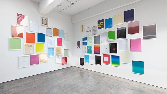
A friend once complained that contemporary curating is too conceptual. The goal, he said, ought to be the collection of suggestive affinity—this reminds me of this. If the conversation between works is too clear, or too overdetermined by the frame of the show, the energy dissipates, and individual pieces become instances of an overarching idea, instead of generating ideas themselves. Better to pursue electric potential than abstract rigor.
Thus the difficulty for the curator is twofold. To maintain sensitivity to the work while navigating the labyrinthine bureaucracy and endless paperwork of the profession can be difficult. And even if this sensitivity is sustained, the bias is towards single artist statement shows or large group recitals—usually starved of opportunity in the first case, and diluted in the second—can deflate curatorial impact.
As has been the case throughout history, however, in the rarified air where commercial exchange becomes something more like courtly pageantry, a relative freedom prevails, and occasionally we are treated to masterful displays like the one currently at Paula Cooper in Chelsea. Walid Raad and David Diao is an immensely audacious pairing; not because the artists are so different or so similar, but because the simple formal resonance between the two blooms …
October 5, 2012 – Review
Zoe Leonard
Karen Archey
It’s a cruel fact of art writing that when political work is positioned under weighty rhetoric, its vim and potency become threatened. The press release for Zoe Leonard’s exhibition at Murray Guy wavers on doing just that, suggesting that the show waxes philosophical on the nature of photography by asking the age-old question “What is photography?” Leonard, whose work ardently politicizes the act of looking, is a hero of queer art and champion of photography as an artistic medium. She privileges a practice of aesthetic subtlety, often proffering bodies of works that achieve meaning through their association in totality rather than as singular objects. I would argue that it’s with the breath of the personal and political that Leonard’s work is most keenly felt, and with the scientific and academic that it loses impact.
Leonard’s exhibition at Murray Guy, her first at a New York gallery since 2003 and the inaugural show in the gallery’s expanded Chelsea space, consists of a darkened room acting as a camera obscura and five photographs taken directly focused at the sun. The camera obscura, itself a tool long tied to the history of painting and architecture as much as photography, covers the gallery walls in …
September 23, 2012 – Review
Simon Starling’s "Triangulation Station A (40°44’49.17″ N 74°0’22.45″ W)"
Tyler Coburn
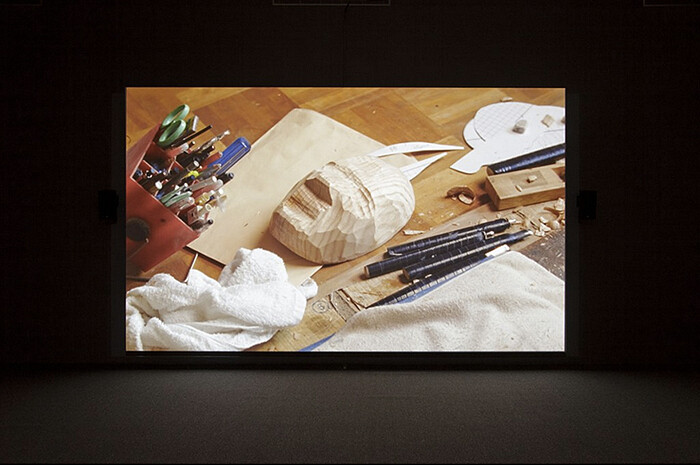
Simon Starling returns yet again to the career of Henry Moore in Project for a Masquerade (Hiroshima) (2010), currently on view at Casey Kaplan, New York. The film traces the troubled history of the British sculptor’s monument, Atom Piece/Nuclear Energy, from its 1967 installation at the historic site of Chicago Pile-1 to the Hiroshima City Museum of Art, which collected a bronze model in 1987. Moore died a year before the acquisition, though he was already caught in political back-pedal. A 1970 photo shoot staged the sculptor at work on the finished model, next to an elephant skull—comparatively neutral, considering the mushroom clouds and human skulls of actual influence.
Starling begins with a name. At the outset of the film, an Osakan mask maker planes “Moore” off a wooden block and whittles the enchanted object down to the sculptor’s face. This mask is joined by fellow Cold War likenesses, shown in partially-completed states, including Pile-1 orchestrator, Enrico Fermi; James Bond; Anthony Blunt; and the opposing faces of the Moore monument. While the camera attentively follows their making—never straying from the craftsman’s studio—a voiceover imagines the finished masks taking positions on the Noh stage. Adapting the 16th-century play “Eboshi-ori,” Starling casts …
July 13, 2012 – Review
"Dogma"
Adam Kleinman
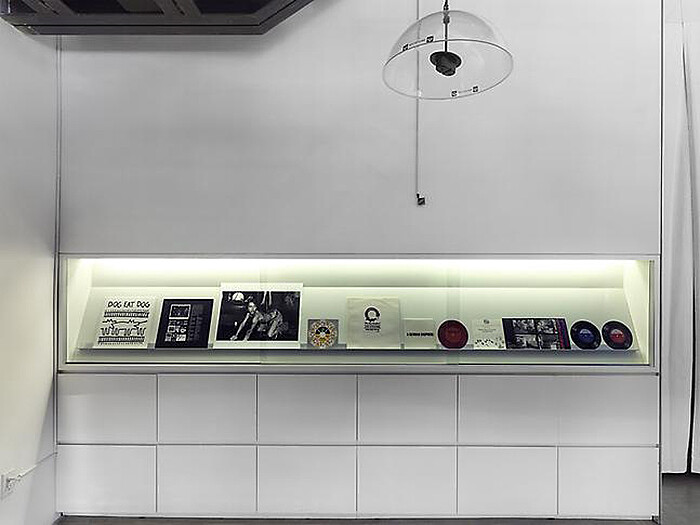
Although dogs are “man’s best friend,” no other species has been as manipulated by humans—a strange take on friendship indeed. This tenuous power play between love and dominance lies at the heart of “Dogma,” Metro Pictures’s summer group show organized around the very relationships and allusions “forged between mankind and dogs” by Swiss Institute Director Gianni Jetzer.
And just to let you know who’s boss, Dustin Pittman’s NOW I WANT TO BE YOUR DOG, IGGY POP 1970 (1970), a black-and-white photograph of the singer wearing a studded collar while offering himself up on all fours, smacks the visitor on the nose upon entry. Joining this image are various other music-related references set in a shared vitrine, the strongest pairing of which is a Keith Haring band poster featuring a conga line of dogs biting other dogs’ asses next to the adage “DOG EAT DOG.” Slipping away from this scintillating juxtaposition of psycho-sexual innuendos are several record albums, namely, Cat Stevens’s Was Dog a Doughnut (1977), an early electro-dance track featuring barking dog sounds complimented by an image of a wiener dog-cum-ouroboros on it’s sleeve; a collection of sound effects edited by Jack Goldstein, most importantly the barks of German Shepherds; and …
July 6, 2012 – Review
Santiago Sierra’s "NO, Global Tour"
Stephen Squibb
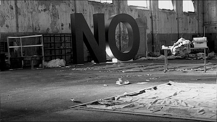
For an artist as avowedly controversial as Santiago Sierra, the evidence is hard to locate. Instead of polemical denunciations or excessive apologetics we find an endlessly reiterated testimony to their existence. What is Santiago Sierra? Controversial, the answer comes back, unanimous. Or, almost as often: difficult. But where does this controversy or difficulty take place? Much harder to say. With the exception of the successful campaign to prevent his turning a German synagogue into a DIY gas chamber (a protest “against the banalization of the holocaust”) and his supporting role as the “good-because-antagonistic” relational artist in Claire Bishop’s celebrated attack on Bourriaud’s “bad-because-collective” relatives, there is little in the way of damnation or celebration. And if the latter sometimes arrives well-tempered by furrowed brows, it just as often evinces no such compunction. In fact, Sierra has been on such a run of unadulterated success that the current offering at Team—a road-movie depicting the worldwide travels of his large NO sculpture—grew out of his need to create a work that could travel. Apparently, he wanted to avoid creating the place-specific performative “remunerations” for which he is famous. As he told the magazine ARTPULSE:
“[I]t was too much work, especially when you …
June 25, 2012 – Review
Martin Kippenberger’s “The Raft of the Medusa”
Media Farzin
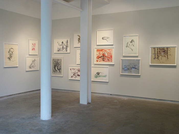
When Théodore Géricault’s The Raft of the Medusa was unveiled in the Paris salon of 1819, there were gasps of horror (and low whistles of admiration) at its political audacity. The painting depicted a public scandal of just three years prior, the tale of a slave ship stranded at sea and then abandoned by its incompetent state-appointed captain. The painting’s stark contrast of despair and hope—a monumental composition of contorted bodies capped by a figure who has just spotted a ship on the horizon—eventually cemented Géricault’s reputation within the Romantic movement.
The painting’s dramatic emotional heroism made it a natural choice for a project by Martin Kippenberger, as source material for an appropriation that combines parody and respect in equal measures. A restless and prolific artist, Kippenberger extended (and undermined) the legacy of Germany’s Pop forefathers through his excessive gestures and a larger-than-life persona. He returned again and again to painting as a medium, and a year before his premature death in 1997, he produced a multi-part project based on Géricault’s painting. Given that it was one of Kippenberger’s last cycles of work, the concept of death has become the inevitably intertwined with its interpretation.
The recent exhibition at Carolina Nitsch features …
May 18, 2012 – Review
Martha Rosler’s “Cuba, January 1981”
Scott Reger

Hairdressers, Trinidad, one of several diptychs in Martha Rosler’s “Cuba, January, 1981,” shows two women looking at each other. In the first image, the blonde addresses the camera, seemingly in mid-speech, while the brunette watches her in profile. In the accompanying image, the brunette smiles for the camera, while the blonde looks on. The similarity of the two images, side by side, sets off clearly the line between looking and being looked at. This line has often been Rosler’s subject: capturing what is at work in the space between images. So a simple reconfiguration of the gaze between hairdressers delineates the spectrum of our assumptions—about power, photography, and, well, haircuts. We can see, suddenly, what it was we were thinking.
This operation is so effective it is often taken for granted. Rancière famously described a montage from Rosler’s House Beautiful: Bringing the War Home (1967–72) as depicting “in the middle of a clear and spacious apartment, a Vietnamese man holding a dead child in his arms. The dead child was the intolerable reality concealed by comfortable American existence…”. Yet the man was actually a woman, the child was actually alive, and the “intolerable reality” had appeared in Life magazine, alongside, as …
May 7, 2012 – Review
New York gallery openings
Nickolas Calabrese
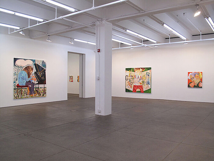
The hot city summer is just around the corner, the Knicks are mercurial as ever, and labor union art handlers are still out of work. New Yorkers have reason to complain. An apt occasion to gripe about the Scrooge McDucks of the art world came and went: the first New York edition of Frieze. The fair also provided galleries with the salacious opportunity to show just how garish they can really be. However, with all of the social and political opposition to opulent displays of the ultra-wealthy, it should come as no surprise that many galleries did not take that route this May. But changes in the art world are bound to occur at moments like this: call it historical inevitability. Whatever the causal factors may be, several galleries in NYC have mounted eloquent and penetrating exhibitions, and the shows represented here are laden with the spirit of a protest, each one more singular and exciting than the next.
Heavily hyped for her first outing at a new gallery is Dana Schutz’s “Piano in the Rain” at Friedrich Petzel Gallery. Schutz’s pictorial fictions are replete with her familiar brand of alterity, though in this sequence the figures seem more comprehensive than …
May 4, 2012 – Review
Frieze New York
Alan Gilbert
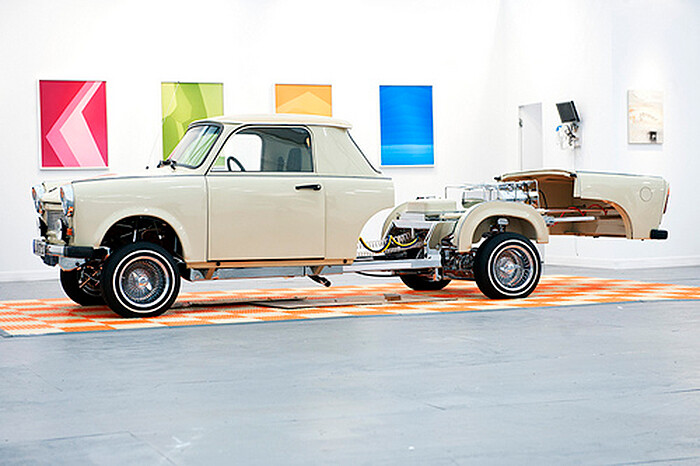
As what remains of the public domain is increasingly privatized, art fairs are becoming the real museums of contemporary art. It’s not a coincidence that the London-based Frieze Art Fair’s inaugural appearance in New York City includes a panel titled “Expanding Museums” featuring the directors of the Museum of Modern Art, the Whitney Museum of American Art, and the chairperson of the Metropolitan Museum’s Modern and Contemporary Art Department. It’s also not a coincidence that a version of Edvard Munch’s The Scream sold at a Sotheby’s New York auction for $120 million—the most ever for an artwork at auction—the day before the Frieze Art Fair opened. Furthermore, it’s probably not a coincidence that Frieze is scheduled for roughly the same week as wallets are being opened for Sotheby’s auctions of Impressionist, modern, and contemporary art. And it’s not a coincidence that on the day I visited the art fair I signed an online petition supporting the unionized art handlers that profit-pumping Sotheby’s has locked-out for more than nine months. On a similar note, Frieze New York instigated its own labor troubles when it decided to use non-union workers to erect a massive 250,000 square-foot tent to house the fair on …
April 12, 2012 – Review
Mounir Fatmi’s "Oriental Accident"
Media Farzin
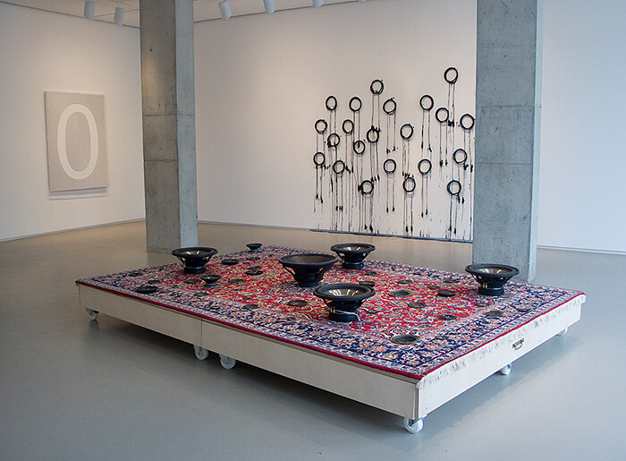
Mounir Fatmi’s invocation of that evocative term “oriental” for his second US solo exhibition is no accident. The Paris-based Moroccan artist frequently draws on charged references—linguistic, political, and historical—to deepen the critical bite of his work. The artworks themselves, however, are usually juxtapositions of found objects that produce conceptual one-liners of a socio-political bent. The six recent works on view here are a remix of his material and thematic experiments of the past decade. At their best, they offer a first-hand encounter with the subtle sensory appeal of his playful appropriations and their skillful recasting of intellectual inquiry as visual pleasure. That said, their blunt symbolism and slick design suggest an opportunist aestheticization of the politics of the Arab Spring: by lining up a striking iconographic web of implied meanings (the artist’s North African origins included), the works hint at profound political critique without actually having to say very much.
The “oriental accident” of the show’s title is never quite explained, though it’s also the title of the 2011 work that greets the viewer upon entry. Loud, metallic vibrations call attention to the speakers mounted on the surface of a Persian carpet. The background noise coming from the speakers is …
April 7, 2012 – Review
Hans-Peter Feldmann
Alan Gilbert
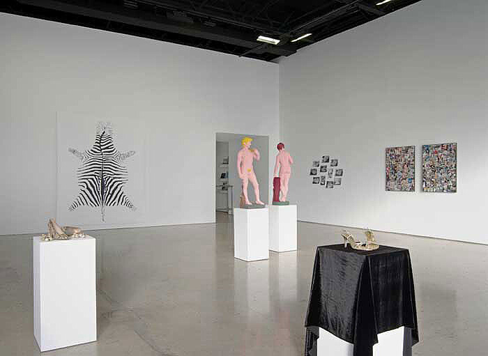
Conceptual art has long had a reputation for being a bit dispassionate and cerebral, but recent curatorial and scholarly approaches have emphasized its more human and even emotional sides. Bas Jan Ader’s 16mm, silent film I’m Too Sad to Tell You (1971) is somewhat of a lynchpin work in this respect. A three-and-a-half-minute, black-and-white close-up of the artist weeping, the piece has none of the coolness—except, perhaps, for its lack of a soundtrack—associated with the genre.
There’s a similar warm conceptualism in Hans-Peter Feldmann’s work, and, like the reception of Ader’s art, a period of semi-disappearance and rediscovery. Some of this was self-induced, as when Feldmann stopped making art during the 1980s and later worked fulltime at a gift shop he opened with his wife in his hometown of Düsseldorf. But over the past two decades, Feldmann has produced and exhibited extensively again, culminating with his 2010 selection for the Hugo Boss Prize. For his accompanying solo exhibition at the Guggenheim Museum in New York City, he installed the $100,000 award money in $1 bills lining a gallery adjacent to the main rotunda.
But if a seriality of the mundane is at the heart of Feldmann’s work, the culminating result occasionally signals …
March 30, 2012 – Review
Superflex "Bankrupt Banks"
Karen Archey
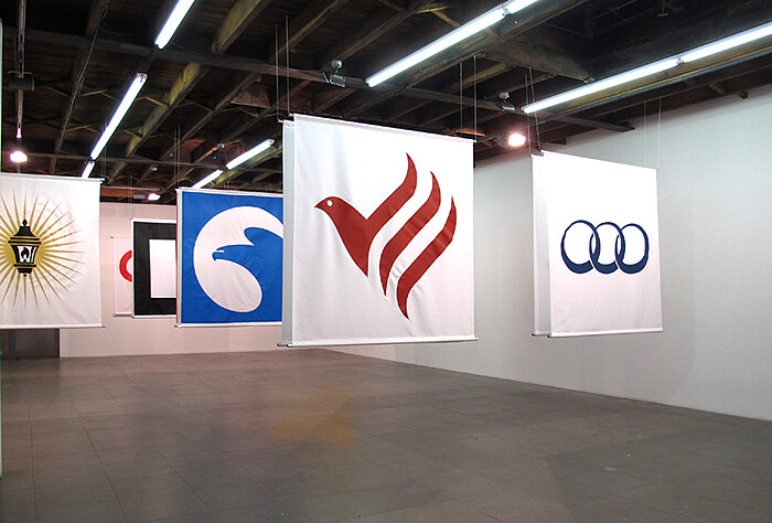
Superflex, the Danish trio who famously installed a life-sized replica of JP Morgan Chase’s bathroom in a dumpy Lower East Side diner, has opened a comparatively sober exhibition at Peter Blum, stringing banners emblazoned with the logos of bankrupt banks throughout the gallery’s Chelsea location. Appropriately titled “Bankrupt Banks,” the exhibition continues the Danish group’s critiques of and investigations into financial markets and economic systems. Unwittingly and complacently fitting into the financial system that is the art world while critiquing those outside it, “Bankrupt Banks” packs a less fierce punch than the more socially conscious projects of the trio’s recent past.
For “Bankrupt Banks,” Superflex (Bjørnstjerne Christiansen, Jakob Fenger, and Rasmus Nielsen) hones in on the graphic design efforts of banks that either declared bankruptcy or were acquired by other banks. Work titles detail which retired bank owns the logo, which non-defunct bank they’ve been acquired by, and on what date, should one forget, Bankrupt Banks / Merrill Lynch acquired by Bank of America, September 14, 2008 (2012); Bankrupt Banks / BankWest acquired by Commonwealth Bank of Australia, October 9th, 2008 (2012), et cetera. Kaupthing, Colonial Bank, Washington Mutual, and Anglo Irish also make appearances. Originally created to communicate power, prestige, …
March 23, 2012 – Review
76th Whitney Biennial
Stephen Squibb
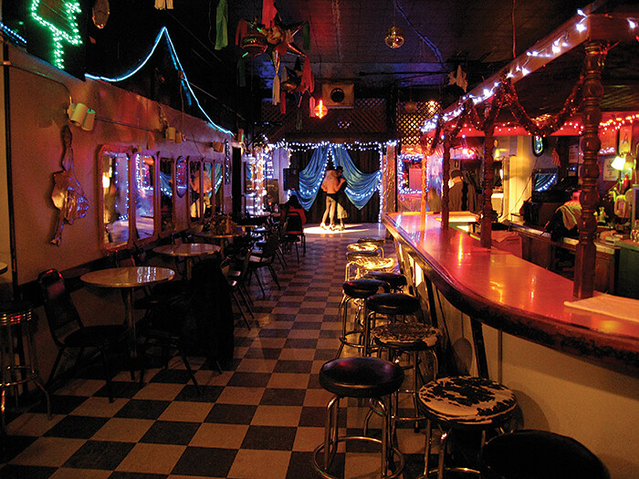
Partial, relaxed, and idiosyncratic are not typically positive associations for large survey shows. But these have been multiplying recently, and perhaps that is why that most venerable of panoramas, the Whitney Biennial, finds itself relieved, a little, of its historical pretensions towards completeness. Any survey is just one of an infinite number that could have been, after all, but it’s rare that curators are secure enough to start with that knowledge rather than resort to it as an excuse after the fact. The 2012 Biennial is so blessed—Thomas Beard, Ed Halter, Jay Sanders, and Elisabeth Sussman are to blame—and the result is a wonderfully open, strange presentation. Other editions have contained a larger selection of more successful works, but I’ve never before left a biennial so keen to return, or found myself wishing that the Whitney weren’t quite so far away.
The chief reason is that so much of the work is spread out over the run of the show, appearing only at specific times. Thus, as you have perhaps heard, almost the entire fourth floor is given over to a large performance space to be inhabited by various artists in various ways. And if the show has a signature, …
March 17, 2012 – Review
New Museum Triennial, "The Ungovernables"
Arnaud Gerspacher
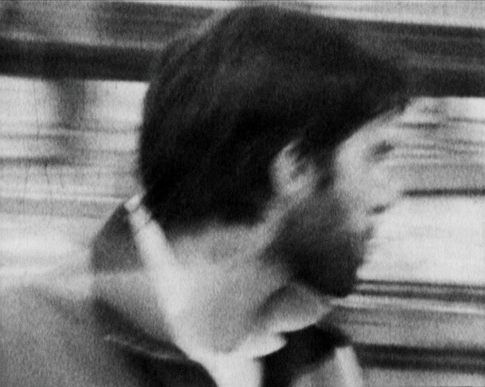
The Grand Inquisitor and Diogenes are crucial figures of the ungovernable—one as cynical exercise of power with impunity, the other as mocking embrace of bare life and irreverence towards authority. These two figures continue to represent the polarities we inhabit: the unofficially ungovernable states and institutions that wield great power (doing business in an official capacity) and officially ungovernable communities that are neglected, perish, or resist (in unofficial capacities). Jean-Luc Nancy’s understanding of this polarity is between the global death-drive of the “un-world” and the creative stirring of “world-making” that resists the cold closure of such an immonde. Some of us have had the luxury of hiding in the middle—increasingly wary of being controlled by larger ungovernables (global capitalism, military states, religious fundamentalisms) yet equally wary of the sacrifices necessary to becoming more ungoverned ourselves. Who can afford to be Diogenes anymore, especially when so many parts of the world fill the role at little or no cost, without choice and little exposure?
It is depressingly clear that history has been far kinder to the grand inquisitors, whose qualifications continue to make for attractive hires at high-level positions. This time, however, if there is an inconvenient return, it is not …
March 9, 2012 – Review
"Anti-Illusion: Procedures/Materials"
Cindy Nemser / Anna Gritz
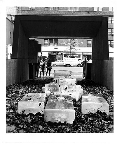
Cindy Nemser’s “The Art of Frustration” warrants a second take because of her critical view onto a time period that is now fetishized almost blindly. At hand of what is most likely the exhibition “Anti-Illusion: Procedures/Materials” at the Whitney Museum in 1969, the review reveals a writer coming to terms with the birth of conceptual and process art. Linking both conceptual and process art’s inherent critique of the art “establishment” to the student revolts of the time, Nemser identifies a lack of influence as the root of the frustration. Nemser claims that this privation leads to a self-referential system of art as entertainment that vies for attention via shock while no longer carrying any greater relevancy. Significantly, she doesn’t mention a single artist by name nor does she focus in depth on any of the work. Whether or not one agrees with her sweeping criticism, this type of writing, detached from formal concerns, favors a socio-political analysis that links artistic strategies to measures beyond the art world. Pitching art against technology, Nemser says, “The greatest example of art today is to be found in the IBM building,” a statement which after 40 years still leaves a sting.
—Anna Gritz …
February 9, 2012 – Review
Peter Fend’s "Über die Grenze: May Not Be Seen or Read or Done"
Colby Chamberlain
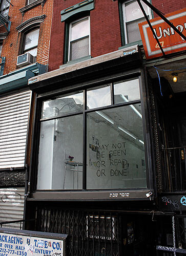
When it comes to Colab, there’s not yet a definitive history. From one perspective, Collaborative Projects was an artist-run funding scheme struck up during the fabled efflorescence of late-70s downtown New York; it consisted mostly of clashing egos who tolerated one another for the sake of self-advancement and government support, and from this melee of backscratching and backbiting sprang several major careers, including those of Jenny Holzer, Kiki Smith, and Tom Otterness. From another, Colab was a model of artist-initiated collective action that devised alternatives for exhibition and film distribution; made inroads into mass media, particularly cable television; and marshaled forces in Manhattan’s intensely local struggles over tenants’ rights and urban development. No doubt, both angles possess an aspect of truth, but, for anyone convinced that present-day artistic practice plays off the past’s unfinished projects, there are considerable stakes in exploring the possibilities of the latter—just as there were stakes for the neo-avant-garde in unearthing the radical aspects of constructivism that had been buried under formalist accounts privileging Naum Gabo and Antoine Pevsner. Much as the historical revisions of the Soviet avant-garde cast Tatlin and Rodchenko as leading protagonists, a strong assessment of Colab today would likely train a spotlight …
January 31, 2012 – Feature
"Environments, Situations, Spaces"
Jill Johnston / Media Farzin
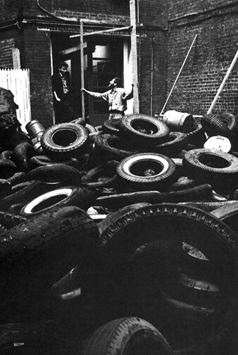
The critic, Jill Johnston once archly observed, is “one who practices the ART of criticism.” Johnston honed her skills through deep immersion in the New York scene of the 1960s, as a dance critic and later columnist for the Village Voice, and subsequently as a contributor to Art News, Art in America, and The New York Review of Books. Her brief, punchy reviews document an art that had not yet acquired a descriptive language, giving words to events that required a new sort of prose. Her writing style was intuitively suited to the task—an easy, fluid stream of consciousness; a direct response to things seen and felt; an informed, authoritative voice that could be funny, disparaging, and provocative in turns. More than a historic document of incredible immediacy, her work offers a model of art writing that recognizes its own stakes in creative production.
—Media Farzin
“Environments” at Martha Jackson’s
The “terrible children” invaded Martha Jackson’s Gallery last May and June with more of those baffling noncommercial commodities, things you can’t use or sell or label even, which nobody could be too clear about why they should be encouraged or endured much less considered the prestige items they obviously are, or …
January 25, 2012 – Review
Michael Wang’s “Carbon Copies”
Media Farzin
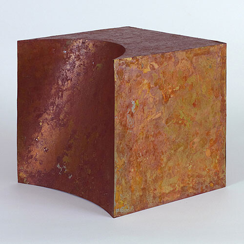
Michael Wang’s recent one-week exhibition, “Carbon Copies,” had nothing to do with those antiquated, inky sheets necessary before the advent of more efficient means of reproduction. For one thing, Wang’s work was nowhere near as messy. A trained architect, he used his first solo exhibition to “copy” twenty contemporary artworks from the perspective of their environmental impact. The show was tightly focused, neatly presented, grounded in persuasive research, and—in some way—entirely superfluous to his project’s stated aims.
His setup was straightforward, if obsessively predetermined: Wang had crafted small cubes representing well-known artworks from the past two decades. Each was sized according to the carbon emissions released in the process of the original artwork’s making. They ranged from the expected culprits (Richard Serra’s steel works, Damien Hirst’s diamonds) to surprise calculations (Marina Abramovic’s lighting, Chris Ofili’s air travel). The cubes themselves looked deliberately handmade, some shaded or textured in delicate graphite, others cast in a material resembling the original (a transparent Roni Horn, a waxy Matthew Barney). They were placed in neat rows, alphabetically by artist’s last name, and the accompanying certificates were placed away from the cubes on shelves along the walls, perhaps to allow for an initial encounter with objects …
December 9, 2011 – Feature
"9 Evenings: Theatre and Engineering"
Robert Smithson / April Lamm
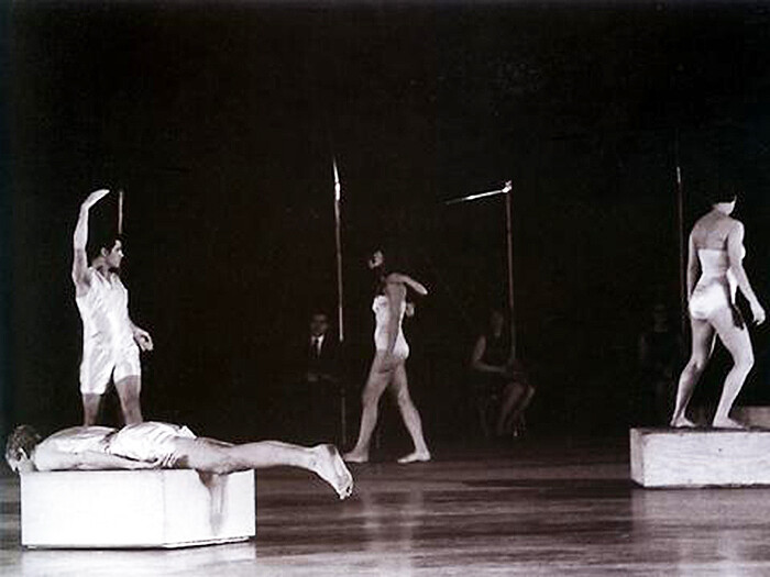
After stumbling across Robert Smithson’s vituperative response to a show that took place in 1966 at the Armory, I had to wonder what exactly it was that he saw. “Bovine formalism, tired painting, eccentric concentrics or numb structures”? His focus on the “funeral of technology” made me imagine that he’d seen a really bad Tinguely (which wouldn’t have surprised me) or maybe a bad Nam June Paik (which would). As it turns out, his ire was directed at an exhibition organized by Billy Klüver (an engineer) that included 10 artists, including Robert Rauschenberg, John Cage, Öyvind Fahlström, and Yvonne Rainer. Under the witty acronym E.A.T. (Experiments in Art and Technology) the performances, nonetheless, pioneered the way for the now-common practice of artists collaborating with practitioners from different fields. For the most part, the result of bringing 30 engineers together with 10 artists yielded performance kitsch at its worst (John Cage’s recordings of brain waves being the exception). You can watch a condensed (20-minute) version of the “Nine Evenings”: here.
—April Lamm
An Esthetics of Disappointment ON THE OCCASION OF THE ART AND TECHNOLOGY SHOW AT THE ARMORY
Many are disappointed at the nullity of art. Many try to pump life or space into …
December 7, 2011 – Review
Andrea Bowers’s "The New Woman’s Survival Guide"
Alan Gilbert
If one of the critiques—made by writers such as Audre Lorde and bell hooks—directed against early second-wave feminism was that it focused primarily on the concerns of white, middle-class, heterosexual women, more recent protest cultures have been criticized for fracturing into a plethora of identities and subject positions that resist being subsumed within larger social movements. The anti-globalization protests of the late 1990s and early 2000s may have been the pinnacle of this organizational mode. Occupy Wall Street, in turn, has shifted the focus more exclusively to economic questions, and in doing so has, like second-wave feminism, been accused of neglecting issues of ethnicity and sexual orientation, as well as, albeit to a lesser extent, gender.
Andrea Bowers’s second solo exhibition at Andrew Kreps adroitly touches on a wide range of these topics and histories. Part of what makes this possible is that Bowers has structured the show as an archive of past and present feminisms (all works are from 2011). The exhibition centers on an independently produced 1973 manual for everyday living entitled The New Woman’s Survival Catalog: A Woman-made Book, which was the result of firsthand research and reporting compiled from around the United States. It presented practical information …
November 27, 2011 – Review
Claire Fontaine’s “Working Together”
Stephen Squibb
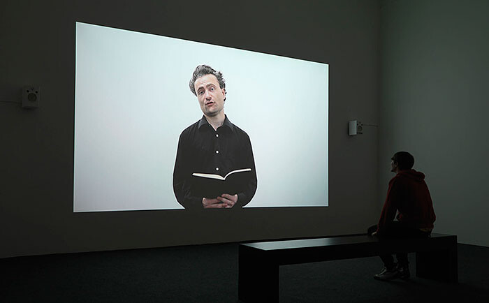
Claire Fontaine’s migration from Reena Spaulings to Metro Pictures for “Working Together,” her first show in Chelsea, pressurizes her concept of the ready-made artist. If this idea was once experimental, now it is deployed in the field at large. Fontaine has described the ready-made artist as referring, “to the reproducibility of artists during… an era that has been qualified as post-Fordist, one in which on-demand has replaced stock. The only goods still produced on an assembly line—that of the education system—without knowing for whom, nor why, are workers, including artists.”[1] Fontaine’s own name is taken from a popular brand of French notebooks and stationary, and those responsible for assembling the work that appears with her signature refer to themselves as her assistants.
It is in this sense that The Assistants (2011) one of two videos on display in “Working Together” —in which a poet reads a Giorgio Agamben text of the same name—can be called a self-portrait. The other, Situations (2011), an unsettling presentation of street-fighting pedagogy, is more in-keeping with the found quality of the rest of the work and is emblematic of the show’s success. In other words, having declared the artist a ready-made, Fontaine could have preceded apace …
November 10, 2011 – Review
Michael Krebber’s “C-A-N-V-A-S, Uhutrust, Jerry Magoo, and guardian.co.uk Paintings”
Antek Walczak
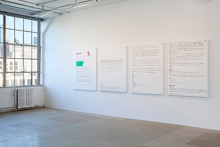
Let’s start this review typically, with a jaunty little narrative that encapsulates what’s happening in Michael Krebber’s latest show at Greene Naftali Gallery. Probably the most famous of Goya’s “Black Paintings” made between 1819-1823, painted directly onto the walls of his home at the time, the Quinta del Sordo (Villa of the Deaf Man), is that which goes by the name of Saturn Devouring His Children, one of six oil murals that adorned the dining room. (footnote 1) In his depiction of the myth of one of the Titans who ate his children in order to circumvent their youthful maneuverings in rendering him forcibly obsolete, Goya made Saturn’s eyes the focal point of the picture. With a crazed and bewildered look, the proto-Olympian gnaws on the arm of the headless corpse he clutches, less a deity in demeanor than a wild and formidable vagrant. Taken as allegory that transmits through the ages, adaptable and mutating, Goya’s work can fit any desperate world condition, but it’s Saturn’s eyeballs, with their lack of a gaze, or at least a pointed intelligence, that locate the horror and tragedy in the global contemporary art scene of 2011, and, in particular, in the paintings of …
October 7, 2011 – Review
Keren Cytter’s “Video Art Manual”
Karen Archey
As in Keren Cytter’s previous work, “Video Art Manual” strings together clichéd, Freudian-tinged narratives with a bad case of ADHD. Comprising four videos and a series of peripheral drawings, “Video Art Manual” is the stuff masochistic art critics live for: as soon as one eye rolling-worthy moment passes, such as a misogynistic character announcing his unprecedented hatred of both ducks and women (they way the talk, the way they walk!), Cytter blasts off with another libidinal oddity, laboring her viewers to glean any sense of comprehension from her work.
Behind a black curtain cordoning off the rear of Zach Feuer’s Chelsea space are a cacophony of projections, ballads, and dramaturgies making up Cytter’s video efforts from the last two years, with one exception from 2002. The soundtrack to the exhibition’s title video blares a MIDI-version of the melody to Guns N’ Roses’s “November Rain,” which is interspersed with rapid-fire human speech. In the back gallery is Cytter’s Hottest Day of the Year, a piece from 2010 riffing off documentary-style filmmaking. In the first half, the video tracks the imaginary Anne-Marie Baptiste and her family from country to country amidst the early 20th century, while the second half confusingly centers around two …
September 23, 2011 – Review
Diango Hernández’s "If I send you this"
Alan Gilbert
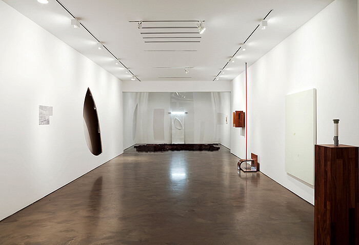
Globalization tends to be portrayed as a mode of abundance (more goods, more communications, more transit, more transactions), and yet its economic underpinnings create conditions of deprivation and want. Diango Hernández’s work navigates between poles of efficiency and scarcity, beginning with his earliest public artistic forays as a member of Ordos Amoris Cabinet, a Cuban collective featuring artists and designers who creatively repurposed everyday objects for pragmatic and ideological uses. This work and his subsequent solo endeavors inevitably return to his experience of living in Cuba, and in particular to the historical hiccup that country has endured both in terms of its own utopian aspirations and the unforgiving economic embargo that the United States and its allies imposed in turn.
As a result, Hernández’s work is riddled with thwarted messages. “If I send you this” is his fourth show at Alexander and Bonin; previous exhibitions have included silenced record players, wooden radio backs installed as a dropped ceiling, and mismatched text on louver windows. His current outing presents a long strand of analog recording tape that snakes along the floor beneath a covered skylight and single fluorescent tube. The small oil-on-paper male figure affixed nearby is trapped with these mute transmissions …
July 19, 2011 – Review
"Sculpture Now"
Aoife Rosenmeyer
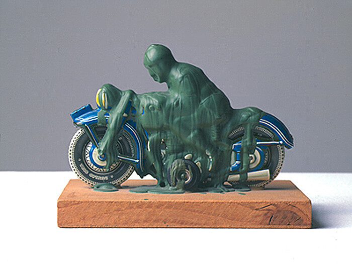
Steering clear of chest-beating monumentalism, Peter Fischli and David Weiss’s “Sculpture Now” contains an embarrassment of riches. With 35 significant works by 27 artists crowding the generous spaces of Eva Presenhuber’s gallery, it is nonetheless a self-effacing show. The works have been “arranged”—that is, Fischi and Weiss have made no claims to “curating” this consistently modest show. And while sculpture surveys are a recurring exhibition trope of late, as if the cultural temperature could be measured more accurately in three dimensions, the method is an unpredictable one, as can be seen when comparing this show to the recent “Modern British Sculpture” at the Royal Academy in London, a broader show whose emphasis ultimately fell on sober, totemic pieces. The resulting selection in Zürich, meanwhile, shrugged off solemnities to create a result that would make the sternest of critics smile.
Two smaller works, the 1969 edition Motorradfahrer from Dieter Roth, and cupped hands as a reservoir (2011) by Andrew Lord were the grace notes at the gallery entrance that signalled its opening chord, Oscar Tuazon’s arch of steel, concrete, and wood bemusedly titled Fun (2011). Despite its size and media, the structure sits lightly, and if you look back, it nearly disappears …
July 14, 2011 – Review
"The Unfinished Film"
Media Farzin
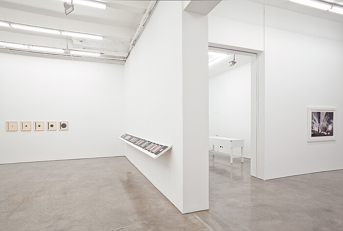
“Am I going haywire? Seriously. Am I going to finish the goddamn thing?” Hollis Frampton was frequently anxious about his monumental Magellan film project. “If you don’t finish an epic poem it is a more or less magnificent ruin,” he said. “This I probably have got to finish or I have blown the whole thing, in my own mind, since it has the problem of establishing its own context.” Frampton’s decade of work was cut short by his death in 1984, and his 36-hour-long “resynthesis of the film art” remains incomplete.
Magellan is one of the many “unfinished” film works featured in Gladstone Gallery’s current summer show, which is guest-curated by Thomas Beard, who is better known as co-director of New York’s experimental film venue Light Industry. In its own subjective way, the exhibition provides Frampton’s work with precisely the kind of context he couldn’t have dared to hope for—a selective take on film history that is both informed and open-ended. The central element of the show is the black box space, where films are projected according to a weekly schedule, starting at 3 pm daily. The rest of the gallery is host to a small group of objects related …
July 8, 2011 – Review
Vahap Avşar’s “NONEISAFE”
Merve Ünsal
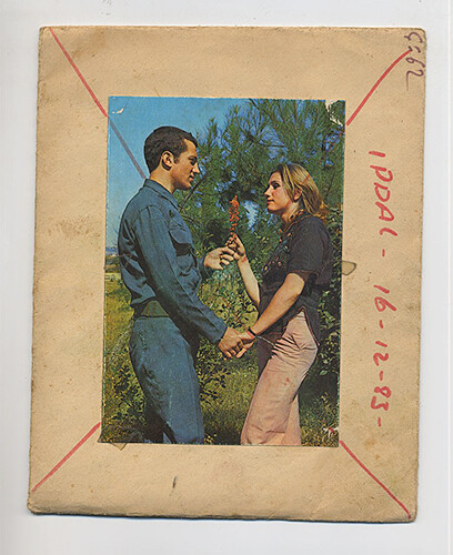
In the context of the current Turkish political climate, there is a tongue-in-cheek criticality to the work of Vahap Avşar. Just across the street from the New Museum, in the swanky Charles Bank Gallery, the multifaceted work of this Turkish artist troubles the viewer—just enough for a double take. His work is charged with politics, in particular the local politics of New York. But expression is not easy. The mixture of aesthetics—found imagery, painting, installation, and video—exposes the artist’s struggle with different media to represent Avşar’s immediate concerns ranging from the militarization of Turkey to delineations of public space.
The first striking note of the show is the abundance of red X’s crossing out seemingly innocuous images, be it censorship or the artist’s personal ire. As it turns out, Ipdal (2010) is a series in which Avşar employs these odd postcards rescued from a printer’s collection found in Istanbul. From over 20,000 postcards produced between the late 1960s and 1990s, Avşar chose to enlarge and exhibit those that were marked by the word ipdal, Turkish for “cancelled.” On his website, the artist explains that this particular form of censorship was executed by the military government in the 1980s in an effort …
June 24, 2011 – Review
Ai Weiwei
Filipa Ramos
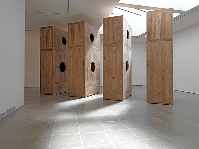
Be it tax evasion or political activism with excessive media, or the former that makes the perfect bait for the latter, it will be hard to tell. What is certain is that artist Ai Weiwei was released on bail by the Chinese police after being arrested and detained without access to his lawyer for some eighty days.
Under these circumstances, what can be said about another exhibition of Ai Weiwei that does not risk turning recent reactions to the artist’s arrest into banal manoeuvres deprived of potency to incite action? Can we ask this of ourselves without sounding cynical?
It is a delicate situation, and we are well aware that the recent exhibitions of Ai Weiwei’s work no doubt solidified his relevance as an artist; even so, a rather disenchanted perspective hovers over recent events, which could be perceived as a shadow of opportunism trailing the increase of interest in the artist.
Ai Weiwei was omnipresent during the opening of the Venice Biennial: one of the texts of its official catalogue bears the title “Where is Ai Weiwei”—a diffuse slogan which has become a mute motto to reaffirm the pressure for justice. And words were not the only weapon, as many wore a …
June 3, 2011 – Review
"Hiroshima Ground Zero"
Brian Sholis
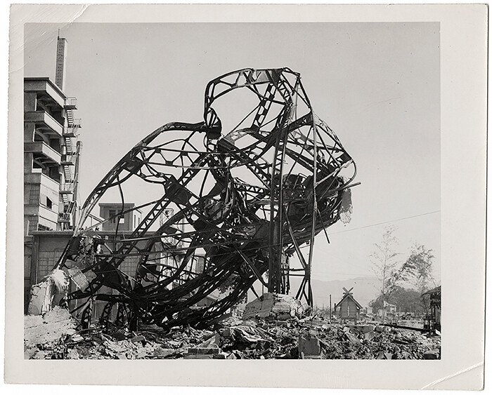
At 8:15 on the morning of August 6, 1945, the Japanese city of Hiroshima was momentarily “covered by a bluish-white glare.” (1) An atom bomb, the first to be dropped on a human population, had exploded 580 meters above the ground. A 4.4-square-mile section of the city center was more or less instantly flattened, and subsequent fires, which raged for more than eight hours, consumed much of what hadn’t been pulverized by the bomb’s concussive force. It is now estimated that nearly two-thirds of the approximately 76,000 buildings in Hiroshima were completely destroyed or burned; approximately 70,000, or more than nine out of ten, were at least “half-destroyed/half-burned/slightly damaged.” Soot from the fires, along with dirt and mud, was swept up into the air by whirlwinds and returned to earth as highly toxic, sticky “black rain.” Those who happened to be within 1.2 kilometers of the detonation point (known as “air zero”) had only a fifty percent chance of surviving; any closer and the mortality rates jumped to between eighty and one hundred percent. The city’s population that August is estimated to have been 340,000, and it is now believed that approximately 140,000 people died as a result of the …
May 28, 2011 – Review
"Vision is elastic. Thought is elastic." curated by Moyra Davey & Zoe Leonard
Antek Walczak
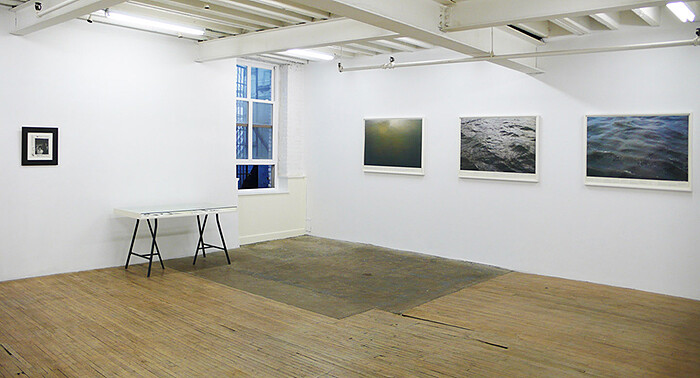
The ubiquitous pairing of writing and photography as amateur pastime and teenage site of self-? (? = production, estrangement, submission, replication?) has as much to do with the pioneering use of Livejournal (LJ) in the early 2000s by the then-emergent figure of the emo, as it does with the eventual standard issue of cameras on keyboard-equipped mobile phones and the image/text-happy society being formed by these device combinations. As Roberto Bolaño might have put it, poets belong to adolescence, and what the emo did was activate the potential poet in the white-suburban, alienated, anxious teen, while the community blog format provided a place where the tortured traces of Georg Trakl’s lines could lamely putrefy under a layer of goth face paint. At the height of zine culture in the mid-70s, a 16-year-old Mark Morrisroe also did a zine, called Dirt, a gossipy-trashy-celebrity thing that wouldn’t be far off from the kind of aggressive celebrity blogs that eclipsed the twilight of the emo’s on LJ. By displaying a few copies of this zine in their curatorial debut (or detour) at Murray Guy, Moyra Davey and Zoe Leonard touch on the antecedent of this pairing of writing with photography, but their main …
May 10, 2011 – Review
Mario Garcia Torres’s "Cover Letter" at Itinerant, 45 Orchard St, New York
Karen Archey
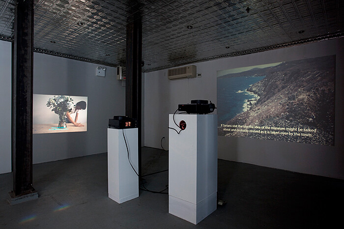
The Lower East Side is a strange place. Imagine the area a mere three years ago: as the financial crisis loomed, galleries such as Invisible-Exports, Lisa Cooley and Rachel Uffner joined or replaced the efforts of veteran spaces Orchard, CANADA, and Reena Spaulings, casting the gallery district as a more critically-minded alternative to the overtly market-driven slickness of Chelsea. Soon after, as real estate prices fell further and the traction of Orchard Street grew, near-hobbyist boutique galleries popped up and faded, transforming the area into a sort of strip mall for affordable art. One usually vacant space on Orchard Street—which used to house a gallery whose title was writ in Comic Sans and sold National Geographic-style photographs of tigers and elephants—recently contained the pop-up exhibition “Cover Letter” by conceptual artist Mario Garcia Torres. Appropriately titled “Itinerant,” the exhibition project is spearheaded by two blue-chip gallery directors, Rose Lord of Marian Goodman and Mari Spirito of 303 Gallery.
“Cover Letter” comprises two slide projections: a new work sharing the exhibition’s title and an older work, What Doesn’t Kill You Makes You Stronger, from 2007. The series of slides in Cover Letter tracks Garcia Torres assembling a bouquet while a letter of application …
April 30, 2011 – Review
Rirkrit Tiravanija’s "FEAR EATS THE SOUL"
Media Farzin
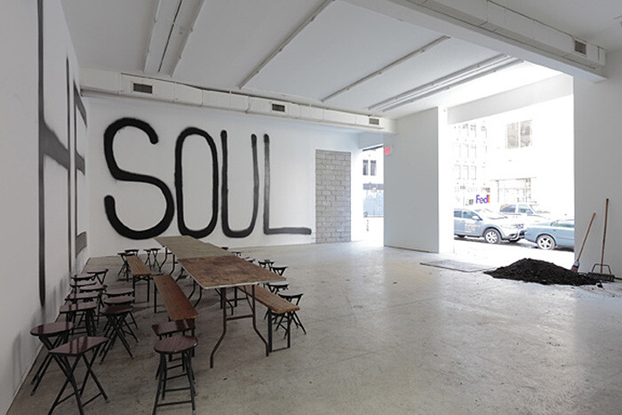
The most striking thing about Rirkrit Tiravanija’s recent New York show is also its most organic aspect: the windows and doors of the main exhibition space have been removed, exposing the interior to the street. From the outside, the space looks empty except for the soaring black letters spray-painted on the walls. Once inside, visitors can piece together the show’s bleak title from the letters: FEAR EATS THE SOUL. The exhibition is built on many references, some obvious (the 1974 Rainer Werner Fassbinder film, Andy Warhol’s Pop appropriations), others more personal and revealed only through conversation with the artist (the recent shooting in Arizona, Gordon Matta-Clark’s Window Blowout of 1976).
Activities within the space, however, are well in keeping with Tiravanija’s aesthetic of cheerful interaction, which can be as engaging as it is unremarkable. There is a plywood structure that houses a t-shirt factory/shop, where political slogans collected by the artist can be “hand-screened while you wait” by Nick Paparone, a student of Tiravanija, at $20 each (with online orders conveniently available). Interactions with visitors are genuinely warm, albeit straightforwardly commercial and slightly awkward. Compared to a “real” shop, the conversation and curiosity are somewhat more forced, since the metonymic “framing” …
April 22, 2011 – Review
David Altmejd at Andrea Rosen Gallery
Paddy Johnson
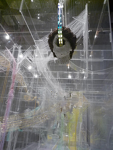
“Property itself has become a more social endeavor,” Wired Magazine co-founder Kevin Kelly wrote three years ago. The now famed blog post describes the dematerialization of raw materials and other saleable objects as a social phenomenon, citing shared music, books, and movies, as among the goods on their way out. Instead, they will all be part of “the cloud,” a vast digital network accessible via tax or subscription.
It’s hard not to think about this concept at David Altmejd’s current exhibition at Andrea Rosen—a visual interpretation of the decentralization and dematerialization we are currently witnessing. Nearly every figurative sculpture and vitrine in the show suggests dispersion, a mass of complicated networks and slow decomposition of substance. This result isn’t always particularly compelling or resolved—Altmejd too frequently fails to account for the viewer’s experience—but the show has a few highlights regardless.
Even from the gallery’s entrance we are told the show is about the freedoms afforded by re-distribution and re-constitution. A winged figurative sculpture made of plaster graces gallery’s entrance, apparently fashioned from the materials in the gallery walls. Altmejd’s transformation of materials is so complete it’s impossible to know this without reading the press release, but it’s clear the wall dirt, unencumbered …
April 7, 2011 – Review
Anna Ostoya’s "Exposures" at Bortolami Gallery, New York
Merve Ünsal
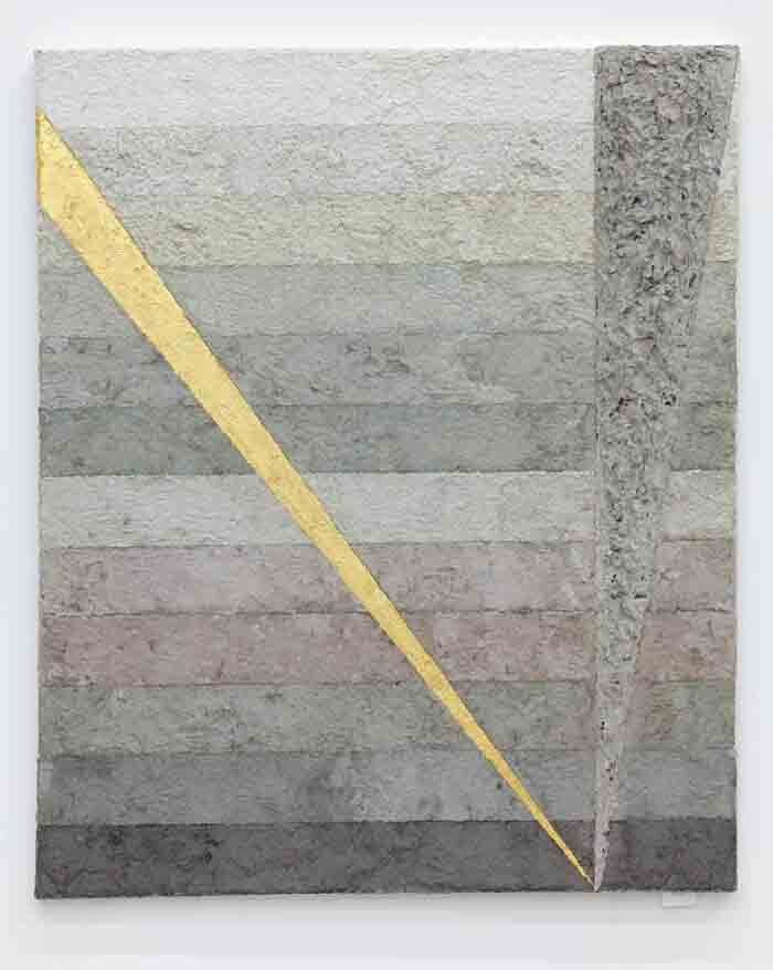
Anna Ostoya’s twenty-eight canvases in Bortolami Gallery mark the twenty-eight days of February 2011. Upon the gallery’s invitation, Ostoya set herself specific rules of production—to initiate a new piece each day for the duration of February, and to work only on 20 x 24 inch canvases with four main materials: newspaper, gold leaf, acrylic paint and papier-mâché. The resulting series of 28 works, Exposures on display are thus residues of a performative, diaristic process that the artist obscures with formal finesse.
Each canvas is remarkably different. While a black and white eye that would make Deren proud marks one canvas, another is void of any images, a bare monochromatic papier-mâché relief. In another piece, an upside-down L of images interwoven with yellow stripes, contrasts a Mondrian-like grid. While one diagonal is a dash of color, another is a collage of images of hands. The canvases are installed at equal distances apart, in a single line around the larger rectangular room of the gallery’s two spaces, triggering a staccato yet rarely surprising experience.
Ostoya’s On Kawara-esque pre-determination of the process is not a means of trammeling; on the contrary, having to use what exists in the newspapers on the day of, to trigger …
March 4, 2011 – Review
The Armory, ADAA The Art Show, and Independent
Karen Archey
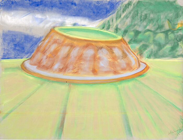
Armory Arts Week 2011 may be remembered as the year of art fairs that failed to defy our expectations. Unlike 2010, which saw the debut of Independent, or 2009, in which the glimmerings of a healthy art market emerged after the major 2008 recession, despite some shifts in gallery loyalty, the 2011 Armory Arts Week remains more or less the same. Swiping many blue-chip galleries from the Armory, the Art Dealers Association of America (ADAA), The Art Show launched on Park Avenue to reveal mostly stuffy secondary market offerings. The Armory International, though it experienced a slight slippage in taste this year, continued to dominate as the most massive and greatest accumulation of all influential galleries amidst the art fairs in New York. Independent, in its sophomore year at the “old Dia building” on 22nd street in Chelsea, continues to act as the vanguard of the fairs, attempting to re-work the art fair model physically and intellectually.
It’s the paintings of Alice Neel that greet the viewer arriving at the ADAA Art Show in David Zwirner’s booth—perhaps diminutive in size compared to those at the International. Zwirner is one of the most blue of blue-chip dissenters of the Armory, including Friedrich …
February 21, 2011 – Review
Kai Althoff’s, "Punkt, Absatz, Blümli" (period, paragraph, Blümli), at Gladstone Gallery, New York
Paddy Johnson
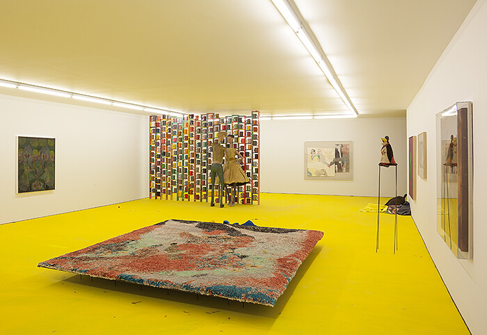
There’s something slightly strange about walking into an installation designed to look like a homemade living room in every way but the lighting. In the case of Kai Althoff at Gladstone Gallery, the cement floor painted bright yellow doesn’t exactly scream domesticity either, but the artist has integrated enough interior design elements that the florescent lights hanging from the lowered ceiling is disconcerting. Why arrange a raised nappy rug, a series of paintings in the style of Otto Dix and George Grosz, and a dividing wall of painted plaster mugs as if they were part of a household if they are to be lit like a gallery object in… a Subway sandwich store?
The answer to this question doesn’t come from the gallery’s press release, which is purely descriptive, but from the objects themselves: everything is a half-revealed mystery; a personal or private act made kind-of public. The results of such arrangements are predictably mixed. Take the references to religion scattered throughout the show: a watercolor portrait of a Jewish man hangs in the main exhibition space, and in a semi-private corner there is a pile of objects presumably used for worship. We never learn what the artist’s relationship to religion …
January 28, 2011 – Review
Edward Krasiński - Eustachy Kossakowski at BROADWAY 1602, New York
Media Farzin
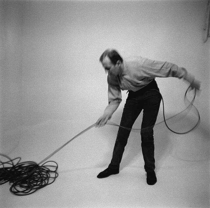
Edward Krasiński and Eustachy Kossakowski were friends, artists, and key members of the Polish neo-avant-garde of the 1960s and 70s. Their recent exhibition at BROADWAY 1602, titled “J’ai perdu la fin!!!” (I Have Lost the End), is a retrospective of their collaborative work. Nearly a hundred small, framed black-and-white photographs, often organized into series, show Krasiński staging a gesture, setting up a sculpture or performing an action for Kossakowski’s camera, in endless variations of an artist making lines out of rubber, wire, string, and, yes, his familiar tape.>
The photographs are accompanied by a few examples of Krasiński’s sculptural work: the 1969 Bobbin, for example, a blue circle being unraveled and wound into a bobbin of blue thread (or vice-versa), and the three geometric abstract reliefs titled Interventions (of 1981, 1992 and 1994) that open the rectangular frame of a painting onto space. But the Interventions, like many of Krasiński’s objects seem like mere supplements to his greater work—the famous blue line.
For better or worse, Krasiński’s career has been defined by a single concept, described in his own words as: “Plastic tape Scotch blue, width 19 mm, length unknown. I stick it horizontally on everything and everywhere, at a height of …
January 18, 2011 – Review
Seth Price’s “Non-Speech, Fire and Smoke” at Friedrich Petzel Gallery, New York
Karen Archey

Seth Price is an artist with conceptual charm: he transforms even the most unassuming materials and practices into contemplative works of art with a Duchampian flick of the wrist. For his exhibition at Friedrich Petzel, “Non-Speech, Fire and Smoke,” Price continues to re-imagine what is deemed artistic media by presenting eight music videos installed in individual user-activated cubicles. That is, the artist’s music tracks (from two soon to be released records from Dais records and Audio Visual Arts) are complemented by video footage originating from his working archive. Although most of the music videos were assembled in 2010 and uploaded on Price’s YouTube channel last fall, much of the footage consists of runoffs of the artist’s more ambitious projects, such as his video lecture Redistribution (2007-ongoing), or material the artist has yet to incorporate in his oeuvre, such as a military film reel a friend bestowed to him in 2002. The resulting exhibition speaks largely to Price’s ability to create something magical from nothing, but also to the uncharacteristic peripheral, if scattered nature of its encompassing parts.
The music videos included in “Non-Speech, Fire and Smoke” are very much the opposite of the hyperproduced Will Cotton and Katie Perry variety—and while …
January 7, 2011 – Review
Ceal Floyer at Lisson Gallery, London
JJ Charlesworth
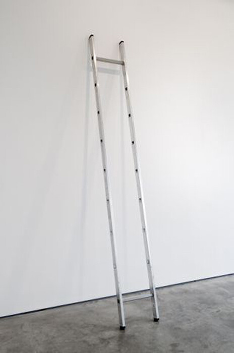
There’s a kind of neo-conceptualism that loves puns. After all, it was old-style conceptualism that first sternly denounced the usually invisible join between object, language, and concept, but that was only on the back of the dry wit of conceptualism’s own errant uncle, Marcel Duchamp, who, unlike his dour descendants, couldn’t resist the ludic anarchism of wordplay and wayward signification. In the middle of winter, you’re always forced to smile at Duchamp’s snow shovel, In Advance of the Broken Arm (1915).
Ceal Floyer is member of the school of neo-conceptualist absurdism, and part of a self-consciously self-deprecating and quotidian strand of post-90s British art that, along with contemporaries such as Martin Creed or Jonathan Monk, reworked the lessons of conceptualism, while re-grounding it in the cheerfully humdrum experiences of the everyday.
Here Floyer keeps things colorless, using the aesthetic negative of conceptualist monochrome against the often bad-pun levity of her linguistic short-circuits. So Ladder (minus 2-8) (2010) is a standard aluminium house ladder with every rung removed except its first and ninth step. It might as well be titled In Advance of the Broken Leg, but it serves as a quick-fire assertion of Floyer’s interest in how minor gestures carried out on …
November 24, 2010 – Review
Pierre Huyghe at Marian Goodman, Paris
Filipa Ramos
The Host and the Cloud, the most recent work of Pierre Huyghe, is an overwhelming mise-en-scène of the contemporary imaginary. The action (of the film) takes place in the former building of the Musée National des Arts et Traditions Populaires. Built by Jean Dubuisson—a disciple of Le Corbusier—and located in the Bois de Boulogne, it was an innovative experiment, conceived to offer a synthetic vision of the traditional French society and constituted as a museum-laboratory, in which conservators and researchers worked close together. Thus, this architectonic monument becomes the set of a vertiginous journey into the heart of pure thought and basic instincts, hosting a series of episodes that took place during three symbolic festivities: Valentine’s day, 1st of May, and Halloween.
The work’s incommunicableness is its strongest feature: it attests that thought is structured around visions and images, which crumble apart when turned into discourse because, on one hand, they do not obey any conventional logic of narrative, and, on the other, they explode simultaneously in so many levels that words automatically submit them to a spatial-temporal hierarchy that corrupts the whole ensemble. Here, the feeling of the critic is similar to that of trying to describe a dream, or …
November 23, 2010 – Review
Frederick Loomis presents Edward Mathew Taylor
Antek Walczak
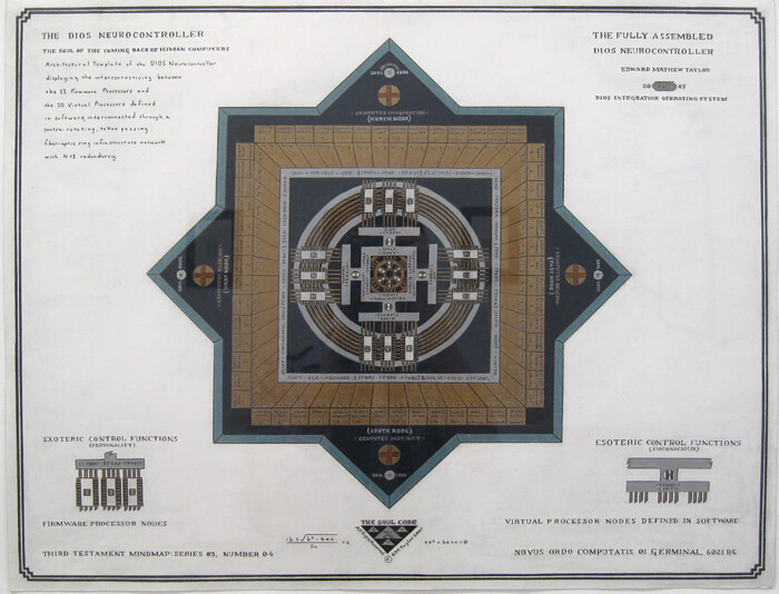
It could happen as follows. You are perhaps 25 years old, in another 25 years you will be 50, and in that future possibility you will be on a dance-floor, where you will see, dancing in the corner, Marc Jacobs. He is as taut in the face as he is tight and flexible in the limbs. He radiates cheerleader warmth and slutty positivity, while the air wafting from under his tartan skirt is fresh and packed with ozone. You shake your head and calculate his age to be nearly 120, though he moves like a minnow shot out of the egg. He’s had work done, for sure, but a limit has been surpassed. It’s no longer about cosmetic distortions that try to blur the ravages of the years. Instead it’s upgrades, updates, and new hardware so he can just keep looking better and better. And you, a becoming-cadaver, who cannot afford a visit to the hair salon, and who can barely pay the rent on your closet in the metropolis that grants you such dazzling visions: you shall whither and die, pathetically excluded from this glamorous, ex-human world.
The above is an It girl’s take on Ray Kurzweil’s coming singularity. For …
October 16, 2010 – Review
Marcel Broodthaers in New York
Media Farzin
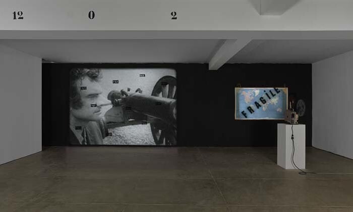
There is an ambiguous theatricality to the recent Marcel Broodthaers exhibition at Marian Goodman. The gallery has reconstructed the 1972 Section Cinéma in its entirety (three carefully installed rooms of films and objects), alongside the work’s precursor, the 1970 Cinéma Modèle. The theatrical effect is a combination of intention and history: the everydayness of objects, the deliberate archaic quality of the technology, their inevitable ageing, and the artifice of new additions like the freestanding entrance “door.” Given that the work attempts theater, cinema, museum, and gallery in one gesture, the ambiguity is surely a sign that it has aged well.
Section Cinéma is an institutional fiction for Broodthaers’s film work. Opposite the entrance, two director’s chairs survey the scene. One projector shows Broodthaers’s Musée Museum against an altered world map (Carte du monde poétique, 1972), the second projector faces a screen stenciled with numbers—”Fig. 1,” “Fig. 2,” and so on—where Broodthaers’s own films are interspersed with newsreels, Chaplin films, and documentaries, in succession and in no clear order. Yet there is a manic pedagogy at work—the film screen, the ceiling beam, the walls, and objects are all are marked as “figures” and turned into illustrations for an invisible commentary.
Three decades from …
October 9, 2010 – Review
George Maciunas in New York
Colby Chamberlain
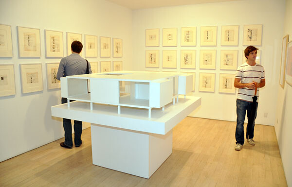
The birth of the curator has led to the death of the artist. Or, at least, that’s the impression one gets from a gloss of the current literature on exhibition practices. Concerns percolate that the expanded portfolio of the curator now encroaches on the artist’s autonomy. Yet it’s important to survey the situation from the opposite direction as well: changes in curatorial practice have long been preceded by those in artistic practice. Since at least the early 1960s, the very category of artist has come under considerable pressure. The famous texts on authorship by Barthes and Foucault were only the theorization of a multi-pronged attack well underway. One such campaign was mounted by George Maciunas, the focal point of two exhibitions in New York this autumn: “Mr. Fluxus” at the Stendhal Gallery and “Out of the Box” at the Emily Harvey Foundation. Maciunas’s example is especially relevant, since he devoted himself so extensively to collective organization, production management, and bureaucratic wrangling—that is, the very spheres of activity where today the agency of artist and curator grow indistinct.
As Julia Robinson has observed, Maciunas is routinely characterized as the impresario of Fluxus, which is more of a dodge than an accurate description. …
September 27, 2010 – Review
Rob Pruitt’s "Pattern and Degradation," at Gavin Brown’s enterprise and Maccarone, New York
Paddy Johnson
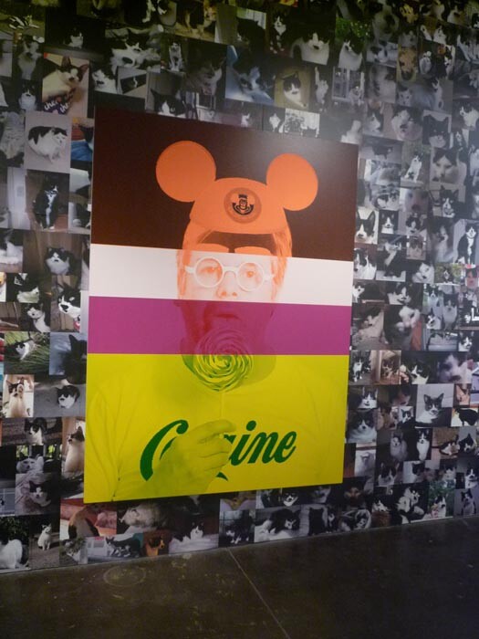
Rob Pruitt’s joint exhibition at Gavin Brown’s enterprise and Maccarone, “Pattern and Degradation,” presses a few of my buttons. Even before stepping into the gallery I had some concerns—the notion of filling over 8,200 square feet with two years of new work without compromising quality seems a stretch, so naturally the show’s theme is about excess. According to the press release, the work is informed by the Amish tradition of Rumspringa, a two year rite of passage in which Amish teenagers are allowed to indulge in all the excesses of modern life before returning to a more modest existence. Pruitt’s exhibition posits a world in which he lives in a “Permanent Rumspringa,” a concept that sounds suspiciously like a marketing ploy to explain over-production.
Seeing as how only two rooms of eight directly deal with Amish culture, there’s not much reason to think otherwise even if indulging in contemporary excess is likely to occasionally exclude a lot of the religion. At the far end of Gavin Brown, rows of both modernist and traditional Amish chairs coated in silver weakly gesture to the religion, as do a number of large patterned paintings referencing traditional Amish quilting. The basic gist of these pieces …
September 17, 2010 – Review
Charlotte Posenenske at Artists Space, New York
Adam Kleinman
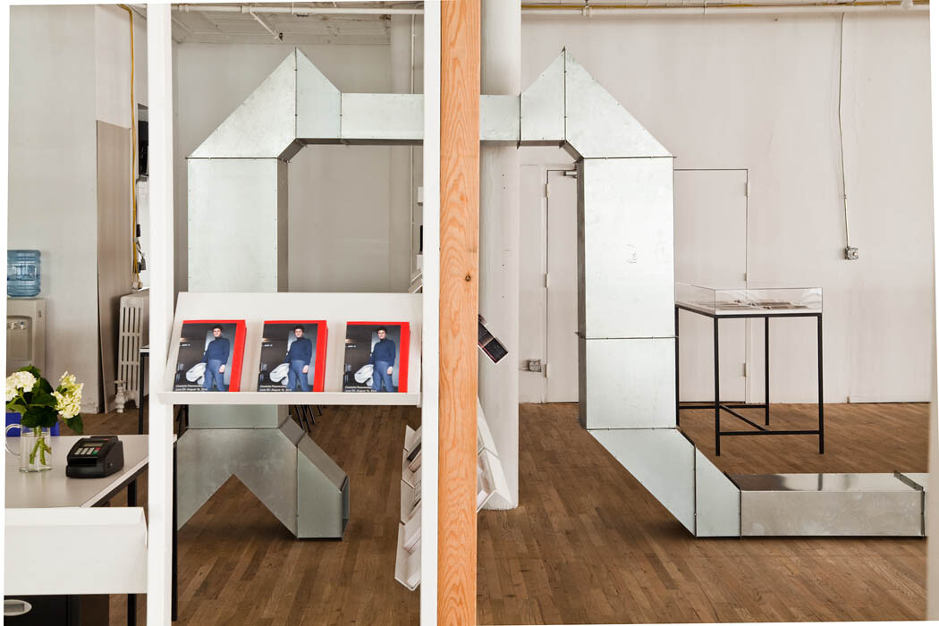
Everywhere you look these days there seems to be some exhibition, text, or reference to the work of German artist Charlotte Posenenske (1930-1985). And often enough, these presentations focus on a central paradox; that the artist decidedly ended her career circa 1968-9—by ceasing to make new work, while also preventing the extant work to circulate—and started a career in sociology thereafter. Adding fuel to the fire of this apparent “disavowal” of her artistic practice, Posenenske’s work seems to prefigure many current debates around art’s social relevance. In particular, the late “ducts” or “tube” series—comprised of modular and variable ventilation-like parts meant to be reconfigured through the decisions of others—are not dissimilar to the “relational turn” toward volition and open-endedness as a means to foster new forms of sociability. Complicating matters, Posenenske’s self-exile was coupled by her written condemnation of the instrumental use of public art and its worth in her reasons for turning down a commission in a new housing development—curious as Posenenske herself placed artworks outside to promote incidental encounters. Here, a second mirror, one reflecting the arguments of many relational art detractors, i.e., that artworks create simulations of social exchange and are allegorical at best, seems to be …
August 11, 2010 – Review
"Lush Life: An Exhibition in Nine Chapters," New York
Media Farzin
The premise is a nine-part exhibition inspired by an edgy crime thriller, promising equal parts complexity and intertextuality. The results, however, aren’t quite as involved. “Lush Life: An Exhibition in Nine Chapters” is grouping of a nine loosely-themed summer shows scattered throughout New York’s Lower East Side. The exhibition takes its cues from Richard Price’s 2008 novel, Lush Life, a murder mystery that unfolds around old and new ghosts of the neighborhood. But the connection stops at the level of inspiration. Not that the show is lacking in structure: the collaborative venture by painter Franklin Evans and independent curator Omar Lopez-Chahoud involved soliciting artists from each gallery, assigning a chapter title as theme to each venue, commissioning works specifically for the show, and even a website complete with a picturesque map and video tour by Price himself.
Walking through the galleries, however, the elaborate armature fades away. This may be to the show’s benefit, saving the work from becoming illustrations of the novel. Price’s Lush Life is mired in urban grit, with brisk dialogue and deft character studies that capture the desperation present in the neighborhood’s upscale bars no less than its outlying housing projects. But the grit of the “Lush …
August 4, 2010 – Review
"Jill Magid: A Reasonable Man in a Box," the Whitney Museum, New York
Paddy Johnson
When Jill Magid wrote “What is a reasonable man in a box?” on the Whitney’s wall I suspect she already knew the answer. The text references the a leaked 2004 memorandum from the US Justice Department prescribing legal means for the CIA to employ illegal torture techniques such as confinement with insects. Slightly more complex than typically seen on an episode of Law and Order, the government’s jargon reduces “legal” torture to: “remove the possibility of permanent physical harm and you can do what you want”, the core of which Magid questions. After all, if you’re imprisoned in a box, how could anyone assume that it would not damage your physical and mental health?
Departing from her usual performative based works, Magid re-imagines the first floor gallery as a dark confinement box and projects a sentimental sepia-toned video of a scorpion’s shadow on the back wall. Every once and a while a pair of long tweezers descend to toy with the bug, catching and releasing it repeatedly. This is its own torturous game, and the shadow suggests only an imagined presence. At the opposite end of the gallery a vinyl-type reproduction of the memo—albeit marred by redaction—is affixed to the wall.
Magid …
August 2, 2010 – Review
Nashashibi/Skaer at Murray Guy, New York
Tyler Coburn
Respected artists in their own right, Rosalind Nashashibi and Lucy Skaer have also led a fruitful collaboration since 2005, pairing their unique temperaments in taut, reflexive films and installations. Theirs is a method that emphasizes the transformations, shifts, and slippages that images and ideas can undergo: through the entropic sedimentation of time, for example, or an act of misrecognition (willed or otherwise) with which an artist can build a new language from extant matter.
For their first collaborative solo exhibition in the US, the British duo tell two mythic stories with both structuralist and iconographic syntaxes. The single-channel film Our Magnolia (2009) expands outwards, in portentous swoops, from British painter Paul Nash’s Flight of the Magnolia (1944). An official artist for both World Wars, Nash ended his career with an essay and series of paintings, entitled “Aerial Flowers,” that channel wartime paranoia into depictions of flowers hovering like enemy parachutes across the English sky. Nashashibi and Skaer’s associative montage shakily traces a path through figures of mortality and militarism into the neoconservatist age, moving from alternating close-ups of the painting and aristocratic flowers to sequential reframings of the hollowed eye socket of a decomposing whale carcass; two photographs of Margaret Thatcher, …
July 12, 2010 – Review
Rodney Graham’s "Painter, Poet, Lighthouse Keeper" at Lisson Gallery, London
Tyler Coburn
Since first stepping onto the other side of the lens in the mid-90s, Rodney Graham has fashioned himself as all color of amateur and outlaw in a wry game of wish fulfillment for an artist of inescapable renown. Cowboys, pirates, saloon men, and Sunday painters, these pseudo-egos follow the performative loops of their respective genres in films and lightboxes that Graham—the consummate citationist—appends with still other pop-cultural and esoteric references. Such densely layered work can make for stimulating (if maddening) viewing, much as Graham’s repeat billing can tilt from artistic reflexivity to self-infatuation. But if the trickster artist’s practice explores the innumerable ways that cultural history can be reframed, then any complaints about his ubiquity falter at the possibility that, like the mise-en-abîme of a wanted poster in Paradoxical Western Scene (2006), one frame merely invites another.
“Painter, Poet, Lighthouse Keeper,” the title of Graham’s current exhibition at Lisson Gallery, introduces several new characters whose creative lives are deeply marked by history. The lightbox Lighthouse Keeper with Lighthouse Model, 1955 (2010) depicts the lighthouse keeper in his maritime kitchen, at a time when automation was rendering his job redundant. Graham’s protagonist instead continues his work on a miniature-scale: a model of …
July 9, 2010 – Review
Michel Auder’s "Keeping Busy: An Inaccurate Survey"
Media Farzin
Michel Auder’s current New York exhibition could be called “epic,” if his approach weren’t so far removed from any claims to grandeur. There are samplings from four decades of film and video, shown as single- and multi-screen installations, accompanied by film stills, polaroids, postcards, and the occasional rooster lamp. The show is divided among Chelsea galleries Zach Feuer and Newman Popiashvili, and Lower East Side non-profit Participant Inc., with a supplemental screening at Anthology Film Archives (and even a Los Angeles outpost at Volume2). There, is quite simply, too much to take in, unless you’re willing to slow down to the leisurely, attentive-yet-scattershot pace of Auder’s camera.
Since the late 60s, Auder’s medium has been video. His tapes are documents of a life obsessively viewed through the camera lens, making him a pioneer in an art form that wouldn’t be regularly exhibited in galleries until two decades later. He works in the tradition of cinema vérité, but his form is never merely diaristic. The art lies in the light touch of his editing, which extracts immediacy, absurdity or accidental drama from his daily encounters. Every representation of reality, Auder knows well, is in some sense a fiction—just as any survey of …
June 12, 2010 – Review
"A Vernacular of Violence" at Invisible-Exports, New York
Tyler Coburn
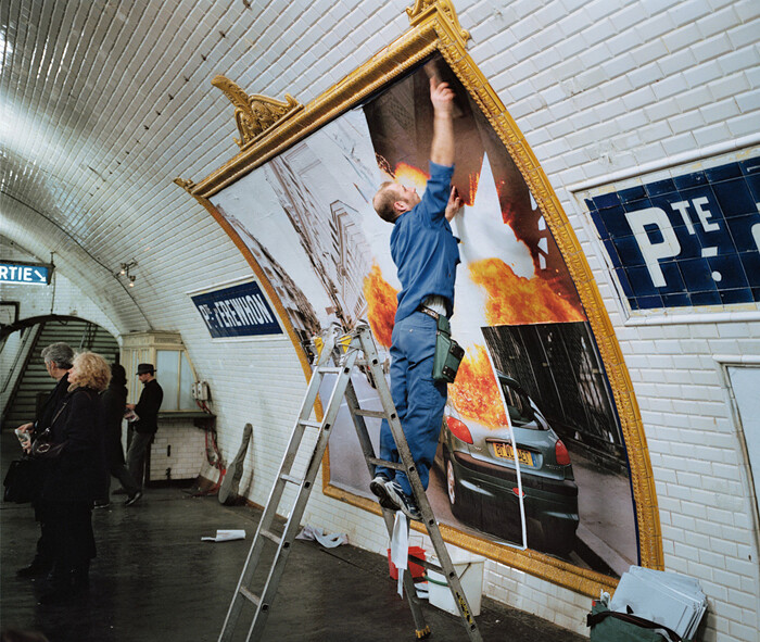
In an untitled text from 2005, the artist collective Claire Fontaine drew a distinction from the shopworn idea of distributed, democratic power, claiming, “Now power explicitly exhibits all the violence it needs to conserve itself” and, thus, implicitly excluding the participation of society’s many constituents. Left to suffer a slow digestion in “the stomach of Capital,” such subjects habituate a type of political impotence that Fontaine, as a readymade artist, critically chooses “as both the means and subject of her work.” This impotence “is neither a disease to be eradicated nor a state of things that disqualifies us ethically,” the collective writes, leaving open to question the shape such ethics could take, and of the contribution of art to this field of activity.
The five other artists participating in “A Vernacular of Violence,” the ambitious group exhibition currently on view at New York’s Invisible-Exports, could be seen to share the collective’s supposition that violence — as empirical event and potential valence — has all but saturated contemporary parlance. Eric Baudelaire’s video Sugar Water (2006), for example, combines the aesthetics of urban terrorism and commercial advertising in delineating the contours of the post-9/11 era. Over the course of a single, seventy-two minute …
June 10, 2010 – Review
"Greater New York 2010"
Colby Chamberlain
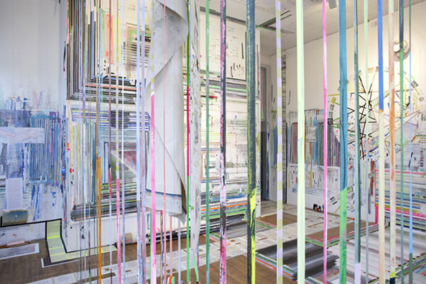
Several installations from P.S.1’s inaugural exhibition “Rooms” (1976) have left a lasting mark on the institution—literally so, as they’re embedded into the building. In the attic, Richard Serra’s steel-beam Untitled is sunk into the concrete; Alan Saret’s The Hole at P.S.1, Fifth Solar Chthonic Wall Temple pierces through a wall. These enduring physical remainders make the history of P.S.1 inseparable from that of site-specificity. Through considerable renovation, the building has retained the character of its Romanesque Revival architecture and traces of its original use as a school. Its spaces are so emphatically idiosyncratic that, even in the case of artworks long absent, it’s difficult to view a new installation without also perceiving the after-image of what stood there previously.* Though it’s been covered over for years, you can still see the cut marks from Gordon Matta-Clark’s Doors, Floors, Doors in the floorboards.
At “Greater New York 2010,” the museum’s first major exhibition since the departure of its founding director Alanna Heiss and its re-christening as MoMA P.S.1, the emblematic piece might be Franklin Evans’s timecompressionmachine, (2010) which occupies the same first-floor corner gallery where Matta-Clark once sawed through the ceiling and floorboards. Evans has smothered the space with colored tape, mylar, …
June 10, 2010 – Review
Trisha Donnelly at Casey Kaplan, New York
Paddy Johnson
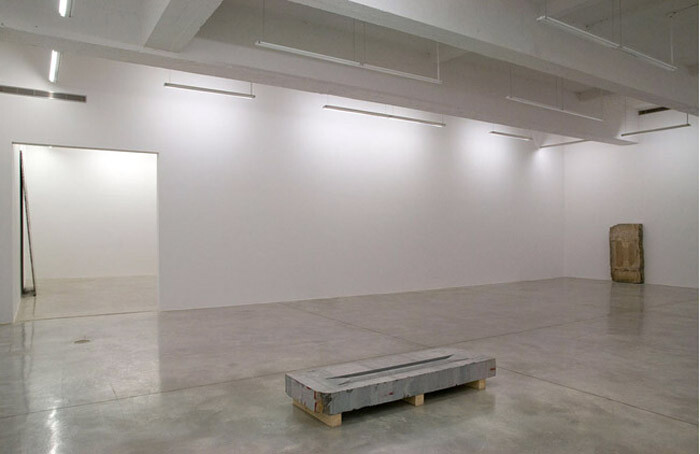
Is a lot of empty space and a couple of big slabs of marble enough to unify an exhibition? Almost certainly yes, which is also the problem: it’s too easy to make a show look cohesive when there’s not much in it. For her fourth solo show at Casey Kaplan, Trisha Donnelly sparsely arranged a few stone sculptures—relics from the fourth (and relatively empty) dimension.
In the first gallery, front and center, there’s an angular pink stone with two ridged scooped out areas on either side. Mounted on two 2x4s, it resembled a seashell, temporarily beached here. In the following room is what looks like a fossil or victim of some mechanical penetration, the scars of the brutal equipment meant to harvest unnamed riches laid bare. When the show was first installed, a small amount of water left from the wetted blades used to cut the stone lay suggestively in the stone’s cracks. (I was disappointed when the gallery director Loring Randolph told me there was no intended meaning behind this; the water was gone when I returned.)
One of many possible Rosetta Stones to the show, a yellowish slab of marble leaning against the far wall with two loud speaker-esque slits …
Load more