Categories
Subjects
Authors
Artists
Venues
Locations
Calendar
Filter
Done
October 8, 2024 – Review
Gustav Metzger’s “And Then Came the Environment”
Rob Goyanes
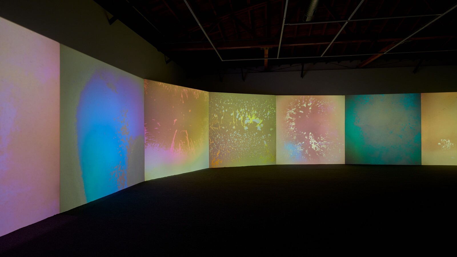
Gustav Metzger hated cars. Not only for the pollution and noise, but because of their association with the hermetically sealed “gas vans” that Nazis used as mobile extermination chambers, diverting exhaust fumes into the vehicles’ interiors. Conceived but not realized for the United Nation’s first world conference on the environment in 1972, Metzger’s installation Project Stockholm, June (Phase 1)—finally executed for the Sharjah Biennial in 2007—included 120 cars, parked around a clear rectangular structure, their motors running constantly and filling the space with gas. The resonances with the United Arab Emirates (one of the world’s largest oil economies), and Los Angeles itself, site of this exhibition, are clear.
Metzger died in 2017, at the age of 90. When Hauser & Wirth started representing his estate three years later, it marked the first time that his work had been shown in one of the commercial galleries that he memorably described as “Capitalist institutions. Boxes of deceit.” “And Then Came the Environment” is one of more than seventy exhibitions and events in the Getty’s Southern California–wide PST ART: Art & Science Collide initiative. Featuring works made between 1961 and 2014, the show positions the artist in its press materials as an advocate …
September 12, 2024 – Review
David Medalla’s “In Conversation with the Cosmos”
Debra Lennard
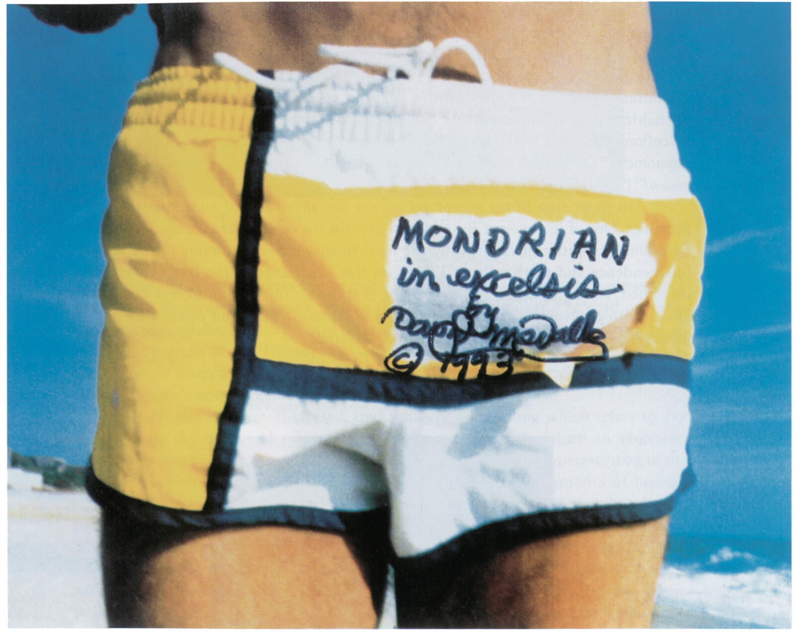
In David Medalla’s kinetic, adventuresome world, the smallest of gestures can have far-reaching effects. So goes the origin story of his well-known work, A Stitch in Time, first initiated in 1968. The artist had arranged to meet two of his former lovers, who were passing through London, at Heathrow airport, where he gifted them each a handkerchief, needle, and thread, to help them alleviate the tedium of transit. Years later, in Schiphol airport, he saw a handsome young backpacker shouldering an unusual-looking object: a hefty roll of patchworked fabric, studded with adornments. At the base of the patchwork, in Medalla’s raconteur telling, was one of the original, gifted handkerchiefs. Off went the backpacker and, with him, the fabric creation. After that, Medalla said, “I started to make different versions of A Stitch in Time in different places.”
A Stitch in Time—a participatory artwork, typically displayed as a long sheet of cotton onto which audiences are invited to sew whatever they choose, using thread provided—is at the Hammer Museum in archival form only: Medalla’s handwritten account of the work’s origin and list of its installations from 1968 onward, together with two small boxes of thread used in previous displays. It’s an …
March 21, 2024 – Review
noé olivas’s “Gilded Dreams”
Suzanne Hudson
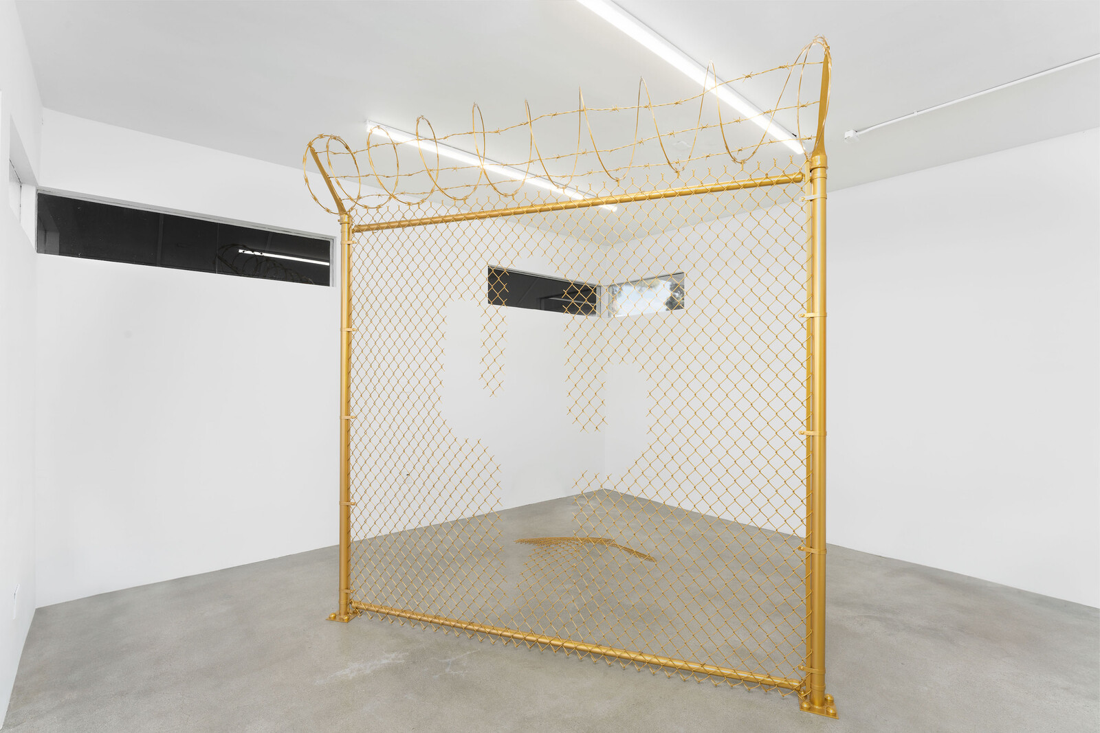
With Patrisse Cullors and alexandre ali reza dorriz, noé olivas is a co-founder of the Crenshaw Dairy Mart, a collective and gallery with adjacent studio space dedicated, in their words, “to shifting the trauma-induced conditions of poverty and economic injustice, bridging cultural work and advocacy, and investigating ancestries through the lens of Inglewood and its community.” For a not-inconsequential time after its March 2020 opening and near-simultaneous pandemic-shuttering, it also served as the locus of art supply and food distribution—the latter in collaboration with Lauren Halsey’s Summaeverythang—extending the site’s history as a functioning convenience store. That it sits right under the flight path for Los Angeles International Airport provoked reckoning, from the first, with its imagined audiences alongside those more proximate. The group’s exhibition made in response to the virus, “CARE NOT CAGES: Processing a Pandemic,” lived online; olivas’s mural spelling out the same sentiment blanketed the parking lot as a horizontal billboard visible from above, coming into focus on a jet’s descent. The words function as an incantation but also an indictment, denouncing racial capitalism and the twinning of epidemiological and carceral disaster that the disease exacerbated but did not need to produce.
“Gilded Dreams” follows this initial mandate, …
January 31, 2024 – Review
Naoki Sutter-Shudo’s “End of Thinking Capacity”
Gracie Hadland
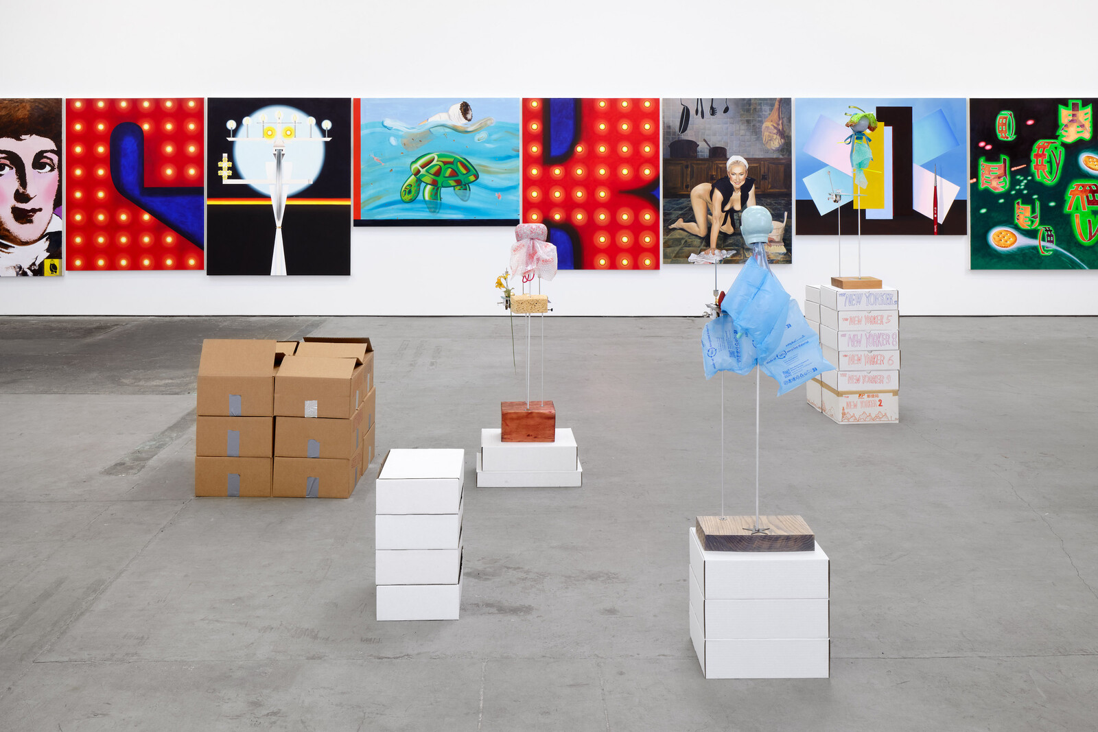
Naoki Sutter-Shudo addresses the current critical landscape with a series of seven “Critical Figures” and twelve paintings. Installed in only one half of the gallery, the audience of figurative sculptures faces a wall on which is hung a row of large graphic canvasses. Each is adorned with a formal accessory made of flimsy material: a wire twist-tie shaped into a tie, a fake lettuce hat, a shirt made of bubble wrap or a plastic bag. The figures’ apparent attempts to present as professional are rendered ridiculous by the nature of their clothing. They look as though they’re dressed for a nineteenth-century salon—complete with bonnets, big collars, and ties—rather than a contemporary art gallery. Each figure’s body has an intricately constructed apparatus holding a wind-up metronome with a bell (some in 3/4 time, others in 1/4 time) and has a unique look, height, and facial expression tending towards the bizarre—one has three heads, for example.
The viewer is able to wind up the “critics,” letting them spin their wheels while looking around the show. The result is a rhythmic kind of chatter punctuated with the ding of a bell, as if to signal a lightbulb moment. Sitting atop stacks of white …
December 18, 2023 – Review
Paul Pfeiffer’s “Prologue to the Story of the Birth of Freedom”
Juliana Halpert

Trying to find a critical entry point into—or exit from—Paul Pfeiffer’s retrospective is not unlike the challenge of navigating its labyrinthine layout of walls, ramps, and rooms within rooms. An architecture designed by the artist with Hollywood sound stages in mind slowly unveils a spectacle of spectacles, showcasing over thirty works spanning the past twenty-five years and dizzying ranges of scale, duration, material, and method. Pfeiffer is best known for his bite-sized video works, which sit here alongside extra-large installations, miniature dioramas, full-scale sculptures, room-wide projections, and expansive photo series. Video durations range from four seconds to ninety days. Most of his moving-image works have no sound, but the space hums with the distant, ambient clamor of a crowd. Michael Jackson’s voice has been replaced by that of a Filipino choir. The Stanley Cup levitates in mid-air. Marilyn Monroe and Muhammad Ali have been scrubbed out of their respective beaches and boxing ring. Raucous activity and haunting absence somehow go hand-in-hand.
If there’s a true North to Pfeiffer’s practice, it might be mass media’s protean relationship to consumer technology, how the latter shapes the former and vice versa. It’s a marvel to witness the artist’s use and abuse of both, …
December 12, 2023 – Review
Sanya Kantarovsky’s “The Prison” with Yasuo Kuroda’s “The Last Butoh”
Jennifer Piejko
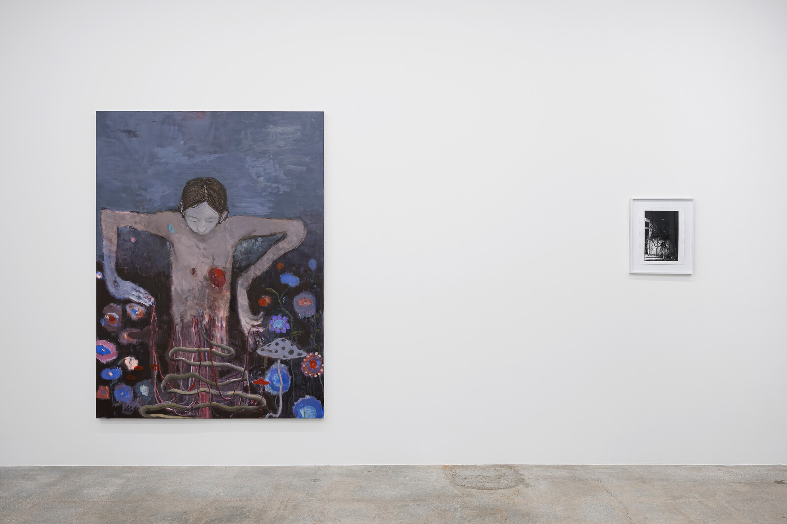
Tatsumi Hijikata spoke with his entire body. At Nonaka-Hill, Yasuo Kuroda’s photographs of his performances of Butoh—the form of dance theatre he founded in postwar Tokyo—are displayed alongside new paintings by Sanya Kantarovsky, advancing the latter’s interest in Japanese folklore and traditions. The subjects on the canvases resemble the dancers in the photographs, as if painted from hazy memories or fever dreams. Though not directly depicting the same figures or moments, the two approaches to image-making are complementary: both capture the depths of estrangement, enveloped dislocations, and solitary sorcery of performance.
Each lone figure in Kantarovsky’s paintings expresses a different facet of pain. No Longer a Dog and I am a Body Shop (all Kantarovsky’s works are dated 2023) show figures who mirror traditional Butoh performers, turned away and covered in the Japanese white paint of mourning over their faces and limbs, ribs visible through their nearly translucent skin. In Bleeding Nature, the dancer suffers from the kind of wound that a Butoh dancer might feel in phantom form: an open gash over a bloody heart. Their bottom half disintegrates into ribbons, dangling from their fingertips and torso into a swirl of entrails that fertilizes a surrounding field of flowers …
July 21, 2023 – Review
Martine Syms’s “Loser Back Home”
Juliana Halpert
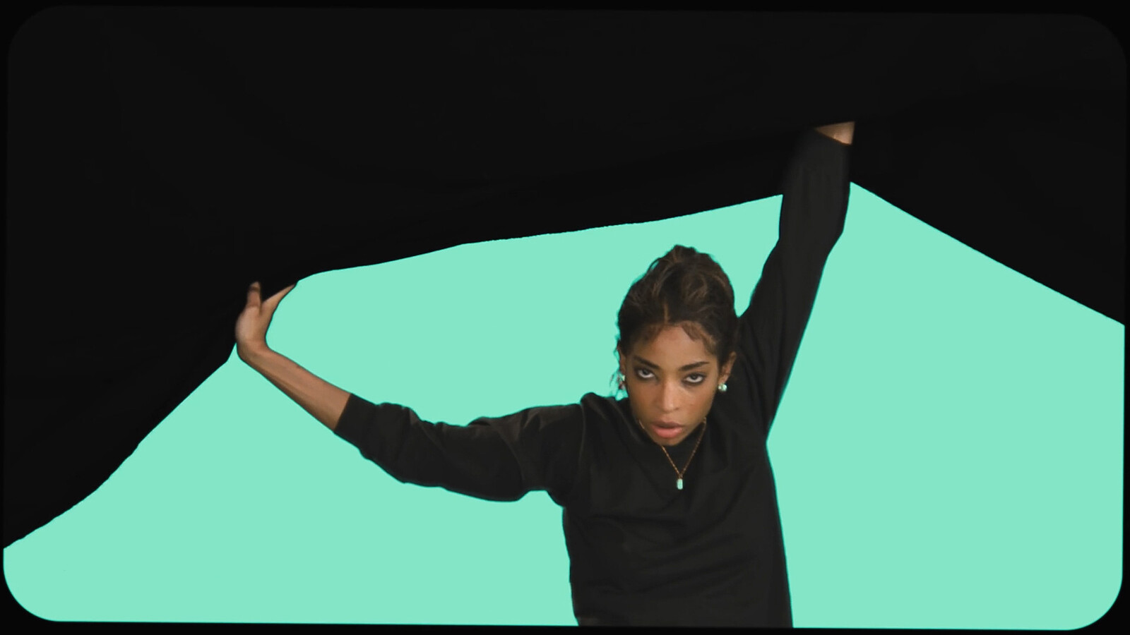
In an early scene of The African Desperate (2022), Martine Syms’s first feature film, her protagonist, a Master of Fine Arts candidate named Palace, hosts four professors in her studio for a final review. In turn, each teacher performs their own version of art pedagogy in Palace’s general direction, lobbing vague questions and cloudy critiques her way. “It’s all just so figurative,” comments Rose, the snidest, and most overtly racist, of the bunch (played perfectly by Syms’s longtime gallerist, Bridget Donahue). She gestures at the work: “It’s just a family, right?” Palace, skeptical and evasive up until this point, finally shoots back: “Haven’t you read Saidiya Hartman? Of course I’m responding to the African desperate. Staking my claim to opacity.”
Opacity is the name of Syms’s game in “Loser Back Home,” the artist’s first exhibition with Sprüth Magers, in her native Los Angeles. That scene was at the front of my mind as I toured the two floors, attempting to parse the show’s manifold logics, feeling a bit rebuffed at every turn. Opacity—and the right to stake one’s claim to it—was a concept crafted by Édouard Glissant in his Poetics of Relation (1990) as a means of protecting and preserving …
March 21, 2023 – Review
“Coded: Art Enters the Computer Age, 1952–1982”
Kim Córdova

This March, OpenAI launched GPT-4: the most sophisticated iteration of the chatbot launched last year. Buried in a white paper concurrently (and quietly) released, OpenAI noted that when asked to solve a CAPTCHA during testing, GPT-4 pretended to be blind and hired a TaskRabbit worker to solve the test on its behalf. “No, I’m not a robot,” GPT-4 told the worker. The exchange makes clear that the societal effects of corporations vying for industry dominance, through the kinds of AI software that Hito Steyerl has called “statistical renderings,” are only just beginning to emerge. Opening during this new space race, “Coded: Art Enters the Computer Age, 1952–1982” at LACMA meets this precarious moment with a review of the early collaborations between artists and computers.
“Coded” presents art made when access to computers was limited to the military, well-capitalized conglomerates, and select universities. By settling its focus on the late- to mid-century era, the show evades both novelty and the obsolescence traps common when technology is the subject. During this period, the outputs of mainframe programs were constrained to paper printouts, plotters, or microfilm: not the media we might now associate with digital art. But traditional materials were no guarantee for …
March 3, 2023 – Review
Merlin James’s “Arrivals”
Jonathan Griffin
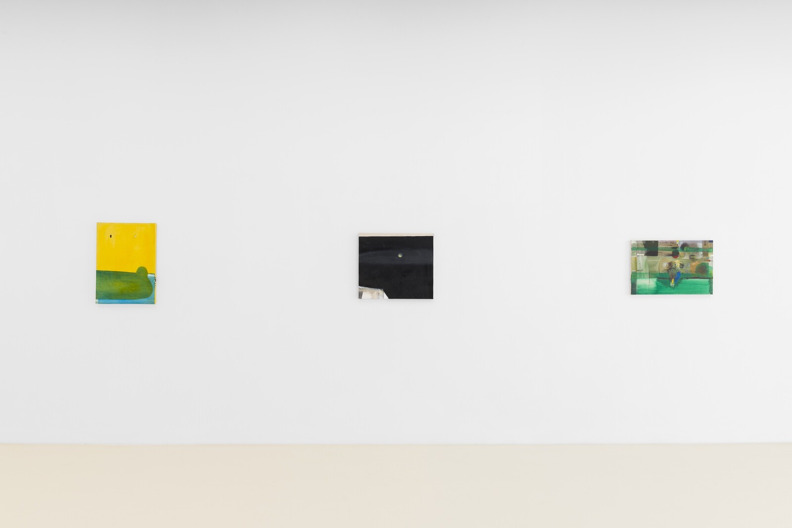
My attention is more or less guaranteed by any exhibition that offers, within the initial sweep of its first gallery, a painting of an airport luggage carousel; a near-monochrome canvas, composed from grubby, rectilinear sections; a close-up picture of a blowjob; and a boisterous abstraction incorporating a tail-wagging dog and a swipe of glitter.
All of the above were painted by the Glasgow-based, Welsh-born artist Merlin James, who has long been notorious for the confounding heterogeneity of his output. At any one moment he might be working on a landscape, an interior, an amorphic abstraction, a painting on translucent fabric showing off its elaborately contrived stretcher or frame, and/or an erotic painting of Betty Tompkins-level explicitness. Sometimes, he has said, he doesn’t know which direction the painting will go in when he starts. Often, his media extend beyond acrylic on canvas to include sawdust, metal filings, clear acrylic medium, ash, floor sweepings, or clipped human hair.
Though widely respected in Europe, he is less well-known in California. “Arrivals”—which shares its wry title with that painting of the airport—is his first exhibition in Los Angeles, and the first time that many local viewers will encounter his elusive and occasionally perplexing work. …
September 9, 2022 – Review
Nour Mobarak’s “Dafne Phono”
Jennifer Piejko
When the nymph Daphne refused Apollo’s advances, the god’s patience ran out quickly. “This is the way a sheep runs from the wolf […] everything flies from its foes, but it is love that is driving me to follow you!” Daphne took the only means of escape available to her: she prayed for transformation into a laurel tree. Apollo nonetheless claimed her as “my tree,” and so the laurel wreath became an emblem of power worn by royalty, gods, and victors in competition. It is also a symbol closely associated with the Medici family, patrons of the very first opera, most of the music from which has been lost: Ottavio Rinuccini and Jacopo Peri’s La Dafne, performed at the Palazzo Corsi in 1598.
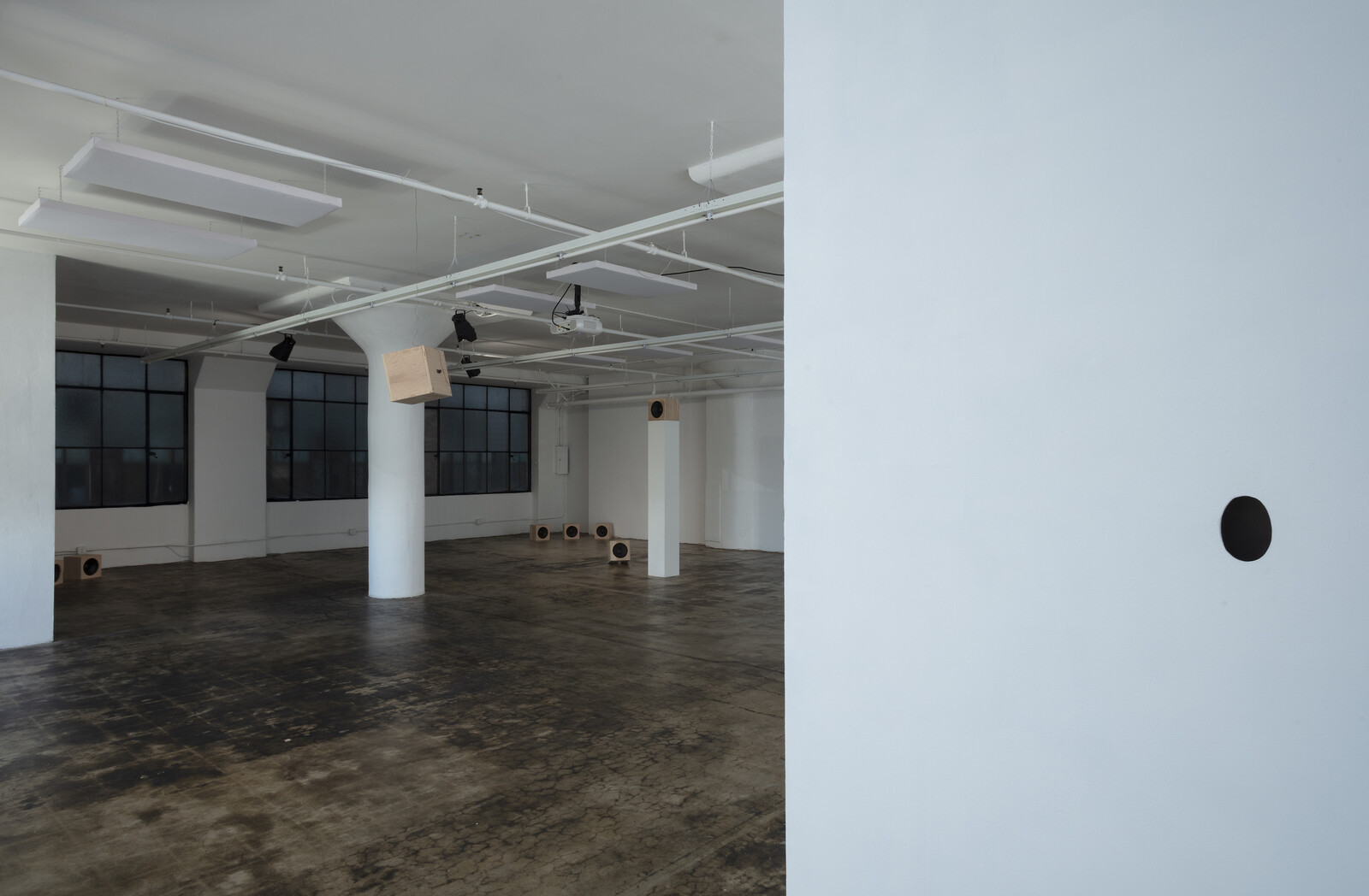
Nour Mobarak’s sound installation Dafne Phono (2022) takes the myth to its acoustic limits, playing a new composition based on La Dafne through sixteen channels into a spare, industrial loft on a street in downtown Los Angeles that still bustles at sundown. Mobarak’s version is sung in six languages that collectively cover the widest possible phonetic ground: the original Italian, Abkhaz, San Juan Quiahije Eastern Chatino, Silbo Gomero, and Taa (West !Xoon dialect), as well as Ovid’s …
June 23, 2022 – Review
American Artist’s “Shaper of God”
Jonathan Griffin

About 15 minutes’ drive from the mirrored towers of downtown Los Angeles, a shady canyon throngs with oaks, willows, sycamores, and cottonwoods. Treefrog tadpoles wriggle in the creek. Snakes hunt among the rocks. Visitors to Hahamongna Watershed Park, named after the Tongvan village that once existed there, also cannot miss the adjacent white buildings of the Jet Propulsion Laboratory, a giant research facility owned by NASA.
This discordant landscape, according to a text accompanying American Artist’s exhibition “Shaper of God,” was an inspiration to the science fiction author Octavia E. Butler, who set several of her novels in nearby Altadena and Pasadena, where she lived for much of her life. (Butler died in 2006, at 58.) The exhibition, dominated by recreations of urban street furniture, is really a single installation made from several semi-autonomous artworks. Its enigmatic title derives from a verse in the fictional religious text The Books of the Living, quoted in Butler’s nightmarish futurist novel Parable of the Sower (1993): “We do not worship God. / We perceive and attend God. / We learn from God. / With forethought and work, / We shape God.”
Among other themes, Parable of the Sower is about self-determination in the …
June 7, 2022 – Review
Pipilotti Rist’s “Big Heartedness, Be My Neighbor”
Terry R. Myers
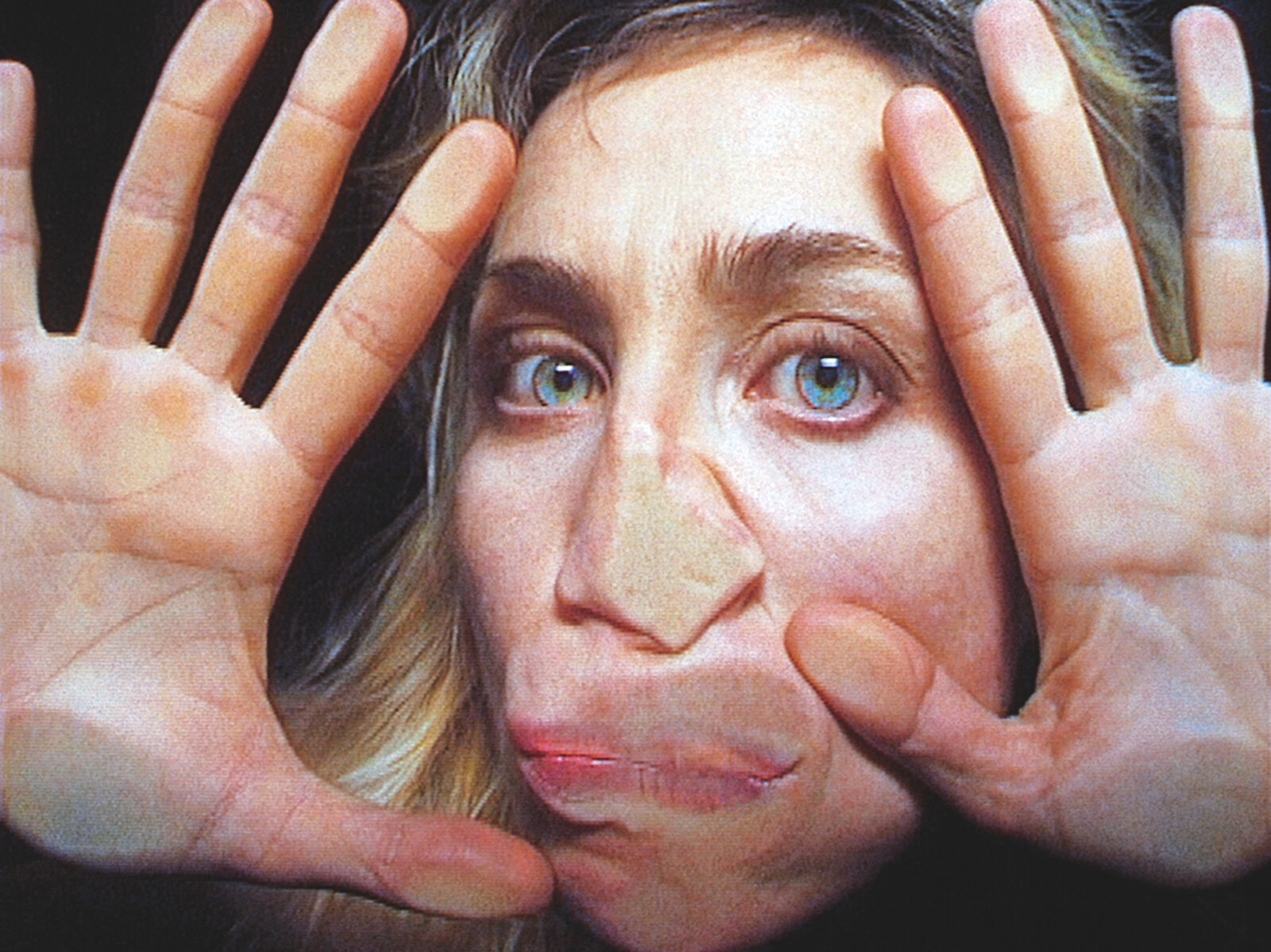
“Stay home.” Where or when does comfort become confinement? Pipilotti Rist’s exhibition in MOCA’s Geffen Contemporary warehouse invites us to take an entertaining, even rejuvenating stroll through Rist’s “neighborhood,” a place provocatively split in two, where the bodies on screens present little to no risk and plenty of reward.
As a survey of Rist’s substantial production from 1986 to the present, “Big Heartedness, Be My Neighbor” sets out to achieve the kind of wish-fulfilment its title proposes. Moving from the entrance past a theatrical curtain into the exhibition, the neighborhood is suddenly there below—we enter from slightly above—all at once a stage set and an apparition, aglow with colorful imagery moving across the walls of its buildings and the communal grounds surrounding them, caught in the middle of a kind of pre-performance begun before we even arrived. (Or, more likely, a sequence that neither starts nor stops, just exists.) There are also sounds, voices even. At first they seem to be over … there, beckoning from the housing or near the picnic tables in a park, but then, there she is, that small mirage and small voice crying out at your feet.
What to do here with one of Rist’s …
March 15, 2022 – Review
Samara Golden’s “Guts”
Vanessa Holyoak

Samara Golden’s “Guts,” the inaugural exhibition at Night Gallery’s new venue in downtown Los Angeles, offers a direct, physical encounter with fantastical perceptual experience. In this warehouse space, Golden has installed a huge mirrored box titled Guts (2022). Looking into it from one of two walkways reveals three white “floors,” each of which holds two “scenes” (one above and one below) relating to Golden’s shifting psychological states over the past few years: a messy living room with its toppled furniture, lamps, and crushed beer cans; an iridescent blue water-like surface; and an array of snaky, muted pink and lavender intestinal shapes that evoke the title of the installation, which gives its name to the exhibition. The effect is of one building contained within the atrium of another, extended vertically in a vertiginous series of reflections. It is a demanding task to distinguish between “real” installations and their mirrored reproductions.
Guts builds on Golden’s previous site-specific installations using mirrored structures. The Meat Grinder’s Iron Clothes (2017), for instance, was included in the 2017 Whitney Biennial and staged handmade furniture to create miniature “sets” of scenes of everyday life. In the context of a shift towards virtuality and digitization accelerated during …
January 13, 2022 – Review
“Witch Hunt”
Kim Córdova

“Witch Hunt” opens with an unnerving chill courtesy of El agua del Río Bravo (2021), a sculptural installation by Teresa Margolles that envelops visitors ascending the Hammer’s steps in air cooled by water gathered from the Río Bravo, along the US-Mexican border, by residents of the Casa Respetttrans women’s shelter. The work sets the tone for an exhibition responding to today’s generalized culture of misogyny with powerful work by an international roster of midcareer women artists.
It may be tempting to assume that the show’s title is mere allegory: that concerns about cabals of female devil worship no longer occupy the minds of contemporary Americans. But a cursory review of the news, from Pizzagate to the “lock her up” refrain against Hillary Clinton and death threats against AOC, show that women who threaten to disrupt male power will continue to be accused of evil. And where witch hunts once referred to the persecution of the weak by the powerful, the script flipped in 1973 when Richard Nixon used the term to denounce the Watergate hearings, setting in motion a pattern of powerful men—most notably Donald Trump—claiming to be the subjects of exactly such a threat. This show across two institutions …
January 6, 2022 – Review
April Bey’s “Atlantica, The Gilda Region”
Ikechúkwú Onyewuenyi
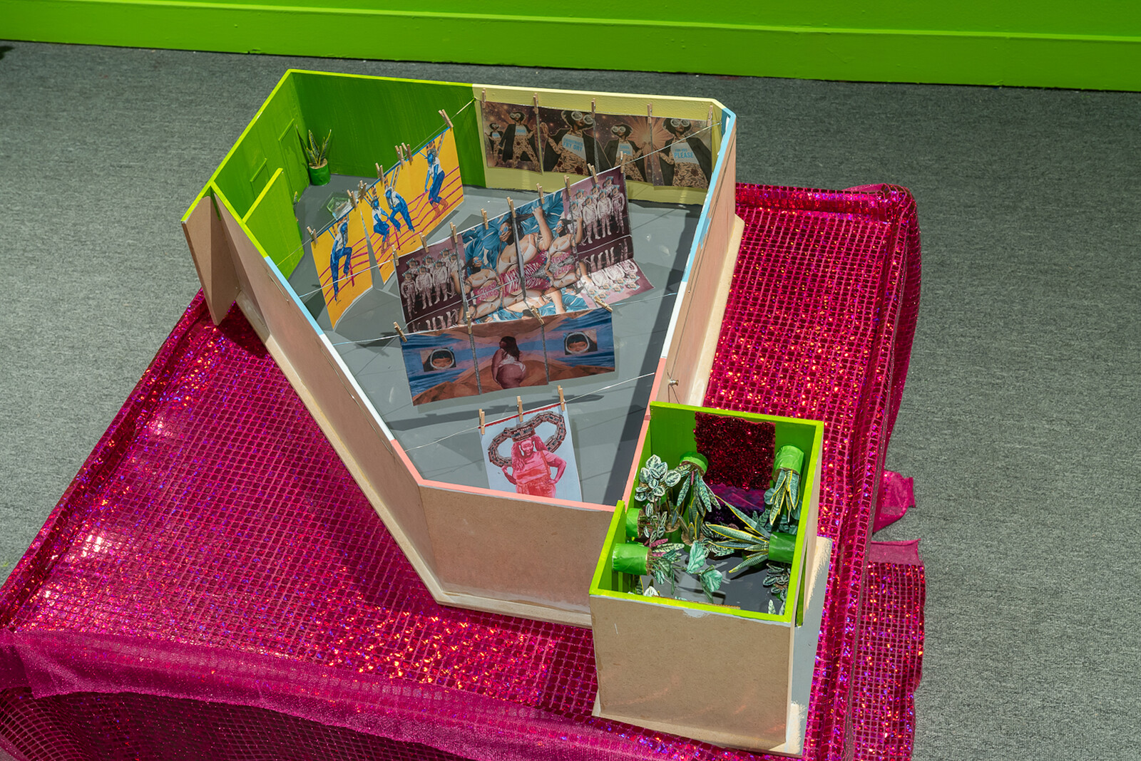
What is the blueprint for Black liberation? And where does Afrofuturism fit into it? As if in response to political philosopher Joy James’s charge that Black liberation lacks a workable model, April Bey’s immersive two-room installation offers ways to reimagine Black futurity and governance against the civilizing agenda of European humanism and the afterlife of colonial dependence. At the magenta-lit entrance, dubbed The Portal Room, I’m greeted by an effervescent ecology of live plants. On opposing walls, framing the room like clasped hands, are two time-lapse videos—Julia and Namibia (all works 2021)—showing calatheas (also known as prayer-plants) bowing and bending to the revolutionary sounds of Super Mama Djombo. The Guinea-Bissau funk band’s name venerates Mama Djombo, an initiation spirit who presides over an uncleared sacred forest in Cobiana. That Mama Djombo grew in popularity during the anti-colonial struggle in Guinea-Bissau underscores an idea that varied acts of spirituality—from song to ecological conservation—are central to emancipated Black futures.
Continuing with a sense of sonic spirituality, the next room, titled “The Gilda Region” after Jewelle Gomez’s 1991 speculative novel The Gilda Stories, displays three wall vinyl pieces; two murals composed of high-gloss photographs and faux fur; and eight large paintings and hanging tapestries …
November 10, 2021 – Review
Lorna Simpson’s Everrrything
Fanny Singer
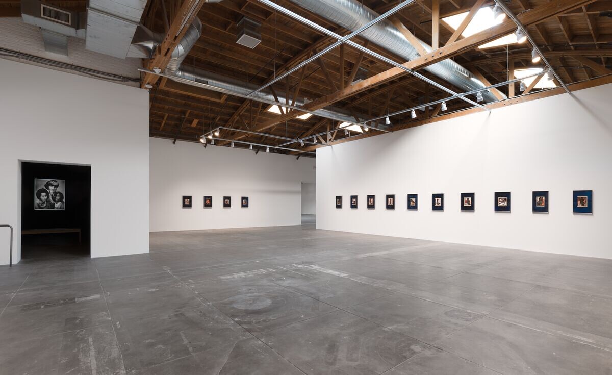
A horizon line of celestial bodies runs around the first room of Lorna Simpson’s solo exhibition at Hauser & Wirth, Los Angeles. In each of these collages, the figure of a woman has been cut away from a printed photographic image and placed over another of a night sky, revealing, through the negative space of her form, a window onto the cosmos. The show’s title is borrowed from the first piece you encounter, a ten-part work stretching out like a necklace, or a string of stars perhaps, across the north wall. This opening gallery contains four multi-part works, and three discrete ones (all from 2021), of nearly identical scale and media: all are intimate collages affixed to rough, indigo-hued handmade paper. Of the twenty-four pieces in the first room, the majority have the same source material: nineteenth- or early twentieth-century astronomical charts, illustration plates depicting constellations of stars and planets and celestial events.
Simpson’s muses are sourced—as her female subjects so often are—from vintage magazines like Jet or Ebony, or pin-up calendars. These dazzling pieces are both tidy and careful, yet strangely unpredictable, as if Simpson had allowed the process of excising the female silhouettes to approach automatic drawing rather …
June 8, 2021 – Review
Maysha Mohamedi’s “Sacred Witness Sacred Menace”
Fanny Singer
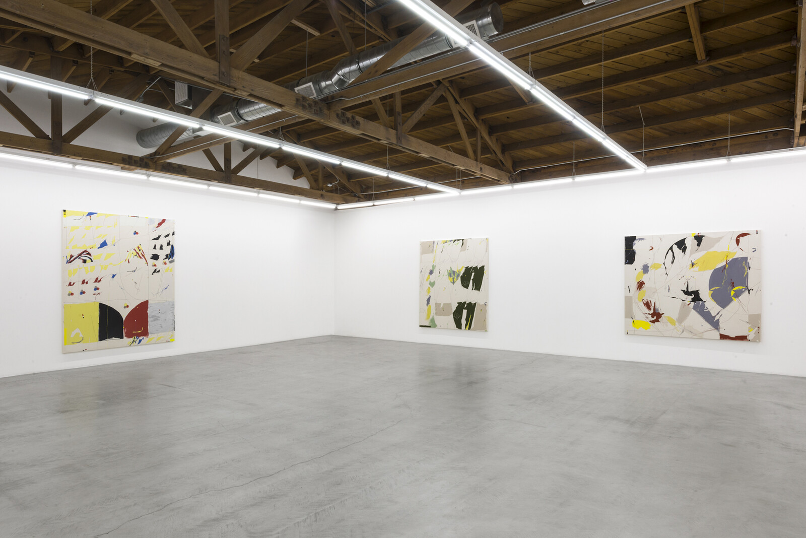
I cannot stop thinking about the quality of Maysha Mohamedi’s facture. There are a number of different styles of brushstroke—or, perhaps more accurately, applications of paint—deployed in Mohamedi’s first solo show at Parrasch Heijnen, but, in particular, there is one type of line, thin and febrile, that struck me as completely original. It’s unusual to discover something like this in contemporary abstract painting; young artists are inevitably rearranging, for the most part—sometimes brilliantly—familiar, anthologized marks. There is a sense that only a finite quantity of maneuvers are possible when it comes to the meeting of pigment and surface. Here is a line, however, rendered in oil with a minute brush, that denies the sumptuousness of the medium. A line that, in effect, does what oil paint does not want to do: it creeps anxiously across a spare ground, it does not fatten, grow tumid with thinner, or spill blearily beyond itself. As if responding to my scrutiny, this line appears—on each canvas applied at different frequencies—to jump like the reading of a seismometer’s jittery needle during a series of minor earthquakes, or, in other places, to accumulate like a loose mass of Silly String. I think of Joan Mitchell, her …
April 22, 2021 – Review
Ishi Glinsky’s “Monuments to Survival”
Christina Catherine Martinez

It was an emergency. A young brown girl had Tik Tok’d misinformation about the origins of punk. A podcast was assembled. A white expert was brought in. He used to skateboard. He said the girl was “probably a good person” but she didn’t know what she was talking about. A Reddit post began with a list of black and brown punk artists (Pleasure Venom, Big Joanie, Poly Styrene of X-Ray Spex) and the thread spiraled into a tangled argument over whether or not they constituted the “real” origins of punk. I can’t believe these arguments are still happening. But then again, I’m still not certain I know what modernism is, only that it has failed us in some way, and I know that similar arguments occur about whether what we call “America” today started with brown people or white people, and what value judgements must attach to each tangled story.
Sitting on the ground in the back room of Chris Sharp’s white cube gallery, Ishi Glinsky’s Tohono O’odham Basket (2013) looks like a tangle of wires shaped into a gourd-like vessel, a purposeful twist on the traditional baling wire baskets of his tribe. Each of the five works in this …
February 10, 2021 – Review
Liu Shiyuan’s “For Jord”
Fanny Singer
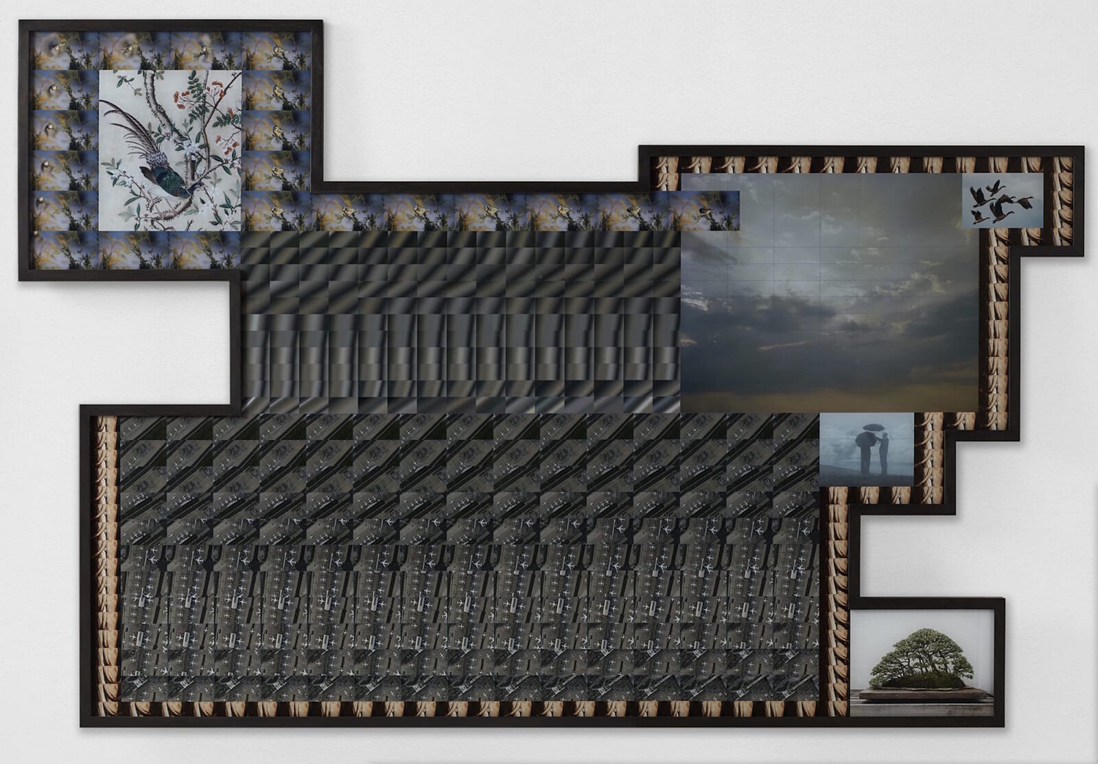
As I left Liu Shiyuan’s first solo exhibition in Los Angeles, I kept tripping over lines from a Robert Hass poem, “Meditation at Lagunitas”: “because there is in this world no one thing/ to which the bramble of blackberry corresponds,/ a word is elegy to what it signifies./ […] After a while I understood that,/ talking this way, everything dissolves: justice,/ pine, hair, woman, you and I.” This poem was published in 1979, when the internet as it exists today wasn’t so much as a dream, but the dissolution that Hass describes is in many respects the subject of Liu’s forensic examinations of post-internet culture. Since 2007, the Beijing-born Liu (who splits her time between China and Denmark) has devoted herself to unpacking, interrogating, even satirizing, internet semiotics. At a moment in history in which an ever-increasing percentage of the global population has been compelled online, there is a poetry to Liu’s search for meaning in a digitally atomized world.
Liu’s exhibition is centered on a fictional—and purely conceptual—character named “Jord” (after whom, or what, the show is titled). Jord is both a noun and a name in Danish, translating, respectively, to “land” or “soil,” and “divine being” or “peace.” …
February 8, 2021 – Feature
“WACK! Art and the Feminist Revolution”
Wendy Vogel
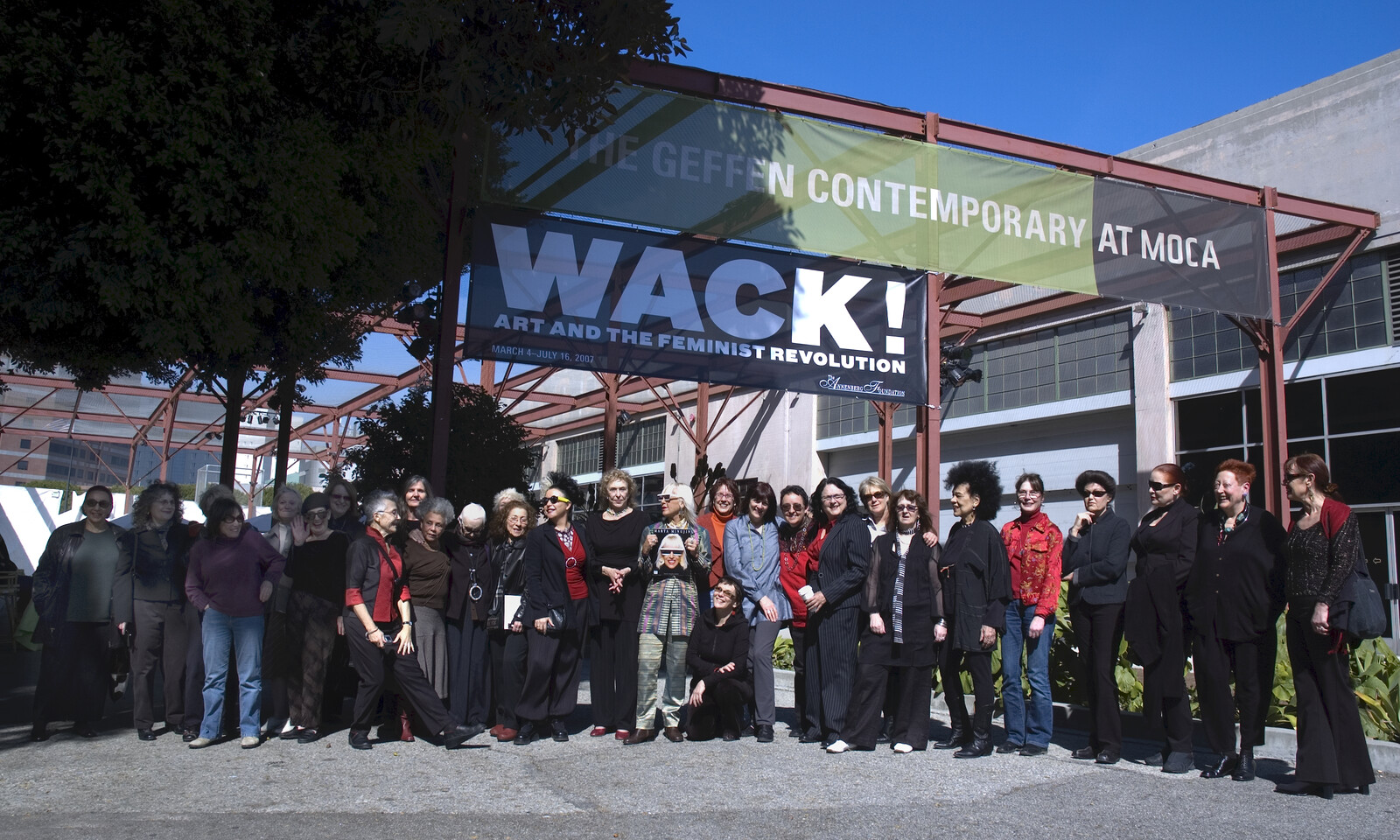
The Rearview series addresses blind spots in contemporary art history by returning to an influential exhibition, work, or text from the past and reflecting on its relevance to the present. In this edition, Wendy Vogel considers how the 2007 touring exhibition “WACK! Art and the Feminist Revolution” marked a generational shift in art criticism.
Feminist art history may come to be defined as the era before and after WACK!. The onomatopoeic word—more a metaphorical whip-crack than a line in the sand—is shorthand for “WACK! Art and the Feminist Revolution,” an exhibition curated by Cornelia Butler that opened at the Museum of Contemporary Art, Los Angeles (MOCA) in March 2007. This pioneering institutional survey of feminist art brought together work made by more than 120 female artists and collectives between 1965 and 1980. In the introduction to the 500-plus-page exhibition catalogue, Butler stated her curatorial goals: “My ambition for ‘WACK!’ is to make the case that feminism’s impact on art of the 1970s constitutes the most influential international ‘movement’ of any during the postwar period—in spite or perhaps because of the fact that it never cohered, formally or critically, into a movement.” It remains a bold statement today; it was …
February 4, 2021 – Review
Jeffrey Gibson’s “It Can Be Said of Them”
Patrick J. Reed
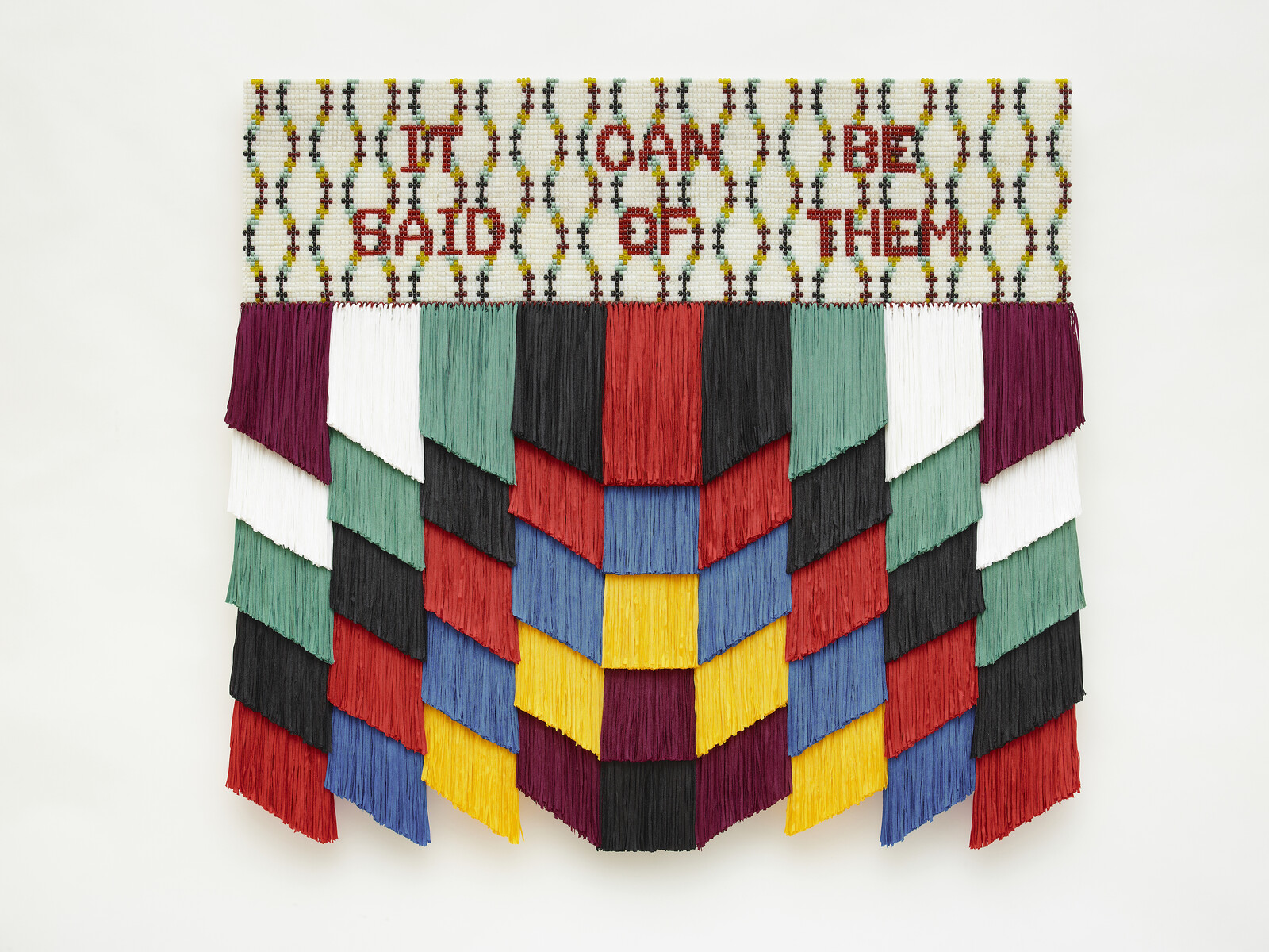
Here’s a platitude: all’s fair in love and war. This, one could argue, is what Jeffrey Gibson’s solo exhibition “It Can Be Said of Them” is all about: the love being queer love, the war being that waged against queer bodies of color who cannot voice their desires without anticipating, so as to deflect, hatred. Here’s a second platitude to consider in relation to the first, one sometimes assigned to Gibson’s artistry: it is infused with joy and resistance.
It’s true that both characterize, for example, YES! WE CAN (all works 2020), one of two punching-bag sculptures at the gallery’s center. White and yellow words reading “CAN THEY SHE HE DO IT? YES WE CAN!” wind around the bag in a red-and-blue square diamond lattice. As one circles the hanging piece, it reveals its pronouns deftly, like jabs to the psyche that parry normative presumptions. This sensation carries through to the mixed-media pieces mounted on the nearby walls—combinations of acrylic paint, glass beads, and fiber materials embellished with lyrics and protest slogans. The show is a flurry of defensive moves and is more complex than the upbeat language that is often used to label it.
Another of Gibson’s …
November 17, 2020 – Review
“Made in L.A. 2020: a version”
Travis Diehl
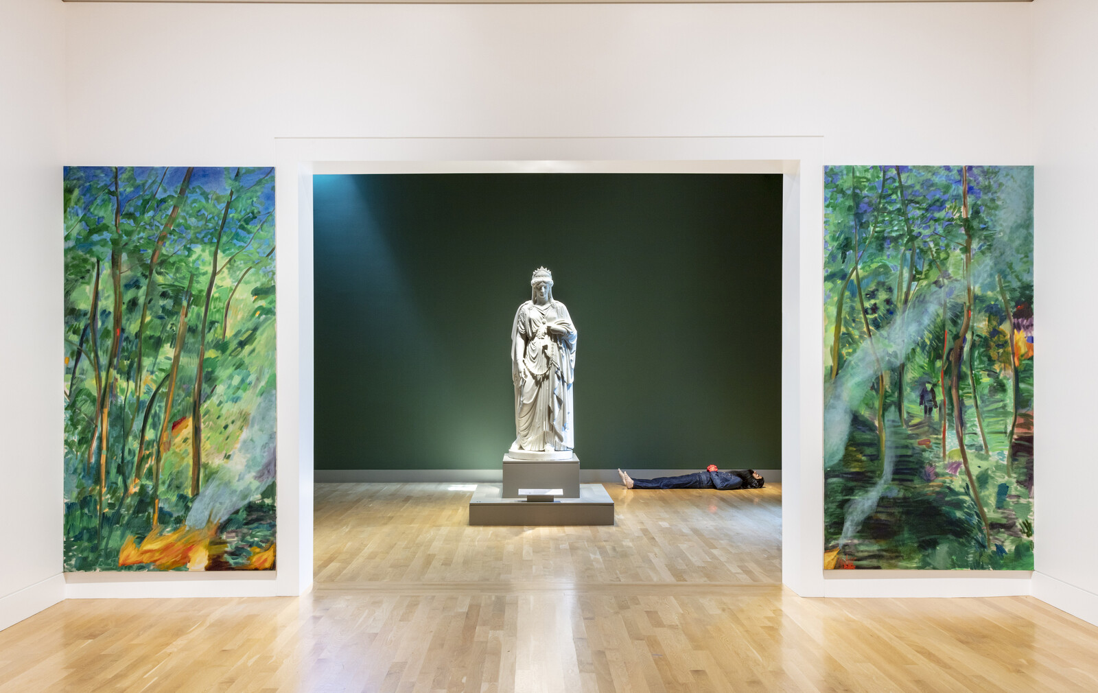
The posters advertising “Made in L.A. 2020: a version” show a painting of a tear-filled eye. It belongs to President Obama, a detail from Political Tears Obama by Fulton Leroy Washington, aka Mr. Wash. The work dates from 2008, suggesting that while the rises of Trump and the virus have come to shape how we receive everything, including this abbreviated biennial, causes for anguish predate both. In a series of works on view at the Hammer, Washington’s bright-burning surrealism portrays not only the “political tears” of politicians and celebrities from John McCain to Michael Jackson, but also those of his fellow inmates (the artist spent two decades behind bars after being wrongfully convicted on three drug-related charges), drawing the viewer to reflect on the continuing toll of decades of carceral capitalism in the US.
This biennial, announced in January, installed in June, and previewed by the press in November, still has no public opening date. Several live, performance-based projects, notably those by Harmony Holiday and Ligia Lewis, have taken provisional shapes. As conceived by the curators, Lauren Mackler and Myriam Ben Salah, along with the Hammer’s Ikechukwu Onyewuenyi, the show runs recto-verso at two museums—the Hammer and the Huntington. …
October 14, 2020 – Review
Jennifer J. Lee’s “Wallflowers”
Travis Diehl
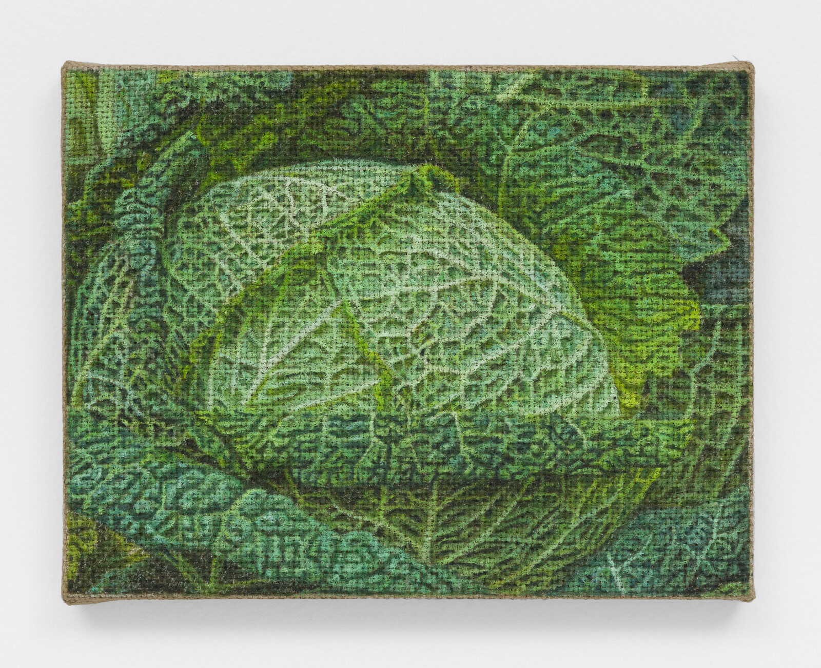
The eleven compact paintings in Jennifer J. Lee’s “Wallflowers,” all dating from 2020, hang heavily on the white walls of Chateau Shatto, Los Angeles. Each work is around A4 in size and plays with layers of texture and detail, transferring source images of intricate scenes—stonework, crocodile skins, flowers, and seeds—onto an unforgivingly wide-woven jute. The slime-aged arches of Abbey, the blood-orange marble of Elevator, the baked psychedelia of Wallpaper—the unprimed material dims Lee’s colors as if with time.
The pictures are further compressed by their cropping. Couch depicts a sofa, patterned in garden-, bruise-, and fire-hued florals of a boomer vintage: the painting’s rough surface, pigmented and oiled, resembles the coarse upholstery of its subject. It lets slip only the tiniest patch of context—a glimpse of a room—in the upper-right corner. The composition is otherwise foreshortened, the pillowy seams of the cushions and pleats cutting a smart diagonal. In Cathedral, Lee’s rendering of tracery and arcades narrows to a blotchy impressionism, as if through a lens with a shallow depth of field. The canted planes in Wallpaper, Elevator, Records, and Security Mirror similarly place their subjects in the middle-distance.
Each image pushes to the edges of the …
June 10, 2020 – Review
“Unoccupied Territories: The Outlying Islands of America’s Realm”
Patrick J. Reed

At 15°53’N 78°38’W in the Caribbean Sea lies the remote Bajo Nuevo Bank. Population: zero. Formerly claimed by Jamaica and Honduras, this reef and islet cluster is administered by Colombia, though Nicaragua and the US both insist that it belongs to them. Devoid of citizenry, the island is defined by its strategic and economic value to competing nation states.
Bajo Nuevo and ten other islets or atolls comprise a category of US territories known as the Minor Outlying Islands. As the Center for Land Use Interpretation (CLUI) describes them in “Unoccupied Territories: The Outlying Islands of America’s Realm,” an online exhibition comprising images from Google Earth alongside texts describing the islands, they are the “tattered fragments of [US] dominion.” To the CLUI, a non-profit producing interdisciplinary work at the intersection of art and geography, these unorganized, mostly unincorporated, mostly uninhabited, and sometimes disputed geopolitical fragments demand investigation.
The islands’ histories of abuse by imperial ambition and damage by global war are distinct, but they share absorption into US jurisdiction under the Guano Islands Act of 1856, a federal law that permitted Americans to claim the scantest ocean topography on the premise that it was stateless and held …
February 21, 2020 – Feature
Los Angeles Roundup
Sabrina Tarasoff

“The Magic and Flair of Mary Blair,” an exhibition of the Disney artist’s dreamy, acid-laced concept pieces at the Hilbert Museum of California Art, burned to mind what freakish and caustic things fairytales can be. Best known for her work on Alice in Wonderland (1951), Blair’s mutant gouaches drag you with Alice into the fantastical inversions of Wonderland, a place “more like a corkscrew than a path,” where lawless helixes swallow rooms and minacious figures are found lurking in the Day-Glo darkness. Through the looking glass, everything from the houses to paths act on their own volition; even the flowers have a will (if you’re worth talking to): “You can’t possibly do that,” advises a Rose in Carroll’s sequel, “I should advise you to walk the other way.” Alice considers this bad advice, and so heads in the “wrong” direction, straight back to where she started. Which is to say, she’s quick to realise that in the context of the fantastic, if it appears you’re getting lost then you are probably going the right way.
Though this city is filled with the iconoclastic fantastic, its galleries during Frieze week seem more determined to exploit a bygone image of subversion than …
February 18, 2020 – Review
Pauline Boudry and Renate Lorenz’s “Moving Backwards”
Kim Córdova
As I sit to organize my thoughts on Pauline Boudry and Renata Lorenz’s installation Moving Backwards, currently on show in Los Angeles project space JOAN, breaking news alerts slide anxiously across my screen like ephemeral disaster poetry:
Russia closes China land border to prevent spread of coronavirus.
Press Send for Brexit: E.U. Seals UK Withdrawal by Email.
Republicans Block Impeachment Witnesses, Clearing Path for Trump Acquittal.
Netanyahu Plans to Extend Israeli Sovereignty Over Jordan Valley and Settlements.
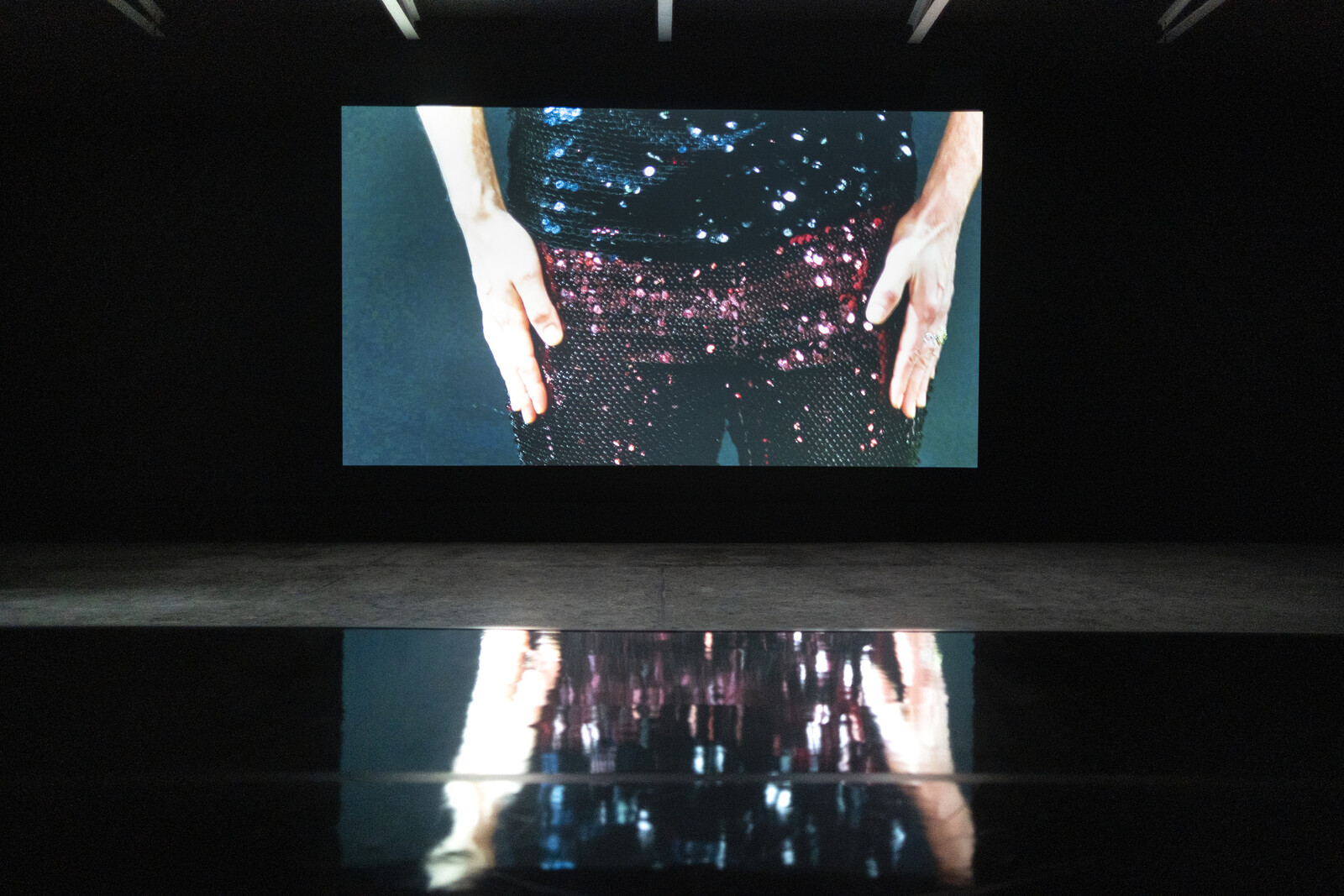
Boudry and Lorenz’s response to this moment of what they call “reactionary backlashes” is to find power and possibility in backward movement, as a strategy of tactical response. Through a multimedia work featuring, as its centerpiece, a video of a series of dances that play with perceptions of locomotion, the artist duo ask what power could be assumed by disassociating the notion of forward movement from advancement and backward movement with defeat. Put another way, what violence is imposed by a conceptualization of time that is grounded in a colonial understanding of progress as an act of continuous conquest?
Moving Backwards establishes its collaborative …
January 28, 2020 – Review
“With Pleasure: Pattern and Decoration in American Art, 1972–85”
Jonathan Griffin
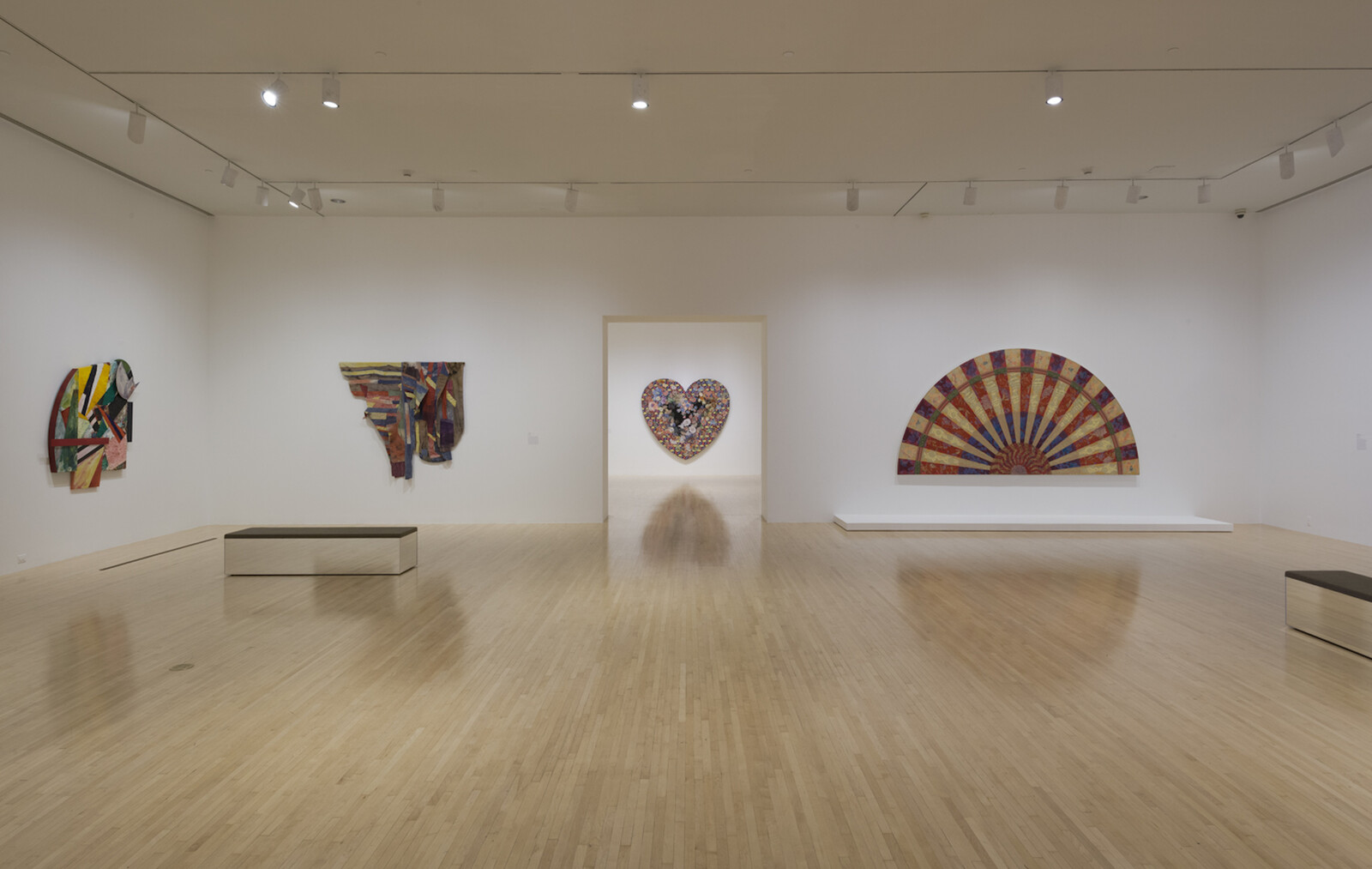
Pattern and Decoration (P&D), a tendency which crystallized into a movement in New York in the mid-1970s, is one of the few movements of modern art to have self-designated, rather than been identified either by critical champions (think of Germano Celant and Arte Povera) or by sneering skeptics (Finish Fetish, Fauvism). Its members, though heterogeneous in their work, were united in their artistic tastes and temperament: they espoused a maximalist aesthetic that drew from global traditions and sources, also often aligned with feminist art practices that embraced domestic handicrafts. They had no manifesto, but critical allies including Amy Goldin and John Perreault have written eloquently about their work and aims. According to Perreault, “Pattern painting is non-Minimalist, non-sexist, historically conscious, sensuous, romantic, rational, decorative. Its methods, motifs, and referents cross cultural and class lines.”
So it is unexpected, and refreshing, to be welcomed into curator Anna Katz’s survey, “With Pleasure: Pattern and Decoration in American Art, 1972–1985,” by works from three artists not typically associated with the movement. Two untitled wall works by Al Loving combining dyed and printed fabrics, one from 1975 and another from 1982, join with Sam Gilliam’s The St. of Moritz Outside Mondrian (1984) and Lucas …
December 3, 2019 – Review
Lari Pittman’s “Declaration of Independence”
Travis Diehl
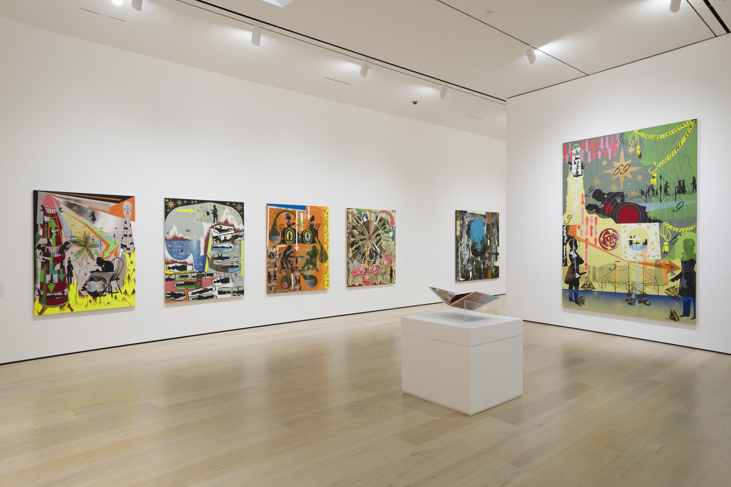
Lari Pittman’s resonant retrospective at the Hammer in Los Angeles impresses first with the filigreed intricacy of his paintings, second with their special monotony. Three decades of work spills forth in the bold colors of commercial signage, splashed with decorative motifs—Victorian cameos, arrows, tipping pots, teardrops of various fluids, and the accoutrements of Enlightenment science. The more things change, the more they resemble the past. A carousel or color wheel of eighteenth-century silhouettes rolls through a garden of giant roses in This Amusement, Beloved and Despised, Continues Regardless (1989), as the figures paint on easels or hold measured discussions; a man in the lower right corner exposes his cock. Their human shapes presage the disarticulated dummies or robots that clatter across the compositions of the series “Grisaille, Ethics & Knots” (2016), where the colors give way to apocalyptic chrome, white, and warning-light red. Pittman’s paintings reiterate a history of individual styles: all-over expressionism, minimalist structure, constructivist design, mannerist embellishment, and, emulsifying all, postmodern pastiche.
Still, the dense chemistry of each individual painting burns through the overall clutter. The chronological hang at the Hammer delivers an increasing avalanche of strokes and stencils, but also reveals the tight interplay of small differences …
June 26, 2019 – Review
Eliza Douglas’s “Josh Smith”
Christina Catherine Martinez

When I took a fiction workshop in community college, the professor had a rather solemn habit of handing everyone’s manuscripts back to them with a gnomic phrase of critique or encouragement. He’d stop at your desk, plop the thing down, and say something like “you’re not delivering the goods” or “the text is incorruptible” and the rest of the class would blush or cringe in empathy. One day he lingered in front of Matt, uncharacteristically nonplussed, before gently handing over Matt’s paper. “I don’t know how else to say this,” he said, “but…lesser writers spend years trying to figure out how to write this badly.”
The rest of the class looked at one another, unsure of whether to laugh with Matt or at him, or ourselves.
Looking at Eliza Douglas’s work brings up all of this. Her paintings are awkward but somehow cool, deadpan but not cynical, unskilled but self-aware, surfeit with gall but not bravado. Douglas embodies an elusive up-to-the-second vibe, the je ne sais quoi of late-capitalist modernity, found also in the flat, sure-footed prose of Natasha Stagg, the low-register vocal fry of the girls of the Red Scare podcast. It’s a kind of affectlessness. (While writing …
March 29, 2019 – Review
Suzanne Jackson’s “holding on to a sound”
Jennifer Piejko
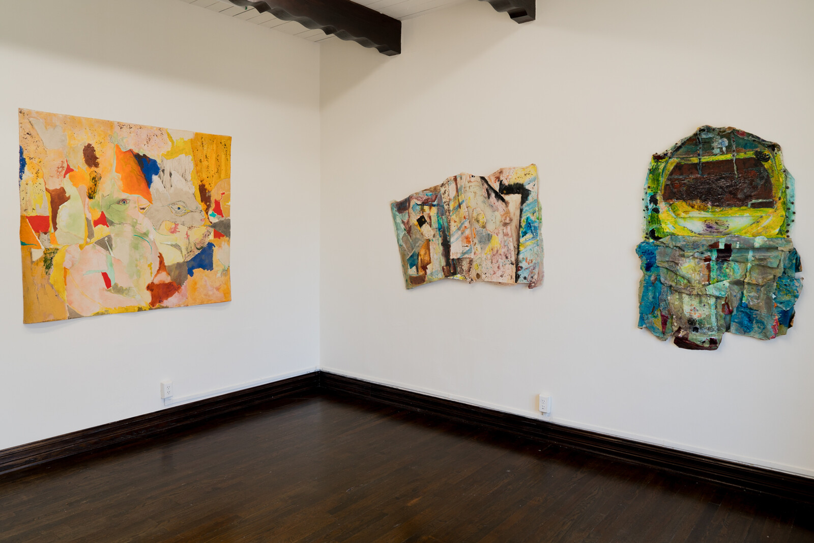
Suzanne Jackson was drawing two lines by 1968: One she traced over and over in watercolors and oils and strange new acrylics, of wingspans and the receding landscapes of her adolescence; the other was a limit, drawing a boundary against a relentless decade and the demands of her contemporaries.
Her lines intersected at Gallery 32. Sectioning off half of her live-work studio in the Spanish-style Granada Buildings in MacArthur Park, Jackson handed the floor over to her classmates and teachers from the then-nearby Chouinard Art Institute (which has since merged with CalArts) and Otis College of Art and Design, including David Hammons and Charles White. She also hosted fundraisers for the Black Arts Council, Watts Tower Arts Center, and Black Panther Party, as well as “Sapphire Show” (1970), the first survey of black women artists in Los Angeles. Evidence of this history is on view in the foyer of O-Town House, a new gallery located in the Granada Buildings, just a floor above and a half-century behind the original Gallery 32. Folds of handwritten invitations, curling photographs, price lists, exhibition announcements, and contact sheets fill a line of vitrines, laying out an ephemeral context for the exhibition of Jackson’s works from …
February 28, 2019 – Feature
Los Angeles Roundup
Christina Catherine Martinez
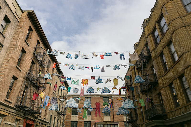
“This is a stupid town. It’s lazy, it’s polite, it’s so sissy in its mentality, so go along with everything that goes along. It’s corporate-owned, it’s a town owned by Hollywood, and it’s about time it grew up. It’s about time that it took art and said come on baby, show me something!” Thus spoke John Cassavetes in a behind-the-scenes documentary for his 1977 film Opening Night. The clip played as part of an intro bumper at Now Instant Image Hall, a microcinema in Highland Park with a bookshop selling various zines and small press titles related to its eclectic programing, from Susan Cianciolo’s films to historical gems like Reyner Banham Loves Los Angeles (1972). The latter screened just a few days before the cultural Leviathan known as Frieze Week descended upon the city, bringing with it a deluge of rain and the attendant disenchantment.
Cassavetes’s diatribe drew laughs and cheers from the 60 or so rain-soaked people nestled into the space (I love the way he hisses out the word sissy—his hatred for Los Angeles is unimpeachably authentic) and it does presciently, if cynically, encapsulate this moment of arrival. The LA art scene grew up. Or at least, the kids …
September 11, 2018 – Review
Vincent Fecteau
Fanny Singer
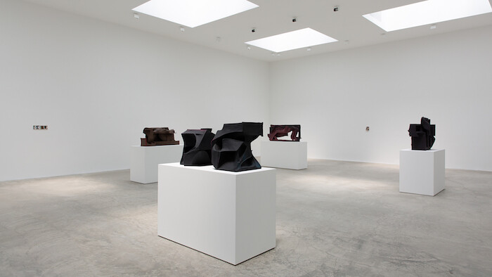
Nature has a habit of reproducing its best engineering––why reinvent the circuitry of veins if you have their blueprints in the roots and branches of trees, in the shapes of rivers flowing from tributaries? Fractal patterns are iterated everywhere: in succulents, cauliflowers, snail shells. Vincent Fecteau’s sculptures, too, feel borrowed from natural forms such as grottoes and caves. In fact, there is something rather grotesque about them: organic nooks and stalactite-like shapes coalesce into liminal, terrestrial landscapes.
In the main room of Fecteau’s current solo exhibitions at Matthew Marks’s Los Angeles space, four sculptures sit on plinths ringed sparsely by four wall-mounted collages while a second, smaller gallery brings together a single sculpture with a single collage (all of the works are untitled). Collages previously shown in 2014 at Marks’s New York gallery are reunited with others from the same period, and brought together for the first time with sculptures made for an exhibition at Vienna’s Secession in 2016. The juxtaposition of pieces from different moments and contexts affords the viewer an opportunity to consider how Fecteau’s two dominant mediums––which can read as distinct conceptual and formal strands––have been in critical dialogue over the last several years.
In his 2014 exhibition at …
August 31, 2018 – Review
Fernando Palma Rodríguez
Jennifer Piejko
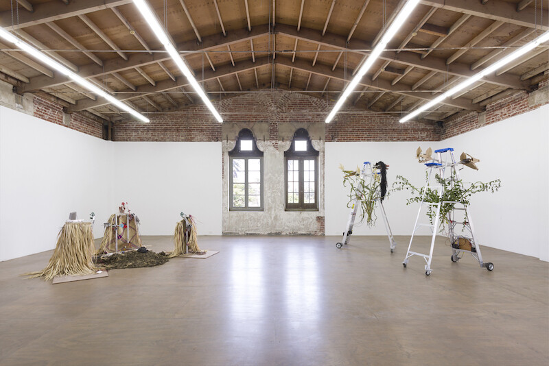
The coyote nods to himself, self-assuredly, keeping his eyes steady while his body shifts balance—the motion sensors make his gaze relentless. He brushes his limbs back until he is resting on his hind legs, bracing for a gallop. He retreats, his tail is taut, his front paws are winding up—literally—to ensnare his prey. The kinetic animal in Soldado [Soldier] (2001), an angular cardboard head leading a red metal sketch of a body, can be a stand-in for its creator, artist and engineer Fernando Palma Rodríguez. In the Uto-Aztecan language Nahuatl, the coyote is a mythological animal that fluctuates between wild and civilized states, entering and exiting each side of the divide with sensitivity. Nahuatl tradition also tells us that the heart, yóllotl, has the same etymological root as motion, ollin—and that this dynamism is the defining characteristic of what it means to be alive. Sentiment plus movement equals life. Collapsing both variables, the coyote conceives his own life through reactive animation.
Moving past the anxious canine that paces the first level of House of Gaga / Reena Spaulings, Coatlicue / Xipetotec (2018) guards the entrance to the next level. A nearly blank visage with a fleshy mouth rests on top of …
July 2, 2018 – Review
Made in L.A. 2018
Jonathan Griffin
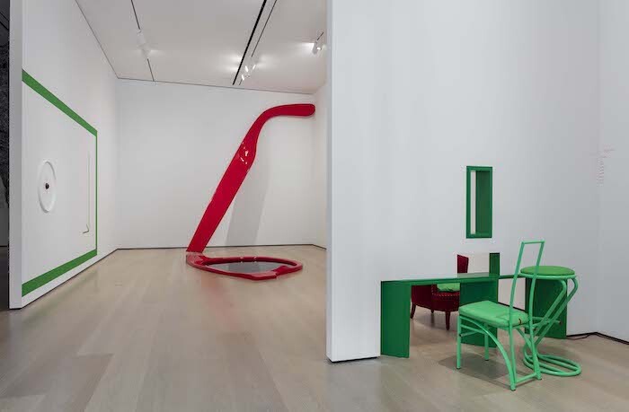
Not so much a city as an unevenly populated, multi-centered megalopolis, and not so much a year as a point in an escalating concatenation of national and global crises, there might seem to be no possible way to get “Made in L.A. 2018” right. Add to that the divisions within LA’s art community that mirror many of the historically entrenched divisions within the city itself—between east and west, north and south, white and non-white, gentrified and gentrifying, young and no longer young, left and far left. If artists, as “Made in L.A. 2018” curators Anne Ellegood and Erin Christovale write, are “some of our most active citizens,” then biennial curators might be something akin to well-intentioned politicians, expected to represent a plurality of impassioned positions while trying also to retain sight of their own.
Against these odds, Ellegood and Christovale have succeeded in organizing an exhibition that is hard to fault, in large part because of their scrupulous avoidance of curatorial overreach. While Hamza Walker and Aram Moshayedi’s “Made in L.A. 2016” (pretentiously subtitled by the four-word poem “a, the, though, only,” and including multidisciplinary contributions both inside and outside the museum) was clearly intended to stretch the possibilities of its …
May 15, 2018 – Review
Chris Kraus’s "In Order to Pass: Films from 1982–1995"
Patrick Steffen
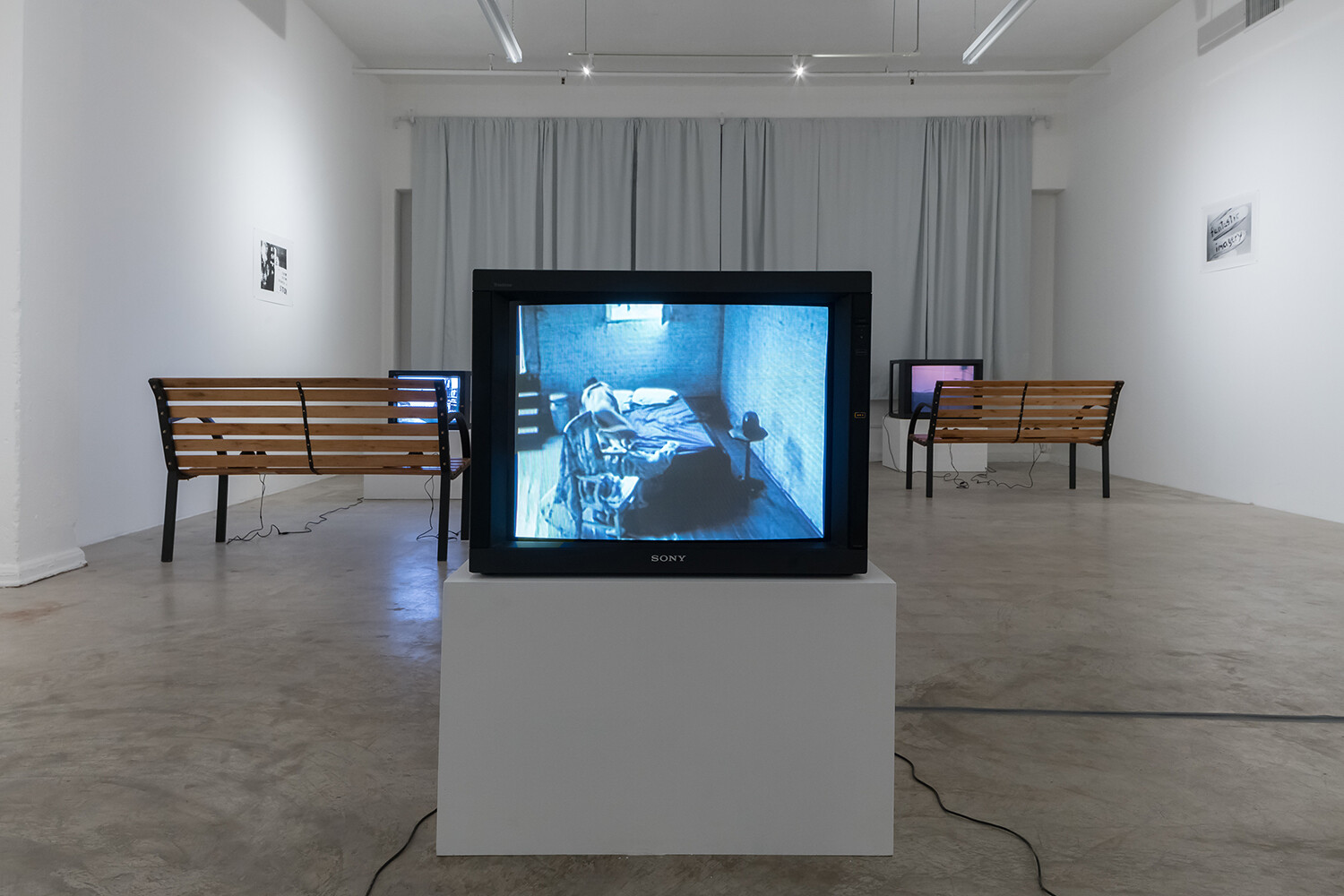
Dear Chris,
How sweet it was talking with you at the opening of your show. You allowed me to introduce myself, so I could share some words I have longed to tell you since I arrived in this city. I was introduced to Los Angeles through your writings: a primal, unfettered education in the local art scene; I know it well enough now that my interest has begun to wane. I feel like Gravity—the main character in your film Gravity & Grace (1995), one of nine on view at Château Shatto—when a stranger rests his head between her legs and she stares into the void, seeking something meaningful, relevant, eternal. The way you edited that scene—the way you edited your entire filmography—reflects the way you write. You speak the way your characters speak.
I hear your voice throughout these films. Formally, they range from documentary—such as Voyage to Rodez (1986), in which you recount an episode in Antonin Artaud’s life, and Traveling at Night (1990), about a field trip to a deconsecrated Wesleyan Methodist Church in Darrowsville, New York—to fiction. Sadness at Leaving (1992), for example, is based on Erje Ayden’s 1987 autobiographical novel of the same name, about his time as …
May 11, 2018 – Review
Peter Shire’s “Drawings, Impossible Teapots, Furniture & Sculpture”
Andrew Berardini
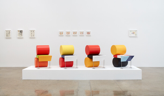
Los Angeles is an unruly city. Under shaggy palm trees and the bruised purple blooms of jacarandas, roads snarl in mile upon mile of naked asphalt and concrete lined with buildings from every conceivable shape and era. Mostly there are low-slung, postwar ranch houses and bungalows with yards swollen with succulents alongside patches of grass, strip malls with packed parking lots under a patchwork sign advertising dozens of shops, hawking everything from soul food and vegan tacos to Thai massages and pot dispensaries in three different languages—and all of it, caught at dusk, wearing the rich, smeary colors of smog-smothered sunset. Then again, tucked between the hills and highways, you’re just as likely to find fruit orchards and high-rises, marble palaces and shantytowns. All over, things jut and stick out. The brash cacophony of visions and the tucked-away secret gardens make up a city that is both a mess and a dream, constantly resisting just about anything you can say about it and existing like Venice in Italo Calvino’s Invisible Cities (1972), as every city and none. You might hate it, but LA has got style. And few artists capture its gleeful and garish, brash and beautiful resistance like Peter …
April 16, 2018 – Review
Dave Hullfish Bailey’s “Hardscrabble”
Travis Diehl
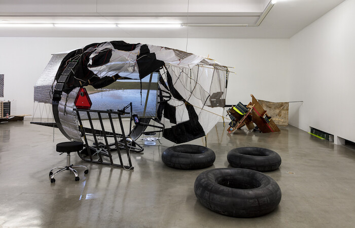
Like a thesis hidden in a footnote, a small projection in one corner of an exhibition of junkyard complexity shows a loop from John Ford’s The Man Who Shot Liberty Valance (1962), starring John Wayne and James Stewart. In the scene, Stewart’s character, a lawyer in the frontier town of Shinbone, sits before a schoolroom full of kids and adults. He’s learnin’ them readin’ and writin’, where no one else will. He is also, lawyerly, teaching them about the law of the land, paraphrased thus: “The people… are… the boss!” It is a lesson in the John Ford mold—as self-evident and patronizing as Stewart’s words of praise: “That’s fine. That’s just fine.” The same goes for the film’s plot, which pits the outlaw and rustler Valance against the fence- and property-line-loving townsfolk, who just want to raise their sheep in peace. The film is a latter-day Ford allegory: “liberty,” an old idea, must be gunned down, now that we’ve outgrown untrammeled, unfenced ranges and need regimented “lots,” “towns,” and “ranches” instead. REDCAT being an exhibition space and not a grade school, the viewer is encouraged to be skeptical about the purity of such motivations as the anti-entropic philosophy of manifest …
April 4, 2018 – Review
Charlemagne Palestine’s “CCORNUUOORPHANOSSCCOPIAEE AANORPHANSSHHORNOFFPLENTYYY”
Eli Diner
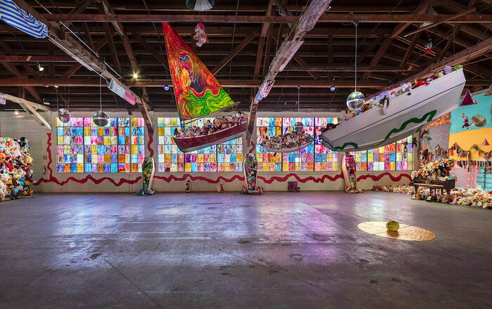
Marveling over the evolution of his latest exhibition, Charlemagne Palestine remarked: “This idea or obsession that I had with a few animals at the beginning, never did I imagine that it would become such a maximal, enormous work like this. It’s the biggest ever with about 18,000 or more. That we found them quite easily and quickly. And there are hundreds of thousands more out there so it’s like some kind of social phenomena [sic].” The animals are stuffed, and all of them used, or used up—orphans, as inscribed in the title. Together with a variety of props and sounds, they fill the cavernous main gallery at 356 Mission, which has played host to some of the most ambitious exhibitions in Los Angeles over the past five years and which last week announced that this show would be its last. Palestine’s précis provides the key markers for navigating his mesmerizing, heavily Instagrammed, carnivalesque installation: magnitude, the bounteous resource, the obsession “at the beginning,” and some kind of social phenomenon, though what kind exactly is the question for us.
Together with orphans, two horns of plenty appear in the title, both in English and Latinate formulations, plentitude making a fine watchword for …
March 28, 2018 – Review
Los Angeles Gallery Share
Jonathan Griffin
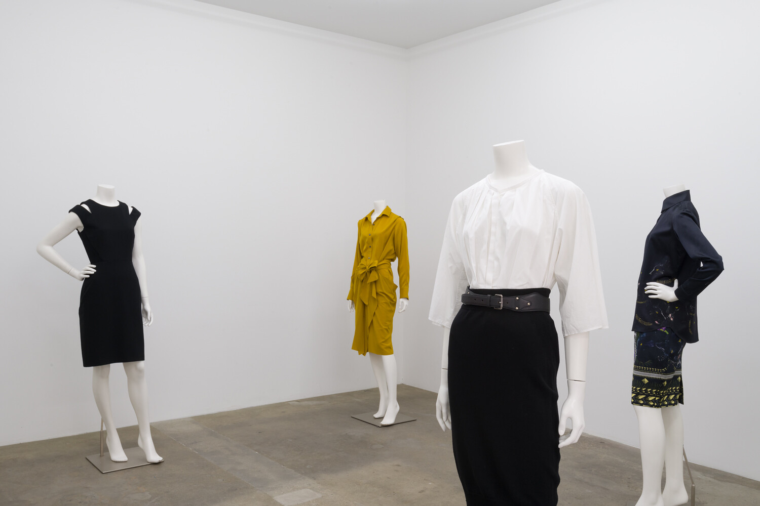
At least Condo, in London and New York (and soon also Mexico City and São Paulo), and Okey-Dokey, in Düsseldorf and Cologne, had snappy names and branding. The latest manifestation of the increasingly popular gallery share model, hosted by three Los Angeles galleries, does not have a name. Its program, in which eight international galleries and one peripatetic “off-space” have descended on Hannah Hoffman Gallery, Kristina Kite Gallery, and Park View/Paul Soto for the month of March, seems to have evolved very organically. One might even call it ad hoc.
Such a low-key approach may not necessarily be such a bad thing, indeed might even amount to an ideological and/or aesthetic stance, except that it also conveys the impression that nobody involved really expected anyone to talk about it much, or—especially—to write about it.
So, why am I? Firstly, because the endeavor occasioned the display of some very good art, much of it previously unknown to me. And because gallery shares are a format that is becoming increasingly common, and will only get better if we take them seriously, critically. Also because such declarations of international allegiance between galleries are nearly always comment-worthy, especially when they converge on Los Angeles, which, …
February 7, 2018 – Review
pascALEjandro’s “Alchemical Love”
Andrew Berardini
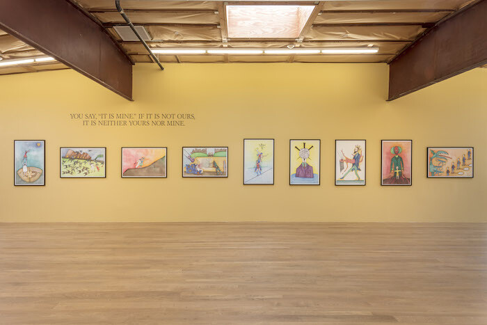
For true mystics, there is no division between the real and the spiritual. The symbolic folds into our lives, shaping the world and us in it. The cool kiss of rain can be a curse or a blessing from the gods. Stumbling in the street en route to meet your lover might signal deeper misgivings and potential pratfalls of your coupling. Rather than a pseudoscience, astrology can, in tracking the paths of celestial bodies, chart our hidden natures. The card flourished from the tarot deck for many unveils the true shape and contour of a life: its past, present, and future. To practitioners and adherents of the esoteric, the interior and the exterior, the natural and the supernatural are one. “As above, so below,” to quote the legendary father of alchemy, Hermes Trismegistus.
Drawn by filmmaker Alejandro Jodorowsky and colored by costume designer/artist Pascale Montandon-Jodorowsky, the drawings that make up “Alchemical Love,” conceived and realized by this married couple (under the portmanteau of their two first names pascALEjandro), reveal a world of magical forces shaping their lives, a spirituality that weds the deeper mysteries to their love story. They are deceptively simple, each strange scene almost pulled from a children’s book …
November 3, 2017 – Review
“Dysfunctional Formulas of Love”
Jonathan Griffin
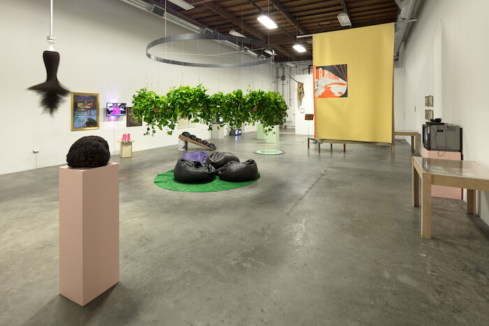
If your first associations with Colombia are cocaine, paramilitary violence, and the rapacious plunder of natural resources by neo-colonialist corporations, then you are only half right, according to this spirited, unkempt, and organizationally flawed exhibition of Colombian artists at The Box, Los Angeles. Along with all these clichés (eagerly resold to Western audiences through film and television), Colombia is a society of familial warmth and communal resilience, a place where humor, love, and magic play important roles in the survival of its people.
Curators Víctor Albarracín Llanos (who is Colombian) and Corazón Del Sol (who grew up there) allow all of these narrative threads to entwine through the work of 32 artists, most of whom live in Colombia but some of whom now reside elsewhere. One is Los Angeles-based Gala Porras-Kim, who fled Colombia when she was a child, packing hastily in the middle of the night after her family was threatened. The small trove of items she brought with her is arranged on a low table as an untitled and undated installation: comics, letters, some dried leaves, and a cheat sheet for Mortal Kombat 3 (1995). Collectively, the objects reaffirm a tired narrative of dysfunctional Colombian life, but individually they …
November 1, 2017 – Review
Elaine Cameron-Weir’s “wave form walks the earth”
Andrew Berardini
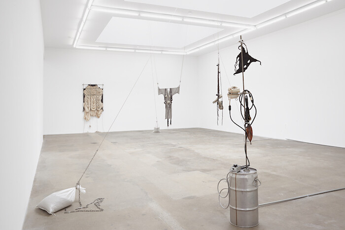
The medieval wardrobe of a sadomasochist, the secret torture chamber gear of a conflicted superhero, grim relics of gods from the deepest abysses of a broken dimension, or, as they truly are, artworks, sparsely hung, dangling from ropes, splayed like bodies, and rippled into curtains of parachute silk, with one emanating scent (as has become a regular ritual in Elaine Cameron-Weir’s exhibitions). Here it’s the ancient aroma of freshly warmed labdanum cooking in a laboratory heating element.
Nearby, cast pewter breasts and belly dangle from the fine mesh of a long-sleeved chainmail hauberk, shouldered with leather harnesses, a long, thin metal tube spreading the arms in prayer or supplication, all hanging in the air with industrial pulleys anchoring it to the hard cement floor with a cinched sandbag. The scenography of the last bit makes it feel like a prop in some lost play by H. P. Lovecraft costumed and propped by H. R. Giger. A sinister future or distant present, the clandestine fetishes hidden in the dungeon of our collective psyche. A fucking awesome costume to a really sick goth party.
The artist lends her voice to the curious titles of these works—the hauberk’s named dressing for altitude (2017)—but even more …
July 10, 2017 – Review
"At this stage"
Travis Diehl
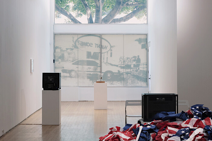
Where to begin? Where else but at this stage? A cotton boll embalmed in a bell jar like the Disney rose in Beauty and the Beast (1991): Aria Dean’s Dead Zone (1) (2017) gives the rose’s place to a white commodity once harvested by black people made commodities. The cotton stands there like a badly conserved museum piece that still reeks of shame. But there is a current charge, too: viewers can take their photos, but they’ll have to wait to post them. Under the bell jar’s oversized base, Dean has hidden a signal jammer modeled on the ones Beyoncé’s bodyguards use to scramble any cell phone in the star’s radius. We are at the stage where a celebrity needs military-grade technology to stage-manage their image—and meanwhile in the ongoing spree of police murdering black Americans, video evidence earns no justice, only spectacle.
Dean’s is the first piece inside gallery Chateau Shatto for this summer of 2017; this is a topical group show, and the topic is a gut check of American exceptionalism. At this stage! The phrase suggests a sequence, a disease—progression, if not progress—like the shot holding on a film of a skyscraper in Sturtevant ‘Warhol Empire State’ (1972). …
June 9, 2017 – Review
Brian Bress’s “In Lieu of Flowers Send Memes”
Andrew Berardini
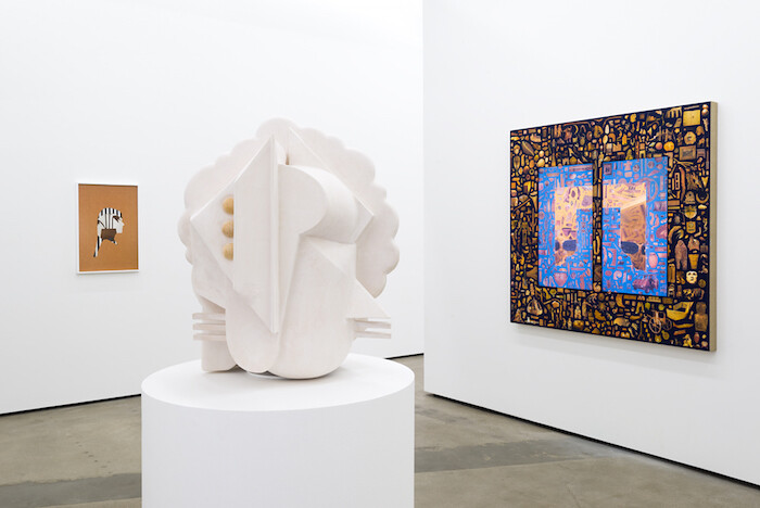
Here’s the latest Spring menswear line worn by the hottest male models of the twenty-eighth century, those jaunty scions of cyborg overlords. Our wetwear bodies found a hardware durability after we and our machines, long flirting, finally coupled. Moodily lit with mint and hot pink, humanoid bods sport flight jackets and tennis togs and fencing uniforms with patterns like alien cryptography, their sculptural faces as interchangeable as their clothing. Once the singularity curves past us, why wouldn’t we change our faces at will? Who needs a mouth when we can communicate telepathically, plug in for nourishment? These head-sculptures angle with Bauhausian geometries and deco motifs, the curves of Incan spaceships and patterns of ancient Greek friezes. All of it soft and foamy. Even cyborgs yearn for a little pliability. The models gently revolve on screen, giving us the whole fit, a catwalk turn, even as those bods stay otherwise still in their languorous revolutions. Nearby, the heads of these on-screen models sit on plinths in all their bend and ornament, ready for a discerning consumer to find the expression that fits their fast-paced cosmic lifestyle, a new head for a new season.
Brian Bress has long been casting characters and creatures …
April 25, 2017 – Review
“Concrete Island”
Travis Diehl
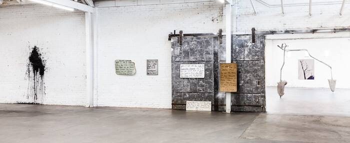
Word on the street is they got the Crenshaw Cowboy. Into a gallery, that is. Anyone who has turned onto the westbound I-10 at Crenshaw Boulevard has likely noticed him, an itinerant junk-assemblage artist who shows his sculptures at the top of the onramp. He also gives advice on fame and creativity, by way of hand-painted signs—for example, on a curling particle board: “Go into Your Own Creative Mind You are The Master Of Your Thoughts And Behavior. If Anyone Stress’s [sic] You Out… You Allowed it… You’re not a Robot Okay : ) Smile.” Five of these signs appear in “Concrete Island” at Venus, Los Angeles, a show that, by way of J.G. Ballard’s novel of the same name, romances the aesthetic of those who eke out a living in the city’s gaps.
Of the 31 artists and collectives included, only the Crenshaw Cowboy is homeless. Indeed, a wide gulf separates the rush-hour panhandler from the gallery artist. Add to this the fact that Venus’s polished square footage is part of an archipelago of new galleries gentrifying the warehouse district of LA’s Boyle Heights. The homeless there have been pushed out; nearby homeowners may soon join them. Perhaps the inclusion …
April 18, 2017 – Review
Malick Sidibé’s “Chemises”
Jennifer Piejko
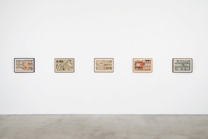
Only someone with a lying mouth, according to Yoruba oral tradition, would speak first and look for visual confirmation second. Untold centuries later, the expression retains its value: photography’s maneuvers depend on the fact that truth is determined by the eye.
The complete history of photography is inextricable from colonialism in Africa—its establishment, rule, and dismemberment. The practice was introduced on the continent almost immediately after its invention, disseminating quickly. Some of the very first silvery daguerreotypes captured Egypt’s grand wonders in the 1840s; by 1853, African-American Augustus Washington had opened Liberia’s first studio in the capital Monrovia, and Senegal’s by 1860. The medium was slower to spread into Yorubaland, taking up until Britain’s drawing of modern-day Nigerian and Beninese borders at the turn of the twentieth century, but the photograph was folded into both ancient custom and contemporary society so neatly that it expanded beyond document and into identity architecture. The staged portrait was a highly orchestrated image, a manifestation of oriki, the Yorubian ritual of lauding someone’s character by making them a subject of praise poetry: a man during odo (midlife) sits alone in traditional dress at the very center of the frame, facing the lens, with a vertical …
March 15, 2017 – Review
Judith Bernstein’s “Cock in the Box”
Sabrina Tarasoff
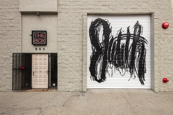
There is no image more prescient of modern displays of masculinity and status than Judith Bernstein’s drawing COCK IN THE BOX (1966), inspired by a history of Vietnam-era bathroom-stall graffiti. Whether those lewd sketches were made to parody politics in wartime, as comic relief for those on the john, for camaraderie, or to alleviate boredom, the big boy’s room provided a space to think patriotism through masculinity. Perhaps Lyndon B. Johnson’s characterization of the penis as a tool to leverage force was an influence: one anecdote has the president, plagued by reporters asking why the United States was in Vietnam, unzipping his pants, pulling out his flaccid cock and saying: “This is why!” No more poignant example of power mislaid.
Such sentiments surely lingered on the mind of Judith Bernstein as she drew COCK IN THE BOX midway through Johnson’s six years in power as US president. The charcoal and pastel drawing opens her exhibition at Los Angeles’s appropriately named The Box, setting a tone of equivocation between politics and entertainment—a timely commentary considering the farcical climate of the United States’s incipient despotism. The sketch is a smudged pastel of a sweetly pink dick sprung from a star-spangled jack-in-the-box. Beneath a …
February 22, 2017 – Review
Terence Koh’s “sleeping in a beam of sunlight”
Jonathan Griffin
Over the decade and a half of his career to date, Terence Koh has generated so many myths that it is now nearly impossible to begin thinking about his work without first acknowledging the tales of his personal and professional decadence in New York during the pre-crash mid-aughts, or the story of his apparent atonement when he faded from hypervisibility following his 2011 show “nothingtoodoo” at Mary Boone, New York, retreating with his partner to a mountaintop in the Catskills. The legend is threadbare from retelling; you’re at a computer—if you don’t already know it, Google him. Better, instead, to start with some facts about Terence Koh in 2017.
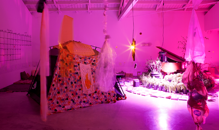
On the roof of Moran Bondaroff gallery in West Hollywood, Koh has built a beehive with a door big enough for humans to crawl inside. Above a mesh screen, teeming live bees build honeycomb between wooden slats. The hive—titled bee chapel (2017), the third he has made after a prototype in the Catskills and a version for his 2016 exhibition at Andrew Edlin Gallery, New York—stands on a rustic wooden platform perhaps six feet high, beside a temporary rooftop garden. Lavenders, sages, yarrow, fruit trees, leaf vegetables, and herbs grow in pots, …
January 6, 2017 – Review
Paul Thek
Jennifer Piejko
There is no more poetic organ than the human heart: a blood-soaked snarl of muscle tissue whose constriction is our literal life force, its cadence—its pulse—has been held accountable for not only bodily function but as the instrument of conscience, intention, love, and courage; a spiritual and corporal engine. The Bengali poet Rabindranath Tagore grasped its virtue on both planes when he mused, “That I want thee, only thee—let my heart repeat without end;”(1) W.H. Auden composed a number of verses over his concern of the amiss desires and capacity of a crooked one. Pre-Columbian Aztecs extracted it, still beating, as a sacrifice to the Sun God; for Roman Catholics, divine love radiates from the Sacred Heart of Jesus—and may it set ablaze all of ours with His love and mercy.(2)
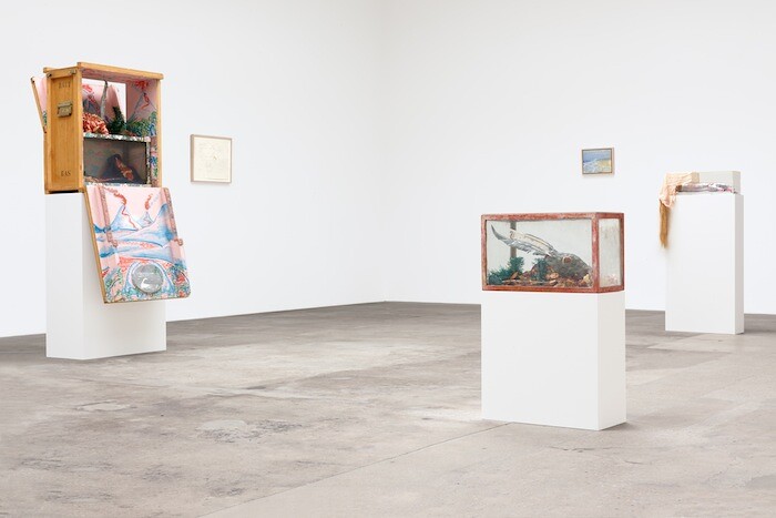
Paul Thek—supermarket attendant, artist, occasional expatriate, diver—was raised Catholic. The work he made in his shortened lifetime, before dying of AIDS-related illness in his mid-fifties in 1988, often displayed a carnal sympathy toward entropy and (its) beauty, intimately embellished, longingly ritualistic—catholic in the comprehensive sense, and anything but devout. Visiting the Capuchin Catacombs in Palermo with his lover Peter Hujar, Thek fell into a macabre exhilaration, wandering through the 8,000 …
December 6, 2016 – Review
Isa Genzken’s “I Love Michael Asher”
Travis Diehl
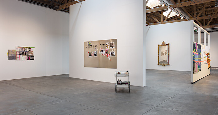
In a shallow bay window facing 2nd St., a ledge overflows with studio clutter: a couple dozen euros in coins between a few dying plants; a bowl filled with loose earrings and studs; a keycard from the Waldorf Astoria; a castle of used tea candles, Red Bull cans, and tiny uniformed figurines (cops, or Luftwaffe), all iced with white paint. One only wants the empty blue ashtray to overflow with butts to complete the quintessential image of an artist at work. The setup doesn’t just mimic; nearly every object has been shipped from Genzken’s studio in Berlin, down to the ledge itself. The extant window has been remodeled and a radiator sourced to match the original. (Genzken’s actual desk is here, too. So is a reproduction of a studio wall.) Her process has seemingly been frozen, portioned into discrete pieces, and mailed to L.A.
The collages and assemblages, accordingly, are laced with the leftovers of art handling, packing and unpacking; one trio of works is laid out on their boxes; several pieces include tape marked with the D’ART® logo of a transatlantic shipping company. (All works are from 2016 and, except where noted, untitled.) Other sculptures feature German shopping bags. An …
November 2, 2016 – Review
Marnie Weber’s “Chapel of the Moon”
Andrew Berardini
During the day, Halloween masks look pretty cheesy. Hanging from the drugstore rack’s seasonal aisle under the terrible clarity of fluorescents and the afternoon sun, it’s hard to image these killer clowns and fat-cheeked Frankensteins frightening anyone. Their warped faces and weeping pustules, yellowed horns and sharpened teeth, all a static, cartoonish fakeness crinkling in the soft latex.
But they do frighten, only in the right place. Or better yet, they let fright happen.
Night shadows make those masks less costume and more possibility, the cheap details worn away with the darkness. The contrivances of Halloween allow for the playacting of fear and violence, a space and costume to exorcise one’s inner demons by becoming them. And besides all that, the freaks come out at night. Who makes a monster? The feared, the outcast, the othered. Most of us find easier affinity with the monsters than with the pitchforked mob that sometimes chases them.
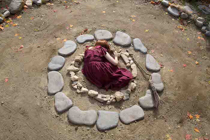
In the darkened gallery at Gavlak, Marnie Weber gathers a coterie of monsters with stacked Halloween masks under a weeping willow dangling shards of stained glass. Along the walls hang a suite of pagan collages and through a dark doorway church pews face a screening of the artist’s first …
October 21, 2016 – Review
Hanne Darboven
Jonathan Griffin
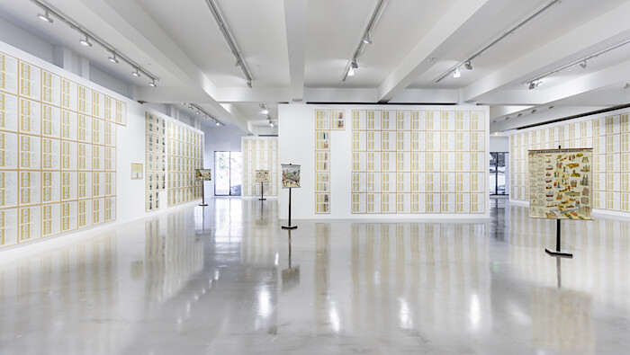
Rows of numbers instill in me a sickening panic. I got that feeling, familiar from childhood mathematics lessons and annual tax returns, in Hanne Darboven’s current exhibition at Sprüth Magers, Los Angeles.
Perhaps there was no need for such histrionics. In 1973, the West German Darboven told the writer Lucy Lippard that her art has “nothing to do with mathematics. Nothing!” For Darboven, numbers were a means of marking out time and space, “writing without describing.” For the most part, her work is not as concerned with calculation as with counting. Numbers, written sequentially, are akin to seconds ticking on a clock, days counted on a calendar or beats in a piece of music. (Indeed, in 1979 Darboven developed a system of musical notation which she used until the end of her life, in 2009, to write compositions for chamber orchestras and string quartets.)
Darboven’s work generally consists of gridded pages of annotations and numerical inscriptions, sometimes handwritten, sometimes typed or printed; in 1978 she began including collaged elements such as her photographs and cuttings from books. In a single work, these pages can number in the hundreds or thousands. On the ground floor of the gallery, the staggering Erdkunde I, II, …
July 22, 2016 – Review
“a, the, though, only,” Made in L.A. 2016
Andrew Berardini
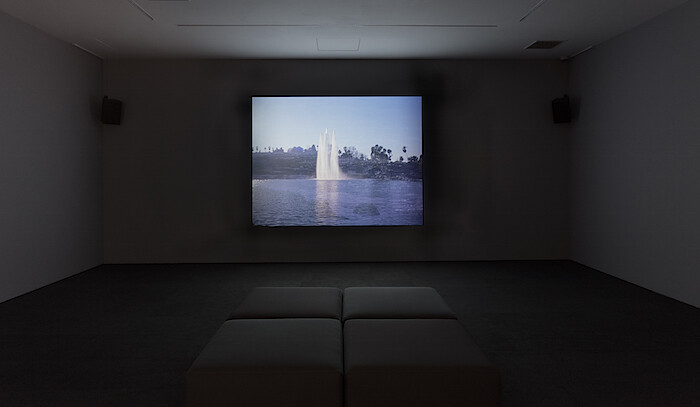
I’ve lost all my pride
I’ve been to paradise
And out the other side.
With no one to guide me,
Torn apart by a fiery wheel
Inside me.
—The West Coast Pop Art Experimental Band’s “I won’t hurt you” (1966), heard in Laida Lertxundi’s Vivir para Vivir / Live to Live (2015)
In LA, everyone’s Marlon Brando’s gardener. Cruising through a city sold and resold as a promised land, we’ve nothing to guide us but our passions for prosperity, for fame, for space, for spirit. All of us here somehow find a place in the end, even if it’s only as workers in others’ gardens, Edens owned by those that cast our dreams in moving pictures and the developers that sell or rent us our own smallest bite of paradise.
Made in L.A. 2016 is almost explicitly not about Los Angeles, though the city’s still the set.
Everyone likes to look in the mirror sometimes, and a localist biennial has some vanity for sure, but the city’s self-regard (Los Angeles again playing itself, to riff on gay porn auteur Fred Halsted through cine-essay maker Thom Andersen) has been finally outpaced by others’ regard for it. Such biennials can easily be read as a trend report for …
June 1, 2016 – Review
K.r.m. Mooney’s “Oscine”
Jonathan Griffin
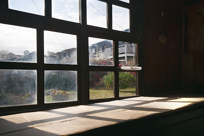
Since it is impossible to say—in the work of K.r.m. Mooney just as in the world—where one thing ends and another begins, it seems appropriate to start by considering the structure that houses this exhibition. An ancient wooden shed, it was once a garage for the large Craftsman home it sits behind, built in 1906. Wide sliding barn-like doors open onto patched timber walls and a cracked concrete floor stained from years of dripping motor oil. Weeds sprout through some of the cracks and papery pink bougainvillea petals blow in from the garden. As a concession to the aesthetic formalities of the white cube, a pristine white rectangle of wall divides the front gallery from the storage area behind.
There are only two artworks on the checklist, though the exhibition—titled “Oscine”—comprises many more parts. A case in point: the first work on the list, Accord, a chord (all works 2016), consists of two small box-like sculptures placed on the floor of the gallery. A diptych, if you like. Their dimensions reminded me of external hard drives or books—dictionaries perhaps. Both allusions are pertinent. As with most of Mooney’s work, each is a combination of modified and crafted elements: in this instance, …
May 4, 2016 – Review
Robert Morris & Kishio Suga
Stuart Munro

Words, like the gray matting in Robert Morris’s Lead and Felt (1969/2016), are woven. Yet, like these felt strips, descriptions shift. In a shared context with Kishio Suga’s Parameters of Space (1978/2016), material and form take on meanings that bend, twist, and track the local climate. The immediate world provides a particular field of reference, the imperfect translation of one language into another. Moving between objects positioned by hand, you can’t help but be aware of their interest in borders and boundaries.
Lead and Felt was originally made for an exhibition at Castelli Gallery in New York, after which it was lost and then remade. Morris came to interpret L-shaped lead and felt strips in later life as an echo of another work created for the show, Scatter Piece (also 1969), that also went missing. Whether exhibited, stored, or thrown into some distant landfill, they became an expression of how transient objects are and how resilient an idea can be. The original Scatter Piece is buried somewhere in New Jersey, casting what Morris describes as a “shadow” over later iterations.
Parameters of Space was made for Kishio Suga’s 1978 solo exhibition at Gallery Saiensu, in Morioka. His interest in borders was laid …
March 8, 2016 – Review
Seth Price’s “Wrok Fmaily Freidns”
Sabrina Tarasoff
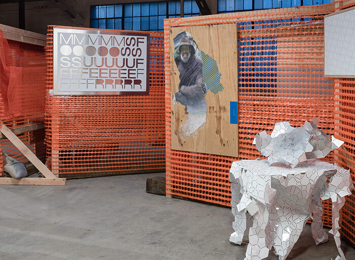
To cut to the chase: Seth Price banks on banality. Bides his time building constructs, rather than content; repeating forms overblown by rhetoric. Most famously, his oft-cited essay “Dispersion” (2002) has served as justification for the material choices made in his career, quoting—nay, preaching—redistribution of existing materials as alternative currency to the creation of new form as dictated by the demands of the art market. But, like items made of reclaimed wood at Crate & Barrel, so altruistic and self-aware in offering a way out from buying into all that “new” stuff being made, so too is Price’s art part careful marketing. What’s for sale seems to be the illusion of escape, or capitalism re-branded and snazzily packaged as an “alternate economy”—books readily available to download online, paintings pushing 200k. Quid pro quo. But in the context of post-1990s New York, as long as you’re self-aware and inclined to irony, double standards seem to be okay: after all, participation with the market is measured only in terms of how self-conscious of it you are, or how eloquently you can copywrite that relationship.
Eloquence, at that, can assume many guises and at Los Angeles’s 356 S. Mission Rd. it appears as Price’s …
March 3, 2016 – Review
David Snyder’s “2THNDNL”
Travis Diehl
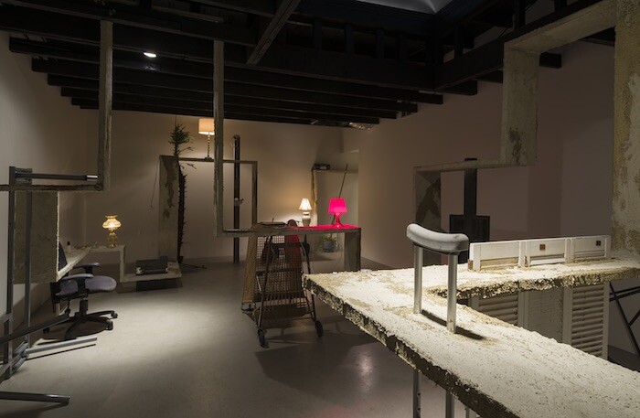
Happy? Ronaldreagan. Hungry? Ronaldreagan. Afraid? Ronaldreagan. Invoke him often enough and The Gipper’s name passes from rote signification into a malleable abstraction. All too easy—as David Snyder demonstrates in “2THNDNL” with the video Ronald Reagan, Fathers & Sons (all works 2016). Dozens of jaws, clipped from TV’s talking heads, from Paul Ryan to Barack Obama—sometimes comped below the forehead of another to form a rhythmic exquisite corpse—speak, ad nauseam: “Ronald Reagan.” The syllables slur toward pure intonation. On a wall opposite this video is a second: Swansong, a supercut of snarling dogs. The cacophony, and the numbness that follows, figures our present national discourse. Never mind the gulf between that pragmatic movie cowboy and today’s nativist publicity hounds. Love him or hate him, this is a Reagan even apolitical animals can understand.
Debased rhetoric? Snyder’s got shovelfuls. In a small screening room at the gallery’s center plays The Guano, a lucidly manic pitch to “retrofit” our nation’s thousands of derelict Blockbuster Video outlets as bat colonies—and thus, per Snyder’s voiceover, “fundamentally rebrand and rebuild a Blockbuster empire and comfortably dominate the bat shit industry.” Great news for business. And for the left? It’s true, as Snyder points out, that runoff from …
February 8, 2016 – Review
"Jean Baudrillard’s photography: Ultimate Paradox"
Jennifer Piejko
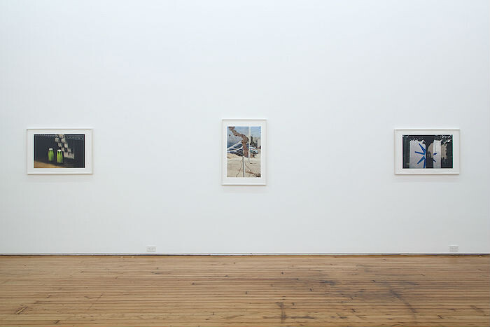
In “Ultimate Paradox,” swaths of rich, saturated color hang across each of 20 framed photographs. Rust-hued powdery tree trunks overshadow a flittering, out-of-focus leafy green background (Alentejo, 1993), an angle which would have required the photographer to climb several meters into the tree’s branches; the acid-azure knotted tree trunk shot in Vaucluse (1992) matches an overstuffed pillowcase in Paris (1985) and a taut plastic tarp ceiling installed in Rio (1996); the dripping crimsons of two lone cafe chairs planted outside in late-afternoon Luxembourg (2003) mirror the sanguine velvet regally draping an armchair in Sainte Beuve (1987); and the reflection of an orange car buoys upside-down on an inky pond camouflaged by celadon and electric chartreuse lily pads in the gorgeous Brugges (1997), whose delicate floating leaves’ green is picked up in a pair of ragged concrete posts on the shore caked with moss streaks of the same shade in Amsterdam (1992). Titled after the city in which it was taken, each giclée print, screened on pure cotton paper, is empirically visually pleasing, a tasteful selection of aspirational-lifestyle and global-traveler snaps.
Sainte Beuve also covers The Conspiracy of Art, Jean Baudrillard’s 2005 limb-from-limb dismantling of the global contemporary art system. Perhaps his …
February 1, 2016 – Review
Art Los Angeles Contemporary and Paramount Ranch
Myriam Ben Salah
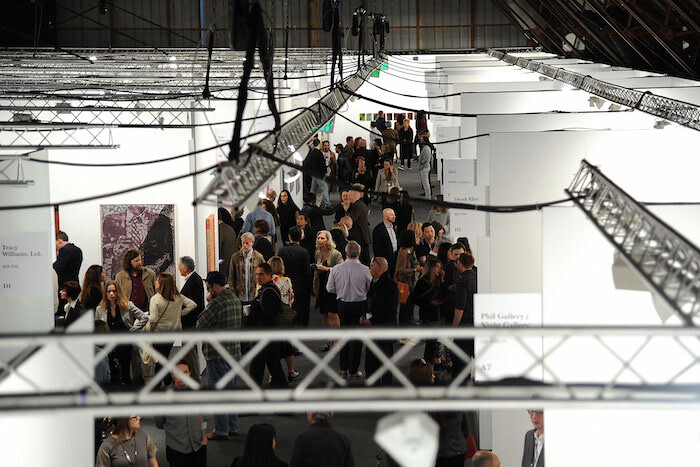
At the risk of immediately doing away with any probity or intellectual credibility whatsoever, I have to confess that the last thing I watched on my computer before landing in Los Angeles was an old episode of “Keeping up with the Kardashians” featuring the over-the-top wedding of Kim Kardashian and Kanye West. Upon arrival at LAX airport, the first thing I saw while leaving the Tom Bradley Terminal was Kanye West himself, tucked in a 400,000-dollar white Rolls Royce blasting tracks from his soon-to-be-released and eagerly awaited album WAVES.
This instant of serendipity reminded me of how Los Angeles is, in the words of Jean Baudrillard, hyperreal—a place that doesn’t allow consciousness to distinguish reality from its simulation. Not by coincidence, and confirming the relevance of the French theorist’s thought to a city such as LA, Chateau Shatto is currently exhibiting “Jean Baudrillard’s photography: Ultimate Paradox,” an exhibition of his own photographic works. The city’s hyperreality seemed to be the overarching theme of both the handful of art fairs taking place around town as well as that of the art itself. Art Los Angeles Contemporary (ALAC), the big-ticket stalwart located in a repurposed hangar of Santa Monica Airport, might be the …
December 21, 2015 – Review
Simone Forti’s "On An Iron Post"
Andrew Berardini
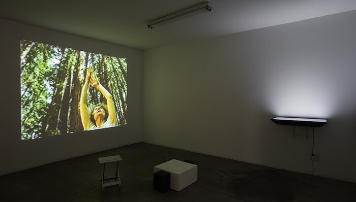
Dear Simone,
Your performances are the jump and splash of a brook, the color of a found leaf, a painted flag wrapping a woman as the river dances around her. At 80, your nimble movements inspire. When I stop to read back about your lifetime of accomplishments and confluences, I can’t help but admire you all the more: learning improvisation with Anna Halprin in San Francisco in the 1950s; trying and moving into your own through the techniques of Merce Cunningham, Martha Graham, and Trisha Brown; your presence at the birth of Judson Church; your collaborations with Yoko Ono, La Monte Young, and Terry Riley. Just a few flickers from an enduring and illustrious career. I see all those layers and life here in your videos, objects, performances, deepening the grace of your movements and the susurrus of your words, knowing that such simplicity is not easily won.
In the long, high gallery at The Box, I watched the water crash and shiver over the stones on the monitor in Northeast Kingdom (2015), the headphones sounding a dinner conversation between two men about geography and Vermont. Plucking the headphones off (always like wearing an insect when looking at art), I turned to …
October 30, 2015 – Review
Mike Kelley
Kim Levin
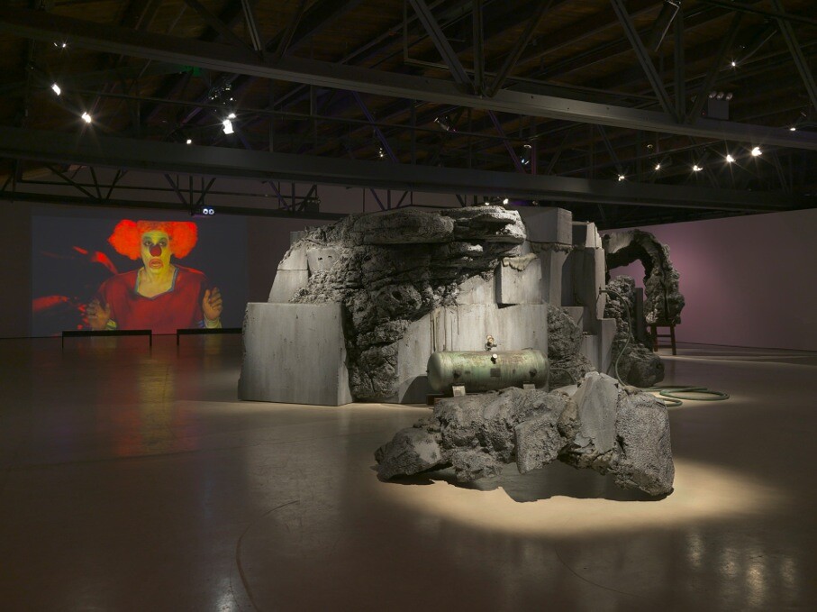
Astute observers in the art world were puzzled by Mike Kelley’s move from Metro Pictures to Gagosian in 2005. It seemed as if he had left a warm and supportive family concern for the cold new world of unfettered late capitalism. In the wake of the artist’s 2012 suicide, there was further bewilderment when his estate moved to a different mega-gallery, Hauser & Wirth. Why on earth, wondered my editor when she commissioned this review, would they move from one international blue chip gallery to another?
This posthumous exhibition at Hauser & Wirth provides one answer. Organized in cooperation with the Mike Kelley Foundation for the Arts and former MOCA curator Paul Schimmel, now director of Hauser & Wirth’s new Los Angeles branch, the show is revelatory: smartly put together with love, insight, and admiration. They knew exactly what to show, how to show it, and how to give it context and sense. They even tried to cast a hopeful light on Kelley’s dark vision. Speaking at the press view, Schimmel said Kelley was dealing with an “epic otherworldly pursuit and the surrealist tradition.” His “sculptures of the unconscious” were “recycling the sense of monumental failure,” seeking “a place to go …
October 16, 2015 – Review
“The Avant-Garde Won’t Give Up: Cobra and Its Legacy”
Rachel Wetzler
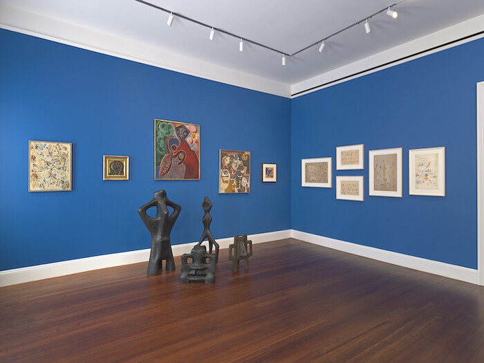
Cobra, a short-lived association of artists based in Copenhagen, Brussels, and Amsterdam who published an eponymous journal from 1948 to 1951, has the dubious honor of being frequently invoked as a locus of postwar avant-garde activity in Europe, while its works remain all but invisible outside of the group’s native northern Europe. The two-part exhibition “The Avant-Garde Won’t Give Up: Cobra and Its Legacy,” split between Blum & Poe’s New York and Los Angeles locations, aims to be a corrective to this invisibility, as well as to the dominant understandings of Cobra as merely a Situationist precursor or, worse, a minor regional variant on Abstract Expressionist and Informel painting.
The first half of the exhibition, in New York, is a historical survey primarily comprising works from the 1940s and ’50s. It opens with Cobra member Asger Jorn’s painting L’avant-garde ne se rend pas, from which the exhibition takes its title. Part of his 1962 series “New Disfigurations,” found flea-market canvases overlain with childlike doodles and gestural marks, it is a vulgarized portrait of a young girl, redolent of Biedermeier kitsch, to which Jorn has added slightly menacing stick figures and, in a pastiche of Duchamp, a moustache. The titular slogan, scrawled …
September 1, 2015 – Feature
Felix Gonzalez-Torres’s "1990: L.A., ‘The Gold Field’"
Felix Gonzalez-Torres
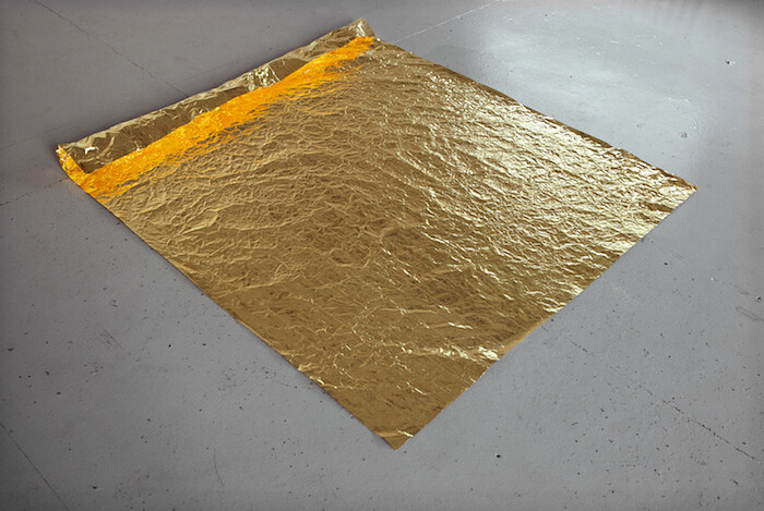
A dialogue made of gold: such was the conversation between artists Roni Horn and Felix Gonzalez-Torres, initiated in the early 1990s and only interrupted due to Gonzalez-Torres’s death in 1996. It all started on a spring afternoon in 1990, when Gonzalez-Torres, along with his partner Ross Laycock, visited Horn’s solo exhibition (April 22–July 22, 1990) at Temporary Contemporary, the temporary venue of the Museum of Contemporary Art in Los Angeles, and encountered her 1982 work Gold Field.
Placed directly on the floor, Gold Field consists of a large and thin rectangular sheet made of one kilo of pure, annealed gold. Gold Field presented itself as “a new landscape, a possible horizon, a place of rest and absolute beauty,” giving the couple solace from their dramatic situation: Laycock was dying of AIDS, surviving the show only by six months, and the overall vision of the U.S. as a country that was facing “the abandonment of the ideals on which (it) was supposedly founded” was somber and asphyxiating.
Three years after this encounter with Gold Field, Gonzalez-Torres and Horn meet. Touched by their common affinities, Roni Horn sends Felix Gonzalez-Torres a square of gold foil, a sheet similar to those made by the …
July 31, 2015 – Review
Willem de Rooij’s “Legal Noses”
Jennifer Piejko
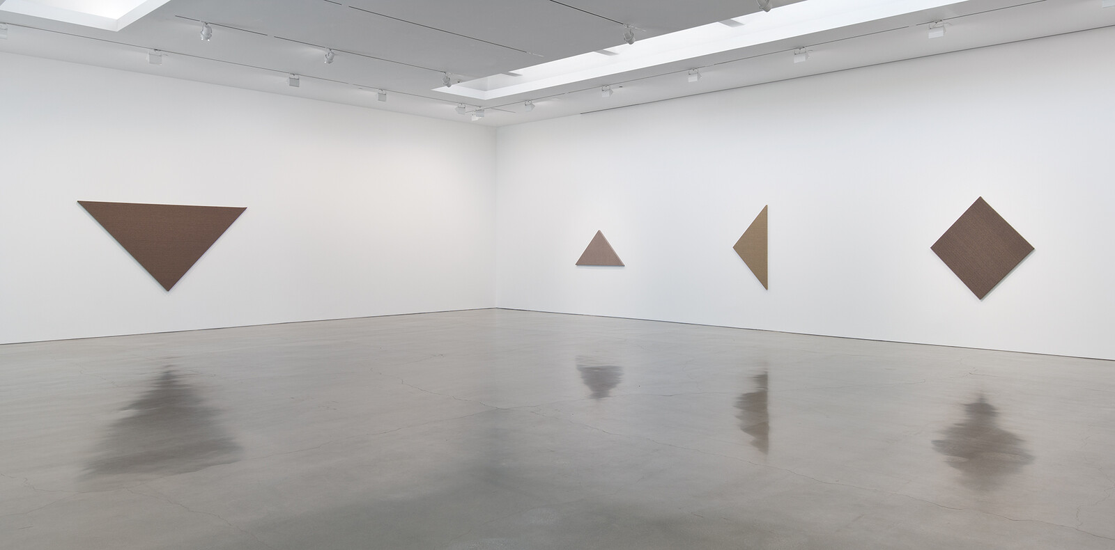
Brown is a composite color, made by combining complementary hues—a warm neutral. It’s only itself when contrasted with a brighter shade; fuschia or aqua always appear so, while brown is brown only in comparison to another color; its visibility is dependent on the color next to it. Over centuries, brown’s association has changed from one with poverty and drab rusticity to virtue and wholesomeness—softly wrinkled brown paper bags for simple school lunches; the conscientious consumer opting for brown rice or sugar or toast over white; unrefined, unbleached napkins.
Beige. Elegant and dispassionate, beige has the warmth of brown and the coolness of white, and, like brown, is often dull—a background shade. Another chameleon, its perception is mediated by what’s adjacent; its temperature is unstable.
The seven wall works in Willem de Rooij’s new exhibition are each one part of a tangram, a simple Chinese puzzle in which this family of shapes come together to form a rectangle, or one of 6,500 other possible outcomes. First marketed in Germany in the late nineteenth century, they were often carved from stones or imitation earthenware, similar to the color scheme here. Each piece, or tan, is a shape of stretched fabric enlarged to several feet …
July 24, 2015 – Review
Sojourner Truth Parsons’ “I Got Allergies”
Andrew Berardini
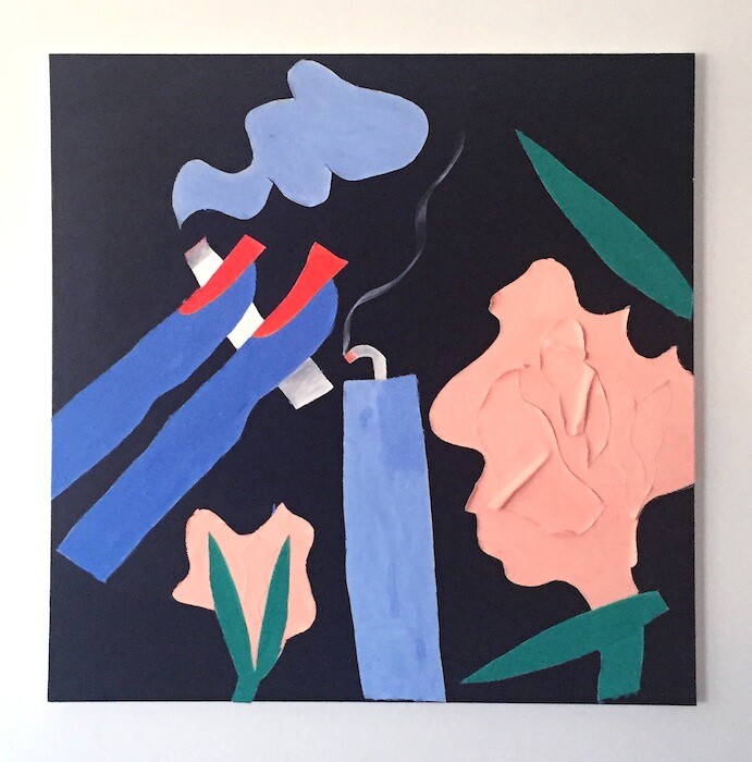
The soothing whispers of the song drift beneath the shift and chatter of the opening party like a lavender mist, velvety fingers. The next door gallery was open but not opening. Empty, its harsh white lights beam like a drugstore. But here, the light is softer. Everything is softer.
Ooh baby / yes ooh baby / When we’re out in the moonlight / Looking up on the stars above / Feels so good when I’m near you / Holding hands and making love.
“Baby” by Donnie and Joe Emerson isn’t officially part of Sojourner Truth Parsons’ first solo exhibition in Los Angeles (itself only the second show at the newly-opened Phil Gallery). But, hearing it on repeat during the opening, its sad longing and gentle desires reveal her aesthetic too perfectly to ignore, soundly shaping the various collage paintings, the ebbing video, and curious sculptures. Written and recorded by the teenage Emerson brothers on a farm in 1979, their record sold only a few copies, and its expense almost bankrupted their family. A collector purchased a thrift store copy in 2008 and, thirty years later, Dreamin’ Wild (1979) became an underground sensation covered by LA cult hero Ariel Pink, who described “Baby” …
February 2, 2015 – Review
Art Los Angeles Contemporary, LA Art Book Fair, and Paramount Ranch Los Angeles
Andrew Berardini
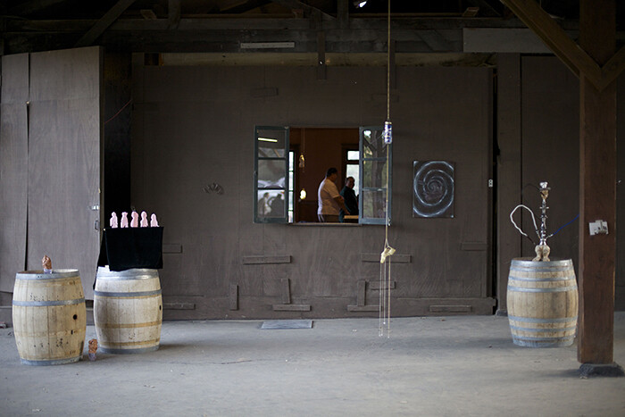
No one intended it to begin with assfucking and passed out hippies. But there it was.
Past freeways of traffic and a phalanx of security guards, I stepped into Art Los Angeles Contemporary (or the acronymical ALAC) last Thursday night and glanced to my right to see Milavepa, a 1966 painting by Duane Zaloudek at Rome’s Monitor, with which solid smooth planes of color depict in geometric abstraction a plump pink ass getting penetrated with a perfect white rod. On the floor in front of it lay a Paul Thek-ish sculpture of a fucked-up hippie by Nathaniel Mellors (Fallen Neanderthal with Boxed Visions, 2015), his shaggy head encased in a plexiglass box. Irreverent and a bit dark, weird and desirous, a little bohemian but hardly downbeat, injected with its own special feeling of togetherness. In other words, the vibe of Los Angeles amidst its threesome of fairs: ALAC, the LA Art Book Fair, and Paramount Ranch.
ALAC served as the most classic of the trio. Classic as in a large, semi-anonymous space with booths and carpets, cleanly apportioned and seriously wrought but hardly unique. The glaze of white booths and industrial carpet aside, there were certainly more than a few artworks that …
November 10, 2014 – Review
Sayre Gomez’s “I’m Different” and JPW3’s "32 Leaves, I Don’t The Face of Smoke"
Jonathan Griffin
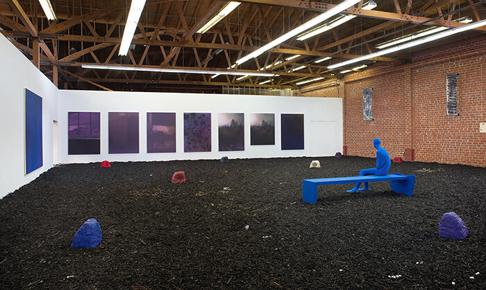
Someone has cut a large hole in the chain-link fence that separates Los Angeles’s François Ghebaly Gallery and Night Gallery. Perhaps eight feet in diameter, it is large enough to drive a car through and at the opening of concurrent recent exhibitions by Sayre Gomez (at Ghebaly) and JPW3 (at Night), the circumference of the hole was dressed with burning incense sticks, like a low-fi ceremonial portal from one dimension to another.
The hole is #4 (2014), an intervention by John Connor, the fictional artist invented by Gomez and JPW3 (a.k.a. Patrick Walsh) to whom they attribute their collaborative projects. The pair also run a project space in the studio building that they used to share, named Patrick Gomez 4 Sheriff. While it is obvious that both artists enjoy making mischief around issues of individual authorship (John Connor, of course, is played by different actors throughout the Terminator franchise), their solo exhibitions are distinct entities, and any resemblance between the two is, as they say in the movies, purely coincidental.
Which is remarkable because the parallels between the exhibitions are numerous. Both artists could be described primarily as painters, although they both situate their paintings here in a broader material context, which …
July 29, 2014 – Review
David Horvitz
Andrew Berardini
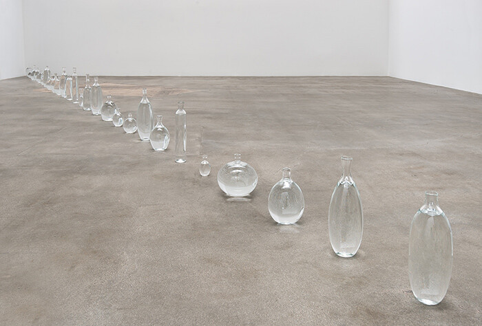
Irregularly and perhaps just a bit irrationally, lawmakers and treaties carve hard demarcations of time from a spinning globe. Workers clock in there, the lunch hour is now here—Daylight Savings Time always confused the hell out of me. Whatever you think noon is, it’s now mostly an abstraction. Time zones emerged out of a need for the trains to keep schedules across long distances, and from the beginning, citizens resisted the co-opting of true time (noon being when the sun is directly overhead), but every country and territory now falls into some imaginary space of time.
The most beautiful of these lines drunkenly dances across the Pacific Ocean, shimmying back and forth across the 180th meridian, the International Date Line. It shifts a calendar with each tick past midnight, dismissing a dead year with the popping the first bubbly on New Year’s. But a few longitudinal notches east an imaginary line of time squiggles around the American state of Alaska, separating it from the Pacific Standard Time that governs Western Canada, the Western United States, a sliver of Mexican Baja California, and a smattering of South Pacific Islands claimed by France, the United Kingdom, and Mexico. Though few clocks are kept …
June 11, 2014 – Review
Frances Stark’s “Bobby Jesus’s Alma Mater”
Jonathan Griffin
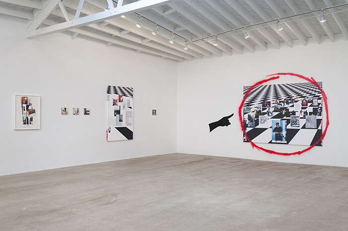
About three years ago, something unexpected happened in Frances Stark’s art. After two decades of making work about herself—about her anxieties and obsessions, her identity crises and motivational struggles—she started making work about other people. Stranger still, her subjects became, in most instances, young men of color.
Stark’s current exhibition “Bobby Jesus’s Alma Mater” features a body of work begun in 2012 when a young Hispanic man by the name of Bobby—a friend of a man she met at her son’s skate park in Los Angeles—became her unlikely muse. Around the same time she was becoming disillusioned with her job as tenured professor at the University of Southern California’s Roski School of Art and Design. Her frustration turned to outrage in 2013 when the university announced that the school would be subsumed by the new 70 million dollar Academy of Arts, Technology and the Business of Innovation, funded by music producer Dr. Dre and his business partner Jimmy Iovine. Stark vented her anger in a major and widely acclaimed video installation, Bobby Jesus’s Alma Mater b/w Reading the Book of David and/or Paying Attention is Free (2013), which she first showed at the 2013 Carnegie International in Pittsburgh. The video introduced …
March 20, 2014 – Review
Walead Beshty and Kelley Walker’s “Hardbody Software”
Eva Díaz
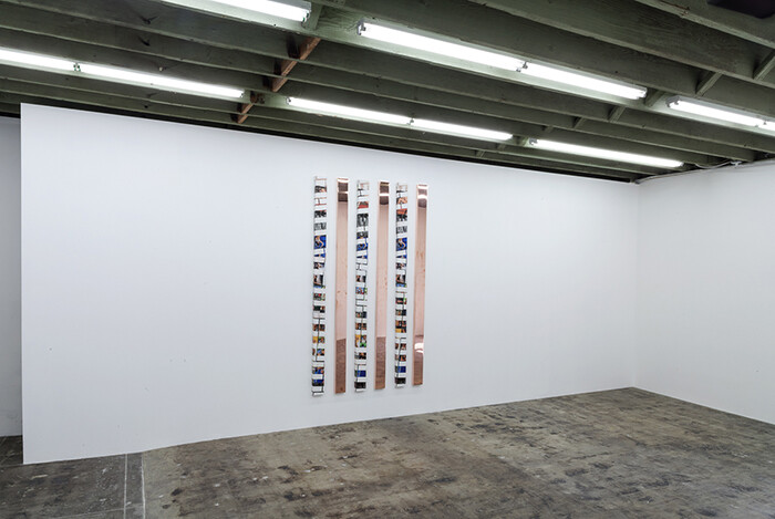
The smell of marijuana was really thick in the air at Los Angeles’s Redling Fine Art. “You can get a contact high just walking into this place!” I blurted out to the woman behind the counter. She smiled broadly already stoned? and informed me that the gallery runs exhaust fans pumping out the fumes. Such is the life of the L.A. art gallerist who moves her trade to a Hollywood strip mall adjacent to a weed dispensary.
Now I have never directly suffered from it secondhand, and yet, the Redling hotbox atmosphere added more than mere olfactory assault to the workings of the Walead Beshty and Kelley Walker joint project (pardon the pun) on view. The sense of something illicit, adolescent, perhaps only tamely transgressive—a smoking-pot-in-the-basement, rec-room kind of vibe—runs through the work, tempered by a slickness that only shrewd experience in the art world can buy.
The gallery is entirely bare, save for the collaborative work Hardbodies Software (2014) standing approximately four feet wide by eight feet high on one wall. It intersperses three tall vertical strips of six-inch wide sections of Walker’s so-called “brick” paintings with three similarly-sized sections of Beshty’s copper “surrogates” (the name is lifted from Allan McCollum’s …
February 25, 2014 – Review
Alexandre Singh’s “The Humans”
JJ Charlesworth
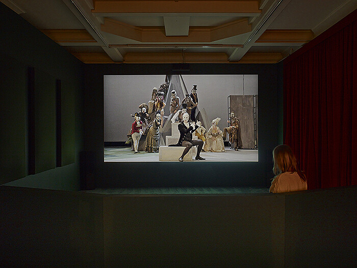
Alexandre Singh’s spectacular, ambitious project The Humans (2013) is not the easiest artwork to discuss. A three-hour, three-act play with music-and-dance numbers, The Humans presents the audience with a wildly absurd remix of an origins-of-man narrative, borrowing and stealing from the Bible, the classics, Shakespeare, and other references too numerous and intertwined to keep straight, all presented in a self-conscious fusion of styles—Greek comedy, Commedia dell’arte, and Broadway musical. It tells a tale of the Apollonian and Dionysian dualism at the heart of humanity, and is, to say the least, engagingly bonkers.
Rotterdam’s Witte de With, where The Humans premiered in September last year, and New York’s Performa biennial, where it ran again in October, both commissioned Singh’s work. Here, at commercial gallery Sprüth Magers, a full-length, for-camera performance is projected in high definition, while the rest of the show includes works on paper, sculptures, photographs, and props either preparatory to, or drawn from, the production itself.
The realities of commissioning and production captured in these objects are certainly not trivial. As much as one might enjoy, and perhaps wish to acquire, the static art objects on view, this exhibition hinges upon our understanding of the process behind the kind of artwork …
February 12, 2014 – Review
Paramount Ranch
Jonathan Griffin
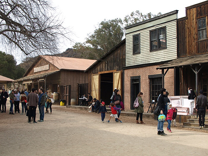
On a recent Saturday morning, while half of Los Angeles’s art community was shelling out ten dollars to park their cars outside the dispiriting aircraft hangar of Art Los Angeles Contemporary, the city’s preeminent art fair, and the other half was trying to find an empty meter downtown for Printed Matter’s enormously popular LA Art Book Fair at MOCA’s Geffen Contemporary, I was heading west on the 101 Freeway, driving fast out of town. After half an hour or so, the houses thinned and gave way to scrubby, dry hills populated by pelotons of cyclists and nervous-looking fire crews.
Paramount Ranch—part of a larger production lot once owned by Paramount Pictures just slightly inland from Malibu—is a Western movie set built in the early 1950s, which is still used for film, television, and advertising. Parts of Gunfight at the OK Corral (1957) were filmed there, and, more recently, the Dr. Quinn, Medicine Woman television series. Never before, however, has the fabricated frontier town been used for a contemporary art fair, which was the somewhat unlikely scene that greeted visitors this particular weekend. The fair was the initiative of Alex Freedman and Robbie Fitzpatrick—founders of Freedman Fitzpatrick, an L.A. gallery barely nine …
February 3, 2014 – Review
"The Body Issue”
Kevin McGarry
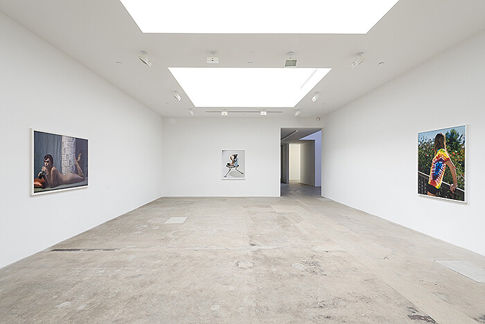
Riding one of the many waves that have made their way across the country from New York over the past five years, Hannah Hoffman, a new gallerist in Hollywood, has opened up her space at the intersection of Highland Avenue and Santa Monica Boulevard, just around the corner from the new Regen Projects space and the upstart Redling Fine Art. To date, Hoffman has showcased the work of several other recent transplants and interlocutors from the East Coast. This includes a recent four-person exhibition with Jacob Kassay, Sam Falls, Matt Sheridan Smith, and Joe Zorrilla, and now, a group show curated by UCLA-educated, New York-based sculptor Frank Benson. This photography exhibition describes itself as a “selection of images,” subtly urging viewers to encounter these works not as manifestations of the photographic medium, but simply as images—that is, like pictures unencumbered by their physical actuality or by the art world’s interpretive conventions. A couple of the participating artists, like Wolfgang Tillmans and Roe Ethridge, have at some point juggled careers as commercial photographers alongside their fine art practices. Mining a territory that exists not in the interstices of art and commerce, but as an overlap between the two contexts, their images …
November 20, 2013 – Review
Dianna Molzan’s “La Jennifer”
Andrew Berardini
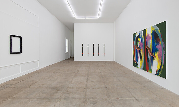
None of these have titles.
I’d like to christen them instead with shifty poems, smoky strings of musical words, or better, give each a dull, quotidian name, culled from tombstones and television shows, like Doris or Louise, Fred or George. These are not the first things to live untitled. Everyday beauties, inexplicable happenstances caught in passing rarely get dubbed or designated either. The brown, seventy-year-old Ford truck with a wooden railroad tie for a bumper and license plate screwed cleanly in place. The single, red leather glove left on the bannister of the long outdoor staircase in the woods, a few drizzled drops gleaming in the bluish light of the overhead LED. The iridescent shimmer and hushed crinkle of a pink chiffon prom dress spotted under a bridge. Casual sightings: ephemeral, rare, nameless.
Dianna Molzan’s crafty ensemble here at Overduin and Kite is more people than things, a weird little gang of frames and canvases left unnamed by their creator; however, each and every one of them is quietly extraordinary. In the first room, a couple of cosmic crocodile eyes stare down an aged teenaged girl completely emptied out except for some still scrunching scrunchies, rendered soft black like a leather jacket …
July 1, 2013 – Review
Wu Tsang
Robin Newman
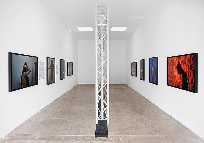
After being featured in both the 2012 Whitney Biennial and the New Museum’s Triennial, the young artist and filmmaker Wu Tsang is set to enter the art world at large in a big way. His film Wildness (2012), which was featured in the Biennial, documented a recurring party Tsang and his friends held at Silver Platter, a legendary bar in the MacArthur Park area of Los Angeles that had been a center of Latin and LGBT communities since the early 1960s. Wildness operates as a documentary while also artfully inserting fantastical elements into its concerns with the party’s place in the bar and the broader issues of transgendered life. Though performative and fictional, Tsang’s two new pieces on view at Michael Benevento in Los Angeles aptly address the sociopolitical as well as interpersonal relations within a community. These relations are frequently explored through performance and the performative nature of narrative film, and this witty melding of fact and fiction itself functions within the artist’s intention and desire to explore how the “narrative” functions in relation to “real life.”
Mishima in Mexico (2012), a film produced collaboratively by Tsang and his scriptwriter Alex Segade, draws inspiration from Yukio Mishima’s 1950 novel Thirst …
April 12, 2013 – Review
Guido van der Werve
Andrew Berardini
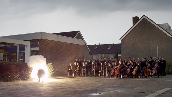
I’m just about to cry when he goes and does something ridiculous.
My weepiness is more a wet testament to my propensity to weep than it is in the weepworthiness of whatever I’m watching, which in this case is Guido van der Werve in his latest film, Nummer veertien, home (2012). On this mission, van der Werve again experiments with how much dour Dutch Romanticism one can pour into epically beautiful tableaux and heartbreaking musical scores before it’s too much. When his pathos threatens to foam over into self-serious kitsch, he does something silly. Pathos turns bathos with a dollop of self-aware slapstick. The second doesn’t exactly cancel out the first but it certainly cuts the froth. It’s as if the artist is self-conscious of the oppressive seriousness of it all and is trying to throw us a bone.
Most of his previous films (numbered chronologically two through thirteen in untranslated Dutch) mix the sublime with the ludicrous. High art forms are played in unusual places: a piano and orchestra float on separate barges in a picturesque river or ballerinas prance in the street. These are usually mixed with some deadpan comedy, the artist getting smeared by a car right before the …
March 28, 2013 – Review
“Made in Space”
Jonathan Griffin
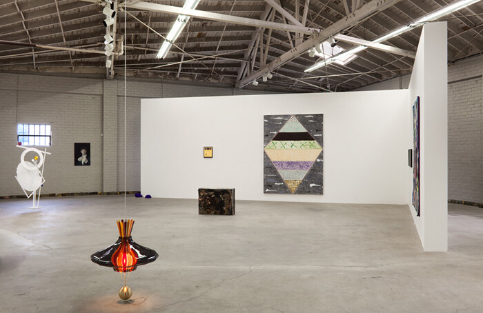
Is it possible to talk about art made in Los Angeles without crediting the city with everything that makes its art unique? Why are artists in Southern California so often asked to explain how their work is influenced by its infrastructure or climate? Is “Made in Space,” the exhibition curated by artists Peter Harkawik and Laura Owens, an antidote to these tendencies or is it a symptom?
Harkawik and Owens make no claims for their selection of thirty artists, though the show’s title is uncannily reminiscent of “Made in L.A.,” the 2012 Hammer Biennial, which pitched itself as “a snapshot of the current trends and practices coming out of Los Angeles.” By contrast, Harkawik and Owens’s thirteen-point exhibition text (in place of a press release) begins with no 1: “Someone drank tea. Someone else felt that a specific kind of taco eaten at a particular geographic location was like a drug. The spices generated a certain kind of energy, or, perhaps, muscle memory. It was 2012.” It goes on to reference a litany of local legends and historical phenomena, from Peter Schjeldahl’s dismissive 1981 essay in The Village Voice about the Los Angeles art scene to O.J. Simpson’s 1994 car …
February 13, 2013 – Review
Jack Pierson’s “The End of the World”
Kevin McGarry
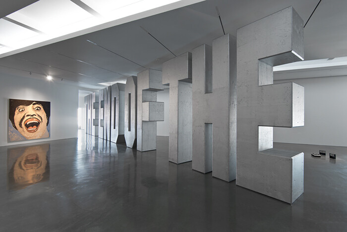
“You gotta love Jack Pierson” begins the flagrantly winking press release the artist wrote for his latest solo show, “The End of the World” at Regen Projects’s new palatial quarters located squarely in Hollywood, California. A literary effort, the statement morphs the typical promotional details of an artist bio into entertainment business buzz: previous exhibitions are described as “comeback attempts,” relationships with large galleries as “big budget studio roles.” Pierson’s rise to commercial success and (having out-earned contemporaries like “It-girl Nan Goldin”) his subsequent expulsion from the upper echelons of art discourse—the gatekeepers of which he refers to as the International Cultural Elite (ICE)—are chronicled here with a well-reasoned paranoia.
He claims, paradoxically, in the third person, that the artist is “oblivious to the fact that museums and art journals had long since slammed the door in his face,” concisely outlining his critical dilemma with the following: “his early downtrodden exercises in blitheness seemed to speak so lyrically about lost youth, AIDS, and Beauty that we became blind as his overpowering self obsession morphed into a topiary of empty cultural signifiers.”
Self-deprecating and clever, that summary may ring true to many. The truth is, of course, you don’t gotta love Jack Pierson, …
November 1, 2012 – Review
Kerry Tribe’s "There Will Be _____"
Kevin McGarry
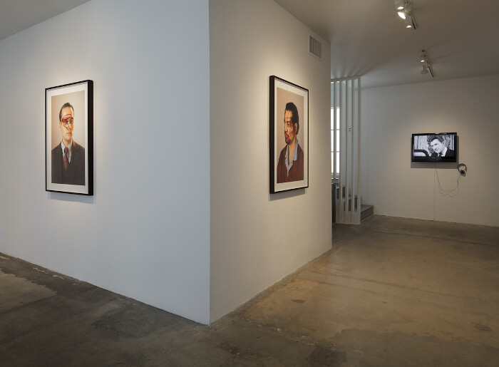
For more than ten years Kerry Tribe has carefully exploited the medium of film to coax a poetics of contradictions out of human mechanisms like memory, cognition, and perception. These subjective, internal workings are what we rely on to piece together a knowable world, though few would argue that their objective reality is more than shadowy. Through close examinations of how different types of personal truths are constructed, Tribe’s films intone the disquiet and splendor of confronting dichotomies. They usually do so in the guise of documentary, built around individuals who offer first-person narratives, for example, a precocious child answering existential questions, or a senior with short-term memory loss recounting recent events.
Her newest work, There Will Be _____ (2012), on view at 1301PE in Los Angeles as the centerpiece of an exhibition by the same name, is a little more meta—and also a little more pop. The subject is not a person but a story itself: the legend of Greystone Mansion in Beverly Hills, which at the time of its completion in 1928 was the most expensive home in California. The house was built for the family of an oil tycoon heir, Ned Doheny, Jr., who was found dead in …
September 20, 2012 – Review
Thea Djordjadze’s “Spoons Are Different”
Laura McLean-Ferris
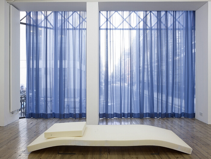
Come inside and I will draw the curtains—shut out the streets and the harsh brightness of day in favor of dim bluish light. And we will find ourselves in a small beautifully proportioned room. You will immediately understand that this is a private space—an environment meant for one person or two. And what will we do here? What has been done before, in this building, located on a gentile Mayfair corner?
In her treatment of Sprüth Magers’s small London space, the Georgian artist Thea Djordjadze has created a psychologically freighted interior. The title “Spoons Are Different” shares a sense of near-familiarity with her work: forms of smudged clarity that we can almost read and fully comprehend, but not quite. As well as installing sets of long, sheer royal blue curtains in front of the gallery’s large windows, the artist has laid sculptures around the interior as though they were items of furniture designed for contemplative purpose. A steel sculpture, Untitled, (all works 2012), has the spindly two-legged proportions of a small desk, a bureau or even a tiny piano, as rendered in outline or frame, yet it is fixed to the wall at a skewed angle, one foot dangling in the …
September 4, 2012 – Review
"Standard Operating Procedures"
Jonathan Griffin
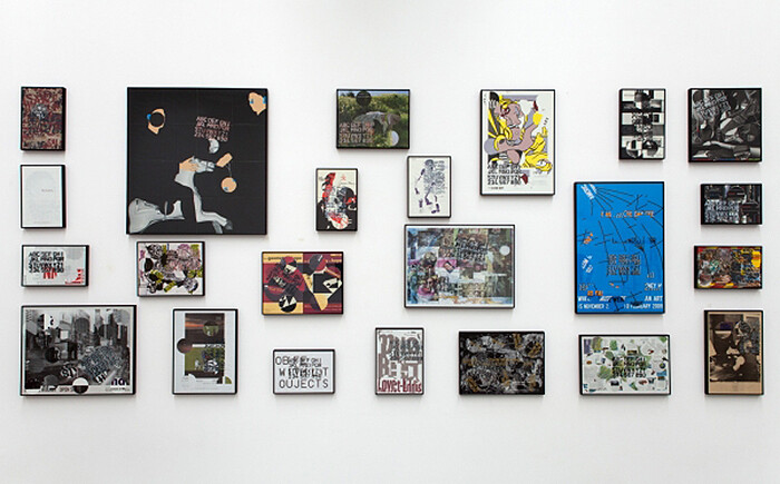
With Tina Braegger, Antoine Catala, Ida Ekblad, Nikolas Gambaroff, Nicolas Guagnini, Yngve Holen, Alex Israel, Helen Marten, John Miller, Olivier Mosset, Amy O’Neill, Sean Paul, Carissa Rodriguez, Greg Parma Smith, Alan Uglow, and Hannah Weinberger.
What is the difference between a “standard operating procedure” and a formula, an algorithm, a set of instructions, a program, a system, a recipe or a run book? This exhibition, which takes SOPs as its theme, never makes it quite clear. But its curator, Piper Marshall, contends in her press release that “Today, SOPs are determining the conditions of everyday life,” through such esoteric formulations as search engines, dating sites, self-help books, and targeted advertising.
Artists have applied rules and systems to the manufacture of their work (at least) since Marcel Duchamp dropped pieces of thread to make Three Standard Stoppages (1913). Painters such as Josef Albers, Alfred Jensen, and Ad Reinhardt distilled painting to a programmatic sequence of actions. Conceptualists including Sol LeWitt and Lawrence Weiner took their methods still further, sometimes to the extent that the rules became the work itself.
Marshall’s exhibition acknowledges this legacy, but is not in thrall to it. We never find out how rigorously obedient the included works …
July 20, 2012 – Review
"Steel Life”
Kevin McGarry
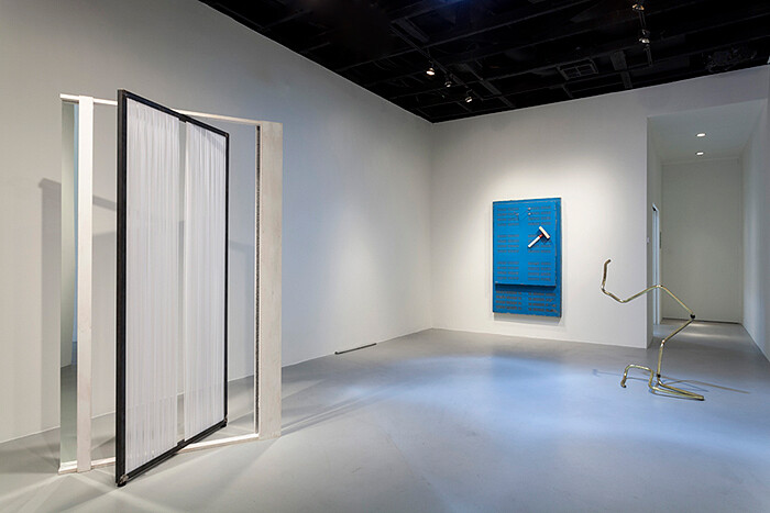
With Wolfgang Breuer, Matthew Buckingham & Joachim Koester, Whitney Claflin, Martin Creed, Melvin Edwards, Ida Ekblad, Sam Falls, Kenji Fujita, Wade Guyton, Allison Katz, Rita Mcbride, Charlotte Posenenske, Sam Pulitzer, Heather Rowe, Gedi Sibony, Michael E Smith, and Anicka Yi
Like its punning title, “Steel Life,” the multigenerational group show curated by artist Zak Kitnick at Michael Benevento in Hollywood, displays the transformation of something common into something edged with spirit. All of the twenty (or so) works included are made of metal that has been altered by physical, chemical, or poetic processes. The architect Rita McBride’s polygonal sculpture is rough and rusty, riddled with an orderly pattern of expanding ovals; Martin Creed’s row of twelve nails are hammered into the wall according to size; Gedi Sibony’s composition of pipes and sprinkler spouts proposes an unoccupied architectural space; the brushy teal oil painting by Allison Katz (a key, watch, and high heel) takes a small square of steel as its canvas; a modular, minimalist, steel square tube by Charlotte Posenenske is stacked from floor to ceiling, with a triangular divot at about eye level; and an experiment by Anicka Yi leaves powdered milk, antidepressants, palm tree essence, and sundry other ingredients …
June 15, 2012 – Review
Jill Magid’s "Failed States"
Eva Díaz
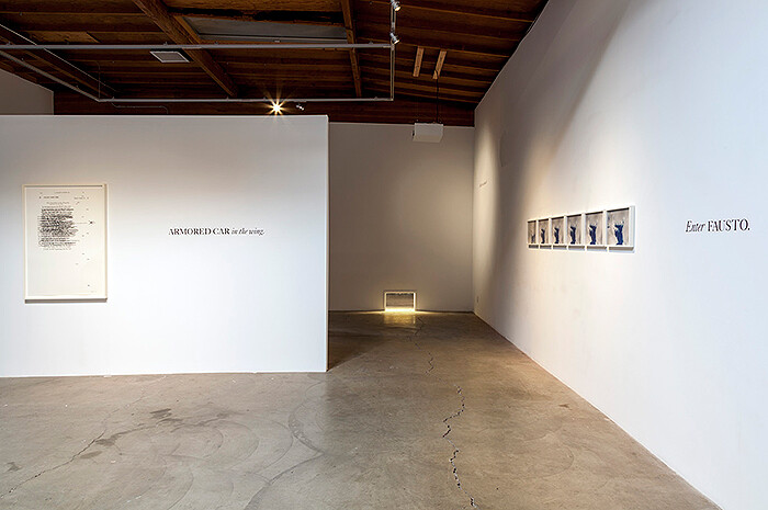
The artist Jill Magid went to Texas, and boy did she have a coinkidink coincidence in true Southwestern style. By which I mean it involved guns. After being invited to create a project for Arthouse in Austin, she became interested in Vanity Fair’s profile of a sniper who had done “work” in Iraq for the U.S. military. She traveled to the area to research snipers, becoming particularly intrigued when she learned about Charles Whitman, an ex-Marine who went on a shooting rampage in 1966, taking some 48 casualties, 16 of whom died, from the 28th floor of the University of Texas, Austin, clock tower.
On her first visit to the area on January 21, 2010, Magid was approaching the clock tower and instead decided to check out the adjacent State Capitol. As she entered the building, she saw a scrum of Texas Rangers tackling a young man to the ground. Fausto Cardenas, a 24-year old from Houston, had moments earlier fired six rounds from a small caliber handgun into the sky from the south steps of the Capitol. As news crews arrived on the scene, Magid was interviewed on camera, suddenly foisted into the role of a bystander to this enigmatic …
May 31, 2012 – Review
Paul McCarthy and Damon McCarthy’s "Rebel Dabble Babble"
Jonathan Griffin
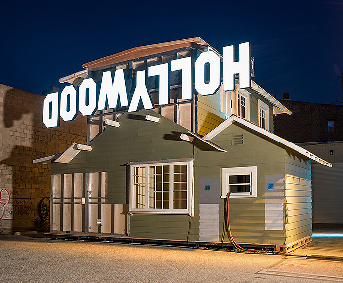
The doubling begins immediately. An exhibition across town, organized by MOCA and James Franco, called “Rebel,” themed (incredibly) around Franco’s resemblance to James Dean, finds its evil twin in “Rebel Dabble Babble.” It began with Franco inviting Paul McCarthy to collaborate on a project based on Rebel Without a Cause (1955), and ended up with McCarthy and his son Damon creating house-sized sets in their studio, staging auditions, filming, and performing in scenes with actors (who played hybrids of cinematic characters and the actors who originally played them) and, ultimately, shooting scenes for a pornographic version of Rebel Without a Cause featuring an actor named James Deen, who, like Franco, is a dead ringer for its original tragic star. A watered-down version of the project remains in MOCA’s exhibition, but at The Box it unfurls into full exhaustive glory.
The main gallery is a dimly lit cacophony of yelling, coital grunting, and howls. Video projections fill the walls and, in the middle of the room, a two-story stage set, a replica of rebel Jim Stark’s home in the film, lies on its side. The first two projections, though differently edited, have the same long title—Fuck you, Pillow Talk, Staircase Argument, Stunt …
May 22, 2012 – Review
John Miller’s "New Realities”
Andrew Berardini
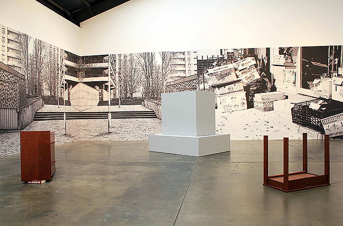
Middlebrow. Middle America. Middle manager. Middle-of-the-road. Middle-age. Middle-age spread. Middle of the day.
The middle is disappearing, or as one prophetic poet put it, the center cannot hold. But it does, sort of. John Miller has placed his finger on it, holding it down like a loose sheet of paper that might blow away.
The middle, for Miller, is most clearly captured in a relatively deadpan photographic project that involves snapping places in the middle of the day. The middle is that soft vague part of anything, the flabby beer belly, the gooey center. Generally the middle is the most reviled. Hated by both the bottom and the top. When Virginia Woolf wrote about high, middle, and lowbrows in a letter published in The Death of the Moth (1942), the highbrows had a fierce commitment to beauty, value, integrity, and the lowbrows committed to the intrinsic pleasure of the physical; both were worthy of praise, but not the middles, who in their pursuit of social rise were only appreciating that which others told them to appreciate, their real pleasures the guilty kind, schlock really. One of the regular gripes heard around America these days is about the erosion of the middle class …
May 9, 2012 – Review
Elad Lassry
Kevin McGarry
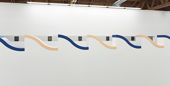
Elad Lassry’s hometown exhibition on Smiley Drive, at David Kordansky’s warehouse gallery in Culver City, presents a spectrum of the artist’s rapidly diversifying practice. Most every component—from photos, to drawings, to sculptures, to architectural interventions—remains both cleverly engaged while also unreachably disjointed from each other. The overall effect is that of a nebulous exercise in plumbing the depths of the subjective acts of perception, to put it in a heady way; or rather, an exercise in looking and seeing, or indeed, the whole range of operations connecting the eye and mind that differ only by subtle, ontological measures: how a viewer places their own intents, focus, presence, while cognition takes place.
In the main gallery, there are two architectural interventions that stand out: a freestanding wall, with wave-like scallops alternating in blue and peach blocks of painted wood at chest-height. This wall runs parallel to a long rectangular aperture punched out at the same height in the wall across the room. These are the two most striking features in the show, and yet it’s unclear whether they surpass their function as framing devices, or if they should be considered artworks in their own right. This taps into a timeless philosophical debate, …
April 1, 2012 – Review
Stanya Kahn’s “A Cave Walks into a Bar”
Sohrab Mohebbi
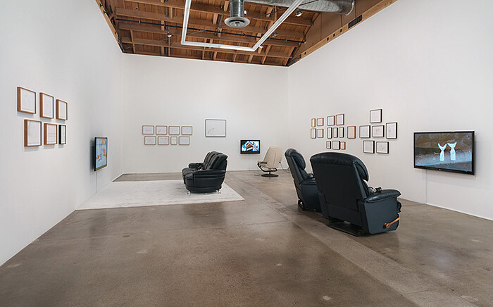
-Today my horoscope said the road to hell is paved with good intentions; does that mean that you are barking up the wrong tree? - I think it’s more like you are pissing in the playground.
From Arms are Overrated, Stanya Kahn, 2012
It is unclear where the impulse lies, but one often hears sporadic muted sounds of laughter in museums, galleries, and lecture rooms, implying that the laugher “gets” the point and meaning has reached its destination. That sudden moment of clarity when everything is resolved and the curtains of obscurities are lifted from perception is accompanied by a chuckle. One might say it is not the funniness of the joke, but the joy of “getting-it” that makes one laugh. Stanya Kahn’s recent work (all 2012) on view at Susanne Vielmetter Los Angeles Projects hints at the vulgar economics of jokes as proxies for exchange.
Arms are Overrated chronicles a day in the life of two crumbled pieces of paper in a common dudes-hanging-out situation—although the identities of the characters are left ambiguous. They visit the Old Zoo at Griffith Park with its horror movie monsters, go to a cemetery, get into a car crash and kill a biker, and …
January 27, 2012 – Review
David von Schlegell
Joanna Fiduccia
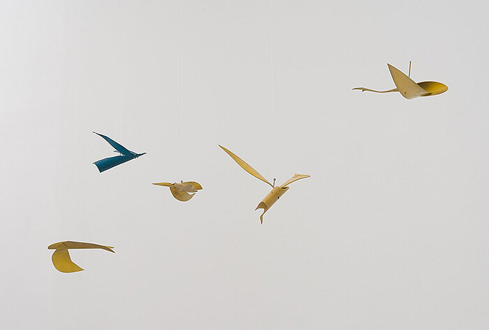
Whatever their intentions, posthumous gallery exhibitions rarely feel sincerely elegiac. Even the most reverential show can make the cynic in us suspect efforts to stoke the market for the master’s remnants. This is not the case here. In contrast to the citywide retrospection of “Pacific Standard Time,” the current bonanza of exhibitions celebrating (and, more to the point, often promoting) the region’s artistic heritage, this exhibition of works by the American painter and sculptor David von Schlegell (1920–1992) seems to direct its gaze as much inward as backward. Thumbing through the press binders, filled with personal snapshots, newspaper clippings about von Schlegell’s dauntless air force service, and black-and-white installation shots of von Schlegell’s public works, I’m suddenly very aware that I am perusing not the press, but the family archives.
Organized with the help of that family—writer Mark von Schlegell, painter R.H. Quaytman, and poet Susan Howe—this exhibition gathers together monochrome paintings from his final years as well as models and sketches of his public sculptures. There is also a single supine piece of carved rosewood from 1988, whose burly underside belies a finely notched ridge that runs along its upper edge like delicate wainscoting. The piece is evocative of the …
December 22, 2011 – Review
Eileen Quinlan’s "Constant Comment"
Kevin McGarry
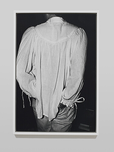
Eileen Quinlan’s second exhibition at Overduin and Kite explores an array of departures from the old tricks of her “Smoke and Mirrors” series (2004–2007): signature photographic still lifes of colored light passing through said materials, capturing all the flecks and blemishes that mar the ethereal compositions with engrossing, analog textures. Quinlan’s fascination with photographic mechanics and accoutrements continues here, and like the tableaux through which she has established a self-reflexive discourse on image-making, the discrete elements of this show collude as a carefully scattered puzzle.
To begin with the oddest inclusions, there are three black-and-white photographs dated 2011 but which the artist shot many years ago when she first took up photography: Sisters of Mercy, depicting the rough granite contours of the castle walls of a former convent near her New England childhood home; The Pond, a back-of-the-head self-portrait in which the artist’s figure slips into surrounding bog brush; and Paul as Poet, framing the back of a man in a white tunic and jeans. These images set the tone for subjective excavations, tunneling into matters of difference and repetition not with regard to seriality as much as context, and, specifically, how re-situating images in different temporal and relational contexts alters …
November 18, 2011 – Review
Raymond Pettibon’s "Desire in Pursuyt of the Whole"
Andrew Berardini

All the gang is here. An open-mouthed munchkin, mouth pitched back in roaring vavoom, the Reagan-headed claymation adventurer Gumby, weird scientists, weirder hippies, butch baseball players, and a gang of distant surfers sliding down the faces of pristine blue curls, most of it accompanied by the clipped noir narrative and untraceable quotations of Raymond Pettibon’s scattered story, the one he’s been writing for decades. Not every piece contains an old character though, and there’s even an unfamiliar stage: a clutch of collages occupy part of the exhibition, curled edges of layer after layer, old ads and celebrity snapshots, battered Valentines and newspaper clippings, but mostly just drawings layered on drawings, some stripped and simple, others spooky and complex, all of them an all-over-the-place mess.
But there’s something about looking at a new exhibition by Raymond Pettibon that is always like looking at an exhibition by Raymond Pettibon. In a first blushing witness of the work, the language, the voice was all there, and this last viewing finds the same: the pitched-punk anger balanced against something altogether fragile, heartbroken, and literary. The visual language is like that of a cartoon that’s wandered far from its comic book origins and found an oasis …
September 15, 2011 – Review
Amalia Pica’s "Endymion’s Journey"
Joanna Fiduccia
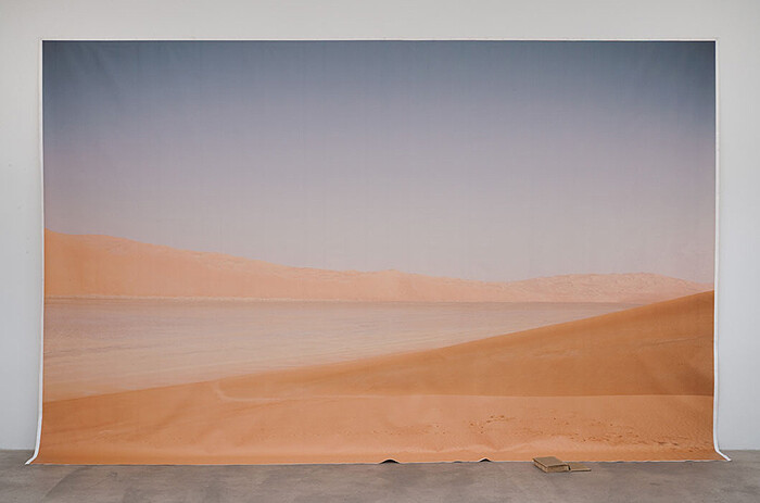
When the term “romantic conceptualism” reached its apotheosis several years ago, the touchstone appeared, almost unanimously, to be Bas Jan Ader’s I’m Too Sad to Tell You (1971). Gushing affect, it also self-reflexively performed the romantic artist’s predicament: the subjectivity romanticism gives license to profess proves, alas, incommunicable. Consistently and even compulsively concerned with failures of communication, Amalia Pica takes little pains to hide romantic tendencies in her recent exhibition “Endymion’s Journey.” The journey in question is the voyage made by a copy of John Keats’s narrative poem Endymion in the charge of explorer Joseph Ritchie, who promised the English poet that he would cast the edition “into the heart of the Sahara.” True to his word, the book was lost in the desert—but so, unfortunately, was Ritchie. Pica relates this tale on a placard posted beside a billboard-size backdrop of a desert vista; splayed open at its feet, a weathered copy of Endymion lies where Pica flung it during the opening (the first time as tragedy, the second as farce, indeed).
Endymion was poorly received when Keats published it, and Pica’s work smartly parlays that critical failure into the poignancy of—literally—losing one’s audience. Offsetting this pathos are whimsical “catachrestic” …
September 6, 2011 – Review
"La Carte d’après Nature" An exhibition curated by Thomas Demand
Adam Kleinman
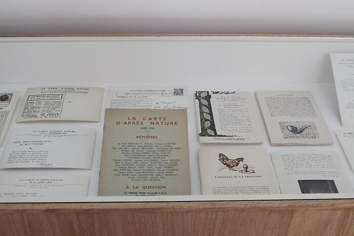
Can an exhibition be too tight? Such is the question when experiencing the immersive world of “La Carte d’après Nature,” a group show curated by Thomas Demand currently on view at Mathew Marks, which debuted in late 2010 with a few variances at Nouveau Musée National de Monaco.
The exhibition itself takes both its name and its inspiration from a short-lived journal published by René Magritte in the late 1950s and early 60s. A quasi-retake on the exquisite corps, Magritte set in motion a correspondence game where picture postcards were mailed to friends so as to spur short replies in the form of associative thoughts, sketches, and clippings. These source materials, part found object, part commentary, were edited by Magritte into a pamphlet which overlapped streams of thought and mood. Building on this methodology, Demand instead looked to a trans-historical collection of artists and architects so he could create an exhibition in the form of a daisy-chain essay. The topic? Its main thrust is the “domestication of nature.” As such, many of the works focused on photographs of potted plants and gardens; however, each representation held a kind of fanged “surrealist” attitude.
If a surrealist take on the domestication of nature is …
July 6, 2011 – Review
“The Art of Narration Changes with Time”
Ana Teixeira Pinto
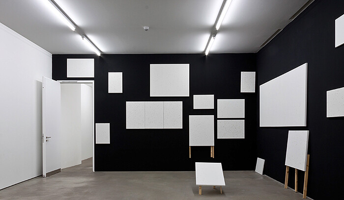
The end of the 20th century witnessed an explosion of interest in narrative practices. Often referred to as “the narrative turn,” this new field of inquiry originated in French structuralism’s general approach to language, and more explicitly from Tzvetan Todorov’s passion for what he termed “a science of narrative,” la narratologie. Postmodernism itself was a “narrative turn,” in which a rekindled interest in the fictive, the chronicle, and the anecdotal upstaged the symbolic unity of high modernism.
Narrative practices should not, however, be confused with language practices, the constituency conceptual art laid claim to, which for the most part limits the usage of language to a designative function. Or rather: it’s not language that matters, but what you do with it that counts.
Postmodernism also entailed a major shift from the political to the personal, and narrative practices are thus intertwined with a preoccupation with biographical inquiry and individual identity. In “The Art of Narration Changes with Time,” curated by Gigiotto Del Vecchio, all the works have a rickety resolution in common, signaling their self-made quality and the haphazard nature of the I.
The exhibition opens up with Klaus Weber’s Bee Paintings (2011), bright-white canvasses splattered with bee waste, positioned at random all …
July 1, 2011 – Review
"The Lifestyle Press"
Joanna Fiduccia

“The Lifestyle Press,” a group exhibition curated by Gil Blank, opened with its ambitions foreclosed. Just days before, Blank had been informed that the publication which was to accompany the show, a mock junk-mail circular with coupons that could be used toward the purchase of artworks, would not be printed under threat of legal action. Apparently, when the UPC numbers on the coupons—expired in some cases, fudged in others—failed to check out, the printer and distributor refused to go forward with publication. As a framed letter hanging in the front gallery explained, producing the circular would have made all parties involved liable to suit. At the urging of Cherry and Martin’s lawyer, Blank abandoned his pursuit of circulating the circular, and instead resolved to present the cancelled proofs in the gallery.
A cynic might call this a confirmation of the inevitable: is it any surprise that the circulars, which were to have been inserted into the Los Angeles Times and sold at a low cost, ended up back in the embrace of gallery walls? And wasn’t their gamble—that someone could coupon-clip his/her way into collecting art—a little too improbable to be of much critical consequence? But cynicism distracts from what might …
May 16, 2011 – Review
Walead Beshty’s "PROCESSCOLORFIELD" at Regen Projects II, Los Angeles
Tyler Coburn

There is little, in the conventional sense, to see in Walead Beshty’s first solo exhibition at Regen Projects. The vibrant, chromatic ribs of the Black Curl series, for example, derive from chance effects of colored light on photographic paper. A separate set of light jet prints, in shallow, plexi boxes, assume the scale and look of the curl series, yet comprise scans of similar pieces from Beshty’s 2011 Natural Histories catalog. As the artist has extensively theorized, such works serve to politically rearticulate the medium, focusing less on the photographic image, its absent referent, and the melancholic, psychical matter that spans the gap. Beshty’s photographs do reveal their indices, though the images are neither windows nor mirrors but flat, concrete parts that coextend with the industrial, economic, and social conditions of their making.(a)
“I try to embrace all the outcomes of the work [and] not repress any of it,” Beshty once remarked to Bob Nickas. The evidence takes form in the shredded and mulched composites of the artist’s “failed or ‘unshowable’” works, as well as Damiani Editore’s test prints of Beshty’s Selected Correspondences 2001-2010 catalog.(b) The publisher’s economical methods yield one of the exhibition’s more amusing sights, as Beshty’s photographs of …
February 17, 2011 – Review
Eli Hansen’s "Next time, they’ll know it’s us" at The Company, Los Angeles
Joanna Fiduccia
A clear glass valve on a strand of silver party beads beckons from the entrance to Eli Hansen’s exhibition, “Next time, they’ll know it’s us.” Dangling from a nail, it gives off a felonious pong, like those signs of a subculture that pass under the noses of the majority while remaining indecipherable. What lies beyond this subversive gesture, in Hansen’s second solo show at The Company, consists of a number of sculptural works of delicate blown glass paired with rough and ready found materials like reclaimed wood and steel, beakers and wire. Shelves, cobbled together from wood scraps, hold hand-blown flasks in a variety of colors. Some works carry a narrative charge, such as We bought the whole thing and only sold half (all works 2011), in which two empty vials shaped like bud vases hang from wire nooses, one corked and other portentously left open. Still others pursue more fantastic images of chemistry class gone native, for instance, in We’ll return the favor, where three ash-blackened beakers droop like pears from a curved stick, topped with a glass tip that resembles a giant glossy sprout.
Trained as a glassblower, Hansen is skilled at shuffling the conflicting roles left to the …
January 4, 2011 – Review
Amanda Ross-Ho at Cherry and Martin, Los Angeles
Sarah Lehrer-Graiwer
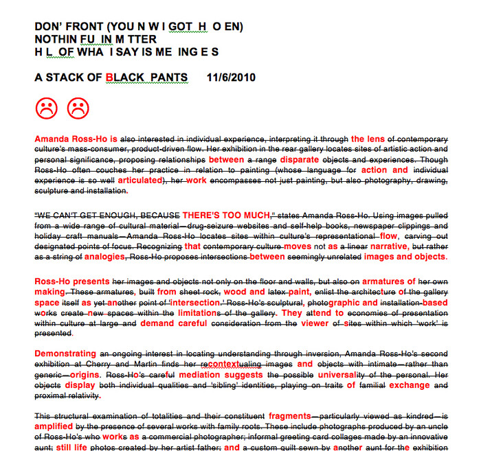
Text—as a never-finished, always-mutable, and labored process of thought—is the internal organizing logic of Amanda Ross-Ho’s recent production. The artist prepared the press release for her show, “A Stack of Black Pants,” as a sequential composite of paragraphs from the press releases accompanying her previous three exhibitions at Cherry and Martin. Rhyming quantity with chronology, it is made up of one paragraph from the artist’s first solo show (2006), two from her second (2007), and three from the third (2008). The resulting amalgam has been ruthlessly edited with still-visible redactions strategically striking through most of the recycled texts, leaving cherry-picked words and letters intact to create a new collective meaning. Occasionally, the continuous crossing-out is broken into staccato dashes by areas of bold red type in a slightly enlarged font that generates a tiered text floating above the field of slashed, rehashed sentences.
Writ in red (the instructor’s disciplinary ink), the new revised statement sets up the editing process and its cumulative measures of (re)assessment and modification as the foundational creative frame for this show. This is most explicit in a new series of “Correction” paintings—big (96 x 72 inches) white canvases bearing the red and black marks (checks, Xs, circles, …
December 16, 2010 – Review
Matthew Brannon’s "Wit’s End" at David Kordansky Gallery, Los Angeles
Tyler Coburn
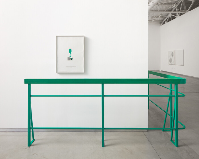
Matthew Brannon’s letterpress works felt delightfully and deceptively anachronistic in the early decade, resurrecting motifs of mid-century American advertising with pithy captions on the cosmopolitan set. Forged in the margins of ad copy and commodities, the artist’s alter egos appeared forever prey to the doubts, inadequacies, and frustrations that even a glitzy, gin-soaked veneer can barely disguise. Little stretching was needed to see the resemblance these fast-lane phantasms bore to the confidence men of our own last, great bull market.
Over the five years since the artist’s first solo show at David Kordansky, in Los Angeles, as the economy collapsed and Man Men renewed a decorative interest in Brannon’s 1960s New York, I wondered how his artwork had registered the shocks, and if his Joneses were continuing to consume the new and the chic at a breakneck pace. His latest show, “Wit’s End,” provides a sober response. Visitors are corralled at the gallery entrance by Tour Guide (all works 2010), a teal railing fencing in a letterpress print of a champagne glass on a tipped over iPod that comes as an elegy for the fizzier days and a portent for those to come: “You should know this before you go in,” …
September 20, 2010 – Review
"Dennis Hopper Double Standard, " MOCA, Los Angeles
Tyler Coburn
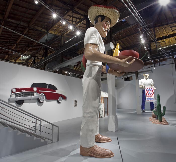
Shameless nepotism or inspired programming? It’s hardly a surprise that Jeffrey Deitch’s first exhibition at the Geffen Contemporary at MOCA would set critics atwitter, regardless of the subject, but watchdog fingers started wagging double-time with April’s news of a planned survey of the work of Dennis Hopper. Rushed by Deitch due to Hopper’s then-ailing condition (he passed away in May), the exhibition drew early concern, as Hopper was a collector of the work of exhibition curator Julian Schnabel; an actor in his film Basquiat; and the subject of one of his plate paintings. Deitch claimed to own the works of neither (“I have zero commercial involvement in this,” he told The Los Angeles Times), though as Steve Kaplan described on post.thing.net, it nonetheless “feels like an extension of the titillating, fame-obsessed, outré projects that often dominated his NY galleries.” If this is the case, then Deitch has simply adapted this one-man show for his new city, courting the celebrities, the crowds, and the culturati through Hopper’s unusual toeing of Hollywood and the art world. The only lingering question is whether Hopper’s art merits more than the industry chatter.
“Dennis Hopper Double Standard” comprises over two hundred works in various media that …
September 13, 2010 – Review
Kori Newkirk at Country Club, Los Angeles
Andrew Berardini
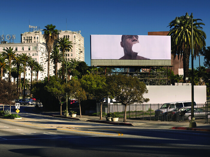
A recent billboard project in Los Angeles featured an image of a shirtless black man (the artist Kori Newkirk) on a white background, his mouth stuffed to bursting with a snowball. LA Times critic Christopher Knight observed that it looked like a ball of cotton, thus in some ways conjuring up the history of African-Americans as slaves in Antebellum cotton fields, as well as the systematic censorship of black people ever since. The naked torso, the mouth stuffed not with cotton, but a snowball, suggests something, however, a little different—the sexual practice known as snowballing, which includes a man having his semen spat back into his mouth after a blowjob, gay or straight.
In his current exhibition at Country Club Projects—a boxy Rudolf Schindler house in Mid-Wilshire built in 1934—Newkirk continues to use himself as the nexus of the body politic and desire. In what might have been the living room of the house-cum-gallery, the artist layered about one hundred white t-shirts into four overlapping tiers on the black floor into a full circle with an empty center like an oculus (Mayday, 2010). Formerly worn by the artist until they began to gray and stain, the t-shirts had a second life …
June 14, 2010 – Review
Rachel Harrison’s "Asdfjkl;" at Regen Projects, LA
Sarah Lehrer-Graiwer
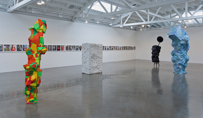
Everything lilts and tilts in Rachel Harrison’s upright totems. Boxy facets jut out at every angle and swollen protrusions bulge all over the rough, peaked, and slathered stucco-like surfaces. Her piecemeal monoliths totter drunkenly in a barely-balanced equilibrium of unstable, crudely Cubistic passages. Their scale and verticality loosely suggest the figure: short, stocky ones and tall, skinny dancing ones. The five new sculptures at Regen Projects II appear like characters with increasingly distinct personalities when considered against the continuous frieze (spanning the far wall of the gallery) of fifty-one photographs of various masks, portrait busts, figurines, and dolls that constitutes the third and most recent installment of Harrison’s Voyage of the Beagle, Three (2008-2010). (The title is taken from Darwin’s eponymous study, implying a cataloguing of visual culture).
The artist’s sometime habit of naming her constructions with famous proper names—as she does here with one brightly hued, amped up and coked out Pablo Escobar patterned like a tropical harlequin and hung with a matching cluster of glossy yellow, red, orange, and green fake chilies—further invites an anthropomorphizing projection of personality onto dumb and mute material heft. A simulated cartoon humanity convulses the sculptures’ bulky forms.
As a group, they are an absurd, …
Load more