Categories
Subjects
Authors
Artists
Venues
Locations
Calendar
Filter
Done
July 27, 2023 – Review
Christopher Kulendran Thomas’s “FOR REAL”
Ann Mbuti
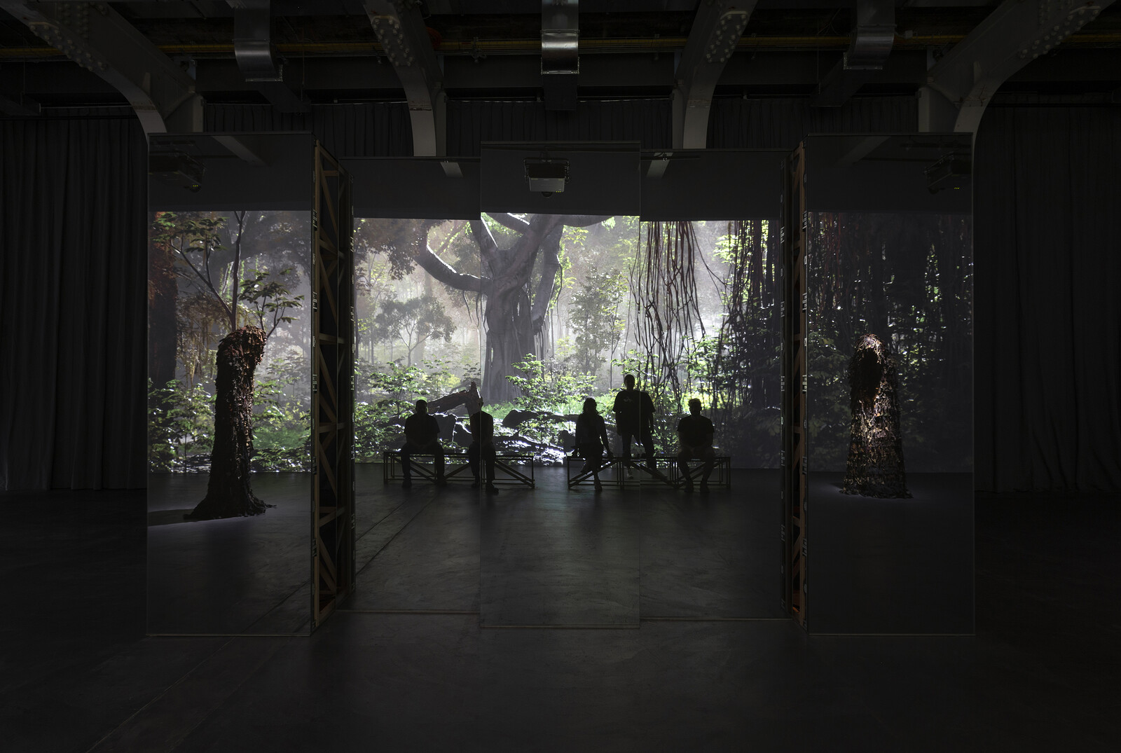
If history is written by the victors, asks Christopher Kulendran Thomas’s exhibition, is reality a construct of the dominant narrative? What then does it mean to write a history of the defeated? The artist’s work starts from the struggle for Tamil independence during the 1983–2009 civil war and its aftermath, and moves onto the larger questions that arise from its failure. Reflecting on the ethnic oppression that claimed hundreds of thousands of lives and forced his family to flee the country, Kulendran Thomas’s collaborations with Annika Kuhlmann suggest that art can influence our perception of not only history but reality itself. Mixing historical facts, storytelling, fiction, and deepfakes, his work offers a glimpse into a reality that exposes the dominant one as just one well-told version of many.
The two previous iterations of this exhibition—at London’s ICA and Berlin’s KW—opened with the struggle for utopia before moving on to contemporary art: at Kunsthalle Zürich, the order is reversed. The looping twenty-four-minute video Being Human (2019), installed within a plywood construction, is the first video to encounter when visiting the exhibition and it reflects on the relationship between the end of the war and the flourishing of contemporary art in Sri Lanka. …
April 7, 2023 – Review
“Unschöne Museen”
Aoife Rosenmeyer
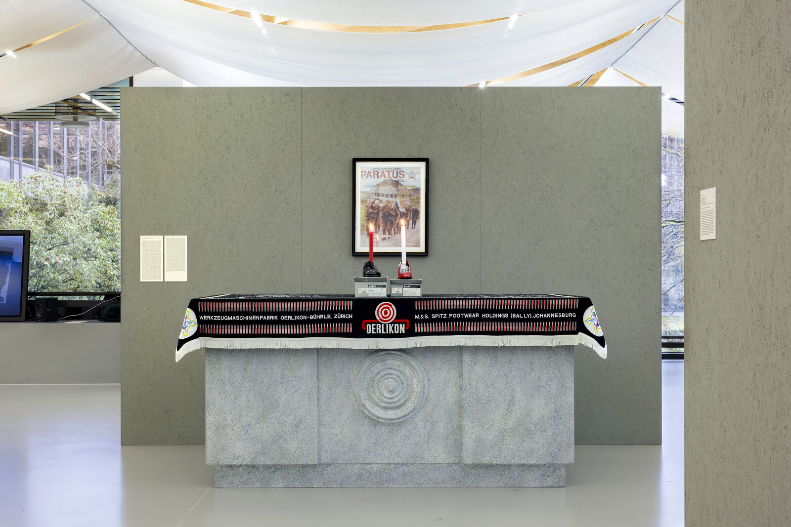
One institution considers another: in a pugilistic text that frames the dense exhibition “Unschöne Museen” [Unbeautiful Museums] at gta exhibitions—part of the ETH Zürich’s architecture department—curators Fredi Fischli, Niels Olsen and Geraldine Tedder mention that recent events at the Kunsthaus Zürich catalyzed this show. The latter behemoth is currently addressing questions of provenance and funding after unflattering investigations into its relationship with donor Emil Georg Bührle. In 2021 the Bührle collection, on long-term loan, went on show in a purpose-built Chipperfield-designed extension to the Kunsthaus. Bührle, who died in 1956, became rich selling arms to Germany under the Nazis; his businesses later cooperated with the government of South Africa under Apartheid. The Kunsthaus’s gestures towards openness in this regard—such as commissioning ongoing additional research on the provenance of works in the Bührle collection—feel overdue.
Nonetheless, it’s staggering for anyone who arrived in Switzerland this millennium that Hans Haacke exhibited Buhrlesque at Kunsthalle Bern back in 1985. Recreated at gta, two shoes made by Bally (a Bührle subsidiary) double as candle-holders on an altar decorated with other Bührle references—all venerating a framed issue of Paratus magazine (the official periodical of the South African Defense Force) celebrating a South African military visit …
November 22, 2022 – Review
Dozie Kanu
Aoife Rosenmeyer
Dozie Kanu blocks the entrance to Francesca Pia’s gallery with a low, square platform studded with cents. I take the H marked out in shinier coins to connote “Helipad” and edge past it into a series of bright rooms arrayed with sculptures composed largely from found metal objects. Among them is hang something metric (all works 2022), which makes a crucifix-like coat rack from a 150 cm rule atop a coiling metal pump component.
Though from Texas, Kanu now makes his ambiguous objects in a studio in rural Portugal. The influence can be seen in the selection of decorative Portuguese keyhole plates painted onto the wooden tabletop of aro pillars chukwu dinners, which is supported by thick metal pipes. Deep blue panelling collars the ceiling, rather than the base, of the central gallery: General State of Judgement and Concern. Its velvety hue is a pleasing touch, making the space a little cosier, and easier to imagine these objects in a living room. The patina on the tortured metal sheet in the light fitting Explosion Proof is so appealing—was there an explosion or is it to signify antiquity, accelerated for your convenience? It’s not all to my taste though. Chair [ …
June 1, 2017 – Review
"Quiet"
Aoife Rosenmeyer
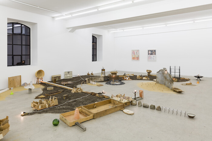
According to the exhibition’s introductory text, “Quiet,” curated by SALTS director and Art Basel Parcours curator Samuel Leuenberger, is inspired by Susan Cain’s 2012 book of the same title, which champions introverts in a world skewed in favor of the ebullient extrovert. It is an odd premise for an exhibition, given that artworks are generally left to speak for themselves and their mediation is delegated from the artist to the curator or the gallerist. Yet now that connections and networks are so strategically fostered, have we lost faith in art’s own inherent power? If the art world is utterly deaf to the potential of a silent or slight gesture, we are doomed. What this show achieves, however, is an exploration of different kinds of quietness and distance between artist, media, and artwork. At its center, a city lies in a crescent at our feet. It is a ruined city, abandoned, the bones of buildings, highways, and civil engineering bared, dirt and sand gathering around it. Houses are missing roofs and sides, though a few bare lightbulbs still burn brightly. Youssef Limoud’s Geometry of the Passing (2017) is made from found detritus, brownish torn waste materials and lost objects such as …
January 18, 2017 – Review
Stefan Tcherepnin’s “Stefan ‘Jackson’ Tcherepnin, 2014-17: The Missing Years”
Daniel Horn
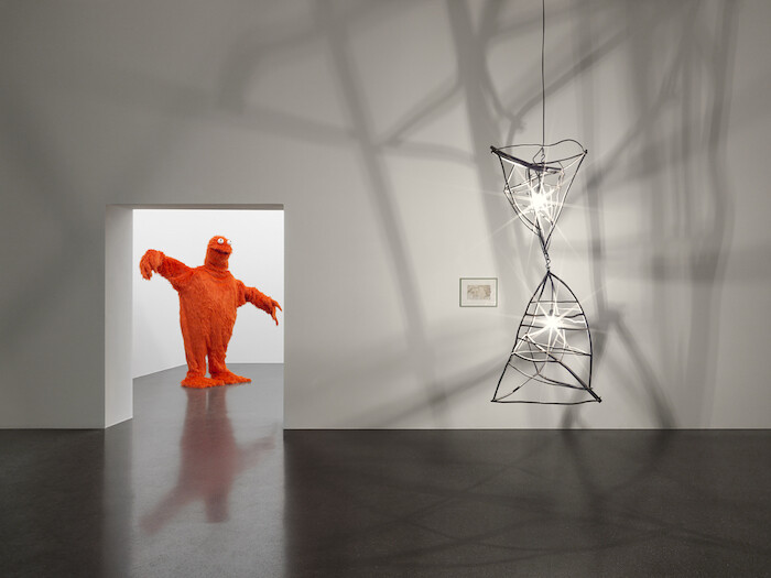
At a recent film screening in Zurich, an artist whose work was about to be premiered half-joked about the emergent trend of updating exhibition press releases with references to the recent US presidential election and the theme of imminent universal doom left behind by November’s stunning outcome. Suddenly, there’s a sense not so much of urgency but rather of creeping sickness and apathy, spreading from Chelsea to South Beach, a pandemic making its way to Europe’s art hubs.
It’s actually been quite some time—not since the aftermath of 9/11, broadly speaking—since any event in US history has had so dramatic an effect on artistic high-end manufacturing and its discourse, not to mention the economic repercussions yet to be determined (by, on the one hand, headlines such as “Ivanka Trump Loves Contemporary Art, Does It Love Her Back?” which recently appeared on artmarketmonitor.com, and the pick of a scion of the founder one of Manhattan’s most exclusive blue-chips for Secretary of the Treasury on the other). It remains to be seen to what extent and by what means the contemporary art world is prepared to address and defy long-term (i.e., a minimum of four years) systemic impoverishment in light of new economic …
October 5, 2016 – Review
Heike-Karin Föll
Aoife Rosenmeyer
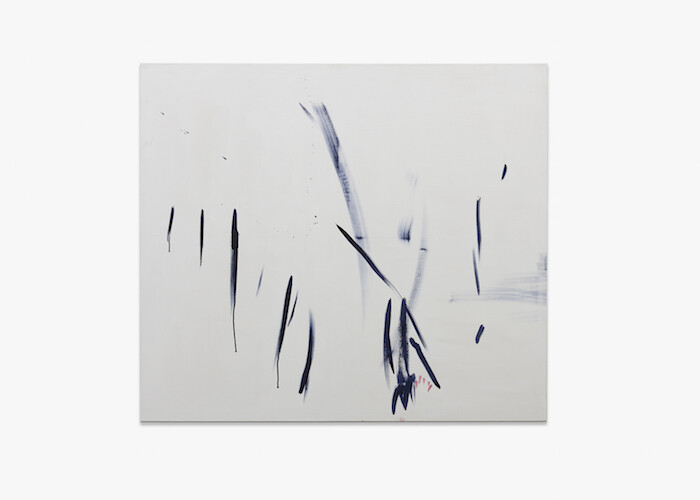
Heike-Karin Föll’s exhibition nests within Rochelle Feinstein’s concurrent, longer-running show at Galerie Francesca Pia. The pragmatic arrangement suits, because modesty is Föll’s camouflage, starting with the conditions of the exhibition. At the gallery entrance are 4 notebooks in a vitrine, while the remainder of the works are in a side gallery: 2 works from 2014 made with pressed plants; 5 larger paintings; and a grid of 27 works on paper, each sheet A4.
Taking the paintings to be top of the hierarchical tree by the standards of the traditional canon, the first encounter is with refresh (2016), roughly a square meter and a half of calm black scrubbing, pulling color across the canvas, with occasional moments of relief in scratches and uncovered areas where delicate blue, yellow, or violet can be made out. A copy of British Vogue collaged to the right of the canvas is obscured but for the headline “refresh,” which can be read vertically. Magazine clippings and the imprint of an N floating towards the top of the canvas are the kind of text that circulates throughout Föll’s works, sometimes typed on a computer, sometimes written, often in transfer letters. This text is portable and inconclusive; letters toy …
February 11, 2016 – Review
“Tunguska”
Daniel Horn

The group exhibition inaugurating Maria Bernheim’s new gallery represents, according to its introductory text, “simply a choice between the bad, up-to-date old and the genuinely new.” The space’s spotless, Chelsea-esque features—sanded concrete floors and the requisite glass storefront—certainly make for a no-nonsense stage on which to appraise the goods on offer according to these self-imposed, stringent, and subjective criteria.
The gallery’s text deploys lengthy passages from Clement Greenberg’s seminal if awkwardly haute-socialist 1939 essay “Avant-Garde and Kitsch” which, for an enterprise such as Bernheim’s, takes guts. Planted in a prime location right across from the city’s artistic hub, the Löwenbräu Areal—where Zurich’s chief contemporary art institutions reside in frictionless symbiosis with blue chips like Hauser & Wirth and Galerie Eva Presenhuber—Bernheim foregoes the vaunted if too often self-conscious and commercialized coming-of-age narrative of the gritty downtown space which evolves into a market force.
Despite this Swiss-style “umbilical cord of gold,” the grouping of artists on view does retain a basis in the local, pairing emerging talents such as Mitchell Anderson and Ramaya Tegegne with more internationally established artists like Jon Rafman. The former are presences on the local scene who also run some of the most interesting off-spaces in Switzerland—Plymouth Rock in …
January 29, 2016 – Review
Jan Vorisek’s "Rented Bodies"
Julia Moritz
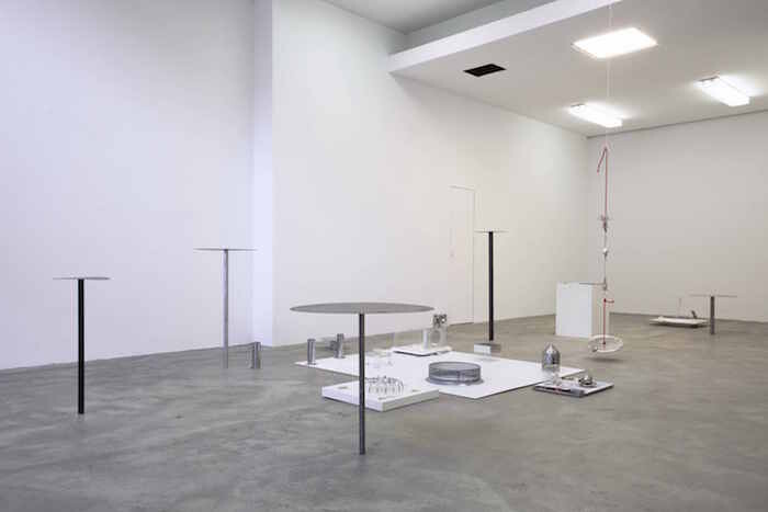
Usually we’re the ones falling into tables. At the opening of Zurich-based artist Jan Vorisek’s first Swiss solo show at Galerie Bernhard on that dark December eve, it was tables that were falling into us. Ouch! And there we were, right in the middle of his ideas, in Rented Bodies (2015), the exhibition’s eponymous installation. Or rather, the tables were right in the middle of us, who loiter around at gallery openings, fetching beer from the fridge to the tables. Yet these tables aren’t tables. They’re Art: dysfunctional mostly, too little, too pretty, too fragile. Or do they seem so just in contrast us being too awkward, tall, dysfunctional all the time, all over the place? It’s this ambiguity that unites us and the tables, in a system of rent, time, and labor on loan from each other, to perform our respective functionalities at the gallery opening, or failing by falling. And so we see much more than tables: Rented Bodies is a whole set of fragile sculptures, 100 percent design products, sampled from gift shops, collected from thrift shops, shop windows, and workshops, meticulously arranged and re-arranged into an environmental assemblage that explores every nook and cranny of the …
October 1, 2015 – Review
Genesis Breyer P-Orridge’s “Breaking Sex”
Aoife Rosenmeyer
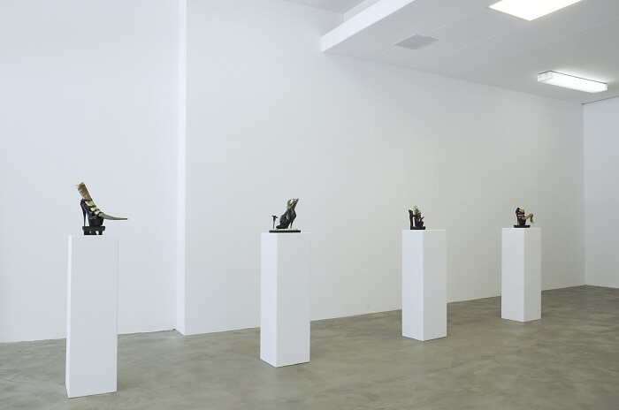
A long, long time ago—in 1976—an artistic collective called COUM Transmissions, of which the active members at the time were Genesis P-Orridge, Cosey Fanni Tutti and Peter Christopherson, held a short exhibition at the ICA in London entitled “Prostitution.” Pornographic photographs of Cosey Fanni Tutti were the main element: these had previously appeared in porn magazines and were re-appropriated for the exhibition. There were sculptures with used tampons, performances of stripping, and inexpert but enthusiastically experimental music too, so it was little wonder the British press were able to find an offended Right Honourable Member of Parliament. The Daily Mail quoted Conservative MP Nicholas Fairbairn calling the artists “the wreckers of civilization. They want to advance decadence.”
Nearly 40 years later Genesis Breyer P-Orridge continues to take aim at so-called civilization. This can be found within her/his exhibition at Galerie Bernhard, and it is an inescapable part of her/his identity. Breyer P-Orridge was born Neil Megson in Manchester in 1950, changing his name to Genesis P-Orridge in 1971; the name Breyer came with marriage to the now deceased performance artist Lady Jaye Breyer P-Orridge. Her/his artistic outlets before and after COUM Transmissions include the collective The Exploding Galaxy, the band Throbbing …
November 13, 2014 – Review
Alexandra Navratil’s “Plunge / Soar”
Aoife Rosenmeyer
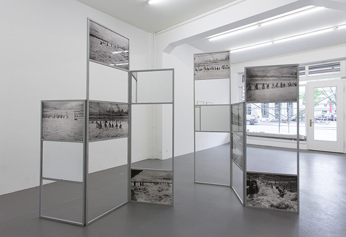
A day prior to the opening of Alexandra Navratil’s “Plunge / Soar,” an article appeared in The Economist online suggesting that the low cost of human labor—brought even lower as other automated processes render people redundant—would be the major barrier to the widespread adoption of driverless cars. This interesting—and horrifying—thought has something in common with Alexandra Navratil’s concerns. For the Zürich exhibition, Navratil employs archival film and photographic material, as she has done for previous bodies of work that have focused on the technologies of celluloid, plastics, and applied color in film. Yet the show opens with two prints made from pages of The Economist, titled August 2014 and September 2014 (all works 2014): scanned reports of financial and economic news are superimposed and, from these, the artist has isolated the verbs that translate market movements into physical movements. Even in a publication that prides itself on objectivity, this prose tends to the purple. Prices may “rise and fall,” but they also “tumble,” “thrive,” “yo-yo,” “shoot up,” “surge,” and “rebound.” The words float over the otherwise masked pages, as if they concern only the immaterial processes occurring in a vacuum of their own self-righteous hyperbole.
The next work encountered in the …
July 23, 2014 – Review
Pamela Rosenkranz’s “My Sexuality”
Mitchell Anderson
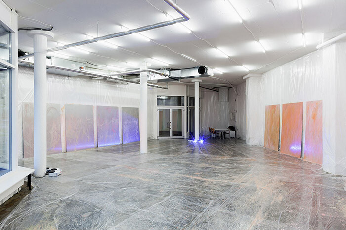
Pamela Rosenkranz’s exhibition at Karma International in Zürich is a complete mess. At first glance, the show lacks the sleek style and execution one has come to expect from an artist who has made a career exploring the slick visual codes and branding techniques used to commodify the natural world. Over the past eight years, Rosenkranz’s critical eye has been drawn to the marketing of bottled water, the anthropomorphization of house paint, even French Nouveau Réalist Yves Klein’s claiming of the sky as his own work of art. This time, however, she has completely wrapped the interior of Karma International’s large storefront location sited on an urban strip mall in loose plastic sheeting, creating what looks like—and at different times, feels like—a studio situation, a condom, and a so-called “kill room” à la American television series Dexter.
Leaning against the draped walls are eleven aluminum panels covered with a fluid acrylic polymer tinted in skin tones of beige, orange, red, brown, and pink. The texture of the surfaces varies between thick coats of brutal drippings to large strokes spanning the range of the artist’s outstretched hands. In some of the paintings, the aluminum base is almost completely visible, while others are …
February 20, 2014 – Review
Kilian Rüthemann’s “hatch up your troubles”
Aoife Rosenmeyer
The week before Kilian Rüthemann’s new exhibition opened at RaebervonStenglin in Zürich, a band of the great, good, wealthy, and hangers-on were in the luxurious Swiss mountain village of Gstaad for the launch of “Elevation 1049: Between Heaven and Hell,” an exhibition of works “positioned in and defined by the landscape they inhabit” that also runs until March 8th. Rüthemann’s contribution to the project is Acht Säulen für den Winter [Eight Columns for Winter] (2014), a row of eight palm tree trunks, upended and planted in the snow-covered lawn of the—indeed grand— hotel Le Grand Bellevue.
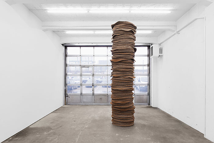
Back in Zürich, some three hours away, his solo show, “hatch up your troubles,” begins in a similar vein with One For Every Moment (Stack) (all works 2014), a rough, hairy column, which at four meters tall is just short of the ceiling in the gallery’s first room. Materially connected to the tree trunks shown in Gstaad, the column is made from a stack of coconut-fiber circular mats with rubber bases. Even though the work towers high, its layers look more like a sediment core drawn from the earth than a palm tree. The second work, hatch up your troubles, borrows its title from a …
October 23, 2013 – Review
Heidi Bucher’s “Water, Houses”
Aoife Rosenmeyer
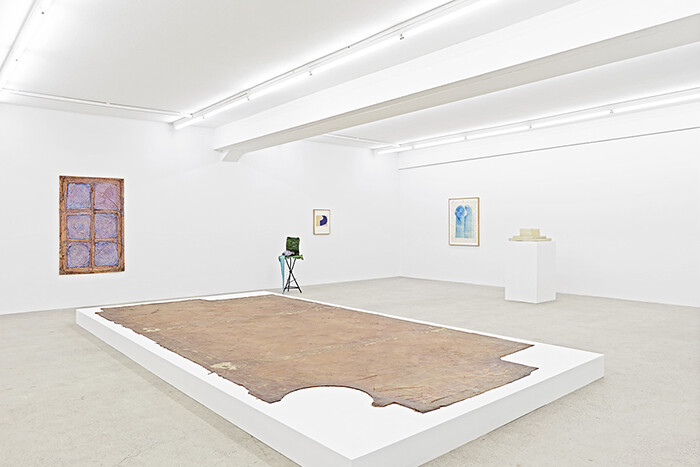
The Swiss artist Heidi Bucher once described her work like that of a forensic scientist: “We paste the rooms and then listen. We observe the surface and coat it. We wrap and unwrap. The lived, the past, becomes entangled in the cloth and remains fixed there. Slowly we loosen the layers of rubber, the skin, and drag yesterday into today.” These words describe the Häutung (or “skinning”) process that resulted in Bucher’s most plangent works, several of which are included in her current solo exhibition at freymond-guth Fine Arts. Exemplifying the new resurgence of interest in Bucher’s work (with exhibitions at the Centre Culturel Suisse in Paris, The Approach in London, Musée Rath in Geneva, and Palazzo Cavour in Turin already scheduled this year), “Water, Houses” offers a critical reassessment of the artist’s later work that is broader and more balanced than the psychological and biographical readings that have dominated its reception since her death in 1993.
Born in Winterthur in 1926, Bucher exhibited her work throughout her lifetime within Europe and in the United States, which is where she also lived and worked for a number of years. It was there that the comical, futuristic costumes she created out of …
October 22, 2012 – Review
La Demeure Joyeuse II
Aoife Rosenmeyer
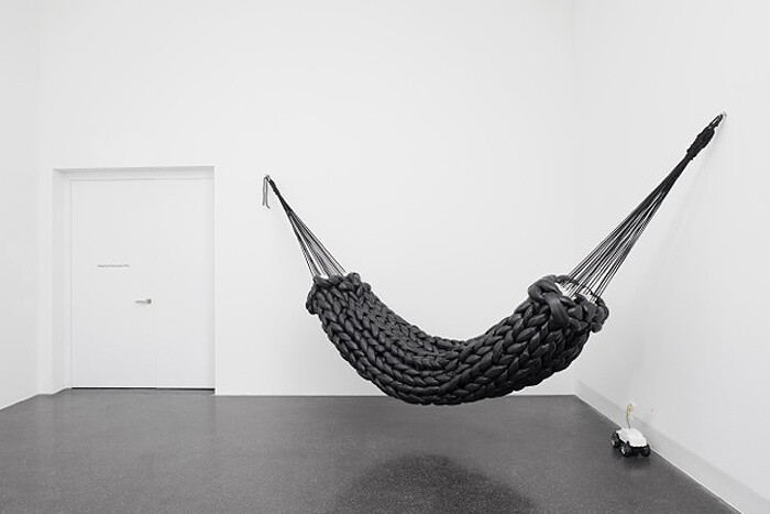
“La Demeure Joyeuse II” or “The Happy Home II” is the first show in Francesca Pia’s new space in the Löwenbräuareal, Zürich’s hub for contemporary art. It’s no wonder the mood is optimistic, though the title refers not to this specific setting but to an exhibition of the same name at the Musée des Arts Décoratifs in Paris in 1953 that provided a platform for the textile designs of Paule Marrot in the company of selected friends from the fields of ceramic and interior design. In Zürich, curator Anne Dressen has now gathered some thirty or so artists and designers who cite the domestic or create objects affiliated with domestic space, and in so doing has also queried what role craft plays in art production. At stake here are the relative values of media, skilled craftsmanship, and art (as opposed to design or decoration). Or, on the other hand, can those valuations be ignored to produce a productive tangle of disciplines?
Leisurely domesticity meets workspace at the entrance to the show: the N°28 fat knit hammock (2006) by Bless, formed from oversized woven snakes of fat black polyester and nylon, strung across a corner. This hammock faces the gallery’s front desk, …
June 29, 2012 – Review
Robert Kinmont’s “Wait”
Aoife Rosenmeyer
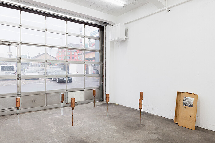
Much discussion of performance or Land Art from the 1960s and 70s considers whether the art consists of the work itself or its documentation. Could it really be experienced secondhand? Was the art the idea … or the stuff of it? Such recondite questions had to be put in the closet when it came to making saleable works in order to live, and few artists of note have ever proven themselves capable of true disinterest in the career element of being an artist.
In 1974, the artist Robert Kinmont walked away from a successful practice to support his family by other means, first of all by founding a school of sorts, then devoting time to the study of meditation, and later working as a carpenter. His return to making art was not for three decades, but, despite that lacuna, his work has rapidly re-found an audience. It’s the first time his art has been seen in Europe, and at that, in three shows: here in Switzerland at RaebervonStenglin; though an exhibition at the Fundación La Caixa in Barcelona, which will travel to Madrid hot on its heels; and the LA MOCA exhibition “Ends of the Earth: Art of the Land to …
May 2, 2012 – Review
Melanie Smith
Aoife Rosenmeyer
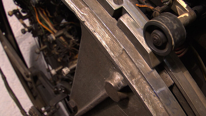
Orpheus’s descent into the Underworld and fruitless return finds its best contemporary analogy in the fate that befell the Chilean miners trapped underground for two months before their rescue in October 2010, when they were hauled to the surface one by one to a waiting barrage of media. In both stories the depths denote death and darkness; the obstacles are psychological as well as physical, and the return to the surface is fraught with danger. It is thus timely that Melanie Smith’s latest major film (following her major outdoor productions Aztec Stadium and Xilitla of 2010) tracks a dramatic and claustrophobic vertical axis. Elevador (2012), an eight-minute film shot in the building where Smith lives in Mexico City, is at the core of Smith’s presentation at Galerie Peter Kilchmann, surrounded by a selection of recent paintings and enigmatic sculptural arrangements.
The events in Elevador emerge from darkness, as a great clanking and whirring lift mechanism bears its box upwards. The predictable movement of this anything-but-reliable, rickety elevator and the quiet mundane details rapidly develop into a magic realist drama mingling domestic with fantastical elements. Each time the door opens a tableau of escalating oddity appears: a man hurriedly stuffs his shirt …
January 3, 2012 – Review
"Start. Reloaded"
Aoife Rosenmeyer
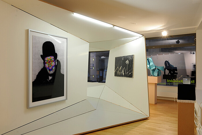
Up until now, Grieder Contemporary was located in the lush suburb of Küsnacht, just outside of Zurich. Delightful though this was—with opening parties spilling over into the garden of the gallerist’s modernist villa—getting there could be a pain and short opening hours further deterred many visitors. Now relocated to central Zurich, the new gallery space also resists the bland packaging of the white cube. It’s as if the gallery has been quasi-invaded by an alien capsule designed by Baierbischofberger
Architects that landed in the horseshoe-shaped commercial space. It’s a crinkled pod, it’s white, and it’s many facets (of laminated CNC cut layered wood veneers) are hinged together to create an experience akin to walking into a Frank Nitsche painting (who coincidentally showed with Grieder previously), or kind of like walking into an opened-up envelope (or several) that’s ready for the recycling bin.
Works by eleven artists that the gallery work with, or plan to in the near future, (Melli Ink, Alicja Kwade, Dieter Meier, Johannes Albers, Kerim Seiler, Gregor Hildebrandt, Christian Jankowski, Jorinde Voigt, Nic Hess, Monica Bonvicini and Thomas Kiesewetter) are displayed in and around this unfolded chamber. It is far from being a straightforward space; the walls are not vertical …
December 12, 2011 – Review
Diane Arbus & August Sander
Quinn Latimer
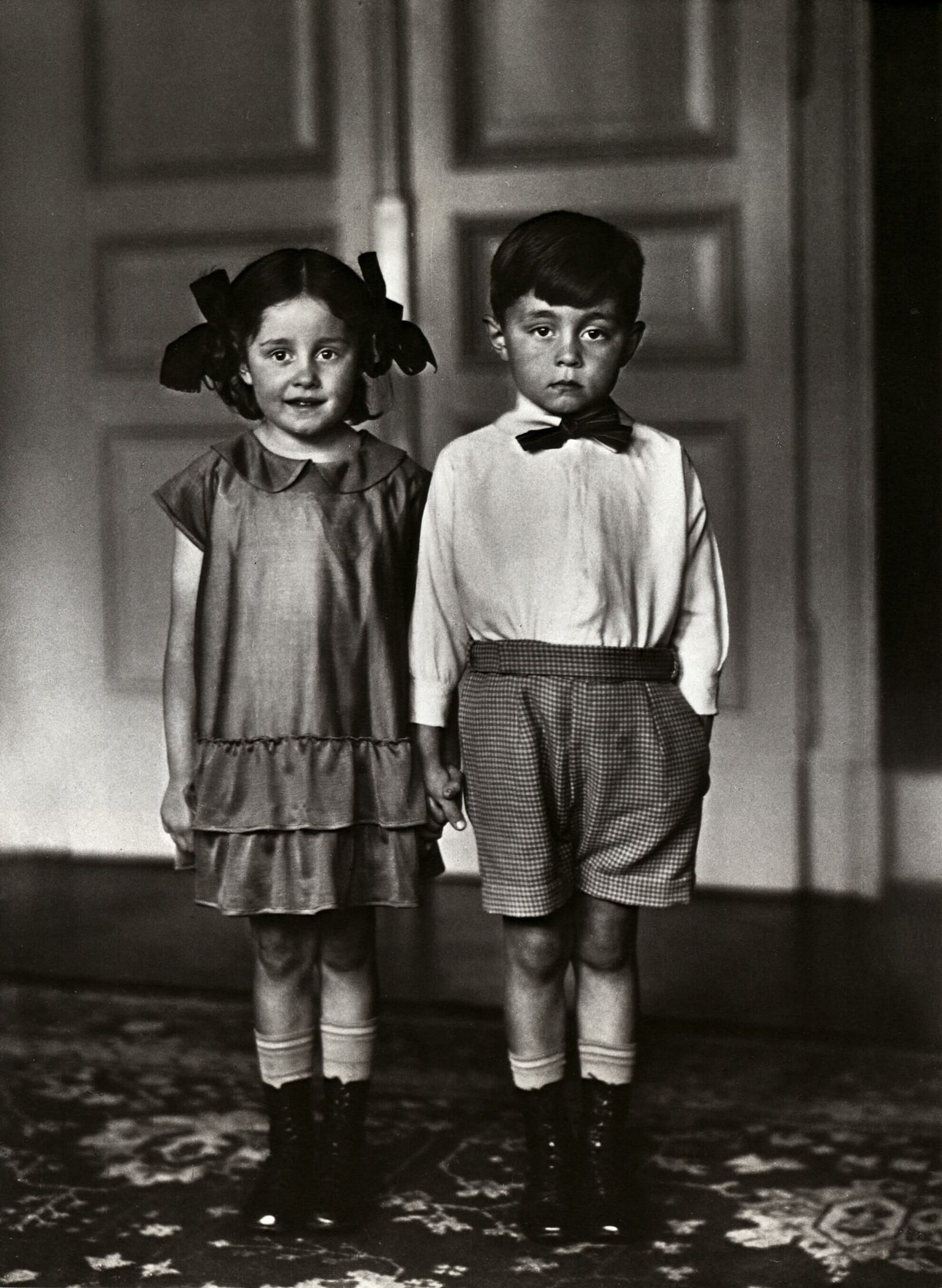
Up to their knees, they’re identical: laced-up leather boots, pale socks, paler legs, shadow-strewn knees. Then difference begins. On the left, ruffles become a dress. On the right, checked shorts become a white shirt, become a soft bow tie knotted under a boyish face. Soft bangs falling over his forehead, he’s morose. Bows in her hair, she smiles. The little boy and girl holding hands might be twins. But the similitude does not end there. Hung near this difference-parsing, class-identifying photograph by August Sander—an elegant gelatin silver print didactically titled Middle-class Children (1925)—are Diane Arbus’s equally indelible and strangely edifying black-and-white photographic investigations of singles, couples, twins, and triplets made some four decades later. See her famous Teenage Couple on Hudson Street, NYC with their oddly mature faces and diminutive child bodies, or Triplets in Their Bedroom, N.J. (both 1963). The identical sisters are clothed as such: starched white shirts buttoned to the neck like fundamentalists, white headbands bisecting their dark, curly hair. The straight lines of their mouths mimic the line of their eyebrows, running parallel to the sad line of their eyes. Their faces conjure a perversion of Madeline’s famous rhyme: “In three straight lines they broke their …
June 22, 2011 – Review
Roman Ondák’s "Enter the Orbit"
JJ Charlesworth
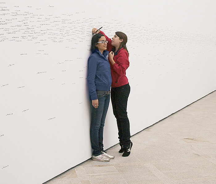
At the core of the work of Slovakian artist Roman Ondák is the sometimes hopeful, sometimes melancholic reflection on the character and experience of human community, society, and its institutions; in the background, the question hovers of how individuals are obliged to live alongside each other, in the humdrum every-day. Ondák’s neo-conceptualist techniques, in fact, yield affective emotional values, using communities of people as the raw material of the work. In his Measuring the Universe (2007), the otherwise empty gallery walls record the height of gallery visitors, in black marker, their grand accumulation producing a hazy band of black-on-white that combines the statistical anonymity of demographics with the intensely personal gesture of the handwritten index: every mark represents a human life, each one a “this is me,” in the throng of common humanity. Similarly, Ondák performed an absurdist action in Good Feelings in Good Times (2003), restaged at frieze art fair in 2004) by hiring professional actors to form a queue outside the British Council building in Cologne. Though what these people were queuing for is never clear, at some point it becomes a gentle comic play on the etiquettes and tolerances of our daily encounters with each other.
For his …
April 26, 2011 – Review
Francis Alÿs, John Armleder and Valérie Favre at Peter Kilchmann, Zurich
Aoife Rosenmeyer
Zurich’s art world was more-than-ordinarily abuzz when Peter Kilchmann and Eva Presenhuber unveiled new gallery spaces on the 14th April. Both have moved a few hundred meters north-west to the Diagonal building at the base of Switzerland’s new tallest building, away from the Löwenbräu-Areal brewery where they had previously lived alongside the Kunsthalle, Migros Museum, and other colleagues. The brewery’s cultural residents had once been moved in by city authorities to catalyse improvement in the neighborhood. Now Presenhuber and Kilchmann are the cherries on the cake of yet another transformation project, only this time it’s the Maag Areal, where mechanical gears were once manufactured, in which Citibank, Ernst & Young, and other multinational companies will soon be doing their alchemy.
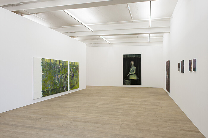
The Diagonal building opening unexpectedly echoed the Löwenbräu opening experience as people crowded on stairs and huddled in bottlenecks of the building, particularly keen to enjoy new views of the edifice towering over them. While Franz West sculptures paraded through Eva Presenhuber’s premises demonstrating their very generous proportions, Kilchmann was devoted to three painters, discretely hung. Unlike Kilchmann’s previous location which was more simply divided in two, his new space is a chain of galleries, in which one is greeted by …
March 29, 2011 – Review
Sofia Hultén’s "Pressure Drop" at RaebervonStenglin, Zürich
Quinn Latimer
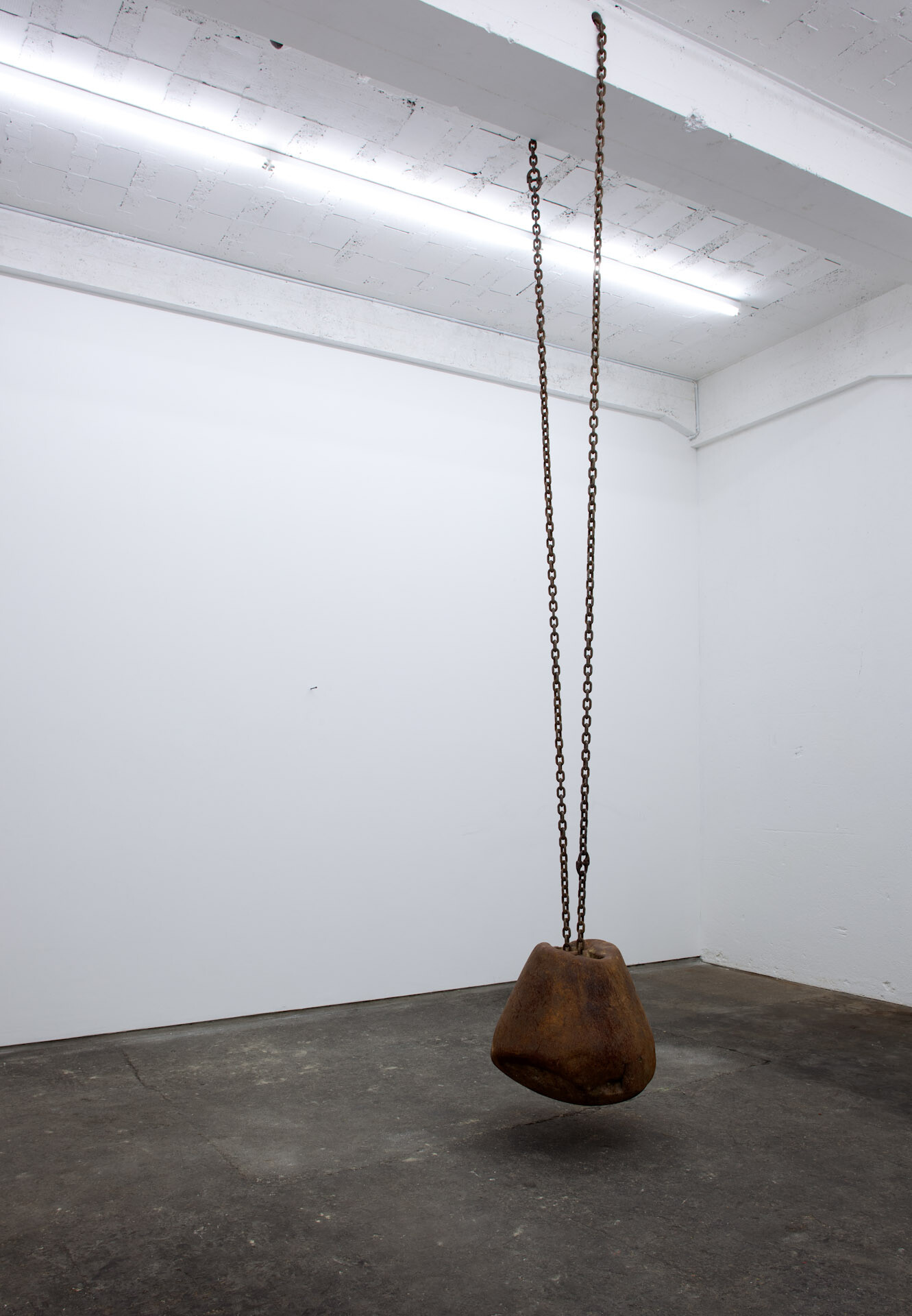
An austere, Mars-meets-Minimalism environment greets visitors to “Pressure Drop,” Sofia Hultén’s recent exhibition at RaebervonStenglin. Strewn over the gallery floor are large, glittery rocks that conjure both a meteor shower come to inexplicable rest, and the boulder-bedeviled construction sites just outside the door (the gallery is in an industrial area of Zürich undergoing seismic demolition). Among the rocks stands a tall, rusty screw press, its circular silver halo evoking the rings of Saturn. Across the gallery, attenuated pieces of wood, pocked with nails and paint, lean against a wall like some fervent reductionist’s idea of a forest. If the installation has a sober, Process Art look to it, the works themselves take that idea to its most sterling and ridiculous. The rocks? Hultén made latex moulds of rocks she found at a construction site, then pulverized and recast them in their found forms in the moulds, giving them their pokerfaced title: Artificial Conglomerates (2011). The wood? Found room molding, which the artist meticulously copied, before mixing the original and manufactured pieces together against the wall. By comparison, the stoic screw press was barely touched: Hultén simply inserted a rusty steel bar into the press, allowing it to put five tons …
February 9, 2011 – Review
Yorgos Sapountzis’s "Sculptures and Mirrors" at Freymond Guth Fine Arts, Zurich
Quinn Latimer
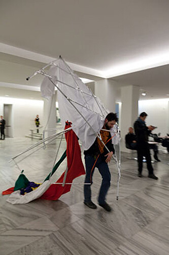
A few weeks ago I found myself in the winter chill outside Kunsthaus Zurich, watching a trance-like Yorgos Sapountzis methodically pace the platz as he dragged a tattered bouquet of bright, flag-like fabrics attached to poles behind him. After herding the audience about like an expert cowpoke, he and his two festively dressed female attendants (looking ready for a freak folk concert in more pastoral pastures) disappeared behind Rodin’s imposing Gate of Hell, which famously fronts the Kunsthaus. Suddenly a racket of noise—amateur banging, thunderish clapping—began. The Greek artist reappeared, stormed into the crowd, then just as quickly disappeared into traffic. A tram rolled past, some polizei nosed about, and the performance was over.
Conjuring both a vague religious processional and a casual neo-pagan ritual, Sapountzis’s performance had begun inside, near a huge Hodler frieze depicting a battle scene. As the Berlin-based artist swirled up and down a flight of marble stairs wrapped in brilliantly colored textiles, a film of public statuary gelled with crass, fluorescent hues was projected against an ad-hoc structure of more bright cloth tied to thin scaffolding, over which a propulsive electronic soundtrack drummed on. With its strange admixture of reticence and inspiration, the performance was a …
December 14, 2010 – Review
Galerie Peter Kilchmann in residence at Marktgasse 4 & 6, Niederdorf, Zurich
Aoife Rosenmeyer
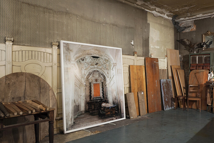
The entrance is through a ramshackle furniture shop; I walk between tables into the back and up the stairs. We’re in the middle of Zurich’s old town, where cheek-by-jowl buildings with uneven floors and low doorways are de rigueur; having the opportunity to snoop around one is an unusual treat. An Adrian Paci photograph is propped up against the wall in the ground-floor shop, the first of more than 60 artworks positioned around dozens of rooms in the two adjoining buildings which date from the 14th century. Upstairs, Mai-Thu Perret’s Negativland (Isolation Bungalow Furniture), 2004, a cluster of dipped black Chinese lanterns with luxurious trailing tails, crowds into the first room. In the context of rich red carved wooden panels, assorted plaster busts, maps, a series of Neue Zürcher Zeitung (newspaper) covers recreated by Claudia and Julia Müller in 2004, heavy bar furnishings, one cabinet displaying Francis Alÿs’s drawings, another the white polyurethane record Fischli/Weiss produced in 2004, and several potted triffids trying to escape their pots, the room is a walk-in Wunderkammer, a collection of unclassified curiosities.
Everywhere you look is the detritus of the building’s many lives and residents, from empty magnums to chemical glassware, ice picks to cast-iron …
October 21, 2010 – Review
"Slip Snip Trip" at Karma International, Zürich
Quinn Latimer
I had dropped out of law school when I met Eve. She was very beautiful. Very pale, cool in her black dress, with never anything more than a single strand of pearls. And distant.
Always poised and distant. By the time the girls were born, it was all so perfect, so ordered. Looking back, of course, it was rigid. The truth is she’d created a world around us that we existed in, where everything had its place, where there was always a kind of harmony. Great dignity. I will say… it was like an ice palace.
—Interiors (1978), Woody Allen
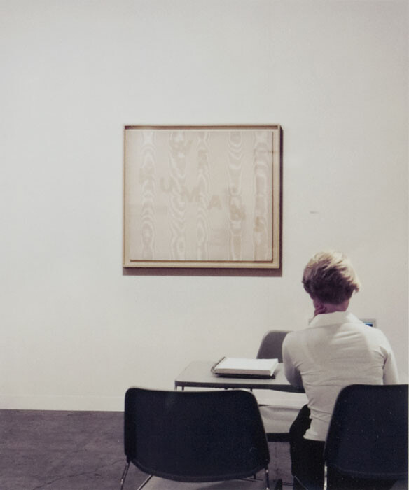
The intersection of art and design, or, to be more accurate, the interest of contemporary artists in design, often leads to interiors that curiously project very little “interiority” about them. Instead, one more often gets a covetous lesson in consumerism: white boxes tricked-out as collector’s homes, wealthy artist’s pads, or similar chamber dramas featuring mid-century furniture, formalist sculpture, and Minimalist plinths (though all might be postmodern approximations thereof). Thus the surprise and delight I found in Karma International’s “Slip Snip Trip,” whose edited constellation of works by gallery artists and Karma friends delineated not just an architectural interior but an incisively metaphysical one …
Load more