Categories
Subjects
Authors
Artists
Venues
Locations
Calendar
Filter
Done
December 9, 2022 – Review
Carol Bove’s “Vase/Face”
Orit Gat
A friend once called me out for overusing “the viewer” in my writing. “What does this viewer stand for?” he asked, suggesting that to use an abstract generality as a stand-in for the self absolves the writer of having to account for their own presence. Initially I saw this as a comment about the politics of being a body in space; that viewers are not interchangeable, experiences matter, and they are distinct. This conversation convinced me that the personal can be a powerful position from which to reflect.
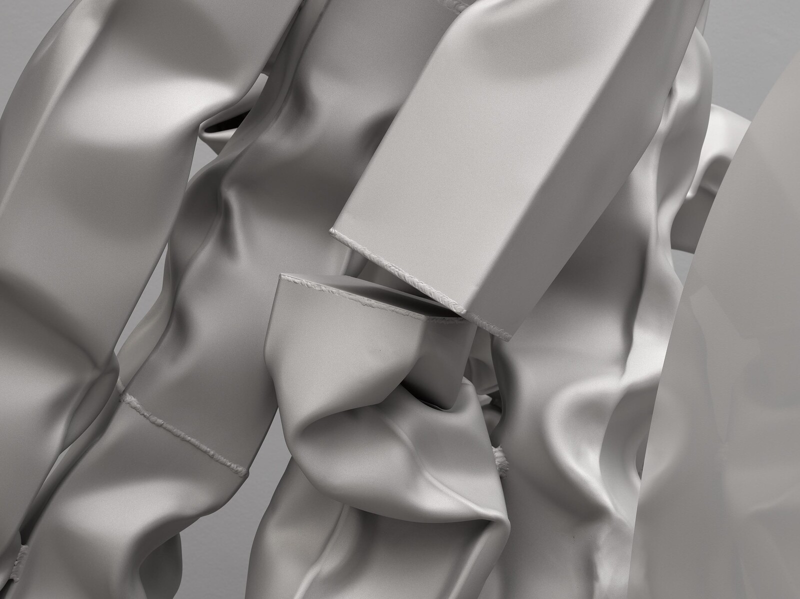
So, here goes: I stood in front of Carol Bove’s new sculptures at David Zwirner and related to them in a way that is intuitive and emotional, a way that made a specific viewer of me, one whose life seeps into the looking. Though they’re made of metal, I saw their softness. I kept staring at the meeting points of two bits of steel, and found in them a connection. Bove’s exhibition, “Vase/Face,” includes two sets of works presented across two rooms, two presentations that differ in scale, color, and treatment. In the main space are four large-scale sculptures made of stainless steel and laminated glass with heat-fused ink. The sandblasted stainless …
September 23, 2022 – Review
“A Maze Zanine, Amaze Zaning, A-Mezzaning, Meza-9”
Rachel Valinsky
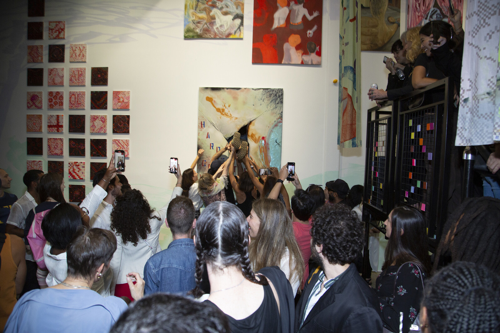
Pulling up to David Zwirner on the opening night of its tongue-twistingly-titled benefit show for Performance Space New York, the scene was chaotic: a several-hundred strong mix of fashion week, Armory week, and overdressed Chelsea partygoing crowds spilled out onto 19th Street, closed to car traffic and repurposed for a block party, complete with food stands and ice-cream truck. Inside, five long banners co-made by the exhibition’s all-star squad of artist-organizers—Ei Arakawa, Kerstin Brätsch, Nicole Eisenman, and Laura Owens—hung from a beam overhead.
These screen-printed, acrylic- and vinyl-painted Curtains (all works 2022 unless otherwise stated)—a title that evokes the fabric separating audience from proscenium stage—read like précis of each artist’s signature style: one shows a cartoonish Eisenman figure raising paint roller to wall, while Brätsch’s and Owens’s colorful, abstract geometries and pop-cultural influences infiltrate others. Two open, wooden structures on wheels evoked both stage props and domestic spaces (they are called “houses” on the gallery map). Behind the curtains, Performance Space’s metal rigging structure was temporarily relocated as décor, where it dynamically remodeled the gallery’s interior. A ramp leading to a platform wrapping around either side of the space served as the titular “mezzanine,” offering elevated views of the many paintings …
February 5, 2021 – Review
Thomas Ruff’s “tableaux chinois”
Tomas Weber

The propaganda photographs of Chairman Mao, miners, dancers, rallies, and flowers reproduced in Thomas Ruff’s “tableaux chinois” look magnificent. Their colors are warm and bright: the grass is the greenest of green, skies blue beyond belief, the Chairman radiates kind-heartedness. Propaganda might at first seem an odd motif for an artist interested in the camera as a machine for recording and rendering objects into reliable flatness. But in addition to testing the limits of the camera’s detachment, Ruff has—going back to his series “Plakate” (1996–99)—also interrogated its capacity to glorify.
Think of the passport-style photographs in his “Portraits” from the 1980s: blown up to overwhelming sizes, the anonymous subjects are transformed into bureaucratic demi-gods. Or take his colossal C-prints of the heavens (“Stars,” 1990): in images taken from an observatory, the light from innumerable stars and galaxies scatters over a black abyss. The apparent neutrality of Ruff’s images—too much to take in all at once—can be grandiose, eulogistic.
Here, Ruff has scanned propaganda images taken from the Chinese-produced European magazine La Chine, published between the 1950s and ’70s, and converted the analog halftone pattern of the scans into a pixel structure. He has then placed the digitally built images over the …
October 11, 2017 – Review
Ruth Asawa
Alan Gilbert
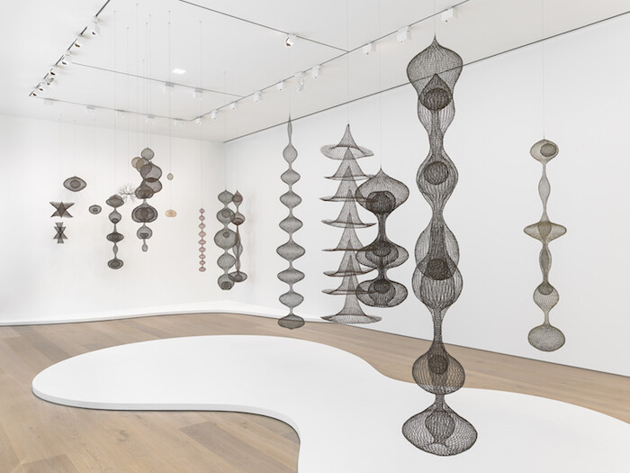
One of the three gallery spaces at David Zwirner’s Ruth Asawa exhibition contains a display case featuring archival photographs taken by Imogen Cunningham of the artist in her studio and with her family; an earlier photo of Asawa in class with Josef Albers at Black Mountain College; a letter Asawa wrote to her future husband, architect Albert Lanier, with enclosed drawing; and more. It also features a small color photograph of Asawa in Mexico placed near a flattish, oval basket made of thin, metal wire. This latter, relatively unassuming object, barely highlighted within the overall exhibition, is in fact a key to Asawa’s important art, which until recently has been neglected, despite a scattering of noted shows. Similar to the painter Etel Adnan, who like Asawa lived and exhibited locally in the San Francisco Bay Area for decades, Asawa did not achieve international renown until much later in life. And like Adnan, she was displaced by war.
While a teenager, Asawa was one of the roughly 120,000 Japanese Americans forced by the United States government into internment camps during World War II. Asawa’s father, a farmer in California, was detained first and sent to a separate location; she didn’t see him …
June 23, 2016 – Review
Jordan Wolfson
Kevin McGarry
At the apex of art and money, the air is thin and the atmosphere is replaced with rarified pain. Rather than terrestrial life, only blood fortunes are endemic here, whose constituent lifestyles are at least as abstract as the most totemic artworks that give this place meaning. All the vectors involved in Jordan Wolfson’s show at David Zwirner point to such a place of supremacy.
The gallery has accrued spectacular gains during this long boom of the art market, which has endured through a period in which the working and unworking people of the world have seen most of what remains to them siphoned away. The artist has been given the codes to launch his vision without compromise, in an ideal demonstration of what one and the other—artist and gallery—can do for each other within the reigning system of production.
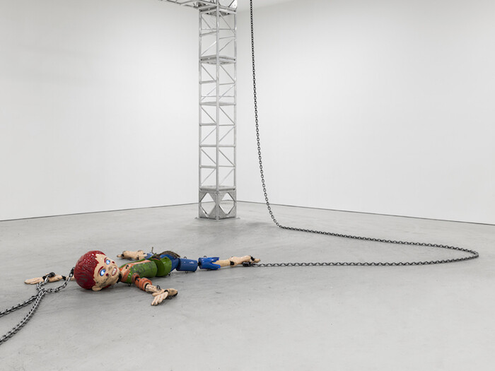
That vision is an inanimate Colored sculpture (2016) of a lacquered, wincing boy, cut up and marionetted by a brutal contraption of chain pulleys in such a way that he is popularly referred to as a robot. This is likely because Wolfson’s breakthrough work, Female Figure (2014)—exhibited at his first solo show with David Zwirner—more conventionally resembles a robot. Two years ago, …
December 11, 2014 – Review
Christopher Williams’s “For Example: Dix-Huit Leçons Sur La Société Industrielle (Revision 19)”
Karen Archey
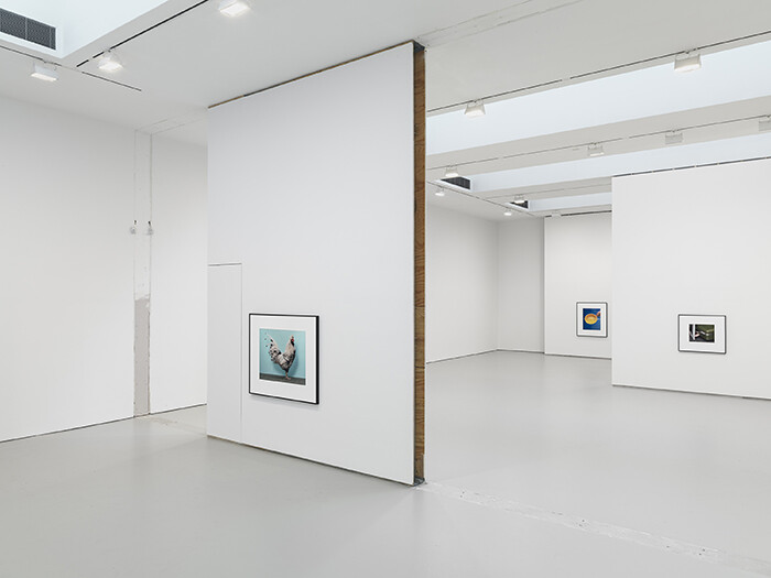
Do you think any collectors were bothered by the raw, open drywall and exposed electric wiring at Christopher Williams’s newest exhibition at David Zwirner? Or did they read it as a bad-boy “fuck you” without actually feeling insulted? Did they read it as Christopher Williams probably intended, as a savant gesture referencing the institutional critique strategies of his mentor Michael Asher, who made work during a time in which manipulating a gallery’s architecture was actually a radical gesture? Do you remember the time in Sex and the City that Charlotte meets a movie star in her gallery and he confuses the fire extinguisher for contemporary art?
Wait—cringe! I forgot mass-appeal pop culture isn’t in-the-know enough to be considered a salient reference in a contemporary art criticism context, even if it’s poking fun of the art world’s need-to-knowness, and especially not if it’s a television show detailing the lives of “basic” women. Intentionally raw walls okay; Sex and the City references not okay. Got it.
You probably get what I’m going for here. There are certain radical gestures—walking around nude in full body paint at an art fair, making monochrome paintings, or performative alterations in the gallery space, for example—that through time have …
November 25, 2013 – Review
Ad Reinhardt
Alan Gilbert
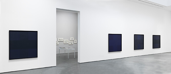
For an artist perhaps most famous for his “black” paintings—some of the most visually obdurate work ever produced on canvas—Ad Reinhardt (1913–1967) spent much of his life taking great pleasure in images. The current show of his work at David Zwirner, which now represents the Reinhardt estate, reveals yet another mid-century abstract artist with deep roots not only in figuration and illustration, but in New Deal-era progressive politics as well—the art history that textbooks and classrooms continue to relegate to the dustbin. Exhibition curator Robert Storr has selected more than two hundred original small cartoons Reinhardt drew while working full-time for the leftist magazine PM from 1942–47 (except for a two-year stint in the U.S. Navy). Topics range from domestic politics to the economy (one example—even more relevant today—features a hot air balloon with the word “salaries” on it being set aloft, while another with the word “wages” remains tethered to the ground), to international concerns (a caricatured Hitler features in a number of them), to gender and race relations. Despite these serious issues, humor abounds in both images and text, and it isn’t a stretch to make a visual connection between the cartoons’ inked black suits and the much …
July 21, 2012 – Review
“Stand still like the hummingbird”
Alan Gilbert

Stepping out of time can be a risky proposition, however carefully planned the escape. Art has always been in conflict with time: whether as a magical or religious symbol of the eternal, as the marker of its maker’s immortality, and, in the twentieth century, as an increasingly riven material object in a virtualizing world. The hummingbird in the title of the group show “Stand still like the hummingbird” at David Zwirner may appear to be motionless, but that’s only because its wings are beating like crazy. Similarly, much of the work on display may appear Postconceptualism cool (or in the case of Marcel Duchamp’s Comb [1916/1964], pre-Conceptualism insouciance), but provocative tensions flutter beneath the surface.
It’s only fitting that the title of the exhibition has been lifted from Henry Miller, since much of the work selected by curator Bellatrix Hubert, a partner at David Zwirner, plays with appropriation, most overtly in two of Sherrie Levine’s most famous photographs: After Walker Evans: 4 and After Walker Evans: 3 (both 1981), portraits of Allie Mae Burroughs and her husband, Floyd, respectively. Although historically huge in the development of twentieth-century art, it can be challenging in the current era of wild appropriation and photography …
November 17, 2010 – Review
Luc Tuymans’s "Corporate" at David Zwirner, New York
Paddy Johnson
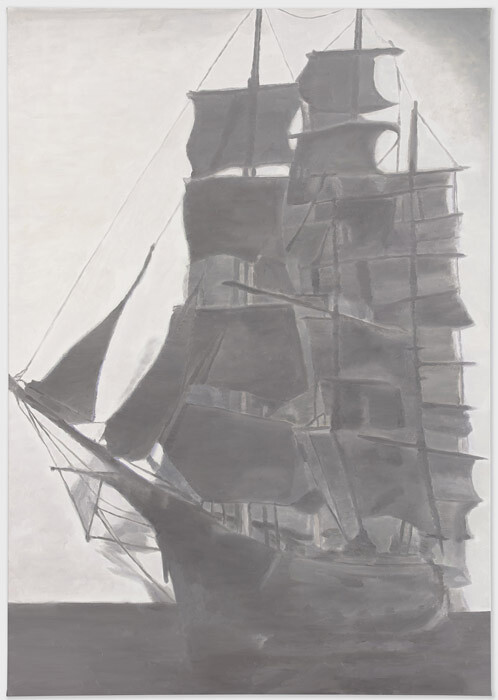
Luc Tuymans’s paintings set a somber mood at David Zwirner: a ship at sail with its stern to a cloudy horizon; a conspiratorial faceless portrait; a panel discussion dissolving as its participants are cast in blinding light. The 11 works in his latest show titled “Corporate” darkly depict corporations as the new feudal lords. This means a series of portraits, interiors, and landscapes in shades of gray line Zwirner’s walls, along with a girl on horseback and some knightly armor.
That Tuymans’s work takes “the banality of evil” as its subject matter—an often re-iterated point made again by curator Helen Molesworth in the artist’s retrospective catalogue at SFMOMA this spring—is only a half-truth here. His 17th century ship painting may evoke the same stillness of a Vija Celmins ocean painting, but it still fails to be quite so unsettling. There’s simply nothing remarkable about the composition, nor the artist’s loose brushwork, a point underscoring the larger problem within the show. The line between quiet and inert is much too thin.
Part of this has to do with the theme of the show, which is engaged only superficially. The subject of each painting ranges from the expected to the uninteresting. Two smoke stacks …