Disorientation: We Are Almost There
Many of the more prominent artworks produced in the last decade or so are characterized by a recasting of what were once called installations as something closer to interiors, relegating the installation to a supportive role that places meaning in the service of activity. From an artwork spread out everywhere we turn to one that is located very precisely in the features that can be said to make up the space—the walls, the furnishings, the floor coverings, the display structures, the shelves. Whether it’s the artwork as lecture hall, museum lobby, bookshop, screening room, library, dining hall, video store, or rec room, one finds a consistent engagement with architecture’s interior spaces and conventional typologies. But this repeated rendezvous has been mostly a dance of half steps—these “interiors” don’t so much use site as setting and material as put a new skin on it. While various artists may have considered what this “slouching toward the interior” may mean for art production, few have considered the potential that may be stored in the interior itself as reflexive structure, malleable form, and analytical tool.
Jorge Pardo’s lobby at Dia or the interior of his Mountain Bar in Los Angeles, for instance, do little but reiterate his project—both in terms of the concerns that drive it and the design languages that it appropriates—on a larger scale. Perhaps these works complicate things, but only internally—that is, only in stretching the question regarding the indeterminacy of sculpture (a question that underlies his entire project) into larger architectural expanses and non-art-institutional spaces that demand more complex forms of bureaucratic negotiation, capital investment, and user engagement. The morphologies and decors employed in these spaces, however, were not introduced as another layer of variables or information—a layer that by its very destabilizing presence forces certain reconfigurations. And something similar can be said about the “interiors” of any number of artists who have been active since the early to mid 1990s.
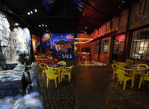

Carsten Höller’s The Double Club (2008–9), a half-Congolese, half-Occidental bar, disco, and restaurant in London, was an interesting recent effort to test the interior as a complex structure. At the very least, it revealed an understanding of decor as bound to cultural codes as much as to personal vocabularies, of the interior as determined at an interface between external factors and “internal” languages. In understanding this, and in showing it twice and side by side, The Double Club assumed a diagrammatic function. Aside from all the eating and dancing and cavorting that took place in it, the structure itself was meaningfully employed to convey at least two different kinds of information: information, on the one hand, about Congolese and Western cultures (even if schematically), their interaction (or lack thereof), their differences, and so forth; and information, on the other, regarding the very conditions of the interior itself. The Double Club was a double diagram.
In this case, the doubling is instrumental in articulating the difference between the interior as container and the interior as self-reflexive structure. It offers a vertical diagram—or a surface-substrate diagram—confronting the look of the space with the structural conditions of the interior. It’s a diagram cast in high relief by the overlapping of two separate nightclubs. This very process of assembling—this effort to establish a system of relations in order to produce a specific morphology and identity—is twice shown and, inevitably, thematized. There’s nothing like repetition to underscore a point and introduce a moment of self-reflexive difference.
We have also seen a horizontal diagram in which two cultures are juxtaposed within an interior, like the DöplirCaffé in China Miéville’s The City & The City, in which
one Muslim and one Jewish coffeehouse, rented side by side, each with its own counter and kitchen, halal and kosher, share a single name, sign, and sprawl of tables, the dividing wall removed.1
But whereas Miéville’s Jewish-Muslim composite (combining the two overdetermined populations of our age) assumes a kind of inevitability in our current geopolitical landscape, the Western-Congolese assemblage feels more arbitrary and more open. Why not Trinidadian and Swiss, Nigerian and Mexican, Cambodian and Argentine, Inuit and Indian? One can imagine this horizontal diagram held in tension by such an arbitrary polarity, proliferating into an unhinged arrangement of multiple cultures, of multiple polarities, inducing disorientation through the geo-zapping that would happen with every step. But in The Double Club, as it stood, the disorientation was contained or only implied: visitors risked being suddenly jolted from only one ambiance/culture to another, all the while clearly seeing this potential shift frozen in the double decor of the club.
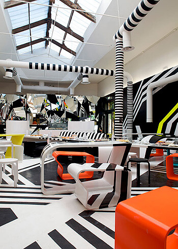

Tobias Rehberger’s “bar-cafeteria,” Was du liebst, bringt dich auch zum Weinen (2009), shown at the last Venice Biennial, renders literal this disorientation and amps it up. He trades incommensurable cultural signs and styles for total sensorial immersion in hyperactive graphics and shapes. Shooting lines, folding planes (physical and represented), bending tubes and ducts, proliferating stools and other slightly deformed furniture pieces, punctuated by recurring moments of intense orange and teal and yellow, begin to articulate an almost unmanageable and gleeful explosion of abstract signage, blurring references, and elongated and twisted artifacts. The senses reel with acceleration and vertigo—it’s a deranged op painting that slipped its frame to stretch like a flexible membrane over the architecture, torquing the pieces of furniture into slightly skewed shapes in the process. Whatever diagrammatic potential there was in Höller’s project is here forfeited to an affective quasi-delirium, to the possibility of shooting a dizzying charge right into our nerve endings.
I read the disorientation that Rehberger aims to induce as a physical stand-in for the ontological disorientation produced by the interior as its sails away from the solid ground and protected territory of sculpture. Even when Rehberger or Pardo produce functional or seemingly functional artifacts, their feet remain firmly planted on terra firma. This is precisely what allows them to flirt with the possibility of running out into and back from the liminal space that sculpture shares with other modes of object production. They seem unwilling to burn the bridges they cross. Rehberger confirms this, I think, with some of his remarks regarding the Venice project:
I am not actually designing the bar-cafeteria in the new Palazzo delle Esposizioni. The sculpture I am making, which is based on dazzle painting [a camouflage paint scheme used on ships during World War I], is the bar-cafeteria.2
The interior, however, rather than being a self-contained thing, the way a sculpture ostensibly is, materializes out of a series of relationships—relationships to architecture, to infrastructure, to program, to function, to materials, to social and cultural codes, to (brand) identity, to fashion, to specific schedules, to mediatic representation, to available capital and technologies, and so forth. These relations generate a system of articulation: they work on matter to produce distinctive forms.
Can the interior, then, as this node within a complex matrix of infrastructural webs and local value systems, serve not only as a container for participatory projects, but as a starting point for critical reflection within art production? Do recent approximations of the interior reveal it to be fertile territory in this regard? Can the interior be a conceptual structure through which ideas are articulated, the way the cinematic remake in video art and the parametric in design have been in recent years? Or, asked a different way: can the interior be recuperated as a vehicle to think through and not just in?

Italian Ice Cream Shops and Poisoned Cherries
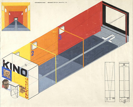
If we speak of recuperation, it’s because the interior has been considered in complex ways before. After the wood-paneled and sumptuously upholstered Victorian apartments that, as Walter Benjamin cleverly pointed out, appear to have been decorated for the presence of dead bodies (the perfect setting for nineteenth-century detective stories), and the eclectic ahistoricity of Jugendstil at the turn of the last century, came efforts to consider interior spaces—inside and outside the home—in complex ways. For example, there are moments in constructivism, de Stijl, and the Bauhaus in which we see the interior treated as vector rather than setting, as malleable typology rather than a set of staid conventions, as active social hub rather than neutral container. The moldings and the upholstery, the organic form and the etched glass, are replaced by gargantuan graphics, hard edges, and abstract patterning—the functions that emerge in the wake of new technologies become generative opportunities in the context of these movements.
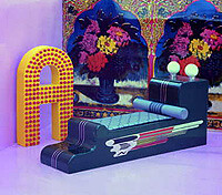

The Radical Architects of the late 1960s—Archigram, Archizoom, Superstudio, Hans Hollein, and others—treated the interior as a rich semantic space through which political and cultural concerns could be articulated and explored. Even Tomas Maldonado—who, in an attempt to defend his side of the divide between the cold industrial design of the Ulm School and its sympathizers, on the one hand, and the hot semantic design of the Radicals, on the other, proposed that the Italians in the latter group were merely designers of interiors—had to concede that their efforts had some critical bite. Although engaged in problems he considered to be anachronistic—addressing an affluent minority in the developed world, trading an old conformism for a new one, and so forth—Maldonado knew that if
we were to consider the conformism of the past with the current one, we [would] have to at least acknowledge that we have won something in terms of an internal dialectic, seeing as, according to the very designers of this new conformism, the objects they produce are deliberately ephemeral and lack lasting value. In this sense, the conformism that these objects produce is itself ephemeral, as it is consumed at top speed by consumerism. Such a conformism implies not so much “being up to date” as being “ahead.”3
The “ahead” within quotation marks is of course ironic: it’s the phantasmic “new” that capitalism always calls for but rarely generates in its hypercharged landscapes of endless stylistic recycling; it’s the mirage of perpetual innovation diffused throughout the culture in order to speed up the cycles of consumption. Self-consciously designing to the rhythms of this constant chase for the new was a way to understand this unprecedented social reality and, also, to produce forms that were implausible before this dynamic was catalyzed by the European postwar economic miracles.
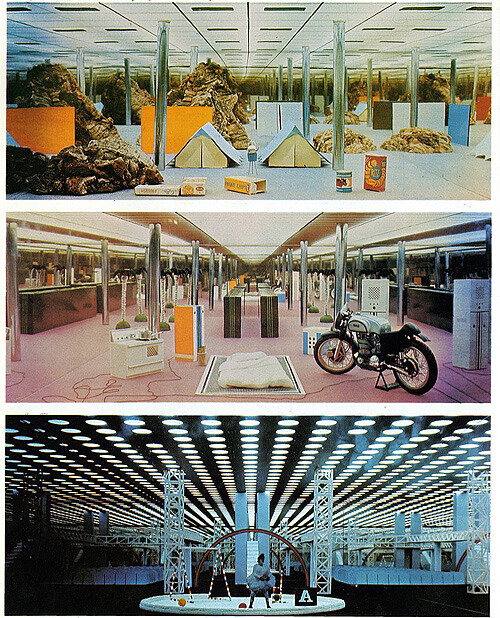

The problem for us … is how to serve up an ice cream in such a way that he [the customer] loses the desire to eat it for the rest of his life. Or an ice cream that, once it has been bought, grows bigger than him and humiliates him. Or that becomes a piece of the world surrounding him and frightens him … In short, an ice cream with no alternatives: either you eat it or it eats you. Or rather: it starts to eat you as soon as you have finished it. And then we think: apple-bombs, poisonous sweets, false information, in short Trojan blankets, beds, or horses that are brought into the house and destroy everything in it.4
The postwar interior that the Radical Architects turned to was an active field where advances in industrial design met antiquated and inflexible values; where behaviors began to be modified by objects; where expendable goods sat inside immovable walls, juxtaposing incommensurable logics, temporalities, and technologies; where the cataclysmic shifts from manufacturing society to information society, from a contained avant-garde culture to an expansive culture industry, were registered. Branzi describes the domestic interior of the 1960s as “the true theater of post-industrial complexity.”5 It was a space in which larger and turbulent social shifts were embodied in compressed form.
The focus on the interior in the case of the Radicals signals a shift from the sphere of production—the factory and the logic of the assembly line, which had permeated industrial design for the previous five or six decades—to the sphere of reception.6 Among other things, this focus was a matter of cognitively mapping a reality that was changing, and of finding proper ways of inhabiting and critically engaging with it, not because manufacturing and the political economy that organized it had vanished, but because they were forced to share space with emerging immaterial means of generating and moving capital, with spectacle and mass media, with increased leisure time and the proliferation of a gadget industry, with changing social mores and cultural conditions—the rise and commodification of information technologies and the new demands that social movements made on the mainstream.
Who’s Afraid of Decor?
In contemporary design, we may see this reflexive current not in the super-integrated interior, the complete environment, whereby everything becomes product, whereby brand, like some living and invasive plant, weaves itself right into the walls, into the display structures, into the doorknobs, into the cash registers, into the hairstyles of the employees, with its spores seeping into the very oxygen particles in the room, turning air into ambiance, life into look. Not even when this is done to such a degree of excess that it is rendered jolting or parodic. We may see it, instead, in negative iterations: in the interior as cancelled structure, as an allegory of so many foreclosed possibilities. Something that may happen, for instance, when Jerszy Seymour floods the room where all his products are displayed (Being There, “River Workshop” at the Villa Noailles, 2009). He creates an interior while negating the interior. It’s a mise en scène of the interior not happening, where what is usually employed to stimulate desire now unmotivates it, creating not a moment of total immersion but one of impenetrability or conceptual slippage.
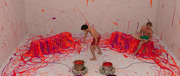

Fleshing out this anti-interior, Seymour remains within the series of relations needed for the interior to materialize by very deliberately refusing to address them. Architecture, program, function, fashion, and so on, are all metaphorically crossed out; the framing discourse of design, however, is the ground on which this is done. (Other systems of relations—institutional support, DIY politics—provide the “lateral” spaces from which to articulate his oppositional stance.) It is only in this explicit negation that his flooded room can be read as that imaginary liquid state of the interior, as a typology still untouched by the many elements that put profit before well-being and ultimately determine the character of the interior in general in our moment. As he has done before by applying pressure to conventional typologies, Seymour is conjuring that bracketed space or moment where we can still imagine a history of design that didn’t turn out the way it has.
It may be in trying things that the designer won’t try (one is spared any sense of obligation to the discipline or its history not intrinsic to the situation), in debilitating some of the protocols indigenous to the field she or he often adheres to (even if unwittingly or through oppositional stances), in remaining insensible to “the chase for the new” that guarantees success in the commercial world, that the use of the interior in an art context may be of interest. One could engage things in a tactical way, understanding “tactics” in Michel de Certeau’s sense—as actions or modes of behavior that have no legitimate institutional ground and don’t aim to make advances in any field. They use, opportunistically, the spaces opened by established practices and institutions in order to unleash unexpected performative elements and to address needs that fall outside the conventional parameters that these practices and institutions adhere to.7
Treating the interior in this way allows us not only to work against the relations of which the interior is both a relay point and a morphological manifestation, but also to alter the relations’ variables—habit may dress them up as immutable, but they don’t need to be. In other words, the art context would allow us to invent programs and alter conventional functions; to introduce value systems usually absent from the equation; to rely on decorative languages or sign systems that may not have an outlet in design institutions and histories, or simply to apply lethal doses of ambiguity to the very idea of a signature language; to tap new infrastructures and propose new routines; to politicize parts of the process through calculated decisions and infuse things with increased self-reflexivity and the complex understanding of site-specificity inherited from Institutional Critique and similar practices; to complicate mediatic representation and representation in general; to practice an amnesia in order to wrest away permission to mix incongruous elements and ferment strange brews of seemingly incommensurable materials; to shift the points of stress and strain and torque the list of expectations (maybe the call for clarity in terms of brand identity becomes its opposite); and so on.
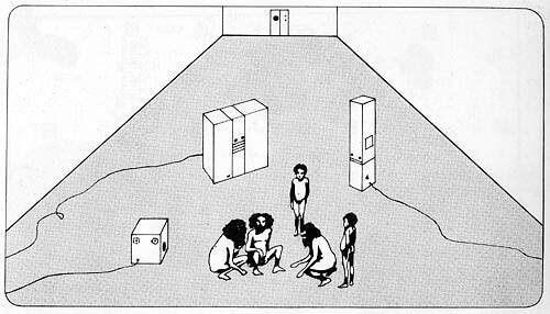

We can be promiscuous with the unexpected. We can run interference by introducing dirty data into the interface. Models need no longer be drawn from the same sphere that they have always come from. The indeterminate home-restaurant in an immigrant neighborhood could be as good a starting point as Karim Rashid’s Kurve; the Tuareg tent as available as the proliferating blob-teriors supposedly signaling the most advanced practices out there; the generic languages of the mobile home designer as rich with potential as the sophisticated vocabularies that are taught at the Royal College of Art; Marcel Broodthaers’ inanimate stage sets (strange and perverse simulacra of the bourgeois apartment) as legitimate a source as any of interior design’s favorite textbook cases.
For instance, what of the interior as a vector or active (diagrammatic) stage, where the transmission of information and human interaction happen not against a purely aesthetic or graphic backdrop, but, on the contrary, in an interior, thematized and activated, that becomes part of the information transmitted, affecting the interaction it shelters? The Double Club was this—or, at least, approximated this. In such a situation, the very idea of a backdrop ceases to make much sense. The very morphologies and graphics that determine the “look” of the interior begin to articulate the flows—of ideas, of interests, of money, of ideology—that cross them, as they diagram their very own structural realities.
And this may afford the possibility for another autonomous but interconnected layer of possibilities to be annexed to the artist’s project. In this layer, deliberate discontinuity, productive dissonance, deformity, indeterminacy, mutation, modification, growth, and instability could generate increasingly transformative articulations that exist in a state of mutual animation with the rest of her project. In an art context, one can practice a kind of interior-design teratology with impunity.
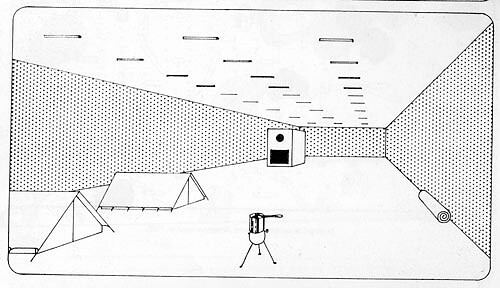

We can also consider the interior as an active tool, independent of the need for it to function in relation to other art objects, activities, or fictional dressing up. The interior itself is—or can be—a diagram of so many relationships that it needs little supplement. And switching the variables within those relations introduces new information, unexpected and foreign material that generates instability at the structural level and is bound to speed the processes of differentiation whereby a thing—the interior—becomes different than itself, allowing new morphologies to emerge, expanding the range of things it can become or how it comes to be, cracking open tightly sealed conventions so that unexpected concerns and positions can sneak in. It could be a matter of working at the level of the interior’s constitutive parts in order to render it a more complex and tactical tool of articulation—a matter, on the one hand, of attempting to chart topographies that still don’t assume physical form, that lie latent in the framework of the interior, where virtual possibilities, not yet pressured into actual forms, sit suspended; and, on the other hand, of placing the interior at the service of concerns that are usually foreign to it (although there is no necessary reason why they should be).
In the end, one is left with questions that invite testing: Can working the interior from an art context open a new dimension for it or in it, just as video and filmic art opened a critical dimension in the cinematic remake? Can shifts at the level of the variables that make up the relations that provide the necessary conditions for the interior have exciting repercussions in spatial articulation? Do their potential ramifications generate morphologies unexpected enough to be worth the effort? Can the interior be tactically inhabited in such a way that, operating on its structural substrate, we can articulate urgent and relevant things—things perhaps not always falling within the scope of design—through tweaked morphologies, unexpected decors, typological deformations, and complex deployments of space?

China Miéville, The City & The City (New York: Del Rey, 2009), 22.
Tobias Rehberger in “Does Venice still matter? Matthew Slotover, Hans Ulrich Obrist, Tobias Rehberger and others on the Biennale,” The Art Newspaper, May 29, 2009 (emphasis added), →.
Tomas Maldonado, “Diseño Industrial, Presente y Futuro,” in Es la Arquitectura un Texto? y otros escritos (Buenos Aires: Ediciones Infinito, 2004), 95. Author’s translation.
Andrea Branzi, “Radical Architecture,” in Andrea Branzi: The Complete Works (London: Thames & Hudson, 1992), 38.
Andrea Branzi, “A Homeless Country: Experimental Models for the Domestic Space,” in Italy: Contemporary Domestic Landscapes 1945–2000, ed. Giampiero Bosoni (Milan: Skira, 2001), 157.
For this notion of moving from the sphere of production (with the factory as a governing metaphor) to the sphere of reception, see Herbert Muschamp’s “Reception Rooms,” in The Work of Ettore Sottsass and Associates, ed. Milco Carboni (New York: Universe Publishing, 1999).
See Michel de Certeau, The Practice of Everyday Life, vol. 1, trans. Steven Rendell (Berkeley: University of California Press, 1984).
Category
Subject
The tactical interiors thesis was generated through collaborative research, experiments, and conversations undertaken with Ernesto Oroza.