Categories
Subjects
Authors
Artists
Venues
Locations
Calendar
Filter
Done
March 12, 2024 – Review
Catherine Opie’s “Walls, Windows, and Blood”
Sylvie Fortin

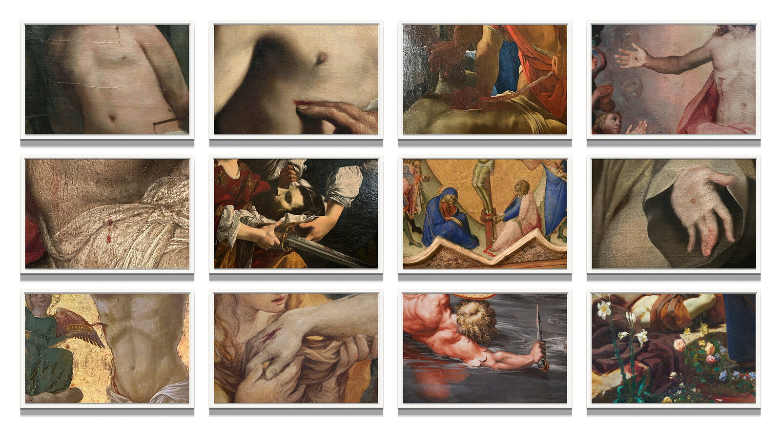
They say ghosts, vampires, and the soulless cast no shadows. Shot in a Vatican City emptied of visitors during the pandemic summer of 2021, Catherine Opie’s new photographs provocatively reshuffle different threads of her longstanding inquiries—the spectrum from transparency to opacity; communal spaces; the body as/and architecture; queerness and institutions. With its succinct, descriptive enumeration, the exhibition’s trinitarian title “Walls, Windows, and Blood” implies unsettling visual conversations to which she gives form with a selection of images from three new series (all works 2023), clustered in grids, lined up along walls, and proceeding in colonnades.
No Apology (June 5, 2021), a large photograph of Pope Francis delivering a speech from a top-floor window of his residence overlooking St. Peter’s Square, greets visitors. A lone white man dwarfed by statuary and muffled by the resounding whiteness of the colonnaded plaza, he floats above a blood-red banner bearing his coat of arms. In his short allocution, uttered in the wake of the traumatic discovery of unmarked graves at the former Church-run Kamloops Indian Residential School in British Columbia, the pontiff acknowledged (apologies would have to wait) the Catholic Church’s complicity in both the colonial dispossession of Canada’s Aboriginal communities and the accompanying systematic …
February 28, 2017 – Review
Kader Attia’s “Reason’s Oxymorons”
Andrew Stefan Weiner

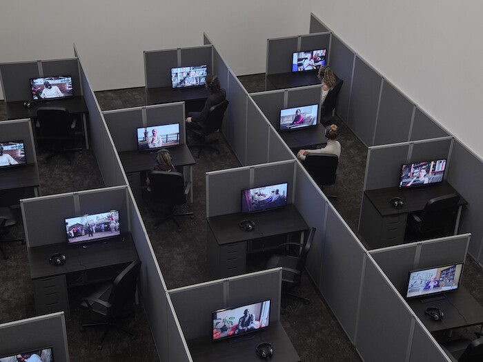
Despite their enigmatic, aloof character, most of the works in Kader Attia’s current exhibition at Lehmann Maupin are relatively easy to make sense of. Whether in their medium (neoconceptual sculpture), their mode of facture (readymade assemblage), or their topic (cultural hybridization), they exemplify what we now expect of “global contemporary art.” This isn’t meant pejoratively; the sculptures are poetic, spare, and subtle, compelling attention while frustrating reductive interpretation. They show why the artist is receiving ever-broader acclamation, and they make clear that he deserves it. Attia’s inventiveness and spatial intelligence are evident from the show’s outset, most memorably in an arrangement of Styrofoam packing materials upon a wooden table (Untitled, 2017), a piece that looks like it might have taken minutes to assemble but that reads as a mordant update of Constant’s designs for New Babylon (1959-74).
By and large, the other sculptures in the show successfully achieve the objectives they seem to set for themselves, reworking established tropes of the Western neo-avant-gardes by interrogating their assumed universality; the precedent of artists like Jimmie Durham and David Hammons is clear. With that said, the piece that stands out is the one that doesn’t really work, at least not in the way …
December 13, 2012 – Review
Mickalene Thomas’s “How to Organize a Room Around a Striking Piece of Art”
Alan Gilbert

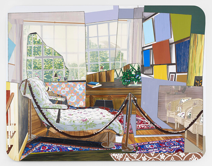
Mickalene Thomas first gained acclaim with her stunning painted portraits of African-American women. She easily could have continued producing this kind of portraiture work à la Chuck Close or Kehinde Wiley and become quite successful in a similar way; instead, she has restlessly explored a variety of genres and mediums—including photography, installation, collage, murals, film, and video—while retaining her signature style. Concurrent with a large solo exhibition at the Brooklyn Museum, her work is showing at both of Lehmann Maupin’s New York City locations under the title “How to Organize a Room Around a Striking Piece of Art.” At the Lower East Side venue, new paintings resulting from time Thomas spent at Claude Monet’s house and garden in Giverny, France, are on display. Each employs the fractured picture plane, swathes of bold color, and embedded rhinestones common to Thomas’s work; if anything, absent the faces that previously dominated, these qualities become even more pronounced.
In her portraits, rhinestones outline shapes or sparkle in the jewelry worn by her depicted subjects, but in Monet’s Salon (all works 2012) red rhinestones cluster in a rug’s gorgeous detailing. This interior view reflects an image seen in the first piece gallery-goers encounter—a video looped partially …
August 11, 2010 – Review
"Lush Life: An Exhibition in Nine Chapters," New York
Media Farzin

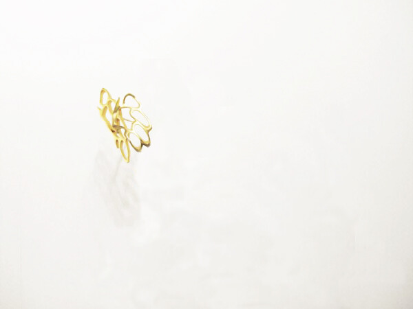
The premise is a nine-part exhibition inspired by an edgy crime thriller, promising equal parts complexity and intertextuality. The results, however, aren’t quite as involved. “Lush Life: An Exhibition in Nine Chapters” is grouping of a nine loosely-themed summer shows scattered throughout New York’s Lower East Side. The exhibition takes its cues from Richard Price’s 2008 novel, Lush Life, a murder mystery that unfolds around old and new ghosts of the neighborhood. But the connection stops at the level of inspiration. Not that the show is lacking in structure: the collaborative venture by painter Franklin Evans and independent curator Omar Lopez-Chahoud involved soliciting artists from each gallery, assigning a chapter title as theme to each venue, commissioning works specifically for the show, and even a website complete with a picturesque map and video tour by Price himself.
Walking through the galleries, however, the elaborate armature fades away. This may be to the show’s benefit, saving the work from becoming illustrations of the novel. Price’s Lush Life is mired in urban grit, with brisk dialogue and deft character studies that capture the desperation present in the neighborhood’s upscale bars no less than its outlying housing projects. But the grit of the “Lush …