Categories
Subjects
Authors
Artists
Venues
Locations
Calendar
Filter
Done
February 26, 2020 – Review
Hannah Levy’s “Pendulous Picnic”
Ksenia M. Soboleva
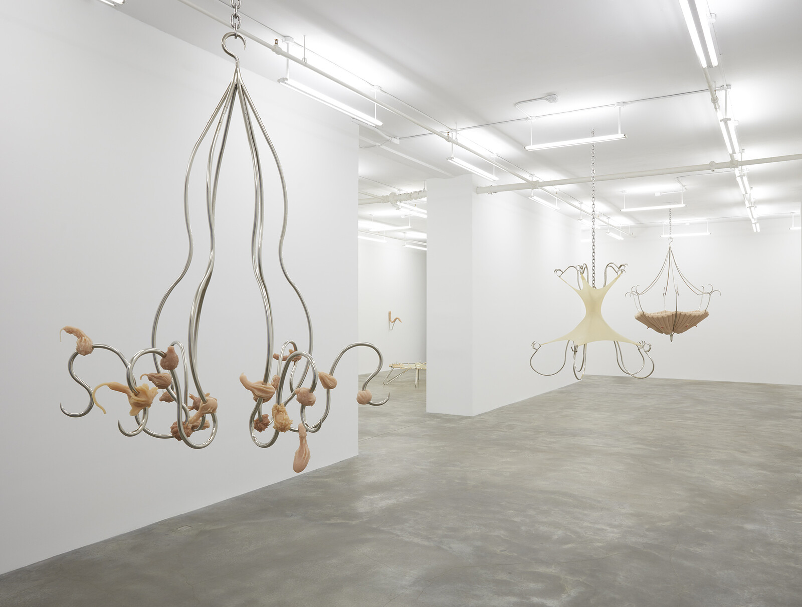
Hannah Levy’s sculptures can make you shudder. Working between sculpture and design, she extracts commonplace objects from domestic contexts and defamiliarizes them through her use of unexpected materials, distortion of scale, and exaggeration of their formal properties: their curves and bends. The sculptures in “Pendulous Picnic,” her first solo exhibition with Casey Kaplan Gallery in New York, combine silicone and steel—the artist’s signature materials—into multifaceted structures that conflate forms resembling vegetables and body parts in disturbing ways. Take her untitled series of wall-mounted sculptures (all 2019), in which metal fixtures hold up silicone casts of enlarged asparagus, a recurring motif. The artist renders each phallic object limp, drooping over the curved metal as if it might slide off any second—thereby denying any imagined potential for sexual pleasure.
More striking are Levy’s suspended sculptures, something of a departure for the artist. Hanging from the ceiling in the first gallery are three large, untitled structures (all 2020) reminiscent of nursery mobiles—though far too large and hazardous to be suitable for infants. The nickel-plated steel frames curl into chillingly sharp edges resembling fishhooks. The metal is pierced with silicone objects whose surfaces resemble pale skin: in the first sculpture the viewer encounters, casts of …
December 4, 2014 – Review
Geoffrey Farmer’s “Cut Nothing, Cut Parts, Cut the Whole, Cut the Order of Time”
Alan Gilbert
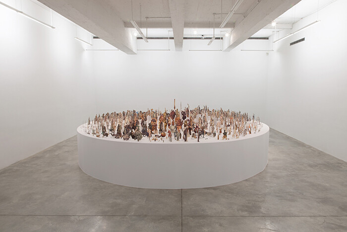
If some version of the afterlife exists, and if Aby Warburg manages to find a little peace there, he might be pleased to see Geoffrey Farmer’s “Cut Nothing, Cut Parts, Cut the Whole, Cut the Order of Time” at New York’s Casey Kaplan. During the last few years of his life, Warburg famously worked on Mnemosyne Atlas (1924–1929), a collection of nearly one thousand images divided thematically and pinned to wooden panels. Though primarily art-historical (and heavy on the Italian Renaissance), these black-and-white reproductions were supplemented with maps, cosmological and mathematical formulas, text, and newspaper photos. While diachronically charting the evolution of an image or motif through time (“ascent to the sun,” for instance), Mnemosyne Atlas also makes synchronic connections across cultures and metaphor. The result is a project that combines the deep knowledge of the scholar with the associational logic of the poet, both amplified by a sense of iconography as always alive: Warburg’s panels are a kind of animistic art history (and prophetically proto-digital).
Farmer’s Leaves of Grass (2012) was among the most memorable works at Documenta 13 in 2012. Using approximately 16,000 images clipped from issues of LIFE magazine spanning 1935–1985 and affixed to thin sticks, he created …
December 16, 2013 – Review
Liam Gillick and Louise Lawler
Tyler Coburn
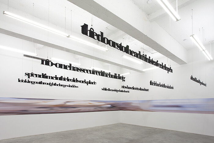
In their current exhibition at Casey Kaplan, Liam Gillick and Louise Lawler look backwards and askance, mining their archives for oblique portraits of the museum and factory floors, fast inclining towards abstraction. Gillick has periodically advocated for a methodology that functions as a “critical double” and “parallel structure” to a dominant culture, and both his and Lawler’s works reveal the possibilities and pitfalls borne of such proximity.
The artists have never shown together, though each has worked to varying degrees with colleagues, from Lawler’s seminal collaborations with Sherrie Levine and Allan McCollum to Gillick’s recent exhibition with Lawrence Weiner. Lawler’s broader practice, of course, is also necessarily incorporative, filled with poignant glimpses of artworks enmeshed in institutional matrices. For Kaplan, she returns to a view of a work by Carl Andre, a Gerhard Richter color chart, and a Richard Serra drawing in Life Expectancy (2010), as well as to an image of Edgar Degas’s dancer in Chicago (2011/2012); the softness of her figure gives the tantalizing suggestion that Lawler has chosen to focus instead on the glass case so central to the sculpture’s original controversy.
These cibachromes share space with their vinyl mutations, “placed and pulled,” as she calls it, along one …
September 23, 2012 – Review
Simon Starling’s "Triangulation Station A (40°44’49.17″ N 74°0’22.45″ W)"
Tyler Coburn
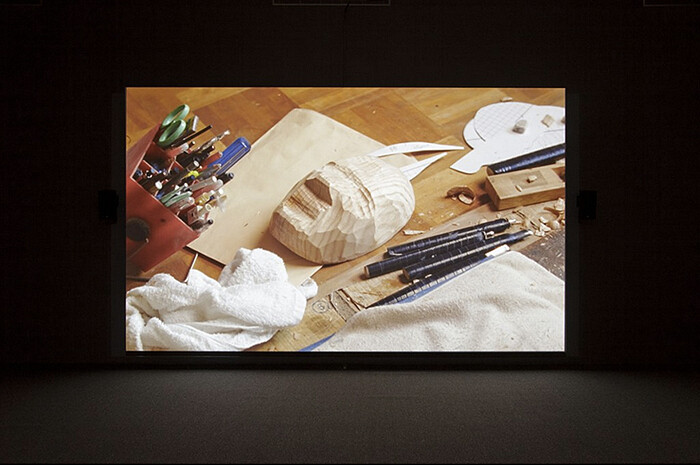
Simon Starling returns yet again to the career of Henry Moore in Project for a Masquerade (Hiroshima) (2010), currently on view at Casey Kaplan, New York. The film traces the troubled history of the British sculptor’s monument, Atom Piece/Nuclear Energy, from its 1967 installation at the historic site of Chicago Pile-1 to the Hiroshima City Museum of Art, which collected a bronze model in 1987. Moore died a year before the acquisition, though he was already caught in political back-pedal. A 1970 photo shoot staged the sculptor at work on the finished model, next to an elephant skull—comparatively neutral, considering the mushroom clouds and human skulls of actual influence.
Starling begins with a name. At the outset of the film, an Osakan mask maker planes “Moore” off a wooden block and whittles the enchanted object down to the sculptor’s face. This mask is joined by fellow Cold War likenesses, shown in partially-completed states, including Pile-1 orchestrator, Enrico Fermi; James Bond; Anthony Blunt; and the opposing faces of the Moore monument. While the camera attentively follows their making—never straying from the craftsman’s studio—a voiceover imagines the finished masks taking positions on the Noh stage. Adapting the 16th-century play “Eboshi-ori,” Starling casts …
June 10, 2010 – Review
Trisha Donnelly at Casey Kaplan, New York
Paddy Johnson
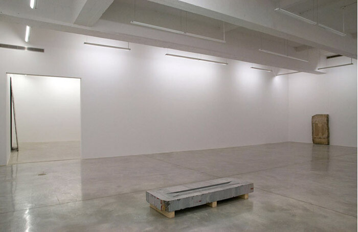
Is a lot of empty space and a couple of big slabs of marble enough to unify an exhibition? Almost certainly yes, which is also the problem: it’s too easy to make a show look cohesive when there’s not much in it. For her fourth solo show at Casey Kaplan, Trisha Donnelly sparsely arranged a few stone sculptures—relics from the fourth (and relatively empty) dimension.
In the first gallery, front and center, there’s an angular pink stone with two ridged scooped out areas on either side. Mounted on two 2x4s, it resembled a seashell, temporarily beached here. In the following room is what looks like a fossil or victim of some mechanical penetration, the scars of the brutal equipment meant to harvest unnamed riches laid bare. When the show was first installed, a small amount of water left from the wetted blades used to cut the stone lay suggestively in the stone’s cracks. (I was disappointed when the gallery director Loring Randolph told me there was no intended meaning behind this; the water was gone when I returned.)
One of many possible Rosetta Stones to the show, a yellowish slab of marble leaning against the far wall with two loud speaker-esque slits …