Categories
Subjects
Authors
Artists
Venues
Locations
Calendar
Filter
Done
July 18, 2017 – Review
Tamara Henderson’s “Seasons End: Panting Healer”
Tom Morton
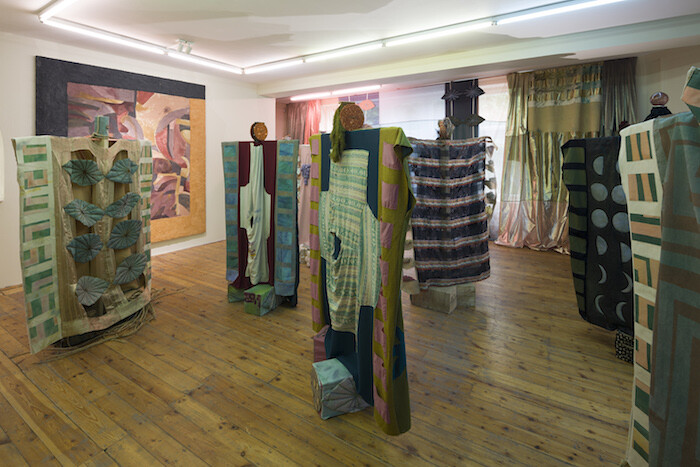
A rule of thumb: hearing about other people’s trips abroad is boring. Another: hearing about their dreams is even worse. Given that the work of Tamara Henderson draws on the Canadian artist’s world-girdling nomadism (her CV is a litany of travel grants and residencies) and her own unconscious (past projects have seen her design quasi-modernist furniture while under hypnosis), then by rights it should function like a sleeping draught. In the best possible fashion, it does. To encounter the woozy, bewitching sculptures, paintings, and drawings that make up her exhibition “Seasons End: Panting Healer” at London’s Rodeo is to let slip the moorings of waking life and drift into a realm where stranger logics rule. As with dreams and drugs, or holidays and holy visions, perhaps the best advice with Henderson’s work is simply to go with it, and see where we fetch up.
First, though, some backstory. The Rodeo show is the third iteration of the artist’s “Seasons End” project, following those at the Mitchell Library (part of Glasgow International) and Los Angeles’s REDCAT in 2016 (two more are planned for 2017: a performance as part of London’s Serpentine Galleries’ “Park Nights” season on July 21 and an exhibition at …
September 2, 2016 – Review
Fouad Elkoury’s “Blues for the Orient”
Colin Perry
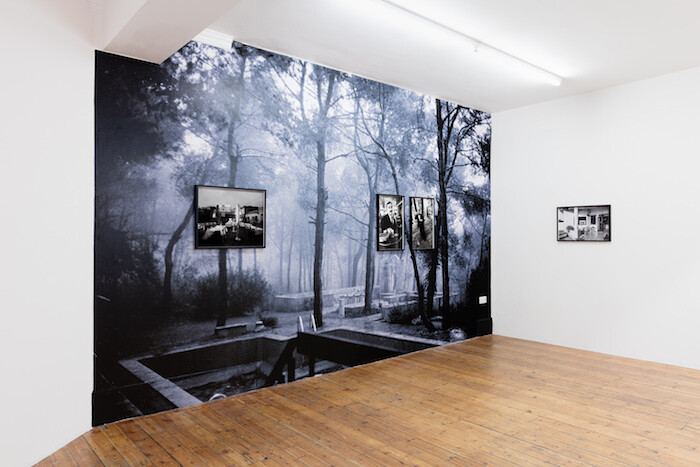
Fouad Elkoury’s photographic installations produce in me a swell of desire and mourning for places that I have never directly observed. Since the 1970s, Elkoury has photographed his home country of Lebanon and the surrounding areas of North Africa, the Middle East, and Europe, tracing a geography of places through images of everyday life: scattered café chairs, empty swimming pools, the swell of waves on the Marmara or the Gulf of Aden. They are at once documentary records and ripe metaphors of transience, modernity, empire, and war—a century of cultural cross-fertilization between East and West. These tensions are neatly contained in the show’s title, “Blues for the Orient,” which is borrowed from a 1961 track by the American saxophonist Yusef Lateef. Elkoury toys here with the Orient as both real and imaginary, as a mood in minor scale.
At London’s Rodeo gallery, Elkoury has papered one whole wall in a black-and-white image of an apparently abandoned swimming pool in a densely forested park (Yarze, 1974). Elkoury has set out to generate a feeling, a mood of elegy and luxuriance given by the dense foliage, which the visitor to the gallery can almost step into—but crucially cannot ever fully access. Elkoury’s images …
May 20, 2015 – Review
Iman Issa’s “Lexicon”
Orit Gat
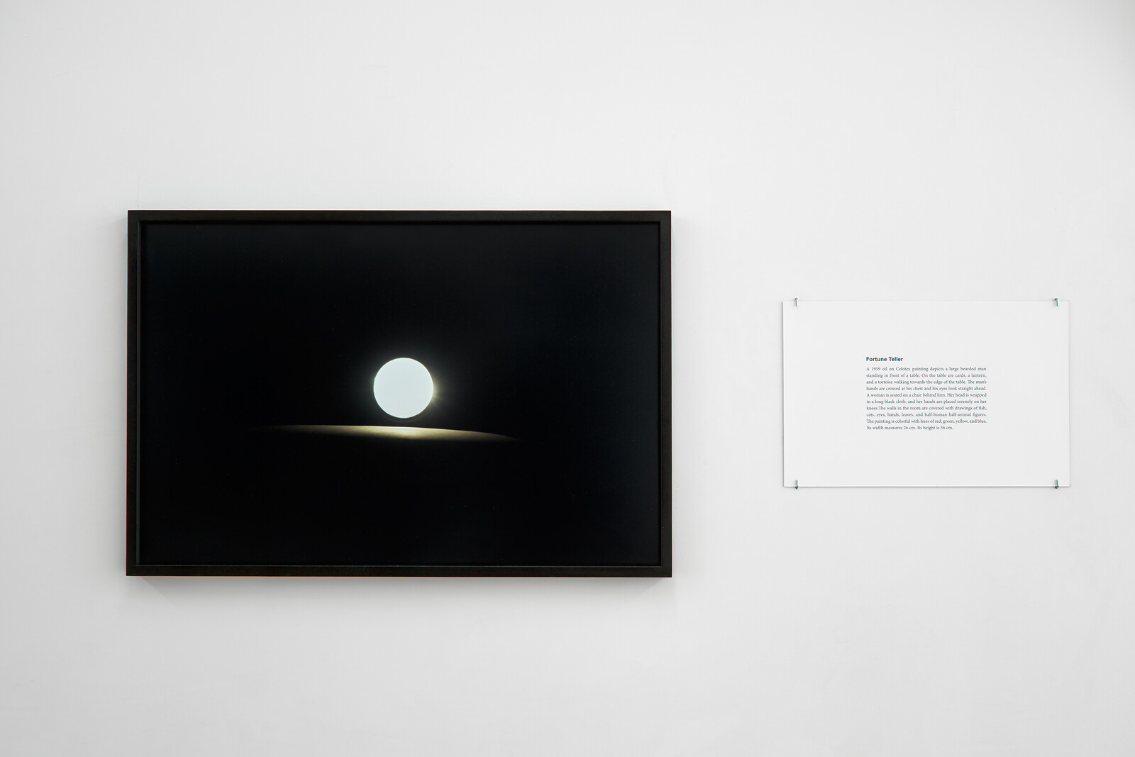
What is the role of description in the way we talk about art? In art-historical discourse, iconography won out over formal analysis. The focus on line, color, and shape was replaced by the primacy of the subject matter. But more often than not, talking about art means talking about stuff in spaces, and so the first order of business is to describe what’s there: clarify what you’re talking about, then talk about its context. Description thus functions as a placeholder for the object, only unlike images and installation shots, description has agency and tacks meaning onto an artwork. Iman Issa’s exhibition “Lexicon” fields this process. “Lexicon” is a series of 13 displays, done between 2012 and 2014, in which Issa remakes historical artworks—drawings, oil paintings, lithographs—by presenting framed texts detailing the work she is responding to (which, despite the descriptions, always remain undisclosed) alongside new objects that reinterpret them.
What describes what? The relationship between the re-creations and the works they were born of is permeable. The titles of the original works are linked to—but not descriptive of—the pieces created by Issa: sculptures placed on white plinths, a video screening in the back office of the gallery, and framed prints. But …
January 23, 2014 – Review
“Burn These Eyes Captain, and Throw Them in the Sea!!"
Merve Ünsal
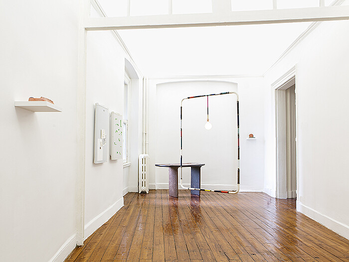
As one wanders through the rooms of Rodeo’s apartment-cum-gallery space, works by eleven artists loosely connected by a low-key aesthetic make a timely statement on the condition of materiality now. Familiar media—a 16mm film, 35mm slides, paintings—are reinvented and intermixed with works fashioned from objects found in the domestic domain, including a shower curtain, refrigerator doors, and a lamp, in order to draw the viewer’s attention to the literal tangibility of sensibilities and how one makes sense of objects and space.
Upon entering the gallery, the viewer encounters Andy Coolquit’s Multi Marfa (2009)—a large lightbulb hung from the ceiling and framed by an unnecessarily large, geometrically minimal wire framework. Informing the entire exhibition, the precariousness of the metal frame hovers between the functional and the functionless. While the bulb illuminates the space with a familiar yellow glow, the structure seeming to support it is anything but “useful.”
Behind this work are Ian Law’s at 43 Kerimeikos; someplace else and at 43 Kerimeikos; kitchen décor (both works 2013), a diptych of refrigerator doors that constitutes an unlikely canvas. The absurdity of Law’s materials and their minimal aesthetic allows this domestic mise-en-scène to answer unspoken questions of intimacy and form. The left piece is …
January 11, 2011 – Review
Gabriel Lester’s "DilSiZ" at Rodeo, Istanbul
Merve Ünsal
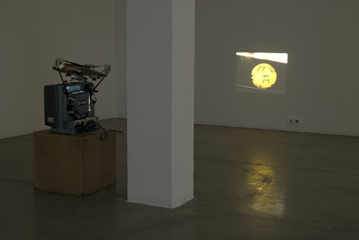
The white box was never so intimate; enclosed in the square-shaped, relatively small room is a man’s seemingly haphazard collection of oddities, triggering a sense of invasiveness upon entering. In “DilSiZ” at Rodeo, Gabriel Lester activates “luck” as a material, thus connecting the dissimilar physical objects in the exhibition.
The experience of the exhibition is marked by the nostalgic hum of the projector, furthering the viewer’s sense of having entered somebody’s personal space. The short 16mm film, Dilsiz (Cleromancy #1) (2010), shows close-ups of a glass lottery ball and a manicured female hand carefully picking the lucky numbers. This action—de-contextualized from the actual process of the lottery with winners, presentation of the numbers and the built-up excitement—is quite futile. The yellow balls are both meaningless and ominous; the video becomes an anchor for the rest of the show, drawing the viewer back with hopes of a conclusion.
Gravity (2010) acts as a foil to the lottery film: every subversive moment of it is one of conclusion and drama. Lester picked out a favorite motif of blockbuster movies, meteorites, or rather some eighty slides of actual meteorite findings, which are looped to give the viewer a strong sense of fulfillment. Lester does not …