1. A Fire Station
The critic sits at her office busy with her private quests and investigations. She has been trying to lose the label of being a critic, and has been refusing the role. Aware of the uneasy stance of the profession these days, she prefers to see herself as a writer. She likes to write.
A far from odd request suddenly lands in her inbox. It comes from afar, through a foreign intermediary. A magazine on the other side of the world requires a review of four recent buildings. There is a theme connecting the disparate objects: safety and emergency programs.
The building that lies closest to the critic is not far: 461km. Another one lies a mere 2,744km away. The farthest is 3,713km. Google Maps says it would take 1 day and 15 hours to get there. The critic sits back and enjoys the prospect of a quick pan-European trip. She likes to travel.
Romantically, she clings for a moment to an old-fashioned idea. Once upon a time, the critic had to experience a piece of architecture to talk about it. She imagines traveling by car for 3 days, 21 hours, and 10 minutes to visit these buildings. She could visit friends in Paris on her way back.
“The speed and economics of the contemporary world have made me an analyst of visual culture,” she muses to herself. She looks at about twenty to thirty different buildings every day. In this flow, she dedicates a few seconds to each. One image is enough to dismiss a building.
She finds herself amused to turn this exercise in visual information accumulation into a different mode of analysis. She remembers colleagues who dedicated painful amounts of time to compare plans and sections to photographic images of beloved buildings. She envied their patience.
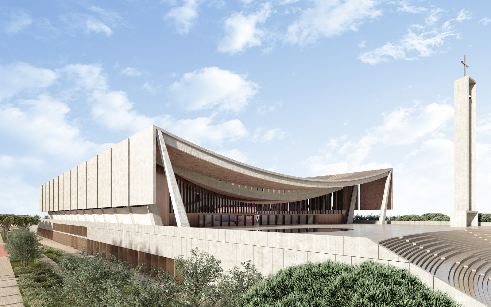
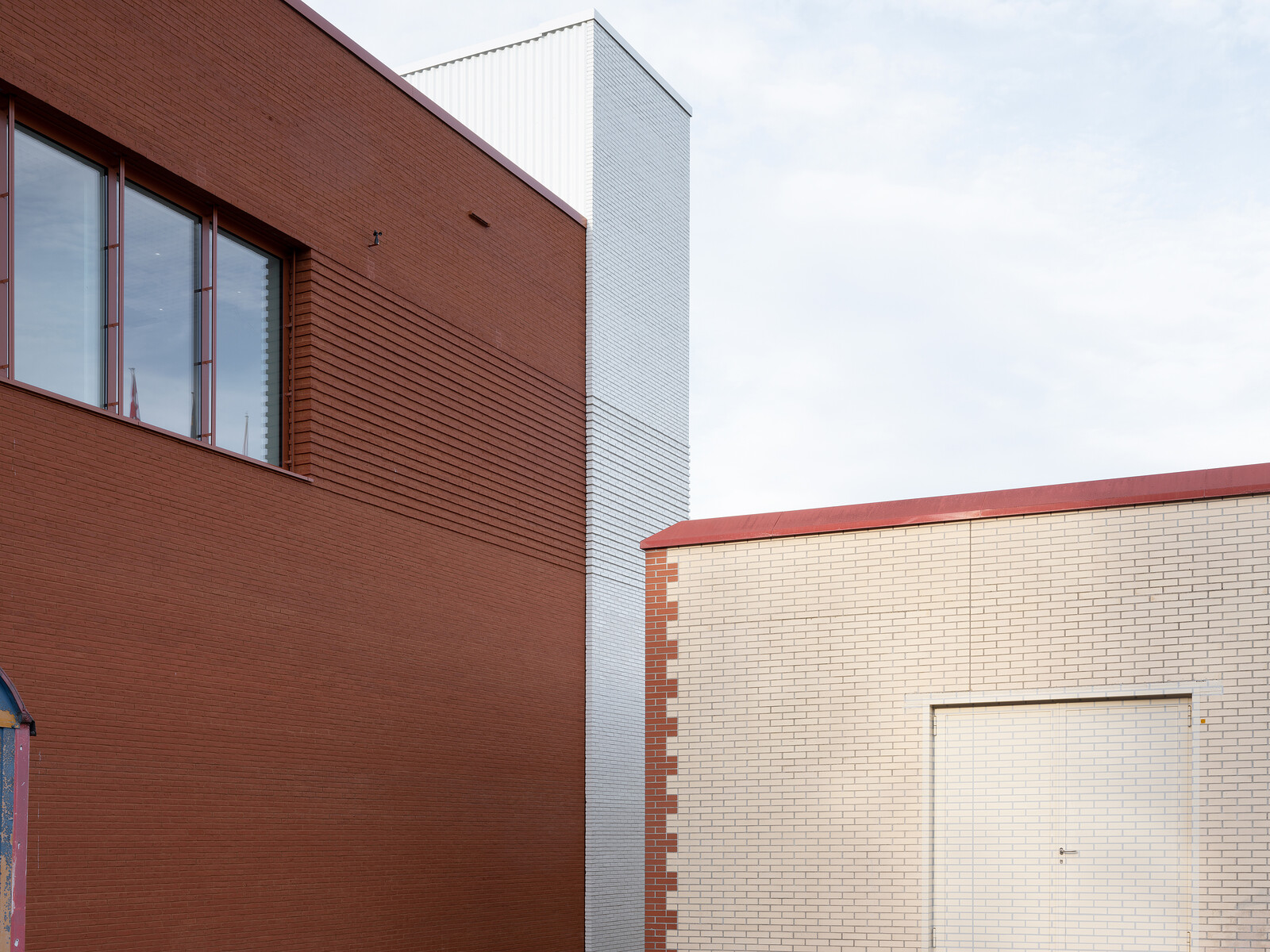
She looks at the images of one of the buildings sent to her in a zip file. A fire station in Bergen. It dates from 2007 and already feels dated. Dating an object, like one does in archeology, is a curious process. It says a lot. It says time is merciless. She reflects that the shape and materiality of this building could have arisen anywhere in between 1987 and… 2007. To say the least. If you would be looking back on it 200 years ahead, this building would be simply undistinguishable. She sighs.
What would future architectural archeologists dig out of this object? The last remains of an enduring Nordic modernism, mixed with a properly sustainable, vaguely postmodern design sensibility? Alvar Aalto turned into an honest, slightly boring, middlebrow production?
In distress, the critic turns to the architect’s description of the building. “Magnificent views,” “the negative appearance of the traffic,” and “the building as part of a future settlement.” She’s looking for redemption, but feels suffocated by obviousness.
Maybe she is being unfair. Unconsciously, maybe the building speaks of a candid willingness to provide a last glimpse of architecture’s social welfare in a burning Europe. On the other hand, the critic realizes she probably longs for a fire station straight out of a Ray Bradbury novel.
The critic is reminded of other fire stations. She visited Vitra’s many years ago. Zaha Hadid used to be a surprising architect—until her formal recipe killed her relevance. One could dwell on the ironies of a fire station made out of languid concrete flames and acute blazing spaces.
She remembers delightful fire station towers that would mash up different bits of the city. To simulate emergency action, they would assemble disparate parts of buildings in an absurd functionalist fashion. True Colin Rowe collectibles. She takes a mental note for further research.
Incidentally, the critic recalls why her profession was made obsolete by the beginning of the twenty-first century. Do we really need motives and arguments? As former New York Times critic Paul Goldberger stated, “nobody tears down a building if the architecture critic doesn’t like it.”
With a sigh, the critic turns her attention onto the next building.1
2. Two Houses
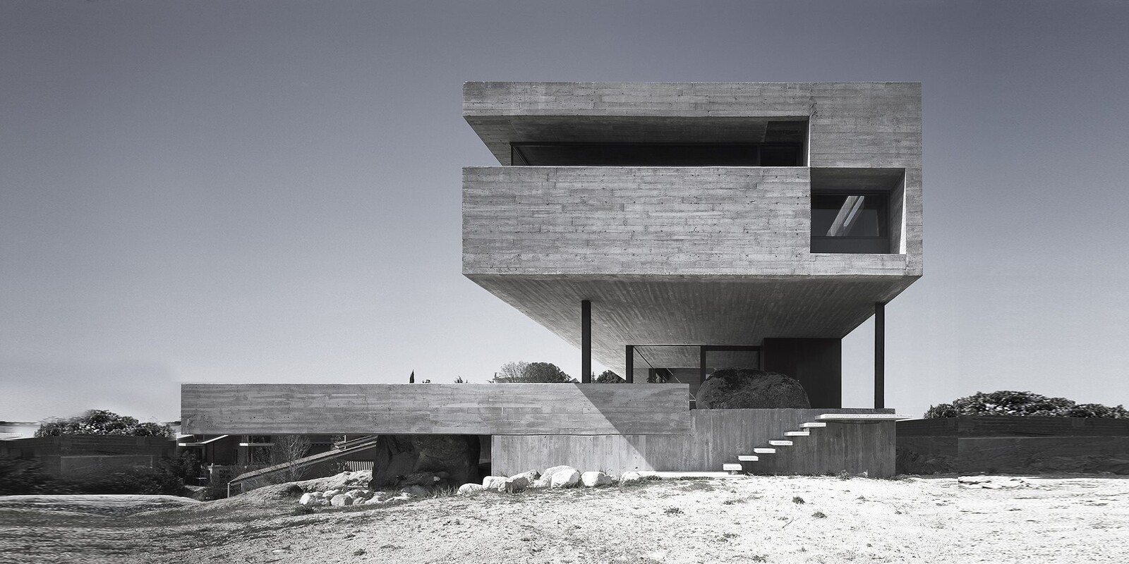
As Paulo Mendes da Rocha once said, or so I’ve heard, when facing a functional demand, architects need to pose problems to themselves. These problems allow for new solutions to appear, as opposed to deploying a given recipe that ensures no architectural advancement is produced. As emerges from the Rode House’s presentation text, the nature of the problems adopted by architects Maurizio Pezo and Sofia von Ellrichhausen are revealed by the conceptual operations of creating an “interrupted encounter between a cone and a cylinder,” or, more subtly, using the “delicate artlessness of a totally forgotten wooden padlock.” Like any sensible architects, they start from the physical and poetic conditions of site and program. As artists, however, they set for themselves a formal research program and conceptual strategy to represent and discuss the world they see. The result here is a house like no other—and, yes, a house that is so different from any other they have built in their already extensive, but careful portfolio. Their Loba House is instead organized in “terraces” that, as regular and geometrically rigorous as they are, are masked inside a mighty concrete volume. Like artworks, these houses are so appealing because they are startling, and because they need no description to make themselves understood—be it in its spatial and architectural qualities, or their sensuous desirability.
All this half-forgotten sophistication may explain why their practice is so appealing to architecture’s cultural circuit and the art world alike. It also begins to shed some light on why their projects appeal to those who enjoy innovation as a driving force for architecture’s renewal, while not obsessing with the latest technological and sustainable gizmo. Yet, this still does not clarify why Pezo von Ellrichhausen enjoy such unanimous appreciation, even among those self-declared Tafurians and Rossians who abhor any presumption of evolution in the field of architecture. Explaining this could require a more theoretical approach. But it is ultimately simple. Like any good artists, Pezo von Ellrichhausen have good taste, and they know exactly how to keep things tight. They do it in minimalist fashion and with the kind of conceptual dryness that the ideologues of architecture’s death misconstrue as absence of originality.2
3. One Hotel
He tried to count how many times he could see his own naked body sitting on the suspended Padimat Traccia toilet. One, two, three, four… There would be one more if he would slightly stretch his neck, and yet another distortion of him on the glass door’s chrome frame. This place was full of mirages. It felt cruel. The glass surfaces, the lacquered plywood, even the polished stone were all giving images he didn’t want to see. A cargo ship full of colored lights crossed the varnished black plywood wall to his left. Images from the outside and the room constantly became superimposed over one another. He often caught himself unexpectedly. At some point he discovered he could use the round face mirror as a monocular to look at the river outside, rather than just use it as an amplifying device to see where his face was turning increasingly grey. Once he walked into the terrace door, thinking it had been open. Fucking reflections. Overwhelmed by the vortex in his booze-filled brain, he came back to the body sitting in front of him. It seemed to emerge from a gloomy void. The hair on his chest was white. He had never noticed that before. He slumbered for a few minutes. When he woke up he dragged himself to bed. He chose a film from the adult menu and fell asleep.
He woke up at five fifty-nine. He had nothing to do, of course. He tried to sleep again, but he knew that was improbable. Over the last forty years he had always woken up around six. The early morning had been a powerful energizer, but now he didn’t have any use for the energy. He felt left with far too many hours to fritter. He reached for the switches in the black lacquered custom-made headboard and opened the electric curtains. Again, it was still dark outside. He got up, hungover, and felt for the discrete sliding door that hid the office and the closet. The door was concealed in a smooth black plywood cube that looked like something out of an exhibition. Leaning against the threshold of the door, he scrutinized the living room, still immersed in shadows. The long entrance wall behind the black matte desk was made of birch plywood covered in glossy green phenolic film, or so they had told him. On its slightly reflective, varnished surface there was a reproduction of an ancient Thai lacquer illustration. “Your room is unique.” He sat at the desk and stared drunkenly at the morning light, slowly letting the river turn silver inside his suite. A small cruise ship went by, crossing the bedroom’s panoramic Schuco window. A few seconds later, it appeared at the terrace corner, on the other side of the living room and its green hand-made TSF Beiriz carpet, its yellow suede and chrome Frigerio armchairs, its black plywood low table, its slender dark Artemide floor lamp, and its other Samsung LCD flat screen. The ship sailed towards the wide river mouth, carrying him back into the luxurious settings he never fully appreciated.3
4. The Museum
“Now, turn your head to the right and look at the corner in which several spatial lines converge. What did the architect have in mind when excruciatingly inventing such convergence?”
The voice was almost sensual. It filled her head. A slight pause allowed for a few seconds of her own musings. Then the smooth voice continued.
“Perhaps the architect wanted to reenact a lost feeling of vertigo, thus attempting to bring back a sort of baroque emotion and psychological drama to what many would ignorantly consider only a sterile amount of stucco and stone? Perhaps he wanted to bring surfaces to an erotic encounter? Or just stubbornly insisted on being faithful to whatever his fingers sketched in a moment of alcoholic torpor? Ultimately this may simply suggest a resistance to the way in which functionalism and efficientism took over the daily conception of architecture, making it stumble down from an altar where it used to join other arts in the elevation of human civilization.”
Struggling to understand that last bit, she felt the audio-guide was perhaps a bit too opinionated.
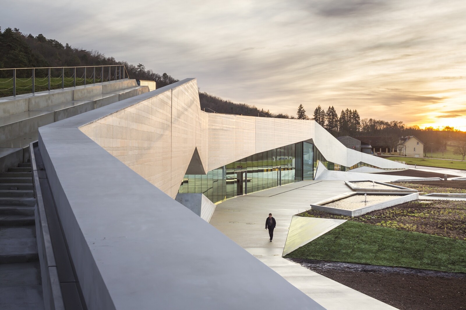
Before moving on to the next station, she used her vantage point to enjoy a panoramic view of the temporary exhibition from afar. She was rejoicing in the rhythm of her visit: one moment she was dragged by the smooth voice into the fantasies encapsulated in the architecture around her; another she was captivated by the art hanging on the walls. The artworks reminded her of the tension she sensed as people prepared to elect their new president. The architecture, instead, felt like an artificial paradise ripe with unfulfilled promises. There seemed to be some sort of intention behind this negotiation. Perhaps the audio-guide was right after all. When she reached the top of the ramp, she pressed the number for the next station.4
5. A Tower
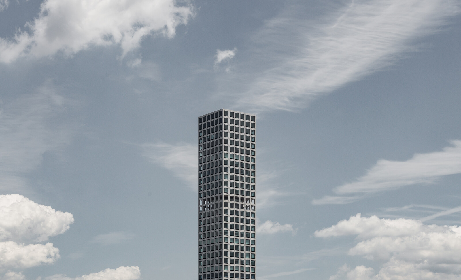
John blinked one eye, then the other. The newsfeed started to feed into her retina in a joyful cacophony of ads, algorithm-selected content, and personal video-messages. She hit pause in her temple and jumped to the desk chair on the other side of her 7.5sqm cubicle in the Newark expanses. Her latest successful IkeaRabbit bid had been confirmed while she slept, tagged with a 12-hour deadline, Hong Kong time. She now had 1 hour and 34 minutes to do the obituary. The HKNYT local editors had thought it would be fun to do arch-obits to keep Manhattan’s memory alive after the great ’29 quakes. Some called it ruin porn, but every day a new tower was revived in 6D from its own rubble, and its 1k-story dully fed into the global newsfeeds. Today was the twenty-fifth anniversary of 432 Park Avenue’s “topping out” (as they used to say).
As she called out the building’s name into FountainApp, the left screen started pouring out data into different columns. As most self-appointed art critics, she always went first for AGR ratings. Yet, if she wanted to avoid a blatantly negative yield, she had to balance it with specialist social media and a couple of academic feeds from wisdomquotes.com. Guidelines also determined that she ought to include at least one piece of self-referential archive info from the old nyt.com. Fortunately, most AGR top-rated material came from there. In this case, she realized, most of it came from 425 commentaries on one single piece published at the time of the building’s completion. She dived into the first entries:
1. I can see this building from where I live. To me it’s a colossal monument to wretched excess and megalomania. I’m sorry it’s there.
2. A vertical ghost-town, standing as a monument to excess.
3. So, we’re supposed to welcome this phallus into the pantheon of noteworthy Manhattan architecture because the developer says we should?
4. Some people call 432 phallic; I call it a giant middle finger extended upward.
5. An astonishing addition to the panoply of useless, and utterly irrelevant residences for non-resident buyers.
6. I am not particularly upset about the proboscidian height and arguably unimaginative architecture of the 432 Park Avenue building, per se. Times change, cities grow, and architectural taste is subjective. What upsets me most is that this building is symptomatic of Manhattan’s decline as a place where people of moderate means can afford to build a life, raise a family, and be part of the wonderful history here.
7. It looks like the architect was poking fun at modernism. The perfectly square windows and extreme height make it a caricature of the modernist skyscrapers it’s surrounded by. It’s a perfectly contextual, satirical building.
8. This odd fixation with the material side of things at the expense of their aesthetic value (or lack of it) speaks volumes, and it promotes a culture of dumb strength.
9. As an architectural form, I think 432 Park Avenue is beautiful in its simplicity and symmetry. As a reflection on our city and society, the view is much less pleasant.
10. The clicking of boot heels on cold concrete. The distant churning of a furnace. An ocean of unreckonable souls reflected outwards, away, in the gloss of a pure and total pane of triple layer bulletproof tempered Paramount™ glass.
11. …5
This was truly the voice of the people as scored by their attention-grab nodes. Since Applefabet had secretly started to record and keep neuronal information from readers’ retinas around the mid-teens, this rating was the most reliable source for juicy, fun stuff. In any case, she had a $9.99 budget for samples, and only from authorized PremiumWiki pages. So, any online vox populi had to be manually twisted and made invisible to piracybots. That was her job. And, with a little help from her apps, she excelled at it.
She spent the next 15 minutes selecting an amount of relevant information from other sources. From what seemed like one of the few specialist magazine publications on 432, she picked a nice contrasting opinion from one Aaron Betsky: “The tower’s very appearance represents the transformation of this and every other city into a place for the wealthy to live and play, but on the other hand it does so with an elegance, borne out of its simplicity as much as its height, that make it clear that it is still possible to make a beautiful skyscraper.”6 From another source, the single academic review she could find on the tower, she collected a cool-sounding theoretical reference: “Here, myths such as the democratic equanimity of the market and the rationality of global capital—performed in the repetition of squares, the flexibility of plans, and the durability of materials—are exposed in the act of their reproduction.”7
As she went along, she couldn’t help noticing that the building had elicited a lot of arguments on economic inequalities, which were now mostly incomprehensible. When the wealthy and powerful migrated to their cryopods and started to control things from their virtual paradises, such debates had become outmoded. So, for the sake of context, she threw in a quote from a then famous business magazine: “The ascendance of 432 Park Avenue to its now-dominant place in the skyline says more about the state of our world than a thousand Thomas Pikettys typing on a thousand keyboards ever could.”8 She was unsure this bit would fit in, but liked the sound of it, and guessed the app would sort it out.
She fed it all into WordAI5.0. Any arrangement of more than three words showing any resemblance to the original text was automatically presented between quote marks, permanently hyperlinked to the original and, once signed off on, charged from her personal account. She used to joke that writing was all about chasing inverted commas.
It took her another 28 minutes to edit connections, substitute words where needed, censor any ideological hues that the AI might have overlooked, and even add a personal flourish. She re-read the piece, checked the 1000-character count, and felt good. She called out “Send!” and looked at the clock. She rejoiced, having made it 35 minutes before the deadline, adding a few precious credits to her online profile. Now she could hit the shower, reconnect to the flow of their newsfeed and, like everyone else, wait for the notification on their next effective bid on IkeaRabbit.
I used the story “to defend that rather than adhere blindly and boringly to the objects it observes, the writing of architecture has to somehow go against the grain of architecture itself. Rather than being subservient to its subject, architectural writing has to take flight and construct its own critical worlds, even if in dialogue with architecture. Of course, if architectural writing wants to have a durable impact, it also has to seduce its readers into its arguments. It has to detach itself from the functionalistic, Pavlovian responses of description, comparison and repetition. It has to liberate itself from academic formulas and limited expectations. It has to build its own project as an autonomous narrative. Indeed, it has to find its own pleasure.” See Pedro Gadanho “On (Architectural) Writing as an Autonomous, Personal Practice,” GAM 11 (2015), previously published in “On Experimental Architectural Writing and Its Media,” in Archizines, ed. Elias Redstone (London: Bedford Press, 2012), extract originally published as “Salon des Refusés #01,” in Shrapnel Contemporary, May 25, 2011, ➝.
The last architectural review I have published, I must confess, was of a couple of buildings I’ve never set foot in. The Lobe House, in fact, sits in Chile’s Chiloé Province, some 19 hours and 40 minutes and several connecting flights away from my home. But I knew the architects well, and as contemporary architecture curator at the Museum of Modern Art, I had even brought another of their house projects to the museum’s collection. It felt appropriate to take this opportunity to trigger a reflection on the impact of single architectural works (and their authors) regarding the wider understanding of the architectural field today. See Pedro Gadanho, “Just what is it that makes these houses so different, so appealing?,” Domus 1020 (2018).
This excerpt comes from a much longer story, written in response to a commission for a book on a new luxury hotel in Lisbon, in 2011. With honorariums being low as usual, it felt adequate to demand spending 24 hours in the hotel so as to fully appreciate its spaces and services. Out of that one-day cycle emerged a narrative that echoed events unfurling at that time, suggesting that the medium of criticism can aspire to more than just addressing a specialist endeavor. The story dwells on an imaginary visit of Dominique Strauss-Kahn, shortly after his resignation from the International Monetary Fund. While the identity of the main character is never disclosed, the piece draws inspiration from Brett Easton Ellis’ fictional techniques to elicit an allegory on today’s extreme economic inequality, as embodied in the experience of luxury architecture. For the full story, go to a bookstore in Lisbon and try your luck. Altis Belém Hotel & Spa: The Voyage, eds. Risco & FSSMGN arquitectos (Lisbon: Caleidoscópio, 2017).
This short story was inspired by a recent visit to Álvaro Siza’s Iberê Camargo Foundation, in Porto Alegre, Brazil. While there still seem to be many people willing/needing/feeling stimulated to write on architecture, one is struck by the impression that, particularly in an age of 140-character sound bites, fewer and fewer seem to be available to sit comfortably and read through an argument of 2000/3000 words. If reading represents the real crisis—in turn generating the apparent success of new, mobile modes of reading such as the one conveyed by e-flux and other electronic newsletters—how do you offer buildings to interested parties through other technologies or from other points of (re)view? Following on the suggestion that “curating is the new criticism”—as picked for a title of an interview for Domus back in 2012—one should think of importing curatorial techniques to the waning field of criticism. Thus, one approach would be to offer audio-guides with exquisitely constructed reviews in which visitors are spared the effort to visualize spaces out of complicated descriptions, but instead are invited to superimpose critical arguments to a direct, but augmented viewing experience.
To the exception of points 7 and 10, all quotes from New York Times readers, on the piece Matt AV Chaban, “New Manhattan Tower Is Now the Tallest, if Not the Fairest, of Them All,” New York Times, October 13, 2014, ➝. Comment 7 taken from a comment placed on thisgreatname, “How do you architects like this building in Manhattan. It is referred to as 432 Park Avenue, but I like to call it ‘Stick Building’,”, reddit, November 6, 2017 ➝, by ThatGreyKid.
See Aaron Betsky, “432 Park Avenue and the Importance of Being There and Being Square,” Architect Magazine, October 16, 2014, ➝.
See Jacob Moore, “432 Park Avenue: Pointing Fingers,” The Avery Review 4 (December 2014), ➝.
See Joshua Brown, “Meet the house that inequality built: 432 Park Avenue,” Fortune, November 24, 2014, ➝.
Positions is an independent initiative of e-flux Architecture.





(2014).jpg,1600)



,-2003,-srgb.jpg,1600)
