In what is arguably one of the most disturbing scenes in the history of cinema, Danny Torrance, a young boy left to his own devices by his neurotic parents, explores the hotel in which he is confined by the snow outside on his tricycle. The camera follows closely behind at tricycle height as he crosses swaths of carpet with maze-like interlocking hexagons pattern, with a soft, muted sound emanating from the wheels traveling over the textile in the corridors, and dark, reflective wooden flooring, with a hard, repetitive sound of the wheels hitting the smooth finish in the public areas of the hotel. The real horror in Kubrick’s film takes place in confined spaces, but it is in the corridors of the hotel where it is gradually built up. In those settings, the floor defines program, encounters, and events. Within the disorienting deep space of the hotel, in cinema as in real life, common architectural devices are not sufficient. The carpet comes in to save the day.
Upon walking the open pathways of John Portman’s Hyatt O’Hare in Chicago, one is confronted with a similar experience. The pattern of the carpet is a sophisticated version of the one in The Shining—the same brownish hues are now articulated in several layers of shapes that gradient between circular and hexagonal motifs, echoing the foliage embedded in the low side walls. It is easy to imagine one’s self on a low bike—perhaps a folding Bickerton—swooping and sprinting over the surface of these patterns Reyner Banham style, enjoying a visual intoxication such as the one he experienced in a different bike ride, pondering the baseline of American hotels in the late twentieth century. Visual intoxication seems to be a common theme for visitors, occasional or not, to Portman’s buildings.
Another kind of intoxication took place following the sudden attention given to Portman’s architecture as one of the frontiers of postmodern thinking in Fredric Jameson’s now canonical text Postmodernism, or, the Cultural Logic of Late Capitalism.1 Architectural theory struggled at the time to make sense of the radically altered forces behind recent transformations of the built environment. Before Jameson published his text, architectural theorists did not pay much attention to Portman, focusing instead on the internal problems of high theory, be it linguistic and semiotic-based analyses in the 1970s, or the growing trend towards poststructuralist readings of space during the 1980s. But the wider focus on the Bonaventure Hotel in Los Angeles that Jameson generated led some architectural historians and theorists to pay attention to Portman’s larger oeuvre, albeit in a limited way, which almost always followed his hypothesis. It was a powerful hypothesis indeed, positioning Portman’s atria as the prime example for the emergence of a new kind of postmodern hyperspace, which “finally succeeded in transcending the capacities of the individual human body to locate itself, to organize its immediate surroundings perceptually, and cognitively to map its position in a mappable external world.”2
Finally, the specters of Ernst Mandel’s late capitalism could be spatialized and vilified.3 Jameson used his unique talent for theoretical writing with literary undertones to argue a-la-Baudrillard that the Bonavetura “aspires to be a total space, a complete world, a kind of miniature city… it does not wish to be part of the city, but rather its replacement or substitute.” This was evident in its hidden entrances, and in its cylindrical glass envelope in which “you cannot see the hotel itself, but only the distorted images of everything around it.” Jameson read Portman’s work strictly as populist, designed for the masses, and standing in contrast to the ambitions of high modernism to inject “an elevated, a new Utopian language into the tawdry and commercial sign-system of the surrounding city.” From Jameson on, a Portman project would usually be understood as either an atrium, a city within a city, or a theater of movement, or a combination thereof.
These tropes exist almost in all of the accounts attempting to decipher the mysterious allure of Portman. Even Rem Koolhaas fell in the trap, and in his witty commentary on Portman’s works in Atlanta, he focused again on the atrium as the device that Portman gave to the world: “a hermetic interior, sealed against the real,” which of course, goes the narrative, destroyed downtown.4 More than twenty years after this reading, little has changed. In the recent book Portman’s America & Other Speculations, Mohsen Mostafavi, K. Michael Hays, and Alexander Porter provide a historically sound analysis of Portman’s atrium that connects it to Le Corbusier and Denis Diderot, yet reverts to the clichés of theatricality, internal world, and the Jamesonian game of mirrors.5 In the same volume, Iwan Baan, whose photographs usually display the nonchalance of Cartier-Breson with a helicopter, documented several key projects by Portman in a way that only complicated their potential interpretation.
One exception to such interpretations is found in Paul Goldberger’s 1974 account for a Global Architecture publication covering several of Portman’s projects.6 In this short text, which precedes Jameson’s by more than a decade, Goldberger sees the atrium, the experience of movement through space, the theatrical moments, and the resemblance to town squares. But he is also sensitive to Portman’s ambition to “please both the architecturally unsophisticated and the cognoscenti.” His conclusion, rather than condescension, is that this architecture, whose shortcomings he is well aware of, has nevertheless the effect of “[allowing] people to examine their own notions of what architecture is.”
Hyatt Regency O’Hare, completed in 1969, is rarely included in the writing on Portman’s work, and for a good reason: it defies almost every single Jamesonian premise. It has an atrium, but one subdivided by bridges that challenge the perception of a single volume. It is low compared to its more well-known contemporaries, thus compromising the poetic descriptions of fast elevators rising with eruptive force to become the “reflexive signs and emblems of movement proper.” It is made of reflective glass cylinders, but also of a concrete box. And not only is it outside of downtown, but outside of the city.
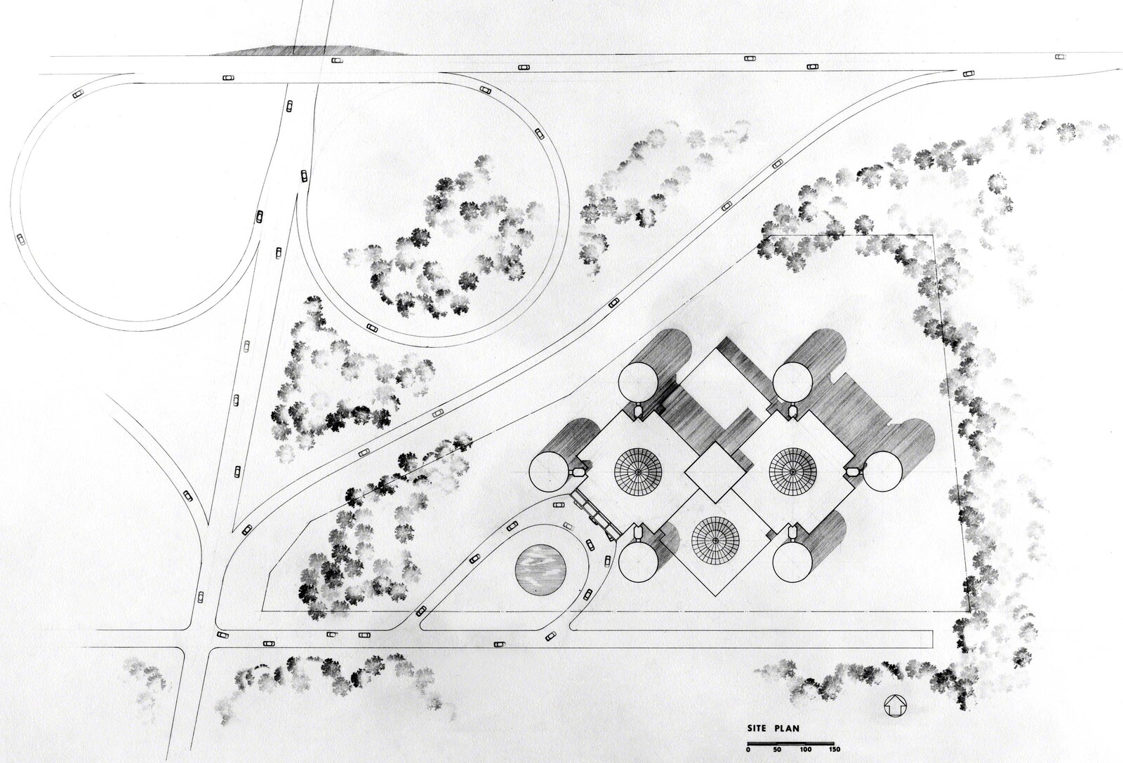
John Portman and Associates, Hyatt Regency O’Hare, site plan, early design concept. Source: The Portman Archives, LLC

John Portman and Associates, Hyatt Regency O’Hare, south elevation, early design concept. Source: The Portman Archives, LLC
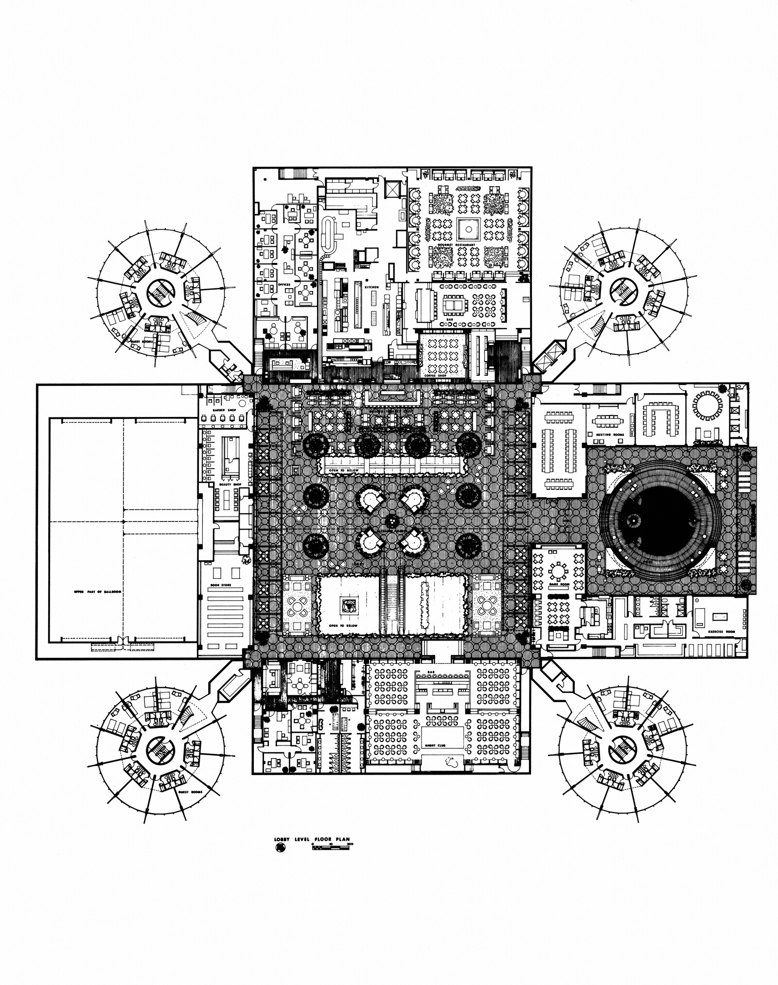
John Portman and Associates, Hyatt Regency O’Hare, lobby level floor plan, final design. Source: The Portman Archives, LLC
John Portman and Associates, Hyatt Regency O’Hare, site plan, early design concept. Source: The Portman Archives, LLC
Yet strangely enough, it is contextual. When designing the hotel, Portman considered several massing options that responded to Federal airport regulations restricting the height of the project. An unrealized scheme shows the hotel sprawling with four connected concrete boxes and six glass cylinders. In this scheme, elements from the earlier Atlanta projects become the building blocks for an almost structuralist search for new combinations. With the chosen scheme—a single concrete box surrounded by four cylinders extending from its corners—one such combination is proposed and adapted to site conditions, while still preserving the isotropic qualities of a larger system. The low, bulky mass that results, with its opaque bastions in all directions, evokes, of all things, a medieval structure. It is as if HH Richardson made one final attempt in glass and concrete to make his mark on the city of Chicago.
The unlikely connection to the site is reinforced by the building’s facades, which are perhaps the most uncanny of any Portman project. The concrete box gets a straightforward treatment: eight stories of serial balconies in matte grey, disturbed only by one duplex suite that pops out on each of the four sides. The base is nothing to write home about. The cylinders, on the other hand, are something else: resting on free-standing concrete walls on the ground floor, the glass volumes seem to levitate. In sharp contrast to the disorienting, distorted impressions Portman’s projects evoked in observers in their downtown sites, the glass facets in O’Hare are a true marvel. In the absence of other buildings in the immediate surrounding, the game of mirrors does not occur here in the same way. Instead, the cylinders reflect the changing sky and the slow-moving traces of vehicular and air traffic. The warm hue of an older generation of glass facades turns the experience of traveling around the project into a mesmerizing, ever-changing optical spectacle. Using different modes of transportation in different speeds, which is inherent to an airport environment, is key in that experience, as it supports the impression of a slightly different project in each encounter.
The entrance to the building is unassuming. An escalator leads up to the central space that is organized around a massive cluster of elevators. As Goldberger noted, “the sense of sheer space at Atlanta and San Francisco is sacrificed for a greater sense of structure—and an extraordinary Piranesian effect created by the corridors spanning the space.” But other entrances, leading directly to the central space via sky bridges, exist, supporting a continuity of exterior and interior that is missing in Jameson’s account. With these, one can make their way from the adjacent convention center, walking in the covered bridge as their reflection blends with refracted rays of light on the curved surfaces of the hotel, before moving further in. And then, there’s the carpet.
Carpets are rarely considered as integral to the architecture of a building. That is possibly a result of the preconceptions of modernist architecture, in which they were considered decoration, or merely flat elements on the floor, which in itself, as Keller Easterling recently noted, was not regarded as more than a plane on which to place walls and other vertical space-dividing elements.7 But I don’t suppose the priests of high-modernism, working on their pristine glass and concrete pavilions, ever anticipated the emergence of the deep spaces of hospitality—architectural types such as hotels, convention centers, and casinos (or the combination of which) that emerged with the advent of artificial lighting and air conditioning and bloated to such mammoth scales on the wings of advanced capitalism. In these buildings, which one can see beginning to appear in the 1970s, carpets do much more than decorate, and can be considered as strategic interventions that bring together optics, the psychology of perception, graphic design, and fiber technology to achieve various goals: from defining distinct programmatic areas to complementing the building’s architectural style, to sometimes camouflaging what needs to be hidden and disorienting those who need to be held captive and spend more dollars.
The carpet in O’Hare belongs to this species. It is clear from first encounter than it goes beyond programmatic determination (the phuuuuuuuuuuuuuu and drrrrrrrrr-drrrrrrrr-drrrrrrrr sounds from Danny’s tricycle) and into the realm of orientation devices that operate on the cognitive, sensorial, and perceptual levels, perhaps akin to what Jameson was missing in Bonavetura. Its pattern divides the open corridors that envelope the atria by defining a soft gradient between areas closer to the open space, in which an overlay of circles and leaf-like apertures create a sense of depth and visual stimulation, and areas adjacent to the rooms, in which the apertures seem to close and the pattern becomes a flat, opaque, beige-colored circle and hexagon surface. This is also a division between different kinds of movement, with tired travelers and cleaning carts occupying the shaded beige surface and the freshened and energetic business crowds using the fast lane where can they encounter others like themselves. In the corners, thick red frames seem to magnify the pattern and delineate potential stopping points, where the carpet allows for a change in pace and attention, and its dynamic visual effect becomes static and balanced. Upon looking from these stopping points in the upper level or, better still, from the carpeted bridges that crisscross the central space, a multiplier effect is achieved and the entire volume turns into carpet space that reverberates with the intensity of a baroque masterpiece.
This exhilarating experience puts in question the interpretation of the atrium as theater, in which, Hays and Porter write: “as viewer, I have no indication where I am standing, what the circumstances of my body are.” In this specific space, due to the circumstances that led to its design, one’s movement dictates the visual effects and their neurological processing, and the presence of the carpet supports a vertical, rather than horizontal gaze that is intrinsic to the theater’s typology and experience. While disorientation is still there, one does not feel entirely immersed, or lost, as might be the case in other Portman projects. O’Hare is something else.
Does it matter that Portman did not design this specific carpet? Older photographs show a simpler version of uniform burgundy in the hallways, and intricate circular tile patterns in the central space, similar to the ones designed for the Hyatt Regency and Embarcadero Center in San Francisco and the Hyatt Regency in Atlanta. O’Hare’s original tiles were covered and the new carpet installed in 2009 as part of a thorough remodeling project done by another Atlanta-based firm, tvsdesign. The new design only amplifies the initial idiosyncrasy of the project in Portman’s oeuvre. But when regarded as carpet space, the project also reflects on larger questions that go beyond his architecture. Considering the underexposed roles carpets play in buildings and reckoning with their design, making, installment, and periodical tossing and replacement, may lead to a humble pondering on the ability of architects to determine what becomes, in certain cases, the most dominant designed element in their projects; these flat and effective spatial devices that can evoke anxiety, sensual pleasure, delirium, or other forms of desired intoxication.
Fredric Jameson, “Postmodernism, or The Cultural Logic of Late Capitalism,” New Left Review (1984): 55–92.
Ibid., 83.
Ernest Mandel, Late Capitalism (London: NLB, 1972).
Rem Koolhaas, “Atlanta,” in Koolhaas, Office for Metropolitan Architecture, and Bruce Mau, S,M,L,XL (Monacelli Press, 1995), 841.
Mohsen Mostafavi ed., Portman’s America & Other Speculations (Zurich: Lars Müller Publishers, 2017).
Yukio Futagawa ed., Global Architecture 28 (1974).
Keller Easterling, “Floor,” in Rem Koolhaas, James Westcott, Ben Davis, Stephan Trüby, Harvard University. Graduate School of Design, and Office for Metropolitan Architecture, eds., Elements of Architecture (Venice: Marsilio Editori Spa, 2014).
Positions is an independent initiative of e-flux Architecture.






(2014).jpg,1600)


,-2003,-srgb.jpg,1600)
