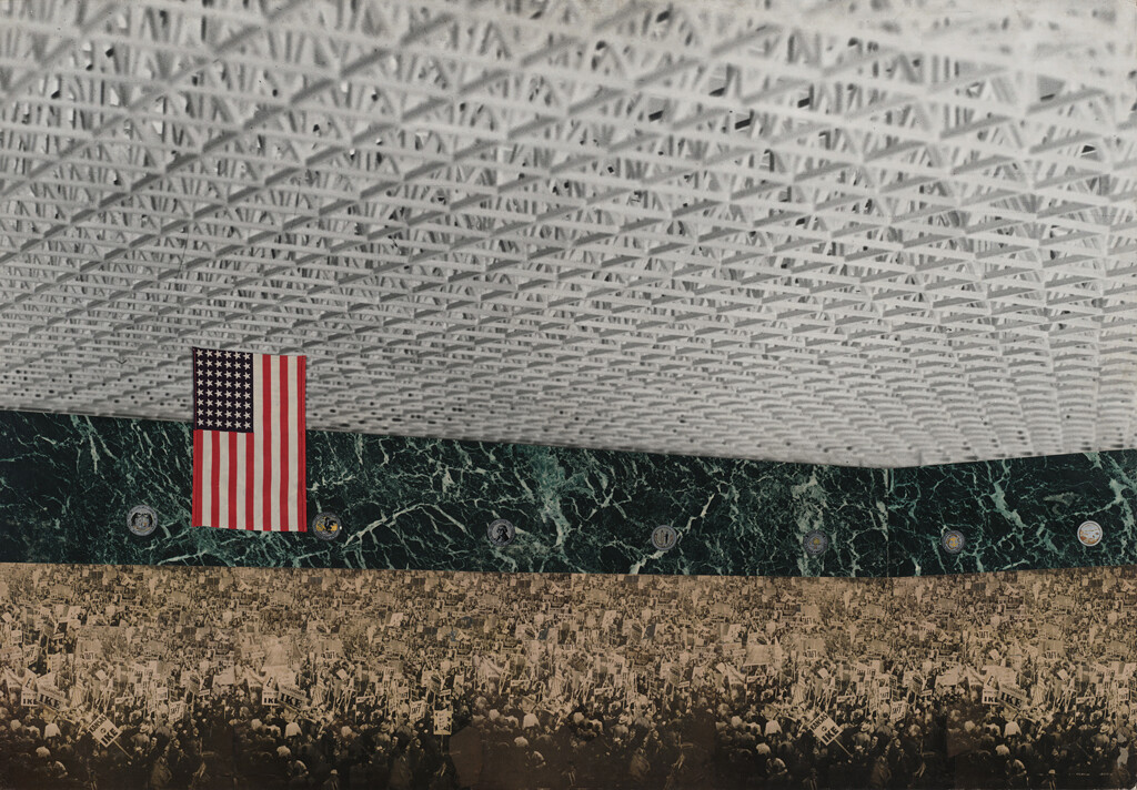
By the late 1960s, Alan Solomon was established as one of America’s most innovative and influential curators. He had organized dozens of exhibitions for institutions across the US and Europe, and as the pioneering director of the Jewish Museum in New York he had mounted the first major retrospectives of Robert Rauschenberg (in 1963) and Jasper Johns (in 1964). He had played a key role, too, in establishing American art as newly ascendant on the global stage; he had curated the American Pavilion at the 1964 Venice Biennale, where Rauschenberg won the Golden Lion, the first time since the exhibition had been established in 1895 that the award had gone to an American artist.1 And yet, writing in the catalog for his 1967 show American Painting Now, Solomon made a bold claim—it was, he confidently asserted, “an exhibition … without precedent.”2
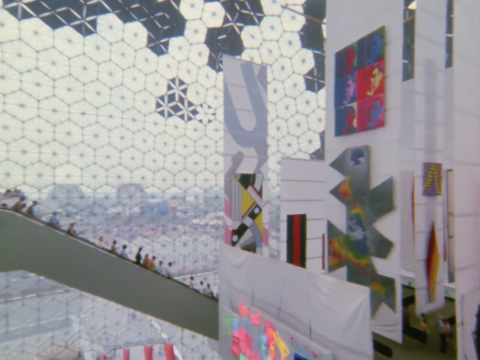
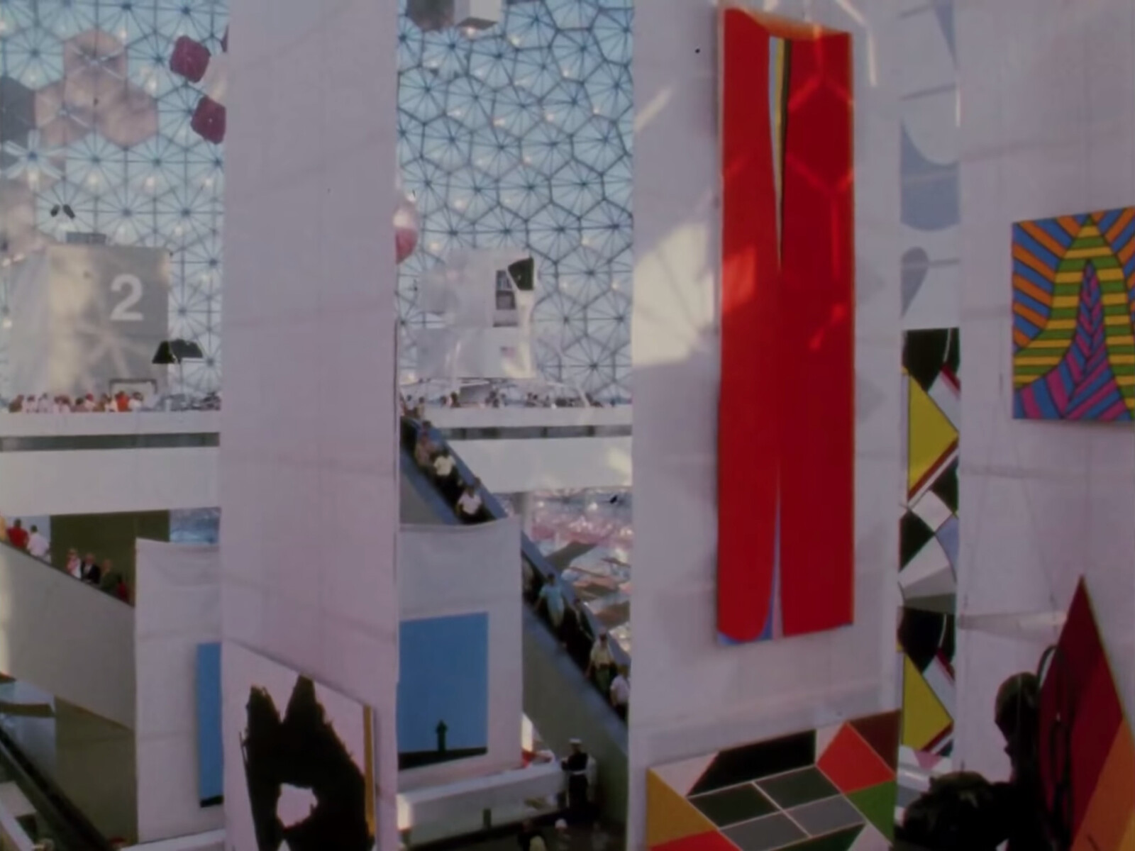
Looking back now, more than half a century later, the boast seems warranted. First, there was the venue. American Painting Now took place not in a museum or gallery but in the vast, airy interior of the colossal geodesic dome that Buckminster Fuller had designed as the US pavilion for Expo 67 in Montreal. By 1967, Fuller and his domes were both already well known, but the Expo pavilion was still an unheard-of setting for a major exhibition of contemporary art. Most implementations of Fuller’s structures had been purely technical, as in the series of “radomes” he designed to house US military radar installations in the Arctic in 1956.3 A handful of his domes had already been used at trade fairs and expos, too, but these had been conceived more as objects of display in themselves than as settings for independent exhibitions.4 In Montreal, the dome’s programming was far more ambitious and its interior architecture far more complex. Solomon’s show was paired with three others, each devoted to a different aspect of American culture, all housed on a series of enormous platforms linked by a complex network of stairs and escalators that had been designed for the building by Cambridge Seven Associates, an interdisciplinary firm selected for its expertise in exhibition design.5 The combination was electric, suggesting an entirely new way of using Fuller’s structures. As New York Times architecture critic Ada Louise Huxtable pointed out at the time: “In the past, no one quite knew what to do with a geodesic dome, beyond building one for radar purposes in some remote area of Icelandic tundra. You couldn’t make ‘architecture’ out of it, said the architects. It didn’t ‘go’ with anything, said a puzzled public. In Montreal, at last, everything goes with it.”6
And while American art had been shown at previous world’s fairs, Solomon’s selection as curator indicated an entirely new level of ambition.7 Previous exhibitions had typically presented a mix of contemporary and traditional work (Jackson Pollock and Frederic Remington, shown together in Moscow in 1959, were a representative pairing), because their organizers were as concerned with establishing a normative American identity as they were with burnishing the avant-garde credentials of American artists.8 Solomon, in contrast, was given carte blanche to organize what he described as a “survey of major trends in contemporary American art,” assembling a virtual who’s who of American painters—including Helen Frankenthaler, Jasper Johns, Ellsworth Kelly, Roy Lichtenstein, Barnett Newman, Robert Rauschenberg, Andy Warhol, and others—that would have been the envy of any museum of modern or contemporary art. Nor was Solomon content to simply re-present well known works. Instead, he commissioned new paintings specifically for his show.9 Responding to the dome’s enormous size, many artists produced their largest works yet, which in many cases would be the largest of their entire careers. Biggest of all was the multi-panel painting by Robert Indiana that was, at fifty-three feet high, not only far bigger than anything that could have fit into a normal museum gallery, but taller than many museum buildings themselves.
Visitors to the fair seem to have been fascinated by the hallucinatory combination of Fuller’s arresting architecture and what one journalist described as “pop-art paintings five stories tall.”10 Eleven million visitors saw Solomon’s show over the course of the six-month fair. Even by present standards, when art museums have achieved record-breaking popularity, this is a staggering number.11 For comparison, consider that the Metropolitan Museum of Art in New York, one of the world’s most popular museums, recently announced that its 2018 show Heavenly Bodies had been the most visited in the museum’s history—drawing 1.6 million visitors over five months. The most exceptional aspect of American Painting Now may have been the sheer size of its audience.
Surely, then, Solomon was right—his show was unprecedented—and surely, too, this heady amalgamation of new architecture, new artwork, and new audience deserves a prominent place in the history of both the art and architecture of the postwar era. Yet from a contemporary perspective, one of the most striking things about American Painting Now is not how novel it was then, but how completely it has been forgotten today.
Fuller himself has enjoyed something of a renaissance in the last decade. His global perspective (think of his trademark phrase “Spaceship Earth”), his pioneering interest in ecology and sustainability, and his unshakable faith in technological progress as a panacea for social and environmental problems exert a broad contemporary appeal. His domes have become a key part of his mythology, with the Expo pavilion often singled out as a defining project. But the geodesic dome is typically understood more as an invention than as a building—as a brilliant solution to the technical problem of enclosing the most space with the least material rather than as a means of fulfilling a specific architectural purpose. And so the business of program and use, of what actually went on inside any given dome, is often overlooked—even in the case of a famous example like the Expo pavilion. In a New Yorker article on Fuller’s legacy (penned in 2008, on the occasion of a major Fuller retrospective at the Whitney Museum of American Art in New York), for example, environmental writer Elizabeth Kolbert characterized Fuller’s Montreal project as succeeding independently from, or even in spite of, its contents: “Though the exhibit inside was criticized as uninspiring, Fuller’s dome, which looked as if it were about to float free of the earth, was a hit.”12
This schism and the subsequent amnesia have been most pronounced in relation to American Painting Now. Recent scholarship has subjected the Expo pavilion to increasingly fine-grained analysis, adding a welcome depth and breadth to our understanding of both the building itself and of Fuller’s work more generally. But even as historians have probed everything from the building’s connection to cybernetics (Fuller designed a computer-controlled shading system for its transparent skin, as well as an unrealized interactive display for its interior) to its complex political valences (Fuller was a supporter of the US “Atoms for Peace” program, and his interest in adapting military technology for civilian use made him an ideal ambassador for US “soft power”), they have neglected Solomon’s exhibition or even mischaracterized it.13 American Painting Now has been described as everything from a wholesale “embrace of pop art”14 (despite Solomon’s vehement insistence to the contrary)15 to an exhibition of “Op Art paintings”16 (despite the fact that not a single artist in the show was associated with that movement), to a presentation of “abstract expressionist painting and sculpture” (despite the fact that only one or two painters included had even a tangential connection to Abstract Expressionism, and not a single sculpture was on view).17
Nearly all interpretations of the Expo pavilion to date have placed it within either a history of building technology or a political history of architecture. To an extent, these prevailing readings are probably overdetermined by the dome’s author and its context: Fuller’s own fanatical devotion to high-tech design on the one hand, and the tense Cold War backdrop of the Montreal Expo on the other. But the systematic consistency and almost comic flagrancy with which Solomon’s show—along with the pavilion’s other exhibits—has been minimized or misunderstood suggest something deeper, a kind of structural myopia. It is almost as if contemporary historians, looking back to 1967, can only see the dome’s outer skin, the crystalline structure of its sparkling space frame, while the frenetic crowds, brash colors, and supersize spectacles within refuse to come into focus.
American Painting Now landed squarely in a disciplinary blind spot. The experimental structures produced for world’s fairs have long been assigned a pivotal role in architectural history. Indeed, Joseph Paxton’s Crystal Palace, built in London for the Great Exhibition in 1851, was repeatedly positioned as the origin of modern architecture by the first generation of scholars who tried to write the history of modernism as such. In the catalog of Philip Johnson and Henry-Russell Hitchcock’s famous 1932 Modern Architecture: International Exhibition at New York’s Museum of Modern Art (MoMA) it was described as “more of a direct ancestor of the new style than any one building of its time.”18 Nikolaus Pevsner’s Pioneers of the Modern Movement, published in 1936, also assigned the Crystal Palace a pivotal role, claiming its iron and glass construction as a key “source for our present style.”19 And for Sigfried Giedion, in his 1941 book Space, Time and Architecture, Paxton’s building was “the realization of a new conception of building, one for which there was no precedent.”20 The commissioners of the US pavilion at Expo 67 self-consciously strove to place themselves in this legacy, arguing that their building “should do what the Eiffel Tower did for the Paris Exposition (1889) and the Crystal Palace for the Great Exhibition (1851)—influence the course of technology and architecture for decades.”21 Part of what made Fuller such an appealing choice was that the domes he designed seemed so obviously to update the Crystal Palace for the space age; this association was remarked on by everyone from local Canadian reporters to Arthur Drexler, MoMA’s architecture director at the time.22 Both were audacious feats of engineering, and both were lightweight, transparent structures built quickly from prefabricated components, but Fuller had replaced Victorian glass and cast iron with tessellated acrylic panels and the latest high-strength alloys.
It is scarcely surprising, then, that the Montreal pavilion is now considered “a key work of postwar modern architecture,” as one contemporary historian put it.23 But the building’s close association with the Crystal Palace—and with the legacy of modernism more generally—is nonetheless revealing, for not a single one of the scholars that enshrined the Crystal Palace in the history of modern architecture seriously considered its function as a space of display. Johnson, characteristically polemical, put it most directly: the Crystal Palace was a work of “pure engineering,” one entirely “outside the field of architecture.”24 It is, therefore, a precedent for modernism strictly in terms of structure and nothing else. The fact that the Crystal Palace is often discussed in the same terms as the Eiffel Tower (and as early suspension bridges, in some accounts) is paradigmatic, as if the former did not happen to be, in addition to a prime example of nineteenth century engineering, a container tailor-made to house the single largest display of consumer goods the world had ever seen.
By treating the Crystal Palace as a kind of nonarchitecture, early historians of modern architecture were able to avoid analyzing—or even admitting—its actual function. The clear implication is that an exhibition was an irrelevant, even unworthy, program for the rarified form of cultural production that was modern architecture. Even more importantly, this categorization allowed historians to position modern architecture as the “pure” outgrowth of modern technology, without pausing to ask whether a building like the Crystal Palace might in fact have emerged from the very same cultural, economic, and political logics as the exhibition inside it—indeed, whether modern architecture itself might have emerged in no small part as a means of creating the spaces necessary for modern spectacle and consumption.25
Consciously or not, this historiographic legacy seems to have influenced the reception of American Painting Now. But the fact that it was a show of painting in particular complicated matters further, because modern painting, like nineteenth-century engineering, had been identified as a key precedent for modern architecture. Indeed, Solomon’s exhibition seemed to invert the understanding of painting’s influence on architecture that was deeply embedded in the mythology of modernism itself.
For its early chroniclers, modern architecture was, by definition, unprecedented. MoMA’s founding director, Alfred Barr, succinctly captured this core claim in his foreword to Hitchcock and Johnson’s catalog, describing a “genuinely new style,” which was, “both in appearance and structure … fundamentally original.”26 The identification of engineering as one source for modern architecture bolstered this claim by tying it to materials and construction techniques that were inarguably novel. But this association also created a kind of catch-22. Much of the allure of structures like the Crystal Palace lay in the sense that their design was driven solely by functional necessity. For the modern style to be properly architectural—to transcend the “pure engineering” from which it had, in part, developed—it would need a new formal language to complement its new technical foundation. Yet this language could absolutely not come from within architecture, because the modern movement’s most fundamental achievement was supposed to be its decisive break with the centuries of historical revivalism that had preceded it: any building that looked too much like one that had come before could never truly be modern. Painting offered a crucial solution to this dilemma. Like engineering, it was comfortably nonarchitectural—“pure form,” as Hitchcock put it—yet it constituted an entire field of aesthetic innovation from which architects could borrow freely.27 It was only through this symbiotic combination of engineering and painting that modern architecture could emerge as revolutionary in both “appearance and structure.”
While there were a number of well-known links between painting and architecture during this period—Le Corbusier’s fascination with Cubism; Theo van Doesburg’s attempts to translate the principles of De Stijl into three-dimensional space—for early historians of modern architecture, the connection was broader and deeper, even epistemic. While the details of their individual narratives varied, the outline was the same. Painting, more nimble and less hampered by the practical constraints endemic to architecture, broke free from historical precedent first.28 And conveniently enough, painting achieved this break primarily by producing a new language of abstract forms and simplified geometry that was in turn ideally suited to serve as the basis for a new architecture.
Pevsner was most explicit about the primacy of painting, and he also traced its influence farthest back into history. As he put it, while the architects of the late nineteenth century were still mired in historicism, “the leaders of European painting in 1890 fought for something that had never existed before,” producing a “new style … free from tradition, unencumbered and uncompromising.”29 In Pevsner’s telling, this style was already architectonic; Cézanne, for example, is credited with making “the abstract scheme of construction” into the “real subject” of his painting by building up his compositions, piece by piece, “with cylinder, sphere, and cone.”30 This was the same kind of stripped-down geometric construction taken up by architects like Gropius, Mies, and Le Corbusier in the ensuing decades; there could thus be no question that “the break was achieved by the painters earlier than by the architects.”31
Giedion’s account turned on Cubism, which he described as a kind of avant-garde “research into space.” Giedion argued that the new conception of space developed by Cubist painters—which broke down the Cartesian unity of perspective into more fundamental elements of line and plane—laid the foundation for the new formal principles of modern architecture.32 In Modern Architecture, Hitchcock and Johnson saw the advent of abstract painting as a key step in the evolution of modern architecture, and Hitchcock continued to develop this thesis in his 1948 book Painting Toward Architecture.33 Here he explicitly argued that modern architecture had emerged from a synthesis between nineteenth-century engineering and abstract painting: the formal possibilities “implicit” in innovative engineering projects remained “unrealized and merely immanent” for decades, “until catalytic contact with the experiments of the advanced artists of a quarter century ago brought them to crystallization.”34 Like those of Giedion and Pevsner, Hitchcock’s schema was based on a teleological, even triumphalist, notion of historical progress that was also inherently hierarchical—painting blazed the trail for architecture to follow.
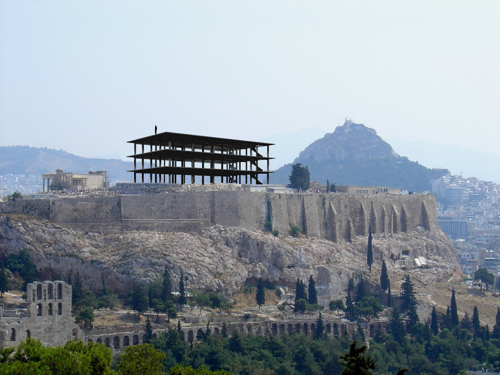
American Painting Now turned this conventional wisdom about the relationship between art and architecture on its head. Rather than following painting’s lead, Fuller had created a building that—with Solomon’s help—actually conjured up a new kind of painting, short-circuiting modernism’s ostensible flow of ideas and innovation. Even if it had not actually generated a new style, the Expo dome pushed the pushed the medium of painting to new extremes of scale. Indeed, the artworks within had become fully architectonic objects in their own right; they were measured in stories rather than feet and did not hang on walls but were suspended from steel cables attached directly to the structural grid of the dome itself.35 In retrospect, all this seems aberrant, even anachronistic. Hitchcock had explicitly warned that “contemporary architecture cannot expect to dictate the evolution of contemporary painting,” and yet, within the immense interior of Fuller’s dome, this is exactly what seems to have taken place.36 There is thus no established historical framework that allows us to understand this bizarre admixture of art and architecture; American Painting Now seems to be not just a footnote to or a distraction from the pavilion’s status as a “key work of postwar modern architecture,” but actually anathema to the theories of modernism that endowed the building with such significance in the first place.
And yet today there is much about the pavilion that seems familiar, even startlingly contemporary. Perhaps most striking is its size, which was conceptualized as not just enormous, but limitless. As one organizer recalled, “For the first time, we were able to go to artists and say, ‘what would you do if you had unlimited space? Do you want to do a 100-foot high painting?’”37 Solomon referred to this quality as the dome’s “property of scalelessness,” and he was adamant that it established a new relationship between the building and the artworks inside of it: “although big paintings are prevalent in our time, from the beginning it was clear that the demands of the Expo space could not be met even by these existing works.”38 Rhetorically, Solomon posed this as a kind of emancipation, a means of freeing artists from the constraints imposed by the size of typical studios and galleries. But in reality, the dome’s limitlessness was in itself a new kind of limit—it required artists to create new works to fit the exhibition space. This was a radical departure from the prevailing model of the gallery space as it had evolved as a site of disciplinary interface over the course of the twentieth century; for artists, architecture now stood as a provocation.
By the time Solomon articulated the dome’s “demands” in 1967, the conventions of exhibition architecture were crystallizing into the familiar typology that we now recognize as the “white cube.” In Solomon’s hometown of New York, for example, Philip Johnson’s expansion of MoMA had been completed in 1964 and Marcel Breuer’s Whitney Museum was finished in 1966. While each had idiosyncratic features, particularly on the exterior, the galleries within both buildings were characterized by pristine white walls and crisply rectilinear geometry. Today, perhaps because it is still so closely associated with institutions such as MoMA and the Whitney and their canonical collections of modern and contemporary art, the white cube is often assumed to be as quintessentially modern as abstraction itself, equally rooted in the seismic shifts that rocked both art and architecture in the early twentieth century. In reality, however, the ideal conditions for viewing modern art were debated well into the postwar era. Opening in 1959, less than a decade before Johnson or Breuer’s projects, Frank Lloyd Wright’s Solomon R. Guggenheim Museum offered a radically different model for experiencing the “non-objective” art in its collection. Nor was Wright’s building simply an outlier, the flight of fancy of an eccentric genius. One of its predecessors was the Art of This Century Gallery that Frederick Kiesler designed in New York for Peggy Guggenheim to exhibit her growing collection in 1942. Kiesler’s space was much smaller than Wright’s but included arguably even more radical features, including concave walls, paintings suspended from ropes, and movable easels and mounts that enabled an interactive viewing experience, allowing visitors to reposition artworks as they examined them.39
Ironically, the main alternative to such experimental exhibition spaces was a decidedly staid one: the bourgeois interior. Modern art, after all, was purchased by private individuals long before it received institutional support, and many early museums of modern art were based on (or actually built in) the apartments or houses of collectors. MoMA, for example, spent several formative years of its first decade in a four-story town house on Fifty-Third Street. This is where Alfred Barr’s now-canonical 1936 exhibition Cubism and Abstract Art took place, with paintings hung on walls that were not painted white but covered in beige cloth, a half step toward modernist neutrality that nonetheless continued a long-standing tradition of textile wall-coverings in salons.40 And when the dealer Leo Castelli, who played a key role in the rise of Abstract Expressionism and other influential postwar American art, established his gallery in 1957, it occupied a town house on the Upper East Side.41
The white cube emerged as a kind of uneasy compromise between these two poles. Avant-garde experiments in exhibition design may have failed to catch on in part because architects themselves never fully backed them. It can be hard to imagine in a post-Bilbao world—when commissions for museum buildings are considered the paragon of architectural prestige, just as the institutions themselves are seen as unrivaled engines of both cultural and economic development—but in the mid-twentieth century, museum design was not necessarily considered a pressing architectural problem. Indeed, many architects seem to have looked on museums with some ambivalence, in large part because the relationship between modern architecture and modern art was still too close for comfort. Offering advice to designers in a 1948 article for Architect’s Yearbook, “The Place of Painting and Sculpture in Relation to Modern Architecture,” Hitchcock described the “real dilemma” posed by exhibiting works of modern art in modern buildings: modern architects had succeeded in “providing at full scale in three dimensions the effects which the Abstract painters and sculptors had adumbrated in their independent works of art. Such an architecture could not readily use framed pictures or detached pieces of sculpture … since a building was intended to be in itself an Abstract plastic composition.”42 In other words, to look at, say, a Mondrian painting in a modernist building “would have been ridiculous,” because that building was itself “a structure inspired globally by the aesthetic concepts of Mondrian.”43 There was thus a certain fundamental redundancy between art and architecture that might have proven equally awkward for both. Hitchcock argued that modern art, too, was at a disadvantage when shown in modern buildings, and concluded that “Abstract painting … draws no real support from the architecture to which it has lent so much.”44
In the years that followed, artists and, most importantly, curators seem to have agreed. The white cube was embraced not so much because it was modern per se, but because it was neutral, a kind of zero degree of architecture that respected—even emphasized—the autonomy of works of art. Rather than embodying a modernist synthesis of art and architecture—the kind of “total environment” that avant-garde pioneers such as Kiesler had dreamed of—the white cube represented something more like a nonaggression pact between them. Ironically, this spatial disjunction was redoubled temporally. By the time the white cube was established as the predominant exhibition space for modern art in the 1960s, “modern” art was not actually contemporary anymore. In fact, artists who were actually contemporary were actively attacking the white cube, seeking to undermine its dominance through new forms of installation and performance art. Indeed, when the artist Brian O’Doherty permanently enshrined the phrase in the art-world lexicon with his widely influential 1976 Artforum article “Inside the White Cube,” he explicitly marked it as a target of critique.45 The white cube was thus doubly anachronistic, both overdue and outmoded at the same time.
With American Painting Now, Solomon briefly brought contemporary art and architecture back into sync; new art was created through an encounter with architecture more or less in real time. But his show remained anomalous. Even as museum design continued to develop over the ensuing decades, gallery architecture seemed to remain fundamentally belated in relation to contemporary art. By the 1990s, repurposed industrial sites were becoming increasingly popular as exhibition spaces, but artists had been working in former lofts and factories since at least the ’60s; these studio spaces were pioneered by many of the same artists who had sought to escape the white cube in the first place. It was only at the turn of millennium that architects began to catch up, and then pull ahead, in this space race. London’s Tate Modern, for example, which opened in 2000, made a pioneering leap in scale from the merely industrial to the truly infrastructural. Designed by Herzog & de Meuron, the museum is housed in a repurposed power station that had once generated a sizable percentage of the London’s electricity. Its signature feature is the single vast space known as Turbine Hall (so named because it had contained the gargantuan oil-fired engines of the original plant), which contains more than thirty-five thousand square feet of exhibition area within a single rectangle, covered by a roof 115 feet high.46 Some artists, curators, and architects worried that Tate Modern had gone too far, and that such a cavernous space couldn’t possibly function to display art. Rem Koolhaas, for example, dismissed it as a “massive nonspace,” in an uncanny echo of Solomon, who, with more positive connotations, had referred to Fuller’s dome as “non-architecture.”47
But the proof was in the attendance figures. Tate Modern is now the world’s most visited museum of modern and contemporary art by a wide margin, and its success is in no small part due to the enormous popularity of the Unilever Series (2000–2012), an annual program of site-specific works commissioned from a roster of the world’s most famous artists and installed in Turbine Hall. The Tate recently doubled down on this strategy with the Tanks, two self-styled “huge circular spaces” created from the old power plant’s underground oil storage facilities.48 The Tanks opened in 2016, their express mission being to “generate ideas, creative energy and new possibilities for artists and audiences.”49 This notion of architecture as generator—the idea that contemporary art should be made to fit museum buildings, rather than that museum buildings should be tailored to the developments of contemporary art—is becoming ubiquitous. The trend is visible in the proliferation of the ever-larger project rooms, “column-free” or “open-plan” galleries, and hyper-flexible installation spaces that have become a standard feature of museums around the globe. Just as Fuller’s dome did in 1967, these new galleries issue a challenge to artists, daring them to (literally) make the next big thing. Part of what Solomon seems to have anticipated is a fundamental shift in the nature of contemporary art itself; rather than describing the art of the present or recent past, “contemporary” now refers to the near future, designating the art that will be made to order for the institutions increasingly responsible for not just displaying but also producing it.
When a museum becomes a site of production, its architecture must evolve accordingly. Solomon boasted, for example, that shipping and assembling even the largest multi-panel paintings posed no difficulties in Montreal: “whereas the size of door openings is often a limiting factor in museums, the huge entrance to the Pavilion … was large enough to permit trucks to drive right into the building.”50 This might have seemed novel in 1967, but the idea that the art museum can be a center of art making—an extension of or even a replacement for the studio—has become a core strategy of contemporary institutions competing for cutting-edge status in an increasingly crowded field. The new OMA-designed Fondation d’Entreprise Galeries Lafayette in Paris, which opened in 2018, was conceived explicitly as a “curatorial machine,” a place for artists to pursue experimental projects and test new ideas. 51 The Shed, by Diller, Scofidio + Renfro (DS+R), which opened earlier this year in New York, has similarly been touted by its architects as “a machine for making art.”52 In both buildings, this machinic quality is more than metaphorical: their walls and floors actually move, offering an infinitely reconfigurable environment that promises to draw endless new responses from artists while also offering visitors endless novelty.
These kinetic qualities, too, were prefigured by Fuller’s dome. He intended the building’s skin itself to be animated by his computer-controlled sunshades, for example, and although that system was never fully operational, one can imagine the striking play of light and shadow it would have created in the interior. But remarkable effects of movement were introduced in other ways. The Expo’s monorail was routed through the building, creating both a dramatic means of entrance for the visitors who chose to disembark there and a diverting spectacle for the visitors already inside, who could watch the train’s rhythmic loops as a backdrop to the exhibits.53 And the dominant feature of the interior architecture was the system of enormous escalators linking the four exhibition platforms. The longest, at 125 feet, was proudly proclaimed to be the largest in the world at the time. Thanks to these escalators, much, if not most, of a visitor’s time in the pavilion would have been spent in automated motion, echoing and amplifying the visual effects produced by the monorail approach. Archival film shot from the monorail shows sparkling patterns of sunlight playing across the dome’s acrylic skin—an animated effect produced by the train’s movement. Footage from the interior captures the ways in which the paintings—large enough to be visible from almost any point within the dome’s interior—loomed and danced in a wild play of parallax effects as visitors–cum–escalator passengers glided up, down, under, and over them. Moreover, the sheer size of the crowds meant that the movement of people themselves became a dominant feature of the experience. As the exhibition designers conceded, “the flow of humanity through that pavilion really energized it. The people became the exhibit.”54 In contemporary museums, moving components are piously presented as a means of helping artists realize their vision. But the Expo pavilion shows how easily animated architecture can become the main attraction, swallowing and superseding whatever it contains.
Indeed, the dome’s machinic qualities had a dark side; the structure was intended not only to automate the movement of visitors but to strictly control it. As Solomon recounted, one of the most important factors in planning the show had been “the size of the crowds and the rate of crowd movement. The Pavilion was designed to handle some thousands of people an hour. They could not wander at will through the building, because the flow of visitors was controlled by the placement of stairs and escalators… There were usually thousands waiting outside in queues; the rate at which they could be admitted was established mechanically—by the capacity of the main seven-story escalator.”55 As dystopian as this may sound, many of Solomon’s colleagues were untroubled, even enthusiastic about the oddly passive viewing experience that was produced by this architectural mechanism of control. One recalled, “to ride those escalators was a most beautiful experience, because at that point you could stand still while your eye changed its position and floated vertically as well as horizontally through this changing perspective.”56 Here, modernist opticality has entirely succumbed to the logic of spectacle; the subject is reduced to a disembodied, mechanized eye.
What happened to the art itself amidst this phantasmagoria of bodies and structures in constant motion? Solomon was surprisingly frank: “It was quite clear that visitors would not be able to spend long periods looking at the pictures from afar, and that the visual intensity and contrast of the environment would unavoidably give the art a lot of competition.” And so he limited himself “to styles which were broad and simple,” admitting that he had to leave out certain artists he would have liked to include, simply because their “paintings are just too subtle for the visual and psychological environment of the exhibition.”57 In a sense, Solomon may have sold painting out, favoring flash over substance. But in the end it hardly mattered, because it was impossible to experience the paintings as independent works of art anyway. As the art historian John Canaday, then Huxtable’s colleague as art critic at the New York Times, complained when he attempted to review the show, the dome had become “an encompassing universe for the art on exhibition there. Although there is a section of the entity that is called ‘American Painting Now,’ it cannot be isolated from the context of the building.”58 He concluded that the combination was “so wildly, so theatrically, successful” that the show amounted to a denigration of painting itself: “The one thing that would have made the exhibition perfect would have been to have commissioned the paintings frankly as banners, recognizing them as bright, disposable art, a decorative auxiliary to the celebration.”59
As bad as the show may have been for the paintings, it was worse for the visitors. Not only had Solomon subjected them to a new, impoverished form of looking—fast, fluid, disembodied—at a new, impoverished form of art—flashy, atmospheric, superficial—but he had succeeded in eliminating their agency entirely. One of the exhibition designers captured this move in admirably succinct, if unsettlingly violent, terms: entering the pavilion, the visitor would be “confronted with the raw material of experience; all that is demanded of him is participation. Not understanding. Not agreement. Participation.”60 And so we arrive at the paradox that is among the pavilion’s most contemporary qualities: in the face of increasingly and aggressively immersive forms of art and architecture, “interaction” is not necessarily consensual, and “participation” is often reduced to an initial act of surrender.
In retrospect, it seems likely that Solomon and his colleagues were so frank about the pavilion because they assumed it was an aberration, never to be repeated. But we are now entering a new era of museum architecture in which many of the pavilion’s qualities are becoming the norm. In recent decades, both art and architecture have grown exponentially: galleries are literally bigger, as are the installations inside of them. They are also attracting bigger audiences, which means that they are bigger business for the museums and municipalities behind them. Indeed, this heady combination of art and architecture—which now affects everything from the patterns of urban growth and the character of public space to the nature of collective experience—promises to become one of the defining features of culture in the twenty-first century.
This phenomenon has justifiably received increasing attention from scholars and critics, and the past decade has seen a number of pioneering attempts to retheorize the relationship between art and architecture to reflect the new conditions of our age. Almost without exception, however, these treatments have characterized recent developments as a kind of synthesis. The sinister merger charted by Hal Foster’s The Art-Architecture Complex (2011) entails a total collapse of critical distance as both fields succumb to the pressures of globalized consumer capitalism; Sylvia Lavin’s more upbeat Kissing Architecture (also 2011) celebrates a kind of mutual embrace in which boundaries are blurred between intimately intertwined disciplines; Giuliana Bruno’s Surface (2014) prognosticates a rapidly arriving future in which art and architecture will fuse into the same array of technologies and media, projected onto the same screens and inhabiting the same virtual realms. These three books present three widely divergent viewpoints and arguments, but all fundamentally posit a convergence between the two fields.61
A look back at Fuller’s dome suggests that we might actually be in the midst of a different kind of paradigm shift, one in which architecture is newly dominant. The rise of supersize galleries, animated architecture, and an emphasis on visitor engagement at all costs reflects the fact that experience has emerged as one of the most precious resources in the global economy, as has its corollary: attention. Architecture is, par excellence, a mechanism for creating experience and a device for capturing attention—to say nothing of its easy familiarity with capital, its propensity for reifying power, and its effectiveness in regulating bodies and behavior.
But architecture’s appeal today is not necessarily limited to its most troubling qualities. We may have been slow to recognize architecture’s ascendance in part because modernism’s deeply entrenched hierarchies have conditioned us to see the visual arts as the apex of cultural production. But not only does history show that different disciplines and media wax and wane in prestige, it also reminds us that artists have spent much of the past hundred years striving to achieve effects in their work that seem more or less inherent to architecture. Merging art and life was a cherished goal of the avant-garde; architecture frames our experience of both. Many artists have experimented with new media and exhibition formats in pursuit of a more immersive viewer experience; buildings are the original immersive environments. Artists, too, have long sought to increase viewer participation in their work; the fact that buildings have users—not viewers—suggests that architecture already constitutes activated subjects.
In any event, it is clear that architecture has become empowered. What remains to be seen is how, and to what ends, this power will be deployed. And here the value of taking Fuller’s dome seriously as a display space for contemporary art snaps into focus. Today, new museums are routinely presented as entering uncharted architectural and cultural territory: the scale of a vast space like Turbine Hall is touted as unprecedented; or the museum-as-machine designed by the likes of DS+R or OMA is offered as the heretofore unimagined fulfillment of an unrealized avant-garde dream.62 The insidious implication is clear: not only do such buildings promise radical new possibilities for both art and architecture, but they are impossible to judge because we can’t know, or even imagine, what new forms of cultural production they will bring. We must, with bated breath, simply wait and see.
To suggest that such projects do have a precedent, and that it exists not in the form of an unconsummated avant-garde fantasy but as an actual material construction, is not to undermine the originality of new museum designs or suppress their own historical specificity. But exploring the connections between the Expo pavilion’s display of American Painting Now and these contemporary buildings reminds us that we do have a historical frame of reference for such projects, and that while they claim to break away from certain long-established trajectories, they may inadvertently reproduce others. Sometimes a structure in the past flashes us a glimpse of a possible future, and in this way we can use one building to think our way through others. The goal of a critical history of architecture is not to deny the unique presentness of our own moment, but to bring it within the scope of our understanding and so enable us to imagine alternative trajectories and transformations.
Solomon’s career was cut short by an early death in 1970. An overview of his accomplishments can be found in his New York Times obituary: “Dr. Alan Solomon Dies at 49; Ex-Director of Jewish Museum,” New York Times, February 19, 1970, 47.
The catalog was published by the Institute of Contemporary Art, Boston, which arranged for the exhibition to travel to that city after the expo: Alan Solomon, American Painting Now: Horticultural Hall, Boston; December 15, 1967–January 10, 1968 (Boston: Institute of Contemporary Art, 1967).
In addition to his design of the “radomes,” some of Fuller’s first dome prototypes had been constructed for the US Marines in 1954. The marines were interested in deploying them as lightweight structures that could be flown into remote areas by helicopter, fully assembled. See Sidney Rosen, Wizard of the Dome: R. Buckminster Fuller; Designer for the Future (Boston: Little, Brown, 1969), 104.
As historian Robert H. Haddow has pointed out, “The geodesic dome with its expressed structure was itself a vast symbol,” and for that reason American exhibition designers often “did not want to clutter it up with objects that would only detract from its emotive power.” Robert H. Haddow, Pavilions of Plenty: Exhibiting American Culture Abroad in the 1950s (Washington, DC: Smithsonian Institution Press, 1997), 219. Haddow’s book also includes a detailed discussion of the domes Fuller built for the International Trade Fair held in Kabul, Afghanistan, in 1956; for a US trade fair exhibit in Poznań, Poland, in 1957; and for the American National Exhibition in Moscow in 1959. The last included a film by Charles and Ray Eames, and so could be understood as a kind of early multimedia environment, but it was not conceived as an exhibition space for visual art per se.
American Painting Now was one of four individual exhibitions, each housed on a separate platform within the dome, and all conceived in relation to the pavilion’s overall theme of “Creative America.” The other exhibits were devoted to the American space program (“Destination Moon”); to Hollywood (“American Cinema”); and to pop culture and vernacular crafts (“American Spirit”). Cambridge Seven Associates was founded in 1962 by a collective that included architects, graphic designers, and industrial designers, and quickly received acclaim for a range of projects that included the graphic identity for the Massachusetts Bay Transportation Authority, designed in 1965, and the New England Aquarium in Boston, which was designed in the early 1960s and opened to the public in 1970. Both Fuller and Cambridge Seven were commissioned by the US Information Agency (USIA). For an excellent overview of the USIA’s role in planning the pavilion and the exhibitions it contained, see Asa McKercher, “The Art of Soft Power at Expo 67: Creative America and Cultural Diplomacy in the US Pavilion,” Journal of Curatorial Studies 5, no. 3 (2016): 369–389.
Ada Louise Huxtable, “Fair, Fairer, Fairest,” New York Times, May 7, 1967, 27.
Solomon was selected by Jack Massey, who was the chief of design and operations of the USIA. Massey was able to make this bold selection in part because Expo 67 marked the first occasion on which the USIA was given full control over a US pavilion, rather than having to answer to the State and Commerce Departments, which had drawn criticism in the past for pushing for US pavilions to be too explicitly tied to foreign policy and too commercial, respectively. See McKercher, “Art of Soft Power,” 369–374.
At the 1959 American National Exhibition in Moscow, Pollock’s Cathedral, 1947, was shown together with Frederic Remington’s Fired On, 1907; the exhibition’s planners had chosen to temper Abstract Expressionism with a healthy dose of manifest destiny and frontier mythology. In contrast, Solomon emphasized that his show was a true survey of contemporary practice by explaining that he had chosen his examples in order to represent “at least three major tendencies: geometric painting, pop art, and shaped canvasses.” For the full list of the twenty-two artists included, see Solomon, American Painting Now.
Because of various schedule constraints and logistical challenges, only thirteen of the artists were able to produce new works for the show. See Solomon, American Painting Now.
“U.S. Pavilion at Expo 67 Opens with Space and Art Displays,” New York Times, April 24, 1967, 18.
While there is general agreement that the US pavilion was the most popular destination at the fair, there is some disagreement about the total number of visitors. Eleven million is the official figure given by the Canadian government: “United States Pavilion at Expo ’67,” ➝.
Elizabeth Kolbert, “Dymaxion Man,” New Yorker, June 9, 2008. It is worth noting that Kolbert also combines Solomon’s show and the other three displays into a single “exhibit.” American Painting Now was similarly overlooked in the Whitney show and the scholarship that accompanied it, receiving only a single mention in the catalog. See K. Michael Hays and Dana Miller, eds., Buckminster Fuller: Starting with the Universe (New York: Whitney Museum of Art, 2008), 35–36.
In addition to the 2016 article by McKercher cited above, recent scholarly analyses of the project include Jonathan Massey, “Buckminster Fuller’s Cybernetic Pastoral: The United States Pavilion at Expo 67,” Journal of Architecture 11, no. 4 (2006): 463–483; Daniela Sheinin, “Kookie Thoughts: Imagining the United States Pavilion at Expo 67 (or How I Learned to Stop Worrying and Love the Bubble),” Journal of Transnational American Studies 5, no. 1 (2013), ➝; and Rebecca Dalvesco, “R. Buckminster Fuller, the Expo ’67 Pavilion and the Atoms for Peace Program,” Leonardo 50, no. 5 (2017): 486–492.
McKercher, “Art of Soft Power,” 369.
“For some reason the press fastened on the idea that this was a pop art show, although only about nine of the twenty-two artists in the exhibition have been associated in any way with that movement.” Solomon, American Painting Now.
Massey, “Buckminster Fuller’s Cybernetic Pastoral,” 811.
Claes Oldenburg’s piece was made of soft vinyl and could conceivably be considered a kind of hanging sculpture, but it was absolutely not Abstract Expressionist. Oddly enough, this last description is from the studio that actually designed the exhibition and the rest of the dome’s interior architecture, Cambridge Seven Associates. See Chermayeff, Sollogub & Poole, Inc., “United States Pavilion, Expo ’67, Montreal, Canada,” ➝.
Modern Architecture: International Exhibition: New York, Feb. 10 to March 23, 1932, Museum of Modern Art (New York: Museum of Modern Art, 1932), 19.
Nikolaus Pevsner, Pioneers of the Modern Movement from William Morris to Walter Gropius (London: Faber & Faber, 1936), 121. Pevsner’s book is particularly interesting from a historiographic perspective because (despite being beaten to the punch by Hitchcock and Johnson) he self-consciously conceived of his book as “the first to be published” on what he called “the development of the modern movement.” See Pevsner, Pioneers of the Modern Movement, 15. The book remained highly influential and was published in new editions under the title Pioneers of Modern Design in 1948 and 1968.
Sigfried Giedion, Space, Time and Architecture: The Growth of a New Tradition (Cambridge: Harvard University Press, 1941), 251–252.
An internal USIA memo cited by Sheinin, “Kookie Thoughts,” 46.
Arthur Drexler had in fact recognized the connection years before the Montreal Expo. He told the author of a Time magazine article on Fuller in 1964 that he lamented the fact that Fuller had not been invited to construct a dome for the New York World’s Fair that year because “it would have had the same impact on the world of design as the Crystal Palace at London’s great exhibition of 1851—probably more so, because the Crystal Palace prefab pieces had classical roots, whereas Bucky’s dome is totally new.” See “The Dymaxion American,” Time, January 10, 1963, 50.
Massey, “Buckminster Fuller’s Cybernetic Pastoral,” 795.
Johnson, “Historical Note,” in Modern Architecture, 19.
Given that the Great Exhibition was staged by the United Kingdom at the height of its colonial power, and that many of the exhibition’s contents were directly or indirectly related to colonial exploitation and violence (raw materials from colonial territories were one highly popular attraction, for example), the prominent place of the Crystal Palace in the historiography of modern architecture reveals underlying links not only between modern architecture, industrialization, and the emergence of commodity capitalism, but between modern architecture and colonialism as well. The fact that Fuller’s architecture was itself entangled in the US military-industrial complex suggests that the connection between modern architecture and imperial power is an enduring one. For a critical examination of the Great Exhibition’s political context as well as its contents and reception, see Jeffrey A. Auerbach, The Great Exhibition of 1851: A Nation on Display (New Haven: Yale University Press, 1999).
Modern Architecture, 13.
Hitchcock used this formulation not in the Modern Architecture catalog but in a slightly later article, discussed in more detail below: Henry Russell Hitchcock, “The Place of Painting and Sculpture in Relation to Modern Architecture,” Architect’s Yearbook 2 (1948): 12.
The idea that painting was less constrained, and therefore more radical, than architecture was most explicitly expressed by Hitchcock, who went so far as to argue that “the central meaning and basic value of abstract art … is that it makes available the results of a kind of plastic research that can hardly be undertaken at full architectural scale.” See Henry-Russell Hitchcock, Painting Toward Architecture (New York: Duell, Sloan and Pearce, 1948), 54.
Pevsner, Pioneers, 72.
Ibid., 74–75.
Ibid., 72.
Giedion, Space, Time and Architecture, 432–34. Intriguingly, Giedion went even further, seeming to position painting not only as a historical precedent for modern architecture but as a kind of heuristic necessary for its subsequent interpretation: “No one can understand contemporary architecture … unless he has grasped the spirit animating this painting.” Ibid., 433. Pevsner implied something similar when he told his readers that they must understand the evolution of painting before he could explain that of architecture: “An account of the revolution in painting has to be given before we can continue the discussion.” Pevsner, Pioneers, 72.
“Abstract art {was} a major influence on modern architecture.” Hitchcock, Painting Toward Architecture, 54.
Ibid., 54.
Indeed, given the fact that they were cable-tensioned to the space frame struts, it could almost be argued that they had actually become part of the dome’s structure. For a full description of the installation, see Solomon, American Painting Now.
Hitchcock, Painting Toward Architecture, 54.
Jack Massey, in a brief documentary film produced by Cambridge Seven Associates, the exhibition’s designers: Pchermayeff, “Design for a Fair: The United States Pavilion at Expo ’67 Montreal, Canada,” YouTube ➝. In this video, Cambridge Seven also take credit for suggesting that the dome be a three-quarter sphere in shape, but this assertion does not seem to be accurate based on a review of existing scholarship.
Solomon, American Painting Now.
For a thorough investigation into Wright’s thinking about the art that would be shown in his museum, see Jack Quinan, “Frank Lloyd Wright’s Guggenheim Museum: A Historian’s Report,” Journal of the Society of Architectural Historians 52, no. 4 (December 1993): 478. For the history of Kiesler’s design, see Susan Davidson and Philip Rylands, eds,. Peggy Guggenheim & Frederick Kiesler: The Story of Art of This Century (New York: Guggenheim Museum, 2005). Kiesler’s space is but one example among a number of important attempts to create new kinds of exhibition environments combining art and architecture, several of which were attempted by European avant-gardes in the interwar period. The German curator Alexander Dorner, for example, invited El Lissitzky to create his famous “Abstract Cabinet” at the Hannover Museum in 1927, and Dorner was working on another exhibition project with Lazlo Moholy-Nagy when he fled Germany for America in 1933. For an overview of Dorner’s career, including his influence in the United States, see Sarah Ganz Blythe and Andrew Martinez, eds., Why Art Museums? The Unfinished Work of Alexander Dorner (Cambridge, MA: MIT Press, 2018).
Mary Anne Staniszewski, The Power of Display: A History of Exhibition Installations at the Museum of Modern Art (Cambridge, MA: MIT Press, 1998), 66, 74. Staniszewski’s book offers a comprehensive study of the evolution of MoMA’s exhibition design.
The Upper East Side was then, and has remained, one of Manhattan’s wealthiest residential neighborhoods. Castelli did eventually open a white cube space in a former loft building in SoHo, but not until 1971.
Hitchcock, “The Place of Painting and Sculpture,” 14.
Ibid., 12.
Ibid., 13.
The article was originally published in three parts: Brian O’Doherty, “Inside the White Cube: Notes on the Gallery Space, Part I,” Artforum, March 1976, 24-30; “Inside the White Cube: Notes on the Gallery Space, Part II,” Artforum, April 1976, 26–34; and “Inside the White Cube: Notes on the Gallery Space, Part III: Context as Content,” Artforum, November 1976, 38–44. It was subsequently republished as a book with a subtitle that underscored its critical bent: Inside the White Cube: The Ideology of the Gallery Space (Berkeley: University of California Press, 1976).
It is worth noting that the Expo Dome was both taller—at just over 200 feet—and enclosed more total floor area: a total of nearly 40,000 square feet on the ground level alone, not including the additional floor area provided by the platforms.
Rem Koolhaas, “The Museum Revisited,” Artforum, Summer 2010, ➝. Solomon, American Painting Now.
Each individual tank contains roughly 8,000 square feet of floor area.
Tate Modern, “The Tanks,” ➝.
Solomon, American Painting Now.
Ellie Stathaki, “OMA’s Lafayette Anticipations in Paris Is a ‘Curatorial Machine,’” Wallpaper, June 15, 2018, ➝.
“Machine Age: Liz Diller Talks with Julian Rose About Museum Architecture,” Artforum, November 2017, ➝. In a presumably inadvertent recapitulation of Solomon’s boast, a climactic moment in the widely circulated animation DS+R created to promote their design features a truck driving straight into the Shed to offload an artwork. Diller, Scofidio + Renfro, “The Shed,” Vimeo, July 8, 2016, ➝.
As a perceptive (though anonymous) writer put it in a roundup of Expo architecture published in the Architectural Review, “The mini-rail passes right through the middle: a delightful idea, both from the point of view of the rider in it and the spectator below it.” “United States of America,” in “Expo 67,” special issue, Architectural Review, August 1967, 160.
These are the words of one of Cambridge Seven’s designers. Cambridge Seven, “Design for a Fair,” ➝.
Solomon, American Painting Now.
Again the words of a Cambridge Seven designer. Cambridge Seven, “Design for a Fair,” ➝.
Ibid.
John Canaday, “Exorcism in Montreal,” New York Times, April 30, 1967, 133.
Ibid. Interestingly, Huxtable herself came to a similar conclusion but was far more sanguine, perhaps because she chafed against a cultural hierarchy that still tended to value painting over architecture. She celebrated the “exhilarating spectacle” Solomon had produced by “playing objects, shapes, and colors knowingly against the structure’s soaring space and the geometric patterns of its transparent skin.” Huxtable, “Fair, Fairer, Fairest.”
Quoted in Sheinin, “Kookie Thoughts,” 6.
Foster argues that “this encounter is now a primary site of image-making and space-shaping in our cultural economy” and details the troubling ways in which “the capitalist subsumption of the cultural into the economic often prompts the repurposing of such art-architecture combinations as points of attraction and/or sites of display.” Hal Foster, The Art-Architecture Complex (London: Verso, 2011), vii, xii. Writing that “a kiss is the coming together of two similar but not identical surfaces … a union of bedazzling convergence and identification,” Lavin proposes that the kiss is the ideal theoretical model for a moment in which producing sensation and affect is more important than respecting traditional disciplinary roles, and when “the mutual attraction between architecture and other forms of visual practice has never been more intense and more varied.” Sylvia Lavin, Kissing Architecture (Princeton, NJ: Princeton University Press, 2011), 5, 22. Identifying the (increasingly digital) surface as “a site of mediation and projection” that reaches “across art, architecture, fashion, design, film, and new media,” Bruno describes her fundamental concern as “what passes between the canvas, wall, and screen.” Giuliana Bruno, Surface: Matters of Aesthetics, Materiality, and Media (Chicago: University of Chicago Press, 2014), 3.
Cedric Price’s Fun Palace is a favorite precedent claimed by such projects.
Positions is an independent initiative of e-flux Architecture.









(2014).jpg,1600)



,-2003,-srgb.jpg,1600)
