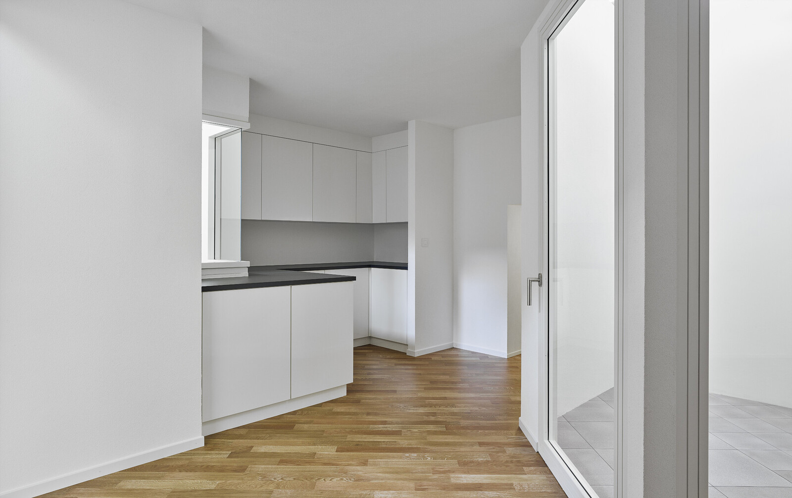
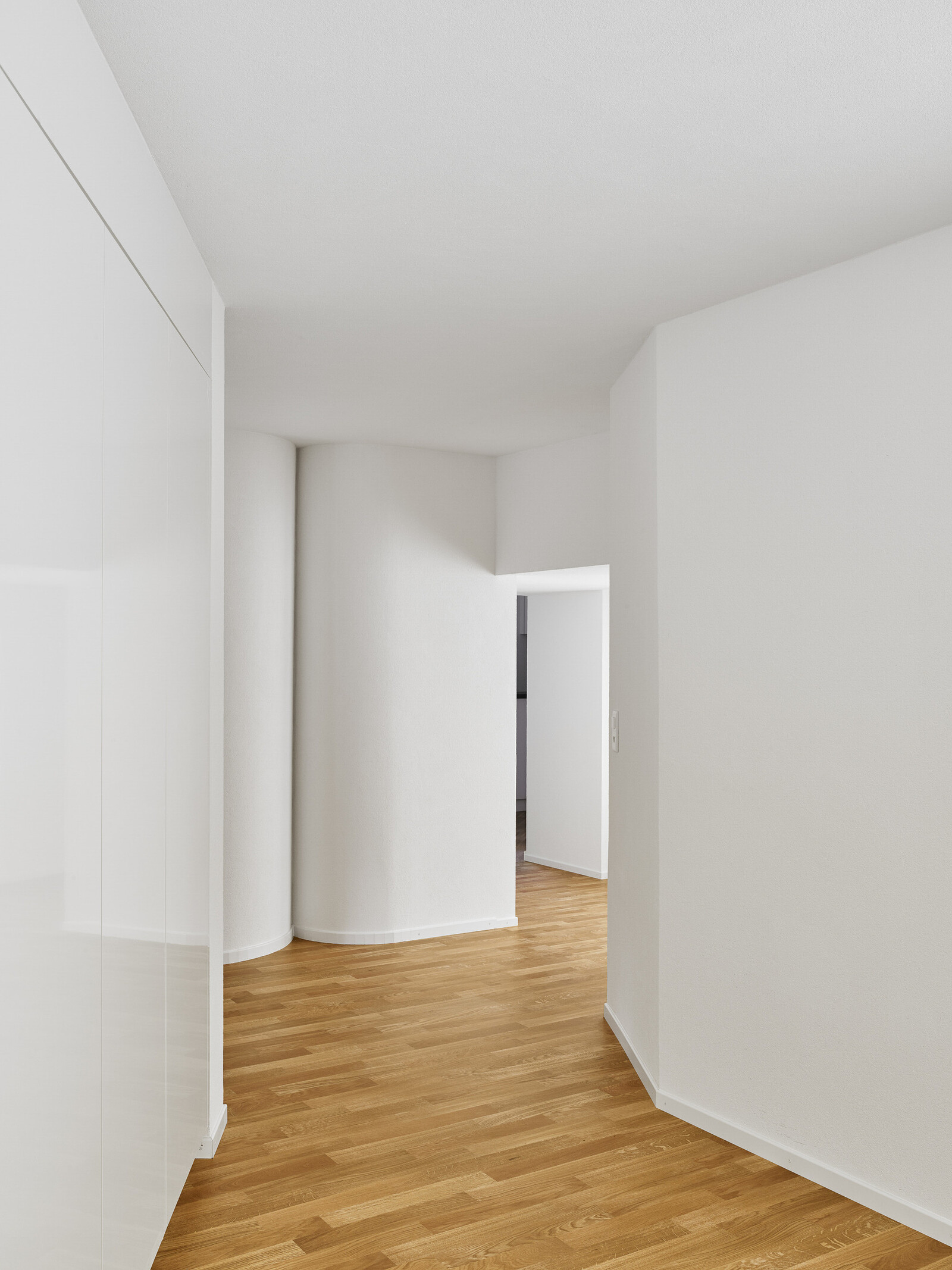
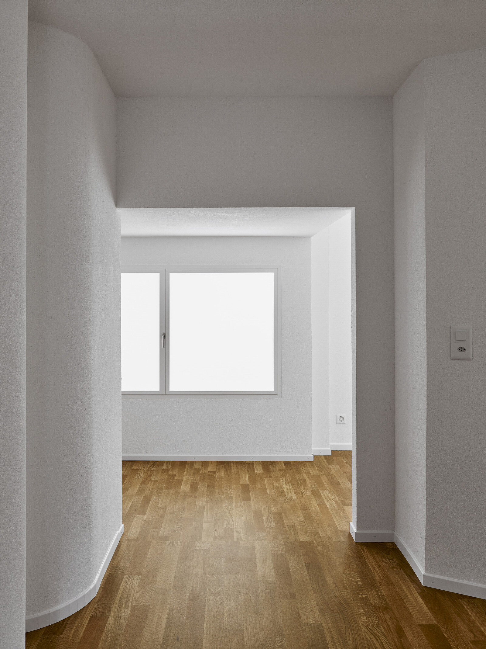
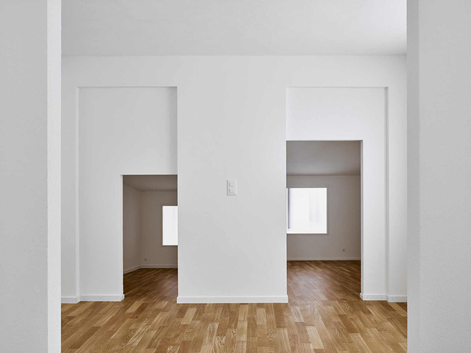
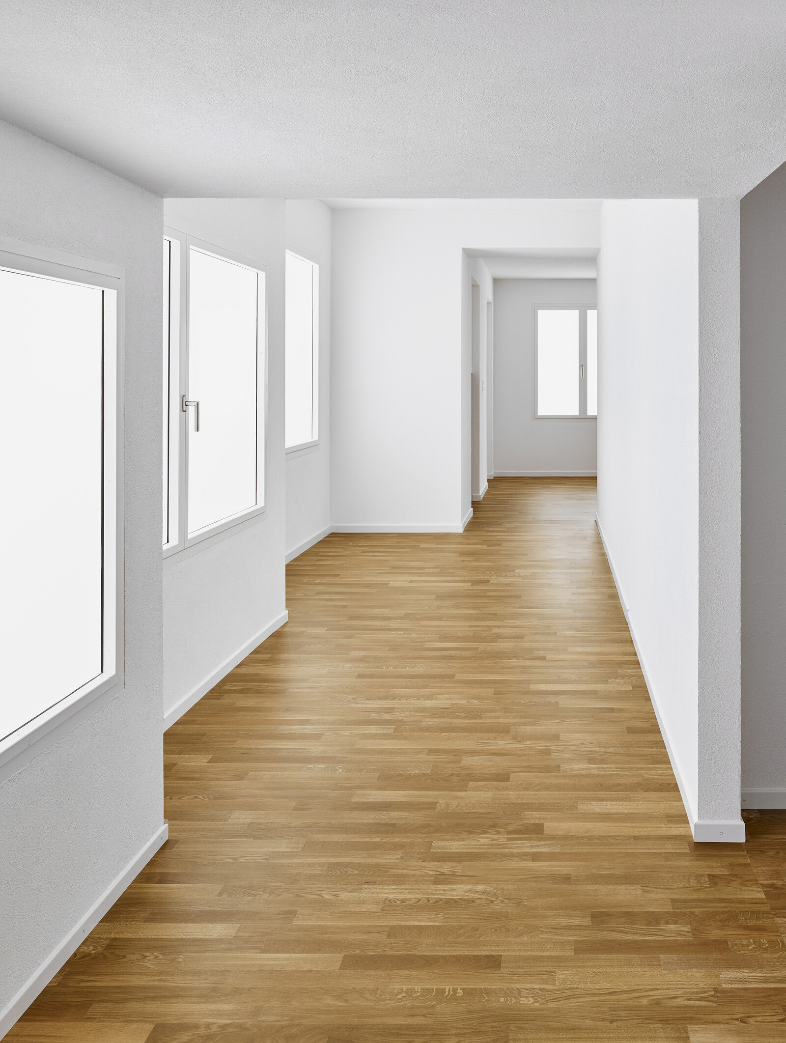
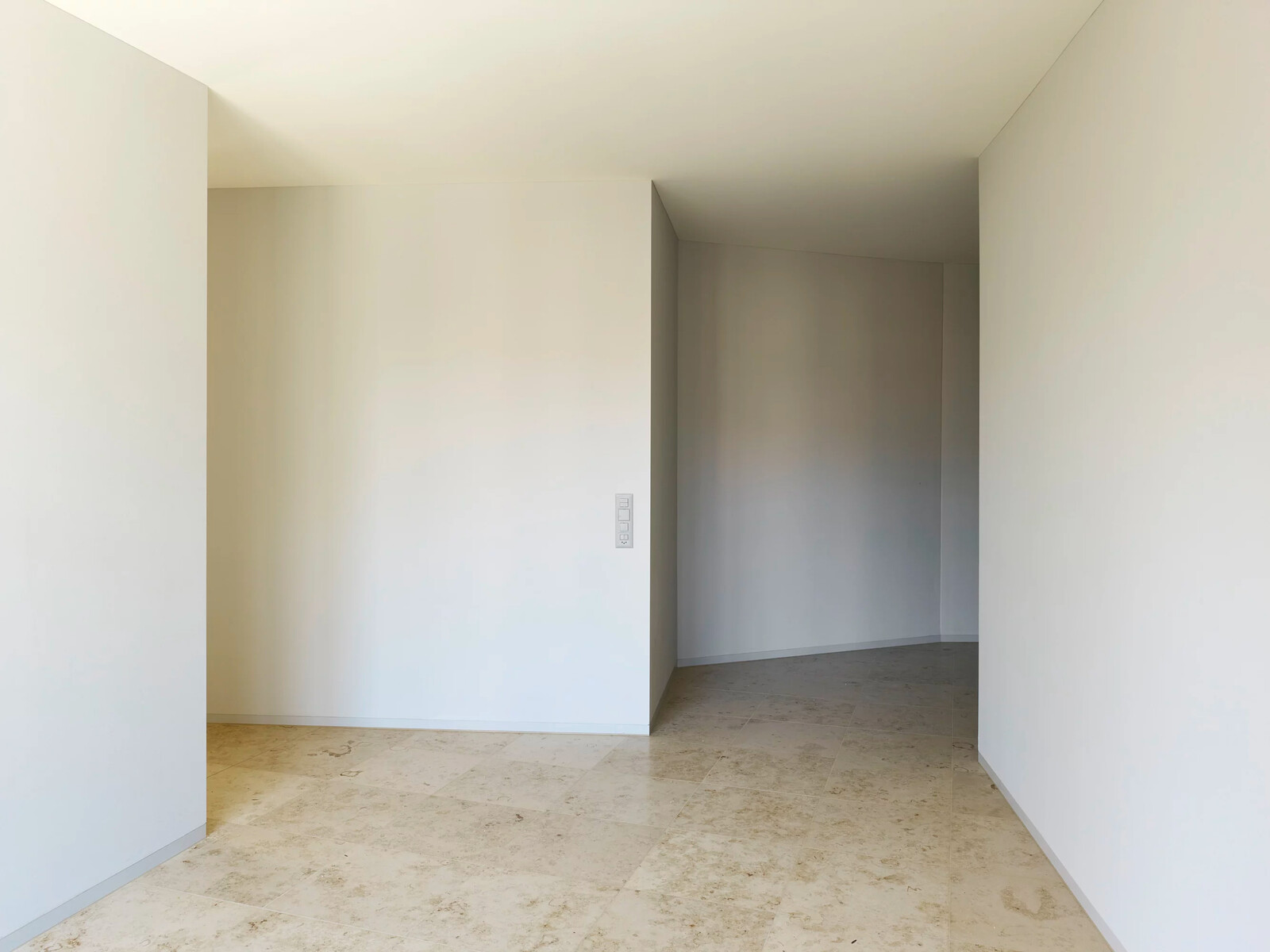
Imagine you are looking through a sequence of photographs. One image after another, all of empty rooms. On superficial inspection, they all look the same. And they seem to show the same thing: nothing. No furniture, no people. Just empty rooms inside empty apartments. The rooms are clean and white. They look new. The light is diffuse, northern. Even the shadows it throws are soft. In one room is a floor of polished concrete, in another, wooden parquet. Sometimes there is a window visible, a patch of sky, a branch of a tree in leaf, hinting at summer, but not enough information to work out what city it is in. The walls sometimes seem to converge, or fall away from the lens. You look at the photographs a little more carefully. You are used to seeing 90° corners splayed out by wide angle lenses, but these odd angles are no artefact of perspective: these are spaces that are no longer exclusively defined by right angles, and abandoning that assumption leaves you a little displaced. The emptiness of the room is not the “subject” of these photographs, exactly. These are not studies of the geometry of empty spaces, because the images don’t encompass the whole room, but only reveal one corner at a time. Rather than on the void, the emphasis seems to be on thresholds, on openings. There’s often a doorway in front of you, and it’s usually slightly ajar. Cumulatively, the photographs convey the feeling of being in a labyrinth, or a first-person shooter for existentialists. As you flick, or scroll, through the pictures, you move from room to room in your imagination, but you never leave the building. You become disoriented.
These photos, which as an archive go by the nickname “the house tour,” were collected from the websites of practicing Swiss architects and then collated by Alessandro Bosshard, Li Tavor, Matthew van der Ploeg, and Ani Vihervaara, the curators of this year’s Swiss Pavilion, Svizzera 240: House Tour, at the Venice Biennale, before being sequenced into a visual essay by the graphic designer Martin Stoecklin.1 The name of the sequence is based on a skit from the comedy Curb Your Enthusiasm, in which Larry refuses to go on Susie’s house tour, because he thinks they’re predictable (“bedrooms, bathrooms, I get it”), and in the process, just as predictably upsets his host. The pictures presented a research problem, or perhaps rather a puzzle: the more that the pictures were examined, the stranger they seemed. Why did they all look so similar? Who are they for? And what purpose do they serve? The images presented a genre without a manifesto, or even a name. There exist no explicit rules for how they should look, and yet they conform to unspoken norms so closely that they could all have been taken by the same photographer.
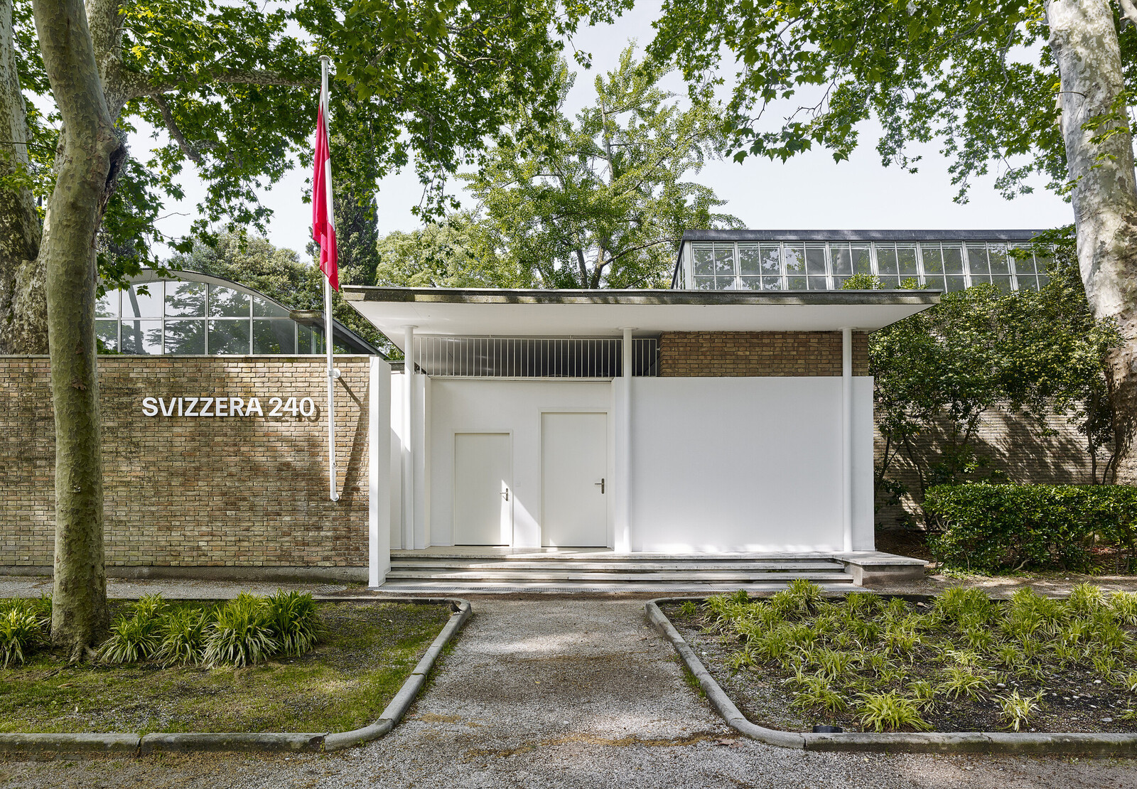
These cool photographs are not marketing for the building (that will be handled by others), nor are they a design tool. They are relics of a ritual. They document a separation. They depict the final state of the building before it is handed over to its owners, a kind of pre-occupancy survey. In this sense, they are mementos for the architects alone. Manifesting a particularly architectural way of visualizing space, they reflect what the architects wish to record of their own work. That they are then available to the public on websites is almost an afterthought, as evidence of having completed (or in German, vollendet, perfected) a project. The oblique relationship between the photographs and their audience makes them particularly interesting. Their uncanny homogenity is not rule based, nor determined by market pressures; it is close to spontaneous, a kind of symptom. Lacking any urgent function, their individual emptiness and collective form reveals to the viewer what they had anticipated of photography, or rather, reveals expectations by denying them. It was perhaps this capacity to be both designed and symptomatic that have made the images, and subsequently the Swiss Pavilion itself, so unsettling. The Swiss Pavilion can be understood as a built response to this research archive of images. This is not the only way to read the pavilion and its installation, but it is one way. In Svizzera 240, the viewer enters a space that looks just like one of the photographs. The visitor walks through rooms in which proportions were preserved, but not the scale, so that the visitor became alternately too big or too small for the rooms that they were in. Like an act of courtesy that unintentionally reveals an ulterior motive, or a film set seen from behind, the Swiss Pavilion quietly and unpolemically reveals both new levels of convention, even automatism, within design, as well as new domains of creative freedom.
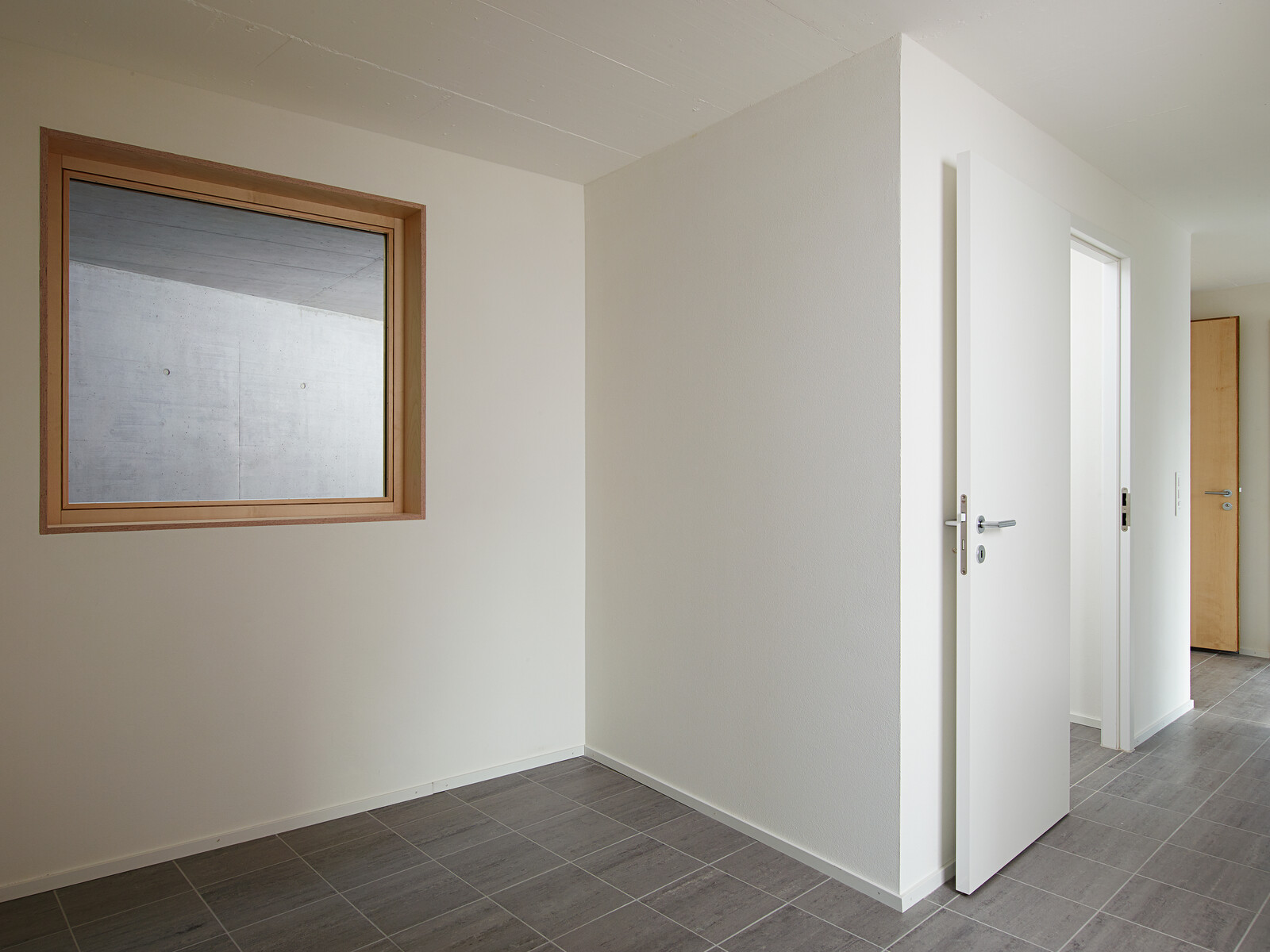
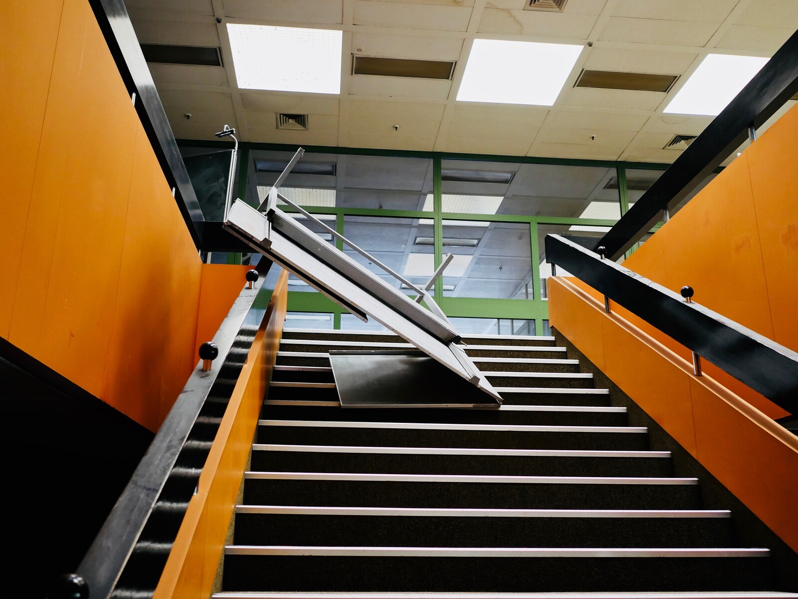
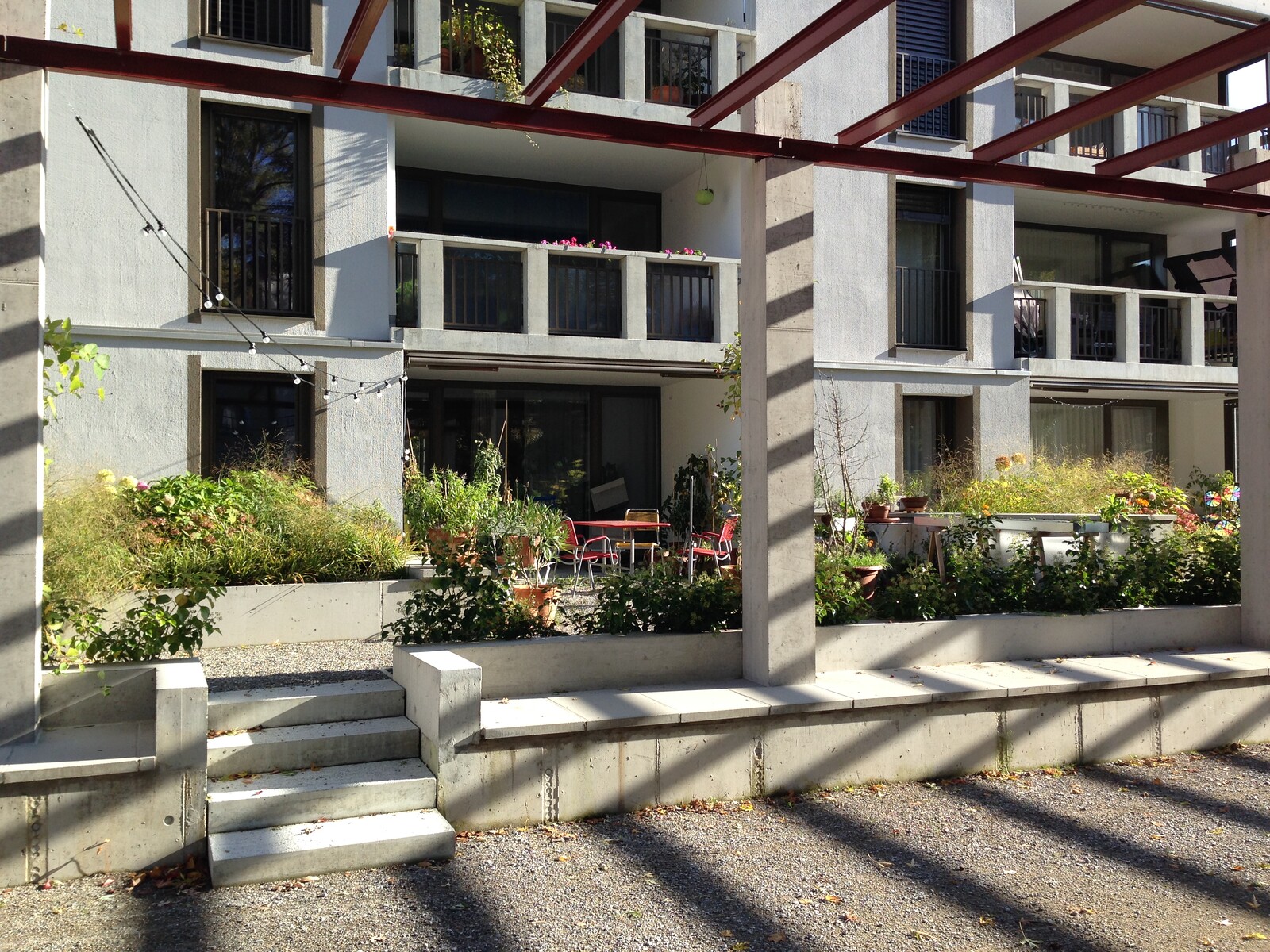
TRIBU architecture, Bonne-Espèrance, Lausanne, 2014. Photo: Michel Bonvin.
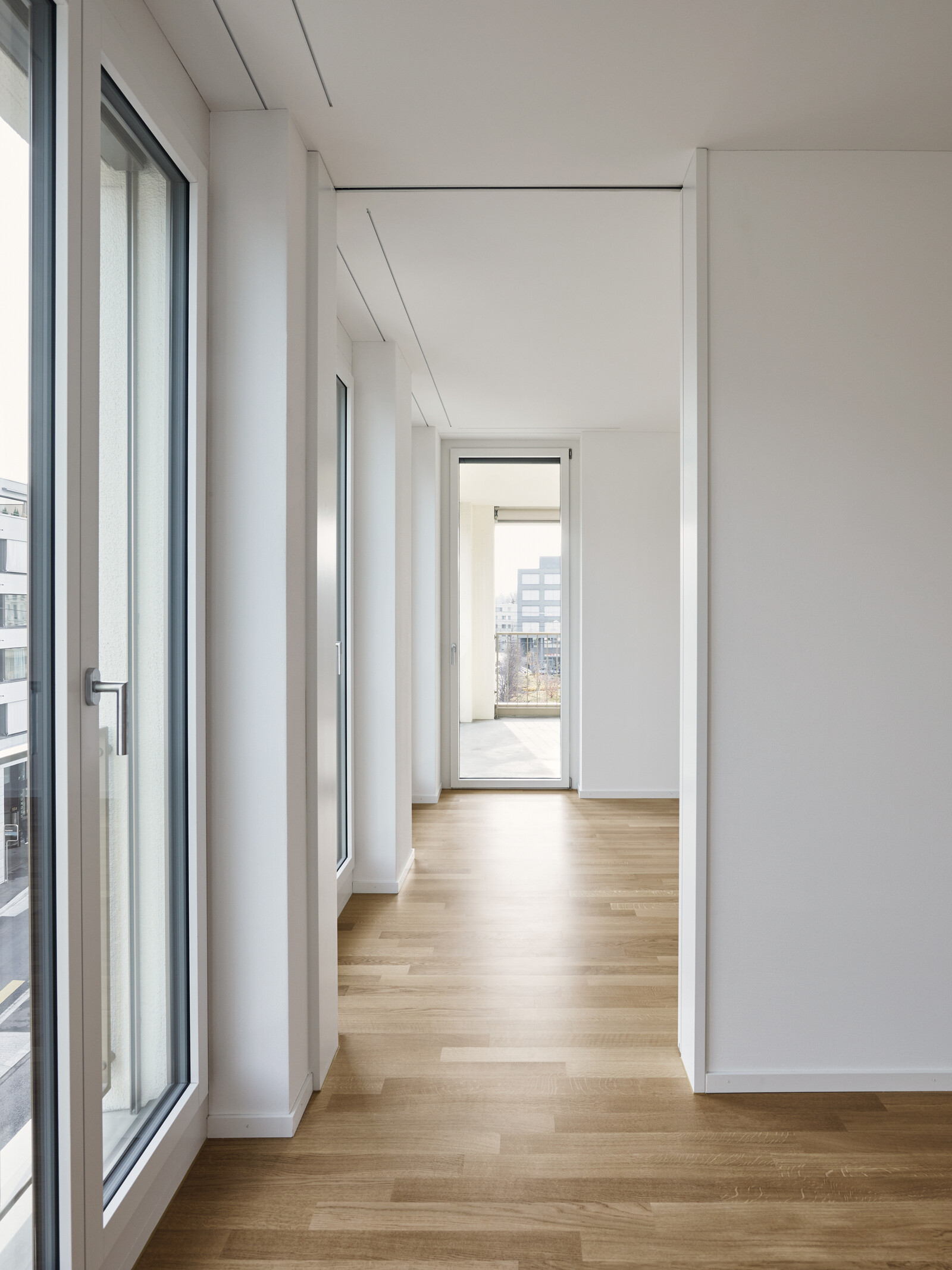
giuliani.hönger architekten, Wohn und Gewerbehaus Weidenhof, Dietikon, 2015. Photo: Giuliani Hönger.
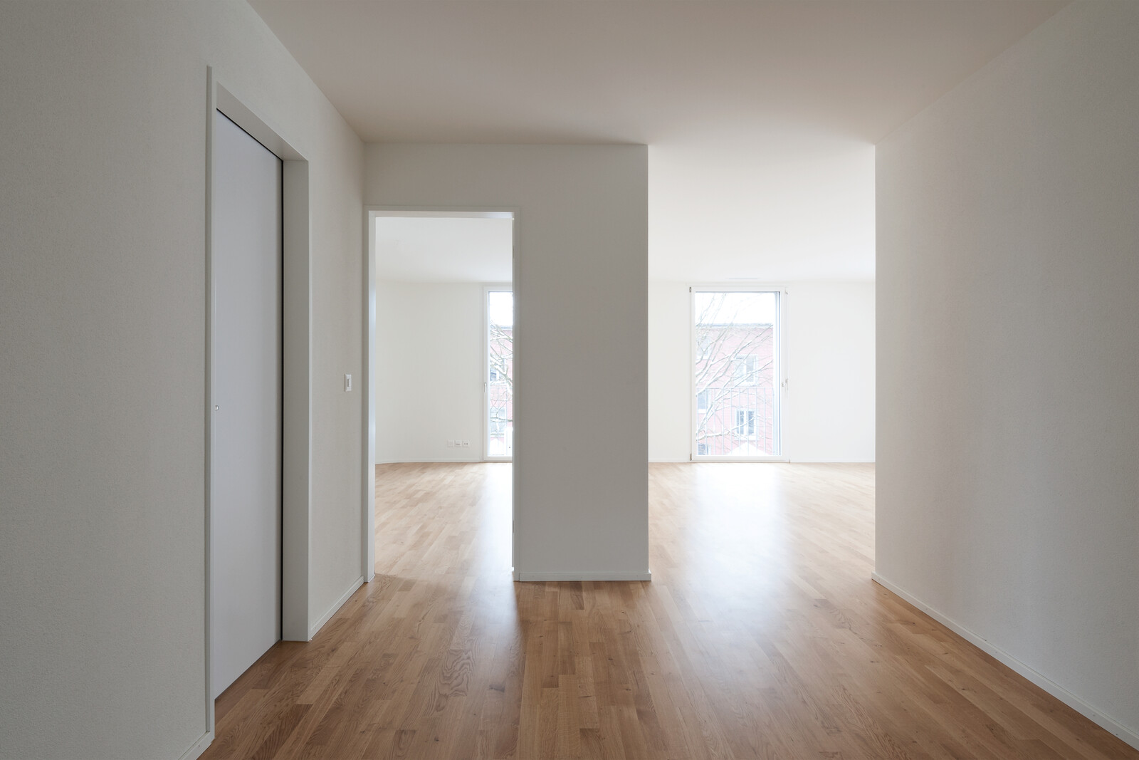
Coon Architektur, Mehrfamilienhaus Wiesenstrasse, Winterthur, 2013. Photo: Christian Schwager.
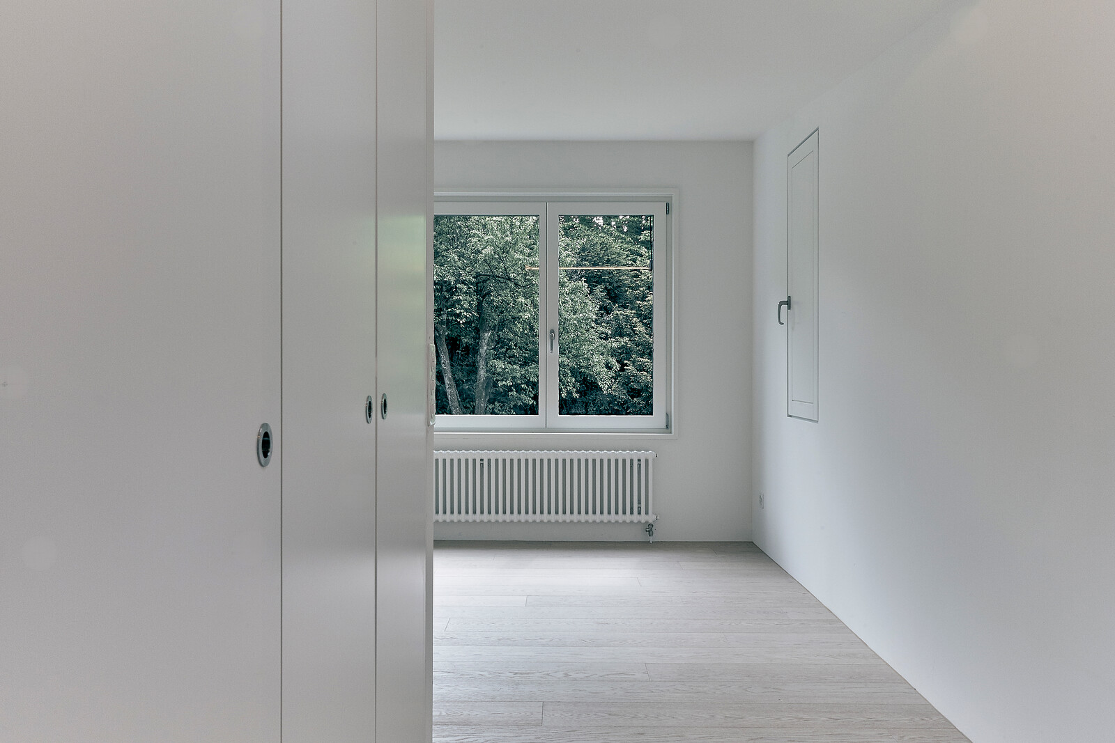
Forster und Uhl Architekten, Erweiterung Wohnhaus Enge, Zürich, 2017. Photo: Forster & Uhl.
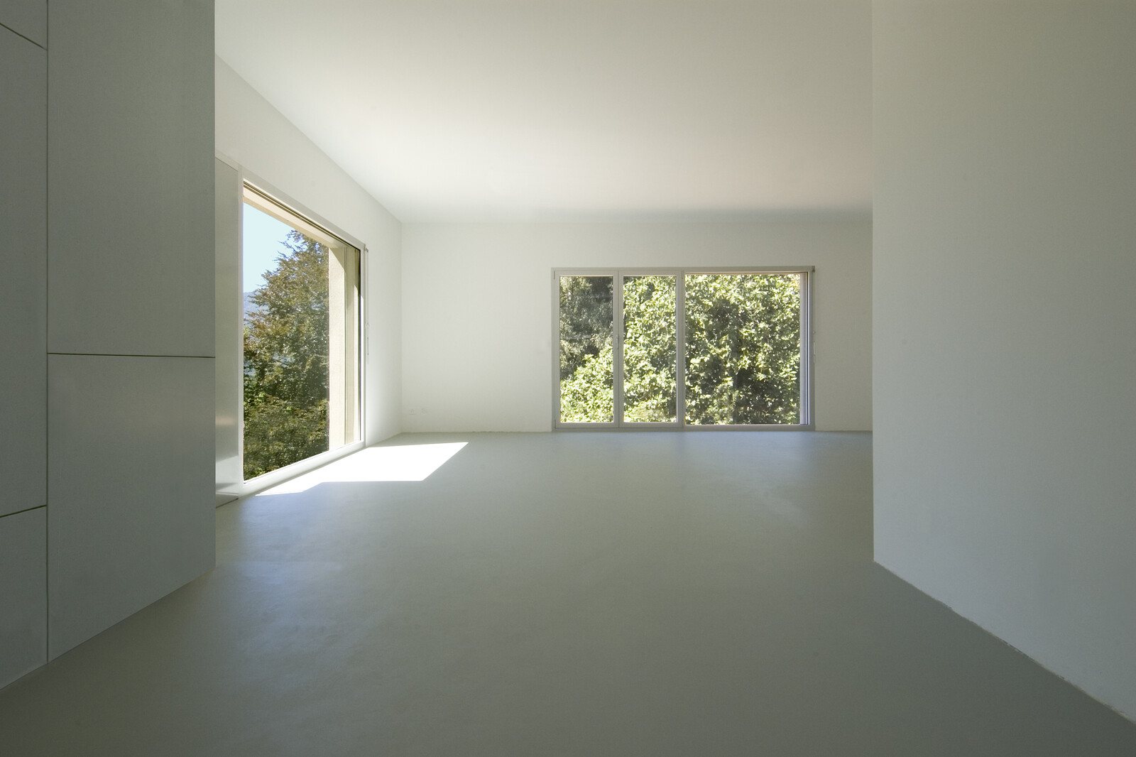
Lukas Meyer Ira Pattini Architetti, Quartiere abitativo Ronchetto, Cadempino, 2004. Photo: Enrico Cano.
TRIBU architecture, Bonne-Espèrance, Lausanne, 2014. Photo: Michel Bonvin.
The appearance of the world that these photographs document is shaped by two things. Digital architectural tools have enabled a drift from a domestic floorplan characterized by perfect rectangles to one in which rooms are often trapezoidal or completely irregular. The increasing complexity of the resulting measurements is handled by the software, and the 3D representation is so easy to zoom, to rotate, that an overview remains available to the designer even as the spatial relations become more entangled. Secondly, the extraordinary degree of standardization in these spaces, the standardization of measurements, the conformity of fittings and of colors, means that the spaces look continuous in these photographic portraits. You can infer these interiors from the plan alone, down to the position and shape of the door knob. Even as the plan becomes more nuanced, the interior elevations are virtually extruded.
In some cases, they are literally extruded. In APIs developed for real estate websites, apartment floorplans are automatically extruded into immersive 3D models that can be “visited” within a browser. A minimum of information is transformed into a maximally detailed illusion of reality, with kitchen islands, doors, windows, shadows, and all. A prospective tenant can even add, and rearrange, furniture within the model. Other companies, such as Archilyse, use the same floorplan data to calculate the subjective psychological qualities of spaces, thereby answering questions such as “will this kitchen seem intimate, or merely cramped?” The goals are pragmatic: either to sell property or to predict sale prices. This information is profitable. Even with the enormous volume of data collected by real estate portals, price predictions are notoriously inaccurate. But then again, their models are based almost exclusively on the post code, square feet, and a previous sale price. Other data was simply too qualitative, too vague, too hard to collect. If data analysts can work out how much people will pay for such hard-to-measure effects, developers will work out how to provide them. The results of these attempts to refine metric models are therefore not only predictive, but normative. What is the exact value of a higher-than-average ceiling, of a load bearing wall, or a secluded bedroom? One possible result of an increase in the range of indices used to predict prices would be a rediscovery of some qualitative aspects of interior architecture by its old adversary, the developer. If spatial complexity is demonstrably, and—above all—predictably related to prices, it will return to developments. Is this an alienation of architecture? Perhaps.
If such experiments can enter into the mainstream, however, they first have to be proven in the field. It is here that the Swiss context of this project becomes significant. For Switzerland has a long tradition of supporting Genossenschaften, housing cooperatives that build collective housing, and in return, are granted free land by the state. The Genossenschaften, much like the housing projects of Red Vienna, became prominent after the First World War. In the last ten years, Genossenschaft projects, insulated from the austerity that has constricted developments elsewhere in Europe, and benefitting from Swiss political structures that encourage small, autonomous community organizations, have become test beds of spatial experimentation. Overwhelmingly, these experiments have been carried out within the plan. As Christian Inderbitzen, of Edelaar Mosayebi Inderbitzin architects, told Emma Letizia Jones and Philip Shelley: “The importance of the floor plan—that’s something that needs to be pointed out. The floor plan in a housing project determines the life that can happen, or not happen. It’s crucial.” Until now, in contemporary Swiss architecture, the plan has been the main site of contest, and it is through the plan that the power relations within the house become legible. The plan, it seems, is where power can be deconstructed, and reconstructed. Politics, implicitly, has its truth in the plan. The façade, also true to its name, is all about rhetoric. In the hermeneutics of architectural suspicion, the façade presents myth, and the floorplan its underlying truth. Elevations, ignored in this debate, threaten to disappear. But precisely because elevations are not so hotly pursued, they yield more. The more we look at them, the more that they reveal about our memories, our expectations, about media history, architectural vernaculars, and the future of the discipline.
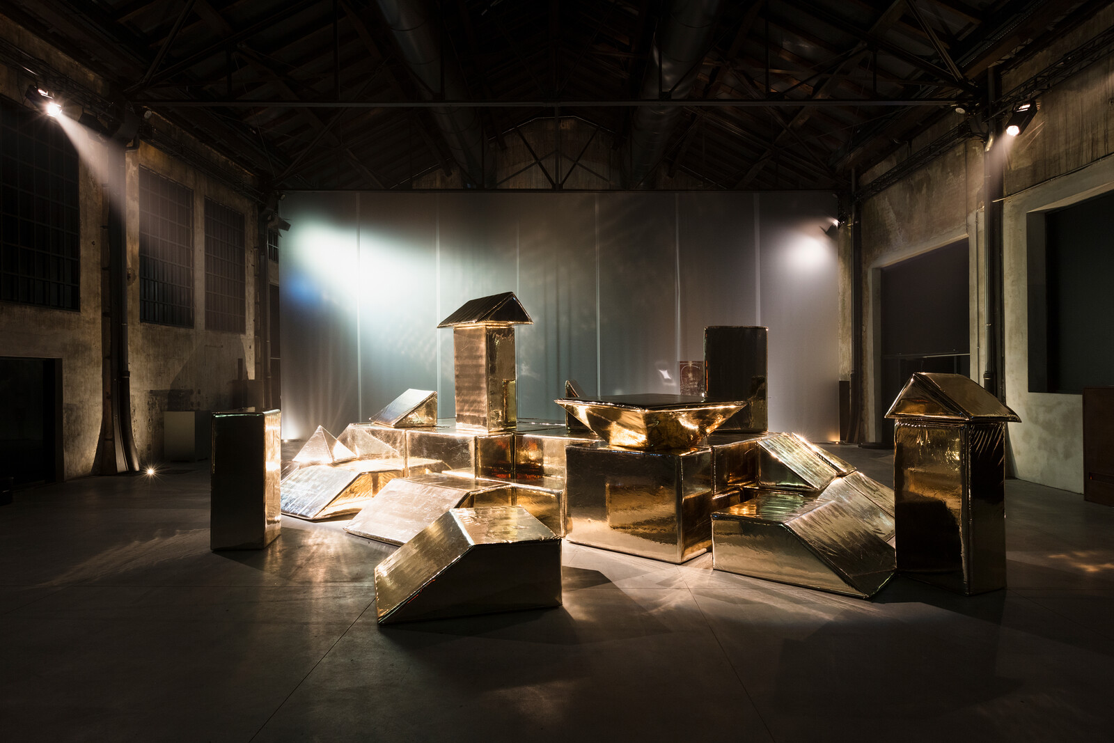
The photograph is often described in art history as if it was a window, but what happens when we step through the window of the picture plane, and into the image itself? Because such images have no natural scale, we might find ourselves suddenly bigger, or smaller, than we expect. For people entering Svizzera 240, this whimsical problem was made concrete. The interior of the pavilion was remapped as a series of rooms whose scale distorted to fill the available space, even as all the fittings, from door handles to wood grain, remained meticulously Swiss standard issue. Visitors would move, increasingly dismayed, from one room to another, feeling themselves smaller, and then larger. With another person in the room—are they standing as far away as we think they are, or are they taller or shorter than we thought? Much like a hike on a glacier in which an inexperienced walker, without the benefit of familiar forms, slowly loses their bearings and is unable to tell if a ridge is an hour away or a day’s march, visitors pleasurably lose their bearings in a space where the objects are familiar, but scale is no longer trustworthy. Architectural historians and critics, walking through the rooms in Svizzera 240, would try to orient themselves via history. Some spoke of mannerism, others of Borromini. The playfulness of the installation, and the pleasure it brought, was also a rejection of functionalism in favor of a baroque, self-reflexive exploration of possibilities, of the rules of a game pushed to its limits. To go, within a few sentences, from minimalism to mannerism (let alone to the Baroque) requires some critical agility. Mannerism and minimalism would seem, on the face of it, to contradict each other. But there is an inner affinity: both mannerism and minimalism explore not just content, but the coordinates of experience. They don’t just make things bigger or smaller, they stretch and compress time and space, wringing meaning out of the grid like some deviant topologist. What the exhibition recalled—for it is a canonical lesson, but one worth retelling—was how the seeming minimalism of the rooms, their sameness, could sensitize the viewer to subtle shifts and could produce on an experiential level a kind of maximalism.
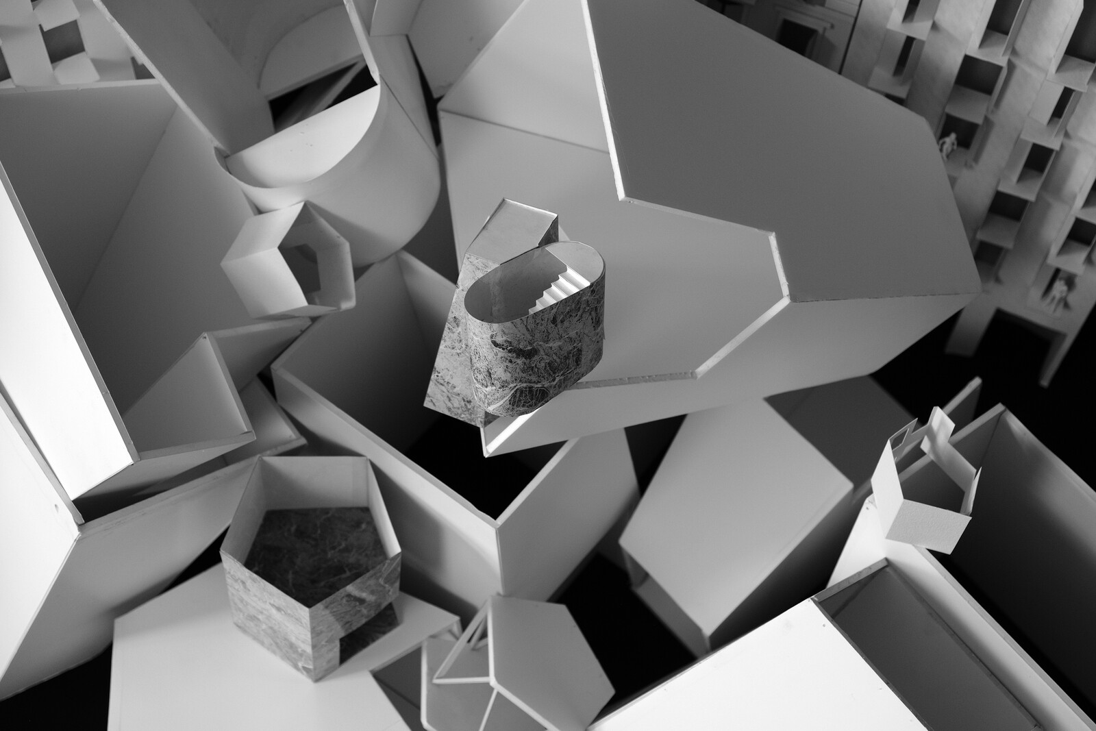
Installation view of Svizzera 240: House Tour at the Swiss Pavilion at the 16th International Architecture Exhibition, La Biennale di Venezia. Photo: Wilson Wootton.
Installation view of Svizzera 240: House Tour at the Swiss Pavilion at the 16th International Architecture Exhibition, La Biennale di Venezia. Photo: Wilson Wootton.
Installation view of Svizzera 240: House Tour at the Swiss Pavilion at the 16th International Architecture Exhibition, La Biennale di Venezia. Photo: Wilson Wootton.
Installation view of Svizzera 240: House Tour at the Swiss Pavilion at the 16th International Architecture Exhibition, La Biennale di Venezia. Photo: Wilson Wootton.
Installation view of Svizzera 240: House Tour at the Swiss Pavilion at the 16th International Architecture Exhibition, La Biennale di Venezia. Photo: Wilson Wootton.
Installation view of Svizzera 240: House Tour at the Swiss Pavilion at the 16th International Architecture Exhibition, La Biennale di Venezia. Photo: Wilson Wootton.
Installation view of Svizzera 240: House Tour at the Swiss Pavilion at the 16th International Architecture Exhibition, La Biennale di Venezia. Photo: Wilson Wootton.
Was Svizzera 240 a critical work? Unlike many of the national pavilions in the Biennale, the Swiss Pavilion did not assert its criticality. It also has to be admitted that the joy the installation evoked contained an enjoyable touch of regression; of suddenly arriving in a kitchen and discovering that one had the perspective of a five-year-old child. But a work that offers the pleasures of regression does so temporarily, and once it recedes, can leave a residue of insight. At the entry of the pavilion was not one door, but two. The other door, left open, showed a kind of trompe l’oeil, a false room that looked as if it had been built to correspond with a naively drawn perspective, as if by a child. Pleasures—even infantile pleasures—are not necessarily incompatible with criticality. In the 1960s, Christian Enzensberger translated Alice in Wonderland, and later Alice through the Looking Glass, from English into German. He could not help but translate them as political allegories, and this was how they were received: both as children’s stories and as political stories. The Red Queen, the White Rabbit, all the figures appeared in post-war Germany with an extraordinarily different valence than their role in Victorian England. And Alice, sometimes she grows to the point that she dominates her world, and sometimes when she shrinks, she threatens to disappear within it. Alice is pure potential. Some arguments are made best simply by demonstrating them as physical truths.
It’s a curious detail that since the introduction of clean air legislation in the early 1980s, coal fired power stations in Germany have been legally obliged to scrub their smoke of fine dust particles, which are for the most part ash with traces of sulfur. This is done with an electrostatic precipitator (also called an ESP), that charges the particles, and then draws them down so that they heap up in huge hoppers that look like geometric teats. Periodically, semitrailers come and collect the fine dust that has accumulated in the hoppers. Clean, white, and powdery, this dust is sold to manufacturers who turn it into plaster, and then drywall (made of calcium sulfate dihydrate). Even as servers continue to model these spaces in which we will live, the dust rain continues to silently fall. Hundreds of thousands of tons of it, every year. Even as we sit in front of screens, in order to pay for our homes or distract ourselves from them, the dust falls. The more electricity we consume, the cheaper and more widely available drywall is. The thin-walled world that we see around us is a side effect of the electricity that we consume as we produce it, study it, and dwell in it. A polygonal balloon inflated by the light with which we illuminate it. The built environment, when examined via this metabolic material path, is in all earnest a media effect, a strange double to the stucco ornament of the rococo, with its inhuman profusion, its rank fecundity. You are looking through a sequence of photographs. At first, they all look the same. And they seem to show the same thing: nothing. No furniture, no people. You have the feeling you are in a labyrinth. You become disoriented.
The collection is reproduced at the start of House Tour: Views of the Unfurnished Interior (Park Books, 2018).
Positions is an independent initiative of e-flux Architecture.
Category
Subject
This essay is based on an unpublished introduction to the book House Tour: Views of the Unfurnished Interior (Park Books 2018) with essays by Francesca Hughes, Nicholas de Monchaux, Georges Teyssot, Martin Steinmann, Christophe Joud and Lorraine Beaudoin, Emma Jones, Sandy Isenstadt, Michael Hill, John Macarthur, Claire Lehmann, Charles Rice, Hans-Christian Dany, Marija Marić, Ariell Ahearn, and Stephen Lezak.
Positions is an initiative of e-flux Architecture.




(2014).jpg,1600)



,-2003,-srgb.jpg,1600)
