Hans Ulrich Obrist: You’ve frequently worked at the junctures between art and architecture. Could you tell us about your early work in exhibition design as well as exhibitions of your own art?
Hans Hollein: My earliest endeavors in that direction date to 1956, when I’d completed my architecture studies at the Academy of Fine Arts in Vienna. I hadn’t received any commissions, but I started to develop ideas. My first studies for a purposeless or—my term at the time—absolute architecture were located on the boundary between architecture and visual art or, more specifically, between architecture and sculpture. I never believed in a neat division between architecture and the other visual arts. I fleshed out my ideas in drawings and models and then won a fellowship to go to the US for two years. I used the time to study at the Illinois Institute of Technology in Chicago and get a master’s degree at Berkeley.

HUO: Who were your teachers in Chicago?
HH: I started studying with Mies van der Rohe, but soon after I got there he withdrew from the IIT due to internal differences, although I continued to see him privately. I then took urban planning classes with Hilberseimer and Peterhans. In my second year, I moved to California. But the real main purpose of my stay was to work free of constraints and really get to know America. I logged around sixty thousand miles driving around the country, with a wide variety of intentions and research foci. For example, at one point I went on a trip to visit every Vienna in the US. I also looked at every single building by Frank Lloyd Wright. That was when I was first confronted with the reality of his designs. I’d known his architecture only from photographs, so the three-dimensional reality was very imposing. I looked at everything he’d done, down to the pigpens he’d built in Alabama. Shortly before his death, he invited me to come up to Taliesin in Wisconsin for a weekend. Another subject I was interested in very early on was Native American architecture. I went to the Southwest several times to study the pueblos more closely.
HUO: Did you document your research?
HH: I accumulated around two thousand slides, a pretty extensive collection. The University of California wanted to buy it, but I declined their offer. Unfortunately, almost all the slides were stolen from my car three days before I flew back home. All I was left with was a series of pictures of Schindler’s buildings I’d deposited at the Museum of Modern Art. I’d seen a photograph of Schindler’s Beach House in an old issue of Architectural Record, which made a big impression on me. I asked around, but no one in my acquaintance knew anything about the architecture. So I drove to Los Angeles to see more of his buildings and take photographs. I met his widow and his former lover, who introduced me to his circle of friends. Schindler himself had died in 1953. I brought out the first books about Schindler in 1960 and 1961. I also obtained access to his archive, which was stored in his son’s garden house. All his drawings were there, in big stacks, with the models sitting atop them, and I was able to document some of that in photographs as well. I took the material to the Museum of Modern Art in New York, gave them an introduction to Schindler’s work, and suggested that they should preserve his archive. They replied that Schindler wasn’t important. Then, in 1964, I also published an article on the pueblo in which I discussed the basic principles and the complexity of this architecture and its interaction with the landscape and nature.
HUO: These were the beginnings of your work as a documentarian?
HH: Yes, but I never planned on becoming an architecture historian or critic. I called my publications on Schindler a “contribution to a corrected architectural history.” Same with my work on the Viennese architect Josef Hoffmann: When I was a student, in 1954–56, art historians had lost sight of his significance. You could pick up furniture designed by Hoffmann at estate sales and from dumpsters. Drawings by Klimt and Schiele went for ten dollars apiece. I thought it was my duty to restore these pioneers of modernism to their rightful place in art history. But my work as a writer never took precedence over my own creative activities. In today’s parlance, what I was doing at the time, especially in my environments, would be described as crossover. Take, for example, my early drawings and collages from the late 1950s and early ’60s, which were acquired by the Museum of Modern Art. In Berkeley, I did a master’s thesis on “Space in Space in Space,” a subject I examined in texts, drawings, and models of various sizes. After coming back from the US, I gave a lecture on my works and ideas. To my mind, I was a sculptor much more than an architect. In 1963 I presented my work in a joint exhibition with Walter Pichler at Galerie nächst St. Stephan.
HUO: Was that your first exhibition?
HH: No. In 1959, I’d done a modest show of work related to my thesis and other pieces I’d created during my time in the US. And I’d put together a small exhibition on Schindler at the Museum of Applied Arts (MAK) in Vienna in 1960. But the show at Galerie nächst St. Stephan in 1963, which was on display for all of three days, was the first presentation of my art. It elicited a very intense reaction. People rushed into the gallery determined to destroy the models. The Kronen Zeitung, an influential tabloid, launched a massive attack as well. Although the exhibition closed after a few days, it triggered a fundamental shift in the situation in Vienna at the time. It was also documented in a little catalogue. The Museum of Modern Art got in touch and purchased some of the exhibits, and I was offered a visiting professorship at Washington University in Saint Louis, which had a very progressive architecture institute at the time where Aldo van Eyck, Frei Otto, and others were teaching.
HUO: So the press response to your first exhibition at Galerie nächst St. Stephan and the catalogue really set your career in motion.
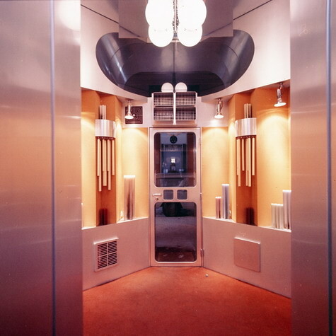
HH: I’ve always seen the medium of writing about exhibitions and catalogues as an important multiplier. In this case, it allowed me to spend another year in the United States, where, besides teaching, I pursued my projects further. When I returned to Vienna, I decided to set up shop as an architect. In 1964, Mr. Retti, a manufacturer of candles, asked three architects to submit proposals for the design of a small store, just 150 sq. ft., on Vienna’s Kohlenmarkt and chose my design. The shop was completed in 1965, and in 1966, it received the R. S. Reynolds Award, then the most highly renowned architecture award. My design competed against skyscrapers by Yamasaki.

HUO: Apparently the store’s microstructure really impressed people!
HH: When Bakema saw it, he said, “But that’s a built manifesto!” And it was, because it wasn’t just a shop, it was an architectural statement. Which was very much my intention. I’d forgone the conventional shop window and divided the unit into two rooms: an exhibition space and a walk-in storeroom. To make up a bit for how small the space really was, I constructed a little passageway that led into the aluminum-clad display storeroom. Two mirrors facing each other formed a transition from the real to the virtual architecture, and for a brief moment, you got the impression of an infinite space. The shop was also a statement on the use of novel materials. I glued the aluminum panels on, a technique that had been virtually nonexistent—I’d been supplied with information on how to do that by the British Aircraft Corporation—and took inspiration from cable-car gondolas for the curved shapes. So the project was a superimposition of different intentions, and many people recognized the way it lent itself to multiple readings.
HUO: Display design for shopping environments has been in focus again lately.
HH: True. Rem Koolhaas is working in that field today. At the time, the majority of the responses were disparaging, along the lines of, “an architect who’s doing a store obviously isn’t getting any major commissions.” After I’d finished the candle shop, I was hired to design several more shops and turned each into another statement, sometimes with different emphases. But ephemeral architecture, like shopping displays and trade-fair booths, was seen as less than respectable. The advantage, to my mind, was that the clients were bolder and more willing to experiment than those who had major commissions to award. For example, I outfitted one boutique with an interior made of synthetic materials. A year after I’d designed the candle shop, Beuys knocked on my door in Vienna and said, “You’ve got to become the new architecture professor at the Düsseldorf Academy of Art!” We spent two days together. My candidacy was supported by the artists and opposed by the architects, and eventually, in 1967, I was appointed professor of architecture.

HUO: The next field you then went into was museum architecture.
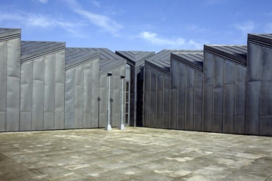
HH: Yes, that was something no architect was interested in at the time. Museums were seen as fusty institutions. On the recommendation of Monsignor Mauer, the director of Galerie nächst St. Stephan, I was invited to do an exhibition in the old building of the municipal museum in Mönchengladbach, which had recently held the first Beuys exhibition. Johannes Cladders, the museum’s director, wanted me to create the new building. But first I designed Richard Feigen’s gallery in New York. Feigen had bought a house in 1967 and wanted to convert it into a large gallery and private residence. He presented an exhibition at his old gallery entitled “Macrostructure” that included work by Claes Oldenburg, Frei Otto, Christo, myself, and others. When I came to pick up my exhibits after the show closed, Feigen and his secretary said to me, “We didn’t know that you’re also an architect who can build. We thought you were only an artist. So why don’t you do our new gallery?” That’s how one thing led to another. In the meantime, I also drafted an experimental museum for Saint Louis, though it was never built. Eventually, Cladders, the director of the museum in Mönchengladbach, proposed to the city’s authorities that I should design the new building. The objection was of course that I’d built virtually nothing. But in the end they came around and chose me. I just thought it was wonderful that a city like Mönchengladbach, with a population of 170,000, was spending its own money to build a museum for contemporary art. Needless to say, the process was time consuming: first an urban-planning study was commissioned to determine the exact location of the new museum. The earliest concrete plans were drawn up in 1972, and the building was inaugurated in 1982. The only new museum buildings in Germany at the time were Philip Johnson’s museum in Bielefeld and the Lehmbruck Museum. The building in Mönchengladbach was the first museum clad in sheet metal, a titanium-zinc alloy. When I presented the idea to Mönchengladbach’s city council, the members said, “Sheet metal? We’re on a tight budget, but we can afford stone cladding.” To which I responded, “It’s great to hear that you’ve got that much money left. I can think of other places where that’ll come in really handy.” After the new building in Mönchengladbach opened, many architects hired to design museums followed its example: from Cologne’s Wallraf-Richartz-Museum to Frank Gehry’s building in Bilbao, sheet metal–clad museums are a common sight today. I should also note that the building in Mönchengladbach was the result of a very interesting constellation. Mönchengladbach was a fairly undistinguished city at the time, with a mixture of provincials and very open-minded people. It was an ordinary municipality that underwrote the project, rather than a wealthy private patron.
HUO: Could you describe your design for Saint Louis in more detail?
HH: I was brought in to do it by Emily Rauh, the future Emily Rauh Pulitzer, who was the curator at the St. Louis Art Museum. The museum owns an eminent collection of Expressionist paintings. My idea for the experimental museum was to construct an installation where the visitor would take a seat and press a button to set a rotating disc in motion on which original works of art—sculptures and paintings—would be mounted. That way he or she would have a very individual experience of selected artworks. The inspiration came from Japanese museums, which have boxes in which exhibits are held—they get taken out and then put back.
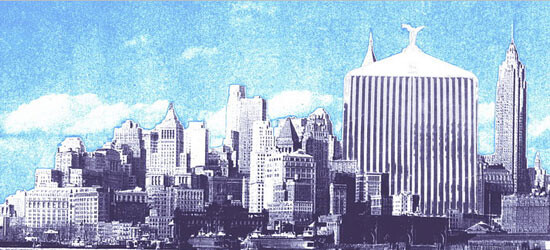

HUO: What do you think of Wolfgang Pehnt’s theses, also with regard to contemporary museum architecture? He conceives architecture as collage and emphasizes the heterogeneity of museums.
HH: I don’t think the term “collage” is quite right. I think that collage is an artistic technique which, on its face, has nothing to do with museum architecture. For example, in my collages—I also use the term “transformations”—the point was to take an object that had a specific meaning and transpose it into another meaning or add a further meaning to it. That’s also a phenomenon Claes Oldenburg was interested in when he worked on objects like the “giant lipstick.” Another aspect is that collage can be a way to represent something with very simple means. The concept of heterogeneity seems more applicable to the character of the building in Mönchengladbach. The entrance is a metaphorical museum-as-temple. The saw-tooth roofs, on the other hand, were the cheapest way to bring daylight into the galleries, a structural element I took from the textile industry. In the conservator’s perspective that was a gamble, because the widely shared conviction at the time was: the more artificial light, the better. But we decided to get as much daylight as possible into the museum and looked to turn-of-the-century museum buildings for models. Regarding the internal layout of the galleries, the museum in Mönchengladbach is best described as a three-dimensional matrix. It’s not a museum with a fixed sequence of rooms; the visitor can take very different paths through it. I enter the building along a diagonal and have four options. For example, I can chart my route follow a rough chronology or go by artistic schools or motifs. This open arrangement of the galleries accommodates modern contemporary art with its rejection of chronological series. It allows for exhibitions that highlight the complexity of the creative approaches that coexist at any point in time. The same applies to the museum in Frankfurt, which also features very different rooms: galleries with skylights or sidelights, ones that are dark, as well as round and angular rooms. It lets each work of art find its place and gives the visitor the freedom to devise his or her own way through the exhibition. I also think a museum is not an erratic block; it’s a building for the community to take possession of.
HUO: You designed several important environments in the early 1970s.
HH: Yes, for example at the Venice Biennale, where I was involved as a visual artist.
HUO: You exhibited rituals.
HH: The Biennale’s theme was “Work and Behavior. Life and Death. Everyday Situations.” I paraphrased it by showing everyday spatial situations, making tile objects, and putting up a tent with a stretcher.
HUO: Are your current projects the realizations of earlier utopian ideas?
HH: Yes. I’ve always tried to bring many of my ideas to fruition eventually. Projects like “Monte Laa” in Vienna with the two towers or “Vulcania” have a lot to do with what I did between the late 1950s and the early ’70s.
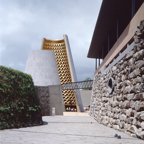

HUO: “Vulcania” is a highly unusual museum.
HH: “Vulcania” is a museum and theme park. An international competition was held and the project caught my interest because there’d never been a museum dedicated to volcanism. I took part in the competition and tried to come up with an idea that would hold the project together. This was actually an instance where I worked with a collage. In addition to the usual detailed plans, I made a collage out of Gustave Doré’s engravings illustrating Jules Verne’s Journey to the Center of the Earth and Dante’s Inferno. The collage visualized my underlying idea: a descent into the interior of the Earth. That’s why all spaces, with the exception of the restaurant and the metaphorical volcano, are underground. I designed an artificial crater into which people would descend before emerging back into daylight at another location. In this way I wanted to illustrate not only the destructive nature of volcanoes but their life-giving aspect as well: their eruptions leave highly fertile soil behind. We also used a wide range of media. There’s an IMAX theater with a sixty-six-foot-tall projection screen where footage of volcanic eruptions is shown. So we tried to address the visitors in diverse ways, also taking into account the different age groups and educational backgrounds. The museum and park are fun for a child to roam, but they also present information that’s of interest to scientists.
HUO: And you’re appealing to all five senses!
HH: Yes, that was also an aspect of our conception. We work with sulfurous odors, the rumbling of volcanoes during eruptions, and the visual presentations. But there are also highly reduced and abstract visualizations and objects.
HUO: You’re planning another museum inside a mountain for Salzburg.
HH: The projected building, which grew out of a competition I won, is the subject of talks about a possible collaboration between the Kunsthistorisches Museum in Vienna, the Hermitage Museum in Saint Petersburg, and the Guggenheim.
HUO: In which way does the expanded concept of art play a role in your work? Is there an analogous expansion of the concept of architecture?
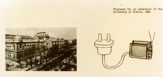
HH: Work that thinks outside the box has always been important to me. I advocated such an expansion early on, in 1960, in my manifesto “Architecture Is in Exile Now.” I’ve also said things like “Everything is architecture!”—things that spoke exactly to this point. One implication is that architecture should avail itself of other media as well. Architecture is more than building in stone. To bring certain points home, I have to bring in other media. For example, I can make spaces larger or narrower also by changing perceptions. I once envisioned pills, like those used to treat claustrophobia or agoraphobia, that would let me experience a space that needn’t exist as a physical structure. My design for a new lecture hall complex for the University of Vienna consisted of a photomontage of the university’s existing buildings in combination with a monitor—my argument was that no new lecture halls needed to be built because the necessary enlargement could be implemented through the use of media.
HUO: With your exhibition conception “Selection 66” for MAK in Vienna you explored an expanded concept of design. How did you implement your approach in the exhibition design?
HH: With a conception that redefined the idea of the “exhibition.”
HUO: The 1968 Architecture Triennale, curated by Giancarlo de Carlo, is an unusual case: it was realized but never seen by the public. Still, it is of special significance in the evolution of your oeuvre because you framed your theses in an extreme way that subsequently proved highly influential. Also, the preparations for the Triennale occasioned many fruitful exchanges between the architects.
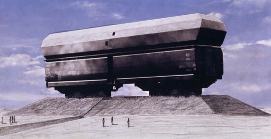

HH: Until recently, the Triennale featured national contributions as well as a general section. I designed the Austrian contribution and grappled with the theme of the “Great Number.” One point of departure, for example, was snow as a characteristic Austrian mass product. In my installation, the visitors walked down a refrigerated corridor with artificial snowstorms raging on the left and right and noise coming from the floor as though they were treading on snow. There was also a large number of doors people could walk through, including a “frustration door” studded with handles, only one of which worked, and it wasn’t where you’d expect it, so people had to try the handles until they found the right one. Another piece was a plastics molding machine set up in the exhibition that I used to make red-white-and-red glasses with temple stems that didn’t fold, so people either had to wear them or hold them in their hands or throw them away. This let me expand the installation’s scope beyond its physical compass.
HUO: Can you tell us something about the conception behind the “MANtransFORMS” exhibition? In an outline you drew up in 1974, you wrote that the exhibition would not be didactic in nature and was not meant to illustrate a history of design. The goal was instead to trace man’s cultural evolution through a focus on design products.
HH: “MANtransFORMS” was held in 1976 and grew out of the 1968 Triennale. The Smithsonian Institution in Washington had set up a National Museum of Design, the Cooper Hewitt, which is now at the Carnegie Mansion in New York. Lisa Taylor, the museum’s director, asked me to draft the inaugural exhibition. A competition was held and in the end I was hired to conceptualize and design the first exhibition at the new museum. My plan was to present an expanded concept of design and to explore the question of the significance of design beyond the finished object. This idea evolved into a show about situations in life in which the visitor was confronted with objects, settings, and moods. The exhibition itself was to be the medium that would convey the message, elicit responses, suggest associations, inspire reflections. That’s also why the more extensive textual explanations were relegated to the catalogue. One challenge was to integrate the exhibition into the rooms of the Carnegie Mansion, parts of which are protected as a historic landmark. Lisa Taylor was very clear that she didn’t want to simply put beautiful objects on display in the museum’s beautiful rooms. On the level of content, my conception was based on the observation that we have fixed images in mind that don’t match the realities they stand for. If I asked you to draw a star, you’d sketch a five- or six-pointed something, which is what we all think of when we hear the word “star.” But a star is actually a sphere, a planet, and looks like the moon or Saturn. Same thing with bread: there’s an image of what bread usually looks like. So we put up a display every morning of “daily bread” from all over the world that demonstrated how there are aspects far beyond the round loaf of baked dough that go into what bread looks like: from storage practices—we had crisp breads that were circular discs with a hole in the middle—to the use of bread dough to express sexual symbolism. We wanted to disprove the notion that “form follows function.” We also exhibited a wide variety of hammers, from surgeon’s mallets to an auto body worker’s hammer, which were all based on the same standard form but then deviated from that standard depending on their specific function. Another theme was water as a construction material, and there was an important sequence I labeled “The Metamorphosis of a Piece of Fabric.” I moreover invited designers and architects—including Ettore Sottsass, Arata Isozaki, Buckminster Fuller, Richard Meier, Peter Bode, and Oswald Mathias Ungers—to present their view of a subject of their choice.
HUO: That was le plein rather than le vide …
HH: Yes. We used every nook and cranny of that building.
HUO: For “Dream and Reality,” which was on display in Vienna in 1985 and which I saw as a student, you created the interior designs and altered the building’s outward appearance as well.
HH: The first time I changed a building’s exterior as part of an exhibition was for “Die Türken vor Wien,” a show about the Ottoman siege of Vienna in 1683. I put up a small tent on the Künstlerhaus’s roof and a larger tent over the whole building. The small tent was in the original size and the large one was scaled up to match the dimensions of St. Charles’s Church across the square. For “Dream and Reality,” I installed two objects on the Historisches Museum’s roof: one hinted at the architecture of Vienna’s public housing projects, while the other was a three-dimensional rendition of a figure from Klimt’s Faculty Paintings, which were destroyed. The exhibition itself covered the visual arts as well as architecture, literature, and film in turn-of-the-century Vienna. We presented the freshly restored Beethoven Frieze, which Klimt had created for the first exhibition at the Secession. We restored Klinger’s Beethoven sculpture, which had also been on display at the Secession at the time. And we carefully reconstructed Josef Hoffmann’s exhibition architecture. We also had a section on Sigmund Freud and the Interpretation of Dreams—I wanted to show Freud’s couch, but the negotiations were slow-going and we didn’t get the loan until two weeks after the exhibition opened, by which time we’d put together a different and very effective installation.
HUO: So you were the exhibition’s curator and responsible for the display design at the same time?
HH: Yes, I’d developed the concept together with the Historisches Museum’s director, Robert Waissenberger.
HUO: Is there an unrealized project that’s dear to your heart, an “unbuilt road”? A project that was too big to build or too small, that was thwarted by censorship or simply fell into oblivion?
HH: There is. I’ve done a lot of work related to it, but for a wide variety of reasons, I was never actually able to put it into practice: building a philharmonic concert hall, which is to say, a concert hall without an electro-acoustic system. The project that came closest to realization was my design for the Walt Disney Concert Hall for the Los Angeles Philharmonic. After a competition with eighty-two entrants that dragged on for two years, at some point Frank Gehry and I were the last two architects still in the running. The jury met and they couldn’t make up their minds, so one night I got a call and was asked whether I would be willing to team up with Gehry. I briefly thought about it and then declined. I told them to award the project to Gehry because the two of us working together seemed like something I didn’t want to inflict on Gehry—who’s a friend—or on myself. Beyond this project, many things I’m doing today are realizations of old dreams: sculptural buildings (the Generali Media Tower, Vienna; the Centrum Bank, Vaduz); floating buildings (Monte Laa); cantilevered structures (the projecting roof over the Albertina); walk-on buildings (Mönchengladbach); and digging into the ground (Vulcania).

