There was once a typist from Texas named Bette Nesmith Graham, who wasn’t very good at her job. In 1951 she started erasing her typing mistakes with a white tempera paint solution she mixed in her kitchen blender. She called her invention Mistake Out and began distributing small green bottles of it to her coworkers. In 1956 she founded the delectably named Mistake Out Company. Shortly after, she was apparently fired from her typist job because she made a “mistake” that she failed to cover up: she typed her company name instead of the name of the bank she was working for. She then sold her typewriter correction fluid from her suburban home for many years before changing the name of the company to Liquid Paper Corporation and selling it to Gillette in 1979—for fifty million dollars. She died six months later, and her son—Mike Nesmith from The Monkees—was primary heir to her estate.

Also in 1951, while Bette was concocting her solution, Ludwig Wittgenstein was dying. This is a curious parallel, because it seems that as his cancer spread, the Austrian philosopher spent his final months obsessing over the opacity of whiteness. After his death, a series of unfinished notes were found on his desk, later published in English as the Remarks On Colour.1 They’re littered with basic Wittgensteinian problems, like having words for what we cannot imagine and thinking of what we have no language for.2 He is mainly preoccupied with the question, “Why can’t we imagine a transparent white?,” which he rephrases in dozens of ways, with varying degrees of exasperation, and never answers. White is opacity par excellence: the more it moves towards transparency, the less white it becomes. Wittgenstein cites Runge’s letter to Goethe, reproduced in Goethe’s Theory of Colours, in which Runge writes, “White water which is pure is as inconceivable as clear milk.”

What was it about 1951? This was also when Robert Rauschenberg started his White Paintings at Black Mountain College in North Carolina. These empty white canvases would become some of the most seminal works in the history of monochrome painting, famously prompting Rauschenberg’s collaborator and friend John Cage to compose in the following year what he considered to be his most important musical score, 4’33” (1952), which is left empty so that audiences only hear the unprescribed noises that are already in the world.
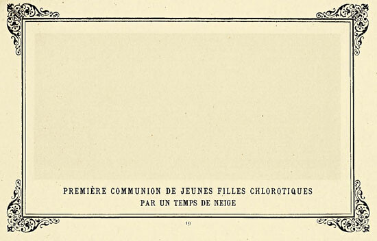
Actually, this link between imageless pictures and soundless music predates the postwar North American avant-garde by many decades. At the risk of validating the classic philistine response, it should be said upfront that the first monochrome paintings were done as a joke. Thirty-five years before the Soviet avant-garde artists proclaimed the death of painting with their iconoclastic monochromes, the 1882 exhibition of Les Arts Incohérents3 in Paris featured an all-black painting by the poet Paul Bilhaud sardonically titled Negroes Fighting in a Cellar at Night. Soon after, the author Alphonse Allais made a series of monochromes that he published in an album in 1887, including a blank white page with an ornamental frame, named First Communion of Anemic Young Girls In The Snow.4 These late-nineteenth-century monochrome images were posited as a gibe against French Impressionism; its logical reductio ad absurdum where everything is turned to pure atmosphere and blank nothingness is all that registers in the pictorial field. And, beating John Cage by more than half a century, Allais’s album of monochromes was accompanied by a nine-page silent musical score billed as a Funeral March for the Obsequies of a Deaf Man.
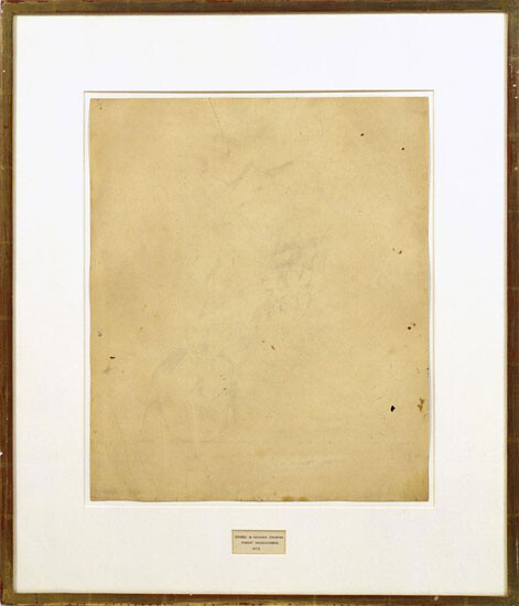
Rauschenberg quickly became disillusioned with his White Paintings and decided that what he really needed to do in order to liberate his art from the shackles of imagery was to obliterate something great, something that existed independently of himself. He famously persuaded Willem de Kooning, one of the giants of the New York art world at the time, to give him a drawing that Rauschenberg then rubbed out—a task that is said to have taken him one month and fourty erasers to complete. The resulting work, Erased de Kooning Drawing (1953), hinges on the interrelatedness of destruction and creation—Jasper Johns famously referred to Rauschenberg’s gesture as “additive subtraction.” As with the medieval palimpsest, the thing erased lingers—even if it has no physical presence. In deleting the older artist’s marks, Rauschenberg created a new icon, but one that was completely dependent on what was formally there – as indicated by its title, which is embedded inside the frame.
Since the erasure of de Kooning, a number of other artists have made new work by rubbing out preexisting images from pages. For Another Misspent Portrait of Etienne de Silhouette, the Australian artist Christian Capurro enlisted 250 people to erase every image from a 246-page Vogue magazine, between the years 1999 and 2004. Keeping track of the amount of time each person spent erasing, Capurro calculated that a total of 267 hours, 49 minutes, and 5 seconds went into the final product, a truly vacuous publication. This was valued at AUD$11,349.18, though nobody was actually paid. Wiping out all the high-end commodification from the pages of Vogue, labor was then equated with time in order to be equated with money, the facilitator of all commodification. But beyond the obvious Marxist critique, this is a work about the base unity of matter. With all signification removed, the pages became pure substance, and the artist went on to exhibit other erased magazines alongside piles of the resulting rubber erasings, indicating simple but tedious transferral of the same thing from one physical state to another.
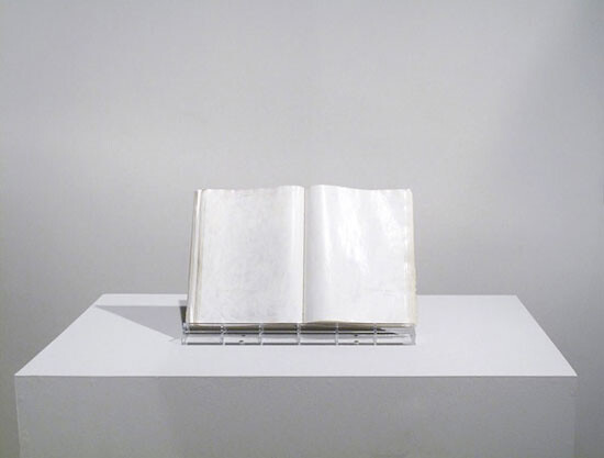

There’s also Tom Friedman’s 11 x 22 x .005 (1992), which is an erased Playboy centerfold, the deadpan title referring to the dimensions of the now blank white page. This is a painstakingly acquired blankness that once again blurs the distinction between mark-making and erasure. The image once carried on this surface was made for intense (masturbatory) visual scrutiny, and while it’s no longer visible, it’s not entirely eradicated either. In her essay The Aesthetics of Silence, Susan Sontag grappled with the concomitancy of emptiness and fullness:
As long as a human eye is looking, there is always something to see. To look at something which is “empty” is still to be looking, still to be seeing something—if only the ghosts of one’s expectations. In order to perceive fullness, one must retain an acute sense of the emptiness which marks it off; conversely, in order to perceive emptiness, one must apprehend other zones of the world as full.
The removal of an image doesn’t amount to its absence: the body of Christ is as present on the aniconic Protestant cross as it is in Michelangelo’s Pietà. I stood before Friedman’s empty Playboy centerfold recently at an exhibition of “unseen art” at the Hayward Gallery in London, and I couldn’t help but see flashes of fleshy airbrushed voluptuousness, even though there was absolutely nothing there.
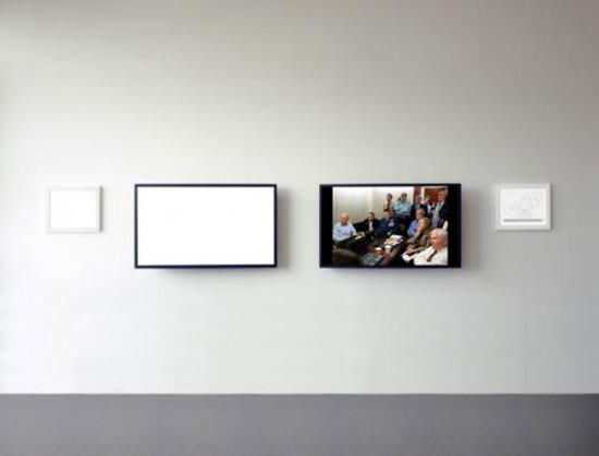
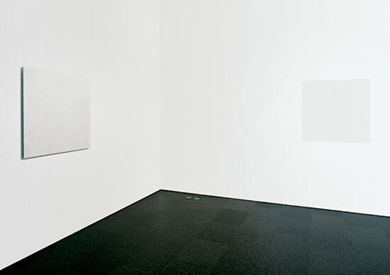
Alfredo Jaar’s May 1, 2011 (2011) has a blank white LCD screen next to another screen showing the official White House Situation Room press photo with President Obama and his security team allegedly watching a live feed of the assassination of Osama bin Laden. With Hilary Clinton’s hand clasped to her mouth, Obama literally on the edge of his seat, and take-away coffee cups indicating a Long Night, the visibly retouched image appeared as theatrical and carefully posed as anything in the history of tableaux vivants. We cannot see what we are being told to believe they are seeing—this was the image disseminated to replace a lack of image (the necessarily unseen body of the slain enemy). Paired with a blank screen of identical proportions, it becomes a critical reminder of the invisibility concomitant with what is made officially visible. A framed diagram next to the White House press image identifies each individual in the scene, but as nothing can be identified in the blank screen, the diagram accompanying it has to remain empty. Here the white monochrome isn’t something obliterated; it simply discloses an absence that is already conspicuously present.
Erasure has revelatory capacities. When the Soviet Union and four Warsaw Pact countries invaded Prague in 1968, the non-violent civilian resistance campaign apparently included painting over all the street signs in white. Immediately upon arrival, half a million troops were lost. This silent mass effacement spoke loudly and clearly—legend has it that the only signs not obliterated were those indicating the way back to Moscow.

Pure whiteness also took on politically disruptive potential in Yoko Ono’s chess set Play It By Trust (1966), in which the whole board and all chessmen are rendered achromatic, so that, once any game is underway, distinctions between self and other become unclear. In the artist’s words:
How to proceed when the opponent is indistinguishable from oneself? You don’t know what is yours and what is theirs. You have to convince people what is yours. In the chess situation it is simple if you are black then black is yours. But this is like a life situation, where you have to play it by convincing each other.5
Whiteness can be obliteration that facilitates; a ground cleared for a new set of relations. To erase an image is always to make another image, but to make any image is in the first place already an act of erasure. Deleuze wrote that “it is a mistake to think that the painter works on a white surface.” Before any mark is made upon it, he argued, the canvas is cluttered with potential images, “so that the painter does not have to cover a blank surface but rather would have to empty it out, clear it, clean it.”6 To give a form concrete presence is to eliminate all other possible forms (“a painting is the sum of its destructions,” Picasso said). Deleuze was not speaking specifically of monochrome painting here, but his observation can be stretched. To paint a canvas completely in white is to paradoxically cover a thing with its own ground, to “clear it” by affirming its origin as its endpoint. But as we have seen, erasure is not always an intervention placed on top of an image; receptive white ground can be excavated from beneath a Playboy centerfold image or a drawing by de Kooning. In this sense, the negation is already contained within the thing, facilitating its appearance. Whiteness obliterates but is perfectly receptive: the invention of Liquid Paper depended on this apparent conundrum, and Wittgenstein’s remarks failed to resolve it. In concealing with its supreme opacity, whiteness goes on to hold all possible images within itself.


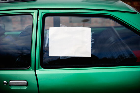
While most art historical surveys would have us believe that monochromes are born as highly self-conscious public gestures of iconoclastic eradication or spiritual transcendence, the UK artist David Batchelor’s Found Monochromes show us that they can also exist inadvertently and inconspicuously. Since 1997 Batchelor has photographed several hundred rectilinear blocks of whiteness encountered around London and in other cities. Things faded and forgotten, things painted over, things facing the other way, these temporary fields of emptiness have double invisibility in that they are blank surface spaces that negate imagery, and they also normally live out their existences completely unnoticed amongst the flux of city life. In “finding” them rather than making them, Batchelor in a sense creates something without adding to the stuff of the world. And maybe this is a better way to approach imageless images in general—not as destructive annihilation of what is there, but rather as an exposure of the emptiness that always already exists.
In Italo Calvino’s short story “A Sign in Space,” the narrator Qfwfq recalls being the first to distinguish in the undistinguished universe. In order to give form to space, he makes a mark in it, sparking an intergalactic feud with another being somewhere in the cosmos. For several billion years, the universe’s first artist is driven by wounded vanity through an exhausting negotiation of mark-making and erasure, until finally there is no difference between the two, as the proliferation of signs returns the universe to the blank artless mass it started as, where nothing can stand apart from anything else. The story ends with the dejected conclusion that “independent of signs, space didn’t exist and perhaps had never existed.” First published in 1963, when the field of semiotics was taking off, “A Sign in Space” has been taken as Calvino’s remark on the absurd futility of any study of signs in the grand scheme of the universe. The sign in space has to return to the perpetual void from which it emerged: what starts out as a radical gesture is to be obliterated in sameness. Qfwfq affirms existence by leaving a trace (i.e., he makes art), but alas, creation only amounts to self-negation.

Everything also amounts to nothing in the blank white screens of Hiroshi Sugimoto’s well-known photographic series Theatres (1978-). As with Batchelor’s Found Monochromes, this is empty whiteness where we expect visual clutter—confined spaces purged of signification amongst the saturated visual field of modern urban life. Also like Batchelor’s inexhaustibly serialized project, these monochromes exist independently to the artist’s intention, rather than as intervened obliteration. Sugimoto wondered what would happen if he ‘photographed cinema’ by keeping the shutter of his camera open for the entire duration of a film. Amazed by the pure white screen that resulted as the total sum of the projected images, he went on to enumerate dozens of images with prolonged exposure photographs from anonymous indoor and drive-through cinemas across the USA, always showing that to see all at once is to see nothing at all. Continuation is harnessed, and the flow of things results in their own disappearance.

Funnily enough (or maybe it’s not funny at all), the most famous monochrome painting in history is currently undergoing auto-erasure. The Black Square is cracking up. Nearly a century has passed since Kazimir Malevich painted what he called “the embryo of all possibilities,” and now its solid opaque surface is giving way, reluctantly opening up to what x-rays confirm are other geometric shapes behind it. The twentieth century’s most remembered radical gesture against the image is revealing the images it has always contained within itself. Where does this leave us?
We know full well by now that Modernity’s dream of the tabula rasa was doomed to fail, that memory refuses evacuation and Progress is always also regressive. At the turn of the twenty-first century, the Spanish artist Ignasi Aballí painted a black square directly onto a gallery wall and then meticulously covered it up with correction fluid brushstrokes. The erasure is of course incomplete, and the form lingers like the geometric ghost of High Modernism that we’re not quite ready to exorcise. The work is called Big Mistake (1998–2005)—which brings this all back a little too neatly to Bette Nesmith Graham’s Liquid Paper, where the whole point of whiteness is that it covers up and remains unseen, in order to receive alternate information on its surface. In this sense, Graham is a more successful monochrome painter than her contemporary Rauschenberg, since her brush strokes were really meant to be indecipherable (and therefore went unauthored). The Mistake Out Company was founded on a need for true erasure of the image, not the affectations of a very much visible “invisibility” that carries the artist’s name/fame. Could the entire history of the avant-garde’s authored monochromes—starting with a forgotten joke and ending with some cracks that are starting to show—be one big mistake that we might be able to cover over with something else?
Ludwig Wittgenstein, Remarks on Colour, ed. G.E.M. Anscombe, trans. Linda L. McAlister and Margarete Schattle (Boston, Massachusetts: Blackwell Publishing, 1991).
Also classically Wittgensteinian is the self-depreciation with which the remarks are set down. Amongst the repetitive, rambling notes, for instance, this suddenly appears: “That which I am writing about so tediously, may be obvious to someone whose mind is less decrepit.”
A short-lived Parisian literary and art movement whose explicit embrace of “incoherency” influenced Dada and Surrealism.
There’s also a red one named Apoplectic Cardinals Harvesting Tomatoes on the Shore of the Red Sea (Study of the Aurora Borealis), and a green one called Some Pimps, Known as Green Backs, on their Bellies in the Grass, Drinking Absinthe.
Yoko Ono on Play It by Trust, (1966) at the Indica Gallery, see →
Gilles Deleuze, Francis Bacon: The Logic of Sensation, trans. Daniel W. Smth (New York: Continuum Books, 2003), 71.
