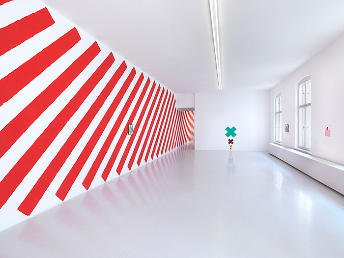
What should we make of paintings made by an artist whose self-declared maxim is “The Whole World + The Work = The Whole World”? Whether this stands for an expansive, optimistic “anything goes” or a reductively pessimistic hopelessness is largely a question of personal temperament, or indeed of momentary mood. The same goes for Martin Creed’s paintings. Just as the two-way perspective of expansion/reduction or optimism/pessimism informs the artist’s more well-known, equally binary works—the lights in a room going on and off, for instance, or a set of curtains automatically opening and closing—so these super simplistic, at times downright ugly paintings balance on a knife edge between the profound and the inane.
Though no doubt cannily aware of their painterly predecessors, Creed’s paintings have as little to do with a history of painting as his works on paper have to do with a tradition of drawing, be it an A4 sheet crumpled into a ball—folded up and opened out again—or covered all over with colored marker. Instead they make sense within Creed’s conceptual, or rather existential (compulsive, even?) approach to art-making as a means through which to determine and articulate order within the chaos and contradictions of the material world. As such they approach painting through the building blocks of the medium: canvas, brush, color, and stroke.
Creed began making paintings four or five years ago (though a work on his website from 1986, Yellow Painting, suggests it to be a long-standing concern) using standard 12 x 10 inch size canvases. The subsequent question of what brush to use becomes the structural basis and surrogate content for several of the works in this show at Johnen Galerie. In Work No. 1208 (2011) a wide pink horizontal brushstroke reaches from edge to edge at the bottom of the canvas, with a medium-width red stripe centered on top, and a narrower blue brushstroke on top of that. Like three objects balancing on top of each other, they bring to mind the piles of boxes of diminishing scale Creed has made, though in fact they merely articulate the width of the brushes used. Other canvases devise a formula for automatically filling up the canvas’s rectangle: an X centered on the canvas is augmented with ‘v’s above and below in apparently randomly selected colors until no space is left.
The wall paintings here adopt similar strategies. The gallery’s long left-hand wall is covered with bright red diagonals, each the width of a standard paint roller with the same width blank between, so that half of the wall is covered with paint and the other half not. In the back room, five pale blue horizontal lines of increasing width at the bottom of one wall each represent the width of a standard size paint brush. The lines are not masked off, imperfections are not corrected; they feel immediate and amateurish and reflect the simplicity of the decisions that structure them: straight lines which serve to articulate their tools, themselves or the space itself. Associations with police barriers or calm seas, like the paintings’ associations with color field predecessors, or, indeed the general relations of Creed’s work to first generation Conceptualists, are strictly incidental. For while it may appear to borrow Conceptualism’s rule-based strategies of art making, there is little of the concise certainty of Sol LeWitt’s enterprise in Creed’s hard-reached decisions. His endeavor does not seek to replace the struggle towards articulation with a clearly affirmative diagram, but rather articulates the agony of decision making itself. Which is better: Off or on? Big or small? Pink or blue?
The final painting, also in the back room—a pseudo expressionistic mass of colored blobs and brownish smears—is the most difficult to place in terms of Creed’s practice and certainly his ugliest (Work No. 1215 (2011)). But even this, it turns out, is determined by a structural principle. A squeeze from every tube of paint at hand was applied to a canvas, another canvas was sandwiched on top, and the blank areas of this imprint were then filled in with a brush; just another way of filling the rectangle. It articulates another knife edge in Creed’s work: between earnest and comic. The wit which laces his work gives even the most apparently pious pieces a comic edge, while the most humorous appear somehow (almost) serious (consider the video for his most recent music track “Thinking/Not Thinking” playing in the office here, in which a neat little trotting dog represents “thinking” while a large, shaggy loping hound stands for “not thinking”). Like his signature maxim, Creed’s work is both expansive and narrow: absorptive enough to comprehend all media, even painting, but destined to show them as merely the sum of their own parts.


