Captioning is anything but a routine curatorial task. There are styles and tendencies, even existing criteria for excellence, with annual awards given for clarity, brevity, and context. Did you know, for example, that there is an “Excellence in Exhibition Label Writing Competition”?1 For the exhibitor, however, captions are always an open question. Should they instruct the viewer? Do they set a mood? Should they be kept to a minimum?
Captioning an architecture exhibition might not be that different from captioning works in other types of exhibitions. But given that architecture can never be exhibited as such, architecture exhibitions inherently allow for experimental, abstracted, and conceptual approaches to representing ideas about space.
Some architecture exhibitions rely on visual impact or conceptual genius to the extent that any captions are effectively negligible. That said, there can often be an awful lot to read in architecture exhibitions. Or, indeed, not enough. Thus, it seems that there is no “best practice” when it comes to captioning. But captions are nonetheless central to the experience.
There is increasing variety in the ways that architecture exhibitions are viewed, visited, and experienced. Both tech-infused popular culture and contemporary museum pedagogy push exhibitions to be user-centric experiences. There are virtual environments and other digital, sensorial, communal, or creative ways of exhibiting architecture.
Captions, then, are certainly not the only way to convey information in today’s age. And from a strictly UX design perspective, some might even see captions as antiquated. They are, after all, printed characters on paper, and often designed to be ignored. As visitors to exhibitions, we are not always even expected to read each caption. Perhaps it is just reassuring that they are there, that everything has a proper label. There are, however, some simple reasons why captions are not going anywhere anytime soon. Like printed books, they persist because they perform their task so well.
Similarly, exhibiting architecture has a somewhat limited and quite analogue set of tools: plans, illustrations, models, photographs. But those media do not do well to explain themselves. In an architecture exhibition, visitors move around amidst displays and look for captions to tell them what they are seeing. This is understandable, but also crucial. Architectural material is not always universally understandable, or even accessible to everyone. Captions rarely just tell us why a plan is exhibited in the first place. Instead, the relationship between an object and its caption is often quite classic, like:
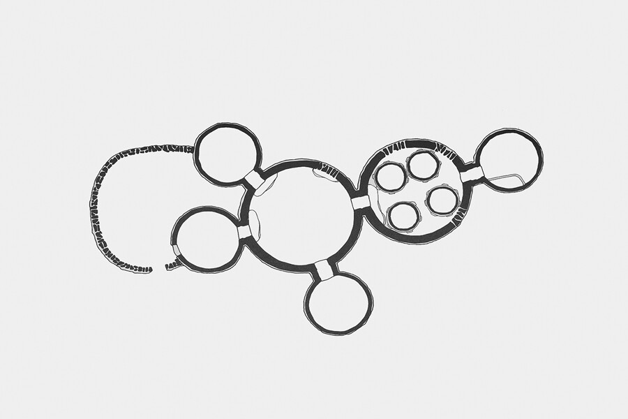

Ground Floor
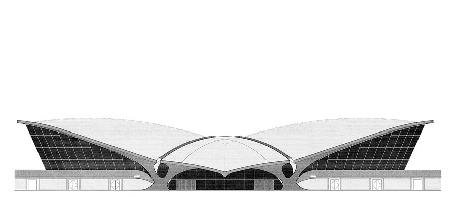

South Elevation
There are also more comprehensive, yet just as common captions, such as:
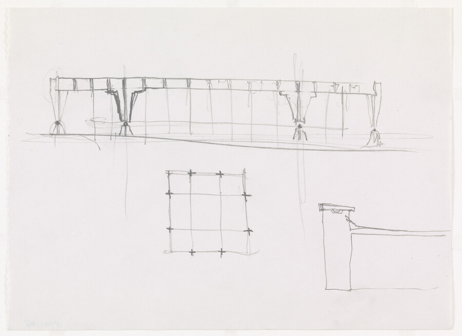

Ludwig Mies van der Rohe
American, born Germany. 1886-1969Ron Bacardi y Compania, S.A., Administration Building, Santiago, Cuba
Project, 1957
Longitudinal elevations, plan, exterior elevations
Pencil on paperMies van der Rohe Archive, gift of the architect, 1965
These captions answer the most obvious question: “What am I looking at?” But they are all “collection-centric” examples. They reproduce a description that the object already has in the catalogue. And when reproduced, they suggest that they are enough for communicating both architecture and the displayed objects; that what someone see’s is what architecture is and looks like. The curtness has meaning.
The tombstone-like quality of captions gives them gravitas, legitimizing the object in turn. They are compelling in making the visitors assume that the objects and their descriptions have a rightful place in the whichever canon that they might be referring to. Standard captions keep our focus on a very particular appreciation of architecture seen through the lens of recognized authorship and institutional habit. What they really say is:
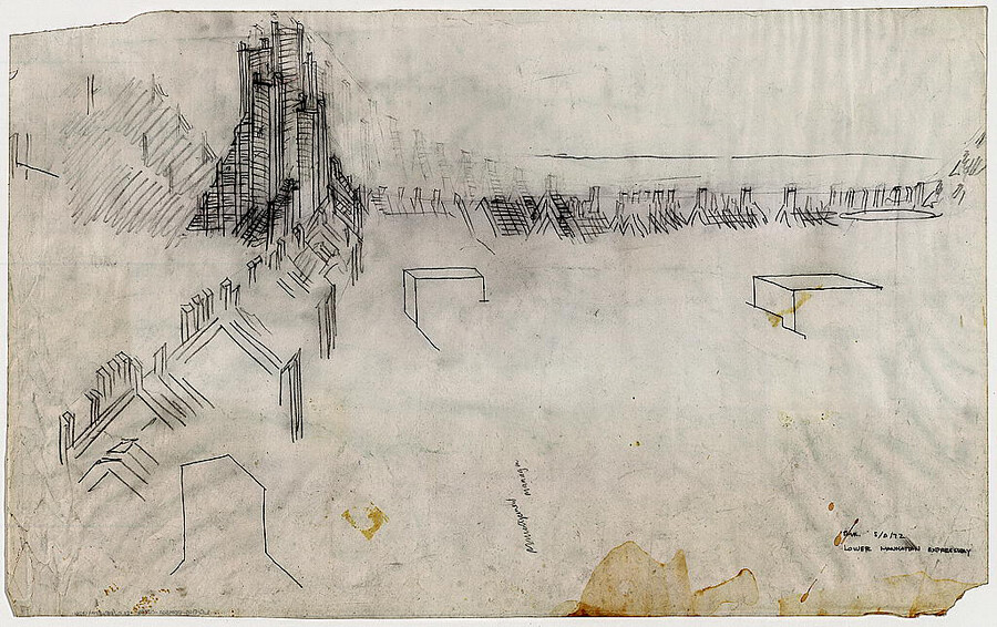

This is what an architect can do.
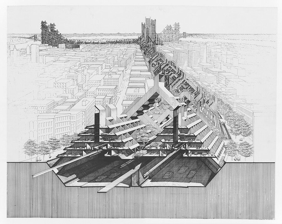

Obviously, it speaks for itself.
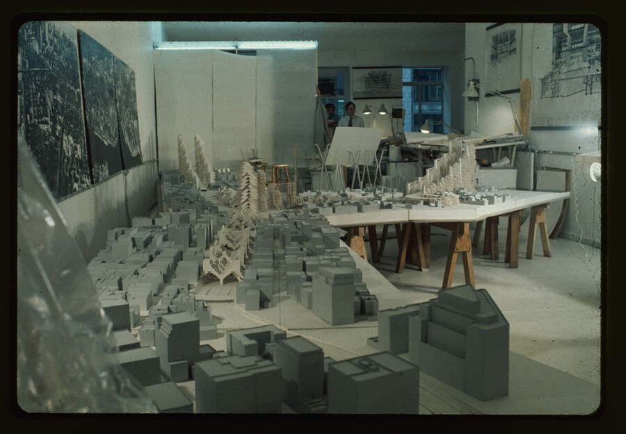

And we have added the date, because, you know… history.
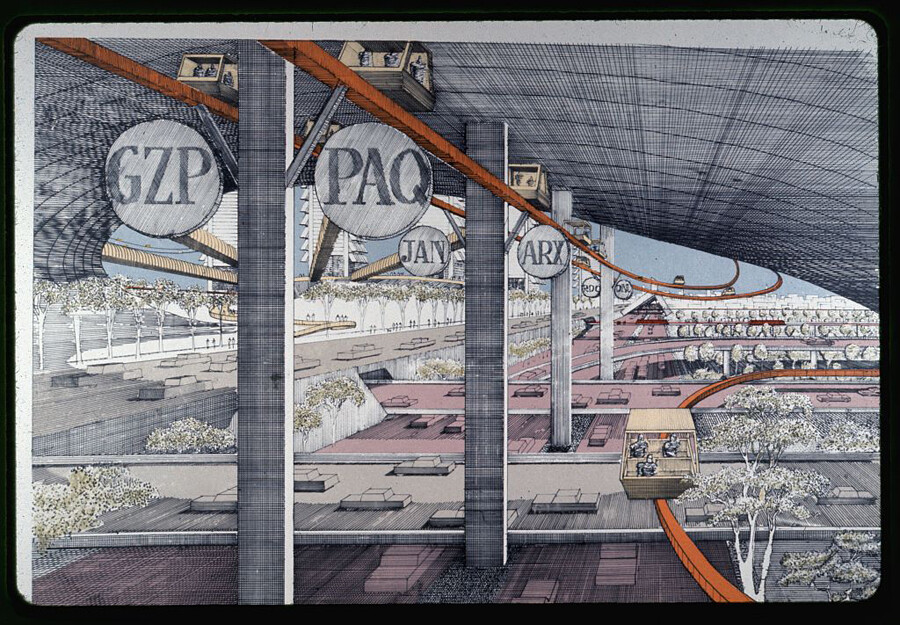

But we don’t know who actually drafted this at the office.
We might not expect to see these types of captions inside a museum or an architecture exhibition, but they are not so different from most captions read and produced daily: the jokes, the ironies, the injustices pointed out on Twitter, or the inspirational, informative, curated memes and commentaries on Instagram. We are no strangers to the power of witty captioning, or the stand-up chops required be good at it.
Expanding the practice of captioning has its value. Like all “information” today, reading a caption in an architecture exhibition comes with a contemporary ballast. Every recorded expression may be scrutinized or pulled out of context later. Even the short, informative, historically accurate note affixed next to an object has become a primary context where institutional representation and implicit power structures come into play.
What would it mean, then, for captioning to be approached in another way? A label set next to a photo or a drawing might communicate architectural thinking beyond the canon of architecture. Captions can tell stories that don’t rely on architectural expertise, but that are important to everyone. Captions can make architecture be seen, where in the traditional sense there isn’t any. Maybe any exhibition could be captioned as an architecture exhibition, and vice versa. Captions can de-institutionalize, and in some form liberate the exhibited object from the conventions of both architecture and exhibitions.
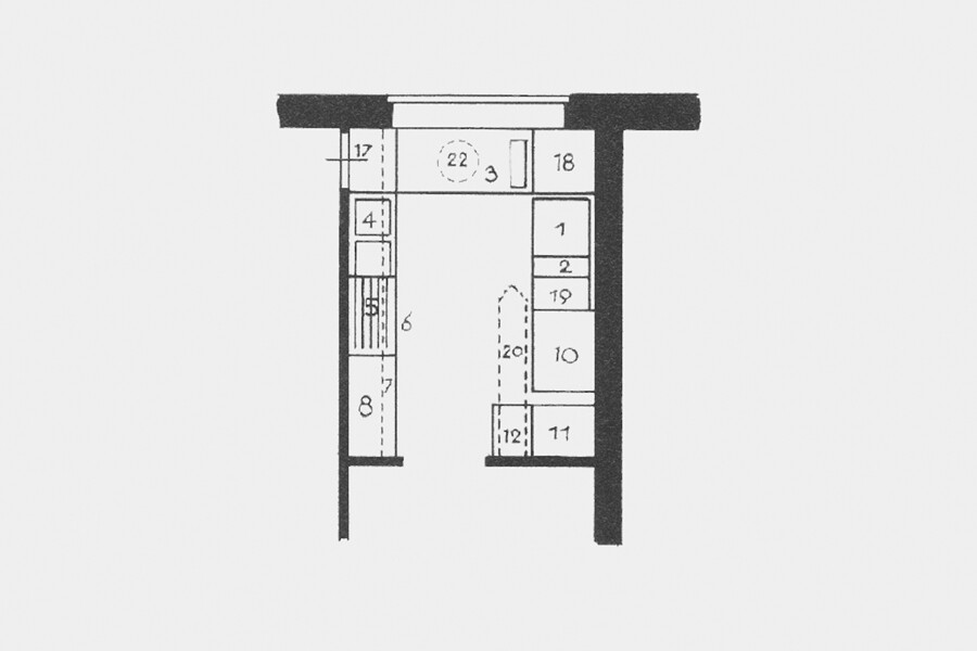

A plan of the Frankfurt Kitchen, designed in 1926 by Austrian architect Margarete Schütte-Lihotzky for a public housing project, is heralded as the innovation behind all modern fitted kitchens. At only 1.9 meters wide and 3.5 meters deep, its compact and functional design vastly improved the mass housing standards of the era. But the kitchen can also be viewed as a piece of domestic machinery, destined to be operated by women in solitude: a sentiment perhaps accentuated by the lone swivel stool (22) by the window. Nevertheless, in some form or another the Frankfurt Kitchen greets us all back at our homes and apartments even today. Being aware of its historical context may help us appreciate its extraordinary design, but also think more openly about the ways we wish to arrange our homes, kitchens, and domestic lives.
In the end, rethinking the caption may not be about replacing the existing exhibiting standards. Captions are information referring to objects as well as cultural notes and forms of textual expression. New institutional endeavors and systematic approaches to captioning may demand new stances on existing policies, unlearning past dichotomies, and radically adjusting our levels of compassion and empathy. Perhaps all it takes to start the process is to experiment with some speculative captions.
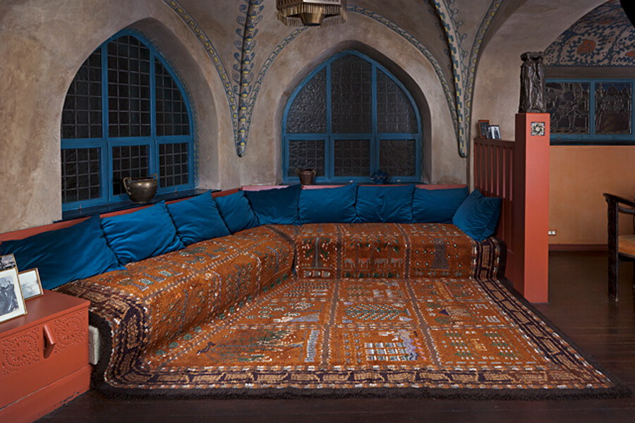

One way to examine National Romanticism more critically is to look at its interiors and color schemes as pseudo-ethnic decoration ideas.
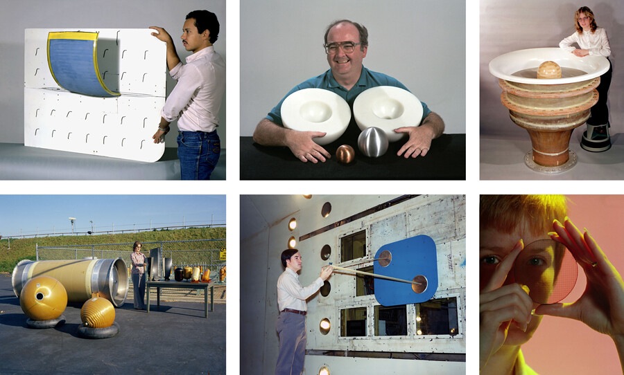

Perhaps you already live and work with materials and shapes in ways that make architectural compositions.
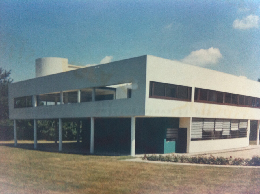

The more varied imagery we are shown of the most celebrated Modernist objects, the easier it is to see their influence in our daily lives.
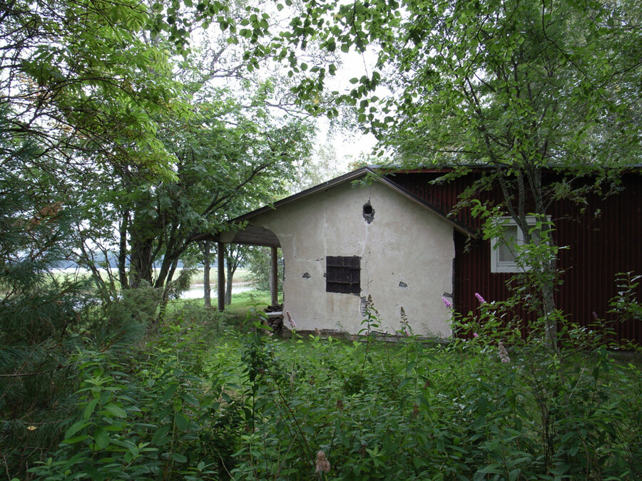

Villa Flora in Alajärvi, Finland. A cottage designed by Aino Aalto in 1926, with alterations in 1936. She was the “steady rock” and wife of Alvar Aalto. For a very long time that was the official version.
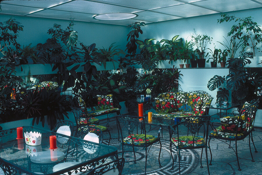

Sometimes it is hard to differentiate the space created by objects in a room from a room as space for objects.
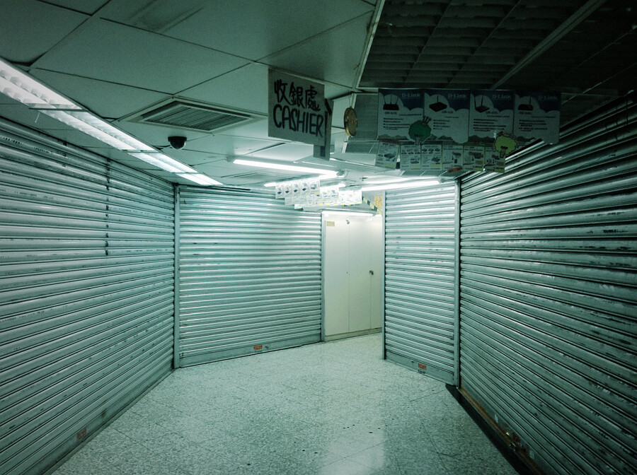

The non-shopping center.
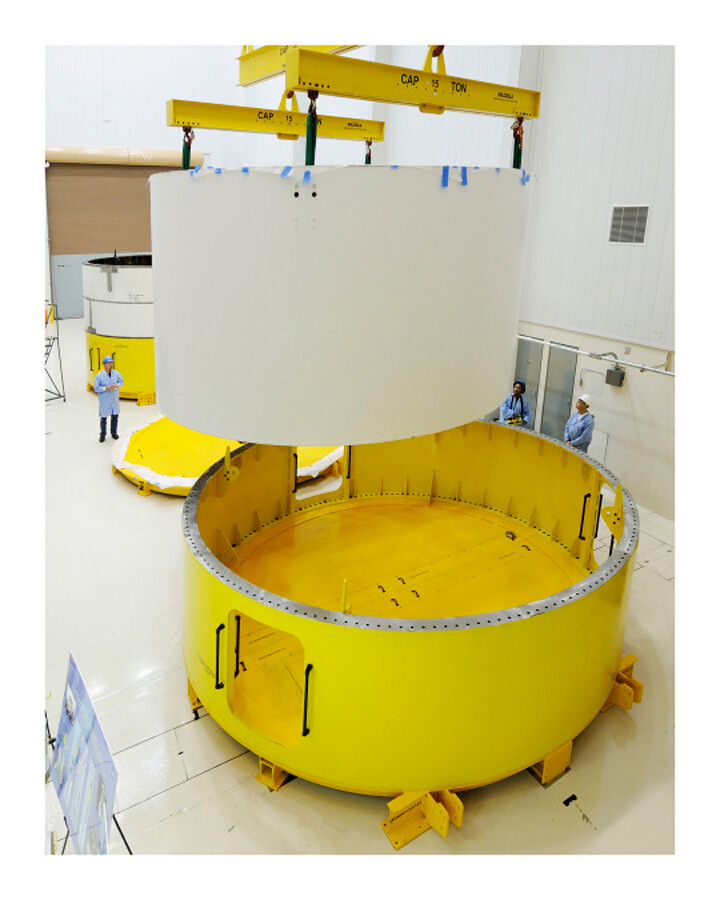

An alternative reading of colors used in built objects is that they reflect the cultures of normalcy around them.
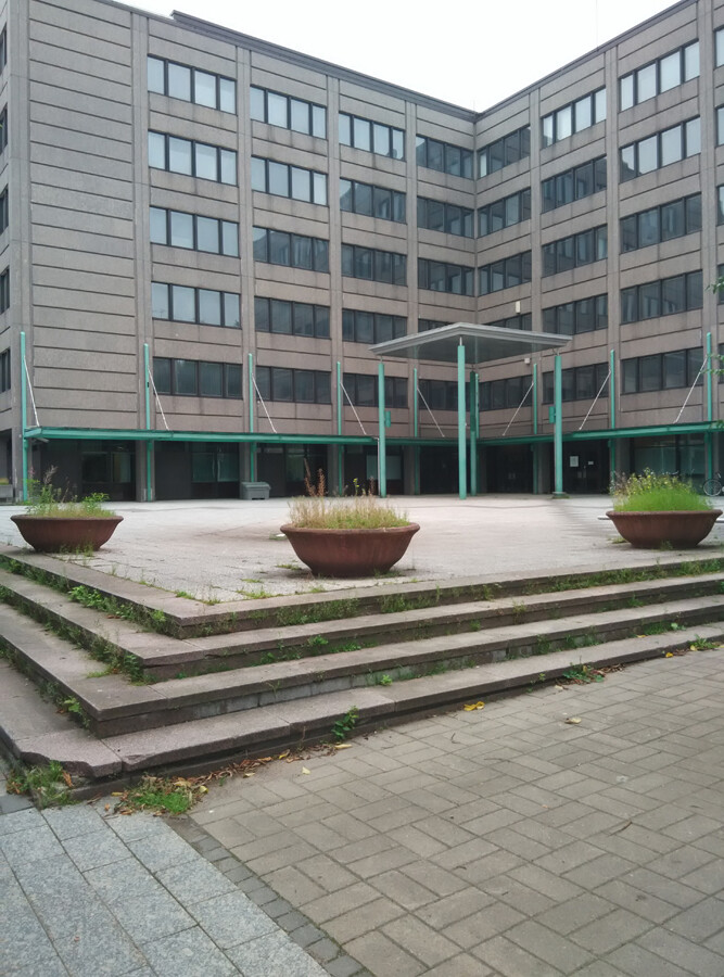

The qualities of an everyday public space can be studied with everyday photography.
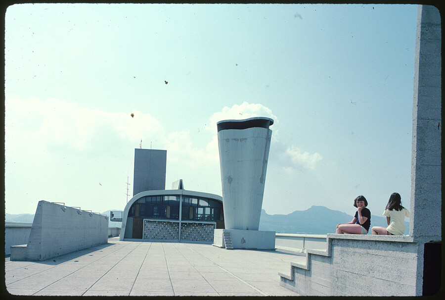

Nostalgia induced by the aesthetics and materiality of film may impact the way we feel about architectural landmarks.
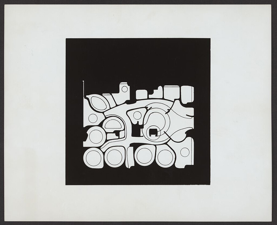

This stylized, framed illustration depicts the floor plan for dentist Dr. Nathan Shore practice in New York designed by architect Paul Rudolph in 1967. The print exemplifies the constant dilemma of balancing architectural design and its spatial, functional and aesthetic requirements. Here, the visual form of the plan has been removed from the other mediums and information. The resulting illustration, popularized as architectural inspiration, still circulates on contemporary social media platforms, whereas the original interiors have disappeared long ago. When shown here on its own, there is nothing that gives away its purpose.
The Excellence in Exhibition Label Writing Competition is organized by the American Alliance of Museums. See: ➝.
Solicited: Proposals is a project initiated by ArkDes and e-flux Architecture.
