Nick Axel What is calm technology?
Amber Case The question of calm technology is how to have things in our environment that focus our attention on the task, and not on the tool. How do we make our environments so that we are more able to do the best of what humans are good at? Calm technology is an idea that was pioneered by Mark Weiser at Xerox PARC during the first half of the 1990s. He published a paper with John Seely Brown in 1993 called “The Coming Age of Calm Technology,” in which they started from the observation that many people used to share one computer, but now many devices share each of us. At that point, they said, the scarce resource is no longer technology—technology becomes cheap—but our attention. Weiser famously said that we don’t need smarter devices, we need smarter humans.
NA It feels as if this idea has only become more relevant ever since it was developed.
AC We live in an era of interruptive technology today. We’re increasingly hooking our life services and those of our loved ones up to these devices. What happens if your pet’s feeding schedule depends on an active connection to the device company’s server, but it goes down while you’re away on vacation? Common sense is so often either missing or overthought in contemporary technologies—and often a combination of the two. There are also some properties of interaction that don’t change; some design features that don’t need to change.
NA What are some examples of calm technology?
AC Calm technology is about an ambient awareness. When you walk into a room and flip on a light switch, you know that the electricity is there. You only notice it when the electricity fails to function. It works alongside you, and with you. The amount of focus or training it takes to turn on a light is very small. The complexity is hidden inside, leaving you with something you can almost subconsiously do. In contrast, much of our current technology requires all of our focus. Windows are a calm technology, in that they let you know whether it’s sunny or cloudy or raining outside. Technology doesn’t need to have a voice in order to communicate, and sometimes a beep isn’t the right idea. The user of an automatic insulin pump might not want it to beep when they’re at a wedding or a funeral. The early design of the Roomba robotic vacuum cleaner was cute because it didn’t try to sound like a human Instead, it was done it would make a simple, happy tone—da-da—or if it was stuck, they would make another, lower-pitched tone, dun-dun.
NA So it’s about engaging more parts, more senses, more faculties of what it means to be human?
AC Yes. Poorly designed notifications—especially those utilizing sound—can be confusing, annoying, and even life-threatening. Alert fatigue in hospitals is one of the leading causes of errors. Some medical staff experience 1,000–10,000 sonic alerts a day, especially in the United States. Shifting the awareness away from the same repetitive beeps into a soundscape, lighting system, or wearable alert system could inform with less intrusion. By using principles of ambient awareness and designing levels of detail, hospitals could be transformed from places of panic into informative landscapes.
NA I imagine these principles could be applied to many more types of spaces, ones that are perhaps less functionally driven.
AC Absolutely. Architectual acoustics also factor into distraction, fatigue, and miscommunication. When Modernism removed crown moldings, ceiling reliefs, and other decorations, the result was a flattening of surfaces and the acoustics of a swimming pool. Service workers and guests of modern bars suffer from their smooth “romantic industrial” concrete walls and exposed HVAC. Airplane cabins have similarly high decibel ratings, prompting the necessary rise of noise cancelling headphones. After I started to use earplugs while driving, I experienced less fatigue, because my brain experienced less acoustic vibration and the need to constantly process it.
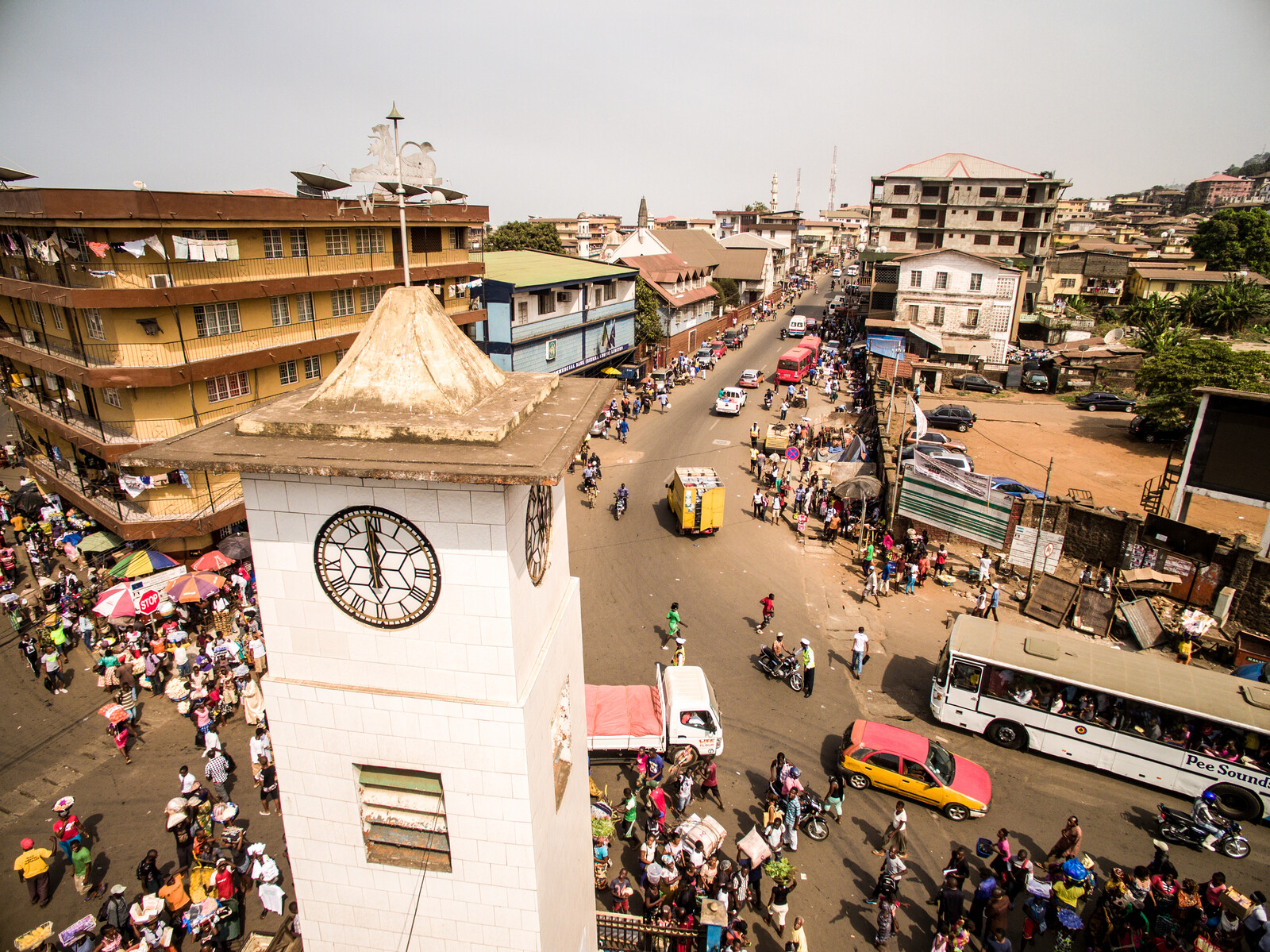
NA Do you think the principles of calm technology can be extrapolated onto the design of cities as a whole? Cities can be very loud. Sometimes this is in quite annoying ways, but also, in others, in very beautiful ways. Playing music on the streets is a way that people and cultures come together, coexist, and present themselves. If we were to think of calm cities, what sort of impact would this have on urban soundscapes?
AC Cities have loads of unwanted noises. Industrial trucks vibrate windows, screech their brakes, and interrupt conversations. Jackhammers and motor vehicles are everywhere. Of course you can close your eyes, but you can’t just close your ears. So people now put on headphones to walk down the street trying to block out sounds. If you live on a busy street, it’s harder to sleep.
NA There are laws in cities all around the world banning certain types of activities in certain places based on the amount of noise they make. And there’s also activism around this, like protests against new motorways or runways being built at Heathrow, Munich, and other airports. In the case of airports, there are often regulations as to how close new buildings can be built and depending on what type of use they have. But I also think the design of our cities, our streets and our neighborhoods, influences the presence of noise and our relation to it.
AC I really like the idea of a perimeter block, like in Barcelona, with a calm inside courtyard surrounded by narrow capillary streets built at human scale. Larger streets have loud trucks going by, and the smaller streets help with noise abatement. But I do think we need places that are noisy. Part of being human is making music, celebrating, and singing. When we cut off all sounds, we reduce human culture. Music is sound made at a human scale, but the most annoying sounds are made at an industrial scale.
NA I grew up in New York, but when I moved to the Netherlands, I was quite shocked by its visual environment. I’m so used to seeing ads or signs, but in Netherlands, they’re not really there. So I wonder, if you’re talking about sonic gradation and articulation, whether this might not be applied to our other senses as well.
AC Absolutely. Japan has automated sushi conveyer belt systems powered by iPad touchscreens. It’s a calm way of ordering, and the restaurants are usually quiet. But when this idea migrates to the United States, the iPad fills with ads. It’s also a question of priorities.
NA When people visit Amsterdam and they’re not familiar with it, they tend to either get hit by bikes or yelled at for walking or standing in places they’re not supposed to. I feel like when I’m there I have to keep my eyes open wider than I do in other cities. There is a certain density of perception that I need to register to perform, to not get hit or just to do what I’m trying to do. Are there ways to measure distraction or calmness?
AC I had a similar situation to what you mention when I was in the Netherlands because there’s a sense of proximal awareness, which in the States you don’t necessarily have, unless you’re in New York. There’s this idea that you need to keep moving. You get into a state of flow. In this way I find New York very relaxing because it pushes you forward. It’s a great place to be an individual. You can be alone.
NA There’s so much going on around you that you can’t control, it gives you a sense of freedom. All you need to do—and really, you must—is stay aware.
AC But in so many places you’re isolated on a big road in a car. This is different in places like the Netherlands, where you have numerous different modes of transit all sharing the same routes. And if you have one mode of transportation dominate all others, like the car does in the States, it’s really difficult to change, because there are all of these very overt signals that people get used to that tell them a car is coming. You can hear the car; there’s either a red or green light. They’re not used to looking at this small narrow strip on the road that’s for the bike. You don’t need to be aware, because within a couple of meters of you, there aren’t any changes in the types of transportation.
NA We stare at our phones, our laptop screens, for hours every day. There’s lots of activity going on within that space, but there’s such a clear boundary between what’s happening within and outside of it.
AC I’m worried that if someone grows up looking more at a touchscreen than a horizon, they’re not getting a sense of depth in the sense of physical awareness, in the sense of emotional awareness, because everything’s flattened. This kind of compression is something that we first experienced as a culture with the invention of trains, when with acceleration the landscape became two dimensional against the window, which accelerated with the car and then the plane to such a point that the space of transit became a non-place, which people would escape from. But now, what happens when reality is flattened even further and is passing by even faster? That’s why I do urban derives, like walking to the airport, to try and uncompress space, to experience forgotten landscapes.
NA Speaking about the flattening of our perceptual environment, one thing that actually connects the urban design of Amsterdam and New York is that every flow can be read in the first few centimeters above and below the ground plane. Every line of movement, every instruction that you may need to know where you’re going, is there; whether it’s surface color or texture or a slight rise or dip in elevation. But you’re not constantly looking at the ground; it forms a part of your peripheral awareness. It allows you to be aware of it, but it doesn’t force you. It doesn’t scream at you, even though for some people that might actually be useful. Cities are spaces where all different types of norms come together and have to find some way to negotiate and coexist with each other. So there is potential friction, there is conflict in that. But what I understand from you is that what’s most important is to allow for difference to articulate itself; not only to allow for different types of spaces, but for different ways of understanding and experiencing space by different people in ways that they feel comfortable.
AC Absolutely. Cities with multiple modes of transit are perfect examples of this. In Japan, you have this bumpy, yellow raised surface throughout most of Tokyo for the blind, so that they can navigate the city independently, unaided by a dog. There is a respect for the different abled—especially the elderly. Design makes it possible.
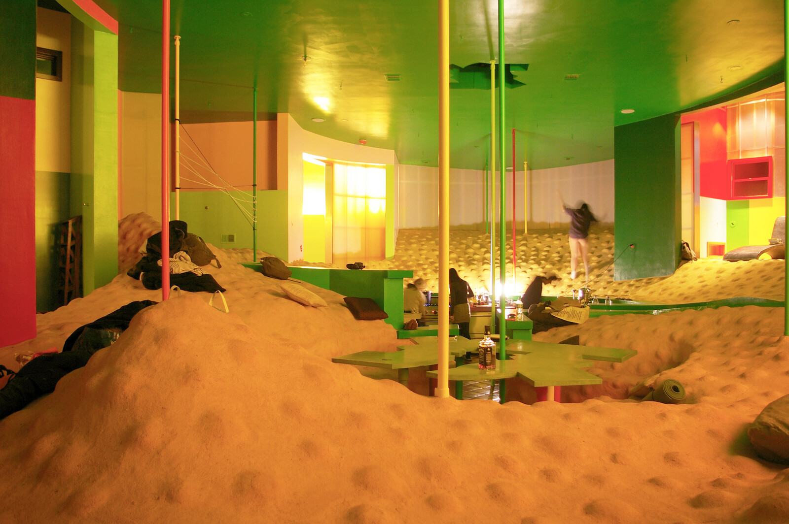
NA The tactile is a completely underexploited dimension for urbanism. Modernism was more of an anaesthetic than aesthetic movement! And not just in terms of smell and sight and sound, but also touch. The Mitaka lofts project by Arakawa and Gins, who dedicated a lot of their work to Helen Keller, is infamous in this regard, where the ground surface, the floor, is bumpy and uneven. But contrary to what might be expected, the mother of someone who lives there, who can normally only walk with a cane, can walk on that surface without one.1 A lot of your work on calm technology and this idea of calmness seems to be very architectural in the sense that it’s trying to draw lines; it’s trying to define or rearticulate boundaries between necessity and excess, between life and technology.
AC I think the biggest issue that we have to deal with today is that we’re stuck in the aesthetics of the future from film. We think that the future is Terminator or the future is a shiny interface; that the future is this perfect thing. But in reality, the future is a blend of history and future that are living alongside each other. And if you’re going to make something that lasts, you can’t afford to switch something out every year. As a human, you could switch out a prosthetic every year as long as you have the right social class and you can afford it, but for a piece of architecture, do you really want to shut down your hotel for one month every year to update to the latest tech and retrain your entire staff on it? It doesn’t make sense to add for the sake of adding, just so that it looks futuristic.
NA A house should be more than just a house, yet things are becoming less and less customizable, at least after you buy it. Before purchase, you can choose all the different options you want (and that they provide)—you can “personalize” it—but afterwards, it’s a black box. When the Macbook Pro adopted its unibody design; that really changed things. It made a laptop a product, a true spectacle. It focused expectations of what we think a laptop can do, while constraining the options for what we might want to try and do with it, or to it. I can see this as a logical trend for real estate and housing too. Maybe it’s already here, with microapartments. Is Agbogbloshie, the e-waste dump in Ghana, the future of our cities?
AC People assume that technology is a computer, but a technology is any tool, and some tools are just incredibly well designed. Even if it’s old, if it’s designed well, you can use it immediately. You don’t have to be trained on it. The interface should lead you to the thing you need to do, be it a button to press or whatever, to get you to the goal. You shouldn’t need to remember how to use it. Abstraction is a real issue. People today either don’t know how to or simply don’t have time to maintain their own house or mend their own clothes. But cooking is something anyone can pick up. There’s a calmness that comes along with it, and then you share it with people. It’s inherently social; it’s a social technology. When Silicon Valley workers press a button to get a food delivery, there is a missed opportunity for meditation. In a culture obsessed with efficiency, why do so many people have such little time?
NA There’s such a delicate play in this conversation between “what should” and “what should not.” The entire public discourse around automation is about the belief that we will not have to do something in the future, namely: work. Even though that’s not actually true, I think that there’s an increasingly ethical project of what articulating and generating consensus about we should and should not have to do.
AC The key is to give people multiplicities. There isn’t any one solution, or one future. In a good society, people should be able to choose how much technology they want to use. Some people don’t want to use a computer all the time, and some people do. If you take so much away through automation, then you end up with incredibly bored people. One example is instant cake mix: when it came out in the States, it said, “just add water.” Nobody wanted to just add water. So they came up with a new cake mix that said, “add eggs, water, and milk,” and everybody liked using it because it was so easy. Before it was too easy.
NA There’s some writing about boredom today as a radical project in response to the culture of immediacy we live in. I think a lot of what you’re talking about relies on patience, which is something that is also being automated away. But I wonder, on the other side of these lines that you’re trying to draw, there is “life.” So you’re asking whether we’ll have enough time to do that? You have a background in anthropology, so I wanted to ask, what is that?
AC What is life?
NA Well, no. Or, kind of. There are a lot of anthropologists who have created these homo blank terms, like homo economicus, homo ludens, or homo faber. Would yours be homo multitudus?
AC My mentor Sheldon Renan came up with the term homo connectus, that everything wants to be connected. But I don’t like any one size fits all of anything. That’s why guidelines are interesting. They don’t reduce things to templates.
NA Architecture for a very long time has tried to give space to people to live their life, however that is. But it failed, for numerous reasons. So I wonder, to what extent is a frontier for this the invention of terms: of new language that we can use to describe what it is that we want or how we think things should be. In architecture there’s this term, “program,” which tries to attach language and objects to meaning and function. So on a plan you’ll have a room and if you draw a bed in it and you call it a bedroom, you’ll have made a bedroom, in the most simplistic terms. But with an expanded awareness of what it means to exist as both a body and a mind in a space, there are expanded definitions for what program might be. It might be about hot or cold, moist or dry, loud or silent, hard or soft. It might be about which radio frequencies are present, and which are absent. I can definitely imagine a new programmatic vocabulary for program emerging. We have the technology, you know? We have enough sensors to pay attention to ourselves in more sensitive ways. But there’s a skepticism towards human experience and emotion.
AC That’s why I like the idea of “warm data,” because we can’t find all the answers in a quantified self, in a quantified space.
NA What is warm data?
AC Warm data is Nora Bateson’s idea that there is a kind of data, like feelings and emotions and experiences, that can’t be written down and codified into a research paper that somebody can read. It’s like, just if you have a recipe for really good food, doesn’t mean you’ll be able to make it. Warm data is not what to make, but how to make it. It’s a different kind of knowledge, of attunement. Warm data could also be the idea that a bedroom should be the place in a house where you seem to fall into. Design shouldn’t be obsessed with new ways of doing things. It should be about connecting to what something feels like, what it means.
Momoyo Homma, “’We Have Decided Not to Die’: The Work of Arakawa and Madeline Gins,” October 30, 2014, in The Funambulist, produced by Léopold Lambert, podcast, 54:52, ➝.
Digital × is a collaboration between e-flux Architecture and the Norman Foster Foundation within the context of its 2019 educational program.
