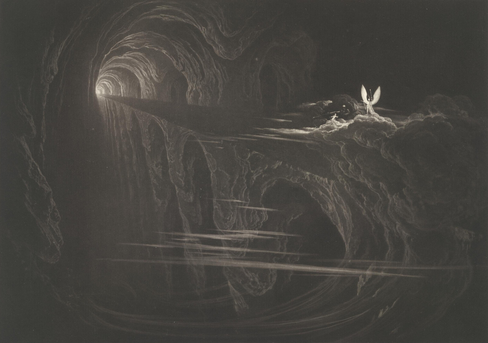
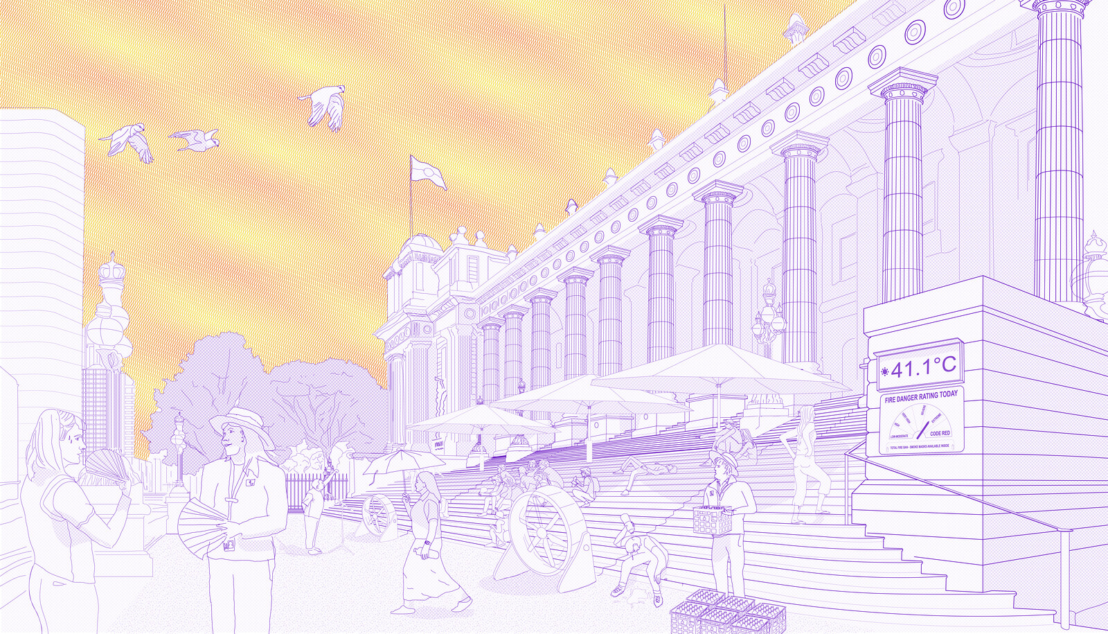
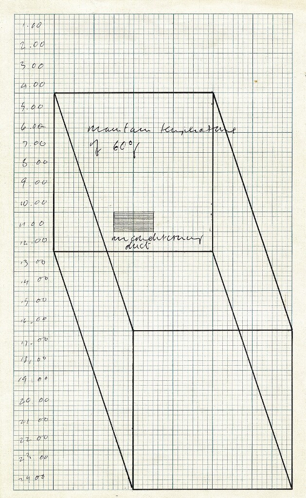
All that architecture has learned from the environmental crisis is the need for insulation, protection, and preservation. Walls are thickening, windows are shrinking, and buildings are becoming passive. The watchword is retreat. We have to protect ourselves from everything: from cold, from sun, from noise, from wind. The more hermetic buildings are, it seems, the more virtuous. The only problem is that they protect themselves more than they protect the environment. The environmental crisis could lead to the emergence of a new, strange form of communion between beings and things. But up until now, the opposite has happened.
This disciplinary retreat responds to a grand narrative of the end of the world that is imbued with feelings of fear and guilt, as well as questions of morality. If the specter of the apocalypse hangs over us, what else can we do but prepare for the worst? Besides these quasi-religious questions, it is also clear that we stand at the confluence of new priorities for both comfort and economy. Small windows cost less, and walls filled with thick layers of insulation, rated and certified, are a response to carefully defined markets.
The resulting problem for architecture is twofold. First, the idea of comfort has been reduced to a standard conception that targets any kind of sensation, hot or cold, shadow or dazzle, noise and echo. Any attempt to introduce matters of sensory perception is annihilated by a scientific understanding that measures comfort by their absence. Second, instead of bringing us magnificent fortresses, this defensive retreat generates a tedious architecture, one that takes the shape of thermos-like buildings, wrapped in indeterminate manufactured façade materials, vaguely designed to incorporate a standard percentage of medium-sized openings. This architecture without quality only feeds the interests of the gurus of the apocalypse, namely, technicians appointed to verify the strict application of environmental measures that are often disconnected from local contexts and issues, and lobbyists who favor marketing the latest green technical gadgets. In search of an alternative, we have developed a strategy that consists of turning buildings inside out, as one might do with a glove, or when skinning a rabbit.

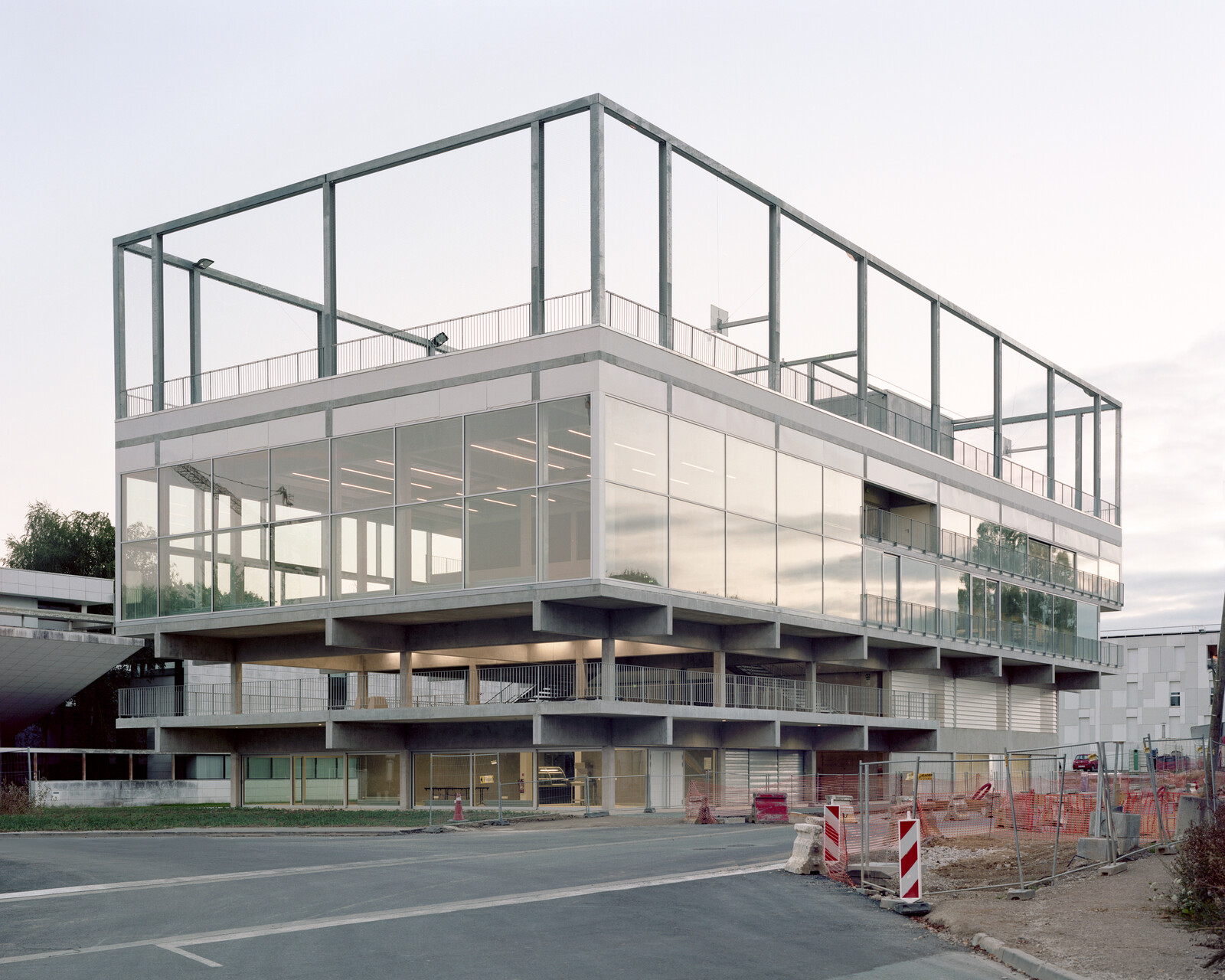
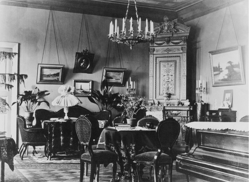
The Public Condenser at Paris-Saclay University. Photo by Maxime Delvaux.

The Public Condenser at Paris-Saclay University. Photo by Maxime Delvaux.

The Public Condenser at Paris-Saclay University. Photo by Maxime Delvaux.

The Public Condenser at Paris-Saclay University. Photo by Maxime Delvaux.
The Public Condenser at Paris-Saclay University. Photo by Maxime Delvaux.
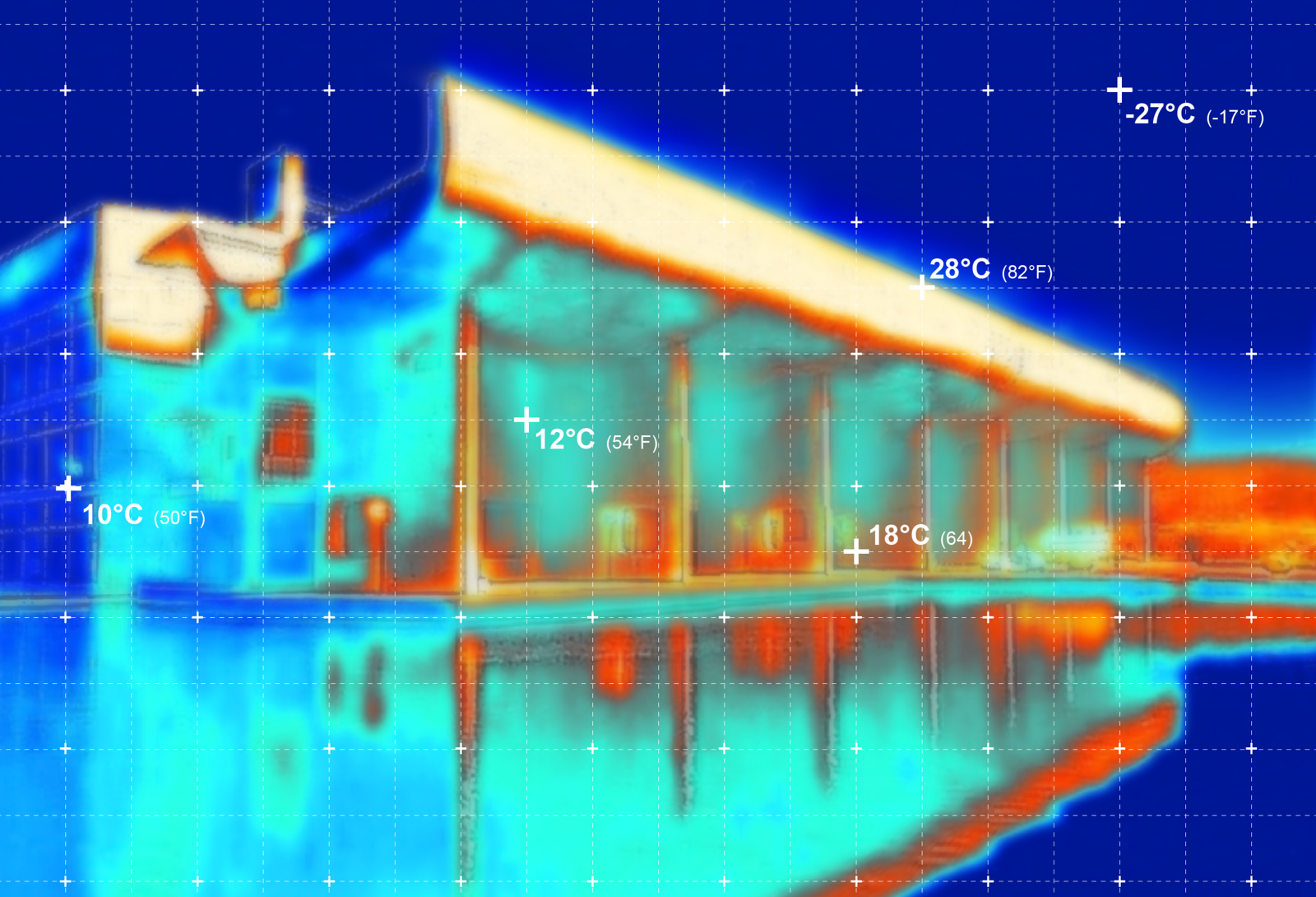
Apart from the two main sports halls, the purpose of the Public Condenser at Paris-Saclay University is to serve as a cafeteria for 600 visitors twice a day. Their bodies alone are sufficient to heat the entire building. Accordingly, the building would only need to be preheated twice a day, before meals, for less than an hour total. This means that the conventional climate strategy based on inertia—i.e., the capacity of a building to maintain a constant temperature—was completely unnecessary. We therefore conceived a responsive building, one capable of reacting to discontinuous occupancy.

Plan of the ground floor of the Public Condenser at Paris-Saclay University. Drawing by Muoto.

Plan of the first floor of the Public Condenser at Paris-Saclay University. Drawing by Muoto.

Plan of the second floor of the Public Condenser at Paris-Saclay University. Drawing by Muoto.

Plan of the roof floor of the Public Condenser at Paris-Saclay University. Drawing by Muoto.
Plan of the ground floor of the Public Condenser at Paris-Saclay University. Drawing by Muoto.
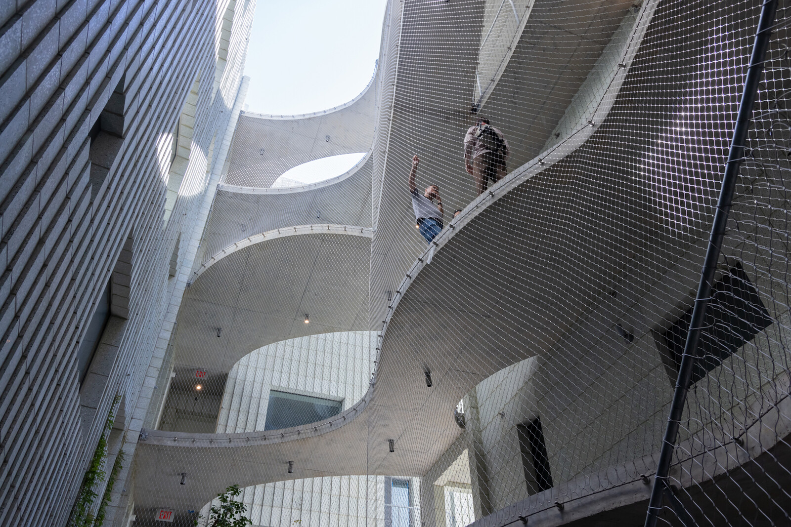
We designed the building as a shelf containing a series of independent heat bubbles, each corresponding to different activities. In the center, a monumental staircase provides access to the different platforms and leads to an open-air roof space. As a result, the layout of the building is similar to a Klein bottle, a mix of semi-indoor, semi-outdoor spaces. And instead of placing the entrance on the edge of the façade, multiple doors within the heart of the building lead to different spaces. The building resembles a structure without an interior; a transparent body confidently exhibiting its organs.

The Ateliers Médicis at Clichy-Montfermeil. Image by Olivier Campagne at ArtefactoryLab.

The Ateliers Médicis at Clichy-Montfermeil. Image by Olivier Campagne at ArtefactoryLab.

The Ateliers Médicis at Clichy-Montfermeil. Image by Olivier Campagne at ArtefactoryLab.

The Ateliers Médicis at Clichy-Montfermeil. Image by Muoto.

The Ateliers Médicis at Clichy-Montfermeil. Image by Olivier Campagne at ArtefactoryLab.
The Ateliers Médicis at Clichy-Montfermeil. Image by Olivier Campagne at ArtefactoryLab.
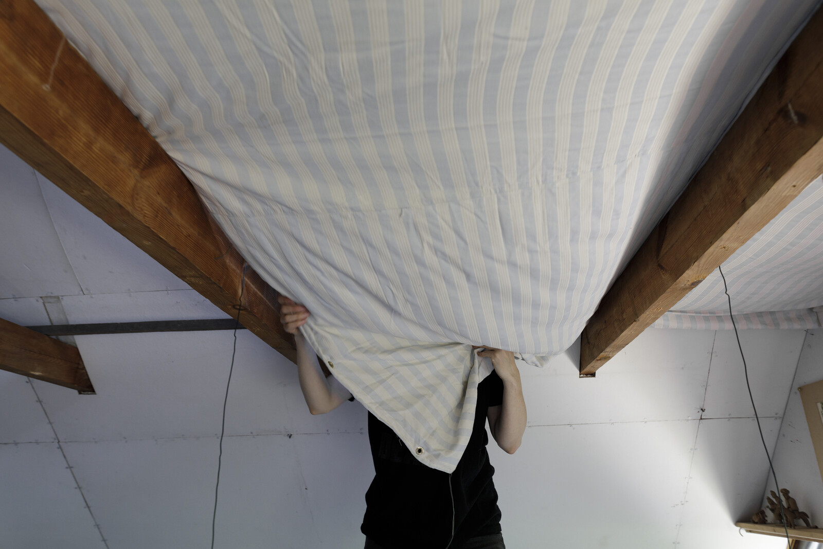
Ateliers Médicis at Clichy-Montfermeil, in eastern Paris, is a cultural facility that needs many dark spaces for filming, exhibitions, and recording studios. Such programs often create a contradiction, in that these spaces also want to be open to their immediate urban environment. In our case, the main space was an opaque black box, a big rehearsal and performance hall. But we were also asked to create a stage for street art, where artists could perform in unusual and informal settings. Our solution was to place the black box in the center and surround it with a series of spaces arranged like the layers of an onion. The first layer takes the shape of a double row of movable acoustic partitions, creating an independent space for circulation or storage for seats. The second layer consists of studios, an exhibition space, and logistical spaces. The third layer consists of a series of five-meter-deep peripheral passages, displaying all the spaces that are usually hidden, such as backstage areas and passageways. Equipped with a series of bridges, this peripheral space can also be turned into a winter garden—cool and ventilated in summer, heated by the sun in winter. The last layer is a system of large thermal curtains running along the façade, emphasizing the theatrical function of the building.
These two projects each in their own way challenge the protective function of façades, either by reducing them to the point of abolishing the distinction between inside and outside or by augmenting them to become a habitable space. They suggest an architecture that displays its interiority not by sticking pipes and staircases on the façade as ornament, but by establishing typologies that are open to the elements. They are architectures ready to admit rain and wind, and perhaps even mold and bacteria, as components just as fundamental as brick and steel. They suggest a notion of interiority that is not conceived as a strict protection from a supposedly hostile exterior, but rather as a deliberately porous and ambiguous relationship between buildings and their environments.
After Comfort: A User’s Guide is a project by e-flux Architecture in collaboration with the University of Technology Sydney, the Technical University of Munich, the University of Liverpool, and Transsolar.
